This post may contain affiliate links. If you make a booking or purchase through these links, we may earn a commission at no additional cost to you.
A narrow hallway poses a design problem that cannot be solved by rearranging furniture, because width is fixed and the passage is mostly traffic path.
What can change is how the corridor runs, where the eye lands at the far end, and how the vertical plane is used.
Some approaches here are reversible styling moves suited to renters, while others are permanent surface or architectural decisions.
Each entry explains the visible composition, the practical function of the elements, and the tradeoffs worth weighing before committing.
Expect ideas built for corridors with limited daylight, a single usable wall, or door swings that rule out floor furniture.
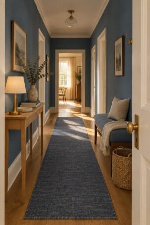
A Tonal Paint Wash That Blurs Wall, Trim, and Ceiling Into One Surface
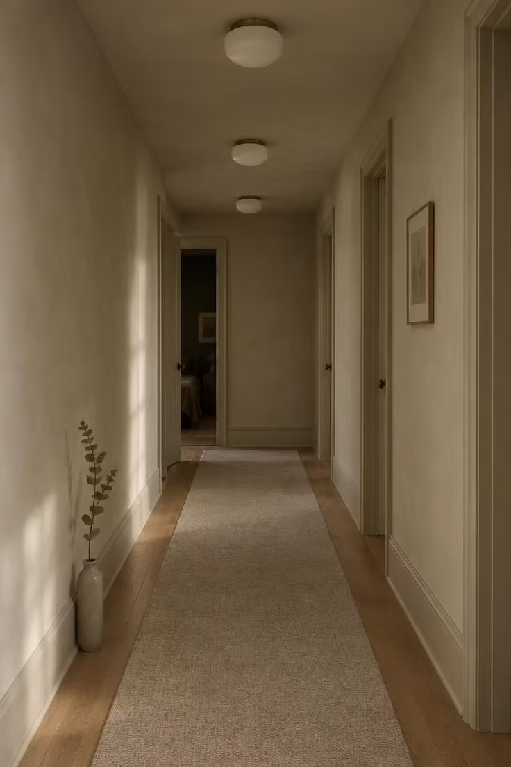
Painting walls, trim, and ceiling in closely related shades removes the horizontal lines that visually chop a corridor into segments.
The length then reads as one continuous surface rather than a stack of separate planes.
Finish choice carries a real tradeoff in a corridor, where raking light from adjoining rooms exposes every imperfection.
Matte and eggshell hide patchy drywall and old repairs better; higher sheen wipes clean more easily but shows bumps and filled spots.
Among narrow hallway paint colors, a slight tonal shift between wall and trim reads more deliberate than stark white trim against a mid-tone wall in a tight space.
Pair the walls with a hallway runner in a tone within a shade or two of the floor so the floor plane does not compete.
This approach suits a long narrow hallway with dated trim profiles, patchy drywall, or a mix of door casings that draw attention to themselves.
Style Blueprint:
- Matte or eggshell paint in closely related warm greige shades for walls, trim, and ceiling
- A low-pile flat-weave runner in a tone near the flooring color
- Slim flush-mount ceiling lights with simple diffusers
- One narrow vase with a dried botanical stem
- Painter's tape and a large sample board for testing the tonal scheme at both ends of the hall
Design Pro-Tip: Test tonal paint schemes on a large sample board placed at both ends of the hallway at different times of day, because hallway light shifts dramatically along the length and a color that reads warm near a doorway can turn gray ten feet in.
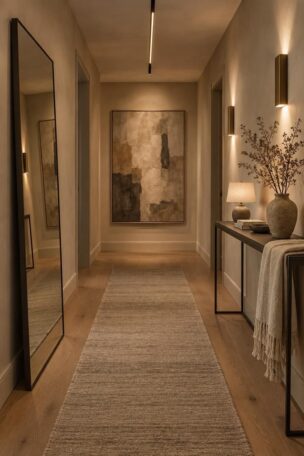
A Floor-to-Ceiling Mirror Leaning on the Corridor's End Wall
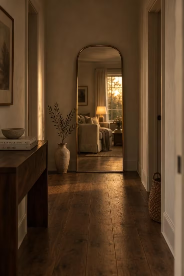
A mirror at the terminus reflects whatever lies beyond the viewer, so the corridor appears to continue into the reflected space rather than stopping at a blank wall.
That effect is the reason this ranks among the most dependable narrow hallway ideas, and it shows why small hallway ideas often start at the end of the passage rather than along it.
Placement logic decides whether the mirror works at all.
Opposite a window, a lit doorway, or a bright adjoining room, it reads as a light multiplier.
Opposite a blank wall, it simply shows blank wall.
Leaning versus hanging changes the commitment level.
A leaning mirror is fully reversible and renter-friendly, but it needs floor space at the base and a wall it can rest against without tipping.
Scale matters, and a mirror narrower than roughly the door width beside it can look undersized at the end of a long run.
Keep the wall around the mirror quiet so the reflection carries the visual interest.
Tall plants or a single slim object beside the base add weight without crowding the passage.
Style Blueprint:
- A tall arched mirror with a slim metal or wood frame
- A shallow console or narrow table for the side wall
- One ceramic vessel with a single branch
- A woven basket or grounding object at floor level
- A quiet, low-contrast wall finish behind the mirror
A Single Oversized Canvas on the Long Wall, Hung Low Relative to the Runner
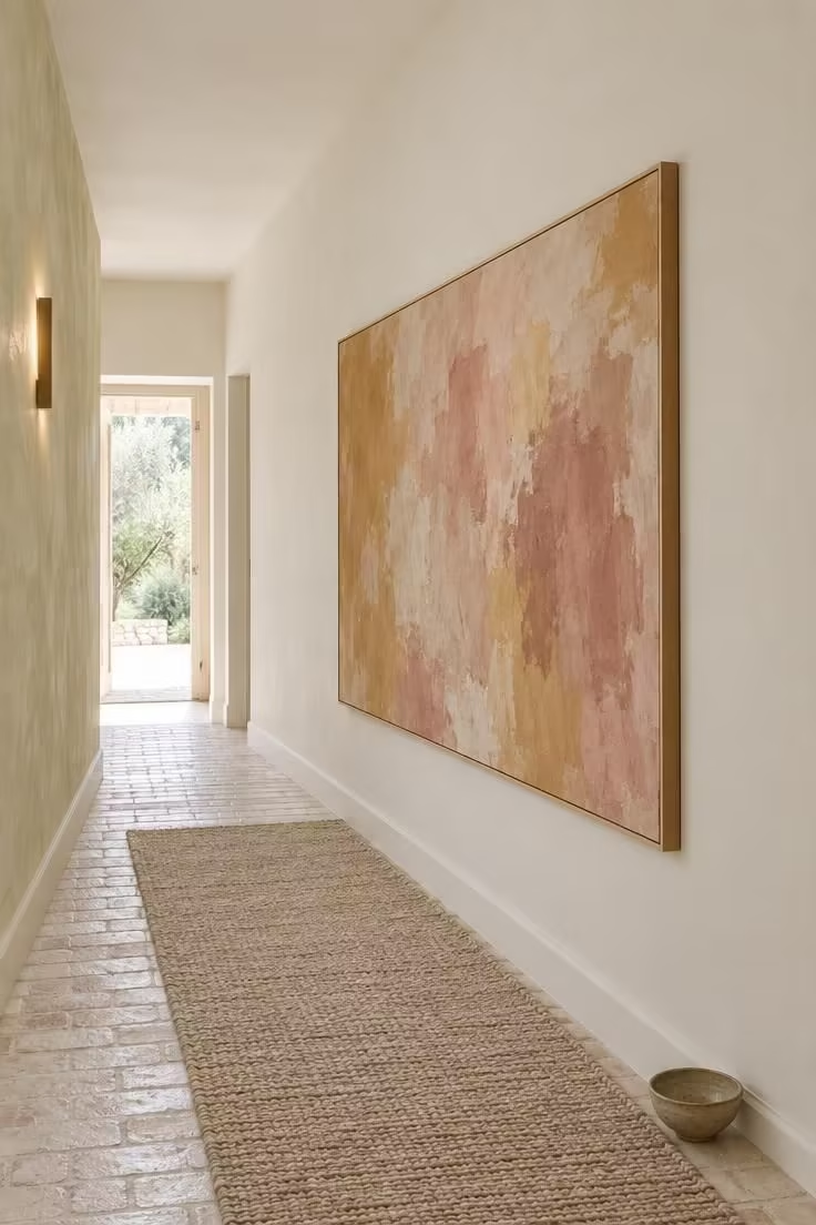
One large piece replaces a gallery wall and reduces visual noise in a corridor where the eye already travels a long distance.
Proportion carries the idea, and it is the detail that separates narrow hallway ideas that work from ones that feel unfinished.
A single artwork sized to roughly two-thirds of the wall length it occupies tends to read as intentional rather than lost, while small pieces in a long narrow hallway often disappear.
Hang height deserves a second look.
Centering a large piece on the wall rather than at seated eye level often suits corridors, where the viewer is almost always standing and moving.
Frame depth matters in a passage.
A slim float frame or canvas with painted edges keeps the piece from catching shoulders.
This approach works best where the long wall has no doors interrupting it.
Choosing a canvas in two or three muted tones keeps the corridor from feeling busy at close range.
Style Blueprint:
- One oversized canvas sized to roughly two-thirds of the wall length
- A thin float frame in natural wood or painted to match the canvas edge
- A woven runner with a visible border of flooring on both sides
- One small handcrafted object at floor level
- A wall finish in a soft matte tone that stays quiet behind the art
A Continuous Picture Ledge Running the Full Length Above a Low Bench
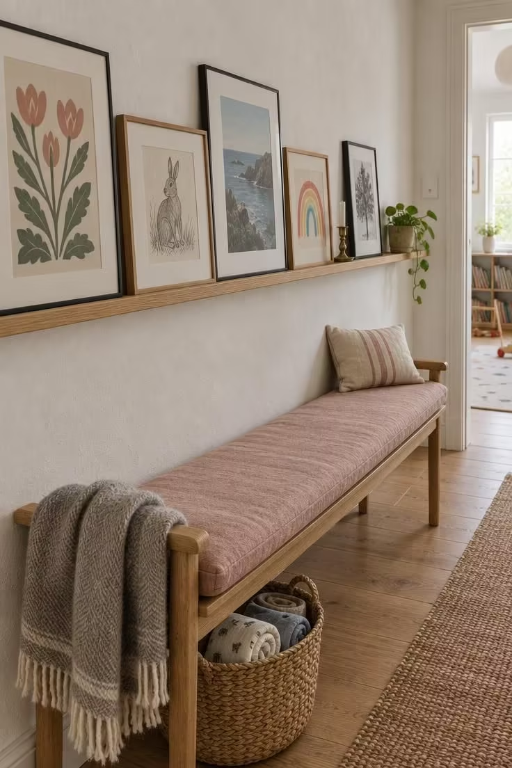
An unbroken ledge line draws the eye down the corridor and gives the long axis a purpose.
The overlapping art arrangement can be rotated seasonally without new holes, which keeps this among the more flexible narrow hallway ideas for a long wall with no doors interrupting it.
Depth is the practical constraint.
Picture ledges protrude more than flat-hung frames, so keep the ledge shallow and the objects on it slim in a corridor with regular traffic.
A bench below the ledge creates a layered composition with art above and a resting surface below, but only where door swings and traffic allow floor furniture.
Where floor furniture will not fit, the ledge alone still carries the corridor's long line.
Rotation keeps the arrangement alive, so store off-season prints flat and swap them on a schedule rather than letting the ledge become a static display.
Leaning frames can slide during cleaning.
A small adhesive putty dot under each frame keeps the arrangement steady.
Soft hallway lighting helps here, since raking light along a corridor shows every gap between overlapping frames, and even a wash of light from an adjoining room keeps the ledge line legible from the far end.
Style Blueprint:
- A slim picture ledge in natural oak running the full wall length
- A low wooden bench with a linen cushion in a muted tone
- Overlapping framed prints in mixed thin frames
- Small adhesive putty dots to steady leaning frames
- A woven basket for storage beneath the bench
Design Pro-Tip: Run the ledge the entire length of the wall rather than in segments, because a continuous line reads as architectural while short interrupted ledges read as furniture and make the corridor feel more cluttered rather than longer.
Slim Wall Sconces Spaced in an Even Rhythm Down One Wall
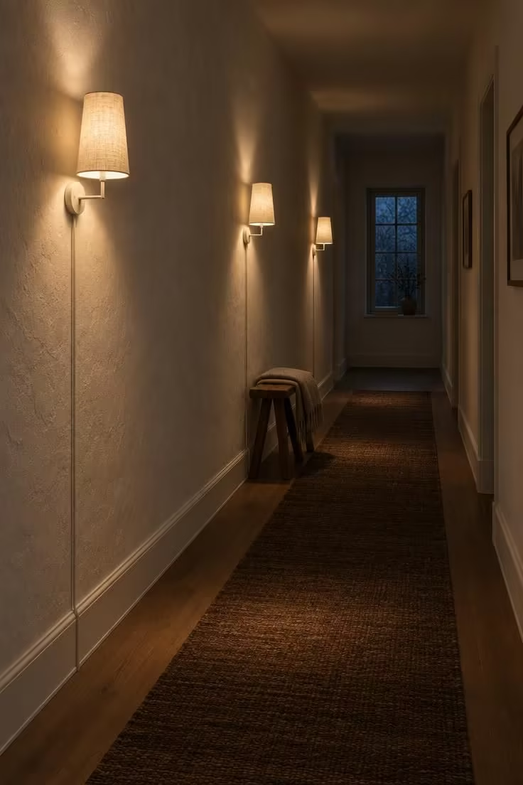
Evenly spaced light sources break a long corridor into a sequence of brighter and dimmer zones, so the eye reads chapters rather than one dark tunnel.
Spacing beats count: three well-spaced fixtures usually read better than six crowded ones, which can look like a runway.
Plug-in sconces with cord covers are reversible for renters.
Hardwired sconces are a permanent electrical change and outside the scope of this styling idea.
Height consistency reinforces the rhythm, since slight variations read as mistakes in a corridor where everything is viewed in sequence.
Sconces that wash the wall rather than point outward reduce glare in a narrow space where the viewer stands near the fixture.
A hallway runner in a darker tone gives the pools of light something to land on.
Matching the cord cover to the wall finish lets the wiring recede without drawing attention.
Style Blueprint:
- Three matching plug-in wall sconces with slim shades
- Cord covers painted to match the wall finish
- A dark-toned runner to ground the pools of light
- A low wooden stool with one folded textile
- Wall paint in a soft chalky white with visible texture
Design Pro-Tip: Test sconce spacing on the wall with painter's tape before committing to a position. Stand at both ends of the corridor and check how the intervals read in perspective.
A Tight Grid Gallery in Matching Frames on a Deep Olive Wall
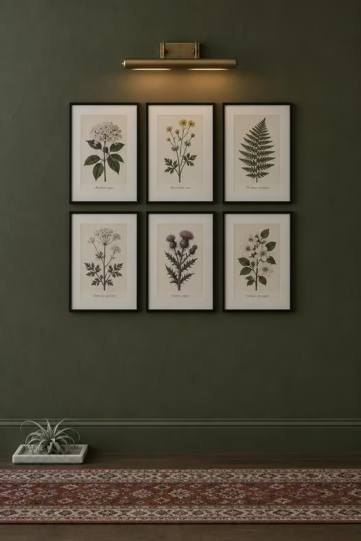
A uniform grid turns multiple small pieces into one large visual block, solving the scale problem of small art in a long corridor without requiring a single oversized canvas.
Grid math carries the effect, and consistent gaps between frames matter more than exact frame size.
Measure the wall and lay the pattern out on paper before committing to holes.
Thin frames match each other and many narrow hallway paint colors, so the block reads as one unit rather than a scattering of separate pieces.
Hallway wall decor at this scale also lets a hallway mirror sit at the corridor's end without competing, since the grid holds the long wall on its own.
Deeper wall color behind a light-framed grid increases contrast and makes the block read from farther down the corridor.
Pattern scale applies to print subjects as well, since fine-scale repetition recedes while large-scale motifs advance, which matters when choosing what to frame.
Grid layouts make expansion easy later, because adding two more matching frames extends the block rather than disrupting it.
Style Blueprint:
- Six identical thin black frames with matching mats
- Botanical or geometric prints with even tonal weight
- Deep olive matte wall paint
- An aged brass picture light above the grid
- A slim wool runner in rust and cream below
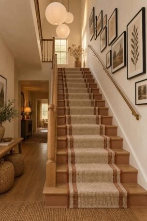
A Long Striped Runner Sized to Leave Visible Flooring on Both Sides
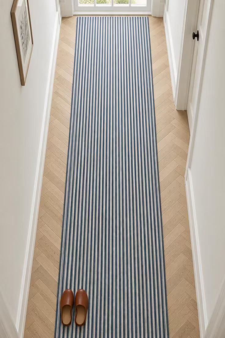
A runner that follows the direction of travel reinforces the corridor's long axis.
Sizing carries the effect, and a runner that leaves a small, even border of flooring on each side typically reads more considered than one that spans the full width.
Pattern direction shifts the result as stripes running the length of the runner exaggerate the corridor's length, while crosswise stripes can chop it into segments.
Upkeep deserves honest consideration, since runners shift, curl at edges, and collect dust.
An anti-slip pad underneath and regular vacuuming are standard practical measures.
Flat-weave and low-pile runners lie flatter in a corridor than thick plush, which can buckle in doorways.
Where the runner leaves more bare flooring, a hallway gallery wall or hallway wall decor above it can echo the striped rhythm without crowding the walkway.
Style Blueprint:
- A flat-weave or low-pile runner with lengthwise stripes
- An anti-slip pad cut to the runner's dimensions
- A clear even border of visible flooring on both sides
- A handheld vacuum or brush for weekly upkeep
- Neutral wall finishes that let the stripe pattern lead
Design Pro-Tip: Photograph the runner in place from both ends of the corridor before committing, because a pattern that reads elegantly in a close-up can turn busy or dizzying when viewed in perspective down a long run.
A Picture-Rail Line in Contrast Trim That Runs Unbroken Past Every Door
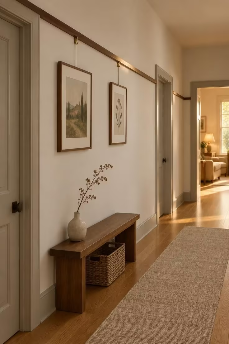
A continuous horizontal line at a fixed height ties a corridor's disparate doors, casings, and wall segments into one system and gives the eye a guide rail.
Trim profile shapes how that line reads.
A simple rectangular or half-round profile in a contrasting finish reads as a deliberate architectural line.
Ornate profiles can feel busy when repeated along a long run.
Rail hooks allow art to be moved without new holes, which suits readers who like to rotate pieces.
The line should pass above door casings rather than stopping at them, or the effect breaks into segments.
Finish pairing sets the tone, since a dark rail on a light wall maximizes the line's visibility while tone-on-tone keeps the treatment subtle.
Where doors interrupt both walls, a rail can still run above them to preserve the continuity.
A bench beneath the rail, its basket slid underneath, keeps hallway storage close at hand without adding a second focal point.
Style Blueprint:
- A slim rectangular picture rail in a contrasting wood or painted finish
- Small brass rail hooks rated for the frame sizes used
- Two or three framed prints in thin profiles
- A low wooden bench with a woven basket underneath for hallway storage
- A low-pile runner in a quiet neutral tone
A Salon-Style Cluster of Mixed Frames Centered on the One Solid Wall
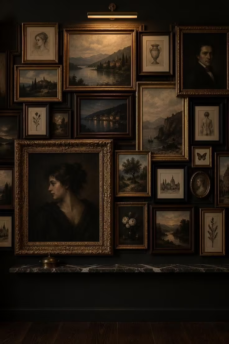
A dense cluster fills a wall edge-to-edge so the arrangement reads as a single textured surface rather than a collection of small items.
The composition needs an anchor, and one larger piece placed off-center keeps a cluster from reading as random.
Frame depth matters because overlapping frames protrude at different depths, so keep the deepest frame in the cluster slim in a tight corridor.
A shared subject, era, or mat color holds mismatched frames together visually.
The surrounding wall is part of the composition, so among narrow hallway paint colors a deep charcoal or near-black gives light and mid-tone frames strong contrast, while a soft off-white lets a mixed-frame cluster read as the only pattern on the wall.
Closely hung frames collect dust on the top edges of each frame.
A soft brush on a handle reaches them without removing pieces from the wall.
Style Blueprint:
- 8 to 12 frames in mixed gilt, walnut, and black finishes
- One larger anchor piece placed off-center
- A shared mat color or subject theme to unify the group
- A small brass picture light above the cluster
- A soft long-handled brush for dusting the top edges
A Shallow Floating Shelf With a Single Row of Small Objects Above a Slim Console
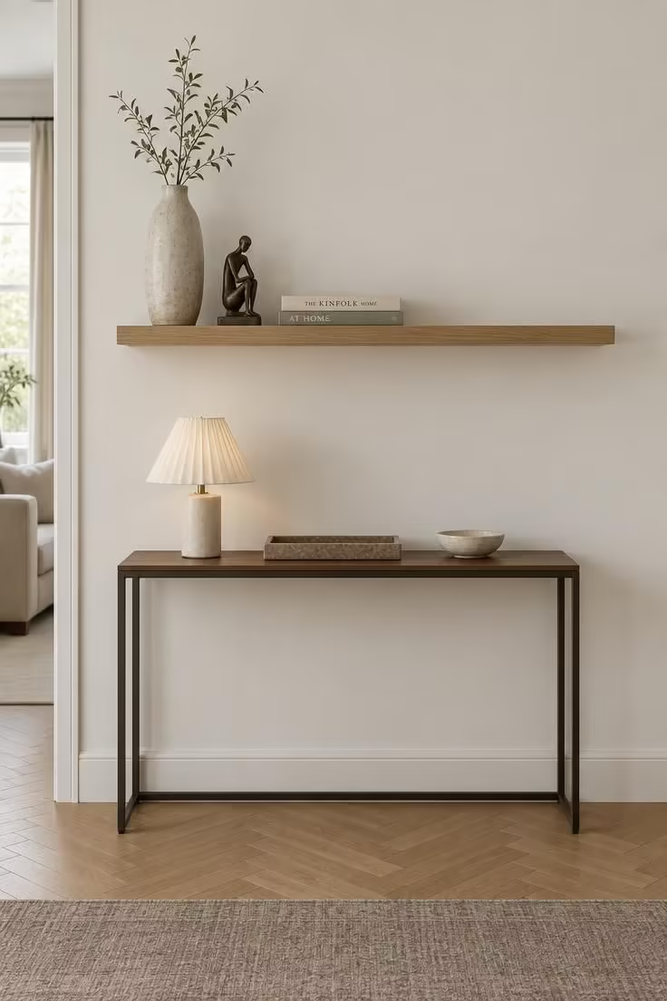
Two parallel horizontal planes, shelf above and console below, create a layered vignette that draws the eye without consuming much floor area.
Depth discipline is the governing rule, and shelving and consoles shallow enough to hold a tray, a small lamp, and one object are the practical limit in a corridor with regular foot traffic.
One taller item on the shelf, such as a vase or small sculpture, gives the arrangement a focal point.
Negative space keeps the composition from feeling like storage, and leaving two-thirds of the shelf empty works better than filling it.
A console intrudes into the walkway, so measure the remaining clear width against how the corridor is actually used before placing furniture.
Chosen well, the shelf and console together can carry the hallway wall decor for the entire passage without a single additional piece.
Style Blueprint:
- A shallow floating shelf in natural oak or painted to match the wall
- A narrow console table with a slim profile
- A rectangular tray, a small lamp, and one dish for the console
- A tall vase or small sculpture for the shelf
- Deliberate empty space on at least two-thirds of the shelf
Design Pro-Tip: Treat the shelf and console as one composition, and align an object on the console vertically with an object on the shelf so the two planes read as a single designed moment rather than two separate displays.
A Striped Ceiling Treatment That Pulls the Eye Along the Corridor's Length
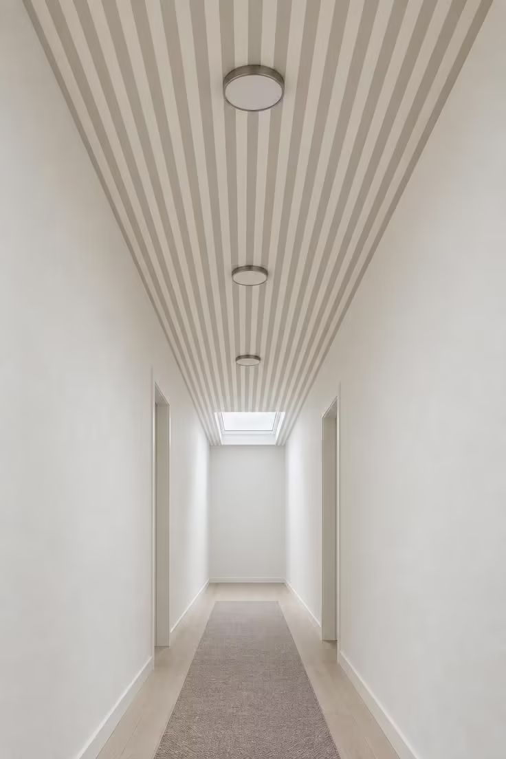
Stripes applied to the ceiling and running lengthwise reinforce the corridor's long axis and shift attention away from the walls that define its narrow width.
Direction logic decides the effect.
Lengthwise stripes elongate, while crosswise stripes add rhythm but can chop the corridor into segments.
Contrast level sets the ceiling's role, since low-contrast stripes read as texture while high-contrast stripes become the dominant feature and demand plain walls below.
Flush or semi-flush lights suit corridors where a pendant would feel intrusive, and the striped field stays uninterrupted with flush fixtures.
Ceiling treatments are more visible in corridors with a lower ceiling, where viewers are more likely to look up as they approach the end wall.
Where the ceiling has beams or texture already, a lighter stripe application lets those features coexist rather than compete.
Style Blueprint:
- Pale cream and soft taupe paint in two closely related tones
- A fine artist's brush or ceiling stripe kit for even lines
- Three flush-mount ceiling lights with slim rims
- Plain warm white walls to keep the ceiling as the feature
- A muted taupe runner below to echo the ceiling palette
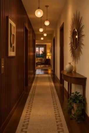
A Short Row of Small Pendants Hung at Consistent Height Over a Narrow Runner
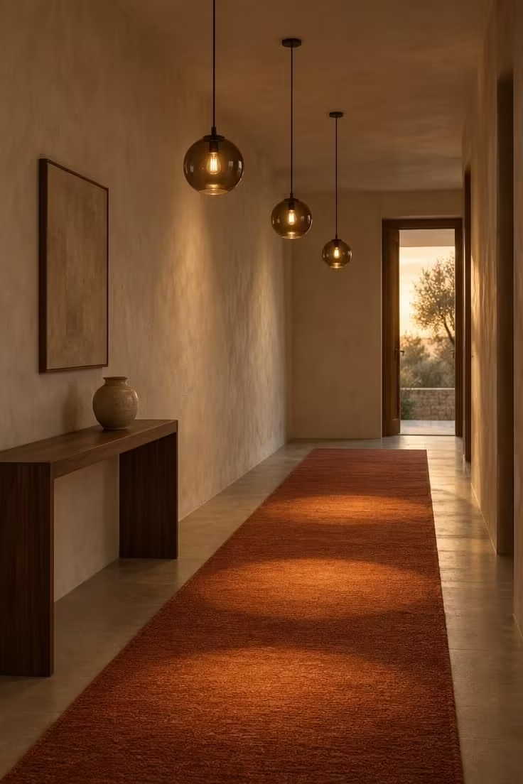
A sequence of small pendants at a consistent height creates a repeating overhead element that paces the walk and visually divides a long corridor.
Height consistency is non-negotiable in a corridor, because pendants are viewed in perspective one behind the other and any difference in drop height is immediately visible.
Fixture scale matters, and small, simple silhouettes read better in a narrow corridor than wide or branching designs that visually crowd the passage.
Pendants need clearance above head height and enough ceiling height that the corridor does not feel lowered, and flush fixtures are the alternative where it does.
Layering pendants with a picture light or sconce along the wall gives two layers of light rather than one.
Matching the pendant finish to the corridor's metal accents ties the sequence into the room's overall palette.
Style Blueprint:
- Three small globe pendants in a simple silhouette
- Matching finish across all three for visual consistency
- A narrow runner in a warm grounding color below
- A slim console with one ceramic object on the side wall
- Warm bulb temperature for the layered glow between pendants
A Ledge of Narrow Timber Slats Mounted Vertically as a Full-Height Screen
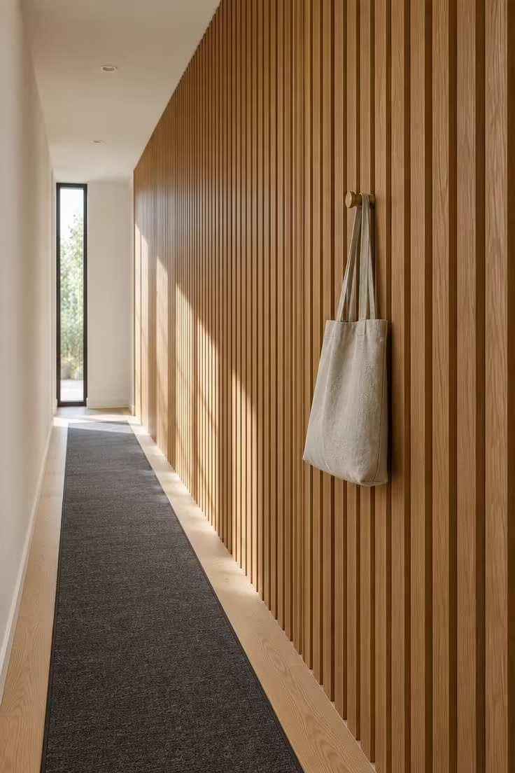
Vertical slats add a strong upward line and texture without consuming walking width, since they sit flush against the wall.
Slat spacing shifts the read.
Closer spacing reads as a solid textured surface, while wider spacing reads as a screen and lets background color show through.
Finish choice changes the warmth.
A natural oil finish keeps the wood warm, while a painted finish in the wall color makes the texture subtle.
Keep the slat assembly shallow so it does not narrow the passage, even though it sits against the wall.
Vertical slats pair well with a tonal floor and a quiet runner so the wall texture stays the focus.
A single hook integrated into the rhythm adds a small functional moment without disrupting the pattern.
Style Blueprint:
- Narrow vertical wood slats sized for the wall height
- A natural oil finish or a paint matched to the wall color
- A slim low-pile runner in a muted tone below
- A single brass hook integrated between slats
- Tonal flooring that lets the wall texture lead
Design Pro-Tip: Run the slats from skirting to ceiling rather than stopping at a rail, because a full-height run of vertical lines reinforces ceiling height while a partial run can read as a dado and chop the wall.
A Leaner Mirror Opposite a Window, Reflecting Borrowed Daylight
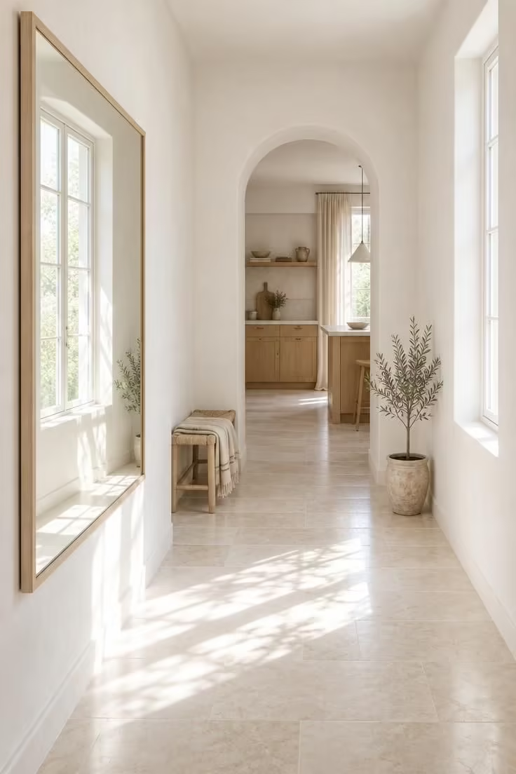
A mirror positioned opposite a window reflects the daylight entering the corridor, spreading brightness along a space that may have no window of its own.
Placement logic governs whether the mirror works, and the mirror must face the light source to be useful, because facing a blank wall it reflects nothing of interest.
Size affects how much light the mirror carries, and a mirror wide enough to capture the window from typical viewing positions in the corridor works harder than a narrow one.
A slim frame keeps the mirror reading as an opening rather than an object.
Mirrors in corridors create reflections of movement, which can be distracting for some readers, and an arched or softly framed mirror can soften this effect.
A pale frame finish echoing the surrounding trim keeps the mirror integrated rather than floating on the wall.
Style Blueprint:
- A wide rectangular mirror sized to capture the window's reflection
- A slim pale oak or painted frame to match the trim
- Light-toned walls that bounce reflected daylight
- One grounding object such as a potted olive tree
- A woven bench or small seat for the far corner
A Deep Saturated Wall Color Paired With Brass and Warm Wood
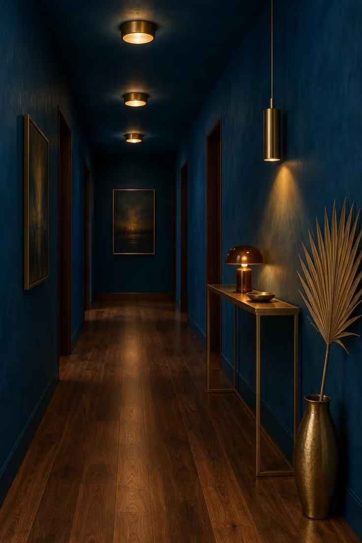
A deep saturated wall color gives the corridor a deliberate character that feels enveloping rather than cramped, since the walls read as a continuous jewel-toned surface.
Contrast hides or reveals the effect.
Keeping trim and ceiling in tones close to the wall color lets the deep hue wrap the space, while white trim would break the envelope into segments.
Hallway lighting becomes more important with darker walls, and layering warm brass fixtures at intervals keeps the corridor from reading as a single dark stretch.
Accent materials carry the palette, and brass, warm wood, and amber glass work with deep blues, greens, and plums without competing.
A darker corridor with little daylight can feel closed-in if lighting is not layered, which is a compositional tradeoff rather than a defect of the color itself.
A console in a matching metal finish and a single large botanical object keep the styling consistent with the rich palette.
Style Blueprint:
- Deep peacock blue matte paint for the walls
- Ceiling and trim in tones close to the wall color
- Aged brass flush ceiling lights and console hardware
- Warm walnut or dark stained flooring
- A brass floor vessel with one large dried botanical
Conclusion
Two questions decide whether a narrow hallway idea works.
How much depth does the element add to the passage?
Every protruding shelf, mirror, or console eats into the walking path that the corridor depends on.
Where does the eye land?
It might settle on a mirror reflecting a bright room, a single large canvas, or the end of a picture rail that carries the length of the wall.
Some of the ideas here are fully reversible, including a leaning mirror, plug-in sconces, or a hallway runner swapped seasonally.
Others commit to a surface or a trim line, and those decisions deserve a slower plan.
Start with one axis, the long wall, the end wall, or the ceiling.
Let one treatment lead rather than layering several competing focal points.
A corridor is viewed in sequence.
A single repeated element that carries the length of the passage usually does more than several one-off decorative moments.
Choose narrow hallway ideas that solve a specific constraint in the space, and the corridor will read as considered rather than simply leftover space.