This post may contain affiliate links. If you make a booking or purchase through these links, we may earn a commission at no additional cost to you.
Staircases and hallways are the spaces you move through dozens of times a day, yet they usually get whatever paint and flooring was left over from the rooms around them.
The real question is how to make a passage feel deliberate and warm without turning it into a renovation.
This walkthrough is image-driven, not a construction plan.
Every idea here is presented as a visual composition first.
Notes on scale, viewpoint, and upkeep follow each idea.
Honest guidance on when a space is too narrow or too temporary for it appears throughout.
The ideas run loosely from the foot of the stairs upward and outward into the hall.
You can follow along in the order you would actually move through the house.
Before choosing anything, photograph your own stair wall and hallway from the bottom step and from the far doorway.
The view you are designing for is the one you see in motion.
Painting the Stair Riser Line in a Single Accent Color
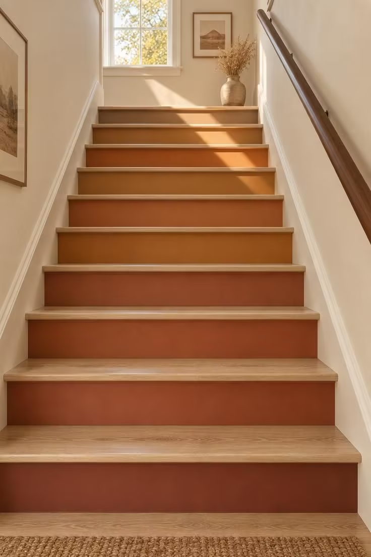
Painting only the risers keeps the treads as the quiet, hard-wearing surface and turns the vertical faces into a repeating stripe.
One saturated tone, clay or terracotta or muted ochre, reads as a deliberate line rather than a decorative accident.
The stripe works hardest on a straight, visible flight where the riser edges are clean and nothing blocks the view from the bottom step.
On a switchback or an open-riser stair, the effect fragments and the rhythm disappears.
Riser paint takes scuffs and shoe marks more readily than natural wood, so a washable finish in a slightly deeper tone holds up better than a pale pastel.
A chip in a dark riser is far less visible than a chip in a cream one.
The direction of travel changes everything here.
The stripe reads strongest from the bottom step and weakest from the landing looking down, so decide which view matters more before committing to a color.
Renters can achieve a similar look with peel-and-stick riser decals, which come off without leaving the wood bare.
The tradeoff is a shorter lifespan and a slightly flatter finish.
Repeat the accent once at the top of the flight, with a small framed print or a vase on the landing, so the color has somewhere to arrive rather than just stopping.
Among stairs and hallway ideas, this one earns its place because the color does the work of a runner without covering the treads.
No stair runner is needed to carry the palette, and the painted line pairs easily with whatever hallway decor already fills the rooms beyond.
Set against other narrow hallway ideas, the stripe reads as a simple way to give a plain flight a clear focal point.
It also coordinates well with a staircase wall decor scheme kept intentionally quiet on the surrounding wall.
Style Blueprint:
- Riser paint in a single flat, chalky finish, clay or terracotta or muted ochre, against natural wood treads.
- Trim, stringer, and balusters in one quiet off-white so the riser color reads as a stripe, not a clash.
- One repeated accent at the top of the flight, such as a small framed print or a vase on the landing.
- A handrail tone that matches the treads rather than the risers, so the diagonal line stays continuous.
Design Pro-Tip: Sample your stair from the bottom step and hold the paint chip there for two days before you buy, since the riser color you love on a chip often shifts under a north-facing stairwell window.
A Stepped Gallery Wall That Follows the Stair Rake
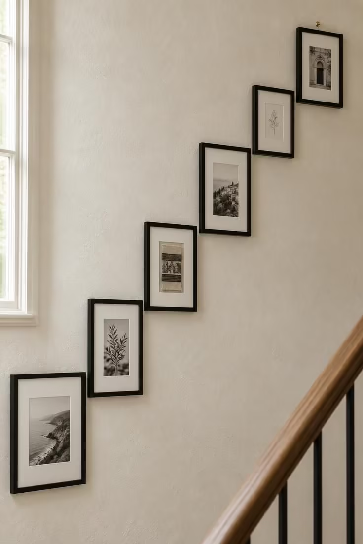
A stair wall is usually one large, uninterrupted, slightly angled surface, which makes it the best gallery wall in the house and the hardest one to hang well.
The arrangement has to track the handrail line rather than the floor, so every frame's center sits roughly parallel to the rake.
Unify with one frame color and one mat width, then vary only the outer dimensions.
Six frames in the same black with the same white mat read as a single composition even when the sizes differ.
The largest piece belongs at the bottom step, where viewing distance is greatest.
Small pieces low and large pieces high inverts the perspective and looks unbalanced from the most common viewpoint.
Gap discipline matters more here than on a level wall.
A consistent gap of five to eight centimeters keeps the diagonal legible, while an uneven gap turns the arrangement into a cluster.
Frames on a stair wall sit above eye level, so dust settles on the upper edge of every frame.
A long-handled duster every few weeks keeps the arrangement looking intentional rather than neglected.
Glass catches glare from a landing window and can wash out the art directly beneath it.
Matte or anti-reflective glazing solves this at a modest cost per frame.
Very narrow flights should carry three larger pieces instead of nine small ones, because a dense arrangement crowds the visual path.
In a rental, removable adhesive strips on lightweight frames or a picture ledge that follows the rake gets most of the effect with none of the wall damage.
Style Blueprint:
- Every frame center tracking parallel to the handrail line rather than to the floor.
- One frame color and one mat width throughout, with only outer dimensions varying.
- A consistent five to eight centimeter gap between frames.
- The largest piece placed at the bottom step where viewing distance is greatest.
- A midpoint for the whole arrangement that sits near the midpoint of the stair.
A Single Oversized Print Filling the Stairwell Void
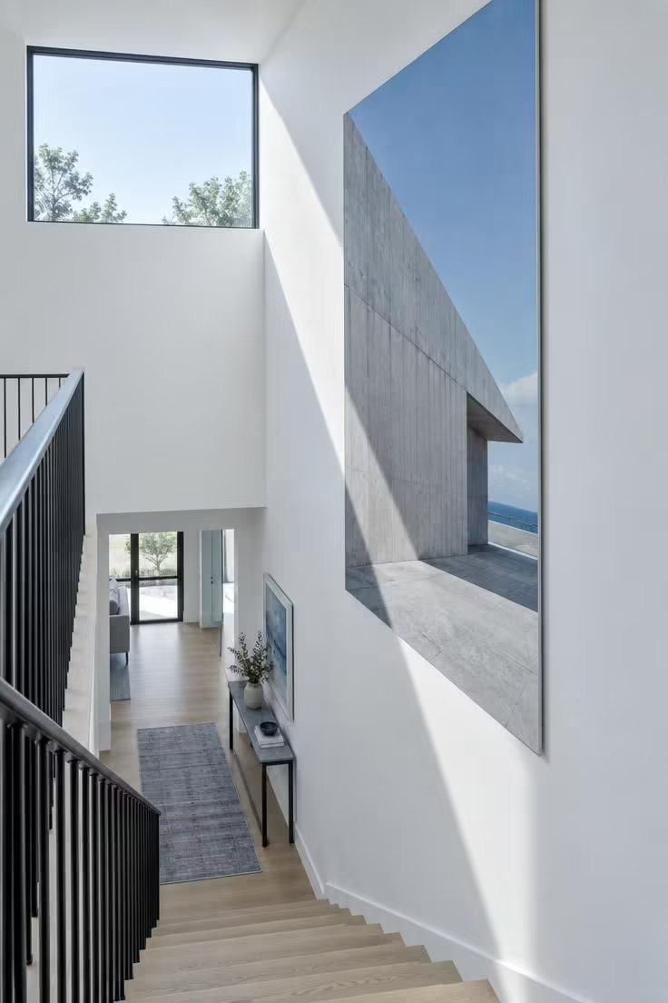
An open stairwell void is often the largest empty surface in a home, and one oversized print fills it with a single gesture.
The artwork needs a strong internal vertical or horizon line, since fine details disappear at stairwell distance.
Frame depth should match the wall's tolerance.
A shallow frame or a frameless mount keeps the wall plane clean and stops the piece from reading as furniture.
Color choice is easier when the print echoes one existing finish in the hallway below, whether that is the floor tone, the trim, or the handrail.
That single echo ties the tall wall to the walking level.
Center the piece on the wall as seen from the landing, not as measured from the floor.
The landing is where the print is viewed head-on, and centering from there corrects for the stair's odd geometry.
Dusting an oversized print on a stairwell wall is awkward and swapping it is nearly impossible without help.
Treat this as a long-term commitment rather than a seasonal change.
Print colors shift under the stairwell's actual light.
A cool-toned piece can turn grey in a warm-lit stairwell, so check a proof or a small test print in the space first.
An oversized textile hanging, such as a linen panel or a framed vintage map, fills the same void with a softer surface and much less glare.
In a low-ceilinged stair, a large print crowds the headspace and a smaller piece works better.
Style Blueprint:
- One large-format image with a strong internal vertical or horizon line.
- A shallow frame or frameless mount that keeps the wall plane clean.
- A dominant print color that echoes one existing hallway finish.
- Centering measured from the landing viewpoint rather than from the floor.
Design Pro-Tip: An oversized print on a stairwell wall is difficult to dust and nearly impossible to swap without help, so choose an image you can live with for years, not a season.
This idea suits a tall, open void where the surrounding wall is otherwise blank.
From the bottom step the print reads as a destination, while from the landing it reads as a backdrop, so decide which view matters more before ordering.
A single large piece also gives a transitional space a clear focal point without the layering and upkeep that a stepped gallery wall or a narrow hallway ideas arrangement would demand.
A Slim Console With a Wall-Mounted Mirror in a Wide Hall
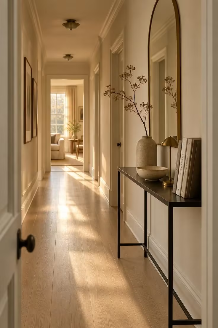
A hallway console earns its place by holding what a passage actually collects, and a wall-mounted mirror above it turns a dead end into a visual destination.
Depth is the deciding factor: a console around 25 to 30 centimeters deep holds a lamp and a bowl without narrowing the visual path.
Mirror height should reach at least halfway up the wall so the reflection reads as an opening rather than a porthole.
Three objects on the surface is the practical ceiling: one tall, one low, one textural.
Anything more reads as clutter in a space you only pass through.
Matching the console and mirror frame metals makes the arrangement read as one gesture rather than two purchases.
A hallway console becomes a landing pad for keys, mail, and bags within a week.
A shallow tray or a lidded bowl keeps the visual footprint small while still corralling the daily accumulation.
The mirror needs dusting on both faces if it sits deep in a frame, and the console surface needs a wipe-down more often than a living room table because of passing traffic.
This arrangement suits a hallway at least 110 centimeters wide, where a 30 centimeter console still leaves a clear walking line.
In a narrower hall, a wall-mounted shelf at the same height replaces the console without losing the composition.
A tall mirror reflects whatever is opposite it, often a door, a radiator, or a coat rack.
Check the reflection from three steps away before deciding anything.
Freestanding consoles and leaning mirrors avoid wall damage entirely and move with you.
Style Blueprint:
- A console no deeper than 30 centimeters so the walking line stays visually clear.
- A mirror tall enough to reach at least halfway up the wall.
- Three surface objects only: one tall, one low, one textural.
- Matching metals on the console and mirror frame.
Vertical Beadboard Paneling Painted to the Dado Line in a Narrow Hall
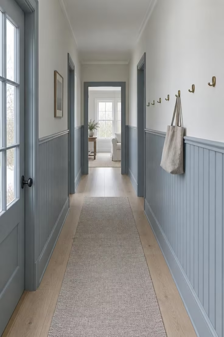
Narrow hallway ideas often start with vertical lines, and beadboard painted to a dado line works because it adds height without adding depth.
Setting the dado at roughly one-third of the wall height makes the horizontal cap read as a base rather than a stripe across the middle.
One paint for the beadboard and a lighter tone above it keeps the paneling grounded.
Keeping the trim the same as one of the two tones keeps the wall from gaining a third color it does not need.
Hooks space at a consistent interval of roughly 30 to 40 centimeters, all in one style.
An even rhythm in a narrow passage reads as intention, while a mix of hook styles reads as accumulated hardware.
Running the paneling continuously past door frames rather than stopping and starting lets the hall read as one unbroken line.
Breaking at each frame turns a long hall into a series of small awkward walls.
Beadboard's vertical grooves collect dust in a way flat paint does not, so a soft brush attachment on a vacuum handles the maintenance in seconds.
Light-colored paneling shows scuffs from bags and shoes near the floor line, and a slightly deeper tone on the lower band wears better visually.
If the hall already has a picture rail, align the dado to it rather than introducing a second horizontal line.
Hooks set for adults leave a gap above them, and that band is a natural home for a single long framed print or a row of small ones.
A dark dado under a cool overcast window reads heavier than the same color under warm light, so test a sample panel near the window before painting the whole run.
Where painted stair risers already carry a deep tone nearby, echo that color in the lower band so the two zones of the passage feel related.
A removable wallpaper with a vertical stripe achieves a similar visual effect in a rental with far less commitment.
Paneling is a permanent change.
In a short, wide hallway, the paneling lacks a long run to read along and the effect is lost.
Style Blueprint:
- A dado line at roughly one-third of the wall height.
- One paint for the beadboard and a lighter tone above it, with trim matching one of the two.
- Hooks spaced at 30 to 40 centimeters in one consistent style.
- Paneling run continuously past door frames rather than stopping at each one.
Design Pro-Tip: Paint a large sample board rather than a small chip and tape it to the wall at the dado height for two days before committing, since narrow halls can make tone shifts obvious at every hour of the day.
A Stairwell Void Anchored by One Tall Hanging Pendant Cluster
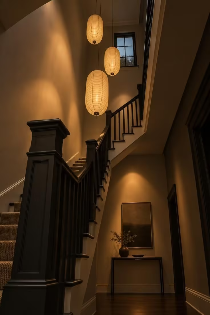
A cluster of small fixtures reads better in a tall, narrow void than one large shade, because the eye follows the vertical stagger rather than a single heavy form.
Two or three shades at irregular drop lengths form a loose vertical composition.
Keeping all shades in one material and one tone, and varying only the size, holds the cluster together.
Mixing materials splits the composition into separate objects competing for attention.
Positioning matters more than style here.
The cluster should be visible from both the bottom step and the landing, since those are the two places it is actually seen.
Paper and fabric shades collect dust and can yellow with age, so a shade that can be dusted with a soft brush holds its look longer.
In a tall void, reaching a high fixture is a real inconvenience, which makes a fitting with an accessible bulb position worth the search.
This idea suits a genuinely tall, open stairwell void.
In a closed stair with a low ceiling, a cluster crowds the headspace and reads as heavy.
For stairwell lighting at a ceiling height that is hard to reach, a fitting with an accessible bulb position or a long-life bulb type is the practical choice.
A cluster is a strong focal point and competes with anything else hung in the void, so the surrounding walls should stay quiet.
A plug-in pendant with a cord routed along the ceiling line approximates the look without new wiring, though the cord run needs to read cleanly from the primary viewpoint.
If the cord would cross an open sightline, this alternative gives up the idea's main advantage.
Style Blueprint:
- Two or three slim fixtures rather than one large shade.
- Staggered drop lengths that form an irregular vertical composition.
- One shade material and one tone throughout, varying only size.
- A cluster position visible from both the bottom step and the landing.
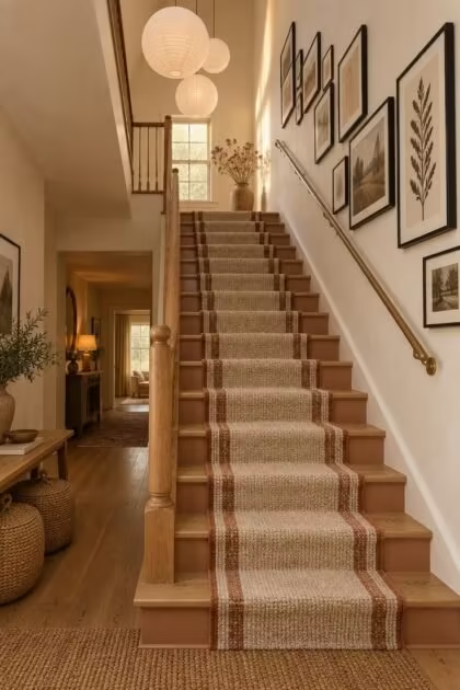
A Striped Flat-Weave Runner Climbing the Stair Treads
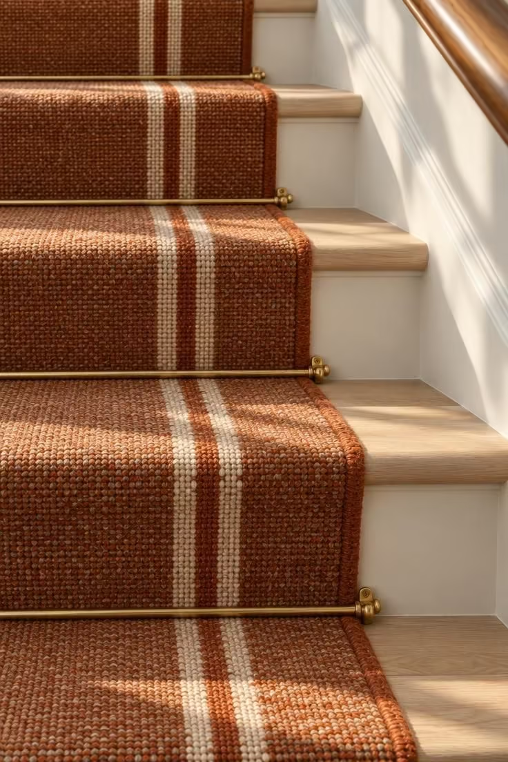
A stair runner is one of the most common ways to bring color and pattern to a stair, and a flat-weave or low-pile construction is the version that behaves.
A thick pile buckles on treads and reads unevenly from below, which is the angle most people see it from.
Stripe width should relate to stair width.
A narrow stripe on a wide stair vanishes, while a broad stripe on a narrow stair dominates the entire view.
Bringing the runner's secondary color into the hallway below, through a cushion or a frame or a bowl, ties the stair to the floor it arrives on.
Without that echo the runner reads as an isolated purchase.
If stair rods are part of the look, keep them one metal and one finish throughout the run.
Mixing finishes breaks the repetition the rods are meant to create.
Runners on stairs shift with traffic and need periodic straightening.
A slightly crooked runner is the most common visual flaw in an otherwise tidy stair, and it is noticeable from the bottom step.
Vacuum the runner on both the tread and riser faces, since grit trapped under the runner edge is what wears the weave fastest.
Light-colored runners show traffic quickly, and stripes hide small marks better than solids.
On an open-riser stair a runner is impractical and the idea should shift to a hallway runner instead.
A loose runner without rods can be lifted for cleaning and moved to a new home, while rods leave small marks.
A striped runner is the loudest element in the stair, so the surrounding palette should stay quiet or the stripes compete with everything else.
Style Blueprint:
- A flat-weave or low-pile runner rather than a thick pile.
- Stripe width scaled to the stair width.
- The runner's secondary color echoed somewhere in the hallway below.
- One metal and one finish for all stair rods.
A Picture-Frame Molding Grid Painted Tone-on-Tone on a Hallway Wall
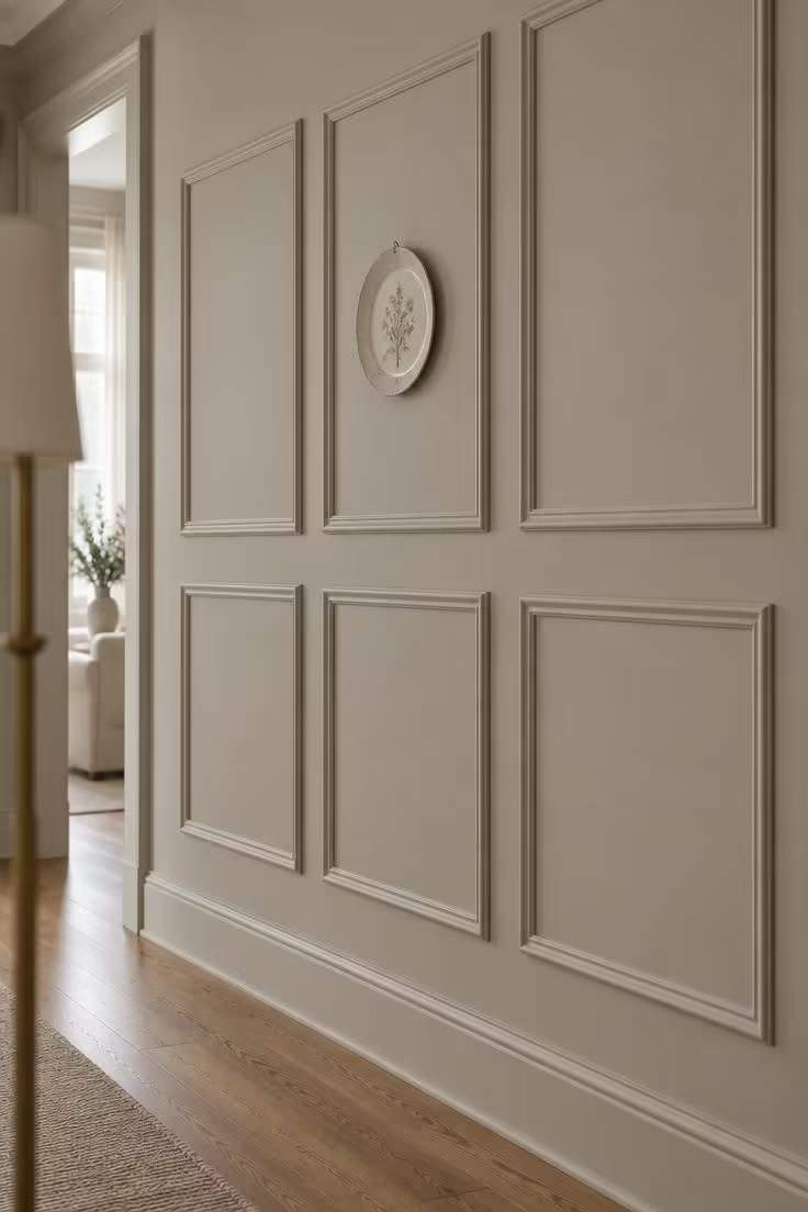
Picture-frame molding applied as a repeating grid adds architectural relief to a wall without changing the wall, and painting it tone-on-tone keeps the effect quiet and plaster-like.
A consistent panel size and gap is what makes the grid read as architecture rather than decoration.
Painting molding and wall the same tone gives a soft, unified look.
Molding in a lighter tone gives a crisper panel read, at the cost of a busier wall.
Aligning the top of the grid to a consistent height along the whole run matters more than aligning it to the ceiling, especially if the ceiling slopes.
A sloping ceiling with a level grid looks deliberate, while a grid that follows the slope looks crooked.
Contents inside the panels should stay minimal, one object per panel or nothing at all.
Empty panels often read better than filled ones because the relief itself is the feature.
Molding profiles collect dust on their top edges, and a soft brush every few weeks keeps the lines crisp.
On a wall that is not flat, panels can sit proud in places and read unevenly in raking light, which shows up most in the late afternoon.
This idea needs a long, uninterrupted hallway wall where the grid can repeat at least four times.
A short hall with one or two panels reads as an unfinished attempt.
This staircase wall decor treatment disappears in flat, dim light and only reads under raking or layered light, so a picture light or a floor lamp at one end of the run brings the grid forward.
Removing the molding later requires filling and painting, which makes this a poor fit for a rental.
Style Blueprint:
- A consistent panel size and gap across the entire run.
- Molding and wall in the same tone, or molding in one lighter tone.
- A grid top aligned to a consistent height rather than to the ceiling.
- One object per panel at most, or empty panels left bare.
A Hallway Bench With Lidded Baskets at the Foot of the Stairs
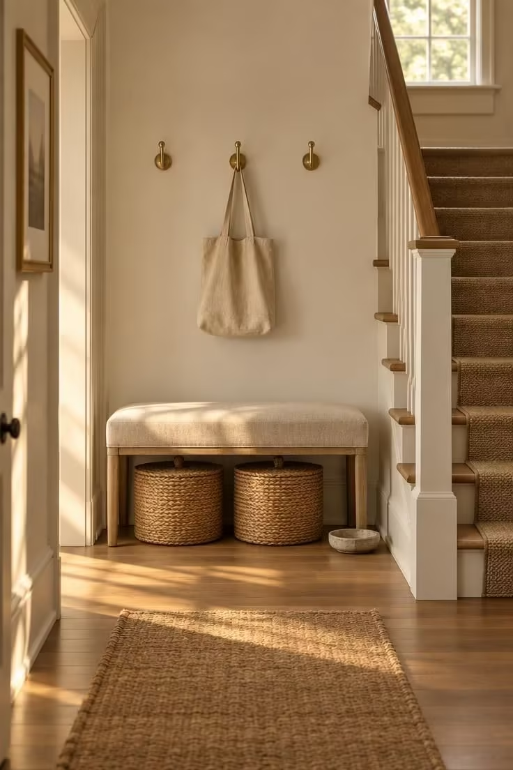
The foot of the stairs is where bags, shoes, and coats naturally collect, and a low bench with lidded baskets gives that collection a defined home.
A backless bench keeps the visual line low, which matters in a passage.
Where hallway storage matters more than seating, a hallway console table is an alternative to the same wall, though it trades away a place to sit.
Lidded baskets rather than open ones keep the contents hidden and the visual line clean.
The tradeoff is real: lidded baskets hide dust and clutter but still need periodic emptying and a wipe-down, while open baskets collect visible dust in a traffic area.
Hooks at a consistent height and spacing keep a bag on one hook from crowding the next.
Even spacing reads as a system, while uneven spacing reads as a mistake.
Bench upholstery in a mid-tone hides daily wear far better than cream.
An upholstered hallway bench takes more wear than a living room chair, so a removable, washable cover is worth seeking out.
This arrangement suits a hall that widens slightly at the foot of the stairs, where the bench has a natural home without narrowing the path.
In a tight hall, a single wall-mounted shelf and two hooks replace the bench and hold most of the same function.
A bench is a visual anchor and a landing pad at the same time.
Without a clear limit on what lives under it, it becomes a pile, and two baskets is the practical ceiling.
Freestanding benches and over-the-door hooks avoid wall damage, while screw-in hooks are a permanent change.
Style Blueprint:
- A low, backless bench that clears the baskets beneath it without looking cramped.
- Lidded baskets rather than open ones to keep the visual line clean.
- Hooks at a consistent height and spacing.
- Mid-tone bench upholstery, ideally with a removable washable cover.
Design Pro-Tip: Sit on the hallway floor at the foot of your stairs and look up, since that low, in-motion viewpoint is what most guests actually see and the one most hallway arrangements are never checked against.
An Under-Stair Nook Fitted With a Slim Closed Cabinet
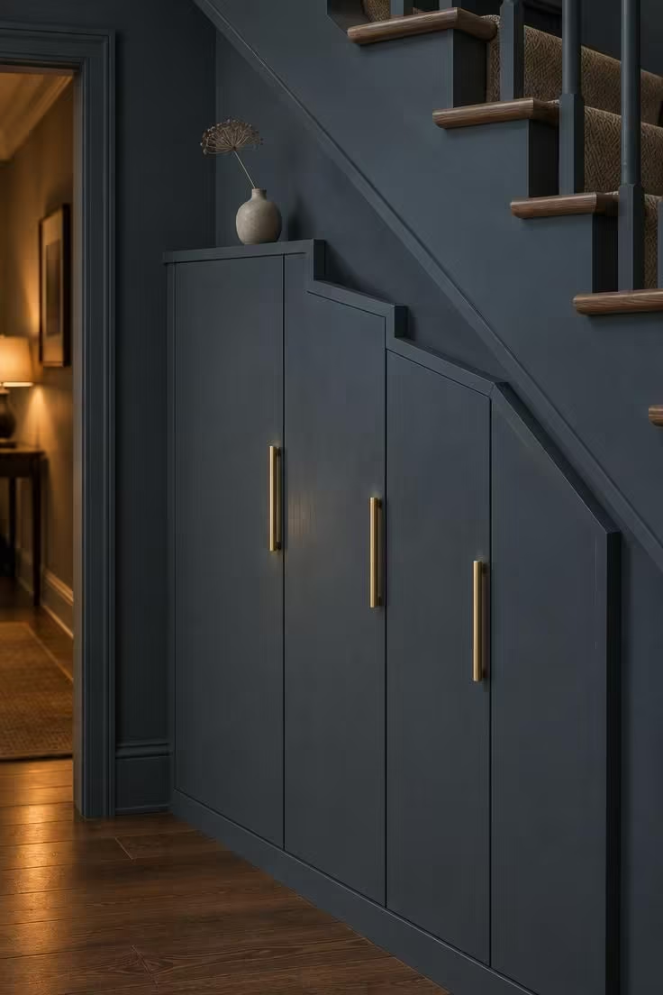
Painting a fitted cabinet the same tone as the wall lets it read as part of the architecture rather than a piece of furniture pushed into a gap.
The stepped top edge following the stair's slope looks far more deliberate than a jagged one.
Slim vertical handles echo the cabinet's proportions and keep the door fronts quiet.
A large round knob on a narrow door front looks out of scale.
The top surface should hold one object at most.
Under-stair surfaces collect clutter faster than almost anywhere in a home, and an empty top keeps the area reading as considered rather than stored-on.
Closed cabinetry hides contents and dust, but the contents still need periodic clearing to avoid a slow accumulation.
The sloped top surface is easy to forget and collects dust that shows against a dark finish.
This idea suits an under-stair zone at least 40 centimeters deep and tall enough for a full-height unit.
In a shallow recess, a low cabinet or a lidded bench works better than a tall one.
A dark cabinet under a dark stair in a dim hallway can read as a void.
A lighter tone on the door fronts, or a single picture light above the cabinet, brings the surface forward.
A fitted cabinet is a permanent change and reads as built-in even when it is freestanding, which makes it a poor rental choice.
A freestanding slim wardrobe in a matching tone achieves a similar look with less commitment.
Items used in the hallway itself, such as shoes, bags, cleaning supplies, or spare bulbs, keep the cabinet earning its place.
An open under-stair bookcase in a pale wood reads lighter and doubles as a display, at the cost of more visible dust and clutter.
Style Blueprint:
- A cabinet painted the same tone as the wall so it reads as architecture.
- Slim vertical handles echoing the cabinet's proportions.
- One object only on the top surface.
- A stepped top edge that follows the stair's slope cleanly.
A Slim Picture Ledge Following the Stair Rake
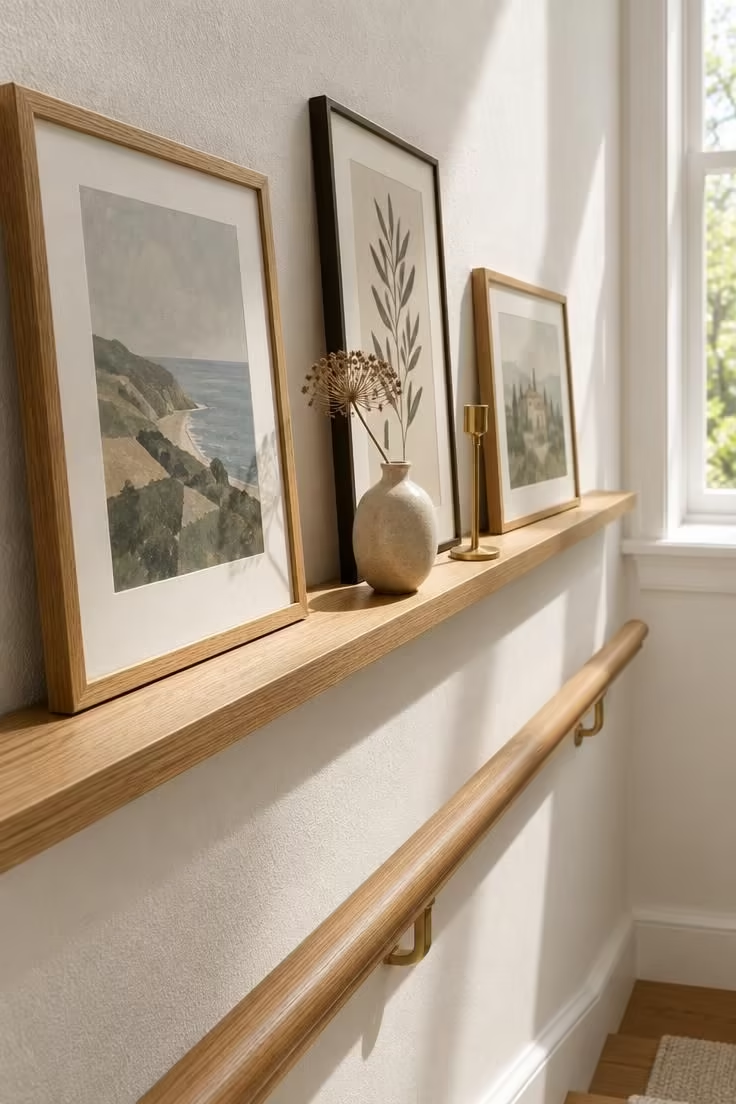
A picture ledge that parallels the handrail turns a stair wall into a changing display without the commitment of a hung gallery.
Frames lean rather than hang, which suits the rake angle where hanging frames would look tilted.
Ledge depth should hold a leaning frame without much overhang.
Narrow enough to read as a shelf rather than a ledge keeps it from intruding on the visual path.
Varying object heights along the run gives the eye something to follow from bottom to top.
A row of identical frames at the same height turns the ledge into a flat line.
Keeping the ledge color close to the wall or the handrail lets the line read as one gesture rather than a separate element.
Objects on an open ledge in a stairwell are visible from below and need dusting regularly, and leaning frames can slide if the ledge is not perfectly level.
Keeping the object count low stops the ledge from reading as clutter from the bottom step.
On a stair wall wide enough for a ledge without crowding the handrail, this idea works well.
In a narrow stair, a ledge protrudes into the visual path and flat-hung art is the better choice.
A ledge is more flexible than a gallery grid, since objects swap seasonally, but it holds less and needs more frequent styling.
A screw-mounted ledge leaves small marks, while a removable adhesive ledge holds only very lightweight frames.
Style Blueprint:
- A ledge depth that holds a leaning frame without much overhang.
- Leaning frames rather than hung ones, suited to the rake angle.
- Object heights varied along the run so the eye travels.
- A ledge color close to the wall or the handrail.
A Hallway Ceiling Painted a Deeper Tone Than the Walls
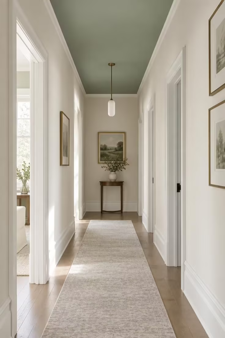
Painting a hallway ceiling a deeper tone than the walls treats the ceiling as a visible plane rather than a default white surface.
A tone two or three shades deeper than the walls, but not darker than the floor, keeps the hall from feeling capped.
Bright white trim makes the wall-ceiling junction read crisp and gives the deeper ceiling a defined edge.
Without that edge the color transition looks unfinished.
Running the ceiling color continuously past door heads rather than stopping at each frame keeps the passage reading as one space.
Matching the hallway ceiling to the stair ceiling when the two are continuous makes the whole circulation zone read as one gesture.
This idea suits a hall with ceilings around 2.5 meters or more, where the ceiling has room to read as a plane.
In a low hall, a deeper ceiling crowds the space and the walls should stay light if the ceiling is the feature.
Deeper ceiling tones show roller marks and touch-ups more than white, so a matt finish and an even coat matter more than usual.
Noting the color somewhere accessible saves a future repaint from guessing.
A deeper ceiling is a strong commitment and can make a dark hallway read darker if the walls are also deep.
Testing with the light actually used in the evening, not just daylight, is the only way to know how the tone behaves.
Ceilings are usually the last thing a landlord repaints, so it is worth checking whether a ceiling color change is permitted before starting.
Style Blueprint:
- A ceiling tone two or three shades deeper than the walls but not darker than the floor.
- Bright white trim so the wall-ceiling junction reads crisp.
- The ceiling color run continuously past door heads.
- A matt finish in an even coat to reduce visible roller marks.
A Tall Narrow Mirror Leaning Against a Hallway Wall
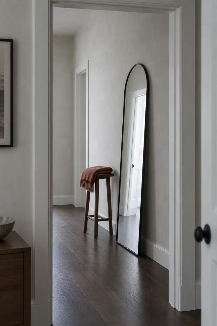
A tall narrow mirror leaning against a hallway wall reinforces the vertical line of the passage and adds a reflective surface at floor level.
The proportion should be clearly taller than wide, whether as an upright rectangle or an arch.
Leaning rather than hanging keeps the wall clean and the mirror movable, which suits renters and anyone who likes to rearrange.
The tradeoff is that a leaning mirror is the easiest thing in the hall to bump and shift.
Pairing the mirror with one low object only, such as a stool, a plant, or a basket, keeps the composition simple.
A low stool or plant in front of the base also discourages passing traffic from knocking it, which reads as intentional styling rather than a workaround.
Positioning matters, because a mirror reflects whatever is opposite it.
A doorway at close range reflects a door rather than a view, and a cluttered surface opposite reflects clutter.
Mirror glass shows fingerprints and needs regular cleaning, which is a small but real upkeep consideration in a high-traffic passage.
This idea suits a hallway wide enough for the mirror to lean at a slight angle without protruding into the walking line.
In a very narrow hall, a wall-hung mirror takes the same visual role with no floor footprint at all.
Style Blueprint:
- A mirror proportion clearly taller than wide, as an upright rectangle or arch.
- A leaning position rather than a hung one, keeping the wall clean.
- One low object only beside the mirror, such as a stool or a plant.
- A position that reflects a bright doorway rather than a cluttered surface.
Design Pro-Tip: Before leaning a mirror in a hallway, stand where it will sit and look at the wall opposite, since that reflection is what the mirror will actually show and it is rarely the view you imagined.
A Landing Styled as a Small Pause Point With a Chair and Lamp
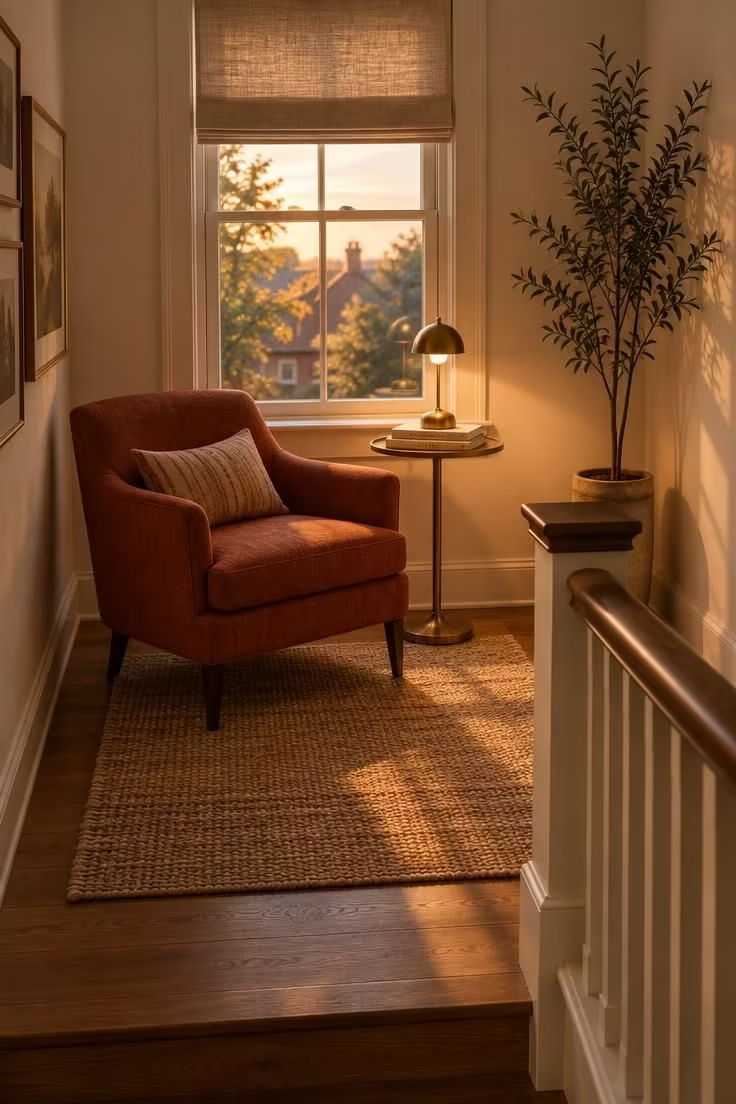
A landing is the one place in a stair-and-hallway zone with genuine usable floor, and treating it as a small pause point gives the whole stair a destination.
One chair and one small table is the right quantity, since a landing reads as crowded quickly with more.
Angling the chair slightly toward the landing window or the stair opening rather than flat against the wall makes the corner read as a place to sit.
A chair pushed square against a wall reads as stored furniture.
A low, warm-toned lamp makes the corner read as a pause rather than a spotlight.
One vertical element, a tall plant or a slim floor lamp, gives the corner height so it does not sit as a low cluster in a tall space.
A chair on a landing works best as a visual anchor and should be judged on whether it earns its floor space.
The piece can still hold a stack of books or a throw even when it is rarely used for sitting.
This idea suits a landing at least 1.2 meters deep, where a chair still leaves a clear walking path to the rooms beyond.
On a shallow landing, a slim console or a single tall plant replaces the chair without losing the pause-point quality.
Plants on a landing need watering access without creating a trip hazard on the stairs, and a small watering can kept on the landing itself solves that neatly.
Tall plants may also need trimming so they do not brush passersby.
Soft furnishings on a landing collect dust from stair traffic, so a chair and table need more frequent cleaning than the same pieces in a low-traffic room.
Style Blueprint:
- One chair and one small side table only.
- The chair angled toward the window or stair opening rather than flat to the wall.
- A low, warm-toned lamp that reads as a pause rather than a spotlight.
- One vertical element, a tall plant or slim floor lamp, to give the corner height.
A Hallway Gallery Wall in One Matching Frame Line
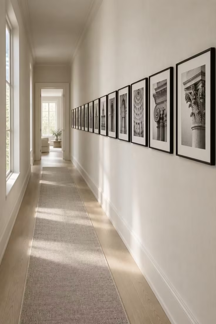
A single line of identical frames at one consistent height turns a long hallway into a repeated motif rather than a collection of pictures.
Repetition reads as intention in a passage, and the eye follows the line toward whatever sits at the end.
Identical frames in one size and color, each holding a different image, keeps the rhythm steady while the contents vary.
Varying the frame sizes breaks the line and turns the repeat into a scatter.
One consistent height for every frame is the detail that makes this work.
The line should be set at a height that reads well both from a doorway at the end and from a few steps into the hall.
The end of the hall is the natural focal point, so the last frame or the doorway beyond it should carry the strongest image or the brightest light.
A line of frames that dies into a dark corner wastes the composition.
Dusting a long line of frames takes a few minutes with a long-handled duster, and it needs doing more often than a single artwork because the total surface area is larger.
Glass in every frame catches glare from a hallway window, so anti-reflective glazing earns its cost across a whole run.
Matching frames are usually sold in sets, which makes adding one later harder than buying an assortment up front.
Buying one extra frame at the start saves a mismatched addition down the line.
In a very narrow hallway the frames should sit flat against the wall without deep box profiles, since depth is the main constraint.
A long run of identical frames suits a hallway with at least four frames of space, and shorter halls are better served by two or three larger pieces.
Style Blueprint:
- Identical frames in one size and one color, with only the contents varying.
- Every frame at one consistent height along the run.
- Even spacing between frames so the repeat reads as a rhythm.
- A stronger image or brighter light at the end of the line.
A Stair Wall Treated With a Half-Height Painted Band
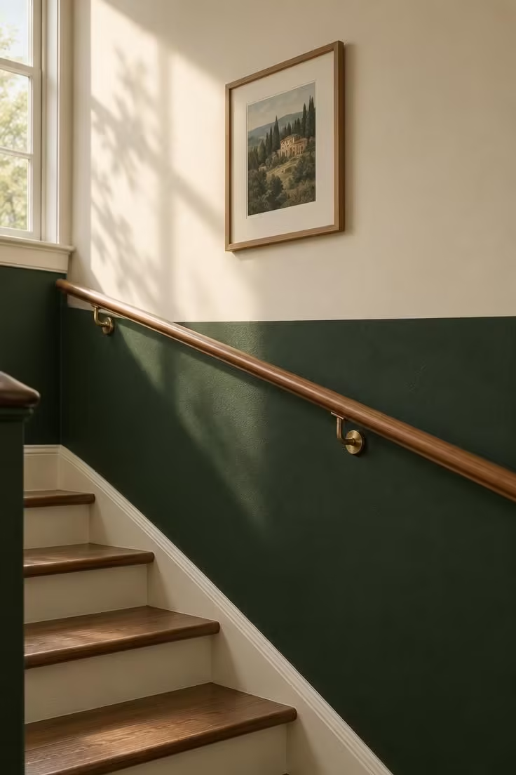
A half-height painted band gives a stair wall structure without the commitment of full paneling or wallpaper.
The horizontal line creates a strong geometry that contrasts with the stair's diagonal rake, and the two read together as a composed space.
The paint line should align with something in the architecture, either the handrail height or an existing trim line, rather than floating at an arbitrary point.
A line that aligns looks intentional while a line that does not looks like it ran out of paint.
One deep tone below and a warm off-white above is the simplest version, and it works because the lower band absorbs scuffs from hands and bags while the upper wall stays light.
A thin painted pinstripe just above the band adds definition at almost no cost.
A small framed print above the band on the upper wall gives the eye something to land on, since the upper section is now a large blank field.
The lower band in a deep tone shows scuffs less than a light one, which is why it works well along a stair.
Touch-ups on a deep tone can flash if the paint is not mixed thoroughly, so keeping a small labeled pot of the same batch is worth the shelf space.
This treatment suits a stair wall with a clear run where the horizontal line can continue without interruption.
In a stair broken up by doors or windows, the band fragments and loses its effect.
Peel-and-stick paint strips or a removable wallpaper band can approximate the look in a rental, though the edge line is less crisp than real paint.
Full removal later requires repainting the whole wall to a single tone.
Style Blueprint:
- A deep tone on the lower half and a warm off-white above.
- A paint line aligned to the handrail height or an existing trim line.
- A slim painted pinstripe just above the band for added definition.
- A small framed print on the upper wall to break the blank field.
A Slim Coat Rail With an Integrated Shelf in a Transitional Space
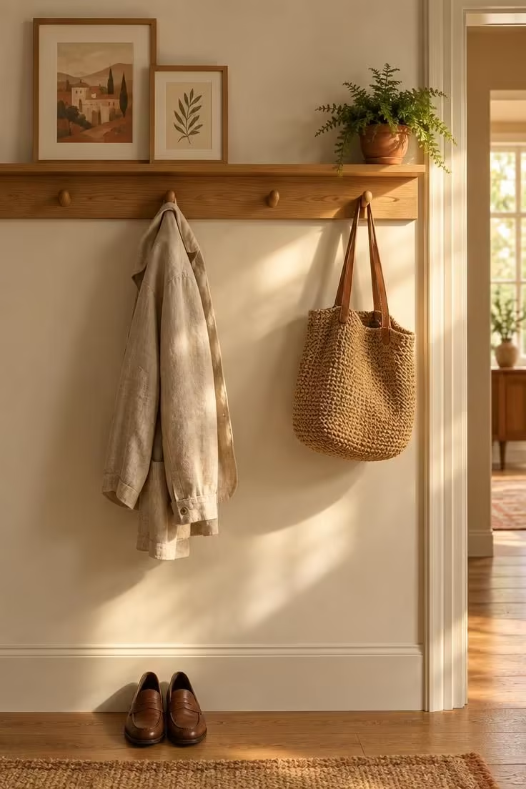
A slim coat rail with a shelf above it turns transitional spaces into a working drop zone without the depth of a console.
The rail sits flush to the wall, which matters in a passage where floor space is the constraint.
Pegs spaced at a consistent interval keep a jacket on one peg from crowding the next.
Simple wooden pegs in one style read as a system, and mixed hardware reads as an accumulation.
The narrow shelf above the rail holds small items, and its top surface should stay close to bare so the arrangement does not become a shelf of things.
Two leaning frames or one small plant is the right quantity.
Shoes placed neatly on the floor below finish the composition and give the rail a clear function.
Without a defined place for shoes, the floor beneath the rail is where they land anyway, just less tidily.
This arrangement suits a transitional space at least a meter of wall wide, where the rail has room to run.
It is one of the most space-efficient hallway storage options available, since the total depth is minimal.
Open rails and pegs collect dust and clutter and are conspicuous in a passage, which is the honest tradeoff against closed cabinetry.
A rail with a shelf can become a catch-all if no clear limit is set for how much it holds.
Pegs on a rail are usually simple to install and easy to remove, which makes this a workable option in a rental with permission.
A wall-mounted shelf above adds vertical storage without adding floor footprint, which is exactly what a narrow hall needs.
Style Blueprint:
- A slim rail mounted flush to the wall to conserve floor space.
- Simple wooden pegs in one style, spaced at consistent intervals.
- A narrow shelf above holding no more than two or three small items.
- A defined spot on the floor below for shoes.
Conclusion
Stairs and hallways carry more traffic than almost any room in a home, and they deserve the same design attention as the spaces they connect.
Each idea here lives at the level of paint, texture, object, and light, which keeps the work in the range of a weekend rather than a renovation.
The common thread is choosing one strong gesture and letting the surrounding surfaces stay quiet.
The decision criteria matter as much as the visual ideas.
Consider whether the space is passed through or paused in, how wide and how bright it is, and where the view lands from the bottom step and the far doorway.
Upkeep is part of the choice too.
Open storage and light-colored runners show traffic more, closed cabinetry hides it, and the honest question is which tradeoff fits how the household actually moves through the space.
Start with the view from the bottom step, pick one idea from the group nearest that viewpoint, and work outward from there.