This post may contain affiliate links. If you make a purchase through these links, we may earn a commission at no additional cost to you.
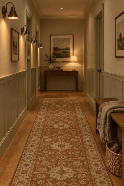
A hallway is a passage, not a room, which is exactly why it so often feels like leftover space.
Bare walls, one overhead light, and a hard floor leave a corridor reading as spare and unfinished, no matter how lovely the rooms on either side happen to be.
Coziness here is a visual and tactile impression.
Warm-leaning color, layered low light, soft textiles underfoot, and a few collected objects that suggest someone actually lives here do most of the work.
The ideas below range from one-gesture fixes for a short stub hall to full treatments for a long, windowless run.
Read for the composition logic behind each idea: rhythm, terminus, layering, scale.
That way any of them can be adapted to a specific hallway's width, daylight, and traffic.
A Long Wool Runner That Leaves Floor Visible at Both Ends
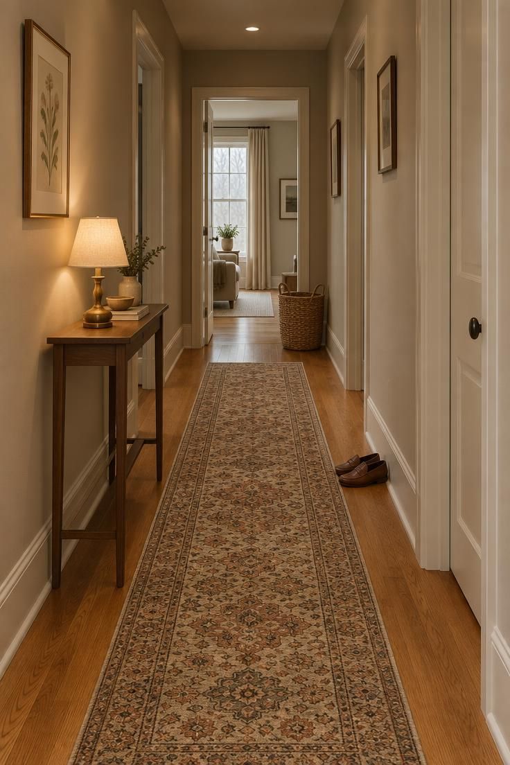
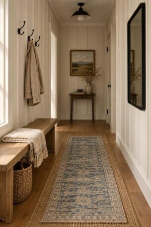
A hallway runner rug that stops short of both ends reads as a styled object rather than wall-to-wall carpet.
The exposed floor strips at each end act like a frame, which gives the runner a deliberate edge instead of letting it die into the corners.
In a cozy hallway, that margin of bare floor is often what separates a considered runner from a leftover strip of carpet.
Low-pile wool or a wool-blend flatweave suits a walked-on corridor better than shag, visually and practically.
Cut pile holds footprints and shows traffic lanes; a flat surface keeps its pattern legible.
Pattern choice matters more than most people expect.
An allover small repeat disguises the look of tracked-in marks, a solid light tone shows them immediately, and a very dark solid shows every speck of dust.
Upkeep is the tradeoff.
A runner in a busy hall wants regular vacuuming and spot-cleaning, and a thin rug pad keeps it from creeping without adding any complexity to the setup.
Length is a judgment call rather than a formula.
In an unusually long or short run, the goal is a visible margin at each end that looks intentional from the doorway.
Style Blueprint:
- Low-pile wool or wool-blend runner in an allover small-scale pattern
- Thin rug pad for grip
- Console lamp or sconce positioned to pool light along the runner's length
- Floor finish left visible at both ends as a deliberate margin
Design Pro-Tip: Compare the runner width with the visible floor border on both sides, then choose the proportion that keeps the corridor feeling open.
Warm Hallway Lighting Layered at Three Heights
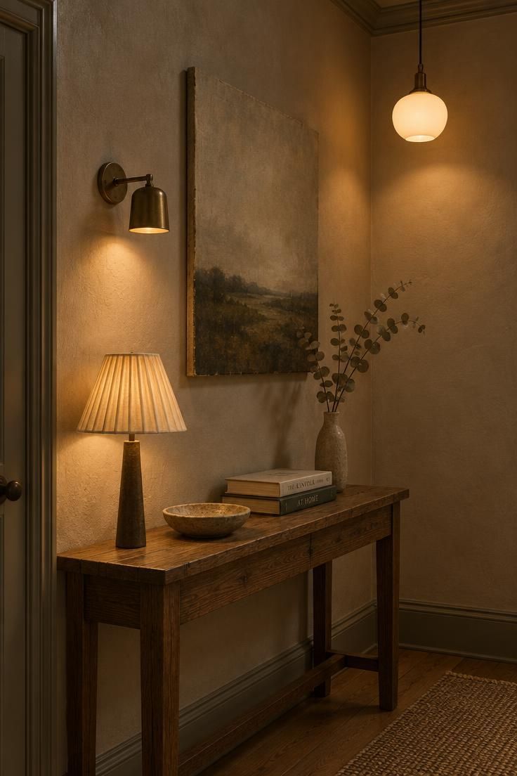
Three heights, three pools.
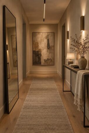
A ceiling source, a mid-height source such as a sconce or picture light, and a low source such as a table lamp spread light across the vertical plane instead of flooding the floor from a single point.
The difference between warm-white low-output bulbs and cool-white high-output ones is visible.
Warm and dim reads soft and pooled; cool and bright reads even and clinical.
Sconces flanking art or a mirror at roughly seated eye level light the wall rather than the floor.
That upward wash is what makes a hallway feel finished at night.
Cords and switches are the real cost of layering.
Cord concealment becomes its own small project in a hall without outlets along the wall.
Plug-in sconces and battery-operated options are removable choices that suit renters.
Candles and string lights work as decorative accents.
Describe them by their look: a low flicker, a soft string of points along a rail.
Warm hallway lighting reads best when no single source is doing all the work.
Style Blueprint:
- One ceiling fixture with a fabric or opal shade
- Two sconces or picture lights at mid-height
- One small table lamp on a console or ledge
- Warm-white bulbs at low output
- Plug-in or battery sconce option for rentals
A Slim Console With a Single Lamp and a Tray
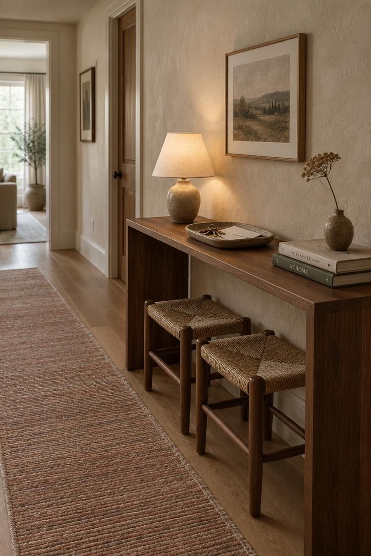
A narrow hallway console table works best with a shallow profile that leaves the walking line visually and physically open.
Treat that as a typical size rather than a rule to follow.
The top surface does real compositional work.
A lamp, a tray, and one stack of books create a resting point for the eye in a space otherwise made entirely of passing motion.
Width is the honest tradeoff.
In a single-file corridor a console can make passage awkward, and wall-mounted or very shallow pieces become the sensible alternative.
Styling restraint matters more here than in any other room.
Three to five objects read as collected; a crowded surface reads as storage overflow.
The tray earns its place functionally.
In an entry hall it catches keys, mail, and the small debris of arriving home.
A wider hall can take a pair of small stools tucked under the console, which adds seating without adding footprint.
Check what sits near a door swing before committing to a position.
That is a placement question, and it is worth solving before the piece is settled.
Style Blueprint:
- A shallow console that leaves the walking line open
- Small table lamp with a fabric shade
- Stoneware or wood tray for keys and mail
- One short stack of books and a single-stem vase
- Optional pair of small tuck-under stools
Half-Height Wall Paneling Below a Warmer Upper Wall
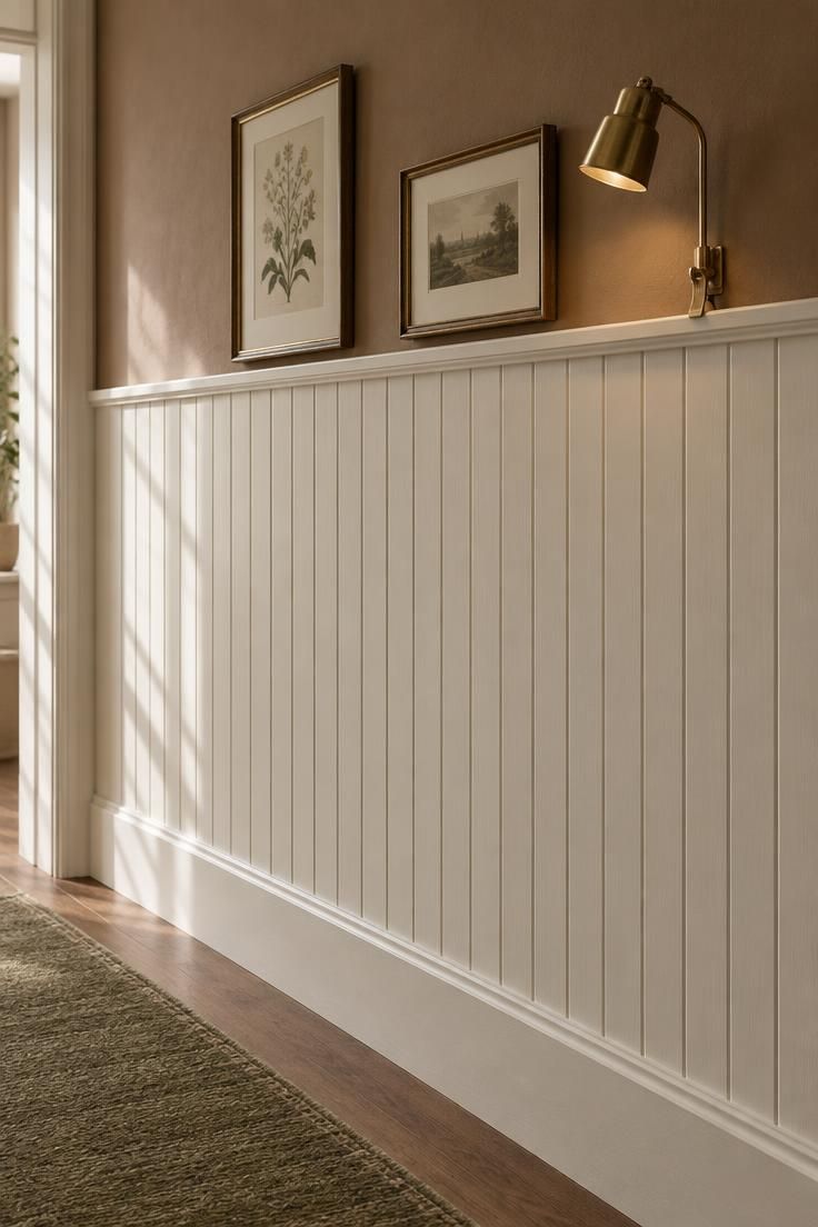
Two tones, one horizontal line.
Half-height paneling in a warm white or soft cream below, a deeper warm tone above, and the rail between them acting as a visual spine along the corridor.
Beadboard, board-and-batten, and flat recessed panels each read differently.
Beadboard is cottage and textured, board-and-batten is crisp and architectural, and flat panels sit quietest in a narrow space.
That continuous horizontal line helps a long hallway.
It gives the eye a path to follow at a consistent height rather than a blank plane interrupted by door frames.
Paneling in a busy hall takes scuffs.
A washable or wipeable finish is the practical choice where bags and shoes regularly brush the lower wall.
The rail itself can work as a display ledge for small frames or a clip-on lamp, which turns a functional line into a styling opportunity.
Hallway wall paneling does most for halls with some length, where the repeat of a rail line reads as rhythm rather than clutter.
Style Blueprint:
- Half-height beadboard, board-and-batten, or flat panels in warm white
- Deeper warm tone above the rail
- Washable or wipeable finish on the lower section
- Slim picture rail at the transition line
- Small frames or a clip-on lamp resting on the rail
A Painted Ceiling That Carries the Corridor's Length
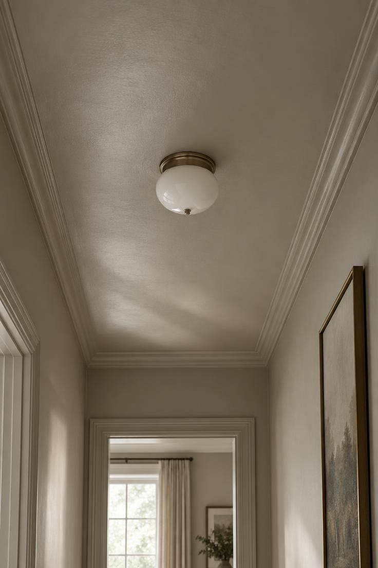
The ceiling is frequently the largest uninterrupted surface in a hallway.
That makes it the element shaping how long the space feels more than any other single plane.
Color-drenching walls and ceiling in the same soft neutral removes the break at the ceiling line.
The corridor reads as one volume rather than a box with a lid.
A deliberately darker or contrasting ceiling shortens apparent height.
That can read intimate in a bright hall and heavy in a dim one.
Trim participates whether or not it is considered.
A painted ceiling that ignores the cornice and door casings looks unfinished rather than intentional.
A small flush-mount or a low pendant with a fabric or opal shade pools light downward.
It also gives the ceiling a reason to be looked at.
The dark-ceiling tradeoff is real in a low-light hall.
Without layered warm light it reads gloomy rather than enveloping.
Test the color on a large painted board held overhead.
Small patches misrepresent how a ceiling tone behaves once it covers an entire plane.
A faint stripe or a tone-on-tone finish suits a ceiling when the walls are kept quiet, since the pattern stays peripheral.
The ceiling's visual weight is the whole subject here.
Style Blueprint:
- Ceiling paint in the same tone as the walls or one step deeper
- Painted cornice and trim in a matching or coordinating finish
- Small flush-mount or low pendant with a fabric or opal shade
- Large painted test board for trial
- Optional faint stripe or tone-on-tone finish if walls stay quiet
A Hallway Bench With Room to Sit, Not to Store Everything
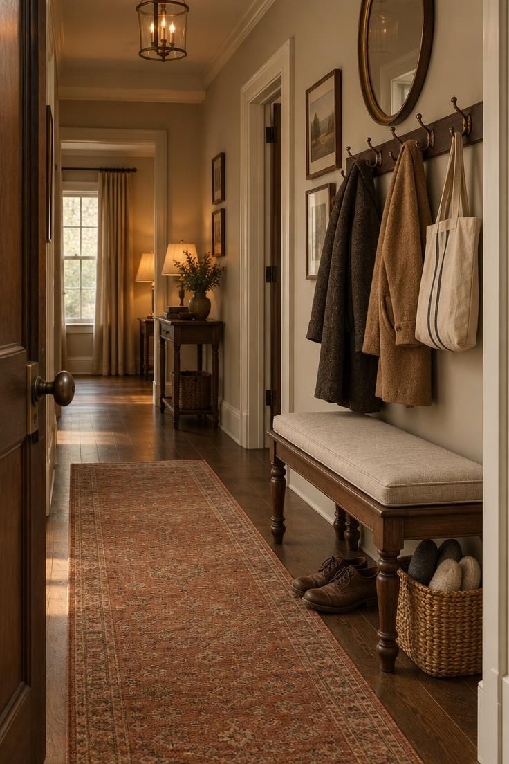
A bench should be a pause point rather than a storage wall.
A seat with a cushion, a low shelf for shoes, and open space beneath reads far more inviting than a solid bank of cabinetry.
The entry-hall version pairs a bench with hooks above, turning a pass-through into a functional landing zone.
Entryway hooks and bench together handle coats, bags, and shoes in a single gesture.
Depth matters more than length at this scale.
A bench that eats the walkable width of a single-file corridor works against the space it is meant to warm.
Cushion and textile choices are practical decisions.
A washable cover or a removable pad suits a hall shared with kids and pets.
Open shelving collects dust.
Closed storage reads tidier in a corridor where nobody lingers to dust.
Visible wood legs beat a solid base in a narrow hall.
The gap keeps the floor line reading continuous rather than blocked.
Style Blueprint:
- Bench with visible legs and a removable cushion
- Washable or removable cover
- Row of wall hooks above
- Low shelf or basket for shoes
- Round mirror to finish the composition
Warm Neutrals Anchored by One Wood Tone
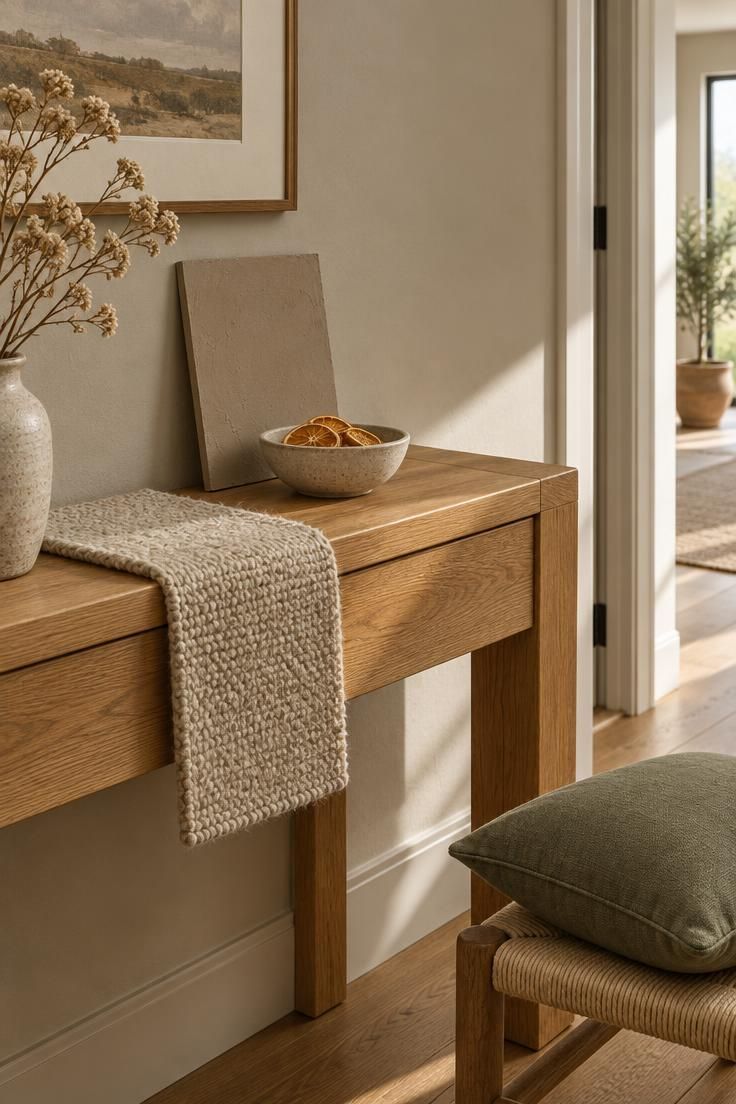
Cream, oatmeal, clay, warm taupe, and muted olive read softer than cool grays and stark whites.
They also hold up in a hall with limited daylight, where cool tones can turn gray.
One wood tone, repeated, anchors the whole palette.
Honey oak, walnut, or a painted finish appearing in at least two places makes the scheme feel intentional rather than accidental.
Accents work best in small doses.
One or two tones in art, a runner, or a cushion keep the calm without turning the hall into a color story.
Warm neutrals fail when every surface sits at the same value.
Varying light and dark within the warm family is what keeps the space from going flat.
Hold paint and fabric samples together in the hallway's own light before deciding.
Neutrals shift noticeably between rooms.
Style Blueprint:
- Two to three warm neutral paint tones across walls and trim
- One wood tone repeated in at least two pieces
- Oatmeal or clay runner as the floor anchor
- One muted accent in art or a cushion
- Samples tested in the hallway's own light
Design Pro-Tip: Put every candidate sample, paint chip, fabric swatch, and wood offcut, on the floor of the hallway itself and look at them from the far end; samples chosen against a white wall in another room often behave differently here.
A Small-Scale Pattern That Suits a Narrow Wall
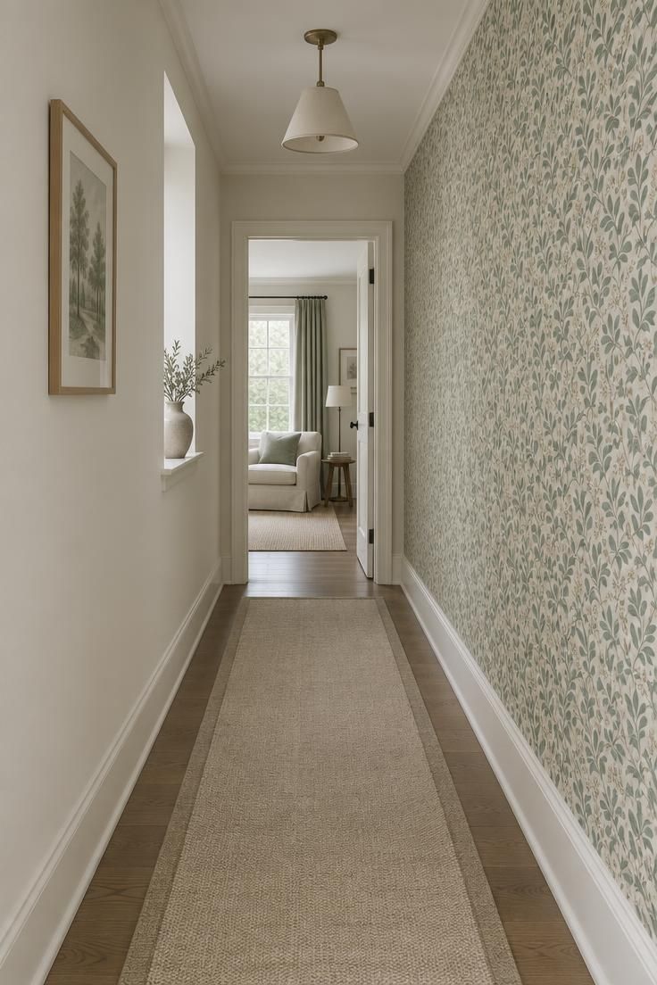
Small repeats suit narrow walls better than large murals.
Stripes, dots, a fine botanical, and petite toile keep their composition when the wall is short or broken by door frames; large murals get cropped and lose their point.
Direction matters with stripes.
Vertical reads as height and horizontal reads as width, so the choice follows whichever dimension the hall lacks.
Pattern gives a long uninterrupted wall something to travel along.
A blank plane in a corridor has nothing for the eye to do.
Wallpaper in a busy hall takes scuffs, so a washable or wipeable surface is the sensible finish.
Keep everything else quiet when the wall carries pattern.
Plain trim, a solid runner, and restrained objects let the repeat do its work.
Renters have options: peel-and-stick papers and removable panels deliver the same look without a permanent commitment.
Handling doors and openings within a patterned run takes planning.
The repeat should not land awkwardly at every frame.
One patterned wall in a long corridor creates a destination effect by making one side the event and the other the frame.
Style Blueprint:
- Small-scale pattern in a repeat sized to the wall
- Plain painted trim in a coordinated tone
- Solid runner without competing pattern
- Washable or wipeable wallpaper finish
- Peel-and-stick or removable panel alternative
A Round or Arched Mirror Placed for the Reflection
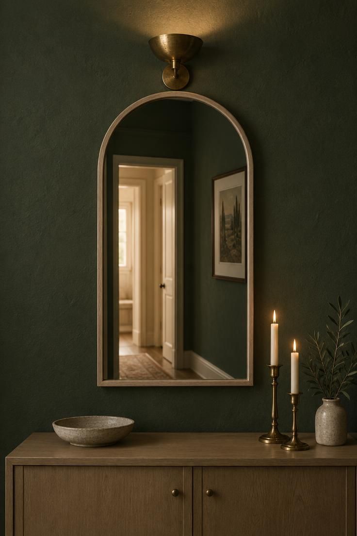
A mirror extends the view, adds a bright focal point, and gives a narrow run a sense of depth.
It is one of the few elements that works in a hall too tight for furniture.
Placement decides whether it earns its keep.
A mirror positioned to catch a doorway, a window, or a lit wall reflects something worth looking at; one opposite a blank corner reflects nothing.
The limitation is worth checking.
A large mirror opposite a doorway can reflect an unflattering view, so it pays to verify what will actually appear in the glass.
Frame shape interacts with the hallway's existing lines.
Round softens a corridor of right angles, arched adds height, and a simple rectangular wood surround stays quietest.
Scale relative to the wall matters.
In a short stub hall one generous mirror is a stronger gesture than several small ones.
Pair the mirror with a single sconce or picture light so the reflection has something bright to carry at night.
Style Blueprint:
- Round, arched, or simple rectangular mirror
- Slim wood or metal frame that suits the trim
- Single sconce or picture light nearby
- Placement checked for what the glass actually reflects
- One object on a ledge or console beneath
Deep Enveloping Walls Paired With Layered Warm Light
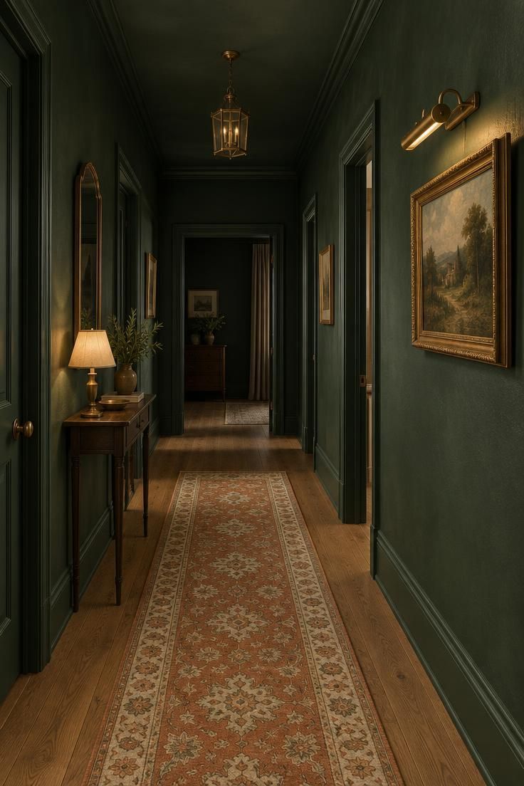
Deep green, ink blue, charcoal, or chocolate carried across walls and often trim makes the corridor read as one continuous volume.
That enveloping quality is what separates it from simply dark paint on a wall.
The pairing is not optional.
Dark walls need layered warm light to read cozy rather than gloomy; without it the same paint looks flat and cold.
This approach works best in a hall with some daylight, or in a windowless hall where the lighting plan is deliberately generous.
Trim is a real decision.
Matching trim to the wall keeps the envelope unbroken, while contrasting trim gives the corridor graphic outlines.
Dark paint draws the walls in visually.
That can read intimate or confining depending on how much light and textile softness is present.
Keep the floor and runner lighter or warmer so the dark walls have something to sit against.
Test with a large painted area rather than a small patch.
Dark colors shift dramatically depending on the light they receive.
Style Blueprint:
- Deep green, ink blue, charcoal, or chocolate paint
- Layered warm lighting at three heights
- Lighter or warmer runner as a counterpoint
- Coordinated or deliberately contrasting trim
- Large painted test area before committing
A Single Tall Artwork or Stacked Frames to Use Vertical Space
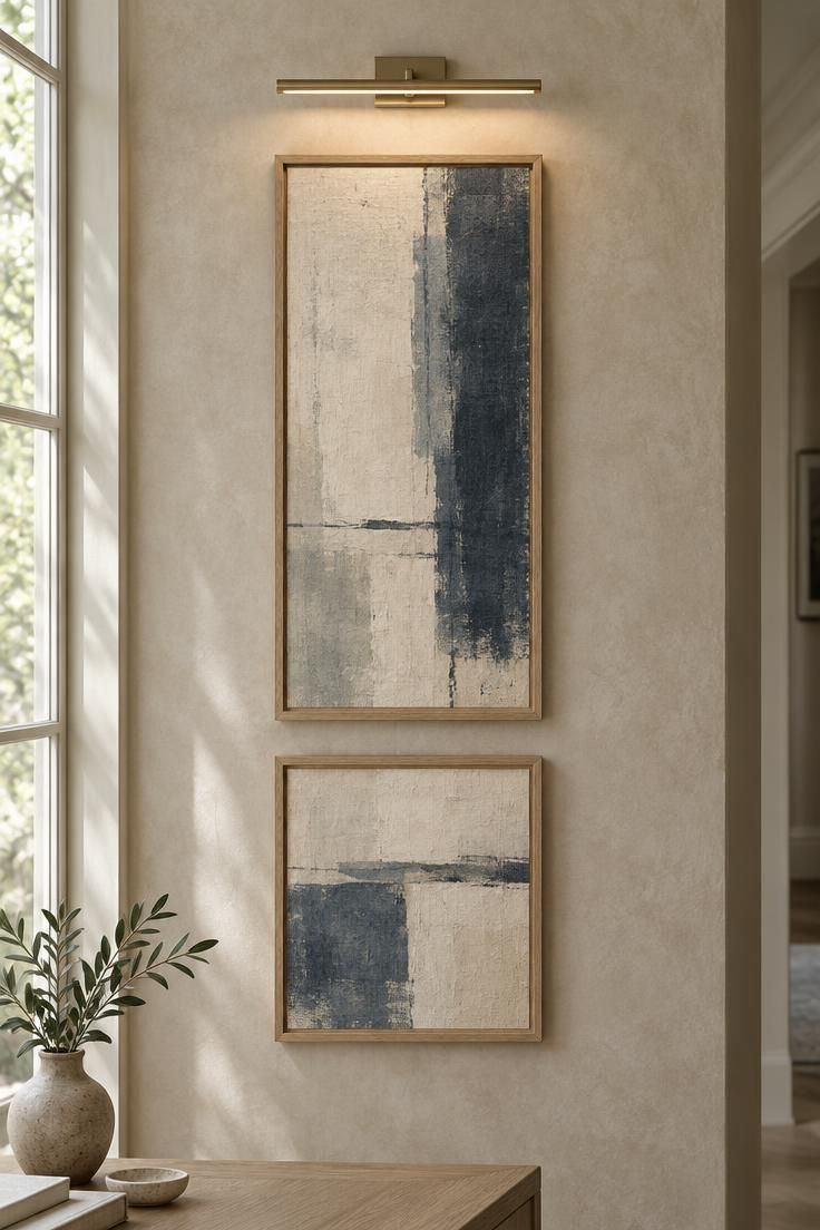
Height is the most available dimension on a narrow hallway wall.
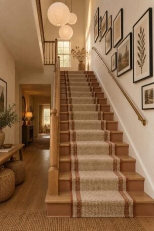
A tall single piece or a stack of two or three frames uses space that a wide arrangement simply cannot.
Stacking follows its own logic.
A larger piece above and a smaller one below, separated by a consistent gap, reads as one unit rather than two unrelated frames.
The alternative is one oversized piece filling the wall between a door frame and the ceiling, which gives the corridor a single bold moment.
Hanging art at a consistent height across a hallway is a common convention rather than a requirement.
In a very narrow hall, the eye-level band is what registers most.
Framing changes the read.
Thin wood or metal frames sit quietly in a long run, matching frames create rhythm, and mixed frames create a collected look.
A picture light or a small sconce above the art makes it a destination rather than a decoration.
Doorways and the natural traffic path determine where the arrangement feels composed rather than crowded.
Map the frame positions with removable paper templates before committing, since the full arrangement makes crowded gaps easier to spot.
A stack of frames works particularly well where the wall is too narrow for a wide arrangement.
Style Blueprint:
- One tall piece or a stack of two to three frames
- Consistent gap between stacked frames
- Thin wood or metal frames
- Picture light or small sconce above
- Paper templates tested on the wall first
Design Pro-Tip: Cut paper templates for each frame and tape them to the wall for a day; living with the shapes before hanging anything reveals whether the arrangement is too crowded or too sparse.
Repeating Sconces or Frames to Build Rhythm Down a Long Run
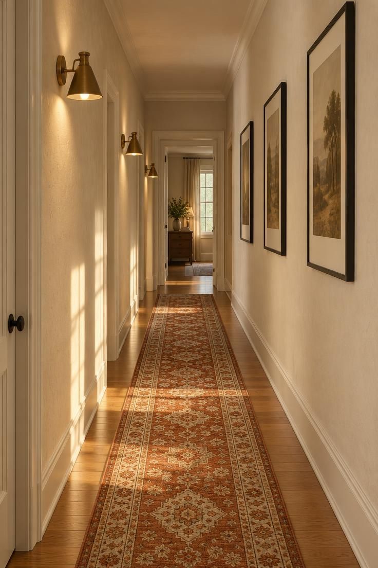
A long hall with no repeating element reads as leftover space.
Evenly spaced sconces, frames, or hooks give the eye a beat to follow.
Spacing is a design decision rather than a fixed measurement.
The goal is even intervals that relate to the architecture, so the rhythm looks deliberate at both ends.
What repeats is flexible: sconces, small frames, peg rails, picture ledges, or a run of hooks in an entry hall.
Repetition changes how length reads.
A steady rhythm can make a long corridor feel intentional rather than endless.
The cost is real.
More fixtures means more cords and more switches, and cord concealment becomes its own small project in a hall without outlets along the wall.
Align the repeated element with door frames and corners rather than fighting them, or the rhythm reads as an accident.
Style Blueprint:
- Three or more matching wall sconces
- Matching frames or peg rails on the opposing wall
- Consistent spacing keyed to door frames and corners
- Patterned runner reinforcing the corridor's length
- Cord concealment plan for a hall without outlets
A Deliberate Focal Point at the Far End of the Corridor
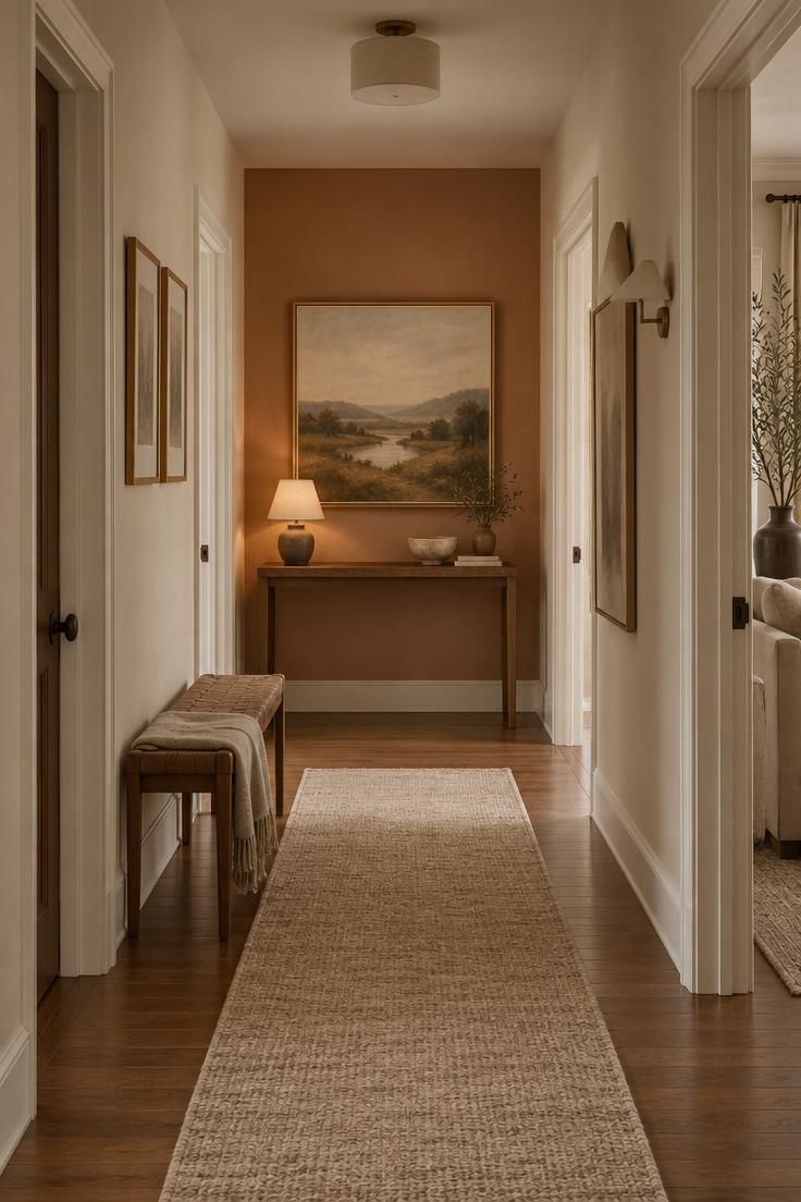
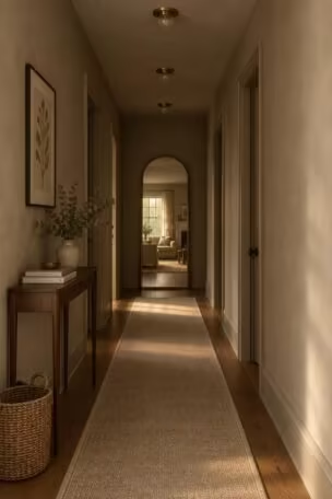
A hallway naturally directs the eye to its far end.
Whatever sits there becomes the destination and gives the whole run a purpose.
Candidate focal points include a single large artwork, a mirror, a slim console with a lamp, a bench, a plant, or a painted accent wall.
One is enough; two compete.
The focal point should hold the view without overwhelming the corridor's rhythm.
Busy compositions read as clutter from a distance.
The accent-wall version delivers a strong destination with minimal intervention.
A single darker or warmer end wall against pale surroundings does the work.
Short halls have a limitation.
The end wall may be visible immediately, so the focal point needs to hold up close as well as at a distance.
Light the focal point deliberately with a small sconce or picture light so it reads from the other end of the corridor at night.
Check sightlines from both directions.
A focal point that works from one end may fall apart from the other.
A focal point can be functional as well as decorative.
A bench that also holds a bag serves the hall twice over.
Style Blueprint:
- One strong element at the far end wall
- Small sconce or picture light aimed at it
- Optional accent wall in a deeper warm tone
- Runner leading the eye toward the terminus
- Sightlines checked from both ends
A Niche or Recessed Corner Treated as a Display Moment
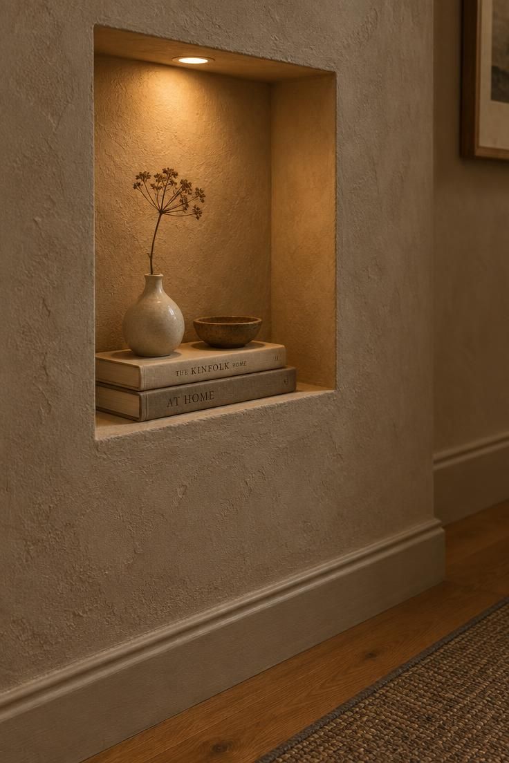
A niche is an existing architectural feature worth styling rather than ignoring.
A shallow recess, a wide windowsill, or the space beside a chimney breast all qualify.
The objects that suit a niche are small and few.
A vase with a single stem, a short stack of books, a dish, and a candle each hold their own in a confined stage.
Lighting decides whether it reads as a feature.
A low warm source inside or just above the niche makes it glow instead of sitting in shadow.
Restraint matters more here than anywhere else.
A niche reads best with three to five objects because the space is genuinely small.
An unlit niche reads as a dark void.
Light is the element that turns a recess into a display moment.
Style Blueprint:
- Three to five small objects, no more
- One single-stem vase and a short book stack
- Small dish or candle as a finishing piece
- Low warm light inside or just above the niche
- Textured plaster finish to catch the glow
Layer Woven Texture Along One Side
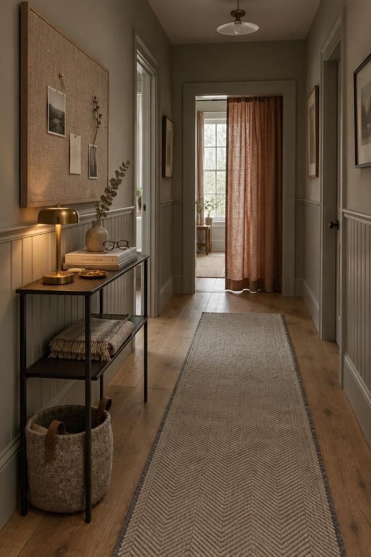
A flatweave runner, one linen wall panel, and a woven basket can warm a narrow corridor without requiring another piece of furniture.
The most convincing arrangement concentrates texture along one side, allowing the opposite wall to remain quiet and the passage to keep its visual width.
A low-pile runner establishes the soft foundation, while a quilted wall hanging or fabric-covered board adds a second tactile plane above it.
Repeat one color from the runner in the wall textile or basket so the layers read as a deliberate composition rather than a collection of unrelated soft objects.
The tradeoff is upkeep, since woven surfaces collect dust and show wear sooner than painted walls or bare flooring.
Choose pieces that can be vacuumed or laundered, and keep trailing fabric away from the floor so the edges remain crisp.
Limiting the treatment to two or three textures gives the hallway warmth without turning a useful passage into a display area.
Design Pro-Tip: Keep the strongest texture on one side of the corridor and repeat only one color across the runner, wall textile, and basket.
Style Blueprint:
- One washable flatweave or low-pile runner
- One linen, felt, or quilted wall textile
- One woven basket that repeats a color from the runner
Conclusion
Coziness in a hallway comes from a small set of recurring moves.
Warmth of surface and color, layered low light at more than one height, textiles that soften hard surfaces, and objects that give the eye somewhere to land.
The ideas scale differently.
A short stub hall often needs only one strong gesture, while a long, windowless run benefits from rhythm, a terminus, and a lighting plan that was thought through rather than inherited.
Weigh the tradeoffs before committing.
Runners need upkeep, textured layers can tighten a narrow space, dark walls need generous warm light, and every added object claims walkable width.
Start with the constraint that cannot be changed, whether that is width, daylight, or traffic, and choose the ideas that answer it.
Applying all of them at once is not the goal.