This post may contain affiliate links. If you make a purchase through these links, we may earn a commission at no additional cost to you.
Hallways are usually the narrowest, most windowless rooms in a home, borrowing whatever light spills in from the rooms that open onto them.
Yellow is a strong candidate for that problem because the lighter registers reflect more light than most wall colors, and the deeper registers add warmth and presence that keep a plain passage from reading as a utilitarian tunnel.
The decisions that matter most come down to which register you choose, where it goes, and what it sits against.
What follows is a set of distinct visual starting points rather than a ranking, and each one names what is painted what.
Pair Soft Putty Yellow With Aged Pine
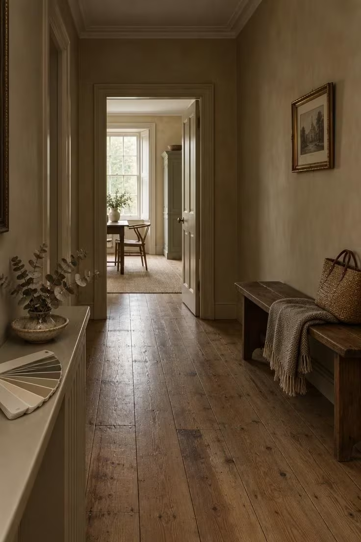
A muted putty yellow gives a dim corridor warmth without making the walls look sharply saturated.
The gray-brown undertone keeps the color grounded beside aged pine floorboards, while soft cream trim lifts the edges of the passage.
Carry the putty yellow across the full wall height so the brighter adjoining room becomes the natural focal point at the end of the hall.
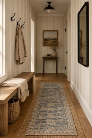
A slim wood ledge, one small gilt frame, and a low bench repeat the floor's warmth without crowding the narrow run.
This palette changes gently through the day, reading more neutral in deep shade and warmer near the open doorway.
The tradeoff is subtlety: anyone looking for a vivid yellow statement will find this direction too quiet, but it suits a period hallway that already has warm, worn materials.
Style Blueprint:
- Putty yellow walls with soft cream trim
- Aged pine flooring and a slim natural-wood ledge
- One gilt frame with a low bench and woven bag
Design Pro-Tip: Test the putty yellow beside the floor and at both ends of the corridor, since the undertone will shift between the darkest wall and the brighter doorway.
Butter Yellow Hallway Walls With Off-White Trim
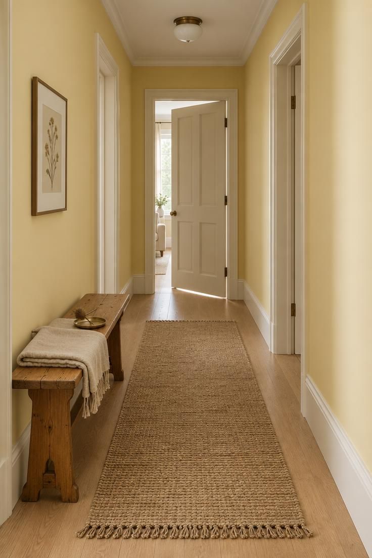
Pale butter sits close to cream, low in saturation, and in shade it reads almost neutral rather than distinctly yellow.
The placement is straightforward: butter across all walls at full height, with off-white on the skirting, casings, and ceiling.
Butter yellow hallway walls work best with a light ceiling and visible floor, which keeps a narrow run from feeling enclosed.
The tradeoff is real, though, because butter can look washed out beside cool gray flooring and needs the warmth of a natural wood or warm-toned floor to hold its color.
Companion elements should stay quiet: a plain jute runner, a small framed print with a white mat, and a slim bench that reads as furniture rather than storage.
A butter scheme also reads differently at the two ends of the same hall, since the wall beside the doorway often catches more light than the wall beside a closed door.
Best fit is a narrow corridor with limited daylight and a warm floor, and this is the easiest full-wall yellow to reverse when tastes change.
Style Blueprint:
- Butter yellow walls at full height
- Off-white trim and ceiling
- A plain jute runner with one small framed print
Mustard Hallway With Dark Wood Floor and a Vintage Runner
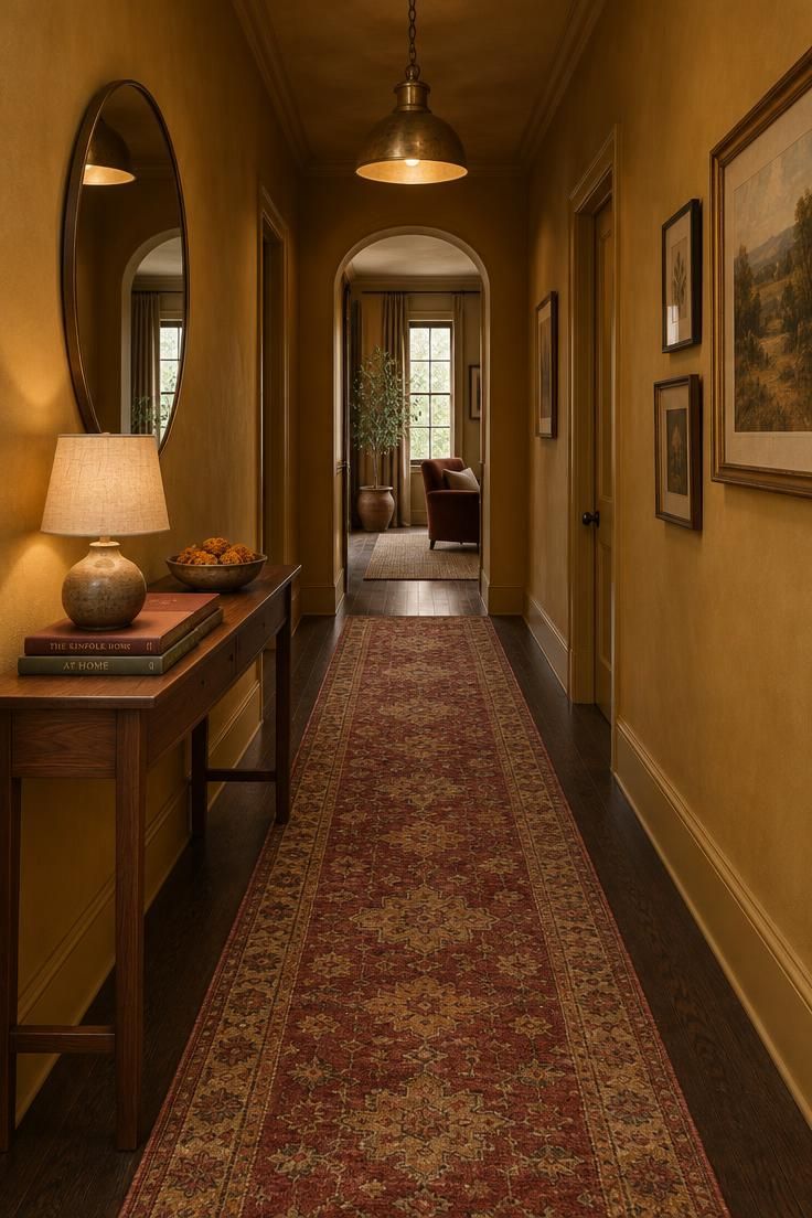
Mustard and ochre are earthy, brown-leaning registers, and they sit most comfortably in a matte finish where the color reads dense rather than slick.
A dark wood floor is what anchors this level of saturation, giving the yellow something solid to sit on instead of letting it float.
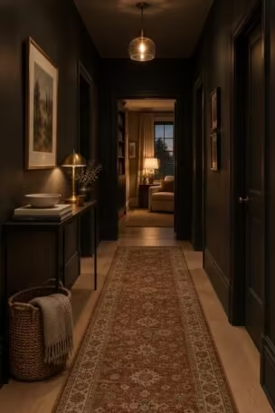
The runner carries the pattern: a faded vintage or vintage-style design in reds, ochres, and deep blues, laid so a strip of dark floor stays visible along both edges.
That visible floor border matters, because a mustard hallway with dark wood floor reads wider when the dark tone frames the textile rather than disappearing beneath it.
Matte paint softens saturated mustard and forgives older, uneven walls, though it is harder to wipe in a corridor that takes coats, bags, and hands.
Deep ochres and ambers can close a narrow corridor down further, so this direction suits a wider hall or a short passage with a bright adjoining room.
A glossier finish on the lower wall or on the door casings is one way to keep the corridor practical without giving up the matte walls.
This is a fuller commitment than butter, better suited to someone who plans to repaint or who treats the hallway as a designed room rather than a pass-through.
Style Blueprint:
- Matte mustard or ochre walls
- Dark wood flooring with a visible border
- One faded runner in rust, ochre, and deep blue
Design Pro-Tip: If the dark floor already carries a lot of grain and variation, keep the runner plain and let the mustard do the talking instead.
Yellow Ceiling With Chalk-White Walls
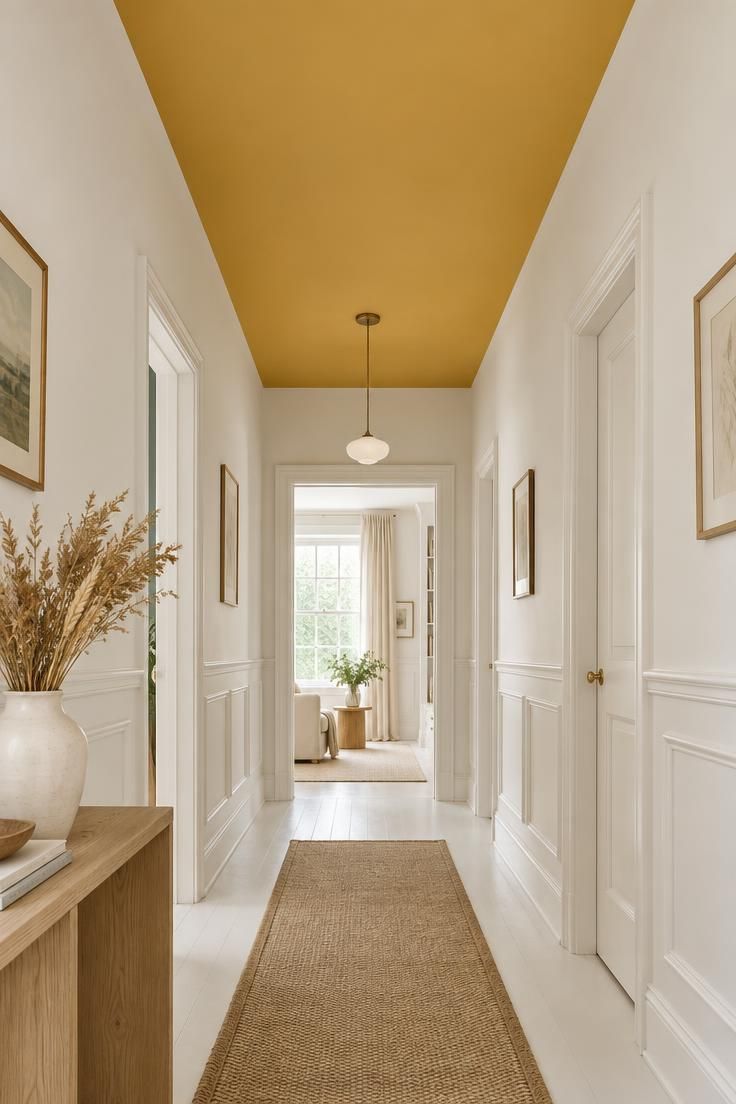
Here the arrangement inverts, with the walls staying chalk white while the ceiling carries the color and draws the eye upward along the corridor's length.
A yellow ceiling with chalk-white walls reads very differently in a low corridor than in a tall one, since a lower ceiling brings the color physically closer while a stairwell or double-height volume gives it room to recede.
Light matters in this direction more than in most, because a yellow ceiling picks up and bounces whatever reaches it and reads strongest where some daylight arrives from an adjoining room.
Companion elements should stay restrained: white trim throughout, a plain floor, and a single pendant or small flush fitting rather than a busy overhead arrangement.
The tradeoff is honest, as a colored ceiling is a visually committing move in a tight space even when the walls stay neutral.
It is also easier to reverse in a rental or a temporary scheme than four yellow walls, since one surface is doing all the work.
Best fit is a short corridor or a stairwell with some height, where the upward pull has room to register.
Style Blueprint:
- A yellow-painted ceiling
- Chalk-white walls and matching trim
- One simple overhead fixture above a quiet floor
Marigold Front Door at the End of a Neutral Hallway
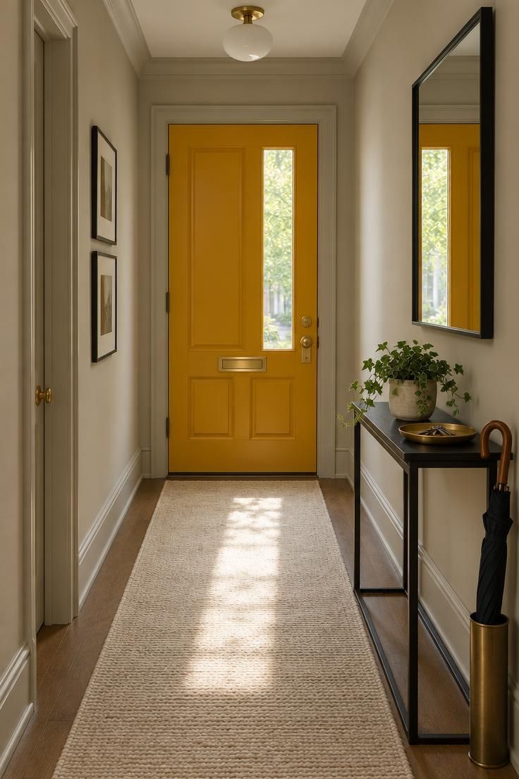
The setup is simple: walls in a warm off-white or soft greige, trim in the same neutral, and one saturated marigold plane at the far end acting as the destination.
The eye travels down the corridor because a single saturated surface at the end of a long run reads as a focal point without any of the walls being painted.
A marigold front door at end of hallway works particularly well when the door is already the natural endpoint of the view from the living room or stair landing.
Keeping the door casing neutral or matched to the trim lets the door read as one clean block of color rather than a framed picture.
Hardware sharpens the effect, and brass or black both work, with brass leaning warmer and black leaning more graphic.
Reversal is the quiet advantage here, since a door is far easier to repaint than four walls and this is the lowest-commitment saturated yellow on the list.
A neutral runner, a slim console with a tray, and one small plant are enough to complete the composition without competing.
Best fit is a long neutral corridor or an entry hall where the door is the obvious visual endpoint.
Style Blueprint:
- One saturated marigold door
- Warm off-white or soft greige walls
- A neutral runner with restrained black or brass hardware
Yellow Wainscot With Patterned Wallpaper Above
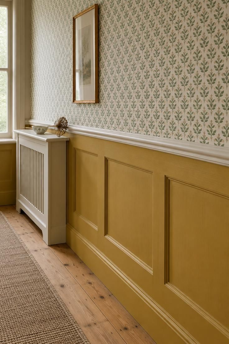
The vertical division does most of the work here, with solid yellow below the dado line and pattern above it, giving a narrow wall structure and a horizontal anchor.
A yellow wainscot with patterned wallpaper should relate in one clear way, picking up a single color from the paper in the wainscot paint rather than trying to match both exactly.
Pattern scale matters on a short or narrow wall, where a small repeat stays legible and a large motif gets chopped by doorways and corners.
Splitting the finish is practical: a slightly more wipeable paint below the dado line and a matte paper above handles a corridor that takes hands and bags.
Companion elements should stay plain, with a simple runner and unadorned trim, so the pattern and the color are not fighting a third busy element.
This is the most involved direction to change, since both paint and paper have to be redone together if the look is retired.
Best fit is a traditional hallway, or a corridor with one long unbroken wall that can carry the repeat cleanly from end to end.
Style Blueprint:
- Solid yellow below the dado line
- Patterned wallpaper that repeats one yellow tone
- Plain trim and a quiet runner
Design Pro-Tip: Buy one extra roll of the wallpaper and store it with the leftover paint, so a future patch repair can match without a full rehang.
Ochre Panelled Hallway With Black Hardware
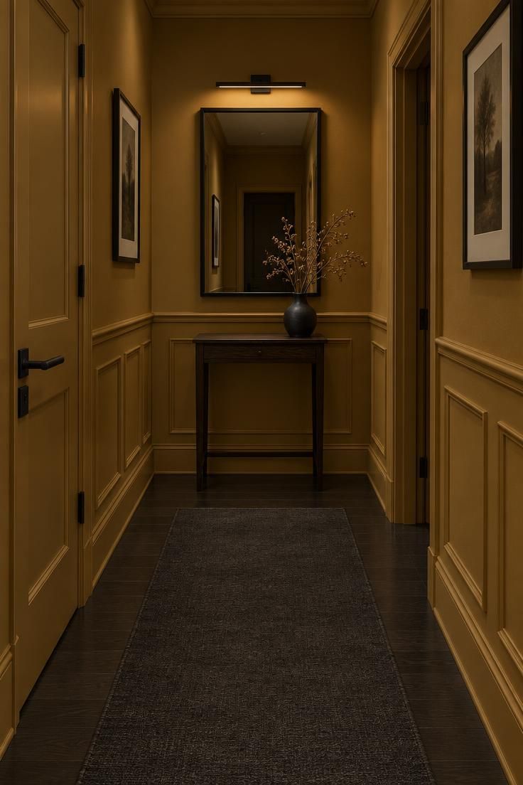
Ochre sits at the more brown-leaning end of the yellow family and is at home on panelling rather than on a flat wall.
Black accents do the sharpening: hardware, a stair rail, or frame profiles give the scheme a formal edge and keep the yellow from reading soft.
The panelling itself changes how light behaves across the wall, because recessed panels create soft shadow lines that break up a flat expanse of color.
A dark stained or painted floor plus a plain runner keeps the lower half of the corridor quiet so the panelling carries the detail.
A single black-framed mirror on the end wall catches whatever light reaches the end of the corridor, which is often the dimmest point in the run.
This direction suits wider halls and period homes, and the black accents make it a more deliberate look than butter or pale lemon, with less room for a partial change later.
Style Blueprint:
- Ochre-painted wall panelling
- Three restrained black accents
- A dark floor with one plain runner
Design Pro-Tip: Keep the black accents to three elements at most, such as hardware, a frame, and one rail, so the contrast stays crisp rather than spotty.
Lemon-Yellow Entry Hall With a Checkerboard Floor
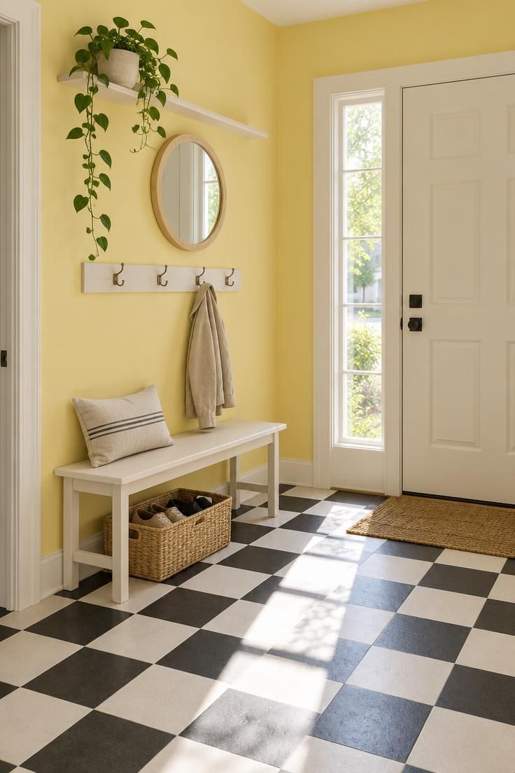
Lemon and citrus yellow are brighter, cooler, and more green-leaning than marigold, which keeps the color from reading heavy in a compact entry.
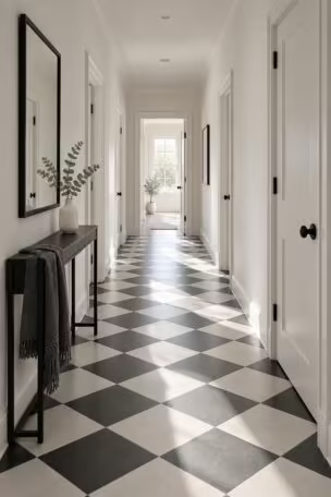
A checkerboard floor in black and white gives the yellow a crisp counterpoint and establishes a strong floor plane that the walls can sit above.
The light behavior is worth checking, because a checkerboard floor in a small entry reads busier in low light, so this direction favors halls that get some daylight or a well-placed light source.
Companion elements stay simple: a plain coat rail, a low bench, and a woven basket for shoes, kept quiet so the floor pattern remains the graphic moment.
A patterned floor is a longer-term commitment than changing wall paint, which affects how reversible this direction really is.
Best fit is an entry hall or a porch-adjacent corridor rather than a long internal passage.
Because this is a high-traffic zone, a wipeable finish on the lower wall is worth considering from the start.
Style Blueprint:
- Lemon-yellow walls
- A black-and-white checkerboard floor
- A simple bench with one woven shoe basket
Amber Stair-Landing Wall With a Picture Rail
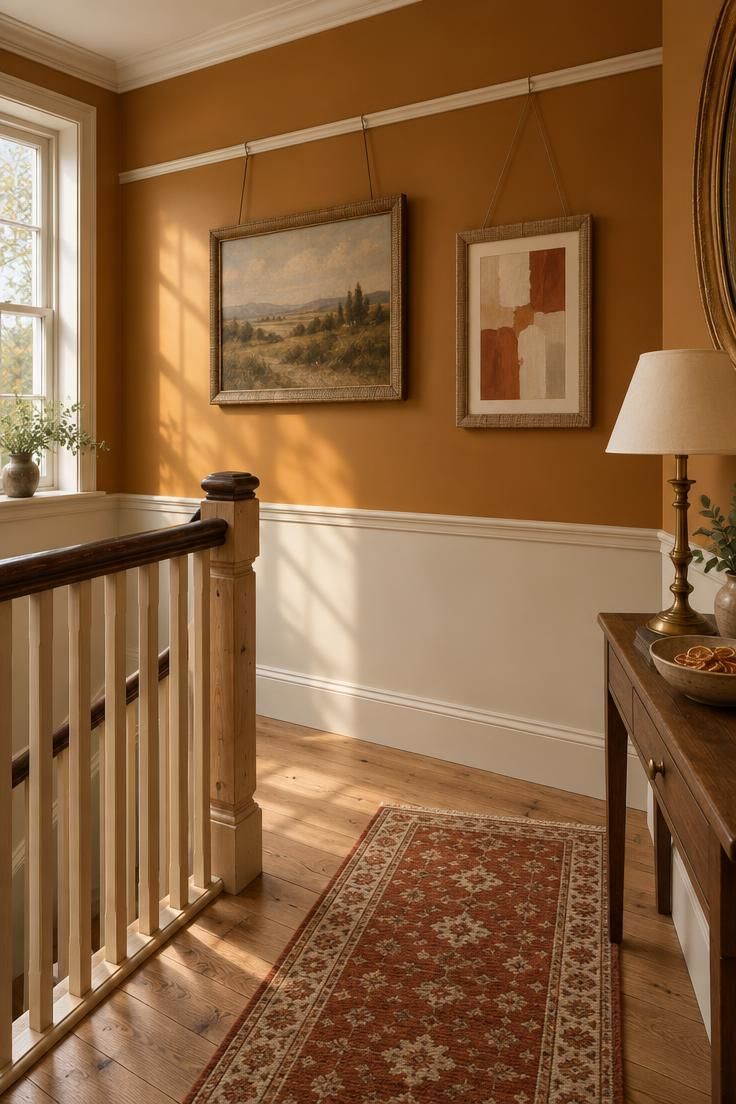
Amber and honey are the deeper, warmer registers, and on a stair landing they have more wall to work across than a tight corridor offers.
The picture rail is the organizing device, since it creates a clear line for hanging art without repeated holes at different heights and it visually lowers the amber to a comfortable band.
Below the rail, a soft off-white keeps the lower wall light so the landing does not read as a solid block of deep color.
Framed art with white mats keeps the display from fighting the wall, and two pieces at slightly different heights feel collected rather than matched.
A warm wood floor and a runner in rust and cream tie the amber to the rest of the stairs, while a brass lamp adds a small pool of warm artificial light after dark.
This direction uses a wider space well, and it reads as intentional in a way a painted corridor rarely does.
Best fit is a landing or a corridor that widens at the top of a stair, where a deep register has room to breathe.
Style Blueprint:
- Amber above a defined picture rail
- Soft off-white on the lower wall
- White-matted art with a rust-and-cream runner
Soft Yellow Alcove With a Bench and Hooks
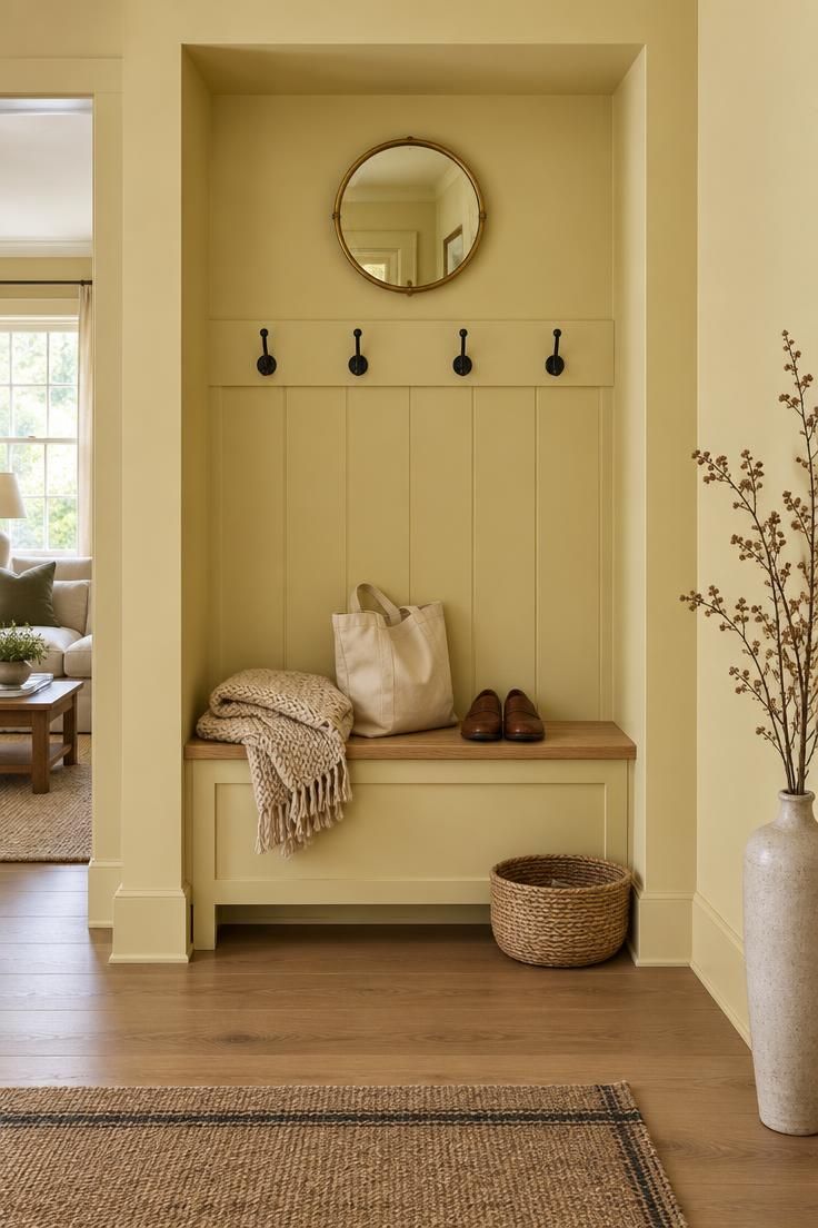
An alcove or niche is the smallest surface that still reads as a deliberate color moment, and painting it in the same soft yellow as the wider hall ties the two together.
The bench and hooks give the yellow a job beyond appearance, turning a recess into a working drop zone for coats, bags, and shoes.
Keeping the seat in natural oak rather than painted introduces a warm material contrast that keeps the alcove from looking like a single flat block.
A round brass mirror above the hooks bounces a little light back into the recess and softens the geometry of the niche.
Contrast matters at this scale, so black hooks against pale yellow keep the alcove from reading overly sweet, and a woven basket adds texture at floor level.
Because the painted area is small, this is one of the easiest ways to test a yellow you are unsure about before committing to a full wall.
Best fit is an entry hall, a wide landing, or any corridor with a recess that currently holds nothing.
Style Blueprint:
- A soft yellow painted recess
- A natural oak bench with black hooks
- One brass mirror and a woven floor basket
Conclusion
The range here is wide, from a buttered full-wall scheme to a single marigold door, and what separates the directions is the register, the placement, and the companion materials rather than the color itself.
Testing any of them at the smallest scale that still reads, whether that is a door, a frame, an alcove, or one accent wall, costs far less than repainting a whole corridor twice.
Sampling the yellow in the corridor itself, at the dark end and beside the floor line, is the one step that carries across every direction on this list.