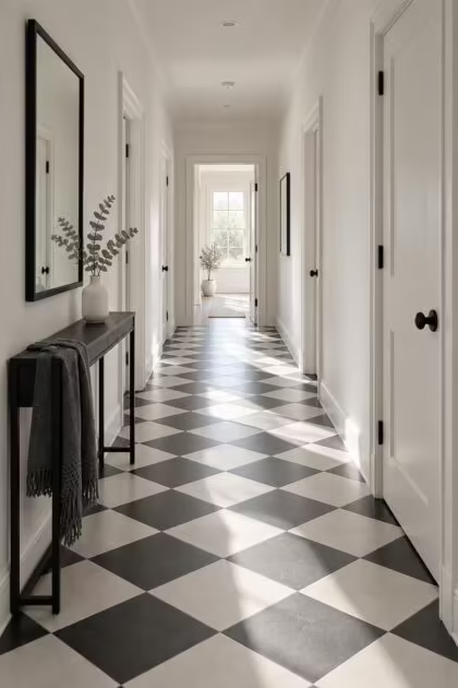
This post may contain affiliate links. If you make a purchase through these links, we may earn a commission at no additional cost to you.
Black and white is a palette, not a single look.
The same two colors can read graphic, soft, moody, or classic depending on proportion, finish, and how light moves through the space.
A hallway adds its own rules: borrowed light, long sightlines, door density, and heavy touch points all change how a black and white hallway behaves compared to a bedroom or living room.
Warmth in a black-and-white scheme usually comes from material contrast, texture, and light quality rather than from adding color.
Each direction below is a distinct composition anchored by one specific visual concept, with notes on where it works, what it asks of the reader, and where the tradeoffs sit.
Checkerboard Floor as the Single Graphic Element
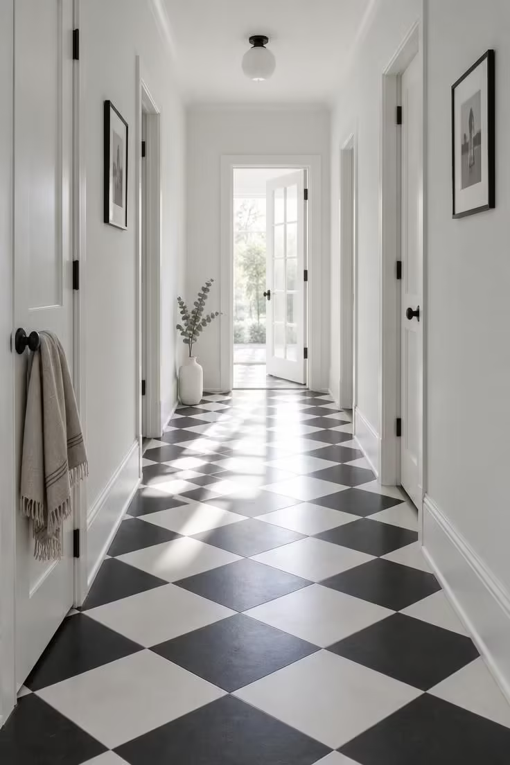
The floor carries the entire graphic load here.
Walls, trim, and ceiling stay plain so the checkerboard grid remains legible at a glance.
Contrast between a checkerboard tile floor and quiet architecture depends on tile size relative to hallway width: small formats read busier, while large formats can be cropped awkwardly at doorways.
Diagonal versus straight lay changes the corridor’s feel, and diagonal placement softens the tunnel effect of a long, narrow passage.
Grout tone is a design decision, not just a maintenance one, because light grout softens the pattern while dark grout crisps it.
Hallways are heavily trafficked, so a matte finish reads calmer but shows scuffs differently than a glossy one, and the choice is about the look rather than a durability guarantee.
In very narrow corridors the floor pattern competes with doorways and reads at extreme angles, so a smaller repeat or a border treatment may suit better.
The pattern works best when the hallway is wide enough for the grid to register as a full checkerboard rather than a series of partial squares.
Style Blueprint:
- Diagonal checkerboard in matte black and soft white
- Plain white or soft-white walls
- Simple black door hardware
- Minimal wall décor so the floor leads
Design Pro-Tip: Lay out the pattern on paper first, centered on the longest sightline from the main entry point, so the grid reads cleanly where people actually see it.
Matte Black Board-and-Batten with Crisp White Trim
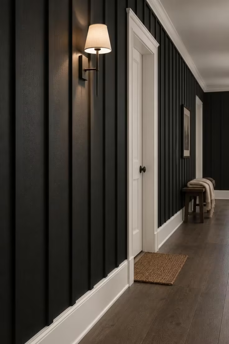
Vertical battens add texture and rhythm to a flat wall.
The white trim and ceiling become the release valve that keeps the composition from feeling sealed.
Ceiling height matters here: vertical battens can make a low ceiling feel taller, but only if the ceiling itself stays genuinely light, because cream weakens the contrast.
Finish choice changes the read, with matte black absorbing light and looking softer while a satin or eggshell catches more light and crisps the contrast.
Door density is the quiet factor, and black wainscoting reads as continuous in a hallway with one or two doors and as broken in a hallway with many.
Black surfaces tend to show dust and fingerprints differently than white, so a wipeable finish on the lower zone suits hallways with heavy traffic.
A windowless hallway with dark paneling can feel enclosed, which means this direction suits hallways with a window, borrowed light, or deliberate artificial lighting.
Working with black wainscoting at this scale rewards patience with samples, since the sheen you choose under a hallway’s specific light is the difference between crisp and flat.
Style Blueprint:
- Matte black board-and-batten
- Bright white baseboards and door casings
- White or very light ceiling paint
- Brass or black hardware for a single accent note
- A directional wall light to model the battens
Design Pro-Tip: Ask for a sample board painted in the actual finish sheen and hold it against the hallway wall at different times of day before committing.
A Black Interior Door as the Corridor’s Punctuation
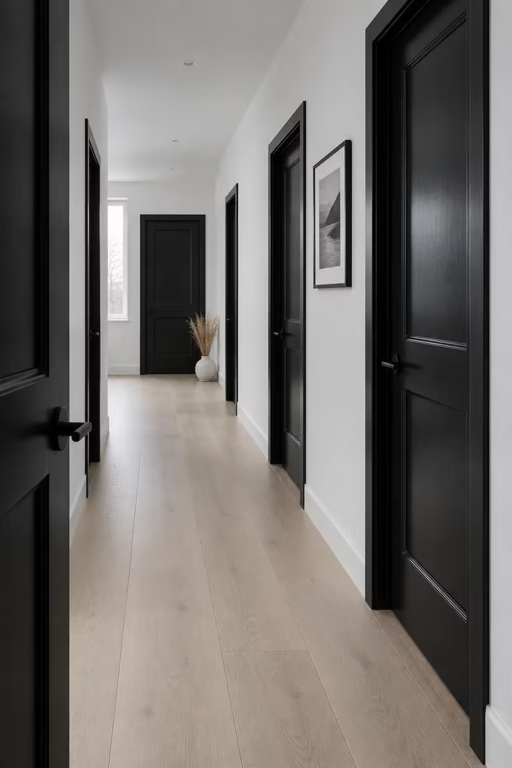
White walls, white trim, and a white ceiling let doors painted saturated black become the graphic element.
The repetition down the corridor is the whole idea, and it works especially well in hallways with several doors on one side where the rhyme of dark rectangles reads as intentional.
A black interior door tends to show fingerprints and scuffs differently than white, and a satin or semi-gloss finish wipes more easily than matte, which is worth knowing before choosing.
Door hardware becomes a small design decision: black hardware disappears into the door, while brass or nickel creates a deliberate accent.
When every other surface is white, one black door misfires, so this direction asks for commitment across the full run of doors.
The contrast between white walls and black doors also amplifies any irregularity in the wall surface, which is worth checking in raking light before painting begins.
A hallway with only one door loses the repetition that makes this direction sing.
Style Blueprint:
- Saturated black interior doors in satin or semi-gloss
- White or near-white walls and trim
- Hardware finish chosen as either a blend or a deliberate accent
Black Wainscoting Below, White Above
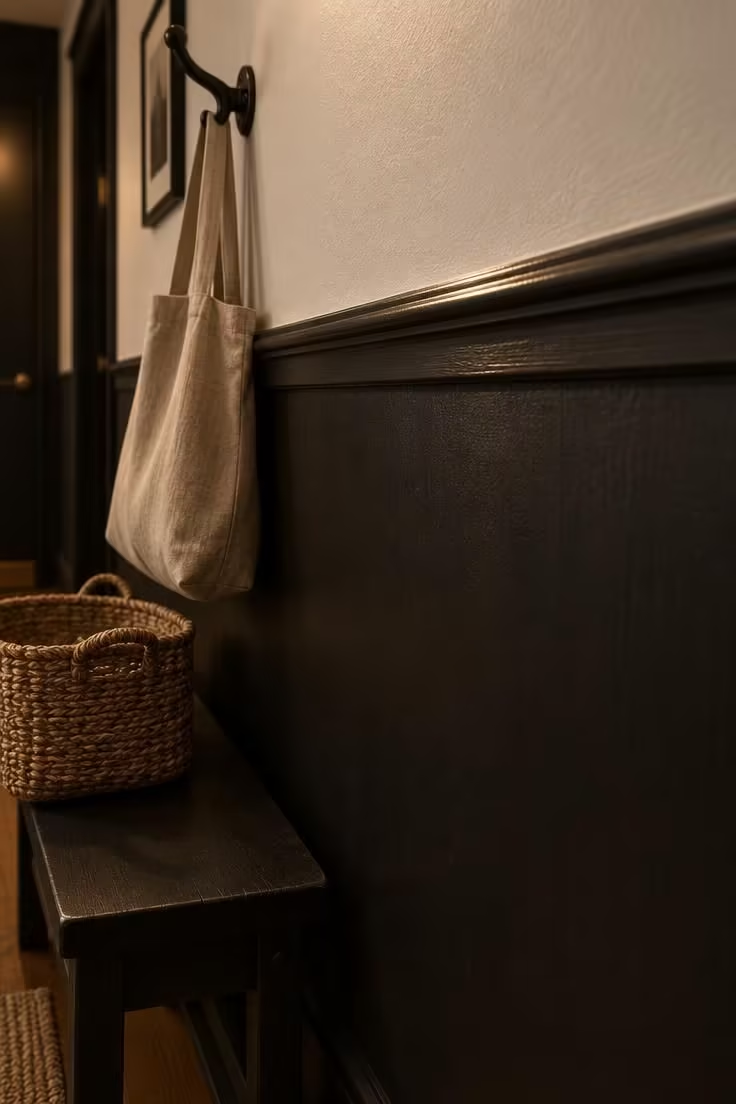
The lower third to half of the wall is painted black, with white above and a chair rail separating the two, and this split grounds a low hallway while humanizing a tall one.
White wainscoting on the upper wall keeps the contrast legible, and a dark lower zone pairs sensibly with the most-touched part of a hallway wall.
In a very short hallway the horizontal line can feel abrupt, and continuous runs and longer hallways read more deliberately.
Chair rail color is a real decision: a white rail sharpens the split while a black rail extends the dark zone upward for a taller-looking base.
Trim consistency across door casings, baseboards, and rail keeps the composition coherent, since mismatched trim undermines the whole split.
Choosing between white wainscoting above and black wainscoting below comes down to which half of the pairing you want to dominate, and the answer changes with ceiling height.
This treatment also works as a maintenance strategy, because the lower zone takes the scuffs a hallway inevitably collects.
Style Blueprint:
- Matte black lower wall treatment
- Crisp white upper wall
- Chair rail in white for a sharp divide, or black to extend the base
- Matching trim profile on baseboards and door casings
Graphic Wallpaper on One Long Wall, Everything Else Quiet
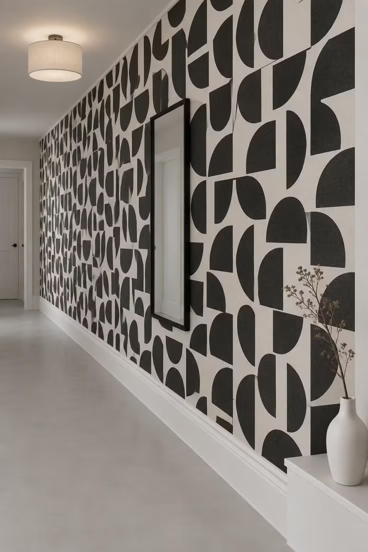
Graphic hallway wallpaper on the long wall, with white trim, plain floor, and minimal accessories, lets the paper do all the graphic work.
The range is wide: geometric, abstract, toile-style, or a small-scale repeat all read very differently in a corridor.
Pattern scale interacts with corridor length, and a large repeat can feel bold in a short hallway while reading stretched in a long one, and a small repeat can read busy at close range.
This is the most commitment-heavy direction in this list, because wallpaper is semi-reversible at best and pattern matching at seams and around doors is the main practical consideration.
Door density matters again, since a hallway with many doors interrupts the paper’s continuity, so a solid wall run is the ideal surface.
Hallways with enough light let the pattern read clearly rather than dissolving into shadow.
A directional pattern can make a narrow corridor feel even narrower, so a calm geometric is often safer than a bold figurative.
This direction is the best candidate in this list for a hallway with one long uninterrupted wall and a modest door count.
Style Blueprint:
- Graphic black-and-white wallpaper on one long wall
- Plain white trim on doors and baseboards
- Plain floor or a subtle solid runner
- Minimal accessories so the paper remains the focal element
Design Pro-Tip: Order one extra roll for pattern matching and future touch-ups, since matching a discontinued run later is a common frustration.
Gallery Wall of Black-Framed Art on White
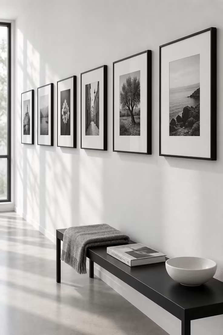
Uniform black framed art with white mats on a white wall turns the frames themselves into the black element, using the wall plane rather than the floor.
This works in almost any hallway width, which makes it a strong direction for narrow corridors where floor pattern and furniture are off the table.
Scale choice matters: a single row of larger frames often reads cleaner than many small frames, which can read as clutter in a narrow passage.
Hanging rhythm benefits from consistency, and even spacing with a common centerline along the corridor helps the row read as one graphic gesture.
For monochrome hallway decor built around wall art, the tone of the prints matters: black-and-white photography reads most unified, while a mix of color prints introduces variety that softens the graphic effect.
Uniform black frames can feel severe in an otherwise soft hallway, so mixed frame widths or a change of mat tone introduce relief without breaking the concept.
Choose black framed art in one consistent profile to keep the repetition legible from the entry point.
Style Blueprint:
- Uniform black frames in one profile
- White mats on every piece
- Common centerline down the corridor
- Black-and-white photography or single-tone prints
- Even spacing measured along the sightline
Black Console Table Against a White Wall
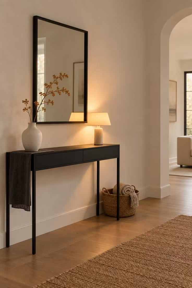
A slim black console table against a white wall, topped with one or two light objects and a mirror above, gives the hallway a piece of furniture as its black note.
Depth is the practical constraint, and in a narrow hallway a shallow console keeps the passage usable while a deep one makes the corridor feel cramped.
The styling rule that makes this work is one or two objects rather than five, because the console is the composition and clutter dilutes it.
A mirror above the console is a common pairing that introduces a second black frame and returns light down the corridor.
A console demands a hallway wide enough to pass without turning sideways, and in single-file corridors, a wall-mounted shelf or a gallery wall serves a similar purpose with less depth.
The black console table earns its place when the hallway has a wall run long enough that the piece reads as intentional rather than squeezed.
Style Blueprint:
- Slim black console in a shallow depth
- One white ceramic vessel and one black-framed mirror
- Low warm table lamp for directional light
Black Ceiling, White Walls: An Upside-Down Composition
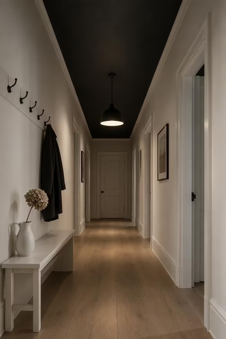
An unexpected reversal places the ceiling in black or deep charcoal with walls and trim in white, so the ceiling recedes and the white surfaces carry the reflective work.
Black ceiling paint in a hallway tends to hide ceiling imperfections that a bright white ceiling would otherwise highlight.
Ceiling height is the gating factor, because this direction reads better in hallways with a decent ceiling where the dark plane has room to recede rather than press down.
The tradeoff is reduced perceived brightness, which means it suits hallways with a window, borrowed light, or deliberate artificial lighting.
Trim and door color become the release valve again, and keeping them genuinely white maintains the contrast.
This is a paint decision rather than a structural one, and it is fully reversible, which makes it a good trial direction for readers curious about dark ceilings but unsure.
The best candidate hallways have some existing light source and a ceiling tall enough that the dark treatment reads as intentional.
Style Blueprint:
- Matte black or deep charcoal ceiling paint
- Bright white walls and trim
- A pendant or shaded fixture to model the ceiling
- Pale floor to bounce light upward
Design Pro-Tip: Paint a large sample board and hold it against the ceiling in the hallway’s actual light before committing, since ceiling color reads very differently from wall color.
A Hallway Runner Rug Doing the Graphic Work
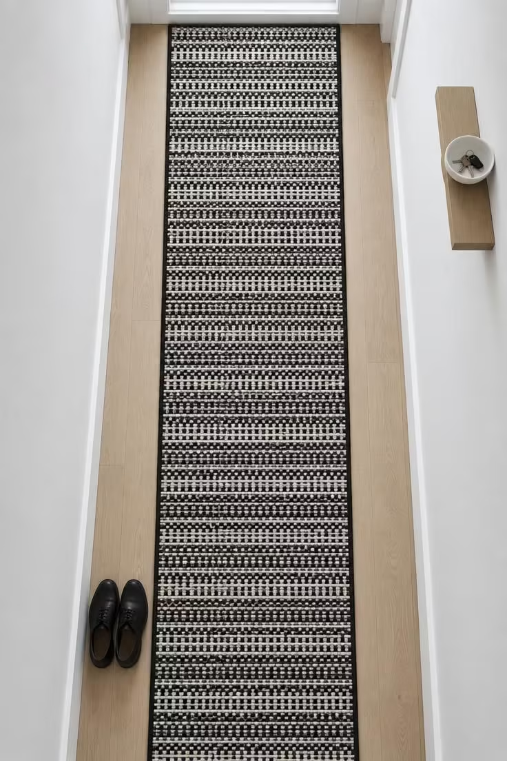
A hallway runner rug brings pattern and warmth without paint, wallpaper, or tile, which makes it the most flexible and reversible direction in this list.
Sizing matters, and a runner that leaves visible flooring on both sides reads as intentional while one that hits both walls reads as wall-to-wall carpet.
Stripe direction is a design lever, with lengthwise stripes stretching the corridor and crosswise stripes widening it.
Runner length should account for doors that swing into the hallway and for the natural stopping points at either end.
A patterned runner over a plain floor gives the graphic hit without committing the architecture.
Runners collect dust and need periodic cleaning, and a low-pile or flat-weave style tends to suit a trafficked hallway better than a deep pile.
In very narrow hallways the runner is the only pattern surface available, which makes it the most consequential decision in the room.
The strongest results come from a runner that reads as a designed band rather than a strip carpet.
Style Blueprint:
- Flat-weave or low-pile runner in black and white
- Visible flooring on both sides
- Plain white walls and trim
- Runner length chosen around door swings
Monochrome with One Material Contrast
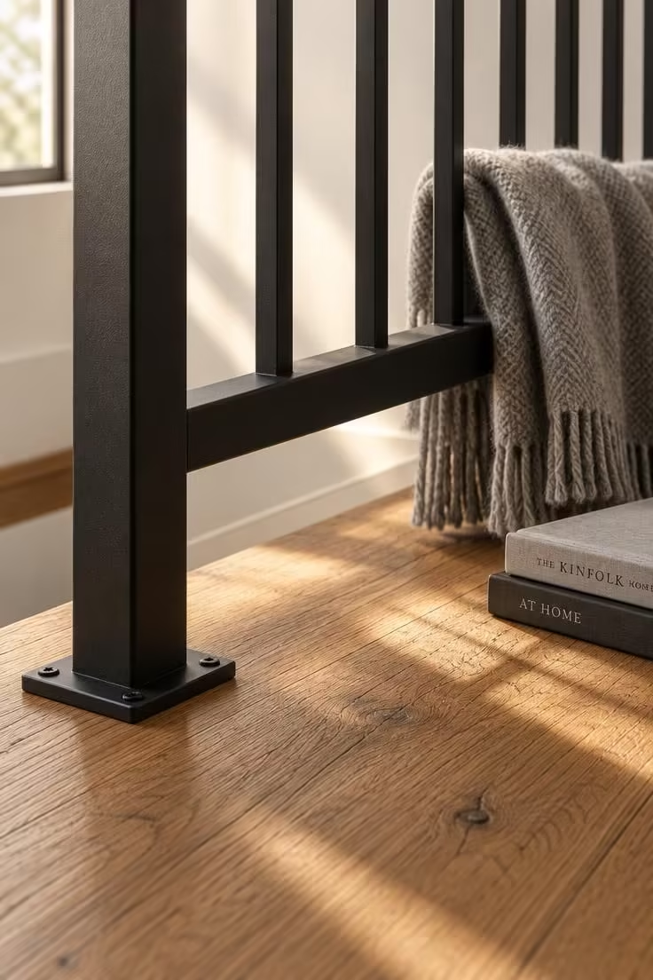
All black and white, but one surface is a genuinely different material, such as a black metal stair railing, a raw or stained wood floor, or a linen shade.
The material contrast keeps a strict palette from reading flat or cold, and it gives the eye somewhere to rest that is not white or black.
This direction pairs well with the horizontal emphasis of black wainscoting on a lower wall, where the wood floor and dark panel meet in a warm, low register.
Hallways that already have a wood floor or a metal railing let the contrast be inherited rather than added.
Once a third material enters, the palette is no longer strictly black and white, and the question is whether the wood is a single accent or a competing voice.
A single well-chosen material answer tends to read clearly in a hallway, where there is not much room for multiple visual ideas to coexist.
Style Blueprint:
- One material outside the black-and-white pairing
- Warm wood or natural linen as that material
- Black metal as the graphic line
- White walls to hold the composition together
Black-Framed Glass Doors or an Internal Window
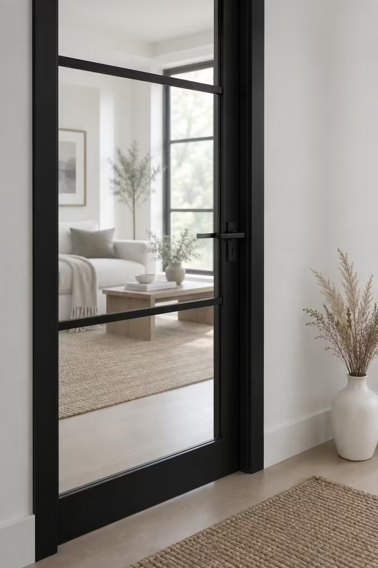
Interior glass with black frames introduces black without adding wall mass, and it can borrow light from an adjacent room to relieve a dark hallway.
Treat this as a glazing and framing decision rather than a paint choice.
Structural or glazing work falls outside the scope of a finish refresh, so this direction is best considered as part of a broader plan rather than a weekend change.
A single internal window at the end of a corridor is a common composition where the frame repeats the black note while the glass does the light work.
In older homes where glazing is not viable, a black interior door paired with a black-framed mirror can echo the same graphic rhythm.
The visual payoff is that the hallway gains a borrowed-light source and a graphic frame without the commitment of wallpaper or tile.
Glass reduces acoustic and visual separation between hallway and adjacent room, which matters in bedrooms and workspaces.
Style Blueprint:
- Black-framed glazing profile
- Glass panel chosen as a visual, non-structural element
- Plain white walls to keep the frame the focus
Painted Floorboards in a Black-and-White Pattern
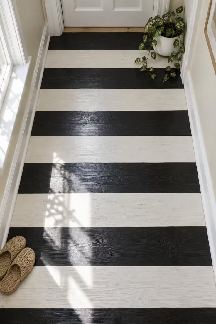
A painted floor, whether checkerboard, wide stripes, or a border, is a lower-commitment alternative to tile and can suit older floorboards.
Because hallways are heavily trafficked, floor paint wears differently at traffic paths than at the edges, so the design should account for that pattern of wear.
Wide stripes read as a graphic gesture, narrow stripes read as texture, and the choice depends on how much of the floor is visible between doorways.
A painted border around a plain field is a quieter option than a full pattern and gives the corridor a defined edge.
Painted floors are more reversible than tile but less forgiving than a runner, which can simply be replaced.
Treat this as a finish choice rather than a durability guarantee, since the look and the upkeep are the reader’s real decision.
A hallway with visible original floorboards and a willingness to repaint periodically tends to suit this direction best.
Style Blueprint:
- Floor enamel in matte black and warm white
- Wide stripe or checkerboard layout
- White trim and pale walls to keep the floor as the focus
- A touch-up tin of each color kept for edge wear
A Single Warm Accent in a Strict Black-and-White Scheme
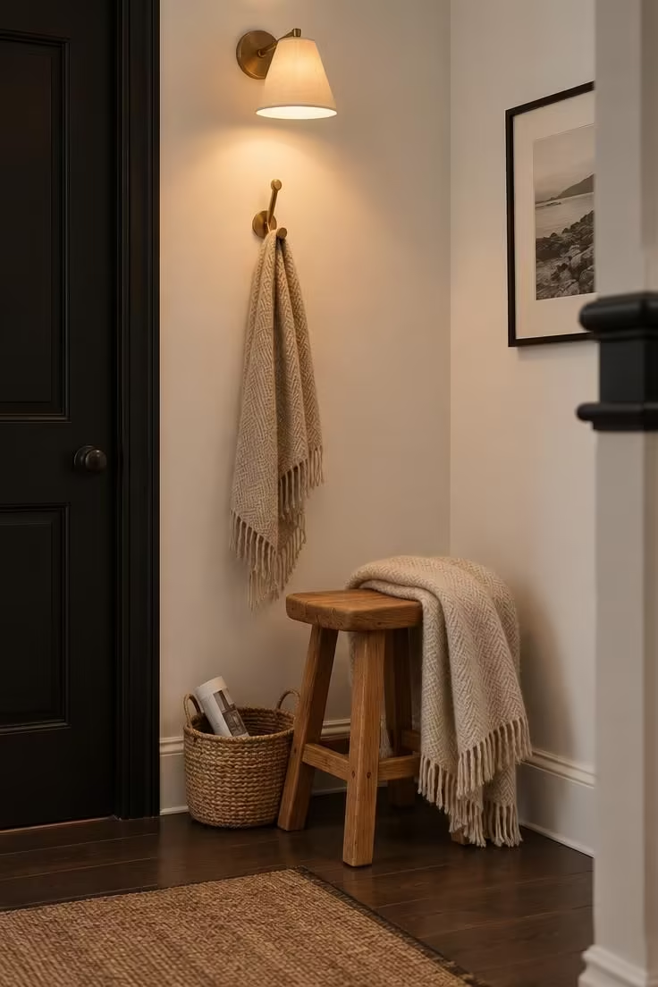
A strict black-and-white scheme can read flat, and a single warm accent gives the palette a place to breathe.
Warm brass or honey wood against black and white reads as deliberate rather than accidental.
The trick is to keep the accent to one material or one tone so the black-and-white composition remains the main idea.
Where a hallway already has a wood floor or a brass fixture, the warm accent can be inherited rather than introduced, which tends to look natural rather than styled.
Too many accents dilute the effect, and two competing warm tones in black-and-white hallways often fight each other.
A single warm note placed where light falls on it, such as a brass hook beneath a sconce, reads best in the low-light conditions most hallways have.
Style Blueprint:
- One warm accent in brass, honey wood, or natural linen
- Strict black-and-white palette everywhere else
- A small shaded sconce to lift the accent
Bringing the Look Together
A successful black and white hallway rarely depends on using equal amounts of both colors.
The stronger approach is to choose one element to carry the contrast, whether that is the floor, doors, wall treatment, furniture, or artwork, and let the rest of the space support it.
Light, finish, texture, and hallway proportions will change how every option reads, so samples and small tests are worth more than rigid rules.
Keep the composition simple, introduce warmth through one considered material or accent, and allow the hallway’s existing architecture to guide how bold the final scheme becomes.