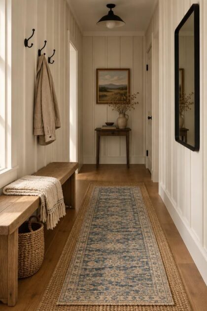
This post may contain affiliate links. If you make a booking or purchase through these links, we may earn a commission at no additional cost to you.
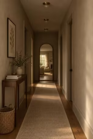
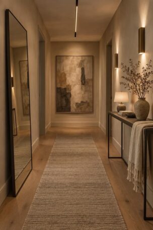
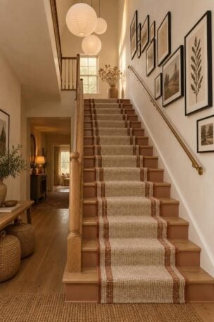
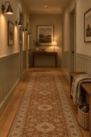
A hallway works harder than almost any other room in the house, yet it rarely gets the same design attention as a kitchen or living room.
Narrow corridors, limited natural light, and doors that interrupt every usable wall make this a difficult space to design effectively.
A modern farmhouse hallway works especially well with those constraints because the style leans on light neutrals, warm wood, and a few hardworking pieces instead of heavy furniture.
The ideas below look at paneling, runners, lighting, and drop-zone storage as ways to make a pass-through space feel finished.
Each one focuses on a single change you could put together without reworking the whole floor plan.
Classic White Board-and-Batten With Matte Black Hardware
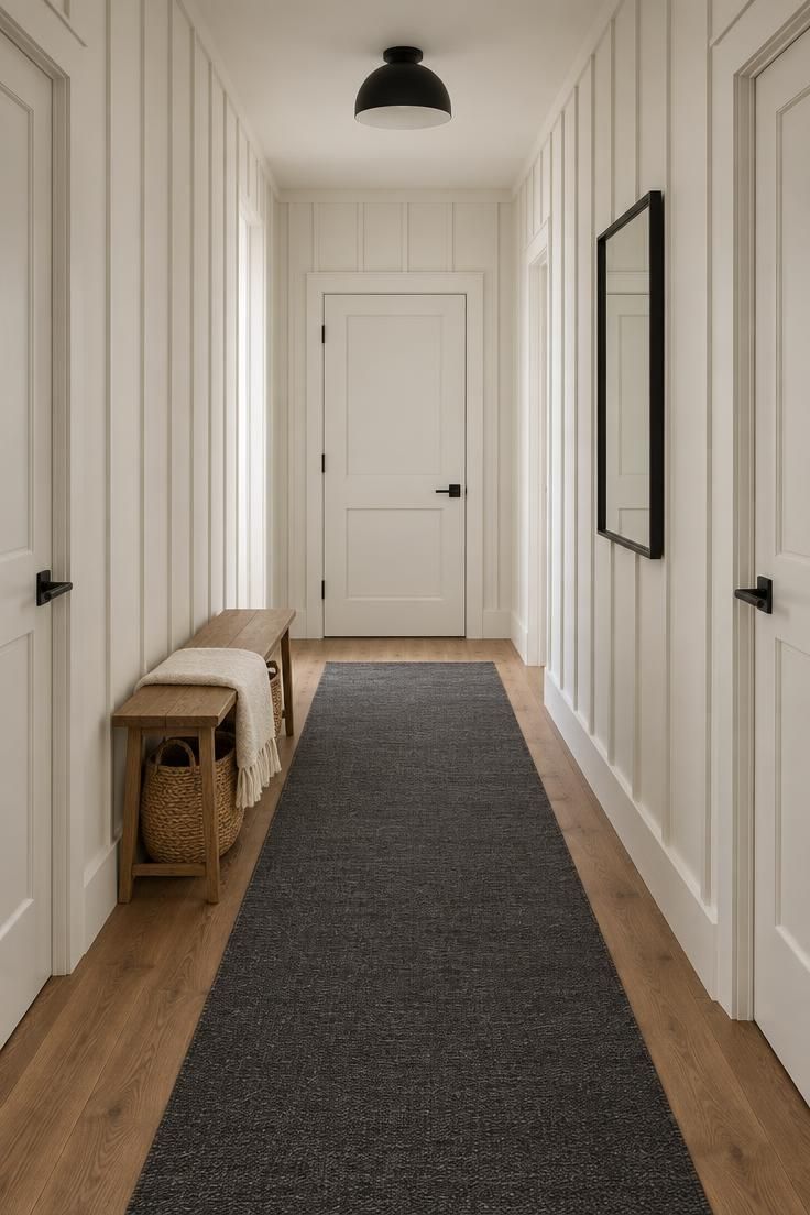
Board-and-batten is the wall treatment most people picture when they imagine this style, and it earns that reputation because it adds structure to a corridor that has none.
Vertical battens running from baseboard to ceiling create a repeating rhythm that carries the eye down the hall instead of letting it stall on blank drywall.
A warm white or soft greige paint keeps the paneling crisp, while matte black door levers, hooks, and a plain ceiling light stop the look from sliding into rustic territory.
Batten spacing matters more than most people expect.
Slim battens set at even intervals read as quiet and architectural, while wide gaps with heavy trim can make a narrow corridor feel busy.
The field color and the batten color usually match in this look, so the pattern comes from shadow rather than contrast.
The runner does the grounding work.
A charcoal flat-weave in a width that leaves a slim strip of wood exposed on each side keeps the floor from disappearing under fabric.
Wider runners crowd a tight hall, and very narrow ones make the corridor look longer than it is.
A low bench against one wall adds a place to set down a bag, but depth is the deciding factor.
Anything that pushes the seating further into the walking path turns a useful hallway into an obstacle course.
When the corridor is generous, the bench and basket earn their footprint.
When it is not, the paneling and runner carry the space on their own.
Style Blueprint:
- Slim vertical battens in warm white or soft greige, painted the same tone as the wall field
- Matte black door levers, hooks, and a plain dome or schoolhouse ceiling light
- Charcoal flat-weave runner with a narrow wood border showing on both sides
- Low wood bench with a woven basket underneath, only where the walking path stays open
Vertical Shiplap Feature Wall That Makes a Low Ceiling Feel Taller
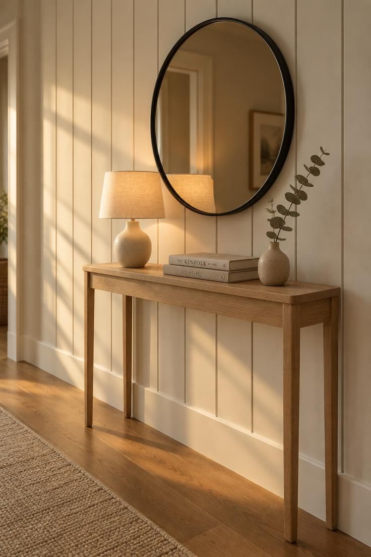
Turning shiplap vertical rather than horizontal changes what the wall does for a corridor.
Horizontal planks stretch a hallway sideways, which is rarely the direction a narrow space needs.
Vertical boards pull the eye up toward the ceiling, and that upward line reads well in a hall with a standard or slightly low ceiling.
Use it on one long wall and leave the opposite side as simple matte paint.
A shiplap feature wall on both sides plus paneling elsewhere plus a wainscot turns a small corridor into a texture sampler, and the result feels restless rather than warm.
The console does the practical work here.
A slim profile keeps the walking path intact, and pairing it with a small lamp gives the hall a second light source instead of forcing the ceiling fixture to carry everything.
A round mirror centered above softens the strong vertical lines and bounces whatever daylight reaches the corridor.
Floor treatment is a judgment call.
If the wood is in good shape and warm in tone, a bare floor keeps the composition from getting crowded.
A neutral runner works when the planks read cool or the corridor feels unfinished.
A vertical shiplap feature wall also gives a blank stretch of hallway a focal point without furniture.
The reveal between boards is what sells the look, so the depth of that gap is worth deciding before the paint goes on.
Style Blueprint:
- Vertical shiplap on one long wall only, painted off-white with a matte finish
- Slim-profile console in white oak or a similar light wood
- Small ceramic lamp with a linen shade for a second light source
- Round black-framed mirror centered above the console
- Bare wood floor or a low-contrast neutral runner, not both at full strength
Bench and Hook Drop Zone at the End of the Hall
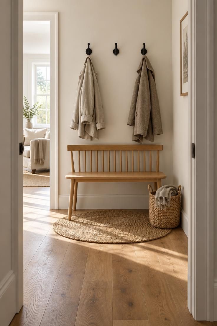
A hallway that dead-ends at a blank wall is an opportunity most people miss.
That stretch of wall can hold a bench and a row of hooks, which turns an aimless corridor into a small landing zone.
The bench and hook drop zone works best where the hall connects a back door, a garage entry, or a side entrance, since that is where coats and bags actually accumulate.
Even in a purely interior corridor, the setup gives the far end a purpose and stops the view from ending in nothing.
Hooks sit above the bench in a single row, spaced so wet coats do not overlap.
The visual balance depends on keeping the height consistent across all of them, because a staggered row reads as an accident rather than a choice.
A woven basket on the floor catches shoes and bags, and a small jute rug underneath the bench draws a boundary around the zone.
That boundary matters in a corridor, since the drop zone should not creep into the walking path.
Bench depth is the main tradeoff.
Shallow seating keeps the passage clear, while a deeper bench is more comfortable but eats floor space.
In a hall that is already tight, a bench without a back is the better compromise.
Keeping the wall above the hooks uncluttered lets the composition stay light even when the bench is in daily use.
Style Blueprint:
- Light wood bench, shallow enough to preserve the walking path
- Three to four matte black or oil-rubbed bronze hooks in one level row
- Woven seagrass or jute basket on the floor for shoes and bags
- Small round jute rug under the bench to define the zone
Gallery Wall of Black-Framed Prints on a Plain Neutral Wall
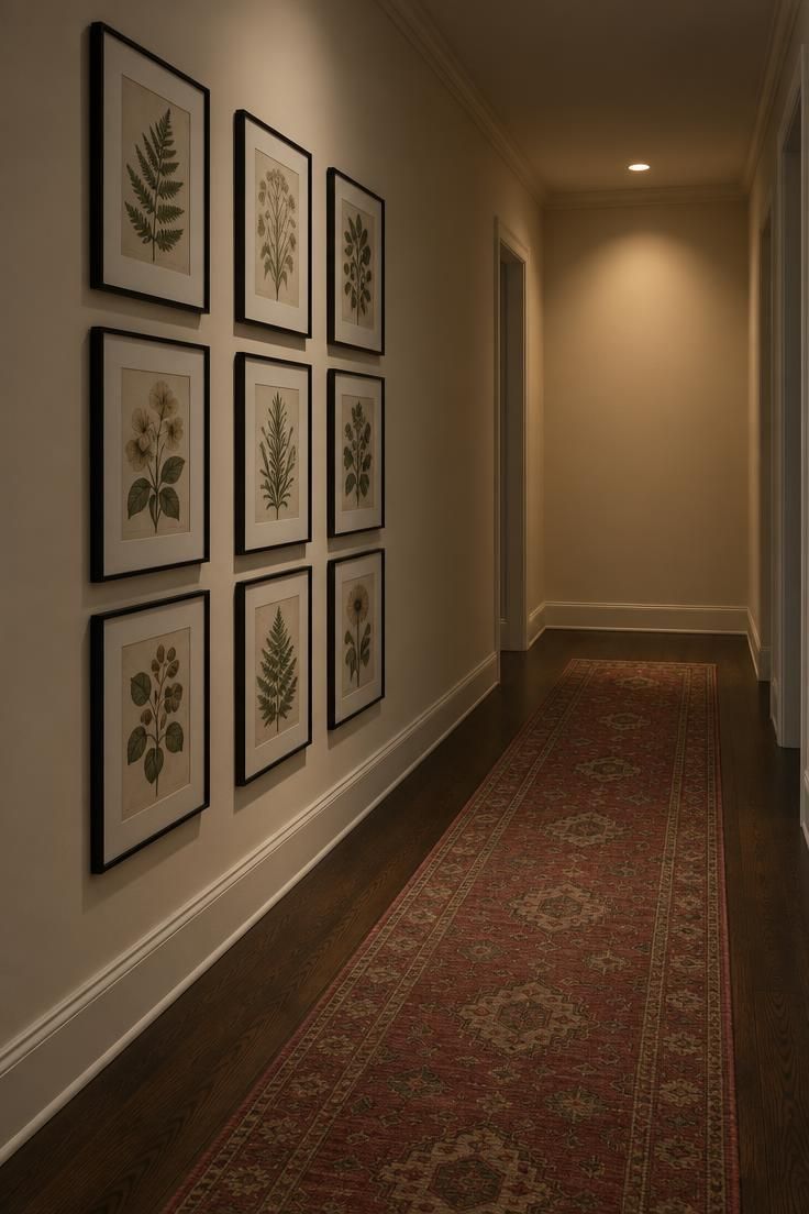
A pass-through hallway with no floor space to spare still has one large empty plane: the wall.
A gallery of black-framed prints fills that plane without narrowing the walking path, which makes it the right answer for corridors that only need to move people from one room to another.
Discipline is what separates a gallery wall that works from one that feels chaotic.
A straight grid with a consistent line at eye level stays calm in a narrow space.
A scattered salon-style hang can look collected in a large room, but in a corridor it adds visual noise to a view that is already compressed.
Thin frames with white mats keep the arrangement light.
Heavy moldings and dark artwork compete with each other and make the wall read as solid rather than open.
The runner underneath is the counterweight.
A faded pattern in muted red, blue, or charcoal gives the floor some color without fighting the prints.
When the art is graphic and the floor is busy at the same time, the two compete for attention and the hall feels smaller.
This idea suits an interior corridor where the only light comes from ceiling fixtures.
Spacing the frames evenly means each one catches light at a similar angle, so no single print disappears into shadow while its neighbor stays bright.
Style Blueprint:
- Thin black frames with white mats, uniform in size for a disciplined grid
- Botanicals, architectural sketches, or simple typography in muted tones
- Straight bottom line across the arrangement rather than a scattered hang
- Faded vintage-style runner in red, blue, or charcoal to counterbalance the art
- No furniture, so the walking path stays completely clear
Warm Wood Slat Accent Wall With a Leaning Mirror
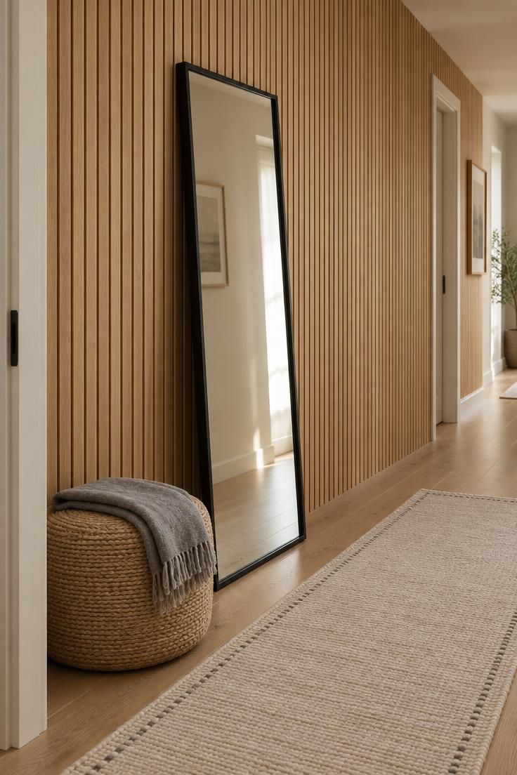
Painted paneling is not the only way to bring texture to a hallway.
Narrow wood slats in a light oak or walnut tone give a wall warmth that paint cannot match, and the grain adds movement across a surface that would otherwise be flat.
This is a bolder move than board-and-batten, so it works best on a short wall, an alcove, or the end of a corridor.
Covering an entire long hallway in slats can make the passage feel dark and tunnel-like, especially in an interior space with no window.
A leaning mirror against the slatted wall does two jobs.
It reflects back whatever light reaches the corridor, and the black frame breaks up the repeating vertical lines so the wall does not read as a single solid plane.
Keeping the rest of the hall minimal is the tradeoff this idea demands.
One piece of simple furniture, such as a woven pouf or a low stool, is enough.
A wood slat wall paired with a busy runner, crowded art, and several baskets turns a strong feature into one loud note among many.
The floor finish should lean soft here, since the slats already supply pattern and warmth.
A light wool farmhouse runner rug in a single undyed tone keeps the contrast gentle while still protecting the wood underneath.
Balance is the whole point of this look.
Wood slats push the hallway toward modern, so a linen or wool textile softens that edge and brings it back toward the farmhouse side of the palette.
Style Blueprint:
- Narrow vertical wood slats in light oak or walnut on a short wall or alcove only
- Full-length mirror with a thin black frame, leaned against the slats
- Light wool runner in a single soft tone, not a competing pattern
- One low woven stool or pouf, and nothing else on the floor
- Keep the opposite wall plain so the slats stay the focal point
Design Pro-Tip: Before committing to any wall treatment, tape the panel or slat spacing onto the wall in painter's tape and stand at both ends of the hall. A pattern that looks balanced up close can read as cramped from the far doorway.
Beadboard Wainscot With a Chair Rail and Slim Console
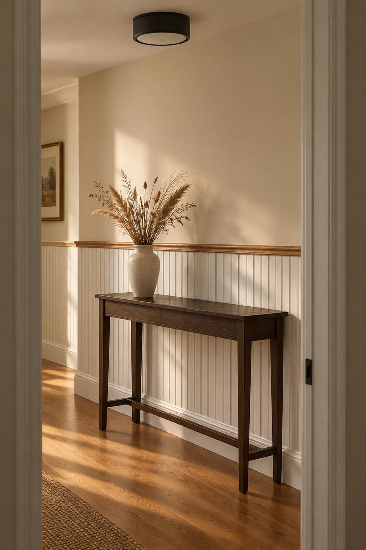
Beadboard wainscot takes a different approach than a board-and-batten hallway.
Instead of paneling the full height of the wall, it covers only the lower portion and leaves a plain painted surface above a slim chair rail.
That split has practical value in a corridor.
The lower wall is where scuffs, handprints, and furniture marks collect, so a washable beadboard surface in a satin or semigloss finish cleans up more easily than flat paint.
The upper wall stays plain, which keeps the texture from overwhelming a narrow space.
Color choices shape the result.
Painting the wainscot and the upper wall the same off-white makes the room feel taller and more unified.
A slightly deeper greige on the upper wall adds contrast at the chair rail and gives the wainscot a defined edge.
A shallow console against the wainscot gives the hall a place for one deliberate object, such as a stoneware vase or a stacked pair of books.
Leaving the top otherwise empty is what keeps the composition calm.
Multiple small objects spread across the surface make a narrow corridor feel cluttered fast.
This idea fits an older home with tight proportions, because the horizontal chair rail breaks up a tall blank wall and the beadboard adds period-appropriate detail without a full remodel.
Caring for the finish is straightforward: wipe the wainscot with a damp cloth, and touch up the chair rail where bags and coats scrape it.
The upper wall rarely needs the same attention.
Style Blueprint:
- Beadboard wainscot on the lower third of the wall in a washable satin or semigloss finish
- Slim wood chair rail, painted to match the wainscot or with a subtle contrast
- Upper wall in the same off-white or a slightly deeper greige
- Very shallow console in dark wood or black, holding one large object
- Simple matte black ceiling fixture so the wall detail stays the focus
Layered Runners Over Hardwood for Pattern Without Commitment
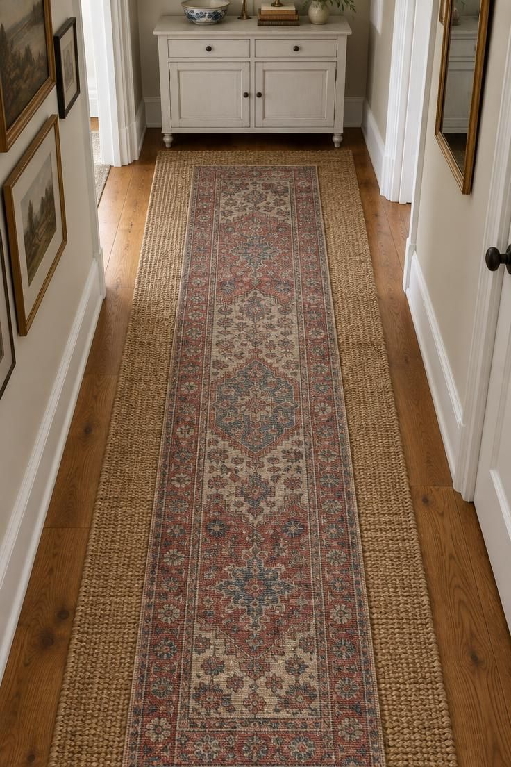
Layering two runners is a low-commitment way to bring color and pattern into a corridor.
Most hallway floors are too long and too plain to carry a single small rug well, so the layered approach solves a proportion problem while adding visual depth.
Start with a natural fiber base in jute or sisal that runs wider and longer than the top layer.
Then add a shorter flat-weave or vintage-inspired runner on top and center it in the walking path.
The base gives the composition a warm neutral field, and the patterned layer sits inside it like a frame.
Faded reds, muted blues, and soft charcoal are the tones that tend to work, since they coordinate with wood floors and black or brass hardware without demanding attention.
Very saturated colors overpower a narrow hall.
The practical advantage is that the top runner can be swapped seasonally or rotated when one end wears faster.
The base layer stays put and continues to protect the floor.
Anchoring matters with any layered setup in a hallway, since two rugs on top of each other shift more easily than one.
Rug pads or grippers placed under each layer keep the stack from drifting into the doorways at either end.
Keep the walls plain and the furniture minimal so the floor pattern carries the room.
Layering rugs works well in a hall that already has warm wood tones, because the natural fiber base ties into the floor color rather than fighting it.
Style Blueprint:
- Wide natural jute or sisal runner as the base layer
- Shorter flat-weave or vintage-inspired runner layered on top, centered
- Muted red, blue, or charcoal pattern rather than saturated color
- Rug pads or grippers under both layers to limit shifting
- Plain walls and minimal furniture so the floor stays the focus
Cubby-Locker Hallway for a Busy Family Entry
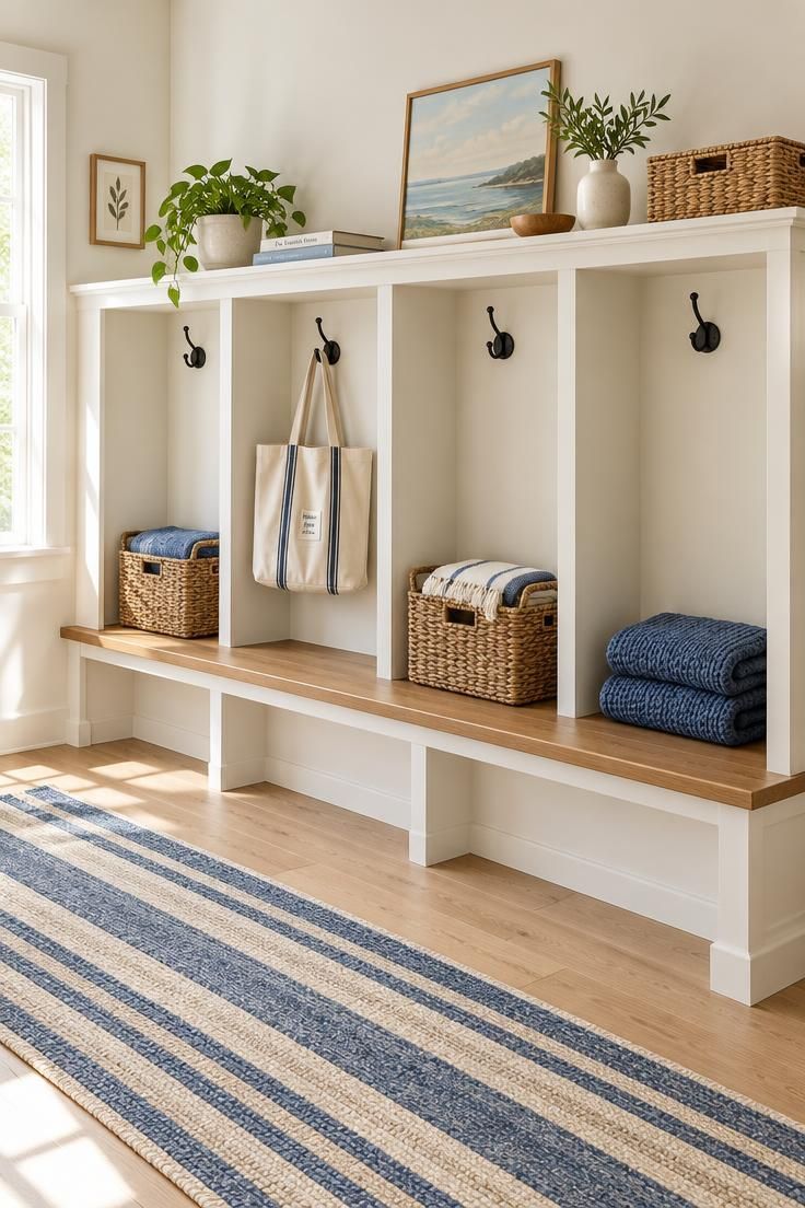
A cubby wall takes the bench-and-hook idea and gives it structure.
Instead of a single seat with hooks above, a row of open cubbies divides the drop zone into assigned spaces, which matters in a household where outerwear piles up faster than it gets put away.
Each cubby holds a basket, a hook for a coat, and room for a small shelf above.
That combination contains the clutter that would otherwise spill into the walking path.
This is the most functional idea on the list, and it makes the largest footprint demand.
It needs a wider hallway or an end wall where the unit can sit without narrowing the passage.
Forcing a cubby wall into a tight corridor leaves neither a comfortable drop zone nor a clear walkway.
A freestanding locker-style unit can achieve a similar effect without built-in construction, though it takes up floor space in a different way.
The visual result is close either way: a row of open compartments, a shared bench seat, and hooks at a consistent height.
The palette stays neutral so the unit does not dominate.
White cubbies with a natural wood bench seat and black hooks read as calm and purposeful.
A long runner in front connects the zone to the rest of the corridor and protects the floor where shoes land most often.
Baskets do the quiet work of keeping the open cubbies from looking messy.
Matching baskets in a single woven material and size make the wall read as one piece of furniture rather than a collection of storage bins.
Style Blueprint:
- White wood cubby unit with a natural wood bench seat
- Matching woven baskets, one per cubby, in the same material and size
- Matte black hooks above each opening at a consistent height
- Folded blankets in neutral tones to soften the empty compartments
- Long striped or solid runner in front to connect the zone to the hall
Sconce and Mirror Composition for a Windowless Corridor
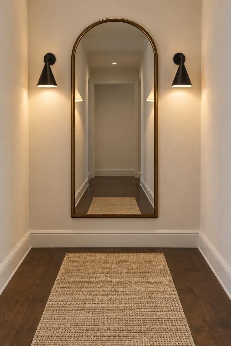
An interior hallway with no window depends entirely on artificial light, and a single overhead fixture leaves the space feeling flat and closed in.
Splitting the light across two sources changes how the corridor reads without adding floor space furniture.
A pair of sconces flanking a round or arched mirror is one of the simplest versions of that idea.
The mirror reflects the sconce glow back into the corridor, and the paired fixtures add a symmetrical point of interest on a wall that might otherwise be blank.
Matte black hallway lighting in a cone or simple cylindrical shape keeps the farmhouse character without looking antique.
The opposite wall stays plain, and the floor gets a light neutral runner.
Both choices push the eye toward the lit wall, which is where the composition lives.
This layout suits a corridor that already has a blank wall and no room for furniture.
A console would compete with the mirror for floor space, so leaving it out is often the better decision in a narrow passage.
Placement symmetry does the heavy lifting.
Sconces set at the same height on both sides and spaced evenly around the mirror read as intentional, while mismatched heights make the whole arrangement look improvised.
Style Blueprint:
- Round or arch-topped mirror as the center of the composition
- Two matching matte black cone or cylinder sconces, set at identical heights
- Plain wall opposite so the lit wall stays the focal point
- Light neutral flat-weave runner on the floor
Barn-Door Motif as a Backdrop for a Small Console
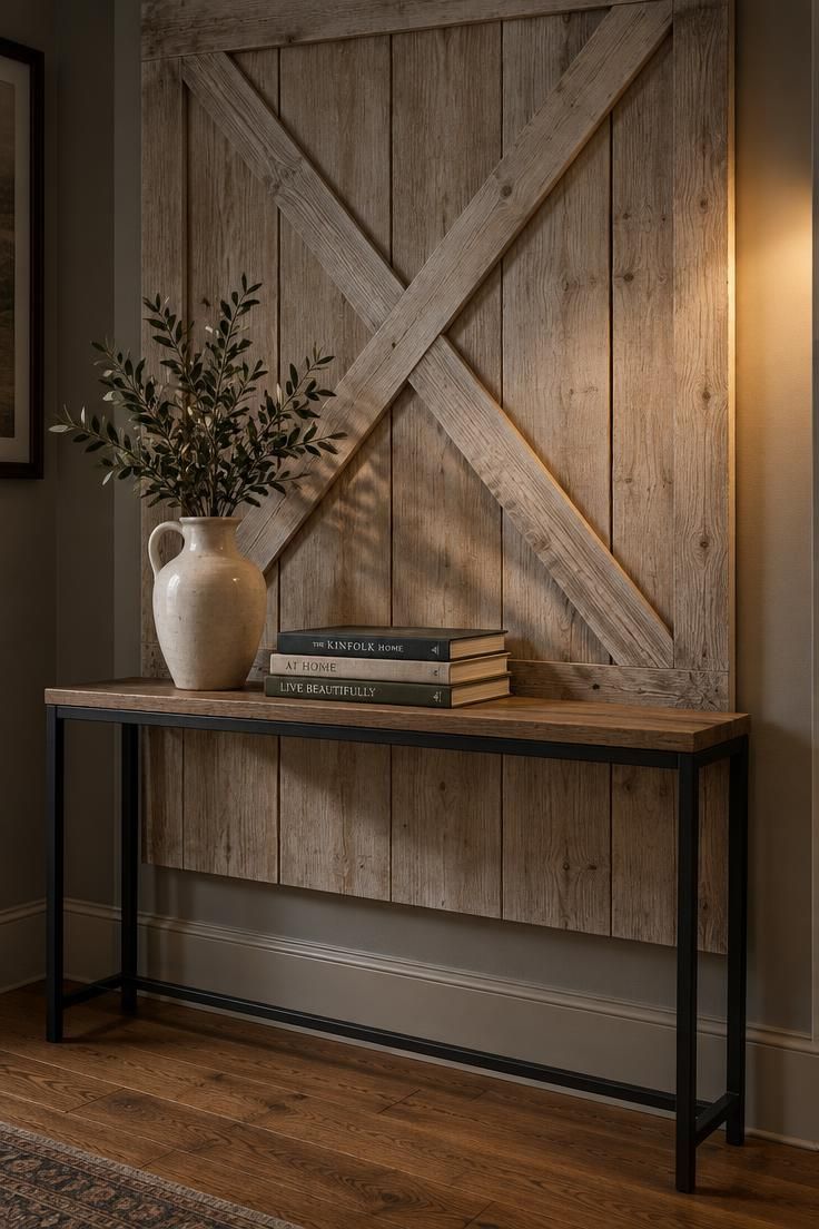
A sliding barn door is one of the most recognizable elements in this style, but in a hallway it does not have to function as a door at all.
A decorative barn-style panel hung flat against the wall supplies the same visual reference without any of the structural questions that come with a working slider.
The paneled texture adds depth to a plain corridor.
Plank seams and a diagonal brace create shadow lines that a flat painted wall cannot produce, which gives the hall a sense of material even when nothing else is happening on that surface.
Contrast keeps the look current.
A rustic wood panel paired with a modern console in black metal and wood balances old and new so the wall does not tip into theme.
A natural or lightly whitewashed finish on the panel keeps a narrow corridor from feeling heavy, since dark stained barn wood in a tight space can close the view down.
This works best on a short wall at the end of a hall or inside an alcove where the panel reads as a destination.
Stretching a decorative panel along a long corridor makes it look like a mistake rather than a backdrop.
The console in front holds very little: a ceramic vessel, a small stack of books, and nothing else competing for attention.
Restraint is what keeps the composition reading as deliberate.
Style Blueprint:
- Decorative barn-style wood panel in natural or lightly whitewashed finish, hung flat as a backdrop
- Slim console in black metal and wood to contrast the rustic panel
- One ceramic vessel and a small stack of books, no more
- Reserve the treatment for a short wall or an alcove rather than a long run
Open-Shelving Corridor With Baskets and Ceramic Vessels
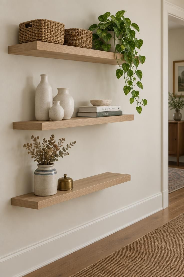
When a hallway has wall space but no floor space, open shelving turns dead wall into display and storage.
Two or three long shallow shelves in light oak or a whitewashed finish can hold baskets, stoneware, and greenery without intruding on the walking path.
Depth is what makes this idea work in a corridor.
Shallow shelves stay visually light and keep the hallway from feeling like a gallery of heavy cabinetry.
Deep shelves lined with objects would push into the space and make the corridor read as narrower than it is.
Height placement matters too.
Shelves mounted above head height or over a low console stay out of the way and keep the passage clear.
Shelves at shoulder level in a narrow hall invite bumped elbows and knocked-over objects.
Styling is where open shelving either succeeds or becomes clutter.
A mix of woven baskets, stoneware crocks, and two or three small plants or dried stems gives the shelves variety without needing dozens of objects.
Grouping similar items and leaving empty space between them reads as considered.
The wall behind can stay plain or take a limewash finish for extra depth.
A light neutral runner on the floor ties the wall display to the room without competing with it.
This idea suits a hall that sees light traffic and is more decorative than functional.
In a corridor where people move through with bags and coats, open shelves become a hazard rather than a feature.
Style Blueprint:
- Two or three shallow floating shelves in light oak or whitewashed wood
- Woven baskets for hidden storage, stoneware for display
- One or two trailing plants or dried stems for organic texture
- Group similar objects and leave empty space between groupings
- Mount shelves above head height in a narrow hall to keep the path clear
Limewash or Matte-Painted Hall With Aged-Brass Fixtures
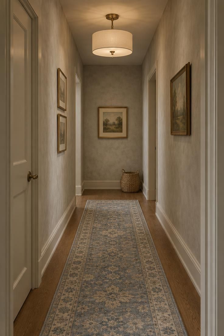
Limewash gives a wall a chalky, mottled surface that shifts slightly with the light.
It adds texture to a hallway without the permanent commitment of paneling, and the effect is softer than a flat painted finish.
A warm off-white or pale mushroom tone used across the walls creates an enveloping effect, since there is no strong color break to interrupt the corridor.
The tradeoff is that the palette becomes very quiet, so the details have to earn attention on their own.
That is where the fixtures come in.
Aged brass or oil-rubbed bronze in a small flush mount, a pair of sconces, and simple door hardware give the monochromatic scheme something to work against.
Brass warms up the pale walls, while oil-rubbed bronze gives a slightly deeper, more rustic contrast.
Because the color story is so restrained, materials carry the room.
A light oak floor, a faded wool runner, and a single woven pendant or basket add warmth through texture rather than hue.
Maintenance is a consideration with limewash.
The finish is softer than standard paint and can mark if scrubbed hard, so a gentle cleaning routine suits it better.
Matte-painted walls are more forgiving but lose some of the depth that limewash provides.
This route works well in an older home where original plaster walls have character worth showing.
Instead of covering them with paneling, the limewash finish lets their subtle unevenness become part of the look.
Style Blueprint:
- Limewash or matte paint in a warm off-white or pale mushroom across all walls
- Aged-brass or oil-rubbed bronze fixtures: flush mount, sconces, door hardware
- Light oak floor with a faded wool runner in muted blue, cream, or gray
- One woven basket or pendant for added texture
- Gentle cleaning routine to preserve the softer finish
Design Pro-Tip: When a hallway is windowless, run the runner color and the wall color in the same tonal family rather than contrasting them. A low-contrast palette keeps a narrow corridor from reading as two competing horizontal bands.
Pendant Row Over a Long, Narrow Corridor
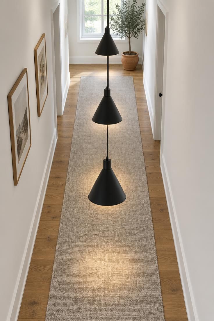
A row of small pendants can turn a plain corridor into a defined path.
Where a single ceiling fixture lights the hall in one pooled splash, a line of two or three pendants spreads the light along the full length of the space.
This idea depends on ceiling height.
A high ceiling gives pendants room to hang without feeling close, and the repeated shapes create a strong visual rhythm down the center of the hall.
In a corridor with a low ceiling, suspended fixtures sit too near the head and make the space feel compressed, so they are better replaced with semi-flush mounts.
Matching pendants in matte black or clear glass keep the row uniform.
Two or three are usually enough for a standard hallway length; more than that turns the ceiling into a runway of lights.
A long runner below reinforces the same line the pendants create.
When the fixtures and the floor covering run in the same direction, the corridor reads as a single continuous move from one end to the other.
Keep the walls and floors neutral so the pendants stay the main event.
Adding a console, a gallery wall, and a bench alongside a pendant row crowds the composition.
A single piece at the far end, such as a small table or a potted olive tree, gives the view somewhere to land.
Style Blueprint:
- Two or three matching pendants in matte black or clear glass
- Even spacing down the center of the hall for a consistent rhythm
- Long neutral runner directly below the pendant line
- Plain walls and flooring so the fixtures carry the composition
- One simple object at the far end to complete the view
Seasonal Vignette on a Console: Dried Stems, Stoneware, and Stacked Books
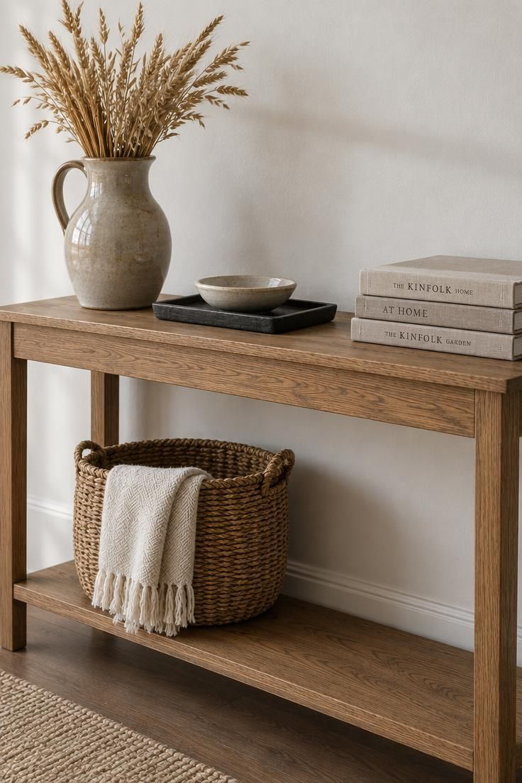
A console table in a hallway is the easiest place to change decor with the seasons while keeping the overall style consistent.
A slim table with a lower shelf gives you two surfaces to work with, and the vignette on top can shift from dried grasses in fall to bare branches in winter without touching the walls or the floor.
The composition works when it stays restrained.
A tall stoneware pitcher with dried stems anchors one end, a stack of neutral-covered books anchors the other, and a small tray or bowl sits in the middle.
That is a single composed vignette rather than a collection of small objects spread across the surface.
The lower shelf does the practical work.
A woven basket or a pair of covered jars holds items that would otherwise clutter the tabletop, and keeping that shelf styled with one or two pieces keeps the whole console from looking top-heavy.
Restraint is the recurring lesson with this idea.
A hallway console that accumulates jars, signs, frames, and candles starts to feel like a market stall, and in a narrow corridor that clutter reads immediately in the view from both ends.
This setup works with nearly any wall treatment, from board-and-batten to plain painted drywall, which makes it a flexible option when the walls are staying as they are.
It also gives a hallway that has nothing else going on a small point of interest without any construction or furniture footprint beyond the table itself.
Style Blueprint:
- Slim oak or dark wood console with a lower shelf
- Tall stoneware pitcher with dried stems as the anchor piece
- Stack of books in neutral linen or paper covers
- Small black tray or ceramic bowl in the center, left mostly empty
- Woven basket or covered jars on the lower shelf
Conclusion
Making a hallway feel finished rarely requires a full renovation.
The moves that do the most work are the simplest ones: add texture with paneling or a matte finish, layer a runner that fits the corridor's actual width, spread light along the length of the hall instead of pooling it in one spot, and give the far end or a blank wall a job with a bench, a set of hooks, or a slim console.
Mixing a few of these approaches works better than stacking all of them into one narrow corridor.
A paneled wall, a layered runner, and a pair of sconces together can carry a hallway on their own.
Adding a gallery wall, a pendant row, and a styled console on top of that turns a tight space into a showroom of competing ideas.
Start with whichever element the hallway most needs: the wall treatment that fills a blank plane, the floor covering that connects the length of the corridor, or the light that keeps the view from ending in shadow.
Layer the rest in as the space allows, and let one or two pieces do the talking rather than the whole list.