This post may contain affiliate links. If you make a purchase through these links, we may earn a commission at no additional cost to you.
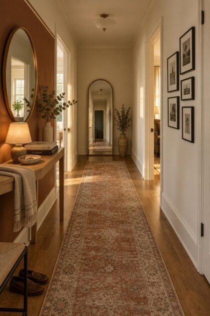
An apartment hallway is the most-crossed and least-decorated strip of a home.
Often it is narrow, windowless, and lined with doors that leave little blank wall to work with.
The constraint set stays the same across nearly every unit: limited width, borrowed light from adjacent rooms, door swings, and rental rules about what can change.
Each idea below pairs a visual composition with a practical tradeoff, favoring walls, ceiling, and lighting over scarce floor space.
Some moves are renter-friendly and some are permanent, and that split is the first decision worth making.
What follows moves through texture, light, color, and one deliberate focal point.
A Ladder of Oak Picture Ledges Climbing One Narrow Wall
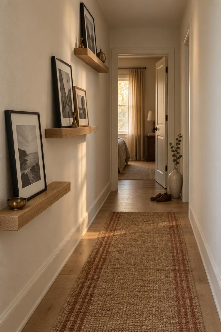
Three shallow ledges staggered so frames lean rather than hang turn a bare apartment hallway wall into a changing display that can be updated without new holes.
Because the frames rest on a surface, the arrangement can be restyled whenever art changes.
Mixing one larger frame with two smaller ones per ledge keeps the eye reading rhythm instead of clutter.
Natural oak with black-and-white photography, or walnut with warm botanical prints, both hold up against a plain wall.
A ledge is a shallow shelf, so anything bulky reads as blocking rather than styled.
This is the most forgiving version of a gallery wall for a corridor, since spacing can be adjusted by sliding frames along the shelf.
Style Blueprint:
- Three shallow picture ledges in matching natural oak
- A mix of one large and two small frames per ledge
- Black-and-white photography or botanical prints with wide mats
- One small brass or ceramic object per shelf for weight
- A low-pile woven runner in a muted tone to ground the floor
Design Pro-Tip: Stack ledge heights so the lowest sits well above the back of any furniture and the highest stays below the ceiling line, since the gap above and below is what makes the arrangement read as deliberate.
A Vintage Wash Hallway Runner Rug That Stops Short of Every Doorway
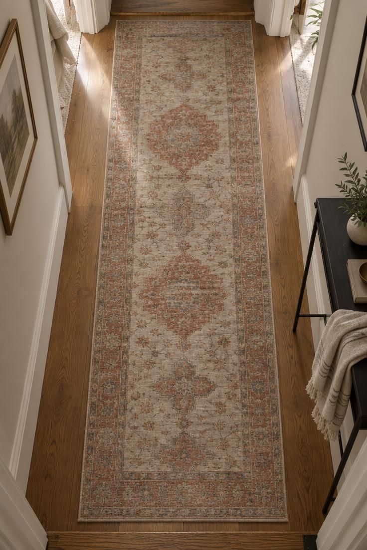
The runner runs the corridor’s full length but stops short of each doorway trim so floor shows at both ends.
Leaving a margin of visible floor on both sides reads more generous than a rug that touches the baseboards.
A faded, low-contrast pattern hides traffic wear better than a crisp geometric in a dim corridor.
Flat-weave or low-pile suits high traffic, and a non-slip pad keeps the rug from creeping on smooth flooring.
Use the runner to introduce the one saturated tone in an otherwise neutral hallway.
A rug is the biggest single commitment in this space, so swap it seasonally if the pattern starts to feel stale.
Style Blueprint:
- A low-pile runner sized to stop short of each doorway
- A faded, low-contrast pattern in two or three related tones
- A non-slip pad cut to the runner’s dimensions
- Exposed floor visible on both sides of the rug
- One saturated accent tone carried nowhere else in the hall
A Shallow Console Table With a Single Lamp and a Catch-All Tray
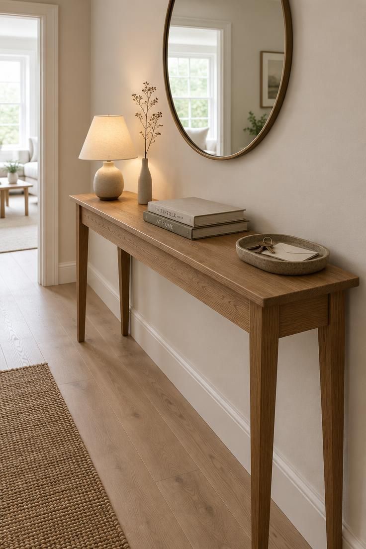
The console table sits flat against the wall on the longest stretch that no door swings into.
Choose the shallowest format available so the walkway keeps its full clear width.
One lamp, one tray, and a stack of two or three books is enough; the tray gives keys and mail a fixed home.
A lamp at console height creates a low pool of light that reads softer than a single overhead fixture.
This is the one idea that meaningfully eats floor width, so skip it where the hallway barely clears a door swing.
A freestanding console needs no wall change, and leaving a small gap behind it keeps the wall untouched.
Style Blueprint:
- A shallow console table in the narrowest available depth
- One small table lamp with a warm shade
- A stoneware or metal catch-all tray for keys
- A stack of two or three hardcover books
- One mirror or one framed artwork above, never both
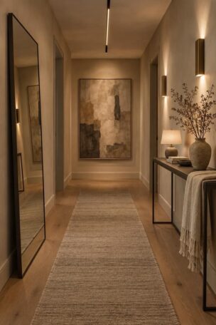
A Repeating Line of Small Warm Wall Sconces Down the Long Wall
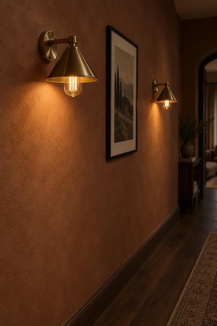
Sconces spaced in a steady rhythm down one long wall read as intentional; pairing them breaks the pattern.
Even gaps between fixtures matter more than an exact measurement, so walk the hall and check the rhythm from the entry.
Small shades or exposed bulbs on brass or matte black arms keep the profile tight to the wall.
Warm bulbs in a dim corridor create a low glow that reads welcoming without lighting the whole hall.
Rechargeable or plug-in sconces avoid hardwiring, and any cord is best routed along the wall base rather than across the floor.
Rechargeable fixtures need periodic charging, so keep a rotation going if more than two are in use.
This approach suits a corridor where the ceiling fixture is dated or harsh and the goal is to lean on accent light instead.
Style Blueprint:
- Three or more matching sconces in brass or matte black
- Warm bulbs with a small shade or exposed filament
- Cord clips or a cord cover in the wall color
- One slim framed print to interrupt the repetition
- A matte wall finish that softens the light falloff
Design Pro-Tip: Run sconces at the same height as the center of your art or mirror rather than at a fixed height, since the alignment is what makes the corridor feel composed instead of assembled.
A Peel-and-Stick Wallpaper Accent on the End Wall Only
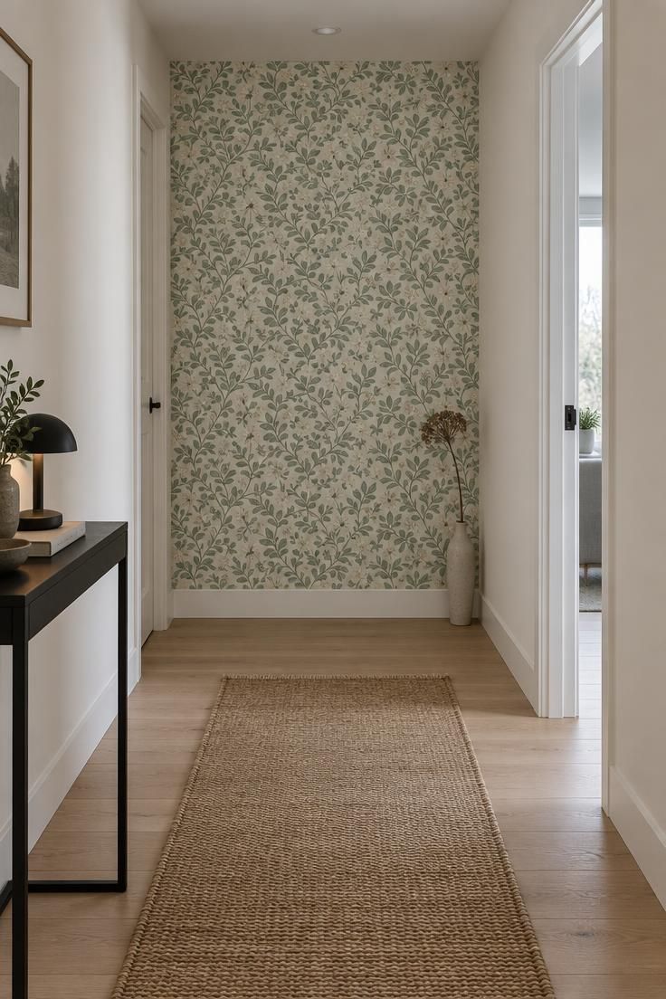
Pattern confined to the end wall gives the corridor one clear focal plane instead of competing patterns.
The end wall is what the eye lands on from the entry, so it earns the boldest treatment in the hall.
A small-scale repeating pattern reads better on a narrow end wall than a large-scale mural.
Pick a paper whose background matches the surrounding wall tone so the transition reads as one continuous surface.
Peel-and-stick wallpaper is the convenient category for reversible pattern changes, especially in a rental.
Pattern on an end wall draws the eye forward, which suits a hall with a door or opening at the far end more than one with a blank dead end.
A patterned paper on the ceiling is a low-commitment surprise in a short corridor.
Keep the floor and adjacent walls plain so the paper carries the visual weight alone.
Style Blueprint:
- One roll of small-scale peel-and-stick wallpaper for the end wall
- A background tone matched to the surrounding wall color
- A smoothing tool and a fresh blade for trimming
- Plain side walls and a neutral floor covering
- One narrow vase or stool at the wall’s base for grounding
A Cluster of Small Framed Prints Flanking a Single Doorway
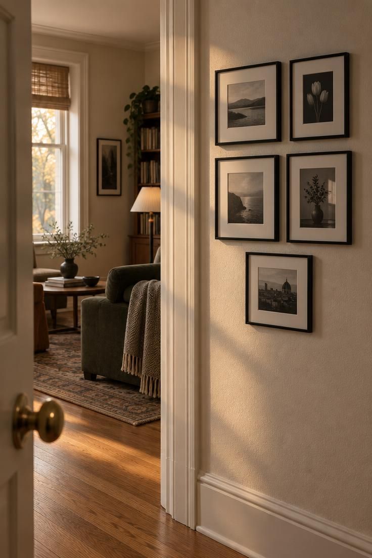
Prints grouped to one side of a doorway trim make the doorway itself part of the composition.
Three to five small frames in a tight cluster read better than one medium frame on a short wall segment.
Leveling the top or bottom edge of the cluster gives a plain arrangement a hidden rule.
Thin black or natural wood frames with generous white mats keep small prints from feeling fussy.
Keep the cluster to one color family so it registers as a single unit from across the hall.
A cluster near a doorway can feel crowded if it creeps into the trim, so leave visible wall between frame and trim.
This is a lighter, more flexible alternative to a gallery wall when the available wall segment is short.
Style Blueprint:
- Five small frames in matching thin black or wood profiles
- Wide white mats in a uniform size
- Prints limited to a single tonal family
- A level or straightedge for aligning one common edge
- Adhesive strips rated for the weight of each frame
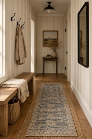
A Slim Bench With Visible Floor Beneath It
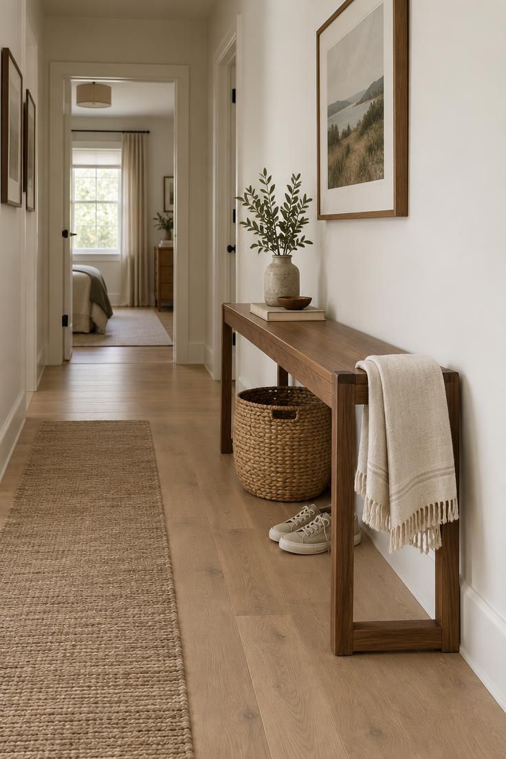
A bench kept shallow and open-framed lets the floor line continue visually underneath it.
Site the bench on a wall stretch where no door swings toward it.
One folded throw and one shallow basket underneath is enough; this is a perch, not a storage unit.
Wood, woven, or metal frames with open lower profiles read lighter than upholstered boxes.
Near the entry, a bench gives a place to set a bag down for a moment.
A bench competes directly with walkway width, so measure the clear path before committing.
Freestanding benches need no wall change, and a felt pad under the legs protects the flooring.
Style Blueprint:
- A shallow open-framed bench in wood, metal, or woven material
- One folded throw in a neutral linen
- A low woven basket sized to slide beneath
- Felt pads for the leg bases
- Enough clear floor on the opposite side to walk past
Design Pro-Tip: Turn the bench 90 degrees away from the wall to test whether the hall reads calmer with the long edge facing you, since some narrow corridors feel more open with furniture running parallel to the walkway.
A Mirrored Panel Leaning at the End of the Corridor
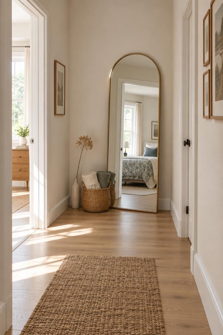
One tall mirror leaning at the hall’s far end, angled slightly, catches light from a doorway or window beyond.
The mirror reflects whatever brightness exists in the adjacent rooms, which is what changes how the corridor reads.
A thin frame in brass, black, or natural wood keeps the mirror from reading as heavy in a tight space.
A mirror that fills most of the wall height gives the corridor a vertical emphasis.
Angle the panel toward the nearest light source rather than holding it flat to the wall.
A large leaning mirror needs a spot where it will not be bumped, so keep it clear of the door swing line.
Leaning mirrors require no hanging hardware at all, which makes them the simplest non-permanent option in a rental.
A horizontal mirror at eye level works for a shorter end wall, though it will not reflect as much of the corridor.
Style Blueprint:
- One tall leaning mirror with a slim frame
- A base position clear of every door swing
- A slight angle toward the nearest light source
- A low basket or stool at the base to anchor it
- Plain walls on either side to keep the reflection clean
A Two-Tone Wall With a Subtle Dado Line and a Warm Trim
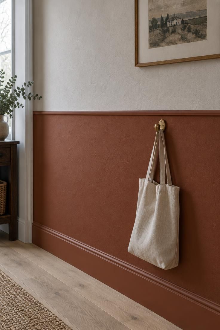
A lower band of deeper color capped by a thin painted trim line, with a lighter shade above, gives a plain corridor a sense of proportion without adding objects.
Warm clay below and soft off-white above, or deep slate below and pale plaster above, both work as pairings.
Where painting is not permitted, a removable wallpaper in a solid tone can approximate the lower band.
A strong horizontal line can visually compress a short low hallway, so it suits corridors with some height.
This is a purely visual treatment rather than anything structural.
Keep objects on the lower band small and few so the painted line stays the dominant element.
Style Blueprint:
- Two paint tones in a related warm or cool family
- A thin trim line or painted stripe at the transition
- A matte finish on the lower band
- Removable solid-tone wallpaper if painting is not permitted
- Small, low-profile objects hung on the lower band only
A Slim Oak Console Anchored by a Tall Narrow Framed Print
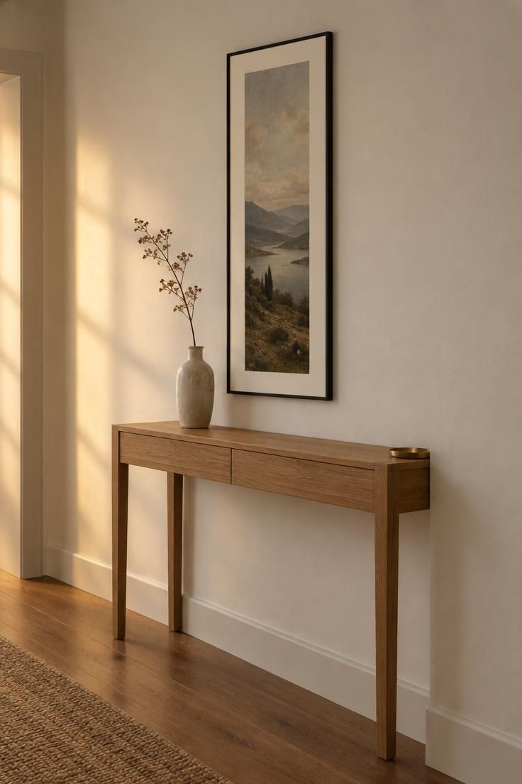
One tall, narrow artwork centered above a shallow console table draws the eye up rather than out.
A vertical shape suits a corridor wall better than a wide landscape, which competes with the walkway.
Warm oak, an off-white mat, and a single tonal print keep the composition restrained.
On the console surface, one vase and one object is the whole styling brief.
Leave visible wall above and below the artwork, since the gap is what makes the composition breathe.
A single central object can feel precious over time, so rotate what sits on the console occasionally.
A freestanding console and a small-hook frame keep the change reversible.
A small lamp or wall sconce above the artwork extends the reading hours into the evening.
Leave the neighboring stretch of wall bare so the console vignette has contrast.
Style Blueprint:
- A slim oak console table in a shallow depth
- One tall narrow framed print with a wide mat
- A single ceramic vase with a dried branch
- Visible bare wall on both sides of the vignette
- A small lamp or sconce above the artwork
Design Pro-Tip: When a single artwork sits above a console table, align the artwork’s center with the console’s center rather than the room’s, since the console is the anchor the eye reads against.
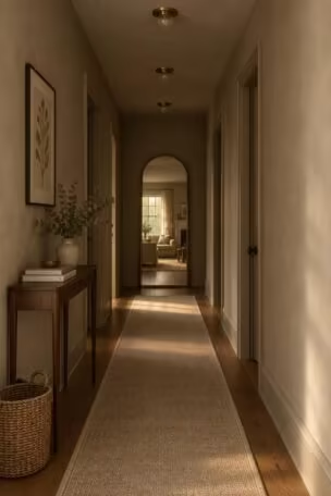
A Woven Jute Runner Paired With a Pair of Tall Dried Grasses
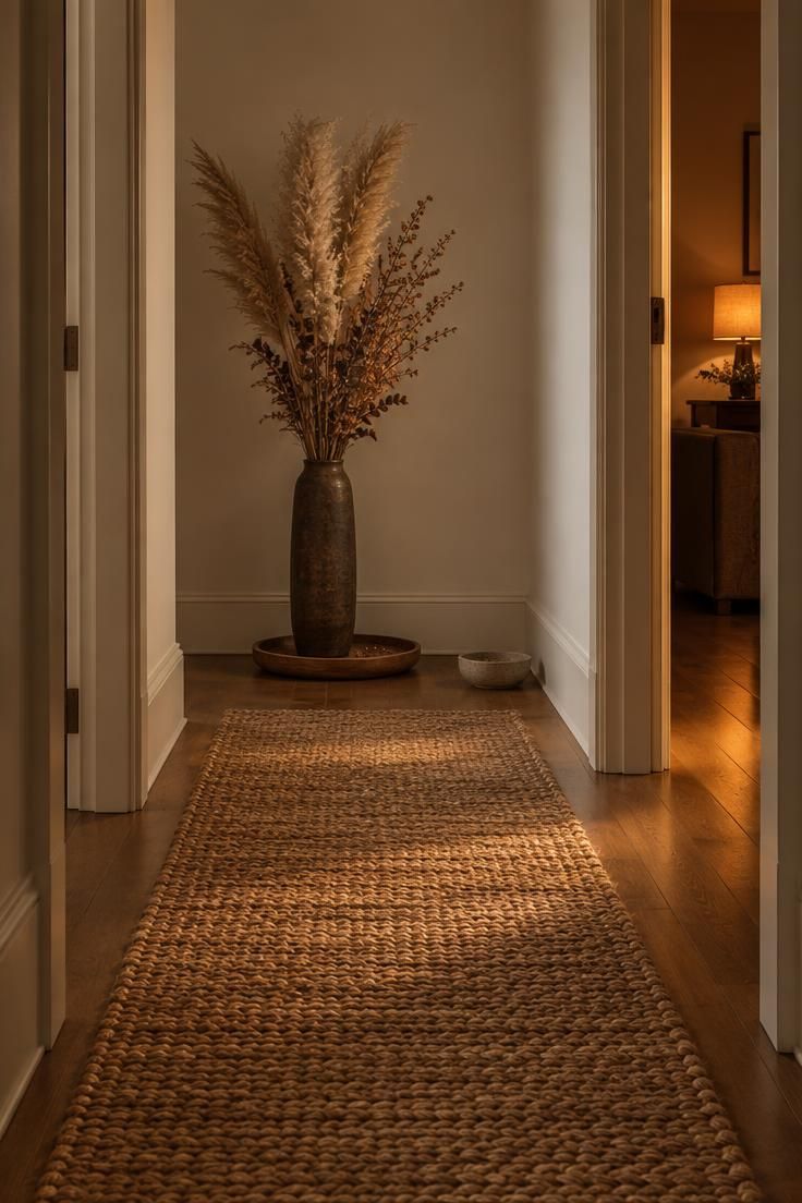
A natural-fiber runner carries the floor line while a single tall arrangement anchors the far end.
Jute or seagrass adds texture without pattern, which suits corridors where the walls already carry visual interest.
A tall, narrow vase with dried branches or grasses reads more sculptural than a wide bouquet in a tight space.
Keep the vase’s height between the console top and the ceiling line so it does not crowd the corridor.
Earthy tan and dried-bronze tones sit calmly against nearly any wall color.
Dried arrangements shed, so keep a small tray under the vase and expect to replace stems seasonally.
Dried grasses are a visual element and do not require the conditions living plants do.
Style Blueprint:
- A plain woven jute or seagrass runner
- One tall narrow floor vase in ceramic or stone
- Dried pampas, branches, or bronze grasses
- A shallow tray beneath the vase for fallen seed
- Bare walls to let the natural texture lead
A Flat-Weave Runner in a Single Bold Color Under a Plain Wall
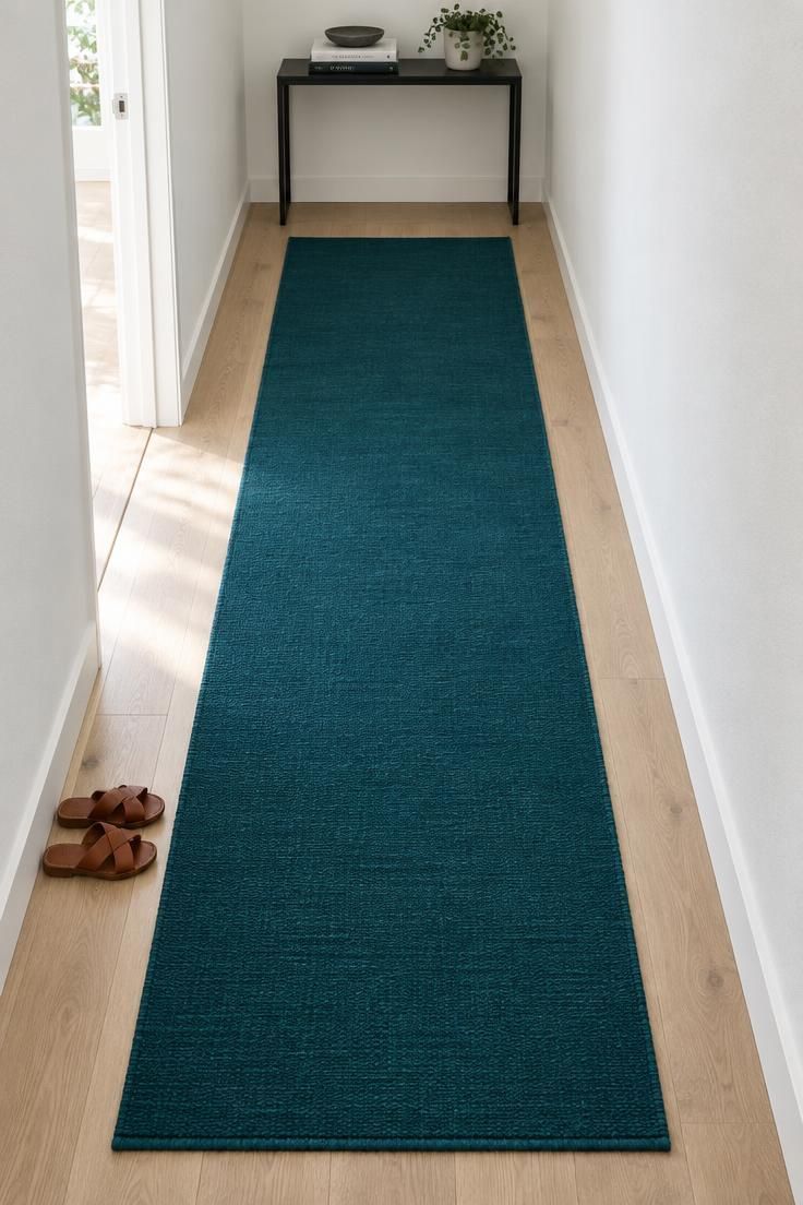
One saturated floor element against deliberately plain walls makes a hallway runner rug the entire statement.
Pick a tone that appears once in the hallway, since repetition elsewhere weakens the effect.
Flat-weave or kilim-style construction offers durability and a low, snag-free profile.
Leave visible floor on both sides, and stop the runner short of door trims.
A solid dark runner shows lint and crumbs more than a patterned one, so a small handheld vacuum kept nearby makes upkeep easy.
Runners require no wall change, which makes this the easiest way to introduce a bold tone in a rental.
A low stack of books on a slim shelf nearby gives the color somewhere to land.
Style Blueprint:
- One solid flat-weave runner in a single saturated color
- Deliberately plain walls in white or off-white
- A non-slip pad beneath the runner
- A handheld vacuum kept within easy reach
- One nearby object in a related tone for continuity
A Wide Leaning Print Layered Behind a Slim Floor Lamp
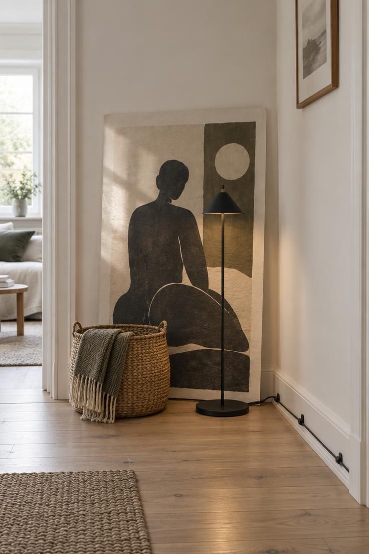
A large print leaning against the wall with a slim floor lamp placed in front of it creates depth without any hanging hardware.
Layer heights deliberately: the lamp’s shade should overlap the print’s lower third, not its center.
A wide, simple print works better in this arrangement than a small framed piece, which would look orphaned behind the lamp.
The floor lamp adds a second light source at standing eye level, which softens the read of a single ceiling fixture.
Route the cord along the wall base and hold it with small clips rather than letting it cross the walkway.
A leaning print can warp over time in humid conditions, so check it periodically and rotate the piece if the paper starts to bow.
Both elements are freestanding, which keeps the whole arrangement reversible.
Style Blueprint:
- One large unframed print or poster with a matte surface
- A slim floor lamp in black or brass
- Small cord clips in the wall color
- A shallow woven basket for texture and storage
- A soft throw folded over the basket’s rim
Conclusion
Narrow, dim, and lined with doors is not a limitation to overcome so much as a set of constraints that narrows the field of good options.
Grouping the ideas by strategy helps: walls carry art and pattern, lighting carries warmth, the floor carries color and texture, and the vertical dimension carries everything the floor cannot.
Whether a change is reversible is the primary gating decision, and it comes before style.
The strongest hallways usually combine two moves, one on the wall and one in the light or along the floor line.
Start with the smallest change that addresses the weakest part of the corridor, whether that is a bare end wall, a harsh ceiling fixture, or a floor that reads unfinished.