This post may contain affiliate links. If you make a purchase through these links, we may earn a commission at no additional cost to you.
A dark hallway is often treated as a single problem waiting for a single coat of paint.
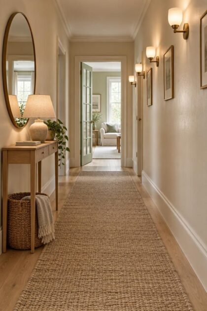
The corridor is really a sequence of light, surface, and movement, and small changes in how those layers work together usually matter more than one large change.
The strongest principle from architectural history is also the most useful starting point: direct attention toward a brighter destination instead of trying to make every inch of the passage uniformly bright.
Why Hallways Resist Brightness, and What Actually Moves the Needle
Brightness in a corridor comes from four things working together: how much light is present, how that light is distributed, how reflective the surfaces are, and how open the space feels.
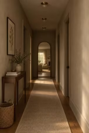
Cornell’s Intypes project documents a concept called “compelling light,” in which a residential corridor directs attention toward a luminous destination such as a bright room, a window, or a stairwell rather than flooding the whole passage evenly.
That idea reframes a slightly darker hallway as a deliberate transition rather than a defect, which matters if the goal is to improve visibility without gutting the architecture.
Hallways are structurally disadvantaged in ways that limit any single fix.
They are often internal, windowless, narrow, and used only in passing, so there is little daylight to stretch and little room for bulky furniture or oversized fixtures.
Changing only one layer usually disappoints.
Painting the walls white without addressing a weak fixture produces a flat result, and adding a mirror without any light worth bouncing simply moves the problem around.
Treat the four layers as a quick inventory before spending anything: light quantity, light distribution, surface reflectivity, and visual openness.
Rate the hallway honestly on each one, then work on the weakest layer first rather than the most visible one.
Design Pro-Tip: Walk the hallway at three times of day with a small notebook and record where the darkest zones actually are. The pattern will tell you whether the problem is distribution, surface, or openness.
Lighting Before Paint: An Effective First Change
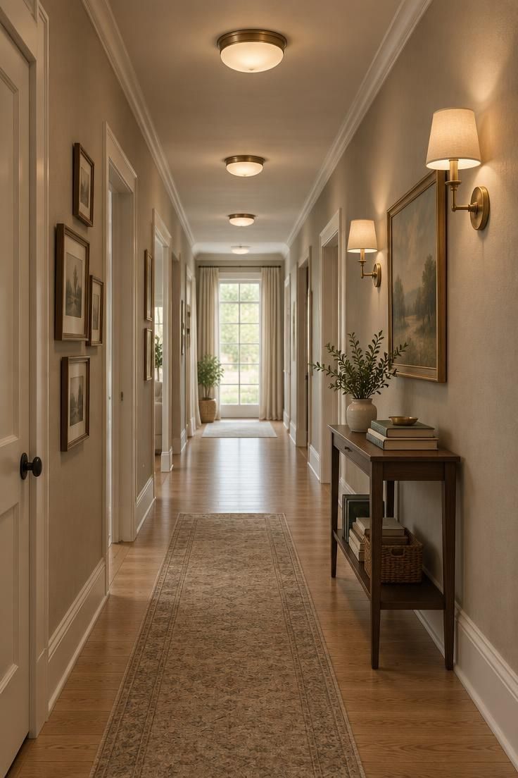
Better lighting usually matters more than a fresh coat of paint, which is why the fixture and bulb decision deserves attention before the wall color decision.
Designers often describe light in layers: ambient light from a ceiling fixture, accent light from sconces or picture lights, decorative light from a pendant or statement piece, and optional glimmer light near the floor.
Several modest, evenly spaced fixtures generally read better in a long hallway than one very bright central light, because a single intense source creates glare and harsh shadows while leaving the ends of the corridor dim.
In a narrow passage, low-profile flush or slim semi-flush ceiling fixtures and shallow sconces keep the corridor feeling open rather than pinched.
Aim light toward walls, artwork, the ceiling, or a bright doorway instead of pooling it in the middle of the floor.
Frosted diffusers and shaded sconces soften the source so it does not glare at eye level.
A color temperature around 2700 to 3000 kelvin is commonly cited as a warm residential range, and a color rendering index of 90 or higher is often preferred for rendering paint, wood, and artwork naturally, though these are design preferences rather than requirements.
Dimmers and motion sensors come up repeatedly as upgrades worth prioritizing over adding more fixtures, and multiple switch points at both ends of the hallway are a practical convenience.
Routing new wiring, adding sconces, or changing fixtures permanently is a job to discuss with a qualified electrician and against local code guidance.
Design Pro-Tip: Before buying any fixture, hold a flashlight at different heights and angles to trace where light actually falls. The beam path tells you more than a showroom ever will.
Warm White Paint Colors That Work With, Not Against, Limited Light
Pure white is not automatically the brightest choice.
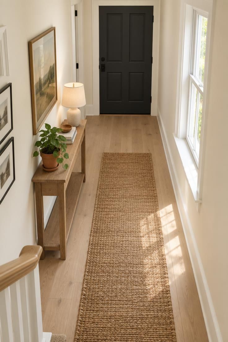
In a hallway with little daylight, a stark blue-white paint can read as gray or flat, especially under a cool bulb.
Warm white hallway paint colors with beige, cream, greige, or blush undertones tend to hold up better in low light.
Warm ivory, soft cream, pale mushroom, light greige, muted sage, and dusty blue-green all appear in current design reporting.
Sheen matters as much as hue.
Eggshell or satin on walls offers modest reflection without highlighting every imperfection, semi-gloss on trim and doors is a common choice, and a matte ceiling reduces glare.
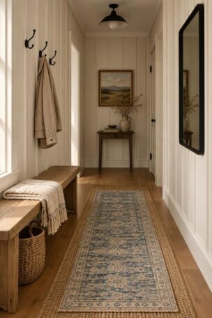
Painting walls, trim, and doors in the same light tone creates a more continuous, spacious effect in a narrow hall.
Dark doors are a valid contrast choice, but they visually segment the corridor into stops.
A slightly lighter ceiling than the walls is a familiar way to make a corridor feel taller.
When choosing an undertone, note the hallway’s fixed elements first: the floor tone, the woodwork, and the colors of the rooms the corridor connects to.
Large Mirror Placement That Actually Reflects Light
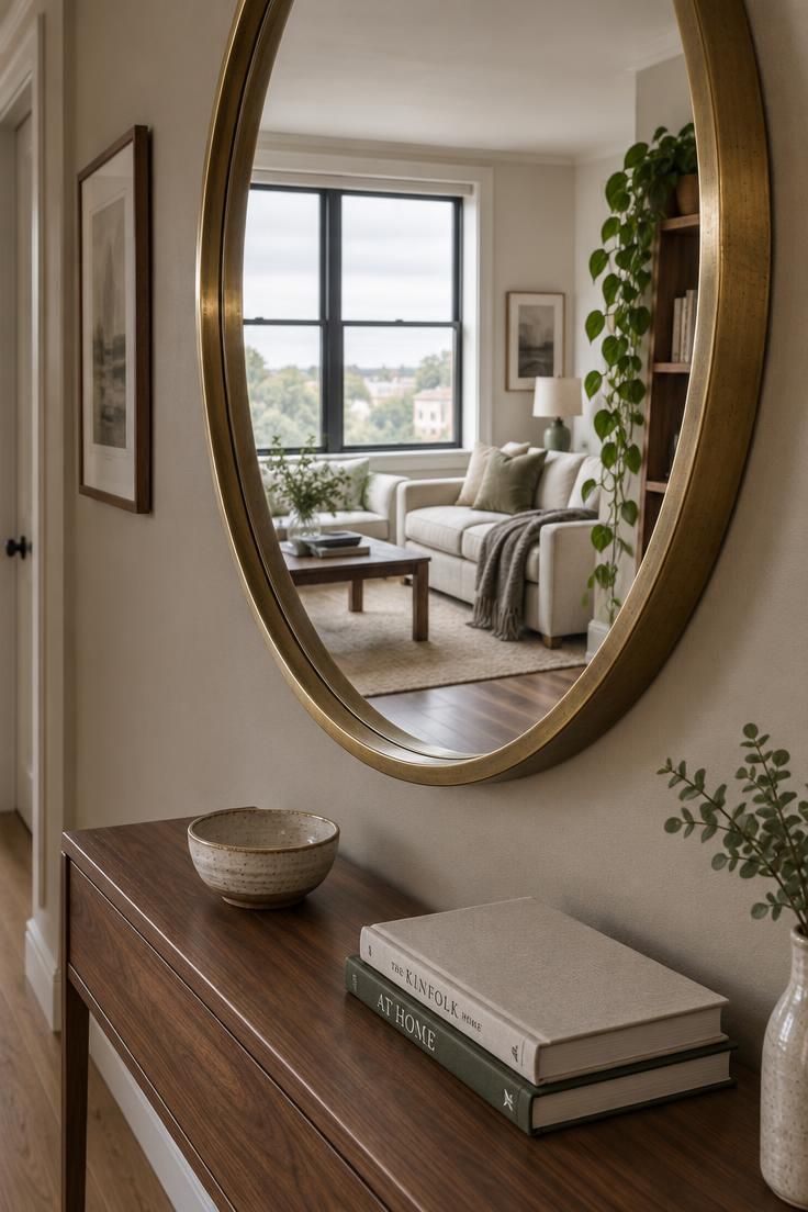
A mirror does not add light.
It redistributes what is already in the room, which is why large mirror placement in a hallway only works when the glass faces something luminous.
Face the mirror toward a window, a glazed door, a bright adjacent room, or the strongest fixture in the corridor.
A mirror that reflects a dark closet, a stack of boxes, or a blank wall can make the hallway feel worse than it did before.
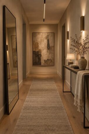
Strong positions include the end of the hallway, the largest uninterrupted wall, the space above a slim console, and the wall opposite the main light source.
Size and proportion do most of the visual work.
One large mirror reads calmer in a narrow space than several small ones, and a frame proportion that echoes the width of a console below keeps the arrangement from feeling top-heavy.
Design Pro-Tip: Before hanging, have someone hold the mirror in place while you walk the full corridor. Decide from the far end, where the reflected light actually reads.
Low-Pile Runners and Floor Choices That Keep the Corridor Open
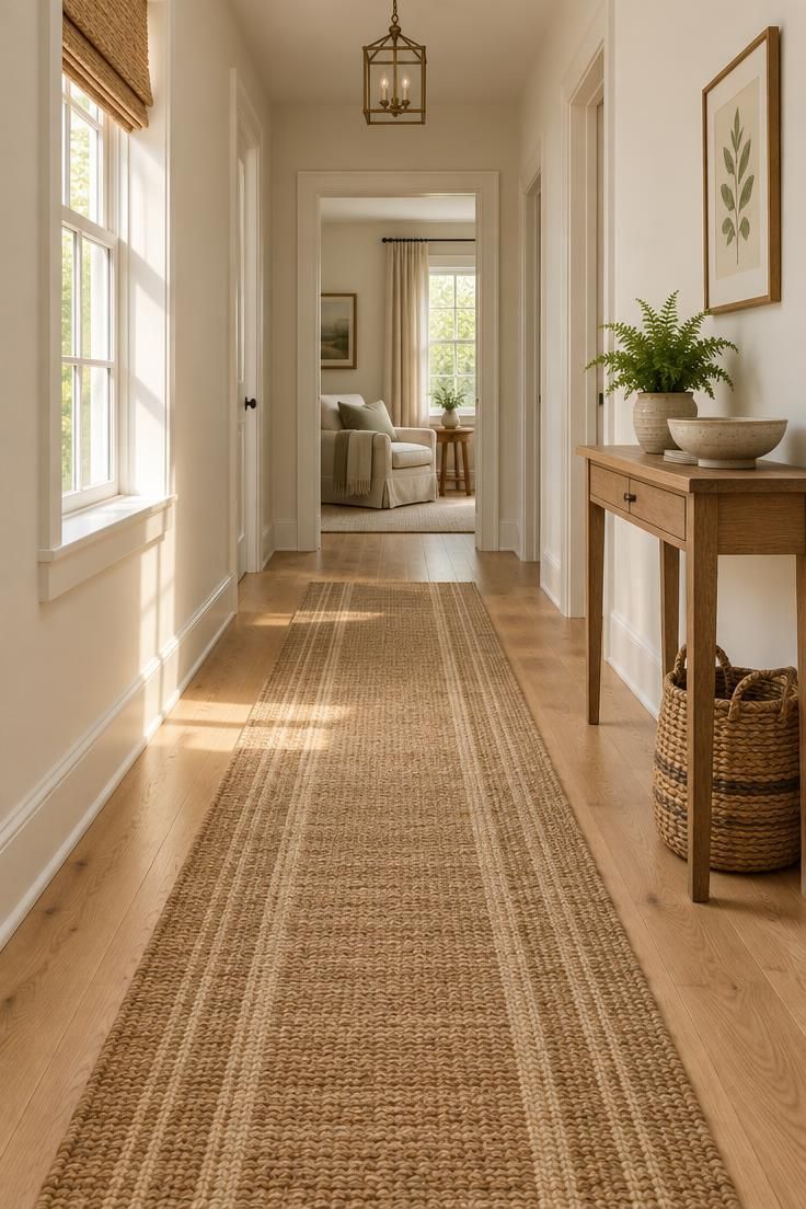
The floor carries more visual weight in a narrow passage than most people expect.
Light or medium-toned flooring reads as more open, while a dark floor with a busy pattern can shrink the corridor before any furniture arrives.
If replacing the floor is not practical, a pale runner is a low-cost substitute that changes the visual weight of the passage immediately.
High-contrast runners and very dark runners tend to visually compress the space.
For low-pile hallway runner ideas, look at subtle stripes, low-contrast patterns, and natural fiber textures such as jute, sisal, or flatweave cotton.
Leave a border of floor visible along both sides so the corridor still reads as a walkway rather than a carpeted channel.
Low pile is a practical choice for high traffic, though the tradeoff is less cushioning underfoot than a plush wool runner would provide at the same price.
Maintenance keeps the effect intact.
Vacuum regularly, rotate the runner occasionally to even out wear, and plan for an occasional deep clean, since pale textiles show soil more readily than dark ones.
Anyone asking how to brighten a dark hallway usually discovers the floor at the end of the process, and by then the palette is already set.
Choose the runner color after the wall color so the two support each other instead of competing.
Reducing Visual Weight: What to Remove, What to Keep
Brightness is as much about subtraction as addition.
A corridor can gain real light and still feel dim because the eye is working too hard to sort through objects.
Bulky furniture, dense gallery walls, heavy curtains, dark doors, and layered patterned rugs each block or absorb light in slightly different ways.
A dark chest of drawers eats a wall, a crowded gallery wall turns into visual noise, and heavy curtains cut off daylight that would otherwise arrive from an adjacent room.
Targeted edits do more than a full clear-out.
One oversized artwork or a small coordinated series reads calmer than a dozen small frames, and a single slim console holds more presence than three mismatched tables.
If an adjacent room has daylight, translucent window treatments let that light through instead of stopping it at the doorway.
Swap a dark, opaque curtain for a sheer or a light linen panel and the whole corridor changes character.
Reducing clutter also lets layered hallway lighting read as separate planes, so ambient, accent, and decorative sources do not compete with objects for attention.
The eye can follow the light instead of sorting the walls.
Design Pro-Tip: Study the hallway with fresh eyes, then mentally remove one item at a time to test whether the corridor feels lighter without it. The first object you hesitate to lose is usually the one doing the most damage.
Why This Matters Now: The Shift Away From Stark White Passages
Recent design reporting from Ideal Home and Livingetc points toward layered lighting, warm neutrals, natural materials, and one large mirror rather than many small ones.
The ASID 2026 Trends Outlook and NAHB’s Best in American Living Awards commentary describe similar directions from an industry angle, without carrying research authority on their own.
The shift moves hallways away from the sterile all-white pass-through that dominated for years.
A corridor that once looked like a service tunnel can now hold warmth and character without sacrificing legibility.
The timing is convenient for anyone planning period home hallway lighting ideas, because paint palettes, fixture styles, and natural-fiber runners are all currently available in forms that suit older architecture rather than fighting it.
Period Home Hallway Lighting Ideas That Preserve Character
Older homes do not need to be erased in the name of brightness.
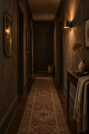
Victorian, Edwardian, Colonial Revival, and Arts and Crafts hallways come with architectural character that is usually worth keeping.
Before electricity, hallways relied on candles, oil lamps, and gaslight, which were relatively weak sources.
Historic interiors used mirrors, glass-paneled doors, transoms, and light-colored plaster and painted woodwork to stretch whatever light was available, and the Bellamy Mansion museum blog documents the use of mirror-backed fixtures and reflective surfaces for exactly that reason.
Period-appropriate sconces, lantern-style ceiling fixtures, opal or frosted glass shades, and large framed mirrors all fit that history while accepting modern warm LED bulbs.
A traditional lantern paired with a warm bulb at around 2700 kelvin keeps the fixture’s character intact, while a cool blue-white bulb will read as modern and out of place against original materials.
Keeping woodwork tones historically appropriate supports the same goal.
When selecting low-pile hallway runner ideas for a period home, natural fibers in muted tones sit more comfortably than high-contrast geometric patterns.
A subtle stripe or a plain flatweave echoes how these corridors were originally dressed.
Glass-paneled doors and transoms, where they are already characteristic of the house, remain one of the most historically honest ways to borrow daylight from adjacent rooms.
Common Mistakes That Cancel the Gains, and a Decision Checklist
Relying on paint alone is the most frequent disappointment.
A white hallway under one dim, cool bulb still reads as dark, so pair any repainting with a lighting change.
One extremely bright central light creates glare and harsh shadows.
Several moderated sources at different heights usually feel better than a single intense one.
Mirrors facing clutter or blank walls do nothing useful.
Move the mirror until it faces a window, a glazed door, or the brightest room nearby.
Cool blue-white bulbs fight a warm or traditional interior.
Choose a warm bulb, especially in a period home or beside natural wood.
High-gloss paint on every surface exposes every imperfection, and blocking daylight from adjacent rooms with heavy curtains or tall furniture undoes the gain.
Visual clutter from a dark ceiling, a busy floor, heavy frames, and dark doors at the same time cancels much of the brightness any single change provides.
A simple order of work keeps the effort efficient.
Improve the lighting layers first, then choose wall color and sheen, then place a mirror facing something luminous, then reduce visual weight, and finally add one point of personality such as a painted end wall, a single artwork, or a decorative sconce.
Treat those steps as design guidance rather than rules.
Personal taste, period architecture, and the rooms the hallway connects to all deserve a vote.
Conclusion
A dark hallway does not need to become a bright white tunnel.
Start with layered lighting and a warm, light-reflective wall color, then place one large mirror where it can bounce existing light, choose a low-contrast runner, and remove visual weight before adding any personality.
For older homes, let period fixtures and materials set the direction rather than working against them.
Walk the corridor at different times of day, change one thing at a time, and treat the passage as a sequence toward a luminous destination rather than a room to be flooded.
The first thing to try is the cheapest: replace the bulbs with a warm, high-CRI option and clear the floor.
From there, work outward through lighting, paint, mirror, and runner, in that order.