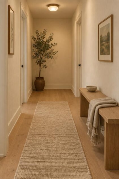
This post may contain affiliate links. If you make a booking or purchase through these links, we may earn a commission at no additional cost to you.
A hallway asks a lot of a small footprint: it absorbs coats, shoes, keys, and mail while staying the first and last thing anyone sees at home.
Warm minimalism answers that demand with restraint rather than emptiness, leaning on matte finishes, woven texture, and storage that reads as part of the architecture.
The ideas below treat each visual move as the starting point, then explain the material, proportion, or tradeoff behind it.
Chalk-Tone Continuity Across Walls, Trim, and Ceiling
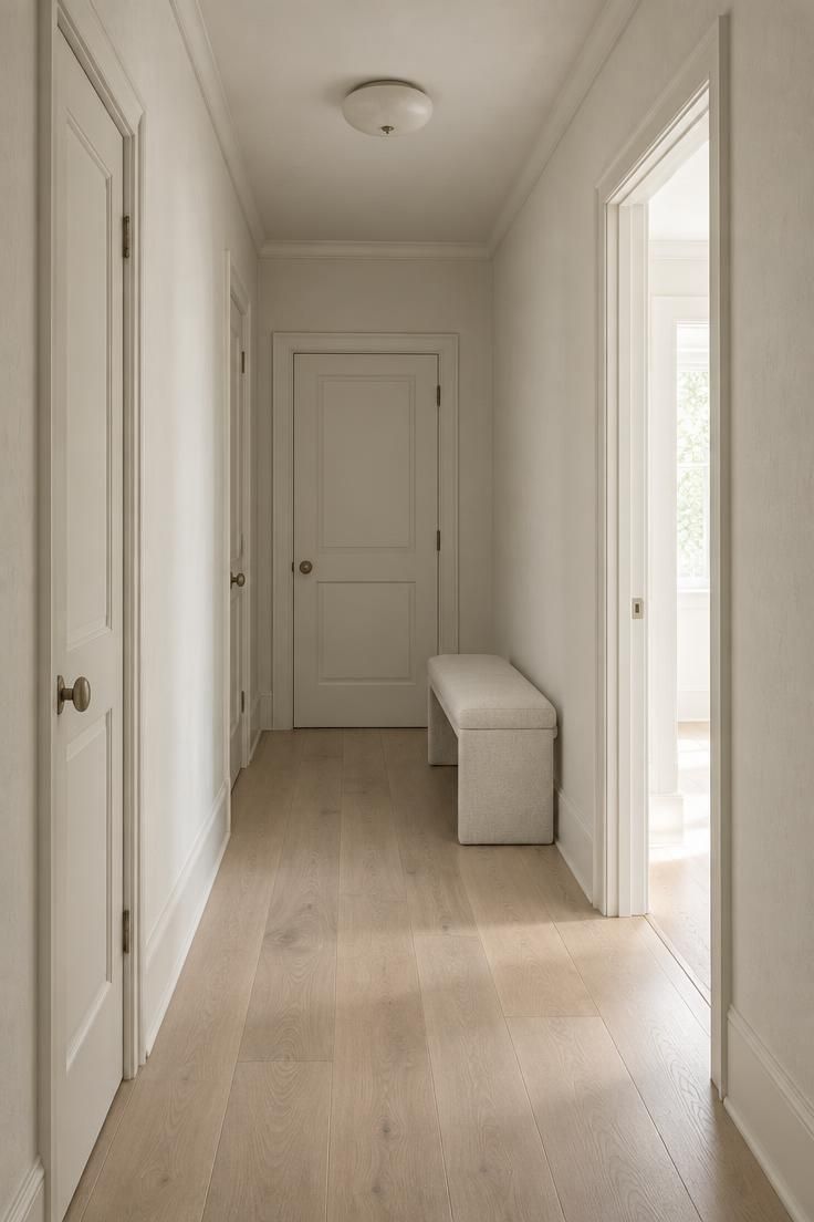
Painting walls, trim, doors, and ceiling in one chalky off-white or warm greige turns a corridor into a single quiet plane, with the floor left as the only strong contrast.
The minimalist hallway effect depends on removing the lines that normally divide those surfaces, so casings and crown dissolve into the wall rather than outlining it.
Finish sheen deserves real thought here.
Dead-flat paint gives the softest surface, but hands, bags, and shoulders brush a corridor wall constantly, so a slightly harder-wearing finish on the lower portion can partner with flatter paint above without breaking the color match.
Watch the floor tone at the threshold.
A change in material or color there interrupts the quiet plane, while carrying the same floor through from the entry into the hall extends the surface and makes a short run feel longer.
A slim bench in the same chalk tone near the end of the hall adds a resting point without introducing a second color story.
Because everything sits in the sightline, a single ceiling fixture repeated down the corridor works better than a mix of pendant, flush mount, and recessed styles competing overhead.
Matching paint across trim, doors, and ceiling usually costs more than painting walls alone, so decide whether full continuity is worth the extra labor before starting.
Style Blueprint:
- Walls, trim, doors, and ceiling in one warm off-white, semigloss on lower walls and flat above
- Pale wide-plank matte oak floor running through the threshold without a material change
- One slim bench in the matching chalk tone near the far end
- A single ceiling-mounted fixture style repeated at even intervals down the hall
Design Pro-Tip: Repeat one ceiling fixture type at even intervals down the hall instead of mixing shapes, which keeps the ceiling plane quiet and gives a narrow corridor a steady rhythm.
Color-Drenched Corridor in a Muted Umber
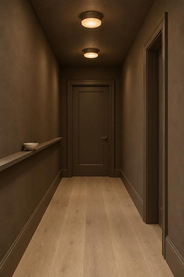
Carrying a deep muted umber, brown, or clay tone across every vertical surface, including the ceiling and door frames, gives a corridor the feeling of a single enclosing volume.
The color reads as soft rather than heavy when warm-toned downlights or wall washers graze the matte surface at intervals, so the finish keeps some depth instead of flattening into one dark mass.
A windowless corridor asks more of artificial light in this scheme, and pairing the walls with a slightly paler wood floor keeps the palette from multiplying into too many browns.
Choose one hardware finish, matte black or aged brass, and repeat it on every handle and hinge so the eye has a single metal note to follow.
A slim wall ledge in the same umber replaces a console without introducing a new tone, holding keys or a single small vase.
For a short hall, this approach suits a corridor with some light source nearby, while a genuinely dark passage can read as a tunnel if the color is not supported by layered lighting.
Style Blueprint:
- Paint walls, ceiling, and door frames in one matte umber or clay tone
- Add a pale oak floor as the only broad contrast
- Use two or three matching warm flush-mount lights in a straight line
- Keep all hardware in one finish, matte black or aged brass
- Include only a slim wall ledge in the same umber tone
Continuous Oak Floor Running Through Several Rooms
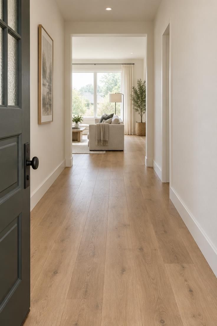
Flooring carried from the front entry through the corridor and into the adjacent room, with no threshold strip or material change, makes a short run read as part of a larger continuous space.
The eye follows the plank lines from door to door, and the corridor stops feeling like a separate, chopped-off zone.
Plank direction matters for that effect, and running boards the length of the passage rather than across it reinforces the sense of depth.
Pale oak shows tracked-in debris and scuffs more readily than a mid-tone, while a mid-tone can darken a windowless passage and make it feel tighter.
Weigh visibility against light level before committing to a tone.
Oiled oak finishes are typically re-oiled periodically rather than sanded back, which suits a hallway's traffic level but means committing to a maintenance routine over the years.
Where the floor meets a doorway, an uninterrupted plane reads calmer than a saddle strip, though a threshold may still be needed at some transitions, and that decision belongs with whoever handles the installation.
Style Blueprint:
- Wide-plank matte oak in a single tone running the full length of the passage
- No threshold strips or material changes at doorways
- Planks oriented along the walking direction to extend the sightline
- Plain off-white walls so the floor remains the dominant horizontal plane
- No rugs or furniture interrupting the continuous surface
Wall-Toned Built-In Storage That Reads as Architecture
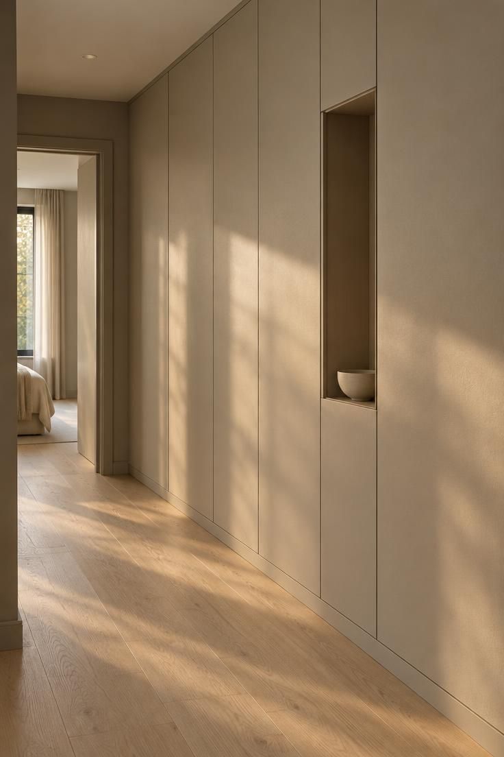
Full-height or half-height cabinets painted the exact wall color, with handleless fronts or recessed finger pulls, let storage disappear into the plane of the wall rather than sit in the path as furniture.
In a narrow hallway design, this matters more than it would in a bedroom or study, because every freestanding piece steals walking width.
Shallow depth and ceiling-height fronts keep the corridor usable while still absorbing coats, shoes, and household overflow, and a veneered or painted MDF finish holds up reasonably in a high-touch zone.
Closed storage stays visually quiet but demands a place to hang a wet coat and drop keys, since nothing is on display to air out.
A single recessed niche at standing height can handle one small drop-zone object like a ceramic bowl or tray, giving the composition a deliberate focal point without adding a table.
Push-latch and finger-pull fronts avoid the visual noise of large hardware, though they can be slower to open when hands are full, which is a small daily tradeoff worth considering.
Style Blueprint:
- Paint cabinet fronts, doors, and surrounding walls in one warm greige or off-white so the built-in reads as part of the architecture.
- Choose handleless fronts or recessed finger pulls to keep the vertical plane quiet.
- Keep cabinet depth shallow enough to avoid narrowing the walking path.
- Add one recessed niche at standing height for a single bowl or tray rather than a console.
- Use a painted MDF or veneered finish for a practical wipeable surface in a busy corridor.
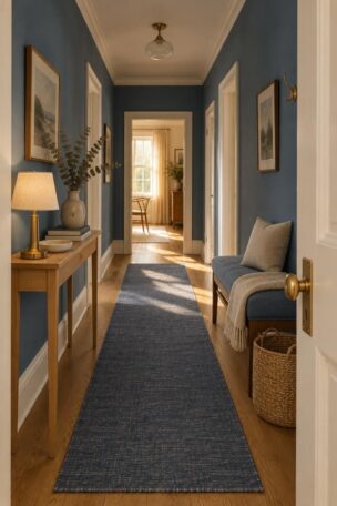
Single Bench as the Only Free-Standing Piece
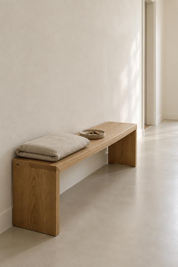
One low bench in oak or upholstered in a single woven textile, set against a blank wall with no hooks, baskets, or rugs competing nearby, gives a corridor a single deliberate object.
The composition rests on that silence around the bench, so anything added nearby undercuts the move.
Depth is the main decision.
A bench that is too deep eats walking width, while a shallow one still works for tying shoes or setting down a bag but will not feel comfortable for long sitting.
A flat-weave cushion in undyed wool or linen adds softness, while a flat-weave hallway runner can stretch the floor space without competing for attention, and a small tray on top handles keys or a pair of sunglasses as the only accessories.
For a hallway that will not fit a standard bench, a slim console in the same tone offers a similar single-object effect without the seat.
One advantage of a freestanding bench over built-in seating is that it lifts away from the wall for cleaning, which matters on a surface that collects dust from shoes and coats.
Style Blueprint:
- Choose a bench depth that leaves at least one clear step of walking width beside it
- Keep the bench top to one folded cushion or one small tray, never both
- Match the wood tone to the floor or pick an undyed upholstered textile for a softer silhouette
- Leave the wall above and the floor around the bench empty so the piece reads as the only object
Evenly Spaced Wall Sconces Along One Side
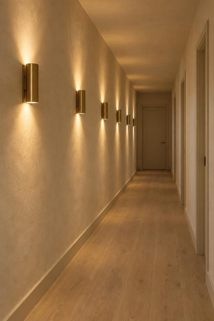
A row of identical small wall sconces mounted at consistent height and spacing down one wall, with nothing but a plain ceiling otherwise, gives a long corridor a steady visual rhythm.
Hallway wall sconces wash the wall surface they sit on, revealing plaster texture and paint depth in a way an overhead fixture alone often misses.
Repetition is the mechanism here.
One sconce style in a single finish, brushed brass or matte black, reads as a system, while mixed fixture shapes and metals read as accumulation.
A long, dark passage may still need ceiling light in addition to the sconce row, since wall washers light one plane and leave the floor and ceiling quieter by comparison.
Spacing that matches the door rhythm, so that each sconce relates to a doorway or wall segment, tends to look intentional rather than evenly plopped.
For a short hall, one or two sconces is usually enough, and a full repeated row can feel like too much hardware for the length.
Style Blueprint:
- One sconce shape repeated at the same height on a single wall
- A consistent finish, brushed brass or matte black, throughout the row
- No additional wall decor or competing fixtures
- Spacing that follows door openings or wall segments rather than arbitrary math
- A pale wall tone so the light pattern reads clearly
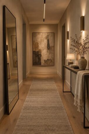
One Oversized Mirror Facing a Single Artwork
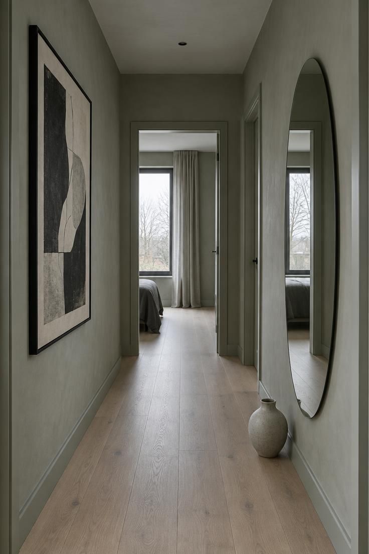
A large slim-framed or frameless mirror on one wall segment with a single framed artwork opposite, everything else left empty, sets up a scale contrast that carries the whole composition.
The mirror reads as a big quiet rectangle reflecting light or a view, while the artwork becomes the only color event in the corridor.
Placement height changes the relationship.
Hanging the artwork at door-frame height makes it compete with the doorways, while setting it lower or making it larger gives it a stronger link to the mirror across the hall.
Frameless mirrors and thin metal frames in one finish keep the palette from multiplying, and a single large mirror is easier to clean streak-free than several small ones, though its size shows marks more readily if cleaned poorly.
If the mirror faces a blank wall, it simply reflects that blankness, so point it toward a light source, a doorway, or a room beyond.
Style Blueprint:
- One tall round frameless mirror centered on one wall, no frame or a very thin metal edge in one finish
- One large abstract print in a thin black frame on the opposite wall, hung lower than door-frame height
- Plain plaster walls in a soft grey-green with no other artwork, hooks, shelves, or furniture
- A pale oak floor and one small ceramic vase beside the mirror as the only floor-level object
- Cool overcast daylight from an adjacent room falling across the mirror, not a blank wall
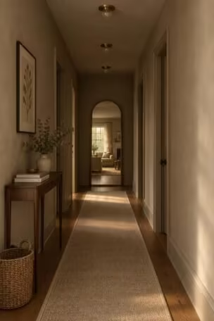
Single Flat-Weave Runner Defining the Walking Path
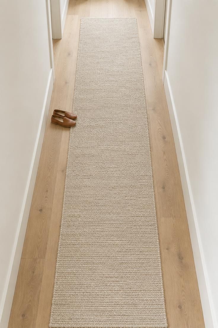
One long flat-weave wool or jute runner in an undyed or muted tone over a pale bare floor defines the walking path and softens the surface underfoot.
A narrow hallway usually reads more calmly with a single long runner than with several small rugs scattered along the length.
Width is the decision to make carefully.
A runner that leaves a margin of floor visible on each side frames the path, while a full-width rug can make a passage feel wider but shows more wear at doorways where feet cross repeatedly.
A continuous hallway flooring plane looks cleaner when the runner is long enough to run nearly the full corridor rather than stopping awkwardly short.
Flat-weave rugs lift and spot-clean more easily than deep pile, though on hard flooring they can shift without a pad underneath, which is worth selecting for at the start.
Reversible runners can be rotated periodically to even out wear along the most-traveled stretch.
Style Blueprint:
- One undyed or muted flat-weave runner nearly the full hall length
- A margin of bare floor left visible on both sides
- No additional rugs, mats, or floor decor at doors
- A low-profile rug pad chosen to keep the runner from shifting
- Pale oak or similarly light continuous flooring underneath
Recessed Wall Niche Replacing a Console Table
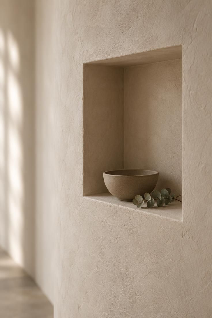
A wall opening or shelf recess at standing height, holding one small bowl or tray for keys and mail, replaces the console entirely and keeps the walking path clear.
The visual effect is subtraction: the niche reads as part of the wall rather than as furniture, which matters most in a corridor with limited width.
Proportion and placement do the heavy lifting.
A niche set slightly below the light switch and aligned with door hardware looks intentional, while one placed too low or too high can feel like an afterthought.
Capacity is deliberately limited to one or two objects, and that limit is the point of the design move rather than a shortfall.
For a hallway without wall depth for a recess, a shallow floating shelf in the same wall color gives a similar impression of an object sitting in the plane rather than on furniture.
Style Blueprint:
- One rectangular recess at standing height, finished in the same plaster tone as the surrounding wall
- A single matte ceramic bowl or small tray as the only object, leaving the niche mostly empty
- Niche base aligned just below the light switch and leveled with nearby door hardware
- No console, hooks, baskets, or free-standing pieces competing for the same wall segment
Textured Plaster or Limewash Wall With No Art
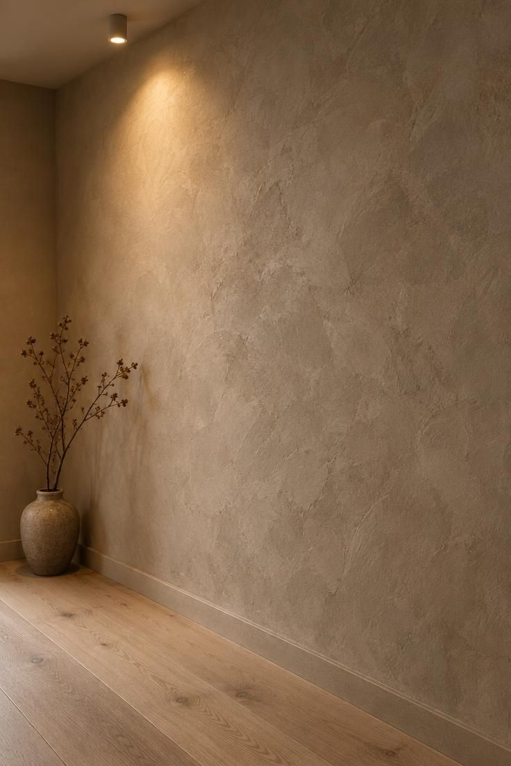
A textured finish such as limewash, clay paint, or matte plaster applied in one tone across all walls lets the surface carry the wall instead of artwork or shelving.
Grazing light from a sconce or doorway reveals the subtle movement in the material, and a single finish repeated throughout reads more calmly in a narrow hall than an accent wall would.
Limewash and mineral finishes can usually be touched up with the same product rather than sanded and repainted, which suits a corridor where small marks appear over time.
The tradeoff is abrasion.
Matte and mineral surfaces can show scuffs at shoulder height where bags and coats brush, and they may be harder to wipe clean than satin or eggshell.
Keeping every other element plain, including trim and ceiling, lets the wall finish stay the single visual event.
Style Blueprint:
- Warm greige limewash or clay paint on all walls, no art or shelves
- One small ceiling fixture or sconce placed to rake light across the main wall
- Pale wide-plank oak floor as the only contrasting surface
- Trim and ceiling kept matte and close to the wall tone
- No free-standing furniture beyond perhaps one small floor object
Minimal Coat Zone With Identical Hooks and a Single Shelf
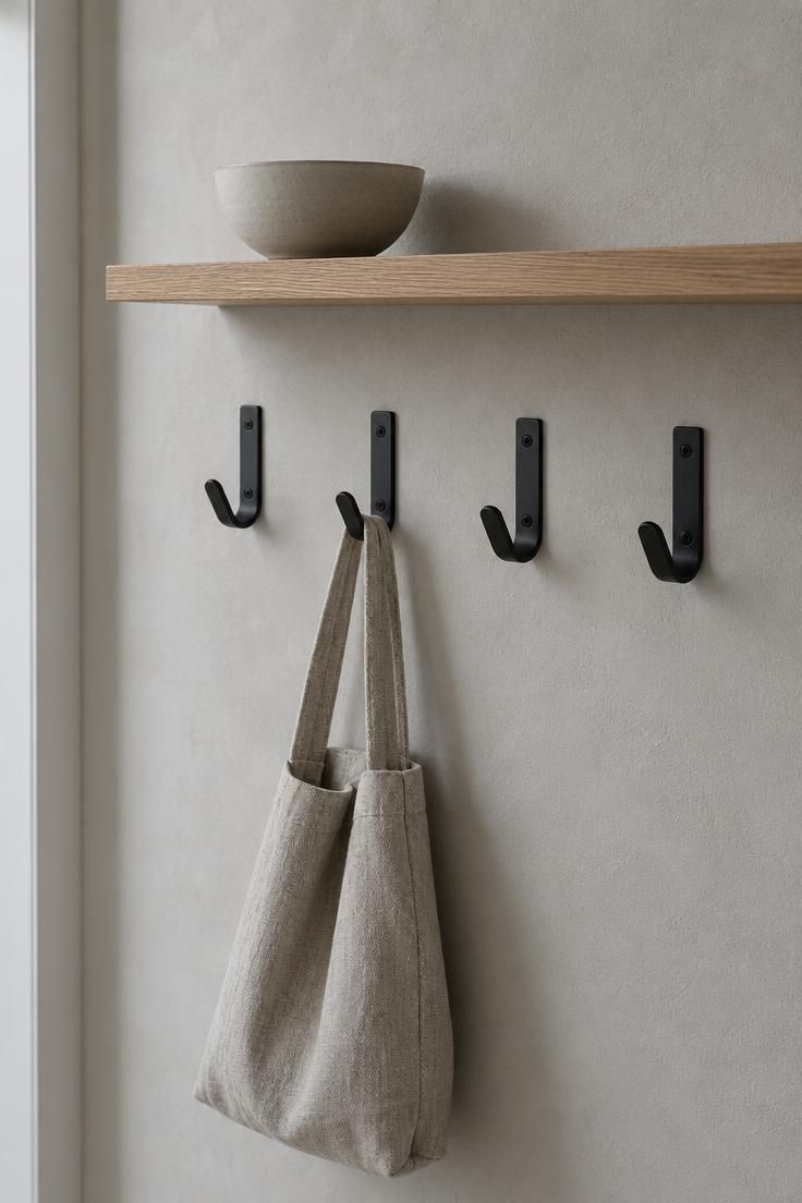
A small group of identical hooks in one finish with a slim shelf above handles the entire drop zone in a narrow area, with no rack, basket, or bench.
Hardware becomes the composition: three or four identical hooks in matte black or brushed steel, evenly spaced, can read as deliberate rather than as clutter.
Hooks are quicker to use than closed storage, but they display whatever is hung, so the visual quiet depends on limiting each person to a single coat or bag.
Compare this with a hallway storage bench, which offers a comfortable seat but takes up more of the walking width than a wall of hooks and a shelf ever would.
A slim oak shelf above the hooks holds one object, a small ceramic bowl or a single framed photo, so the top line stays clean.
Style Blueprint:
- Four identical matte black steel hooks spaced evenly at coat height
- One slim oak shelf mounted above, holding a single matte ceramic bowl
- Pale plaster walls left otherwise empty so the hardware reads as the only event
- No rug, basket, or free-standing piece below the hooks
- One muted coat or bag allowed per hook to keep the composition legible
Tall Narrow Plant as a Focal Point at the Corridor End
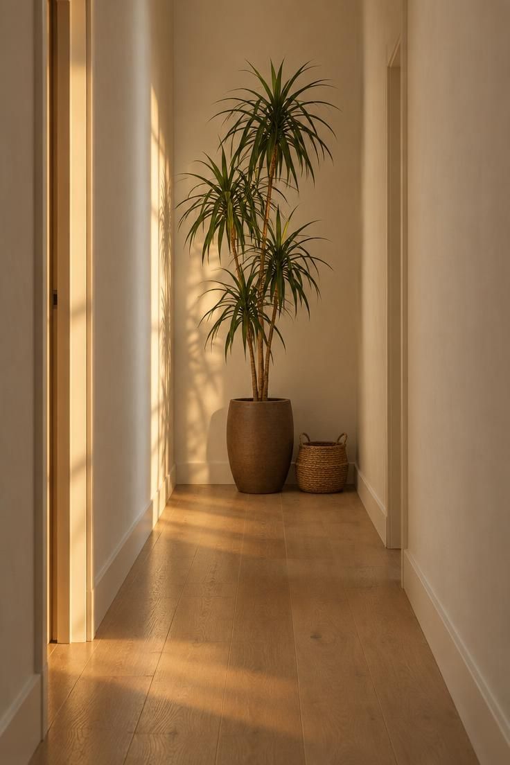
A single tall, narrow plant in a simple matte ceramic pot placed at the corridor's end gives the eye a vertical resting point instead of a blank wall or a table.
The plant draws attention down the length of the hall and gives a small pass-through space a living, non-furniture anchor.
Low planters tend to disappear into the floor line, while a tall, slender shape rises into the visual field where it can hold the end of the axis.
A plant in a dark corridor needs a variety that can cope with limited light, and a pot in the middle of a walking path is more likely to be knocked over than one tucked at the far end.
Pot color also matters: a matte brown or charcoal ceramic gives weight without competing, while a bright glaze becomes its own event.
Style Blueprint:
- One tall, narrow plant in a matte ceramic pot at the exact end of the hallway axis
- Off-white walls and pale continuous flooring left otherwise empty
- Pot in matte brown, charcoal, or another quiet earth tone rather than high-gloss glaze
- No second plant, table, basket, or wall decor competing for the same focal point
Trim and Door Alignment in One Consistent Finish
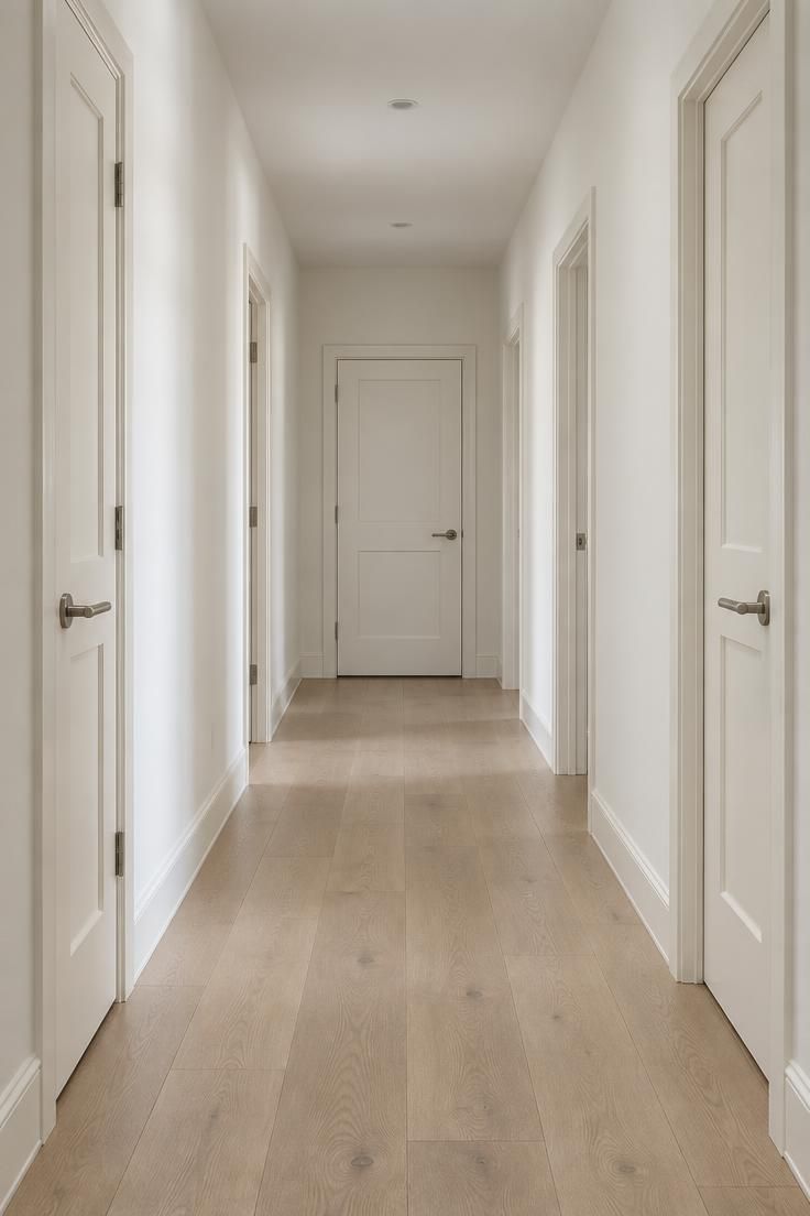
Bringing every door frame, baseboard, and piece of door hardware into one consistent height and finish on plain walls uses no added furniture, art, or wall treatment.
Instead, the architecture itself becomes the design.
Mismatched trim heights and mixed metal door handles are a common source of visual noise in older homes, and aligning them removes a layer of busyness that is easy to overlook until it is gone.
Repeating a single metal finish across handles and hinges keeps the eye moving smoothly down the corridor, while mixed brasses, nickels, and blacks give the passage a scattered quality.
This approach only suits a hall whose walls and floors are already acceptable, since it draws attention to the trim rather than hiding it.
Repainting every piece of trim to match usually costs more than touching up one section, so the decision asks for commitment across the whole run.
Style Blueprint:
- All door frames and baseboards in one off-white semigloss finish
- One brushed nickel finish repeated on every handle and hinge
- Plain warm white walls with no art, hooks, or furniture
- Pale oak floor running without interruption
Design Pro-Tip: Before adding any new piece to a corridor, stand at one end and check whether the eye lands on a single clear focal point, whether that is a plant, a niche, or a mirror.
Conclusion
A warm minimalist hallway usually works through subtraction: one continuous floor plane, a restricted palette, and storage that disappears into the walls rather than sitting in the path.
Small decisions about finish sheen, runner width, fixture repetition, and bench depth matter more in a narrow corridor than they would in a larger room, because every element lives inside the sightline from one door to the next.
Start with a single visual mechanism from the ideas above, whether that is the continuous floor, the repeated light, or the wall-toned built-in, then hold every other choice back so nothing competes with it.