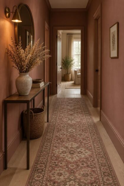
This post may contain affiliate links. If you make a purchase through these links, we may earn a commission at no additional cost to you.
Pink in a corridor behaves differently than pink in a bedroom or living room.
Hallways are transitional, often narrow, and frequently short on daylight, so the shade and the way it is applied matter as much as the color itself.
Some pinks read almost as neutrals, others arrive as a full commitment.
The ideas below range from barely-there blush to deep rose, covering walls, trim, paneling, wallpaper, floors, and joinery.
Each one pairs a specific pink family with the materials it depends on and one practical detail worth knowing before committing.
Full-Height Blush Pink Walls With Warm White Trim
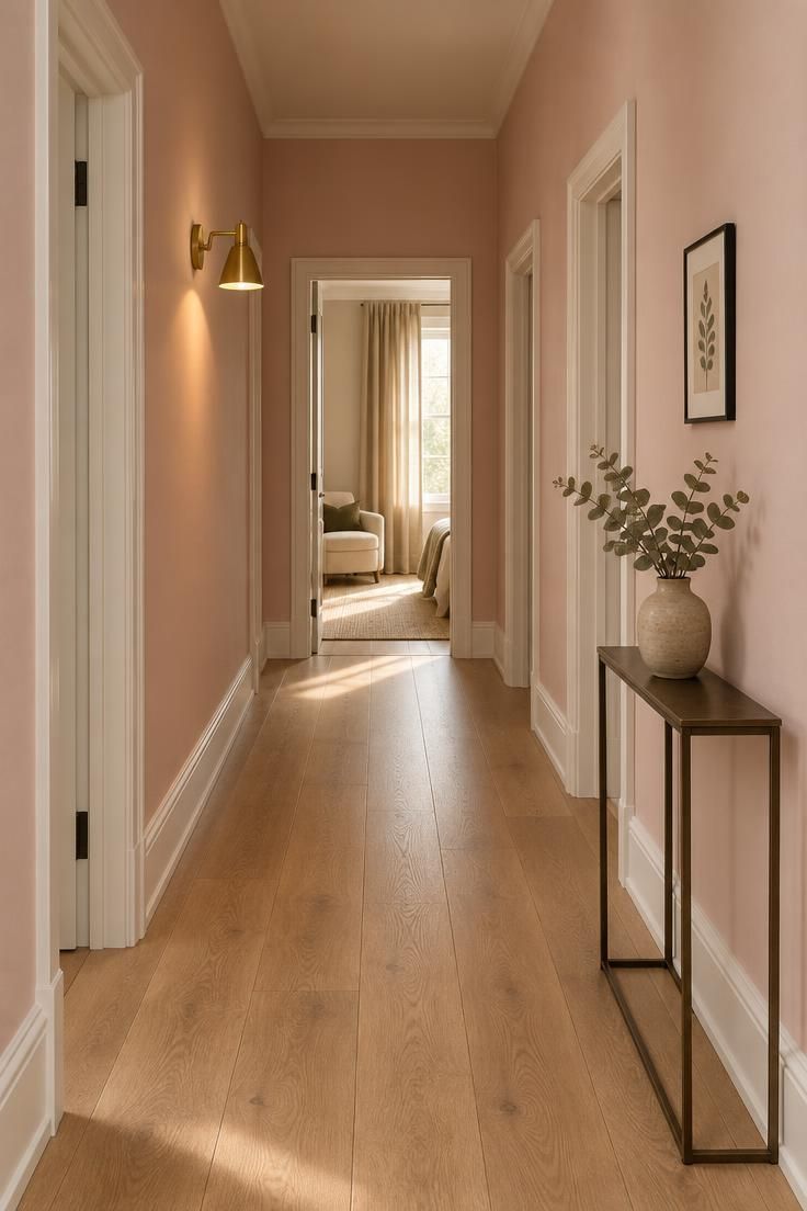
Blush pink applied floor-to-ceiling works as a near-neutral when the undertone stays warm.
The visual success of this treatment depends on how the color reads under the hallway's actual light, which shifts between morning and evening.
A pale oak floor keeps the scheme light and lets the pink stay soft rather than candy-like.
Warm white trim provides a crisp edge that defines the architecture without competing with the wall color.
One brass sconce adds a warm metallic accent that flatters the pink and gives the corridor a focal point at night.
This is the lowest-commitment full-color approach for a pink hallway and suits corridors with at least some natural light.
In a busy corridor, blush shows scuffs and hand marks readily, so a slightly higher-sheen finish that wipes down more easily than flat matt is worth considering.
Style Blueprint:
- Blush walls in a chalky matt or eggshell finish
- Warm white trim on skirting, casings, and doors
- Pale oak or whitewashed floorboards
- One brass wall sconce or picture light
- A single framed print or small mirror
Dusty Rose Walls With Dark Wood Trim and a Vintage Runner
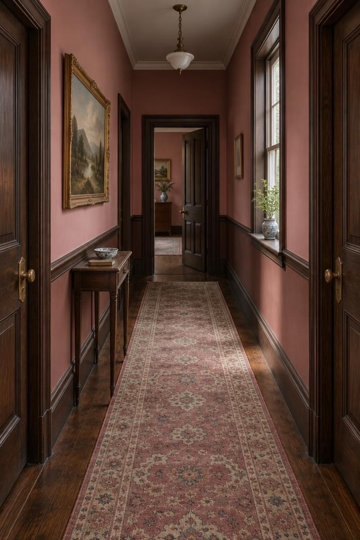
Dusty rose carries a grayed, muted quality that sits naturally beside dark-stained woodwork common in period homes.
A dusty rose hallway color pairs well with the depth of original timber, letting each surface inform the other without fighting for attention.
The chair rail creates a horizontal division that gives the eye a rest in a long corridor.
A patterned runner in rose and cream tones ties the walls to the floor and adds softness underfoot.
Aged brass hardware warms the dark wood and echoes the runner's faded palette.
This combination suits hallways in older properties where original trim and doors are worth highlighting rather than painting over.
Dusty rose can tip toward lilac in north-facing or dim hallways, so testing a large sample on more than one wall before committing is a sensible step.
The dark trim shows dust more readily than white, and the runner needs regular cleaning in a high-traffic corridor.
Style Blueprint:
- Dusty rose walls in eggshell
- Dark stained or near-black woodwork on doors and skirting
- Antique-style patterned runner with rose and cream tones
- Aged brass door hardware
- One small oil-style landscape or portrait in a gilt frame
Pink Two-Tone Walls With a Painted Dado
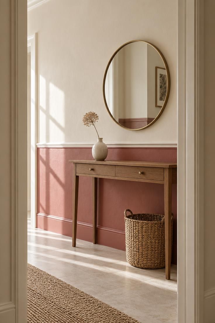
A horizontal split between deeper rose below and cream above creates a visual stop that changes how a low or narrow corridor reads.
Pink two-tone hallway walls put the stronger color below the rail, which grounds the space and draws the eye along the floor line.
Cream above keeps the upper volume light and makes the ceiling feel less pressing.
The slim console and round mirror add function and a focal point without cluttering the walkway.
A painted dado line only looks intentional if it is level and consistent around doors and corners, since a wobbly line is more noticeable than the color itself.
This treatment suits hallways with period proportions or those wanting a traditional feel with a modern color.
It also works well where the ceiling is low, because the light upper section keeps the space from feeling compressed.
Style Blueprint:
- Deeper rose below the rail, cream or off-white above
- Painted dado rail in the same rose or in ivory
- Slim console table with a small ceramic vase
- Round mirror above the console
- Neutral pale floor
Design Pro-Tip: Paint a large sample board and move it around the hallway at different times of day before choosing, because pink shifts noticeably between morning and evening light.
Pink Wainscoting With a Tonal Upper Wall
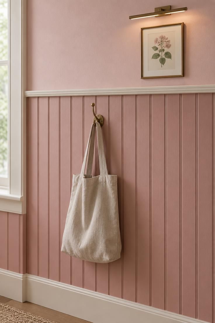
Beadboard or shaker panels painted pink give a flat corridor texture without introducing pattern.
The shadow lines created by the vertical grooves do the visual work and make the wall surface feel considered.
Pink hallway wainscoting reads as a single warm idea when the upper tone belongs to the same family as the panel paint below.
The darker panel anchors the lower wall while the paler upper tone keeps the corridor from feeling boxed in.
The ivory panel cap and skirting frame the paneling and protect the lower wall from everyday contact.
This approach suits hallways where a full pattern would feel busy but plain painted walls feel flat.
Beadboard grooves and panel edges collect dust, so a slightly satin finish on the paneling is easier to wipe than dead-flat matt.
The picture light adds a warm glow that emphasizes the panel texture in the evening.
Style Blueprint:
- Beadboard or shaker panel wainscoting in muted pink
- Lighter tonal pink above the panel cap
- Panel cap and skirting in soft ivory
- Slim picture light or small wall sconce
- One or two small framed prints above
Blush Pink Entryway With Coat Hooks and a Bench
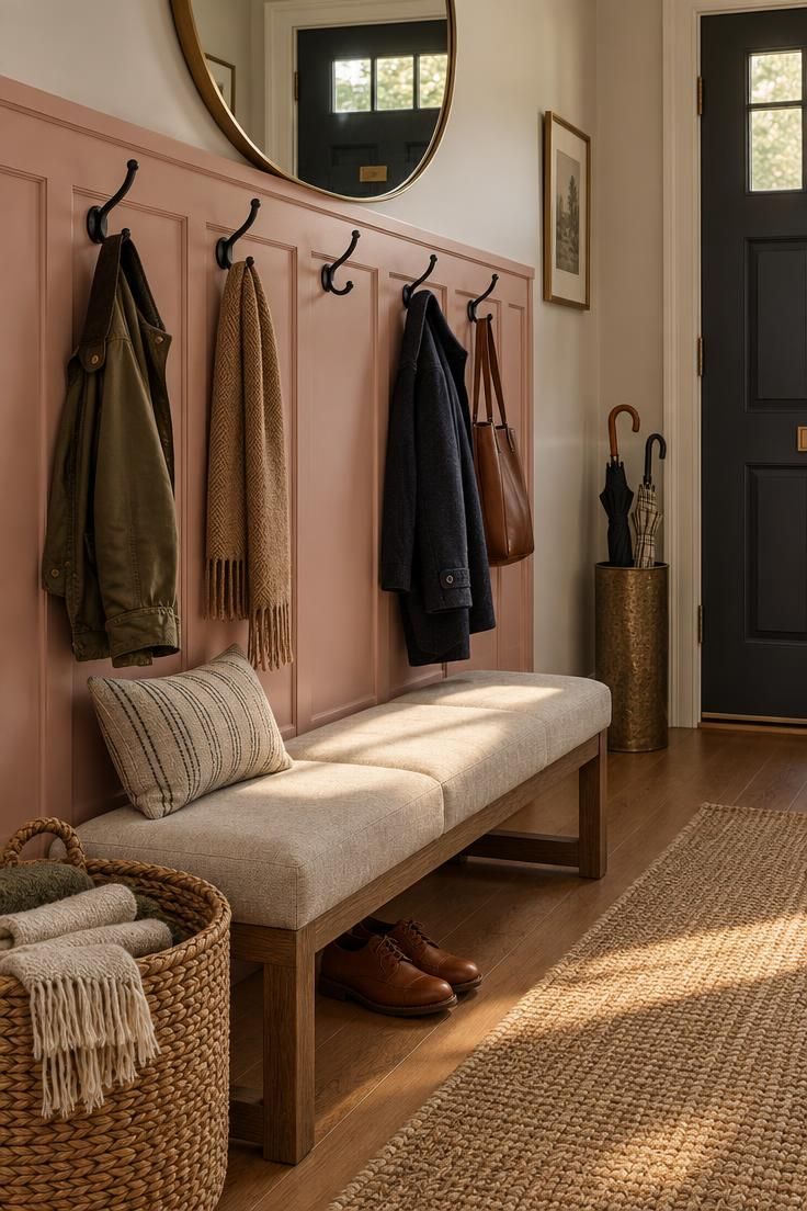
Concentrating the pink on one functional wall panel rather than the whole corridor suits a busy entry where scuffs are likely.
Black metal hooks provide a graphic contrast that keeps the blush from feeling too sweet.
A low bench in a washable neutral fabric adds a place to sit and removes shoes from the walkway.
An umbrella stand at the far end signals the corridor's purpose and keeps wet items contained.
Blush pink entryway decor works best when one wall panel carries the color and the opposite wall stays quiet.
A bench and hooks in a narrow entry narrow the walkable path further, so measuring the remaining clearance before adding either is a practical first step.
This approach works well in hallways that function as a boot room or main entry point.
The rounded mirror above the hooks bounces light back into the space and gives a final check before heading out.
Style Blueprint:
- Blush pink painted wall panel or backboard
- Black or aged brass coat hooks
- Low upholstered bench in a washable neutral fabric
- Woven basket or umbrella stand
- Round mirror above the hooks
Mauve and Lilac-Leaning Pink Walls With Chrome and Glass
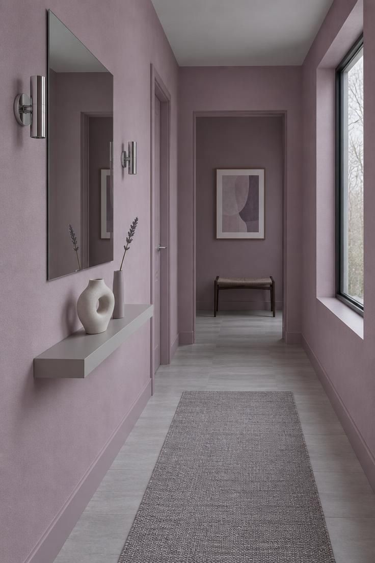
Cooler, purple-adjacent pinks suit modern and minimalist schemes and hold their character better under cool or north light than warm peach-leaning pinks do.
Mauve hallway paint colors sit at the cool end of the pink spectrum and pair naturally with crisp metals rather than warm woods.
Chrome and polished nickel fittings reinforce the cool temperature of the scheme.
A frameless mirror keeps the corridor feeling open and reflects the limited light.
A grey-toned floor provides a neutral base that does not compete with the mauve.
This palette suits hallways with north-facing windows or consistent cool light throughout the day.
Mauve can read flat and washed out in a warm-lit or south-facing hallway, which is the opposite problem to dusty rose, so testing the color under the hallway's actual bulbs matters here.
A single sculptural vessel on a slim shelf adds interest without cluttering a narrow walkway.
Style Blueprint:
- Mauve or lilac-leaning pink walls in eggshell
- Chrome or polished nickel hardware and fittings
- Frameless or slim-framed rectangular mirror
- Grey or cool-toned pale floor
- One sculptural ceramic vessel on a slim shelf
Pink Color-Drenched Hallway With the Ceiling Included
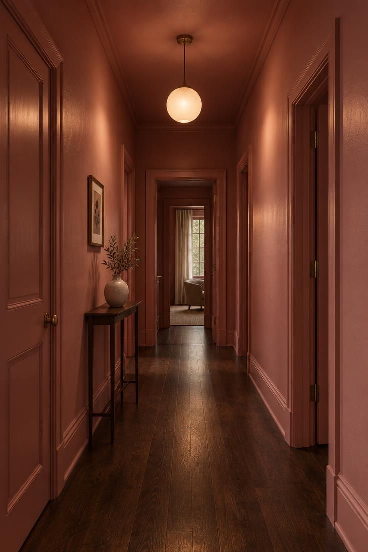
Wrapping the whole volume in one tone removes visual stops and softens corners.
The effect reads calm and enveloping rather than busy, because the eye is not interrupted by contrasting trim or a white ceiling.
Tonal trim in a slightly different sheen rather than a different color keeps the scheme cohesive while adding subtle definition.
A dark wood or natural jute floor grounds the space and prevents it from feeling too floaty.
Color-drenching a windowless corridor can feel enclosing, so it works best where there is at least one source of daylight or a strong lighting scheme.
The single warm pendant creates pools of light that break up the uniform color and give the corridor rhythm.
This treatment suits hallways where a bold, cohesive look is wanted and the architecture is simple enough to carry it.
Style Blueprint:
- Single mid-rose across walls, ceiling, trim, and doors
- Tonal trim in a slightly different sheen rather than a different color
- One warm pendant or globe light
- Dark wood or natural jute floor
- Minimal objects, one vase or one framed print
Coral-Pink Walls With Rattan and Terracotta Accents
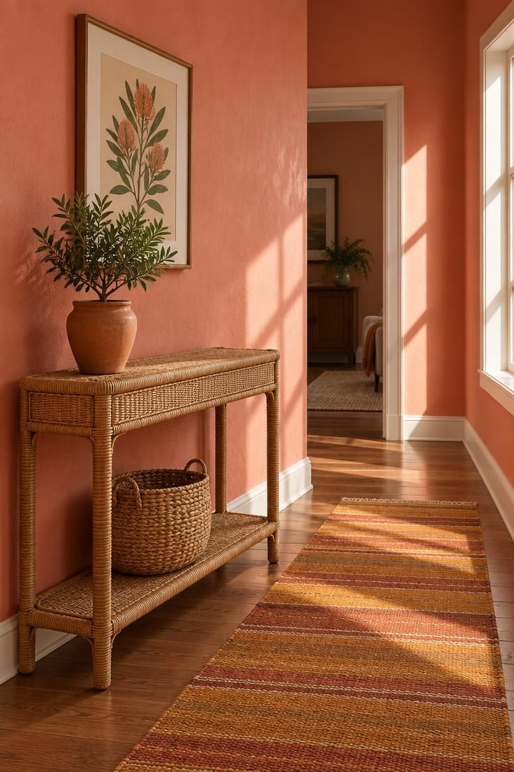
Warmer, more saturated coral pinks work with natural textures and earthy finishes that a cooler mauve would not suit.
Rattan and cane introduce a woven texture that softens the saturation of the walls.
Terracotta pots and a small plant bring an organic element that feels at home with the warm pink.
A flatweave runner in ochre and rust ties the floor to the wall color without matching it exactly.
This palette suits hallways in warmer climates or those with south-facing windows that push the pink toward peach.
Coral and peach pinks are the fastest to look dated when the surrounding materials are too modern or too cool, so keeping the accents natural and warm is the safer route.
Framed botanical or coastal prints reinforce the earthy, relaxed feel.
Style Blueprint:
- Coral or peach-toned pink walls
- Rattan or cane console or wall shelf
- Terracotta pots and a small plant
- Warm-toned flatweave runner
- Framed botanical or coastal print
Design Pro-Tip: Paint at least three sample patches on different walls before deciding, because a hallway's light changes wall to wall, not just hour to hour.
Pink Wallpaper in a Small-Scale Stripe or Block Print
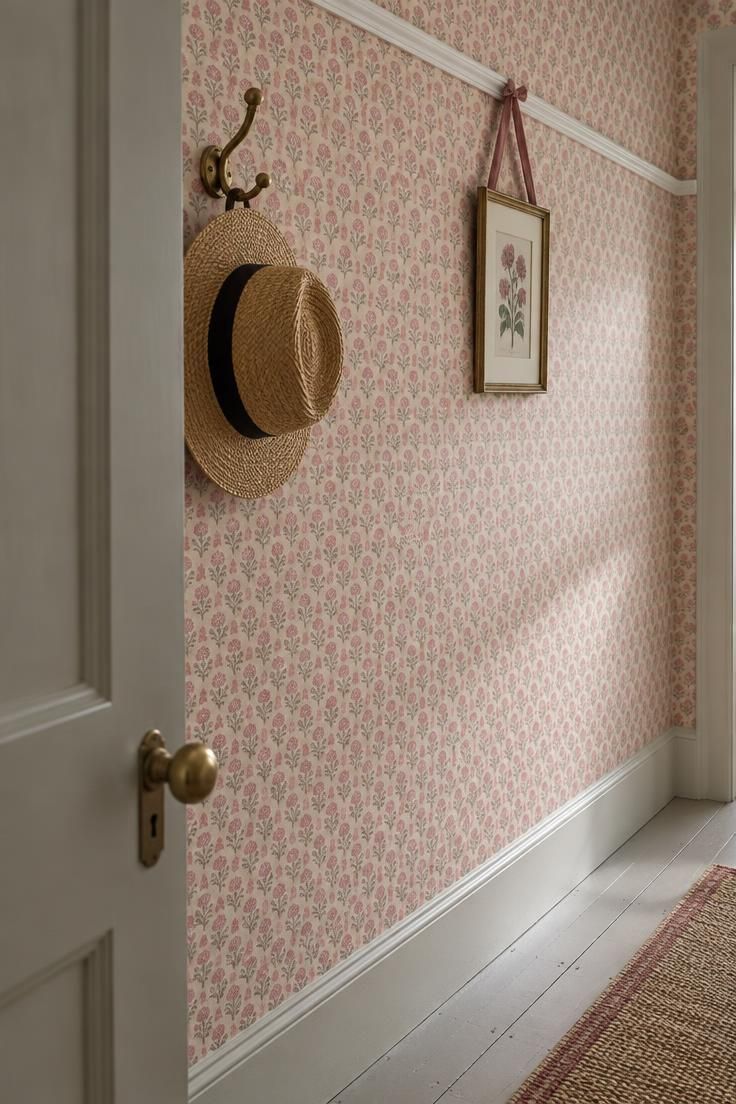
Small-scale pattern disguises imperfect walls and adds interest without overwhelming a narrow space.
The cream background keeps the wallpaper from feeling too dense in a corridor with limited light.
A slim white picture rail gives the eye a horizontal line and provides a place to hang art without damaging the paper.
A painted door in a complementary tone or plain white anchors the pattern and prevents visual chaos.
Pattern matching around doors, corners, and a staircase is more visible in a narrow hallway than in a wide room, so allowing extra paper for matching is a practical consideration.
This approach suits hallways where walls are imperfect or where a plain color feels too quiet.
The small scale of the print means the pattern reads as texture from a distance rather than as a bold statement.
Style Blueprint:
- Small-scale pink block-print or striped wallpaper
- White or ivory picture rail and skirting
- Painted door in a complementary tone or plain white
- Slim brass or black hooks
- One or two small framed prints
Pink Painted Floorboards With a Neutral Upper Wall
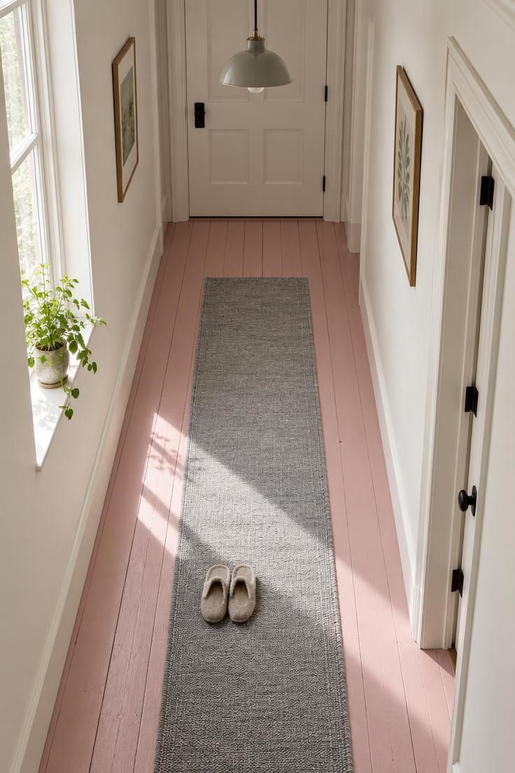
Shifting the pink to the floor keeps walls neutral and lets the corridor's length do the work.
Paint runs with the boards rather than across them, which emphasizes the hallway's depth.
Off-white or soft cream walls provide a calm backdrop that does not compete with the floor color.
A slim neutral or vintage runner adds softness underfoot and breaks up the expanse of painted floor.
A painted hallway floor takes more foot traffic than a bedroom floor, so expect to touch up scuffs more often than an unpainted one.
This approach suits hallways where wall color feels like too much commitment or where original floorboards are worth highlighting.
Black or brass door hardware adds a small graphic detail that ties the scheme together.
Style Blueprint:
- Painted floorboards in a muted or deep pink
- Off-white or soft cream walls
- Slim neutral or vintage runner
- Black or brass door hardware
- One simple pendant or ceiling light
Deep Rose Paneling or Joinery Against Pale Walls
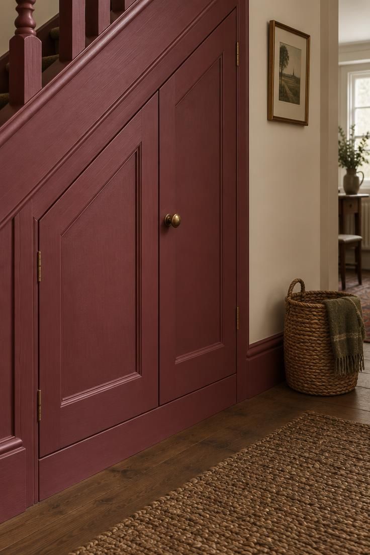
Concentrating a saturated rose on doors, architraves, spindles, or built-in cupboards gives a strong look without committing the whole corridor to a deep shade.
Pale cream walls provide a quiet backdrop that lets the deep rose stand out as the main event.
Brass or aged black knobs and hinges add a metallic accent that catches light and draws attention to the joinery.
A pale neutral floor keeps the scheme from feeling heavy.
This approach suits hallways with architectural features worth highlighting, such as under-stair storage, original doors, or a staircase.
Deep rose joinery shows dust and fingerprints on door edges and around knobs, so a semi-gloss finish that wipes down more easily than matt is worth the tradeoff.
One small framed print or wall mirror on the cream wall balances the composition and adds a personal touch.
Style Blueprint:
- Deep rose or raspberry on doors, skirting, and casings
- Pale cream or off-white walls
- Brass or aged black knobs and hinges
- Pale neutral floor
- One small framed print or wall mirror
Conclusion
Choosing between these ideas comes down to three practical factors: how much natural light the hallway receives, how much traffic it takes, and what the adjoining rooms look like.
Pale pinks suit brighter, wider corridors where the color can read as a soft neutral, while deeper pinks work in smaller or dimmer hallways when the scheme is kept tonal from floor to ceiling.
Traffic matters most for finish choice, since busy corridors reward surfaces that wipe clean and show fewer marks.
The adjoining rooms set the temperature: a warm coral pink beside a cool grey living room will feel disjointed, while a shared undertone makes the transition feel intentional.
Rather than copying a finished look exactly, choose one idea as a starting point and adapt the color temperature to the light in your own hallway.
A dusty rose that looks warm in one corridor can turn lilac in another, and the only reliable test is a large sample in the space itself.