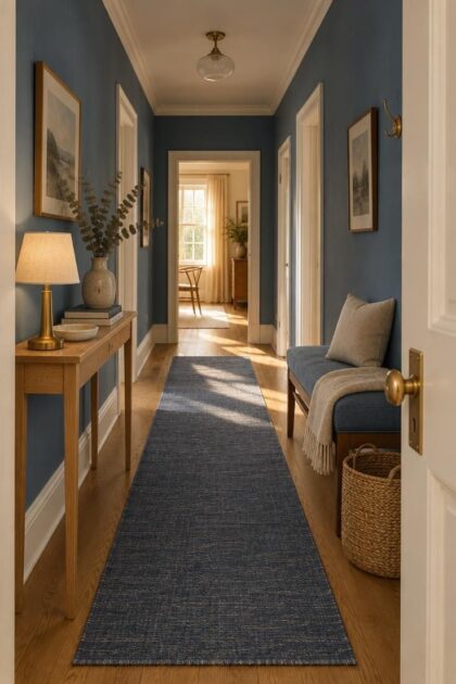
This post may contain affiliate links. If you make a purchase through these links, we may earn a commission at no additional cost to you.
A hallway is the one space every visitor passes through, yet it is usually the last room anyone designs.
Blue is one of the few color families flexible enough to carry that much traffic without reading as an afterthought.
The shades in play range from powder blue and gray-blue to denim, teal-leaning tones, navy, and blue-green, and each one behaves differently in a corridor that gets little daylight and a lot of contact.
Placement, proportion, finish, and pairing matter more here than the shade name alone, and every idea below comes with its own tradeoff so the result can be pictured rather than copied blindly.
Blues shift noticeably between daylight and evening in low-light corridors, which makes comparing samples on the actual wall at more than one time of day the practical first step.
Powder Blue Walls With Warm White Trim and a Jute Runner
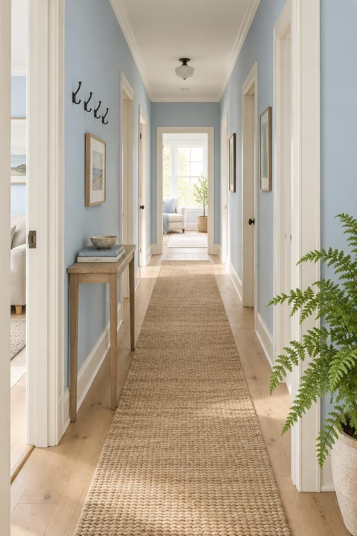
Powder blue sits at the high-lightness, low-saturation end of the family, so it reads close to white in bright conditions and slightly cooler in dim ones.
That behavior makes it the safest full-wall choice for a narrow corridor, where keeping the wall planes reading light matters more than making a statement.
Warm off-white trim softens the crisp edge that bright builder-white tends to create along a long run of doors.
A matte or eggshell wall finish paired with semi-gloss trim lets the trim catch light while the walls stay quiet.
The continuous jute runner visually extends the corridor and anchors a very pale wall color that might otherwise float.
Both very pale flat finishes and natural jute show marks, so a mid-value blue or a patterned textile absorbs contact better in a high-use entry.
Blue accent doors in hallway layouts often work best when the color is sampled from the wall and deepened by two or three shades.
Style Blueprint:
- Powder blue paint in a matte or eggshell finish for the walls
- Warm off-white semi-gloss for trim and ceiling
- Natural jute runner sized to the hallway’s length
- Light oak or pale wood flooring
- Black metal hooks and one small ceramic accent
Color-Drenched Denim Walls, Ceiling, and Doors With Brass Hardware
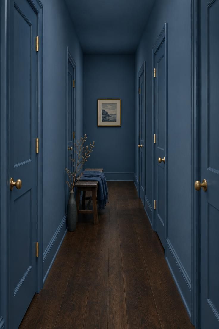
One blue across walls, ceiling, trim, and doors turns a hallway into a single volume rather than a series of separate surfaces.
Architecturally plain corridors benefit most, since color drenching gives a featureless run of doors and walls a deliberate identity.
Color-matched satin or semi-gloss on trim and doors next to matte walls keeps edges reading as tone instead of contrast.
Unlacquered brass hardware and a dark wood floor provide the only tonal break the scheme needs.
A single framed print or small work at the end wall gives the eye somewhere to land in an otherwise uniform field.
Uniform color removes the visual break that trim normally provides, which can make a short hallway feel enclosed, and lighter denim keeps it from going heavy.
Satin rather than gloss on the doors lets the brass do the accent work, since high-gloss doors compete with the hardware.
Blue hallway color drenching works best when one exact blue continues across walls, ceiling, trim, and doors so the corridor reads as one continuous volume.
Style Blueprint:
- Denim mid-blue paint in matte for walls and satin for trim and doors
- Unlacquered brass knobs and hinges
- Dark stained wood flooring
- One small framed print for the end wall
- A bench with a tonal blue throw
Slate Gray-Blue Wainscot With Pale Plaster Above
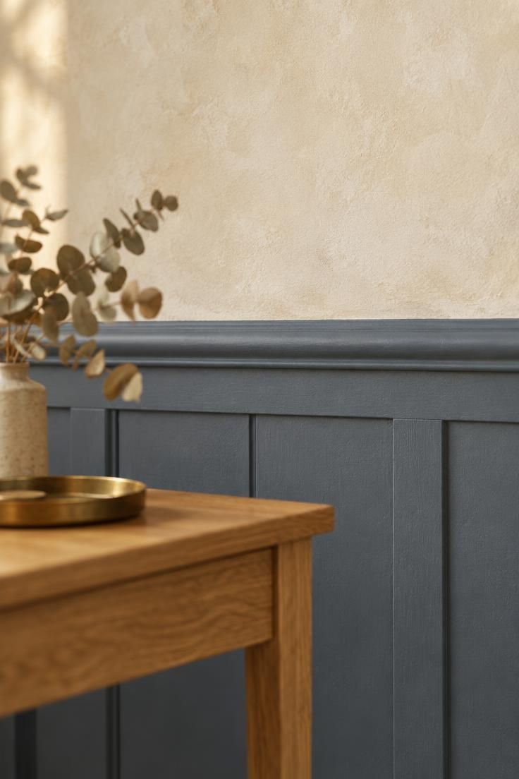
A muted, low-saturation blue below a chair rail gives the wall a grounded lower band, while a light plaster-look surface above keeps the upper field open.
Gray-blue tolerates imperfect hallway light and pairs with both warm and cool materials, which makes it a low-risk choice in a corridor with mixed light sources.
A matte finish on the wainscot reads as a flatter plane, and keeping the upper surface slightly lighter in value keeps the wall from feeling capped.
The horizontal rail line creates a continuous band that runs past doors and visually lengthens a corridor.
A wainscot is a hard, fixed line, though, so in a very short hallway the band can make the space read shorter, and raising the rail line opens the proportions.
The lower band is also where contact happens most, and a mid-value blue tends to show scuffs less than a pale flat finish, which is worth weighing rather than assuming.
Style Blueprint:
- Slate gray-blue paint in a matte finish
- Chair rail with a clean, simple profile
- Pale limewash-look plaster or paint for the upper wall
- Slim natural oak console
- A small brass tray with dried botanicals
Navy Accent Doors on a Neutral Wall Run
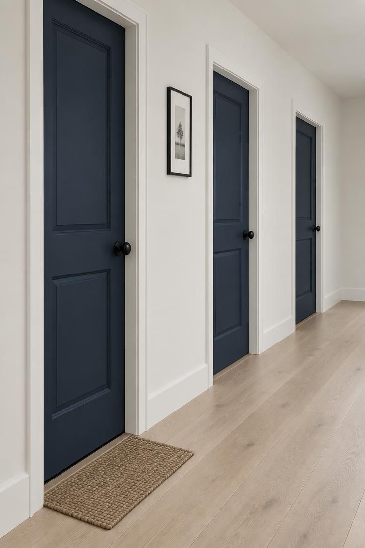
Putting the blue on doors rather than walls turns a repeated object into the hallway’s pattern.
This works best in a corridor with several doors, where the repetition itself becomes the design and the walls stay quiet.
Navy in a satin or semi-gloss on doors reads as deliberate, framed objects rather than flat panels.
Evenly spaced doors create a strong rhythmic sequence, so any art between them should stay small and sparse rather than competing.
Painted doors in a deep color show edge wear more readily at the latch side, and touch-ups on saturated colors tend to be more visible than on lighter tones.
In a very narrow hallway, one navy door at the end wall makes the same point without the rhythm becoming busy.
Style Blueprint:
- Navy paint in a satin or semi-gloss for doors
- Warm-white wall paint
- Small black metal knobs
- Pale oak flooring
- One slim framed print between doors
Design Pro-Tip: When blue goes on doors instead of walls, keep the surrounding wall a warm neutral rather than a cool white, otherwise both the doors and the walls can read slightly gray in a dim corridor.
Blue Painted Beadboard Below a Picture Rail
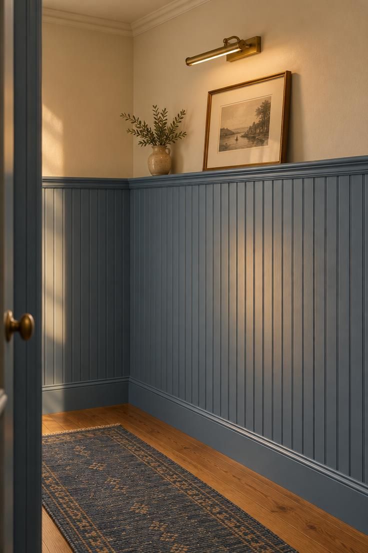
Vertical beadboard in a mid-blue up to a picture rail creates a deliberate line, with a plain light surface above that keeps the upper wall open.
The vertical grooves add a fine rhythm that can make a low hallway read taller without introducing pattern.
Beadboard holds paint differently than flat plaster does, so the same tin of blue can read slightly deeper on the paneled surface.
A picture rail doubles as a natural hanging line, letting art sit above the paneling without competing with the grooves.
Warm off-white above and a warm-toned wood floor keep the mid-blue from going cold.
Beadboard collects dust along the grooves and needs a brush rather than a wipe, which makes a smoother panel treatment easier to maintain.
This treatment rewards a hallway with some wall length and a decent ceiling height, while a flat dado band keeps the proportions simpler in a tight corridor.
Blue wainscoting in hallway settings often stops at a picture rail, so the paneling reads as a low base rather than a full wall treatment.
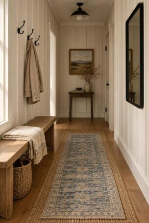
A blue hallway runner laid along the floor anchors the same tone underfoot and softens the hard contrast between painted boards and bare floor.
Blue hallway wall paneling gains depth when the lower boards use a slightly stronger shade than the upper wall.
Style Blueprint:
- Mid-blue paint formulated for wood paneling
- Vertical beadboard paneling to picture-rail height
- Picture rail in the same blue or a warm off-white
- Brass picture light
- Flatweave runner in a muted blue
Vertical-Stripe Blue Wallcovering to Heighten a Narrow Hallway
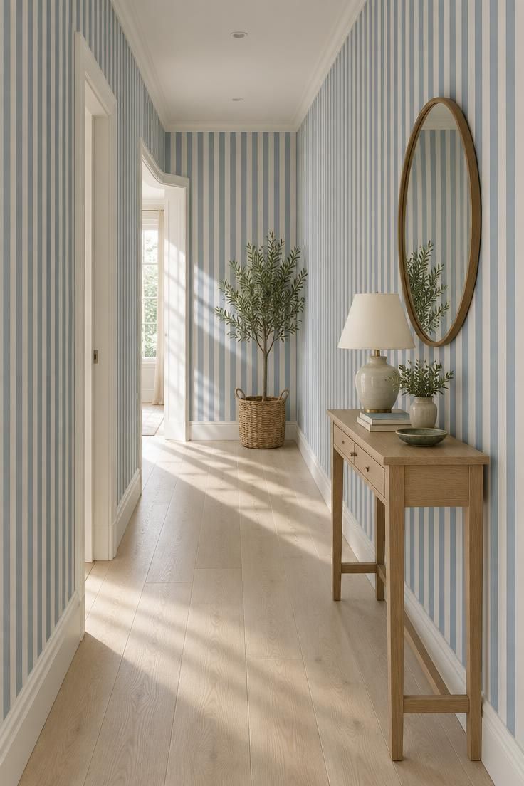
A fine vertical stripe in blue on a light ground, carried on the long walls, gives a corridor a persistent upward rhythm.
Stripe scale matters here, because fine stripes read as texture at a distance while wide stripes read as a bold graphic and can make a hallway feel shorter.
A wallcovering adds a slight surface texture that paint cannot, softening the flatness of a narrow corridor’s long planes.
A round mirror over a slim console breaks the stripe grid and gives the run a stopping point.
Stripes demand straighter walls visually, since an uneven run or a strong ceiling line makes a fine stripe look wobbly.
This is one of the few pattern moves that genuinely helps in a narrow corridor, but it works best when the stripe stays light and fine rather than dark and wide.
Painting the blue hallway ceiling a shade lighter than the stripe keeps the corridor’s upward rhythm unbroken from wall to wall.
Style Blueprint:
- Fine vertical blue-and-off-white striped wallcovering
- Slim console in pale oak
- Round mirror with a thin frame
- Small table lamp with a cream shade
- Woven basket planter with an olive tree or similar greenery
Blue-on-Blue Tonal Hallway: Pale Walls, Mid-Blue Bench, Deep Blue Door
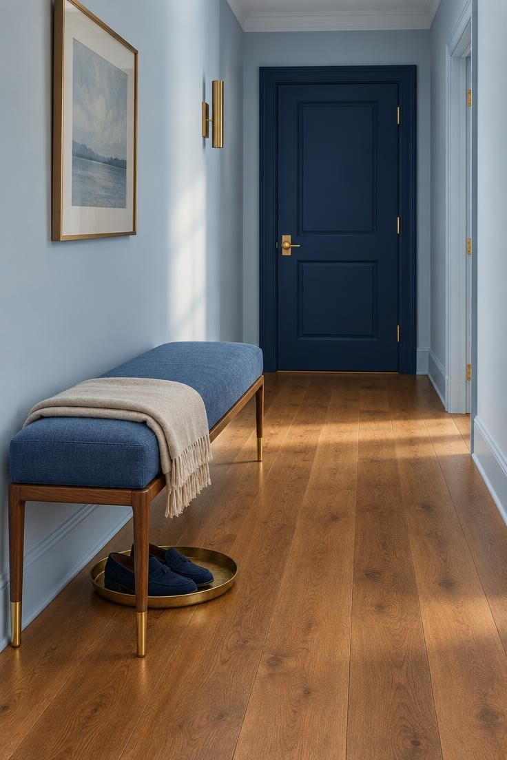
Three distinct blue values used deliberately make the scheme read as a family rather than a match.
Value separation does the work here, since the eye reads the pale wall as a field, the mid-blue bench as an object, and the deep door as a focal end point.
The bench’s upholstery texture and the door’s finish give the same hue different surface qualities, which keeps a tonal scheme from going flat.
Placing the deepest blue at the far end of the hallway lets it double as the visual destination.
Tonal blue schemes need one non-blue element, such as warm wood, brass, or natural fiber, or the hallway loses its contrast and reads uniformly cool.
In a very short hallway, skipping the mid-value bench and using only pale walls and a deep blue door achieves the same layered effect.
Tonal schemes are less forgiving of an accidental near-miss blue, so each value needs to be clearly different from the others.
Buying all three blues as samples and placing them side by side before committing makes value differences far easier to judge.
A navy blue hallway bench anchors the tonal scheme while keeping shoes and bags in one defined landing spot.
Style Blueprint:
- Pale blue wall paint in a matte finish
- Mid-blue upholstered bench with a wooden frame
- Deep navy paint for one interior door
- Warm wood flooring
- Brass accents repeated at least twice
Design Pro-Tip: In a tonal blue scheme, pick one warm material, such as brass, oak, jute, or terracotta, and repeat it at least twice so the palette has a consistent counterpoint.
Blue Ceiling With Off-White Walls and a Long Patterned Runner
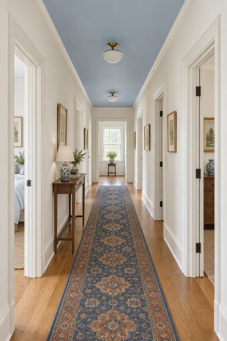
A colored ceiling plane with quiet walls lets the blue register when you look up without competing on the walls themselves.
This suits hallways with ceiling features such as beams, coffers, or a soffit, where the ceiling is already an element worth treating.
A matte ceiling finish reduces reflected glare from any light sources along the run, which matters more in a corridor than in a larger room.
A long patterned runner in indigo and a warm secondary color ties the blue ceiling to the floor and gives the corridor length.
A blue ceiling visually compresses the space, and in a low-ceilinged hallway that is a deliberate effect with a real cost.
In a short, wide hallway the ceiling reads as a larger field and the effect is stronger, while in a long narrow corridor it becomes subtler.
Style Blueprint:
- Pale blue ceiling paint in a matte finish
- Off-white wall paint
- Warm wood flooring
- Long vintage-patterned runner in indigo and rust
- A small ceramic lamp on a slim console
Blue Mural on the End Wall as a Focal Point
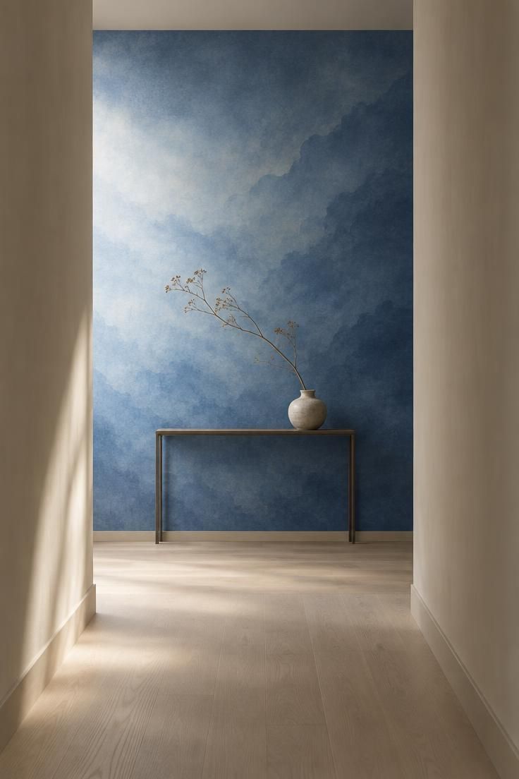
A single mural panel on the end wall, framed by plain neutral hallway walls, lets the corridor deliver a reveal at its terminus.
The end wall is the right location because it is the one surface a person walking the hallway faces head-on, and a long corridor gives it distance to be read.
A tonal blue mural that reads as atmosphere rather than a literal scene keeps the effect from being a one-note novelty.
A slim console and one vessel at the base give the mural a ground line and prevent it from floating above the floor.
A mural is a strong commitment and harder to edit later than paint, while a smaller framed panel gives a similar pull with more flexibility.
Murals on a long run of side walls can feel overwhelming, which is why end-wall placement usually reads better in corridors.
In a short hallway, a single-height mural panel rather than a full floor-to-ceiling application keeps the effect proportionate.
Style Blueprint:
- Tonal blue mural panel sized to the end wall
- Warm-neutral paint for the flanking walls
- Slim console in a natural finish
- One stoneware vessel
- Pale wood flooring
Blue-Gray Cabinet Run in a Mudroom-Style Hallway
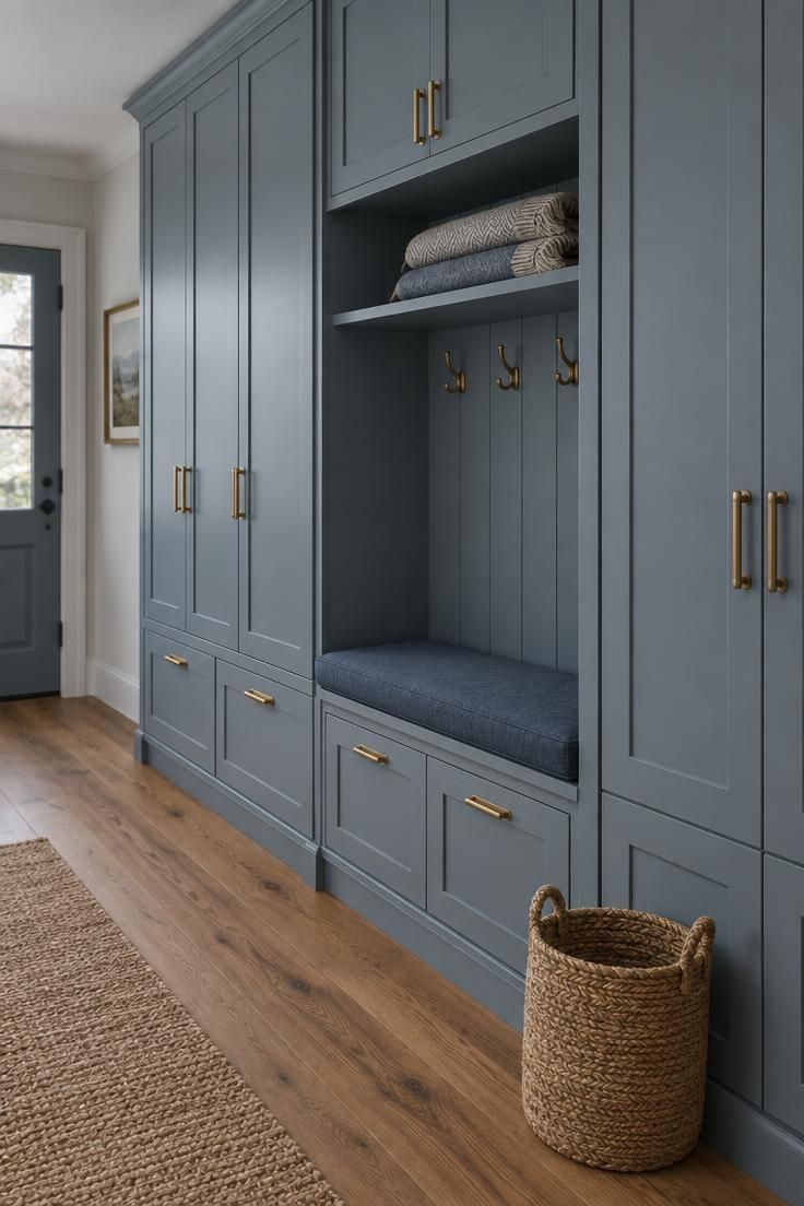
Closed blue-gray cabinetry along one wall with a bench-height nook between upper and lower units makes storage read as a designed band rather than a set of fixtures.
The muted tone keeps a long run of doors visually calm and pairs easily with warm wood and brass.
Satin or semi-gloss on cabinet fronts reads more intentional next to a matte wall, and the sheen difference separates the two surfaces without a color change.
A continuous cabinet run with repeated hardware gives a functional hallway a strong horizontal rhythm.
Brass or black metal pulls, a jute basket at floor level, and a wood floor that stays warm against the cool cabinetry complete the scheme.
Painted cabinet fronts in a mid-tone show fingerprints and scuffing around pulls, which is a real cost in a high-contact entry.
A full cabinet run earns its place only if the hallway genuinely needs closed storage, and otherwise repeating the blue on a slimmer bench and a single cabinet works just as well.
In a narrow corridor, a single lower cabinet run painted blue-gray with a plain wall above keeps the proportions simple.
Style Blueprint:
- Blue-gray paint in satin or semi-gloss for cabinet fronts
- Bench nook with a deeper blue cushion
- Brass or black metal pulls
- Warm wood flooring
- Jute basket for floor-level storage
Design Pro-Tip: On a long blue-gray cabinet run, change the hardware tone at the bench nook, brass below and black above or the reverse, so the storage isn’t read as one undifferentiated block.
Blue Cement-Look Tile Floor With a Warm Wood Console
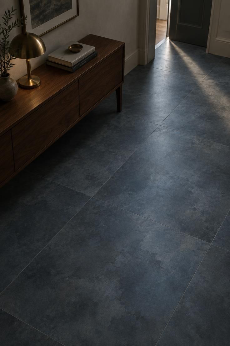
A patterned or tonal cement-look tile in blue-gray or blue-green, laid across the full hallway width, lets the blue read as a ground plane rather than an accent.
The tile’s tonal variation gives the surface movement that solid color cannot, which helps a long corridor avoid flatness at floor level.
Matching the tile’s tone to the hallway’s warm elements, such as walnut, brass, or leather, keeps a blue floor from reading cold underfoot.
A warm wood console against the wall supplies the warm counterweight the blue floor needs.
A blue floor is the single most permanent blue move in this list, and it is considerably harder to reverse than paint or a runner.
Style Blueprint:
- Large-format blue cement-look tile flooring
- Warm walnut console
- Brass table lamp
- Pale plaster or soft neutral wall paint
- One small stack of books or a tray for the console top
Blue Gallery Wall of Mixed-Frame Prints Over a Slim Console
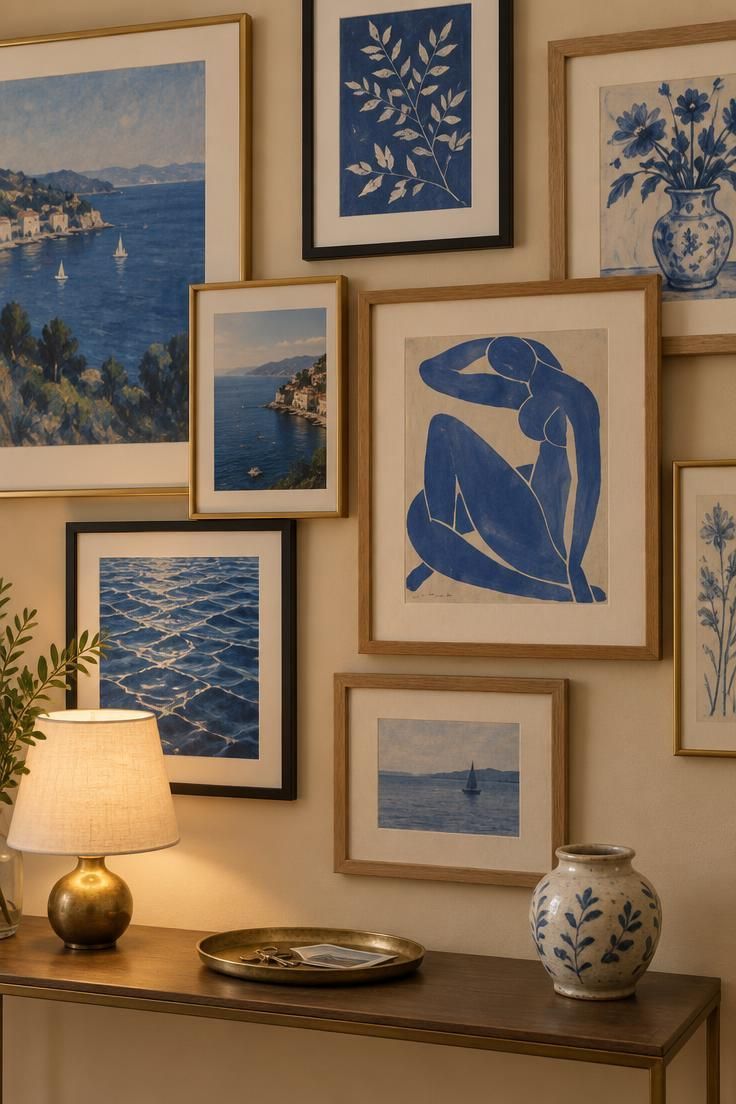
A mixed-frame gallery where the common thread is blue within the artwork rather than the frames gives the hallway a blue identity without a blue wall.
Varied frame tones let a loose cluster read as collected rather than grid-locked.
Combining thin brass, slim black, and natural wood frames gives structure while the artwork carries the color.
Centering the cluster over a slim console, with the console width setting the outer boundary of the arrangement, keeps the composition from drifting.
Blue-heavy artwork reads strongest against a warm neutral wall, since against another blue the artwork loses its edge.
Loose clusters are harder to extend later, so leaving deliberate gaps lets future additions slot in without a full rehang.
In a narrow hallway, keeping the cluster to a single column and letting it run vertically keeps it from crowding the corridor’s width.
Style Blueprint:
- Blue-dominant prints in varied sizes
- Thin brass, slim black, and natural wood frames
- Slim console as the arrangement’s base line
- Small lamp with a linen shade
- Warm neutral wall paint
Pale Blue Washed Paneling With a Midnight Blue Staircase Return
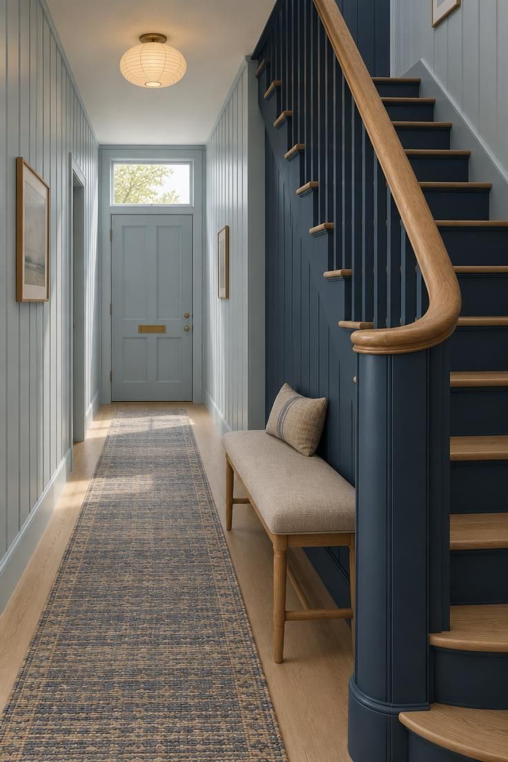
Pale blue hallway paint can feel airy without drifting into pastel nursery territory when it meets deep navy blue hallway walls on a connecting stair return.
In a two-story entry, keep the main corridor in a pale blue wash over flat paneling and let the staircase side wall drop into a saturated navy.
The contrast creates a visual pause at the turn where the hallway changes direction or rises toward the upper landing.
Use the pale blue on vertical shiplap or simple raised panels, then carry the navy only on the lower staircase wall and the riser face behind the bottom step.
This approach gives the pale tone a crisp architectural frame instead of letting it float as an unbroken wall color.
A warm oak handrail helps bridge the two blue values and keeps the transition from feeling abrupt.
Add a small upholstered bench at the base of the stair return in oat-colored linen or nubby wool.
A single flush-mount fixture with a paper or plaster shade keeps the narrow corner softly lit without competing with the strong color shift.
If the hallway has no stair, use the same idea where a doorway recess or short jog creates a natural stopping point for the darker hue.
Style Blueprint:
- Pale blue flat paneling on the main hallway walls with square trim profiles
- Navy blue on the stair return wall or a short end-wall at a hallway turn
- Oak handrail and narrow oak bench legs for a warm wood counterpoint
- A soft oat or chalk-white linen bench cushion
- One plaster or paper shade wall light at the transition point
Conclusion
Every idea here comes down to a placement decision: walls, ceiling, doors, floor, cabinetry, or textiles, and each placement carries a different tradeoff in light, wear, and reversibility.
The hallway-specific constraint that shaped the list is limited daylight, which makes corridor blues shift more than blues in windowed rooms, so comparing samples on the actual wall at more than one time of day matters more than picking a shade on a screen.
A useful starting order is to choose the blue family first, then decide which surface carries it, then add one warm counterweight material so the hallway doesn’t read uniformly cool.
Each of these is a design direction to adapt to a specific corridor’s length, width, ceiling height, and adjoining rooms rather than a preset scheme, and measuring the space is part of weighing how much commitment a given surface allows.