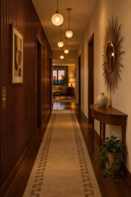
This post may contain affiliate links. If you make a purchase through these links, we may earn a commission at no additional cost to you.
A hallway is the first interior view guests pass through, and often the last space anyone thinks about outfitting.
It is also where warm wood and brass have the most uninterrupted wall to work with, since there is rarely a window, a sofa, or a television competing for attention.
One long elevation can carry a full material story from door to door.
A mid century modern hallway rarely needs a complete furnishing plan.
Proportion, a shallow footprint, and one or two deliberate statements usually do more than an accumulation of objects.
The style's restraint suits a corridor that has to move people through it.
The ideas ahead share three criteria: material honesty, meaning real wood grain and genuine metal rather than printed imitations; a controlled palette; and a floor plan that leaves walkway room intact.
Each one treats the corridor as a composition rather than a storage problem.
Read these as palette, scale, and vignette direction.
Where maintenance or a real tradeoff matters, it is noted.
Walnut Slat Feature Wall Behind a Slim Brass Hook Rail
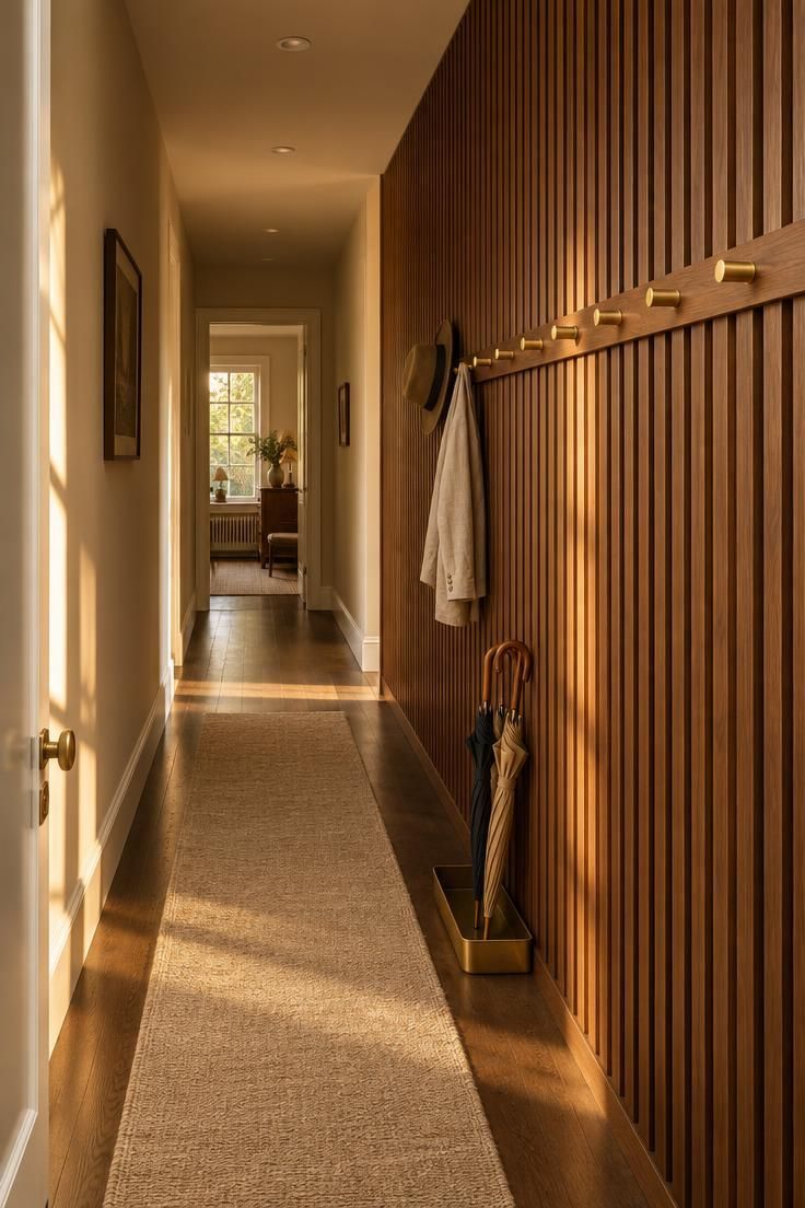
A walnut slat wall does the work of art, storage, and texture at once, which lets the opposing wall stay bare.
A horizontal cleat gives the eye a line to travel down the corridor, and that line matters more than any single object hung from it.
Placement of the cleat is a tonal decision as much as a functional one.
Slats finished one or two shades darker than the floor read as a deliberate panel instead of a wood-on-wood blend that muddles the whole elevation.
Vertical slats also stretch the visual height of a corridor that may feel compressed.
The shadow gaps between boards add depth that a flat panel cannot provide.
The tradeoff lands in upkeep.
Every slat edge collects dust and takes longer to wipe down than a flat painted wall, so this is not the choice for someone who wants a five-minute cleaning routine.
A warm white or cream ceiling keeps the wood from closing in overhead.
Cream also gives the brass hooks something quiet to sit against.
Keep the metal hardware in one finish family.
Matte black switch plates beside brass hooks will read as an afterthought even if both are period appropriate on their own.
Style Blueprint:
- Vertical walnut slats with a satin finish and visible grain running the full wall height
- A horizontal walnut cleat at a consistent height to carry the hooks
- Unlacquered brass hooks in a simple cylinder or angled peg profile
- Warm white or cream ceiling and adjacent walls
- Matte black or brass switch plates to match the metal family
End-of-Corridor Sunburst Mirror Over a Teak Demilune Console
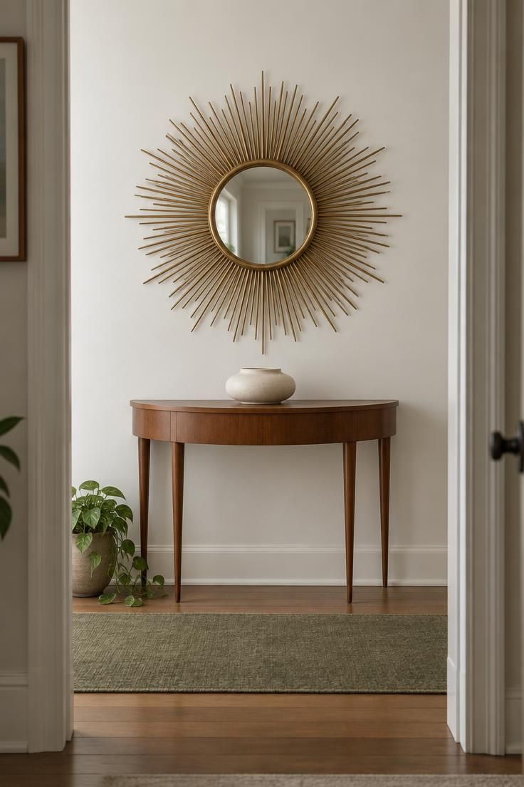
A terminal view gives a long corridor a destination rather than a vanishing point.
The radial form of a sunburst mirror softens the hard rectangular geometry that hallways produce by default.
Demilune shapes suit corridors well.
With no sharp corners at knee height, a half-round console is easier to pass than a full rectangle of the same width.
Proportion decides whether the pairing reads as designed or accidental.
A starburst mirror sized to roughly one-third of the wall width keeps the mid century console table below it looking like a partner rather than an afterthought.
When the mirror spans nearly the whole wall, the furniture underneath tends to disappear.
One object on the console is enough.
A low ceramic vessel or a small brass tray keeps the surface quiet, and a second and third item will start to clutter the view you are deliberately framing.
Since a mid century modern entryway often ends in exactly this kind of terminal wall, the mirror and console pairing works at a front door as well as at the end of an interior run.
Maintenance is a real consideration with this idea.
Every point on a sunburst is a dusting surface, and a smooth-edged mirror takes far less time to keep clean.
Stopping the runner short of the console base keeps the terminal vignette from visually merging into the floor plane.
The gap is small but it separates the composition from the walkway.
Style note: the console's wood tone should relate to whatever wood appears in the nearest adjoining room, even loosely.
Continuity between the corridor and the rooms it connects keeps the whole home reading as one scheme.
Style Blueprint:
- A brass sunburst or starburst mirror sized to about one-third of the wall width
- A demilune or half-round teak console with tapered legs, shallow enough to leave the walkway clear
- One low-profile ceramic vessel or a small brass tray as the only surface object
- Warm white wall behind the mirror so the brass reads clearly
- A wool runner stopping short of the console base
Unlacquered Brass Globe Pendants in a Staggered Row
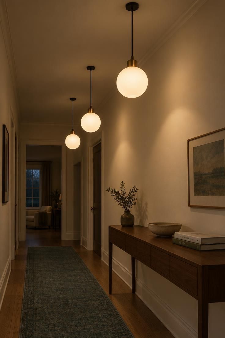
A row of small globes spreads light along the corridor's length instead of pooling it all at one end.
That distribution matters in a windowless passage where light has to do the work of daylight.
Staggered drop lengths create rhythm.
A perfectly level row can look mechanical over a long distance, while small variations give the ceiling line a pulse.
Brass fitters against frosted glass add a jewelry-scale detail at eye level.
Opal or frosted glass also hides smudges better than clear glass, which shows every fingerprint.
A sputnik pendant light gives a related option when one fixture needs to carry the whole ceiling, and the brass fitter family keeps the two looks compatible.
The drop height is the decision that makes or breaks the arrangement.
Pendants taken low enough to enter your sightline frame the corridor rather than light it, and that changes how the space reads at walking pace.
Warm-toned bulbs flatter both wood and brass.
A cold bulb will make walnut look grey and brass look green by comparison.
Keep the ceiling hardware quiet.
A matte black cord and canopy lets the globes and brass carry the attention.
Design Pro-Tip: Choose one brass tone, polished, satin, or unlacquered, and repeat it across hooks, hardware, and light fittings. Mixed brass finishes in one corridor read as mismatched rather than collected.
Rosewood Gallery Wall With Brass Picture Lights
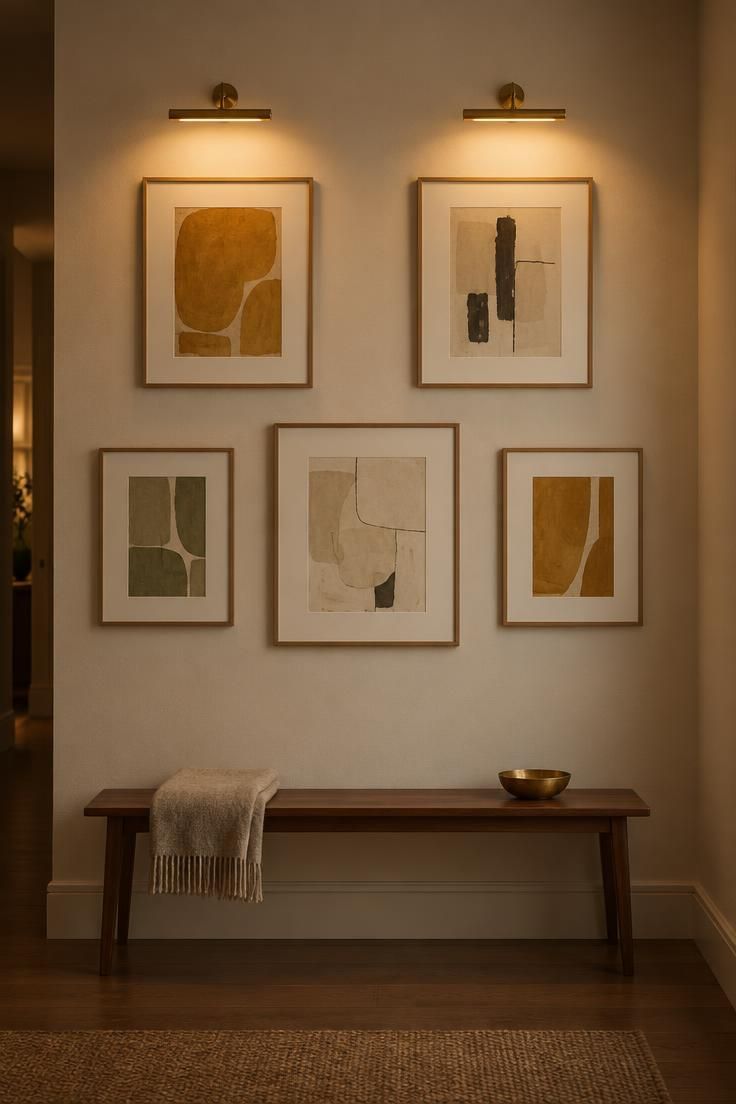
In a windowless corridor, wall-mounted picture lighting makes art legible without flooding the entire space.
Aiming light across the top of a group adds a directional glow that a ceiling fixture cannot produce.
A loose grid with breathing room between frames keeps a long wall from feeling cluttered.
Tight salon arrangements demand more wall height than most corridors offer.
Consistent hanging height is what makes a group of different-sized pieces read as one shape from across the room.
Without it, the arrangement fragments.
Repeating one frame material across every piece is the difference between a collected wall and a scattered one.
Mixed frames can work, but the result reads as accidental more often than intentional.
This is the highest-maintenance idea in this collection.
Every frame edge, glass surface, and light shade gathers dust.
Glass shows every mark in raking light.
Layout deserves time before any hole is made.
Laying the arrangement on the floor first and photographing it from standing height reveals proportion problems that are hard to judge on a vertical wall.
Budget considerations matter here too, since frame and mat costs scale with the number of pieces.
A group of five well-framed prints may cost more than a single larger work.
Scale the group to the wall rather than to the furniture below it.
A wall arrangement and a bench are separate compositions that happen to share an elevation.
Continuity with the adjacent room is worth checking.
If the neighboring space uses warm white walls, matching that tone in the corridor keeps the transition subtle.
Style Blueprint:
- Slim oak or walnut frames with generous mat margins in a loose grid
- Abstract prints, geometric compositions, or vintage exhibition posters in a controlled palette
- Two or three small brass picture lights aimed across the top of the group
- A consistent hanging height so the group reads as a single shape
- Warm white wall finish so paper tone stays warm
Teak Slat-Back Bench With a Brass Umbrella Stand
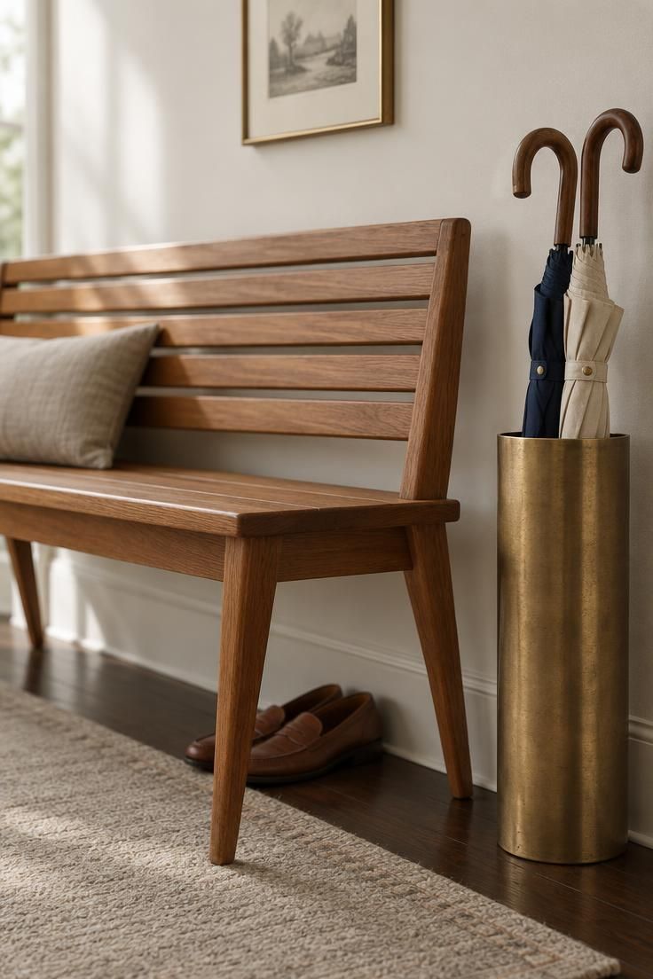
Pairing a bench with an umbrella stand turns an otherwise decorative corridor into a functional landing zone without adding depth.
Both pieces stay close to the wall, which matters in a passage people use daily.
Slats on the bench back echo the slatted screens and wall treatments common in this style, tying the corridor together visually even when the pieces come from different sources.
Depth is the deciding measurement.
Choose a bench you can walk past without turning sideways before choosing the runner width, since a runner wider than the clear floor makes the whole arrangement feel pinched.
Umbrella stands collect water and grit.
A removable insert or a lined base makes emptying far easier.
Setting wet umbrellas on a floor without drainage risks damage to the flooring over time.
Empty the stand after wet weather rather than letting moisture sit.
A single framed print above the bench keeps the wall from competing with the furniture.
A full gallery in this spot would overload a small working zone.
Overflow hooks offset from the bench handle coats during busy seasons without filling the bench surface.
Keeping the seat clear preserves the landing zone.
Budget-friendly versions of this idea exist.
A simple teak-look bench and a plain cylindrical metal stand capture the composition even if neither is period authentic.
Style Blueprint:
- A low teak bench with a slatted back and tapered legs, kept shallow against the wall
- A cylindrical brass umbrella stand at one end of the bench
- A small wool runner in a muted earth tone under the bench
- A single framed print above the bench rather than a gallery
- Matte black or brass coat hooks offset from the bench for overflow
Warm Ochre Paint With a Walnut Picture Rail
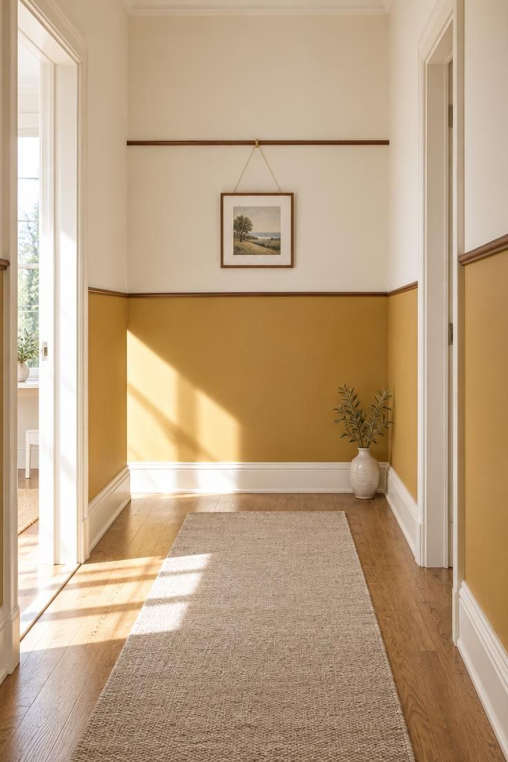
A mid-height picture rail gives the corridor a horizontal break, which is useful when a space is long and otherwise featureless.
The eye gets a resting line between floor and ceiling.
Hanging from the rail instead of the wall means art placement can change with the seasons without patching.
That flexibility has practical value in a corridor where wall space is limited.
Two-tone treatment has a cost.
It makes the upper and lower areas read as separate zones, and in a tall corridor that split can visually shorten the wall.
Ochre below the rail and cream above keeps the warmest color where the eye rests at walking height.
Cream above lightens the upper volume so the ceiling stays open.
A neutral wool runner in oatmeal or cream keeps the ochre from dominating the floor plane as well as the walls.
Two strong warm surfaces at once will overwhelm a narrow space.
Trim painted to match the cream upper wall keeps the baseboards from drawing a second, competing line near the floor.
Satin finish on the rail reads better than high gloss here.
A soft sheen on walnut shows the grain while staying in the mid century modern hallway design vocabulary of understated surfaces.
This paint-and-rail pairing also suits retro hallway ideas where wall color changes with the seasons rather than the furniture.
Repeating the rail height around the entire corridor keeps the horizontal line consistent from every angle.
Style Blueprint:
- Muted ochre or mustard on the lower wall, warm white above the rail
- A slim satin walnut picture rail running level around the corridor
- Small brass hooks on the rail so art hangs without new wall holes
- Cream-painted trim and ceiling to lighten the upper volume
- A neutral wool runner in oatmeal or cream
Scalloped Brass Mirror Above a Shallow Walnut Shelf
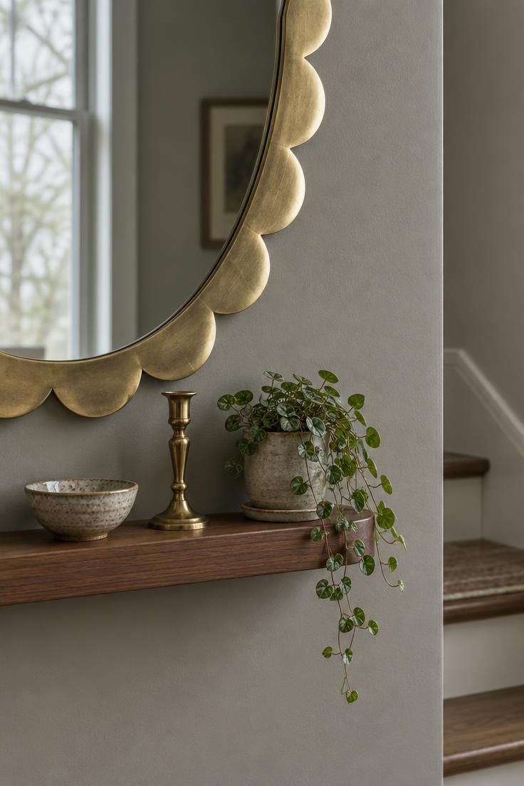
Scalloped edges bring an organic curve into a corridor otherwise made of straight lines.
Rounded profiles break the rectangle repetition that hallways produce naturally.
A shallow shelf costs almost no walkway width and gives the mirror a reason to be there.
Without something below it, a small mirror on a large wall can look stranded.
Storage expectations should stay low.
Very little can sit on a shallow shelf, and treating it as a display surface rather than storage keeps the composition under control.
A cool-toned wall behind warm brass makes the metal read more strongly than a warm wall would.
Soft warm grey bridges the cool daylight and the warm metal without either winning.
Two or three small objects is the ceiling for this arrangement.
A bowl, a candlestick, and a small plant give variety in height without crowding the shelf.
Clearance between the shelf and the mirror's lower edge matters for proportion.
Too much gap and the two read as unrelated; too little and the objects feel pinched.
This kind of pairing is one of the easiest mid century modern hallway ideas to adapt to a narrow plan, since it adds interest without claiming floor space.
A starburst mirror offers a related option if the scalloped edge feels too soft for the rest of the home.
Style Blueprint:
- A brass mirror with a scalloped or petal-edge profile, rounded rather than squared
- A shallow walnut shelf just below the mirror's lower edge
- Two or three small objects: a bowl, a candlestick, a small plant
- A soft warm grey wall to bridge cool light and warm metal
- Cool overcast daylight accepted rather than fought
Sputnik Chandelier Centered in a Muted Teal Corridor
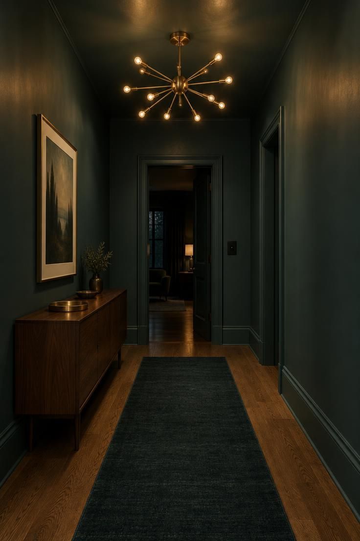
One saturated color on every wall turns a pass-through into a room you notice.
Teal sits comfortably beside walnut because both occupy a similar warmth range.
A compact sputnik gives the corridor a focal point at ceiling level without a large fixture crowding the ceiling plane.
Slim radiating arms read as graphic line rather than mass.
Saturated mid-tone walls absorb light.
Plan for more fixture output or accept a moodier corridor, and test the color on a large sample panel rather than relying on a small paint chip.
Colors shift noticeably at corridor scale.
Bulb temperature is worth attention in a deep-colored room.
Warm bulbs make teal read rich and deep, while cool bulbs can push the same paint toward grey.
Keep the chandelier's spread comfortably narrower than the corridor width so it reads as centered rather than wedged.
A fixture that nearly touches both side walls creates a sense of compression.
The low walnut console should match the fixture's warmth, not fight it.
A wood with strong red or orange undertones will read differently beside brass than a neutral brown.
Switch hardware is a small detail with outsized effect.
Matte black or brass plates keep the metal family consistent along the whole corridor.
This sort of single-fixture ceiling treatment is one of the more striking mid century modern hallway ideas for a home that already leans into saturated wall color.
Style Blueprint:
- A brass sputnik fixture with a compact arm spread suited to a narrow ceiling
- Muted teal walls in a matte finish as the corridor's single saturated color
- A low walnut console in a matching warm tone
- Warm bulbs in the fixture so the teal reads deep
- Matte black or brass switch hardware to match the fixture
Wallpaper Accent With a Boomerang Motif on One Wall
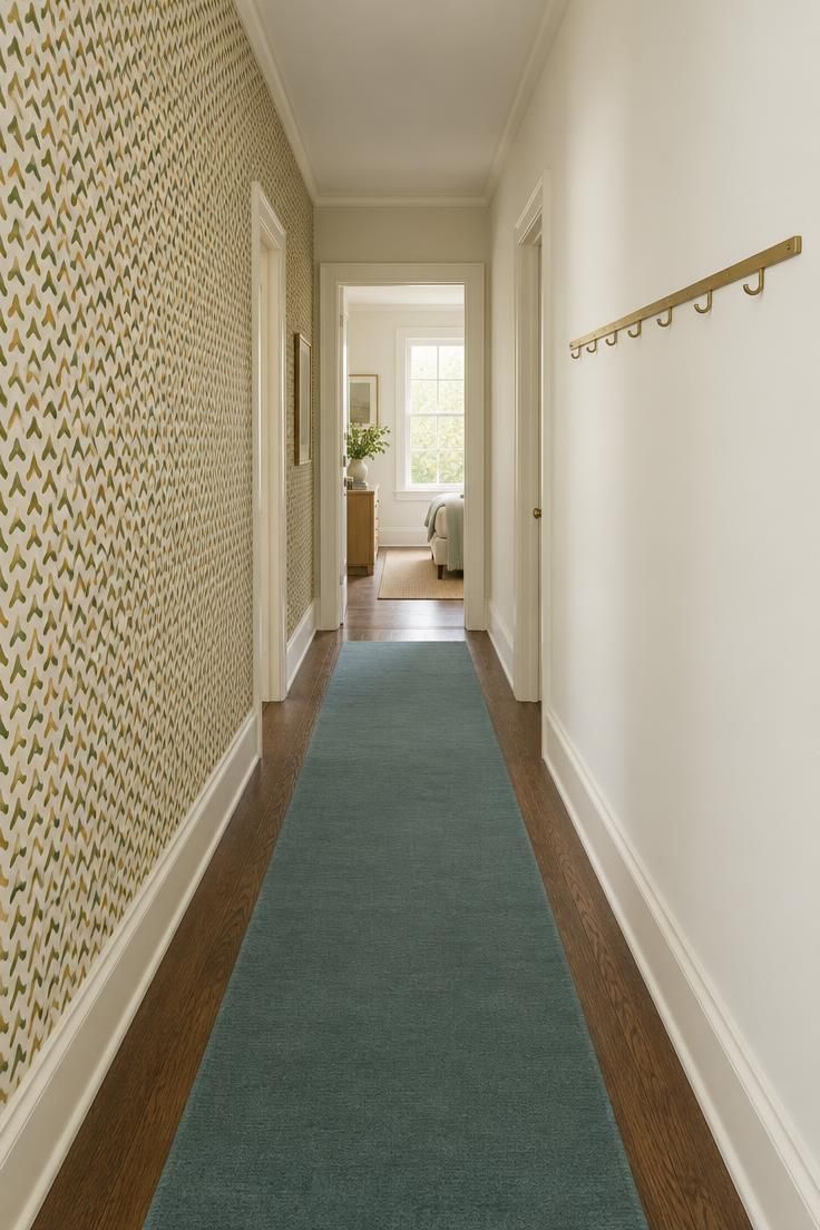
Restricting pattern to one wall gives the corridor energy while keeping the walkway side calm.
In a space this narrow, one patterned surface is usually enough.
Small-scale motifs read better in a narrow corridor than large repeats.
Bigger patterns get chopped by corners, doors, and trim, and the rhythm breaks in ways that are hard to predict on a sample.
Patterned wallpaper in a corridor takes scuffs and hand marks more visibly than flat paint.
Seams are also harder to hide around multiple door frames, which is worth weighing against the visual gain.
A solid-color runner with no pattern keeps the two surfaces from competing.
The floor carries enough visual weight without adding a second motif.
Cream-painted baseboards and trim keep the pattern visually contained.
A contrasting trim color would frame the wallpaper and fight it.
Flat warm white on the opposing wall acts as a counterweight.
It gives the eye somewhere to rest between doorways.
The brass hook rail belongs on the plain wall, not the patterned one.
Hardware over a busy motif disappears into the design instead of reading as a deliberate detail.
For anyone collecting retro hallway ideas, this single-wall pattern approach is a useful middle ground between a fully papered run and a plain painted passage.
A geometric runner rug in a related palette can extend the pattern's color story without repeating the motif itself.
Style Blueprint:
- Small-scale boomerang or atomic-dot wallpaper in olive, mustard, and cream on one wall only
- Flat warm white on the opposing wall as a counterweight
- A brass hook rail on the plain wall to keep the pattern wall clear
- Cream-painted baseboards and trim to contain the pattern
- A solid-color runner so the two patterns do not compete
Open Teak Shelving Unit With a Brass Frame Insert
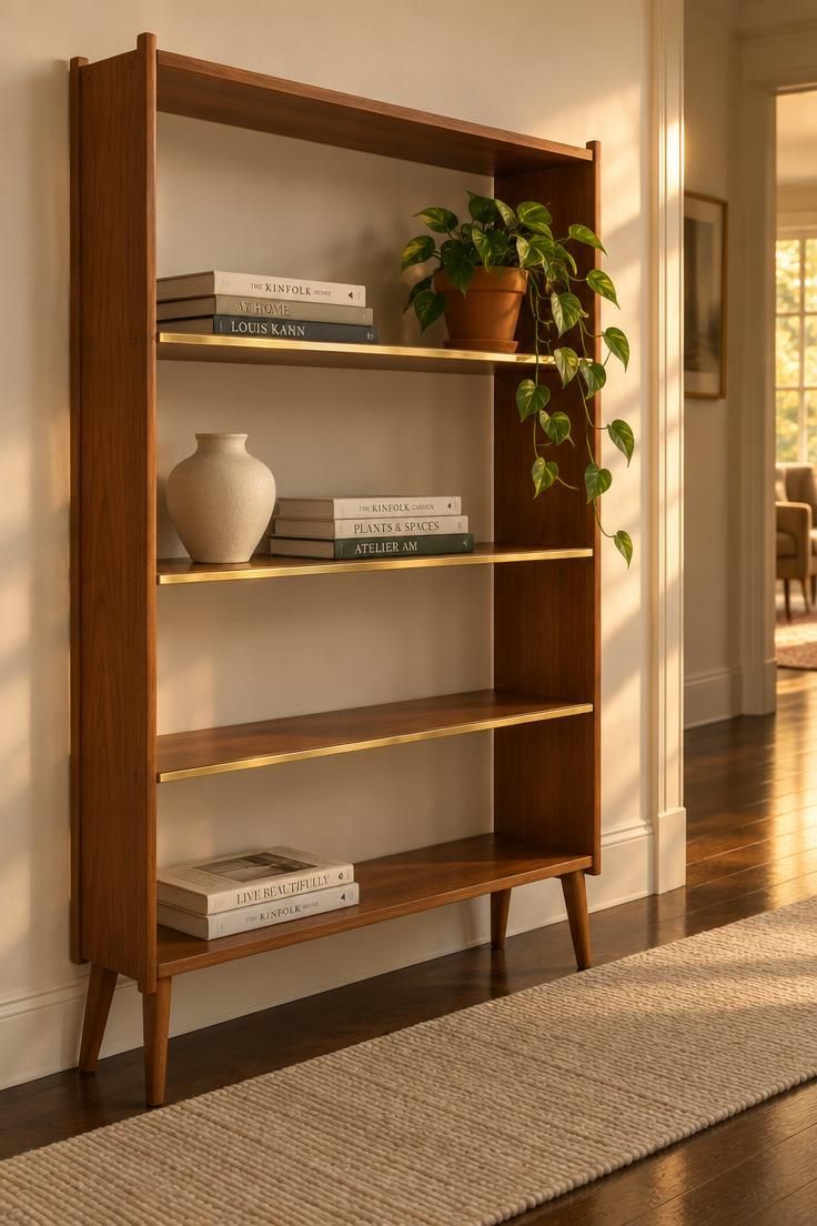
Open shelving doubles as structure and display in a corridor that has no floor space for a large piece.
The unit holds the wall without projecting far into the walkway.
Styling restraint does most of the work here.
An asymmetric ratio of roughly two-thirds empty keeps a narrow corridor from feeling crowded, and empty shelves read as intentional when the filled ones are grouped with care.
Brass frame inserts or edge trim on two shelves adds metal without introducing a second material story.
The accent should feel like a detail, not a competing finish.
Every open shelf and object is a dusting surface.
Closed storage is easier to maintain but far less visually interesting, so this is a tradeoff worth deciding on honestly before committing to open shelving.
Depth is the practical limit.
If the corridor is a main circulation path, keep the unit shallow enough that shoulders clear it comfortably.
Warm white behind the unit keeps the teak silhouette legible.
A dark wall would swallow the shape and make the unit look bulky.
Books laid horizontally instead of vertically give the styling a relaxed, collected feel and keep shelf heights varied without adding height at the top.
Design Pro-Tip: Pick your runner before you pick your wall color. A runner occupies the most continuous visual field in a hallway, and matching an existing rug is far easier than recoloring a hallway after the fact.
Brass Sconce Pair Flanking an Oval Walnut Mirror
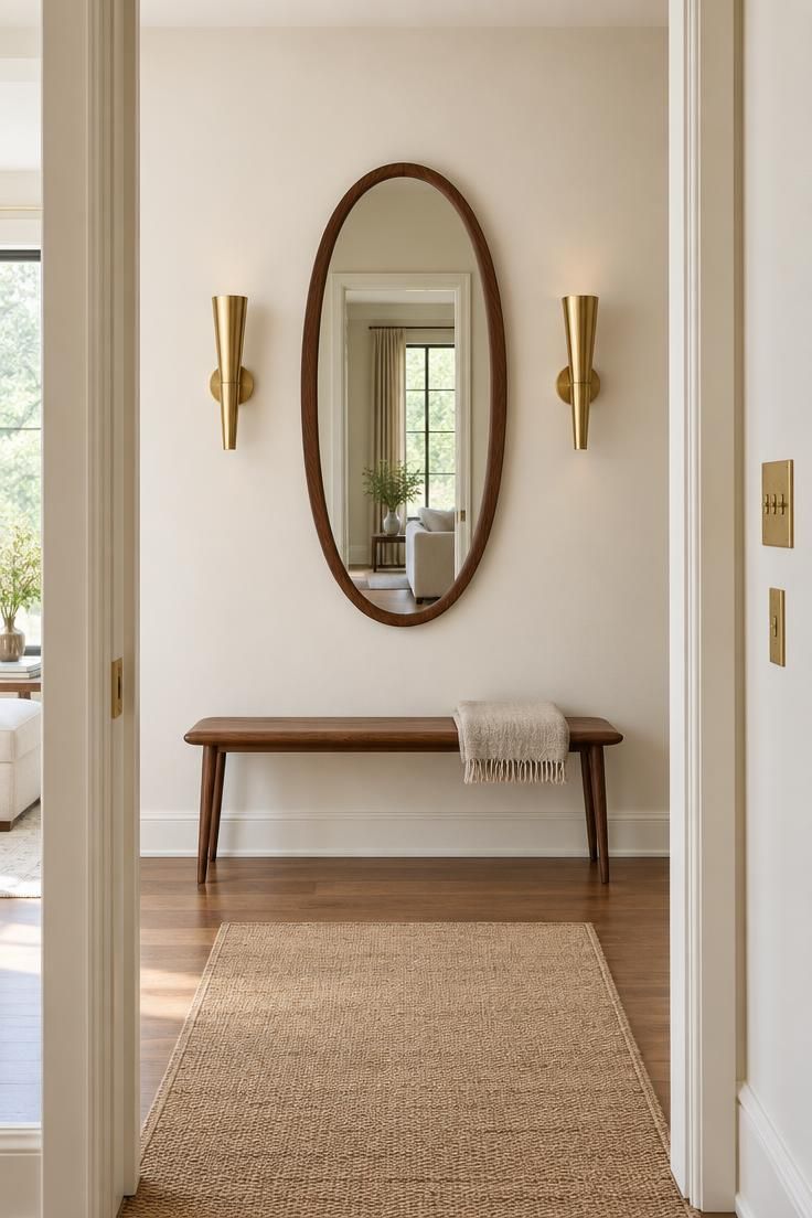
Symmetry gives a corridor wall a formal anchor, and it works especially well at the end of a hall or beside an entry door where the composition is seen head-on.
An oval frame breaks the rectangle-on-rectangle repetition that corridors naturally produce.
Soft curves against straight walls create contrast without adding pattern or color.
Sconces placed at the mirror's midpoint keep the composition centered rather than weighted toward the top.
Height alignment between the two sconces is what makes the pairing read as intentional.
Symmetrical pairs leave no room for improvisation later.
The wall is committed once the mirror is centered, and adding a third element off-axis will disturb the balance.
If the mirror wall also holds a door, symmetry rarely works.
An asymmetric arrangement of one sconce and one hook reads better in that situation, and it is worth sketching the wall elevation before deciding.
Brass switch and outlet plates unify the metal across the elevation.
Small hardware inconsistencies are more visible on a bare wall than on a busy one.
The bench below is optional and depends on walkway width.
An empty floor beneath the mirror is a perfectly complete composition on its own.
This symmetrical pairing is a helpful mid century modern hallway decor reference when the rest of the corridor leans more casual.
Style Blueprint:
- A vertically oriented oval mirror in a walnut frame with visible grain
- Two matching brass sconces positioned symmetrically at the mirror's midpoint
- Warm white walls with no other decoration on that elevation
- Brass switch and outlet plates to unify the metal
- A slim walnut bench or nothing at all beneath, depending on walkway width
Slim Brass Frame Coat Rack With a Walnut Shelf Above
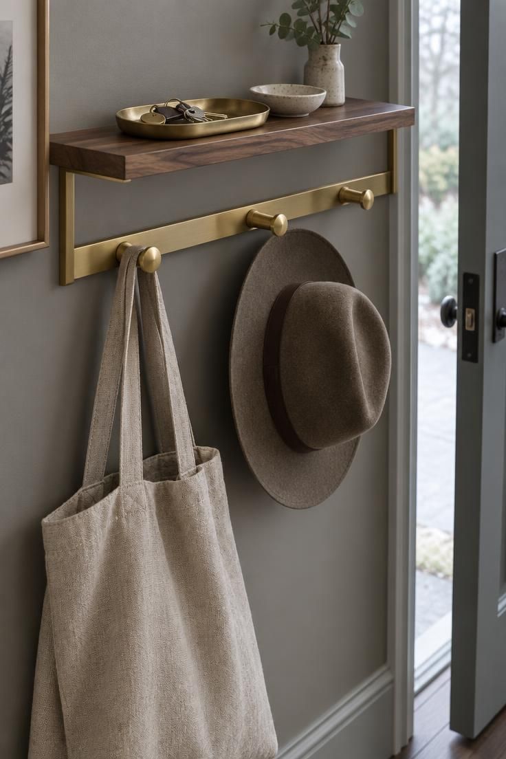
Combining a shelf and a peg rail in one unit gives an entry corridor both a landing surface and hanging storage in a single footprint.
In a narrow space, that consolidation matters more than the individual pieces.
Brass pegs patina with use, which is part of the material's appeal rather than a defect.
Unlacquered surfaces darken gradually where hands touch them most.
Hanging storage fills up quickly without a rule about what lives on the rack.
Left unchecked, it will accumulate bags and outerwear past its visual capacity within a season.
Set the shelf high enough that hanging items clear whatever sits below it, and keep the pegs below eye level so the arrangement stays visually low in the corridor.
Warm grey on the wall gives both brass and walnut distinct grounds to read against.
A warm white wall would soften the brass contrast considerably.
A shallow tray or bowl on the shelf corrals keys and small items so the surface does not become a scatter of loose objects.
Keeping one peg empty is a small but useful styling habit.
It signals capacity rather than fullness and leaves room for a guest's coat.
A walnut slat wall behind a piece like this can work, though the slats and the shelf both compete for the same vertical attention in a short entry run.
Style Blueprint:
- A wall-mounted rack with a slim brass frame and a walnut shelf across the top
- Three to five brass pegs on the frame's lower rail
- A linen tote, a hat, and one scarf as the hanging objects, with no crowding
- A warm grey wall so brass and walnut read distinctly
- A shallow tray or bowl on the shelf for keys and small items
Layered Vignette at the Corridor's End With a Sculptural Plant
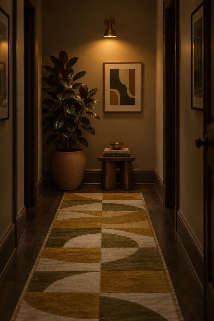
A deliberately composed terminal view turns a corridor's end into a destination.
Layering a plant, a small piece of furniture, and art at different heights gives the eye three things to read instead of one flat wall.
Height variation does the heavy lifting.
A tall plant beside a low stool and a mid-height print creates a diagonal the eye follows naturally.
Off-center placement keeps the vignette from looking like a formal altar at the end of the hall.
Slight asymmetry reads as collected rather than staged.
A geometric runner rug anchors the whole corridor and leads toward the vignette, and the pattern keeps the long floor plane from reading as an empty channel.
Stopping the runner short of the grouping keeps the vignette visually distinct.
Sculptural plants in simple planters suit the style better than bushy, soft forms.
A rubber plant or a tall snake plant holds its shape in low light and stays upright without support.
A single brass wall sconce above the print gives the end wall focused light without involving the ceiling.
Concentrating light at the corridor's destination is more useful than spreading it evenly.
Maintenance on the plant is real.
Large leaves collect dust and need wiping, and the plant needs watering on a routine that suits its species and light levels rather than a fixed schedule.
Keep the stool shallow enough that the vignette does not block the corridor's end.
The composition should be legible from a distance, not just up close.
Style Blueprint:
- A large sculptural plant in a simple unglazed planter at the corridor's end
- A low walnut stool or small bench holding a stack of books and one brass bowl
- A mid-sized framed print in an oak frame hung off-center above the stool
- A geometric runner rug in ochre, olive, and cream leading toward the vignette
- One brass wall sconce focused on the end wall
Conclusion
A mid century modern hallway is built from restraint: one material story, one metal tone, one focal point.
The strongest corridors in this style do less than they seem to, and the empty space is as deliberate as anything in them.
The tradeoffs worth remembering are practical ones.
Slats and gallery walls demand regular dusting, saturated color absorbs light, patterned wallpaper takes scuffs, and every furniture choice is limited by how much walkway width remains.
Mid century modern hallway decor succeeds when the maintenance load matches the way the house is actually lived in, not when every surface demands a daily routine.
Retro hallway ideas can still feel fresh when the upkeep stays honest and the pieces are chosen for daily use rather than display alone.
Start with the runner and the light.
Those two decisions set the palette and the mood for everything else, and the rest of the corridor tends to fall into place once they are settled.