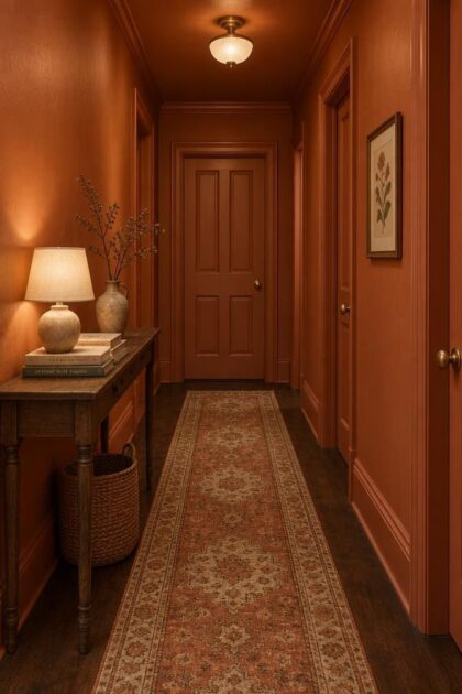
This post may contain affiliate links. If you make a purchase through these links, we may earn a commission at no additional cost to you.
Hallways ask more of a color scheme than most rooms do.
Square footage is small, daylight arrives late or not at all, doorways chop the wall run into short segments, and people pass through with coats, bags, and wet boots.
A colorful hallway has to work under all of that pressure at once.
The ideas below are organized by how color gets delivered, whether through paint, paper, paneling, textiles, objects, or a mix of several.
That way you can pick an approach that fits your corridor’s door count, length, and light rather than copying a room that shares none of your constraints.
Saturated Color-Drenched Envelope in a Warm Terracotta
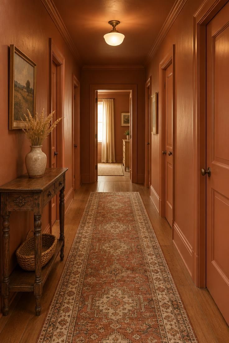
Every visible plane wears the same warm terracotta, so the color-drenched hallway reads as one continuous envelope rather than a series of separate panels.
In halls with several doors, fewer color edges mean the corridor reads as a whole instead of feeling choppy.
A deep hue can tip toward black at the far end of a windowless hall, and a lighter ceiling or a purposeful warm fixture is the usual visual counterweight.
Matching the doors to the walls lets them disappear into the envelope, which some people love and others find disorienting when guests are trying to find a bathroom.
Sheen changes the read: a higher sheen bounces available light and looks more vivid, while a flatter finish looks softer and deeper but marks more readily near switch plates.
Plan on more coats to return a high-chroma wall to neutral than you would need for a mid-tone, which matters if a future repaint is likely.
Style Blueprint:
- Warm terracotta on walls, trim, ceiling, and doors
- A single warm-light fixture set at the ceiling’s center
- Matte-finish switch plates and hardware that recede into the color field
- One small object in a pale natural tone to break the envelope at eye level
Design Pro-Tip: Pick the door strategy before the wall color. Whether doors match the walls, match the trim, or contrast is the decision that most changes how the finished hallway reads.
Two-Tone Color Block With a Low Deep Band and a Pale Upper Wall
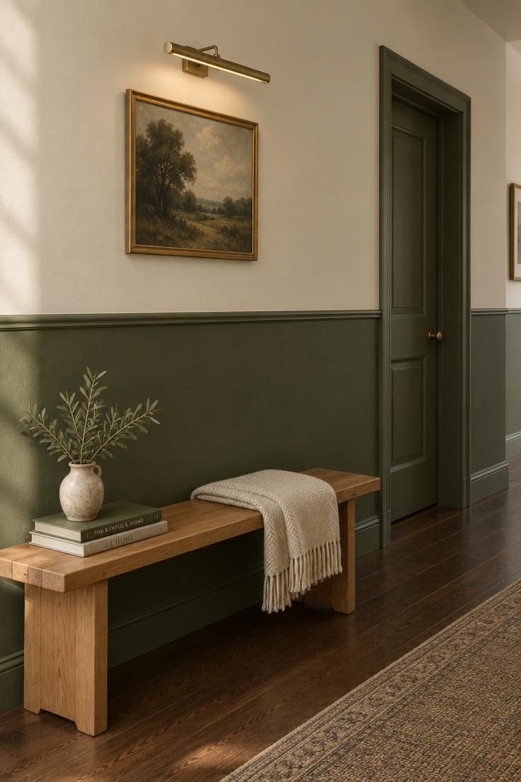
A deep lower band against a pale upper wall, capped by a slim trim rail, is the most classical of hallway color ideas because the composition does so much with a single horizontal line.
On a long corridor the line breaks the visual length and gives the eye something to follow toward the far end.
Reverse the arrangement, with a pale band below and deep color above, and the corridor reads lower and more enclosed.
Proportion decides most of the effect: a very low band reads almost as a dado, while a very high band nearly closes the wall, and the sweet spot shifts with ceiling height.
The pale upper wall holds more light at eye level than the lower band, which matters most in corridors with limited daylight.
Doors, switch plates, and passage openings interrupt the horizontal line, so plan the band height to sit above or below the worst of them.
The lower band is exactly where hands, bags, and coat sleeves land, so a sheen with some cleanability is the common practical answer.
Style Blueprint:
- Deep lower band in a saturated warm hue
- Pale upper wall in a warm white or soft cream
- A slim painted trim cap to define the split
- Switch plates painted to match the band they sit on
Large-Scale Patterned Wallpaper on a Hallway With Few Doors
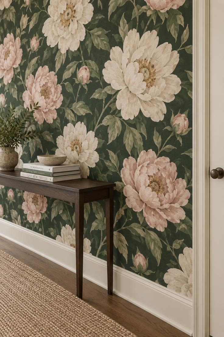
An oversized floral, scenic mural, or painterly repeat covering the full wall run has to be scaled for the short viewing distance of a corridor.
Patterns chosen from a large showroom sample often read far smaller once they are at arm’s length.
Few-door hallways suit large-scale hallway wallpaper best, because the pattern has room to repeat and read as intended without a door frame cutting through the composition.
Pattern scale is the main tradeoff: small repeats can read busy up close, while large motifs need a long enough run to reveal their full design.
Paper type changes the character.
Patterned paper with a repeat feels rhythmic, mural paper with a scene feels like a destination, and grasscloth or woven textures bring visible tooth that catches light along the corridor.
Because the paper already carries the color story, keeping art and objects minimal prevents competition between surfaces.
Peel-and-stick papers are the version renters gravitate toward, while traditional pasted papers are the version that feels permanent.
Seams, textured faces, and woven papers collect dust and are harder to spot-clean than painted walls.
Removing wallpaper is more involved than painting over paint, which is the largest commitment in this section.
Style Blueprint:
- Large-scale patterned paper on all visible walls
- Trim painted to recede into the paper’s background tone
- A slim console or single bench in a quiet solid color
- One framed piece of art, or none, to keep the walls breathing
- A simple floor in a neutral tone so the paper does the talking
Painted Board-and-Batten Paneling Tone-on-Tone With the Wall
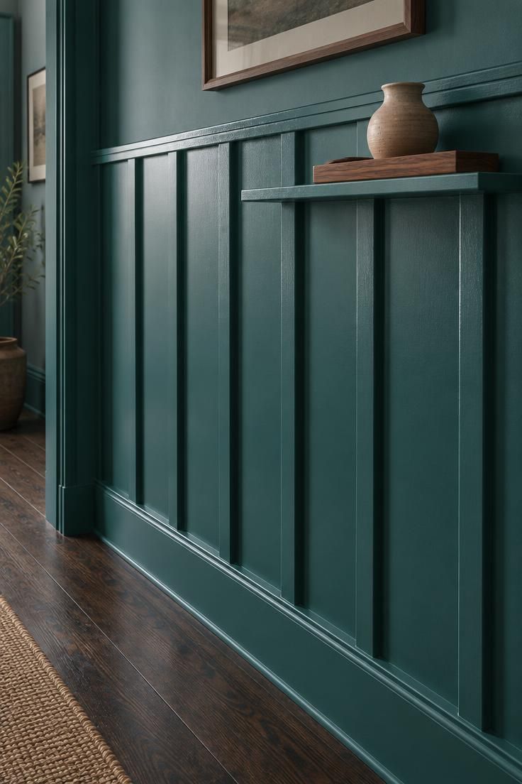
Vertical battens applied over the wall and painted in the same bold hallway paint as the wall behind them keep the color as one field while the surface gains shadow and texture.
That shadow rhythm earns its keep in low-daylight halls, where natural light is scarce and every surface reads a little flatter than it would elsewhere.
Paint the battens in a second hue and the effect shifts: the paneling reads as its own layer, but it also introduces a second color decision that can compete with the wall color.
Paneling covers uneven wall surfaces that paint alone would highlight, which is a practical visual benefit in older homes with wavy plaster.
Battens can run full height or stop at chair-rail height, and the two layouts produce very different proportions along the corridor.
Applied trim changes the wall surface permanently, unlike a paint color, so it is a harder decision to reverse than it first appears.
Style Blueprint:
- Bold saturated wall paint in a single hue
- Battens painted in the same hue as the wall
- A trim cap and baseboard in the same color for continuity
- One modest object in a natural material, like a wood tray or ceramic vessel
Saturated Painted Doors as the Color Event Against Neutral Walls
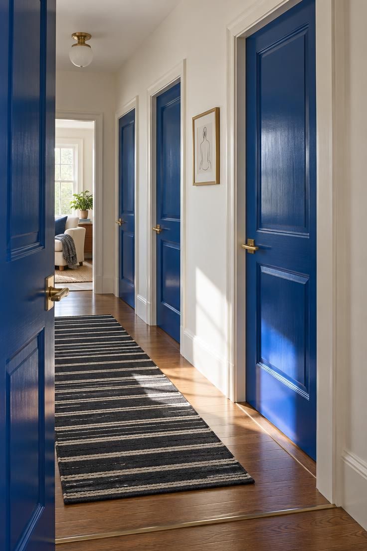
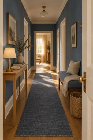
Soft white or pale neutral walls with interior doors painted in a saturated hue turn the doors themselves into the color story.
This works in hallways where doors dominate the wall run, because the doors are already in the composition and making them intentional reads as more coherent than fighting them.
Invert the scheme, with saturated walls and doors in a contrasting neutral, and the corridor reads more graphic and higher in contrast.
Doors painted to disappear into the wall color can be hard for guests to locate, while a contrasting door color solves wayfinding but introduces a second color decision.
In very small hallways with two or three doors, one saturated door color can carry the entire scheme, which makes this one of the most practical small hallway color moves available.
Door hardware is a small but visible choice: matching the door color hides it, while a contrasting metal finish turns it into a punctuation mark repeated down the corridor.
Repainting doors is straightforward, so this remains one of the more flexible saturated moves in the list.
Style Blueprint:
- Soft white or pale neutral on the walls
- Saturated paint on all interior doors in a single hue
- Door hardware in a finish that reads as either punctuation or camouflage
Design Pro-Tip: Look at the hallway at the same time of day you’ll see it most. A saturated hue that looks rich in the afternoon can look almost black in the morning.
Patterned Hallway Runner With Quiet Walls
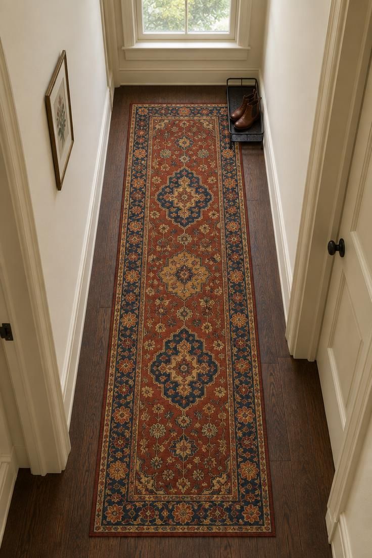
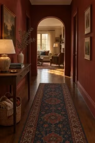
A patterned runner carries the color and rhythm down the floor line while the walls stay in a soft neutral, which makes it the most forgiving version of a colorful hallway.
For readers who don’t want to commit to wall color, the runner is the color event and the walls stay quiet.
Runner width relative to the corridor changes the read: a runner that leaves floor visible at both sides feels more deliberate, while one that nearly meets the walls fills the space edge to edge.
Pattern does practical work in high-traffic halls, because it visually interrupts the marks and scuffs that show on a plain floor surface.
The pattern can echo one wall object or trim color to tie the scheme together, or it can introduce a hue the walls don’t carry at all.
Runners need vacuuming and occasional cleaning, and in a narrow corridor they can shift without something grippy beneath.
This approach suits rentals especially well, since the runner is removable and the walls stay landlord-friendly.
If the runner is the color story, keep the walls and objects minimal, because a busy pattern and busy objects compete in a hallway more than they would in a larger room.
A runner can also be rotated or replaced when the scheme feels tired, without any repainting.
Style Blueprint:
- Patterned runner in a warm or jewel-toned palette
- Soft neutral walls in a warm white or pale cream
- Trim painted to match the walls so the runner leads
- Minimal wall objects, or one small framed print
- A simple boot tray or slim console that doesn’t compete with the pattern
Collected-Object Color Wall of Art, Prints, and Ceramics
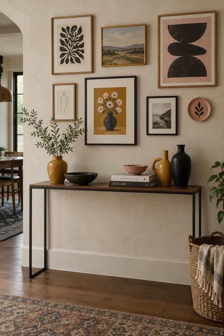
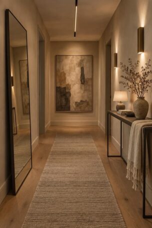
Pale or neutral walls holding a curated layer of framed prints, ceramics, and small objects let the objects deliver the color instead of the architecture.
This is the rental-friendly approach, because the walls and structure stay untouched and the whole scheme can pack up and move with you.
Frame choice sets the tone: matching frames read as gallery discipline, while mismatched frames read as a collected, personal wall.
Object density matters more here than in most rooms.
In a hallway, layered objects compete more with each other, so restraint usually reads better than abundance.
A slim console or wall shelf anchors the arrangement and separates display from the floor line.
Pulling one hue from the art into a ceramic or a small textile is the technique that makes an arrangement read as a scheme rather than as accumulation.
Objects on a console collect dust and can be knocked in a narrow corridor, so a shallow surface reads better than a deep one.
This is the most changeable scheme in the list, because the walls and structure stay untouched.
Style Blueprint:
- Pale or warm neutral wall as the base
- A slim console or floating shelf at a shallow depth
- A grouped arrangement of framed prints, mixing sizes
- A small collection of ceramics or colored objects tied to one art hue
Color on the Ceiling in a Pale Tint or a Full Deep Tone
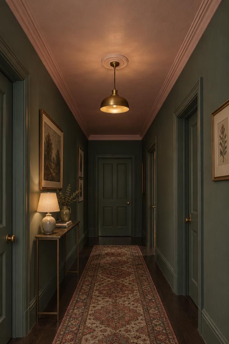
Painting the ceiling changes how a corridor reads when the ceiling is visible from a stair or when it is simply a prominent plane in a narrow space.
Two directions are available.
A pale tint of the wall color reads quiet and slightly taller-feeling, while a deep tone reads more enveloping and turns the ceiling into a second color event.
Ceiling color is especially effective in halls viewed from a stair landing, where the ceiling sits directly in the sightline.
A deep ceiling removes reflection from the corridor’s largest light-bouncing surface, which changes how the walls read at eye level.
A papered ceiling is the more decorative alternative, adding pattern overhead and working best with quieter walls below.
Ceilings are just paint over paint, so the decision is more reversible than most in this list.
Style Blueprint:
- Wall color chosen first, then a ceiling color that relates to it
- Ceiling painted in either a pale tint of the wall or a deep contrast tone
- Trim painted to match one of the two so the planes have a relationship
Painted Floor or Stair Risers at Foot Level
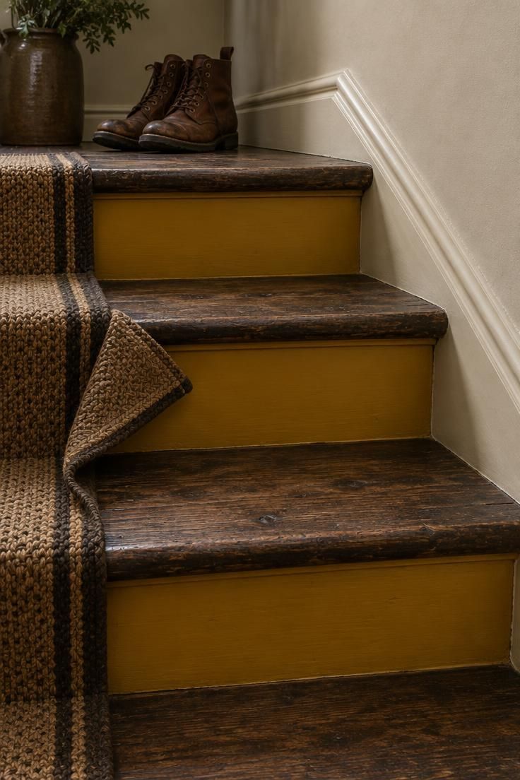
Color placed at the floor plane, either as painted floorboards or as painted stair risers, puts the color story underfoot where it is often overlooked.
In stairs and hallways where the floor is a major visible plane, this turns what would be a background surface into a color moment.
Walls and floor meet along the whole corridor, so each changes how the other reads, and the pairing deserves to be planned together.
Painted floors and risers show wear on treads and in traffic lanes over time and are typically the first surface to need refreshing.
A checkerboard or graphic painted floor is the bolder version, and it competes with busy wallpaper or layered objects in the same way a loud runner does.
Keeping the upper wall in a warm neutral lets the painted floor stay the focus, while a saturated wall would compete for attention.
Painted floors are one of the harder moves to undo, which is worth knowing before the first coat goes down.
Style Blueprint:
- Painted floor or risers in a saturated or graphic color
- Walls kept in a warm neutral or soft tint
- A pale ceiling to keep some reflected light in the corridor
- A boot tray or doormat in a quiet solid tone to define the entry zone
Design Pro-Tip: When two surfaces meet along the entire corridor, like floor and wall, decide which one carries the color, then let the other one be quiet. Two saturated surfaces can read as competing.
Contrast Trim and Switch Plates Against a Saturated Wall
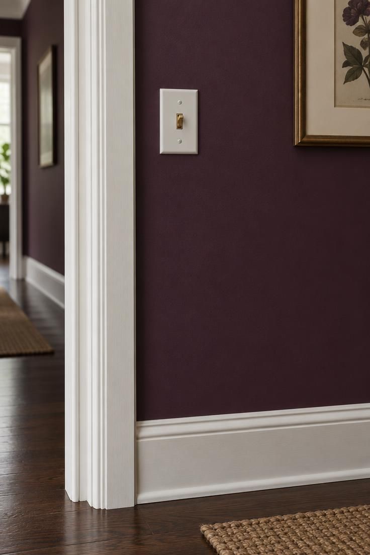
A saturated wall with trim, baseboards, and switch plates in a deliberate second color turns the small interruptions into punctuation rather than problems.
In hallways with many wall interruptions, this approach works because it makes the switch plates and casings intentional instead of trying to hide them.
Deeply saturated walls with white or cream trim is the classic pairing, and the reverse reads more graphic and higher in contrast.
Every interruption becomes a decision, so contrast trim schemes take more planning than tone-on-tone treatments.
Switch plates and outlet covers are the smallest and least expensive way to carry the contrast, and the easiest element to revise if the scheme feels off.
Trim and switch plates are easy to repaint, which makes this a friendly entry point into saturated color for anyone hesitant about commitment.
Style Blueprint:
- Saturated wall color
- Trim, baseboards, and door casings in a contrasting second color
- Switch plates and outlet covers painted to match one of the two
Mixed Envelope With a Corner Change in an L-Shaped Hall
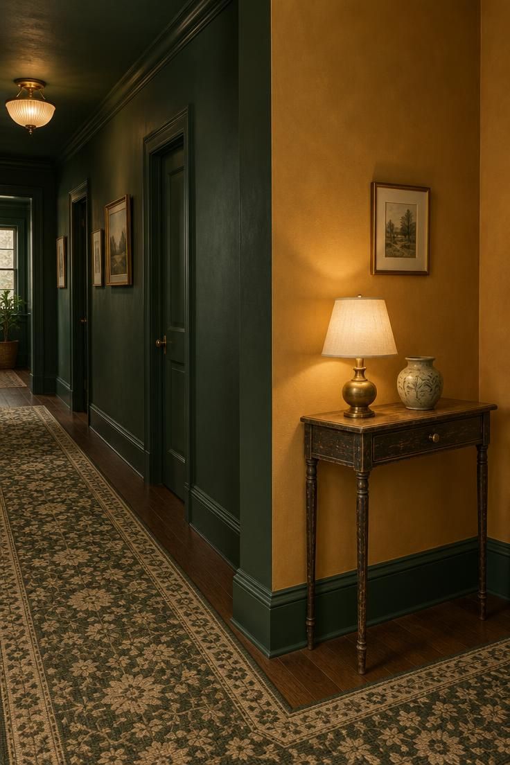
An L-shaped or T-shaped hall gives a color scheme a natural place to change, and the corner becomes a reveal rather than an interruption.
One color through the straight run and a different but harmonious color around the turn keeps the corridor feeling intentional instead of accidental.
The two colors need a relationship to read as one scheme, whether they share a warm base, a similar depth of saturation, or a repeated element like a runner that crosses the corner.
Carrying the same trim, flooring, or runner through both zones is the simplest way to hold the scheme together across the change.
A console, lamp, or single object positioned at the elbow of the turn gives the eye a resting point at the transition.
This approach suits halls where a single saturated color would feel monotonous over a long run, and where a visible corner offers a natural break.
Doors around the corner can match either of the two colors, and the choice usually follows whichever zone they open into.
Style Blueprint:
- Two harmonious colors, one for each leg of the hall
- A shared trim, floor, or runner element that crosses the corner
- A slim console or single object placed at the turn
- Warm lighting that reads consistently across both colors
Conclusion
Each idea in this list delivers color through a different system: paint on every surface, a horizontal paint split, wallpaper, paneling, doors, a runner, collected objects, the ceiling, the floor, trim, or a deliberate change at a corner.
Which one fits depends on your hallway’s dominant constraint.
Count the doors, measure the run, and note how much daylight actually reaches the space before choosing.
The first decisions worth making are the door strategy, the ceiling and trim color, the floor treatment, and how dense the object layer will be.
Color in a hallway is more reversible than it often looks: paint over paint is straightforward, textiles and objects can rotate freely, and only wallpaper and painted floors carry real commitment.
A hallway that carries color with intention is the first thing a guest sees and the last thing they remember.