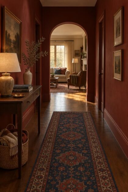
This post may contain affiliate links. If you make a purchase through these links, we may earn a commission at no additional cost to you.
The hallway is the most-seen and least-lit space in most homes, and it usually has more doors than open wall.
That means whatever color lives there gets seen constantly, on the way to the kitchen, on the way upstairs, on the way out the door.
Red is a deliberate choice in a corridor because walls and doors carry nearly the whole visual load, unlike in a furnished room where furniture breaks up the color.
The ideas ahead cover both full color-drenched treatments and accent-only options, with reversibility and existing fixed finishes noted where they matter.
Testing a sample in the actual corridor light, at the hours the space is used, is the practical first move before committing to any surface.
Why a True Red Wall With Crisp White Trim Reads as a Statement
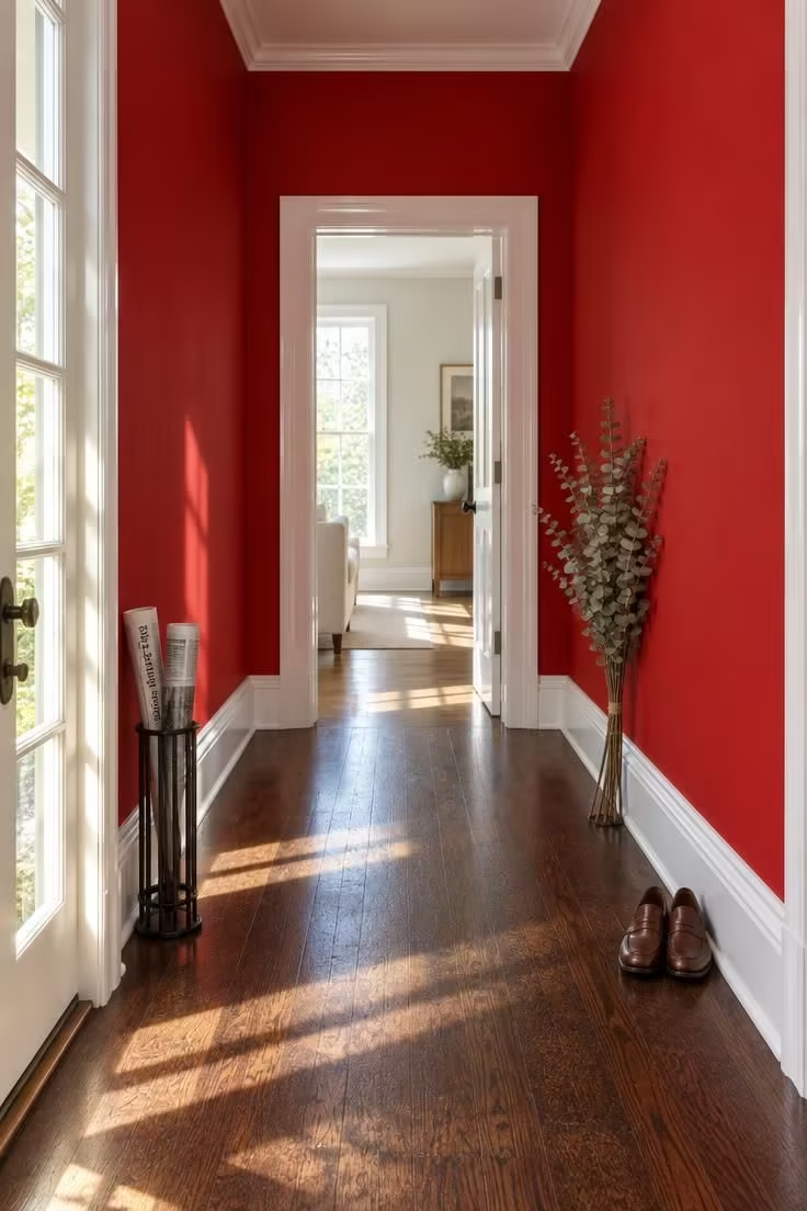
White trim does the heavy lifting in this composition, acting as a hard edge that keeps a bold wall from blurring into the doors and floor.
Without that crisp line, a saturated red can read as one soft mass rather than a graphic plane.
The risk with true red is scale: a shade that looks rich on a small test patch can look much heavier across a long corridor, which is why this direction suits short to medium hallways with reliable daylight.
Choosing the finish matters as much as the color here, since a red hallway sees hand contact, luggage, and constant foot traffic.
Glossier and scrubbable finishes on walls and lower trim hold up better in a high-touch corridor, while matte finishes read softer but show more marks.
Keeping wall decor minimal lets the wall plane itself carry the effect, which is the whole point of this approach.
An oxblood hallway paint pulls the same trick with a deeper, browner base, so the contrast against white trim feels calmer while the wall still holds its own.
Style Blueprint:
- Saturated true-red wall paint with low brown or black content
- Semi-gloss or gloss white trim on casings, baseboard, and doors
- Dark stained or dark-toned wood floor
- Minimal wall decor so the wall plane carries the effect
Design Pro-Tip: Paint a large sample board and move it to three spots along the corridor, under daylight, overhead light, and evening lamp light, before committing, because red shifts tone more than almost any other wall color.
Drenching an Oxblood Corridor From Wall to Ceiling
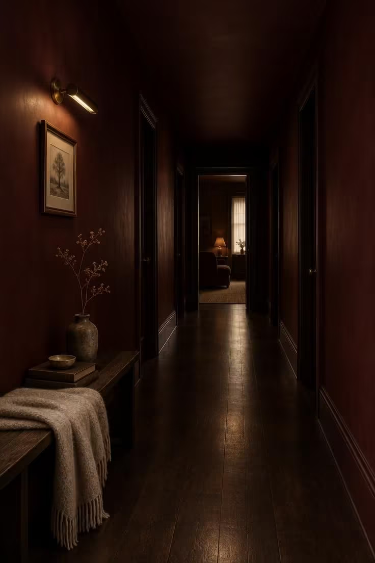
Oxblood differs from true red in its depth, since brown and purple sit under the red rather than beside it.
That depth is forgiving in a low-light corridor, where a brighter red would tip toward orange under warm bulbs.
Painting the ceiling the same tone removes the break between wall and ceiling, so a tight hall reads as a single carved space rather than a boxed one.
The commitment level is real: a drenched ceiling is more visible and more of a project to undo than wall paint alone.
Ceiling paint is generally reversible, but repainting overhead is more laborious than rolling a wall.
Trim painted to match the wall or to a near tone keeps the volume uninterrupted, and a low-sheen dark floor grounds the whole corridor.
Aged brass warms the scheme without competing with it, and one small light source is enough in a space this enclosed.
Style Blueprint:
- Oxblood, burgundy, or wine wall paint with visible brown or purple depth
- Matching painted ceiling in the same tone
- Trim painted to match the wall or in a near-tone
- Aged brass sconce or picture light
- Dark hardwood floor with low sheen
A Single Brick Red End Wall as the Corridor's Focal Point
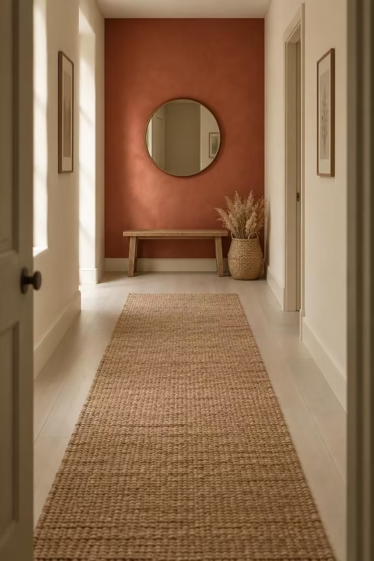
The eye lands on the end wall first in this arrangement, which turns the color into a destination rather than a tunnel effect.
It is the lowest-commitment way to use a bold red in a hallway with many doors, since only one wall receives color.
Choose the end-wall red against the corridor's side wall tone rather than in isolation, because the two surfaces sit in the same view.
A warm cream or greige side wall keeps brick red from reading muddy, while a cooler gray side wall can dull it.
An earthy brick or terracotta-leaning red softens the focal point compared with a true red, which would create a sharper stop at the end of the corridor.
A single focal object keeps the composition from fragmenting, and one bench, framed print, or round mirror is enough.
Runners in a natural fiber tone let the wall hold the color, and the pale floor keeps the corridor's middle bright.
A run of brick red hallway walls works best when just one surface carries the color and the rest stay quiet.
Style Blueprint:
- Earthy brick or terracotta-leaning red on one end wall only
- Warm cream or greige on the flanking corridor walls
- Natural jute or woven runner over a pale floor
- Single focal object such as a small bench, framed print, or round mirror
Design Pro-Tip: When framing an end wall in red, keep the flanking side walls one or two shades lighter than the ceiling trim so the focal wall reads as intentional rather than accidental.
Painting Every Interior Door Red Against Pale Walls
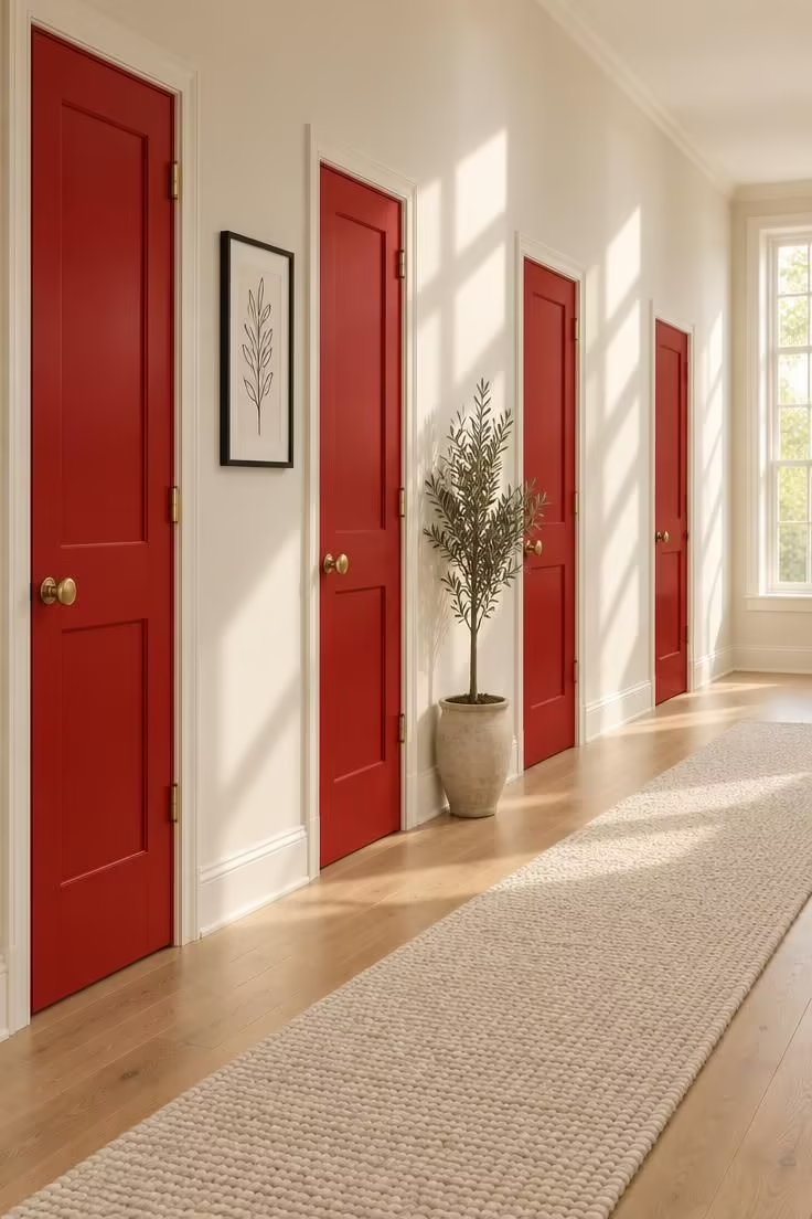
Doors become the primary color field in this approach, which suits a hallway with limited uninterrupted wall space; Consistent hardware color ties the repetition together, so brass, black, or unlacquered metal chosen once and repeated reads as intentional rhythm.
Too many doors can shift the effect from rhythm to clutter, and the balance usually depends on how much pale wall sits between them.
Reversibility deserves a plain look here: painted doors are slower to undo than painted walls, especially when trim and panels are painted the same color.
Pale or off-white side walls isolate the door color so it does not compete with a second field.
A simple, low-pattern floor keeps the doors as the visual event, and the runner stays quiet beneath them.
This direction works especially well in older homes where the door count is high and the wall segments between them are short.
Red painted interior doors turn each threshold into a repeated focal point without overcrowding the narrow walkway.
A coral hallway color can pair with these doors when the surrounding walls lean warm, but it may soften the contrast that keeps the red fields distinct.
Style Blueprint:
- Consistent red across all interior doors in the corridor
- Door trim either painted to match or kept in a contrast white
- Uniform brass, black, or unlacquered metal knobs and hinges
- Pale or off-white side walls to isolate the door color
- Simple, low-pattern floor so the doors remain the visual event
Stair Risers Painted Red Under Calm Treads
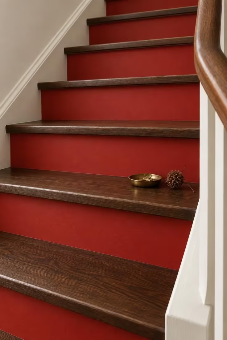
Red stair risers become horizontal color bands while the treads stay visually quiet, so the effect reveals itself while someone ascends.
Riser color covers a much smaller surface area than a full wall, which allows a bold or true red with less risk of visual heaviness.
Painted risers are less reversible than painted walls, and painted stair surfaces see foot traffic, so this is a finish choice worth entering with maintenance in mind.
A flat or low-sheen riser finish keeps the color from flashing under overhead light, while the treads in dark stained or natural wood carry the wear.
A white or pale stringer and skirt board gives the stripes a clean frame, and a handrail echoing the tread material keeps the composition from splitting.
On stairs with an open side, the painted risers also read from the adjacent room, which extends the color beyond the corridor itself.
The pattern of alternating red and wood draws attention to the rhythm of the climb rather than to any single step.
Style Blueprint:
- Red-painted risers in a flat or low-sheen finish
- Dark stained or natural wood treads
- White or pale stringer and skirt board for contrast
- Simple handrail in a tone that echoes the tread material
Rolling Out a Red Hallway Runner Over a Neutral Floor
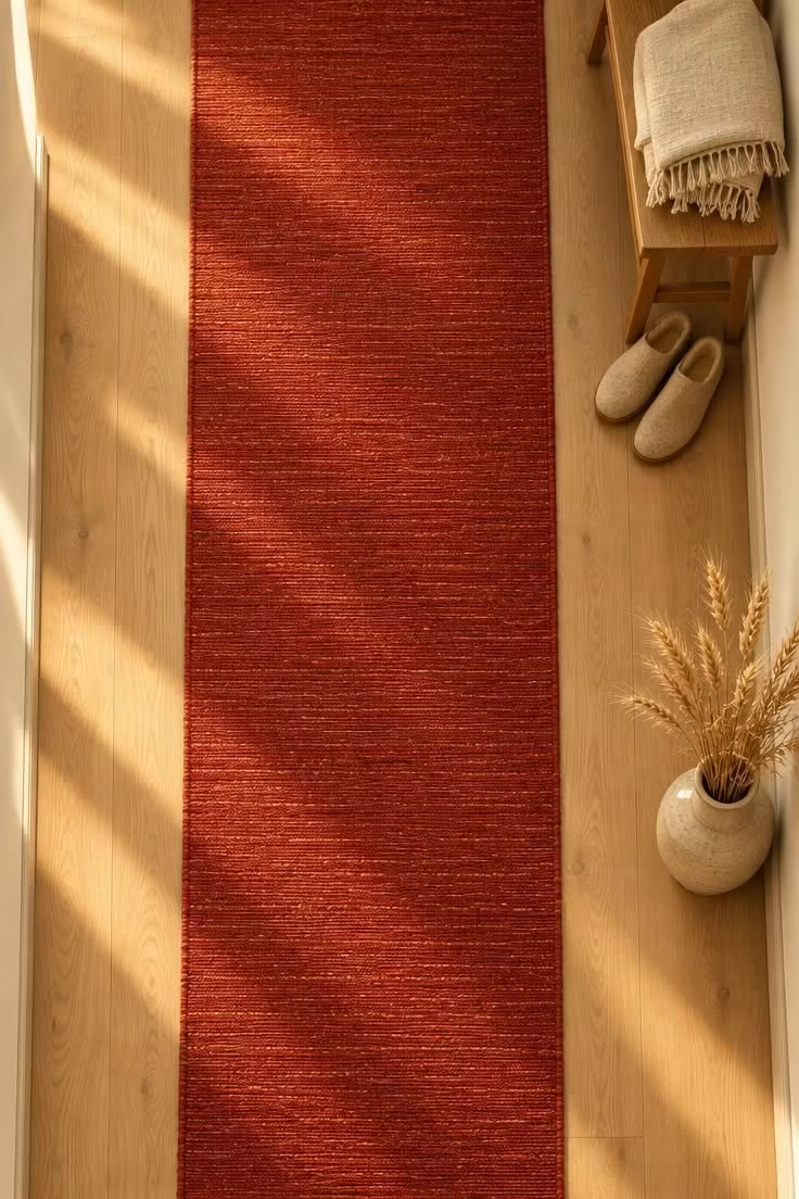
This is the most reversible red idea on the list, since a runner introduces color without touching a single wall.
A runner can be swapped, stored, or moved to another space, which makes it a reasonable choice for renters and for anyone unsure how much red they want in a corridor.
Runner dimensions are a fit question rather than a fixed rule, and in most narrow corridors a runner that leaves visible floor on both sides keeps the walls and floor from feeling pinched.
A runner that spans wall to wall visually erases the floor and makes a narrow hall feel narrower.
Maintenance is straightforward to state: runners collect foot traffic dirt and need regular cleaning or rotation.
A solid red runner shows marks more than a patterned one, so an understated pattern offers some forgiveness without losing the color.
A non-slip pad beneath keeps the runner stable underfoot and holds its position through daily traffic.
When a runner runs up a staircase, a pattern that helps each tread edge read clearly is the practical choice.
Style Blueprint:
- Solid or subtly patterned red runner in a low-pile or flat-weave construction
- Visible flooring margin on both long sides
- Neutral side walls and a pale or mid-tone floor
- Non-slip pad beneath the runner for stability underfoot
- If the runner is on stairs, a pattern that helps each tread edge read clearly
Design Pro-Tip: Measure the corridor's clear floor width first, then choose a runner that leaves a margin, since a runner that spans wall to wall visually erases the floor and makes a narrow hall feel narrower.
Half-Height Red Wainscoting Below a Lighter Upper Wall
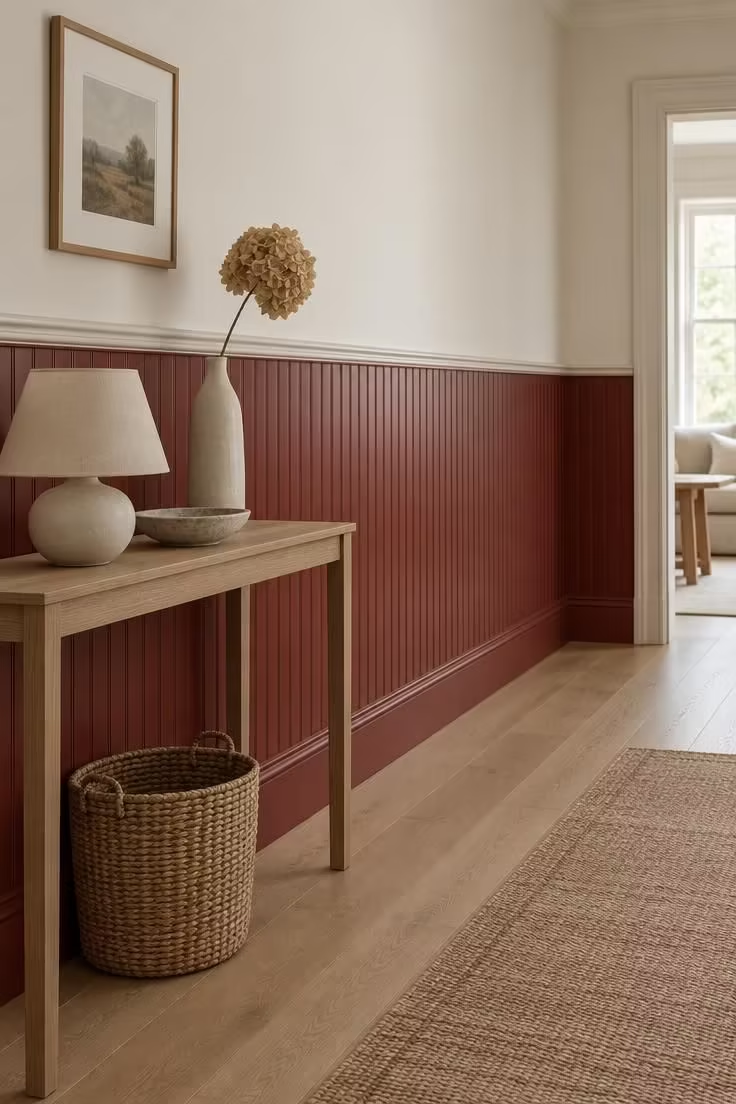
Limiting red to the lower half concentrates color where hands, luggage, and furniture meet the wall while the upper wall stays light and reflective.
The practical advantage is repairability, since lower panels take more contact and are typically easier to touch up or repaint than a full wall.
The chair-rail line creates a strong horizontal, and its height relative to the ceiling can make a corridor read longer or shorter.
Beadboard, shiplap, and flat panel each bring a different amount of shadow and texture to the same red.
A pale warm-white or cream upper wall keeps the corridor's upper half open, which matters most in corridors with no window.
Simple painted chair rail in the same red or a contrast white decides whether the horizontal reads as a line or a step.
Low-profile or wall-hung furniture keeps the panel line visible, so the wainscoting stays part of the composition rather than disappearing behind a cabinet.
Style Blueprint:
- Red-painted beadboard, shiplap, or flat panel wainscoting
- Pale warm-white or cream upper wall
- Simple painted chair rail in the same red or a contrast white
- Low-profile or wall-hung furniture so the panel line stays visible
Small-Pattern Red Wallpaper With Tone-Matched Trim
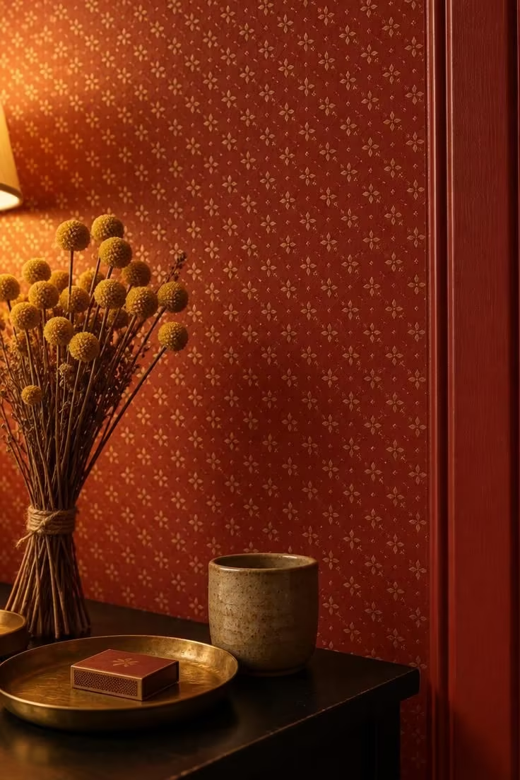
A red wallpaper hallway gains visual texture instead of reading as one flat field, which is the main reason to choose paper over paint here.
Small repeats tend to work better than large-scale patterns in corridors with multiple door openings, where the pattern is interrupted often.
A small motif also keeps a narrow corridor from feeling busy, since the eye reads it as texture rather than as distinct figures.
Installation and removal is the tradeoff to weigh: wallpaper is a greater commitment than paint, and hanging around many doors and casings increases the fuss.
Plain painted trim in a tone-matched or slightly deeper red gives the pattern a clean stopping point.
A simple white or pale ceiling relieves the pattern above, and an unpatterned floor or runner balances the wall texture below.
Framed art kept minimal lets the pattern stay the focal layer, and one or two pieces are usually enough.
Style Blueprint:
- Small-repeat red wallpaper with subtle pattern contrast
- Plain painted trim in a tone-matched or slightly deeper red
- Simple white or pale ceiling to relieve the pattern
- Unpatterned floor or runner to balance the wall texture
- Framed art kept minimal so the pattern stays the focal layer
Design Pro-Tip: In a door-heavy corridor, choose a wallpaper with a small repeat and hang a paper sample beside the casing to confirm the pattern doesn't fight the trim line.
A Coral-Leaning Red for Small or Borrowed-Light Hallways
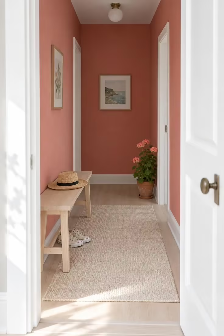
Coral reads closer to a warm neutral than to a true red, so it pairs with most existing finishes without the contrast demands a saturated red makes.
That quality makes it the lowest-commitment entry into red for a small or windowless hallway, where a deeper tone could close the space in.
A coral tone is also a friendlier fit for renters or anyone testing whether red works in their corridor at all.
Crisp white trim keeps the tone from reading pastel, which is the main risk with lighter red-oranges.
A pale wood or light tile floor supports the lighter direction, and a natural-fiber rug in a neutral tone adds texture without adding weight.
In borrowed-light situations, the coral appears brightest near the doorway and softens toward the far end, which gives the corridor a natural gradient.
Style Blueprint:
- Coral or soft red-orange wall paint with low saturation
- Crisp white trim to keep the tone from reading pastel
- Pale wood or light tile floor
- Natural-fiber rug in a neutral tone
A Red-Painted Ceiling in an Otherwise Light Corridor
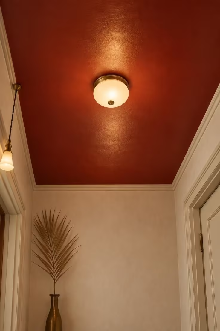
A red painted ceiling reveals itself only on looking up, so the corridor reads mostly light at eye level and shows its color on a second glance.
Ceilings are less interrupted by doors and trim than walls, which lets a strong color sit cleanly on a single plane.
Minimal ceiling trim keeps that plane reading as one continuous surface, and a low-sheen finish avoids a hard reflection from the light source.
The practical side is worth planning for: ceiling paint is straightforward to change, but overhead painting and ladder work make repainting a job rather than an afternoon.
Pale or white walls keep eye level bright, which is the whole reason the ceiling surprise works.
A simple flush-mount or low-profile pendant stays visually quiet against the red and does not compete.
In corridors with a short ceiling height, the red plane sits closer to the eye, so the color is noticed sooner and the effect is stronger.
Style Blueprint:
- Red-painted ceiling in a low-sheen finish
- Pale or white walls to keep eye-level light
- Simple flush-mount or low-profile pendant
- Minimal ceiling trim to let the plane read cleanly
A Red Built-In Bench With a Neutral Surround
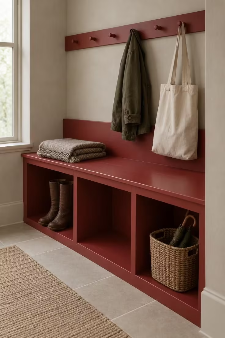
Red confined to a functional object reads clearly in a corridor with neutral walls, and the color stays where it is used every day.
A bench in a hallway earns its footprint by holding bags, shoes, and coats, so the color sits on something with a job rather than on a decorative panel.
Because the surrounding walls stay putty or another quiet neutral, the bench becomes the single color event in the corridor and does not compete with the doors or floor.
Open cubbies beneath keep visual weight low, and a low back lets the bench read as furniture rather than as a wall segment.
If the goal is flexibility, a freestanding red bench offers the same effect with far less commitment than a built-in, and it can move when the scheme changes.
The pegs above extend the function upward, and their tone can echo the bench or stay neutral to keep the red concentrated below.
Style Blueprint:
- Red-painted bench with a low back and open storage beneath
- Neutral putty, greige, or warm gray surrounding walls
- Peg rail above in a matching or neutral tone
- Woven basket and folded textiles for texture
- Simple hard floor or a low-pattern runner beneath
Conclusion
The ideas above sit at two ends of a spectrum: drenching treatments that commit the whole shell, and accent moves like runners, doors, risers, wallpaper, or a bench that let a corridor stay flexible.
Which end suits a space depends less on the shade of red than on the corridor's length, its natural light, and the fixed finishes that will not change.
Red is a decorative decision with wide room to move, and the surfaces that receive it can range from one end wall to an entire volume.
A sample viewed in the actual hallway light, at the times of day the space is used, remains the most useful first step.