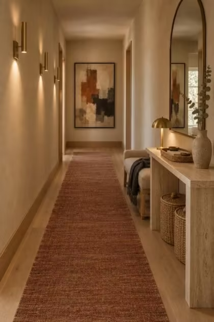
This post may contain affiliate links. If you make a purchase through these links, we may earn a commission at no additional cost to you.
A corridor whose length runs far beyond its width sets up a specific visual problem: parallel wall, floor, and ceiling lines converge toward the far end, and the eye travels straight down without resting anywhere.
Most people living with this geometry notice the same four symptoms: a strong one-point perspective that makes the hall feel like a passage rather than a room, dim middle sections, blank repetitive walls, and the difficulty of placing furniture without pinching the walking path.
Treat it as a composition problem with a circulation constraint.
Every idea below is judged on two axes: what it looks like, meaning rhythm, sightline, terminus, and finish, and what it does, meaning guide movement, store something, mark a transition, or soften an edge.
Each entry pairs one concrete move with an honest tradeoff, and two themes run through the whole list: shallow depth and consistent repetition.
Scan the images first, then read the text for the limitation that decides whether the idea fits your specific corridor.
Put a Single Strong Terminus at the Far End
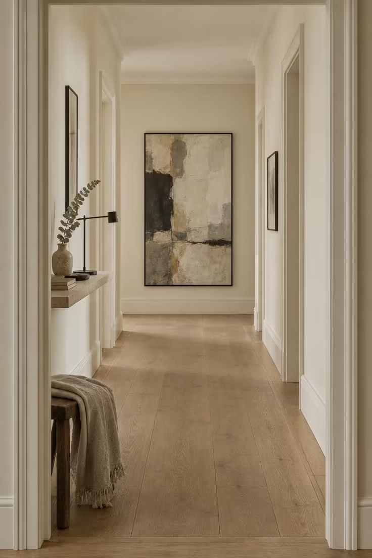
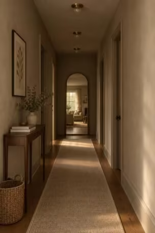
The far wall carries more visual weight than anything on the sides because the converging lines point straight at it, so one strong move there does more work than five medium moves scattered along the run.
Composition here is deliberately spare: a single artwork or a painted door, generous empty wall around it, and a quiet floor so nothing competes.
A small cluster of small frames at the terminus reads as clutter from a distance, which defeats the purpose.
The tradeoff is that the terminus is seen head-on from the whole length, so glare from glass, a deep frame profile, or an off-center hang becomes noticeable from far away.
Test the hang from the corridor's entrance rather than from two steps back.
If the corridor ends in a door that has to stay functional, put the visual weight on the wall beside it, or paint the door itself in one saturated color and leave the surrounding wall calm.
A large framed piece or a painted door can serve as hallway focal point art, anchoring the entire sightline without adding furniture.
Style Blueprint:
- One piece of art sized to roughly the width of the wall it hangs on
- A thin or flush frame profile
- A warm off-white or cream wall so the artwork is the only strong contrast
- Matte floor finish to avoid a competing sheen
Run a Continuous Horizontal Line to Give the Eye a Path
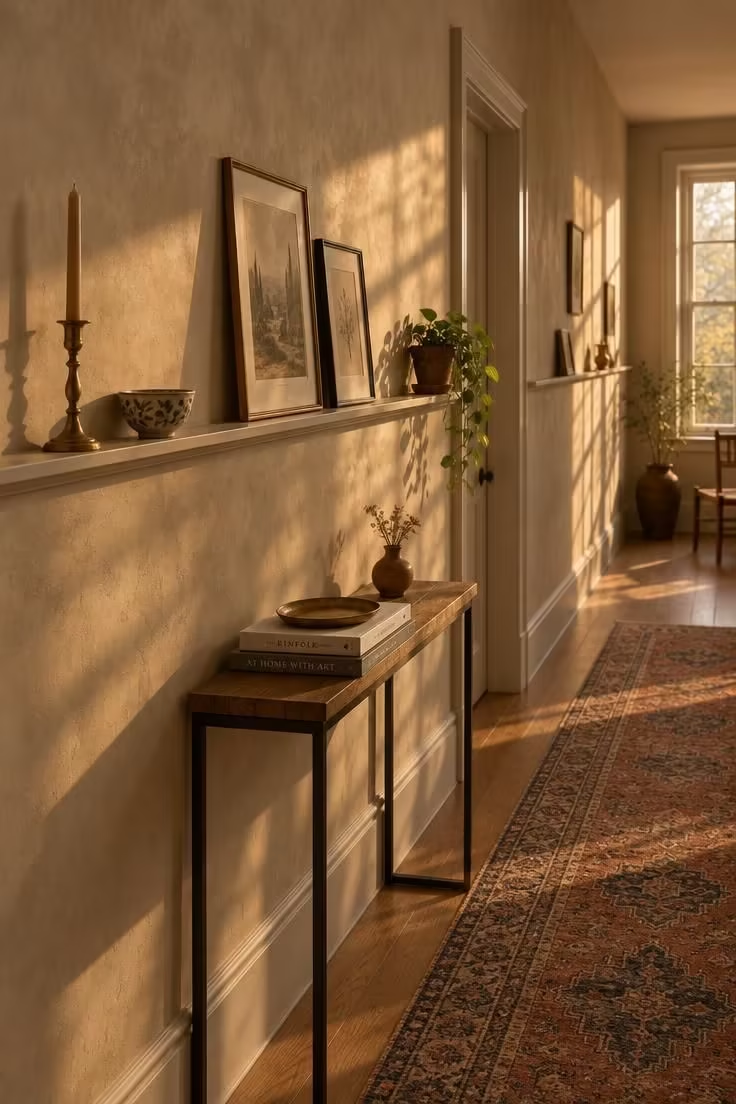
A continuous horizontal element gives the eye something to follow at walking speed, which is how hallway walls are actually seen: at a glancing angle rather than head-on.
Options include a chair rail, a picture ledge, a dado line, a paneling cap, or a shallow floating shelf.
The point is that the line does not stop at every door; it threads past them so the wall reads as one gesture rather than a series of interruptions.
Rhythm depends on consistency, since repeated elements at regular intervals read as intentional while irregular spacing reads as accidental.
Mark your start point and keep the increments equal.
A line that runs unbroken past several doors can fight the architecture if casings are tall or ornate, and in that case let the line stop at the casing and resume on the other side at the same height.
Ledges and rails collect dust along their whole length, and one styled with a few larger objects is faster to clean than one crowded with small pieces.
Where the ledge passes above a landing point, a small hallway console table tucked beneath it can hold a single lamp and one tray without extending past the walking path.
Style Blueprint:
- One line height, measured once and repeated around the run
- A shallow depth that keeps the walking path clear
- Trim painted to match the wall for calm, or in contrast for definition
- Objects in a limited palette repeated along the run
Design Pro-Tip: Run a piece of painter's tape along the wall at your planned line height and live with it for a day before committing, since the right height changes once you see it at walking speed.
Build Rhythm With Evenly Spaced Repeats Down One Wall
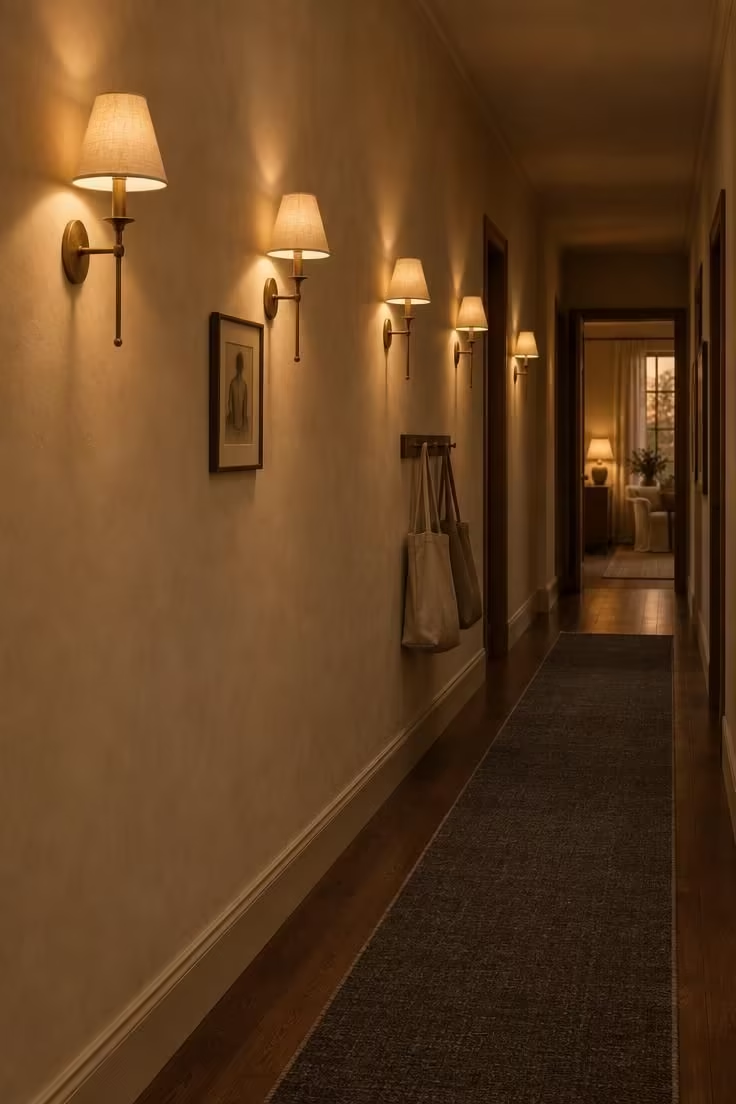
Repetition is the most direct antidote to the tunnel, since a run of identical elements turns length into a sequence rather than a void.
Candidate repeats include sconces, peg rail sections, shallow framed prints in one size, small hooks, or narrow shelves.
Pick one and commit to it rather than mixing two rhythms on the same wall.
The eye reads the intervals as a beat, and the wall stops feeling blank even though very little has been added.
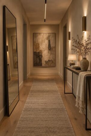
Hallway wall sconces work especially well for this because they create a repeating light rhythm that carries the eye forward after dark.
An even run of sconces needs a light source plan that does not require opening the wall at every point, and corded plug-in styles with a discreet cord cover or a single switched run are the usual compromises.
Talk through that with a qualified electrician before committing to the layout, since the placement itself is the design decision here.
Consistent spacing looks best when it is genuinely consistent, so measure from a fixed datum such as the floor line or the top of the baseboard rather than by eye from the previous object.
Style Blueprint:
- One repeated object, chosen and not mixed with a second rhythm
- One fixed spacing increment measured from a single datum
- One finish for all hardware
- Sconce shades in the same material throughout
- A warm neutral wall so the repeats carry the pattern
Define the Walk With a Long Runner
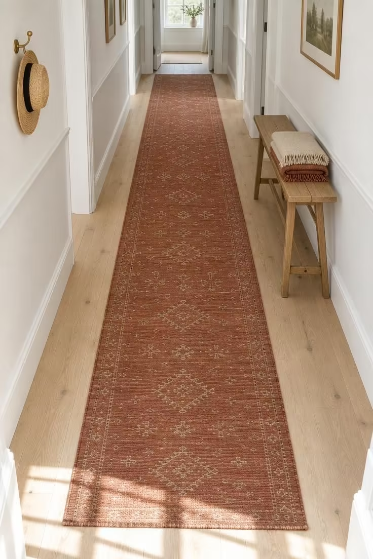
A runner does two jobs at once: it draws a line down the length, which reinforces the corridor's direction, and it defines the walking zone so furniture placement reads as deliberate.
Sizing is the decision that matters most.
A runner that stops well short of the ends makes the corridor feel truncated, while one that runs to or near the thresholds reads as continuous.
Width matters too, and leaving a strip of visible flooring on both sides usually looks more settled than filling the full width.
Narrow hallway runner rugs in wool and flatweave give texture and durability, jute offers a coarser look, and vintage Persian adds pattern that hides traffic marks.
Long runs of light-colored or flat texture show foot traffic quickly, so darker tones, patterns, and washable materials are the practical route in a high-traffic corridor.
Pattern scale deserves a second thought, since a busy motif seen at close range in a narrow space can overwhelm while a small repeated motif seen at a glancing angle can blur into texture.
Style Blueprint:
- Runner length running to or near both thresholds
- A narrow reveal of floor on each side
- Low pile for door clearance
- A pattern scale chosen for close viewing
- A rug pad for grip and a flatter lie
Layer Two Runners When One Length Won't Cover the Run
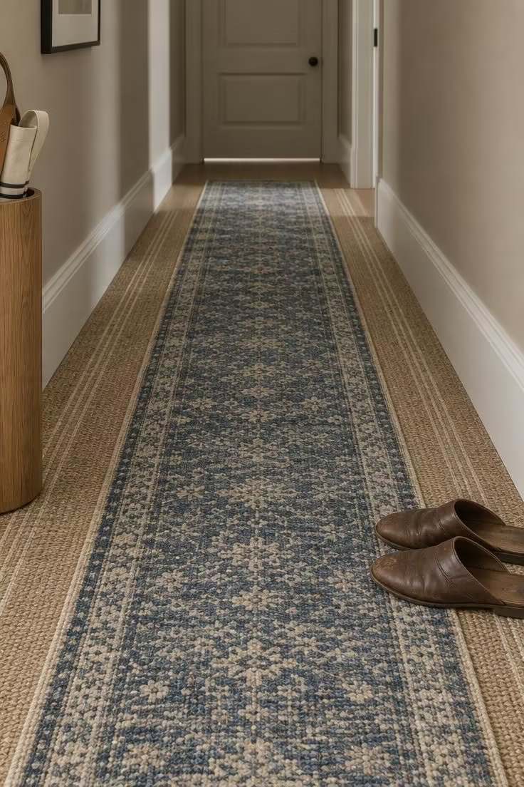
Very long corridors often exceed the lengths available in a single runner, and hallway runner layering solves that without a visible seam.
A longer, cheaper base in jute or flatweave gets a shorter patterned runner centered on top.
The base layer runs nearly the full length, the top layer covers the middle portion, and both share a center line so the asymmetry is intentional rather than accidental.
Beyond coverage, two textures give the floor depth, and the top runner can be swapped seasonally without replacing the base.
Layered rugs shift, so a pad under each layer and a low profile on the top layer keep the arrangement from creeping, and both layers need to lie flat enough that no edge catches a foot.
Two strong patterns compete, so keep the base quiet and textured and let the top layer carry the pattern.
Style Blueprint:
- Base layer in a solid or subtly woven texture
- Top layer narrower by a consistent margin on each side
- A shared center line between the two layers
- Low pile on top for clearance
- A pad under both layers
Design Pro-Tip: Photograph the finished runner arrangement from the corridor's entrance, since that long view reveals whether the layers read as one continuous floor treatment or as two separate rugs.
Interrupt the Center Line With a Shallow Console
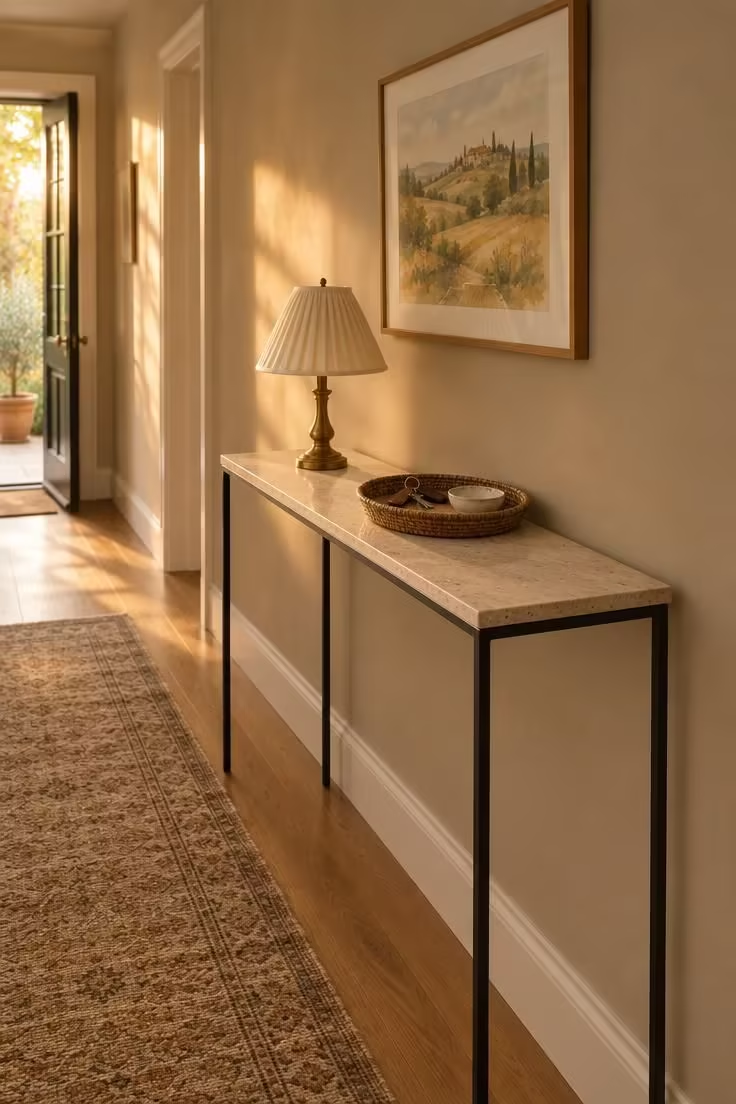
A console placed against one wall breaks the corridor's single long gesture into two shorter ones, which is often enough to dissolve the tunnel reading.
Shallow is the operative word.
A small hallway console table should leave the walking path generously clear, and its legs or plinth base should not protrude past the wall line more than the top does.
Styling for a narrow space comes down to one lamp, one tray or bowl, and one stack of two books; anything more and the surface reads as storage rather than a pause point.
A console in a corridor is a place things land, and without a tray or a defined drop zone the surface becomes a mail pile within a week.
A console with a lamp needs an outlet near the placement, and if there isn't one, a battery or rechargeable lamp avoids running cord across the floor.
Style Blueprint:
- Shallow depth relative to the corridor's width
- Open legs or a slim plinth so the floor reads continuous
- A top in wood, stone, or lacquer
- One lamp and one tray
- Hardware in a single finish
Add a Bench as a Pause Point, Not a Storage Wall
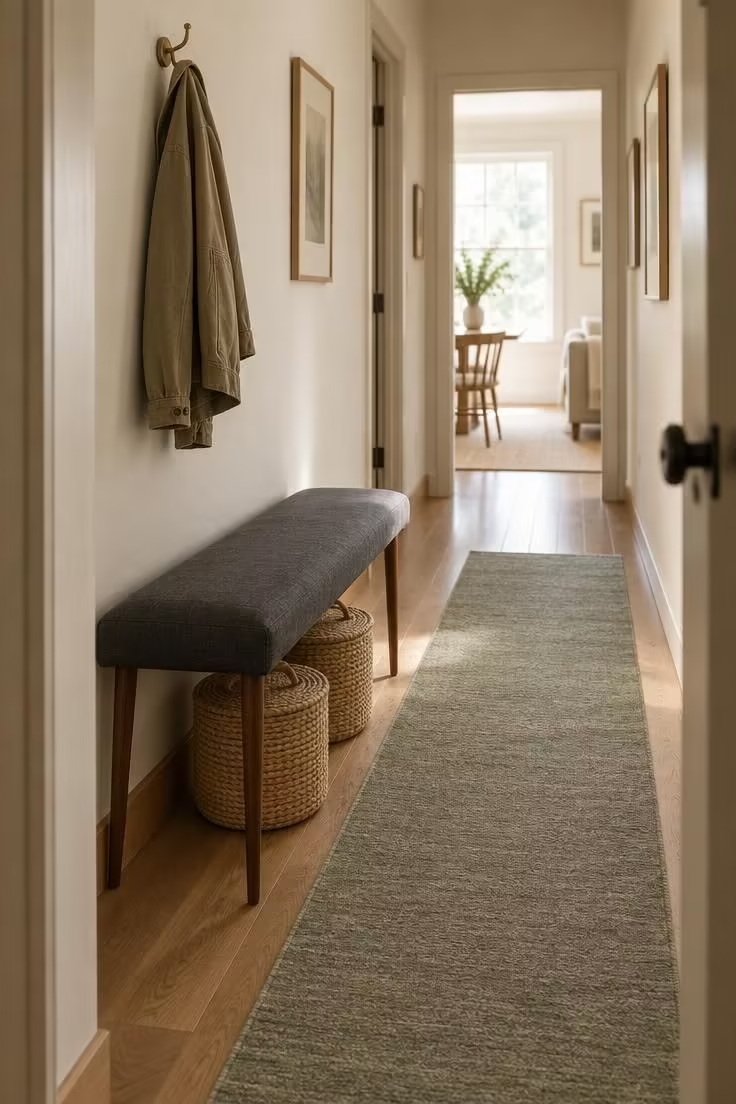
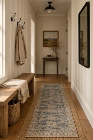
A bench marks a second zone in the corridor and offers a place to sit while putting on shoes, and its low horizontal mass contrasts with the corridor's vertical lines.
Choose a hallway storage bench with a shallow seat depth and legs that read as open rather than solid, so the floor plane stays visible beneath it.
For what goes underneath, two lidded baskets or a single shallow tray works well, and lids matter in a corridor because open baskets of loose items are visible from the full length of the hall.
A bench narrows the walking path at exactly the point where people tend to pause, so in a very tight corridor a wall-mounted fold-down seat or a slim bench with no arms is the more workable version.
Upholstered benches in a corridor take more wear than those in a bedroom, and a tight weave, a removable cover, or a leather seat holds up better than a loose linen slip.
Style Blueprint:
- Shallow seat depth
- Open or slim legs
- One upholstery material in a mid or dark tone
- Two lidded baskets sized to the opening beneath
- A low back or no back at all
Treat the Ceiling as a Surface That Can Carry the Length
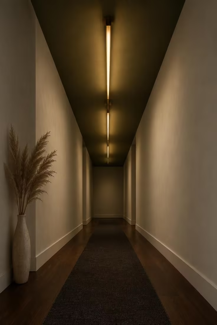
The ceiling is the largest uninterrupted plane in a corridor and the one most often left as white default.
Giving it a color, a texture, or a directional treatment changes the proportions of the space without touching the walls.
Hallway ceiling paint colors can run deeper than the walls for a lower, more intimate feel, lighter for lift, or shift in sheen to mark a transition.
A linear fixture aligned with the corridor's direction rather than across it reinforces the run.
Direction matters here, since a treatment that repeats along the length reinforces the corridor's line while one that cross-cuts it creates a series of bays.
A dark ceiling over a narrow corridor absorbs light, so it needs more distributed light sources to avoid a heavy middle, and a mid-tone is often easier to live with than a very deep one.
Ceiling color is visible from the corridor's entrance as a single plane, so uneven coverage shows, and two coats over a primer are the usual minimum.
Style Blueprint:
- One ceiling tone distinct from the walls
- A finish between flat and eggshell to avoid glare
- A linear light aligned with the corridor
- Trim left or painted to match
- A mid-tone if the corridor is already dim
Design Pro-Tip: Paint a sample board and hold it against the ceiling at the corridor's entrance, since overhead surfaces shift in perceived tone depending on how light falls on them.
Stop the Wall Line With Board and Batten Below the Dado
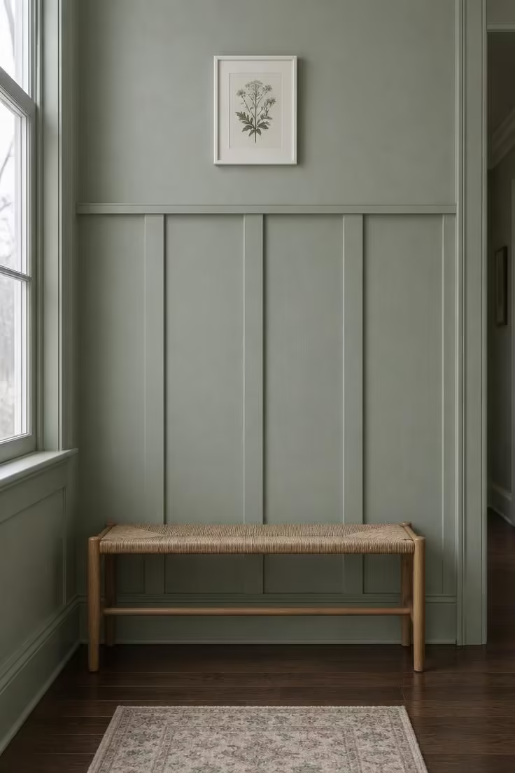
A paneled lower wall gives the corridor texture and a strong horizontal cap line, which reads as a datum the eye can travel along at speed.
Hallway board and batten is the vertical-heavy option, with narrow battens at even intervals, a horizontal cap rail, and the whole assembly painted to match the wall above for calm or in contrast for definition.
The cap rail becomes a shelf-like line in the field of view, so hang art with its bottom edge either well above that line or centered on it rather than straddling it.
Vertical battens at close range in a narrow hall can feel busy, and wider spacing with fewer battens reads calmer than a dense grid.
Painted millwork in a corridor collects scuffs at the base, and a darker or satin finish at the bottom rail hides marks better than a pale flat finish.
Style Blueprint:
- Battens at wide, even spacing
- A cap rail height consistent around the whole run
- The same paint color above and below for a quiet look
- A satin or semi-gloss finish on the millwork
- Art aligned to the cap rail, not straddling it
Compose the Long Wall as One Gallery Rather Than Per-Image Placement
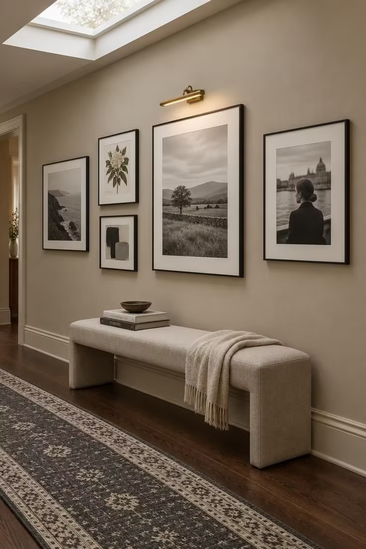
In a corridor, art is seen at an oblique angle, so composition matters more than any individual piece.
Treating the wall as one composition prevents the stop-start look of frames hung one at a time.
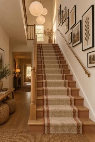
A long hallway gallery wall works two ways: an evenly spaced row at a single center height, which reads as calm and orderly, or a loose cluster centered on the one solid wall between doors, which reads as collected.
One frame style or one frame color unifies mixed subject matter, and mats in a consistent tone do the same job when frames vary.
Glass glare is more visible from an oblique angle, so matte artwork, non-reflective glazing, or a piece with texture instead of a print under glass are the practical swaps.
Very small objects get lost at corridor distance, and if you love small pieces, group them in a tight grid so the group reads as one larger shape.
Style Blueprint:
- One center line height carried across the run
- One or two frame sizes
- A consistent frame finish or mat tone
- A group of small pieces treated as a single unit
- Art scaled to be legible from the corridor's far end
Extend the View With a Mirror Placed for the Reflection
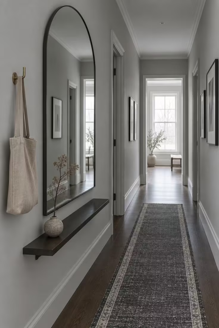
A mirror adds a second sightline, so instead of only looking down the corridor, the eye also looks into the hallway mirror reflection, which reads as depth rather than length.
Placement beats size.
A mirror that reflects a window, a lit room, or a bright wall extends the view usefully, while one that reflects a bare wall or a dark corner just repeats the corridor.
Types to consider include a tall leaner, a wall-hung rectangle, an arched shape, or a pair of smaller mirrors spaced as part of a rhythm.
A mirror positioned to catch a bright light source or a lamp directly toward the viewer creates glare at eye level in a narrow space, so angle it toward a softer wall instead.
A mirror at the terminus doubles the corridor rather than shortening it, and used mid-wall or on a side wall the effect is quite different from one at the end.
Style Blueprint:
- A shape that suits the wall's proportions
- A frame in a finish that repeats elsewhere in the corridor
- Placement angled toward a bright or layered view
- A leaner with a floor stop, or a wall-hung style with clear wall around it
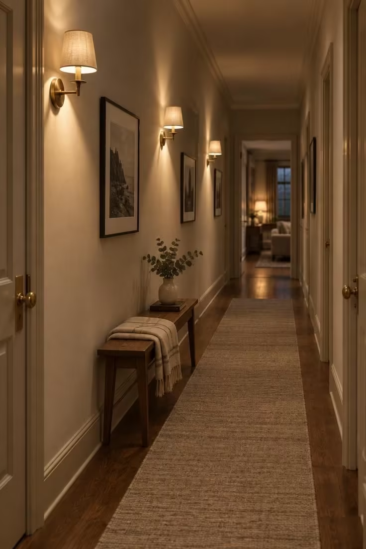
Pair Low Sconces With a Textured Runner for Layered Light and Grounding
Light at eye level changes how a long narrow hallway reads at night, when the tunnel effect is usually strongest.
Hallway wall sconces placed in pairs, spaced evenly apart and set low on the wall, draw the eye forward in small increments rather than one hard line.
Two sconces are enough for a short run; longer passages carry three or four, each pair framing a section of wall between doors.
The glow sits below the ceiling, so the upper wall stays open and the corridor keeps its height.
Beneath them, narrow hallway runner rugs add a second layer through texture rather than pattern.
A flat wool runner with a subtle weave reads quieter than a busy print, and its edge gives the eye a soft boundary to follow.
Pairing warm light above with a matte surface below keeps the two elements in conversation instead of competing.
Choose sconces with a wide, downward-facing shade so light falls onto the runner and floor rather than straight out into the walkway.
Shades in linen, alabaster, or aged brass sit comfortably in a calm palette and rarely date.
Coordinate the sconce finish with door hardware and drawer pulls along the same run so the corridor reads as one considered scheme.
Swap the runner seasonally if the sconces are fixed: a darker wool for winter, a lighter cotton blend for warmer months.
Keep the runner width inside the door swing at each end so the hallway still functions as a passage, not just a composition.
Design Pro-Tip: Repeat the sconce height on both sides of the hall so the light line stays level from the entry to the far wall; slight variations are visible in a narrow space even when the fixtures match.
Style Blueprint:
- Warm metal or alabaster sconces with linen shades, repeated at even intervals
- Flat-weave wool runner in a single muted tone or quiet stripe
- Matte paint on the wall behind the light to soften the glow
- Door hardware and sconce finish drawn from the same metal family
- One low object, such as a slim bench or basket, to break the symmetry near the midpoint
Conclusion
The two axes to revisit one more time are what the corridor looks like and what it does, and the ideas that only change appearance tend to be the ones that don't last.
Most corridors need two or three of these moves rather than all of them, and a terminus, a rhythm, and a runner cover the majority of cases.
Keep the recurring constraints in view: a clear walking path, consistent repetition, and materials that tolerate heavy foot traffic.
Before making changes, photograph your corridor from the entrance, since that view rather than a close-up is how the hallway is actually experienced every day.