This post may contain affiliate links. If you make a purchase through these links, we may earn a commission at no additional cost to you.
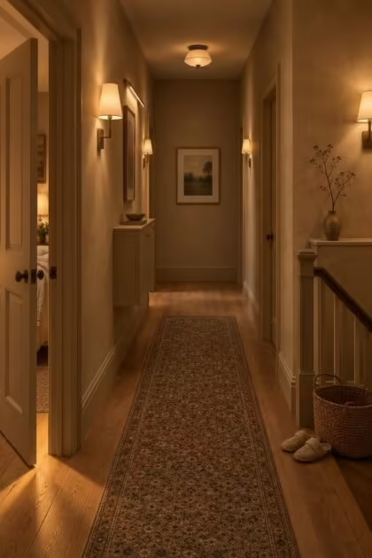
At the top of the stairs, the view runs straight down a narrow corridor where doors outnumber walls and a single ceiling fixture lights only the crown of the passage.
The far end is a blank surface the eye keeps hitting, with nowhere to settle.
An upstairs hallway is a transit space with destination geometry, so the real composition questions become what the eye lands on, where the light falls, and how the door rhythm gets handled.
Working constraints show up as observations rather than rules: short wall runs between casings, a walking strip roughly the width of two people passing, a linen closet door that swings out into the run, and daylight borrowed from open bedrooms.
Each idea below describes a pictureable scene, with tradeoffs and maintenance notes flagged where they matter.
The corridor-specific problems worth solving are too many doors, too little daylight, a dead-end wall, and top-down shadowing.
The End Wall as a Deliberate Destination
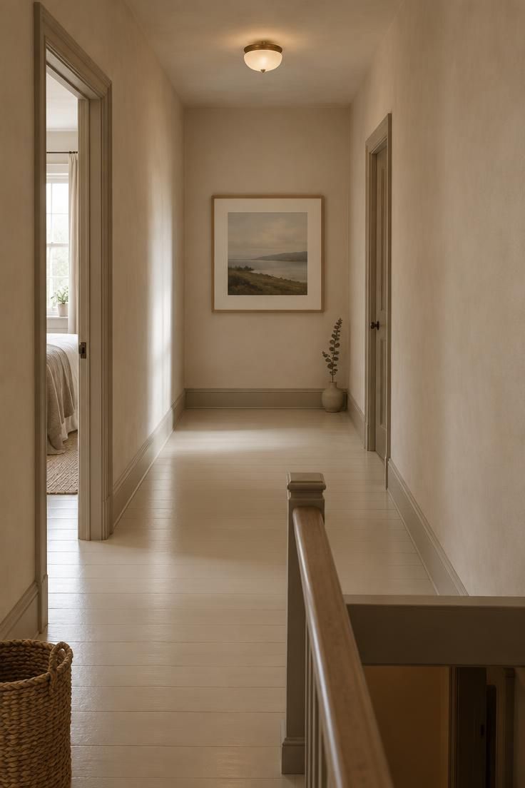
The eye enters this corridor with nowhere to land, so the lone end-wall piece becomes the destination the passage moves toward.
One large thin-frame work, sized so its edges leave generous wall visible on all four sides, reads as the wall's single gesture and keeps the corridor feeling longer than a cluster of small frames would.
A pale mat and a light frame tone carry that length, since the wall stays quiet around the artwork.
A dark, heavy, or deeply boxed frame at the end of a narrow run can make the corridor read shorter instead, which is the main tradeoff to weigh before committing to a finish.
Walls and trim in one continuous warm-neutral tone reduce the number of visual breaks in the passage, letting the single piece hold attention.
If the end wall holds a window, a door, or an attic access, the destination gesture needs to move to the widest side-wall segment instead.
Corridors with a genuine terminal wall and no exterior window suit this approach best.
Style Blueprint:
- one large thin-frame work centered on the end wall, sized so its edges leave generous wall visible on all four sides
- warm-neutral matte wall finish in one continuous tone from wall to trim
- pale oak, black metal, or unfinished ash frame, nothing thick, gilded, or heavily molded
- keep the floor bare or reserve it for a hallway runner that terminates before the wall
- if a ceiling fixture sits centered on the corridor, accept its pool of light and skip a competing source
Frames Centered Between Each Pair of Doors
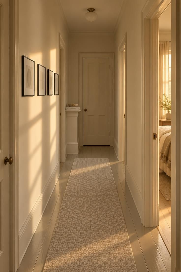
This is the rhythm idea: identical size, identical frame finish, and identical hanging height, repeated between casings along the run.
The corridor already has a repeating vertical beat from doors and casings, and the small frames join that beat instead of arguing with it.
Before buying anything, the actual clear wall between casings on every segment deserves a look, because one short segment breaks the whole rhythm.
The repetition is the idea, so one differently sized frame or a swapped photograph reads as an error rather than variety.
Off-white, deep olive, or charcoal wall color all hold the rhythm, and a mid-tone wall reduces the contrast between frame and wall to soften the beat.
Small frames multiply dusting surfaces, and each frame's top edge collects a visible lint line in a corridor with top-down light.
Monochrome or pale abstract artwork keeps pattern from competing with the measured sequence.
Style Blueprint:
- buy frames in one size, one finish, one profile
- center each piece on the wall segment between casings, not on a fixed interval
- align all frame tops to a single height across the corridor
- keep artwork monochrome, pale, or abstract so pattern does not compete with the rhythm
- leave the wall behind each frame a tone quieter than the artwork
Design Pro-Tip: Photograph a blank wall segment from the doorway before committing to a repeating frame arrangement. The camera catches the height drift your eye forgives in person.
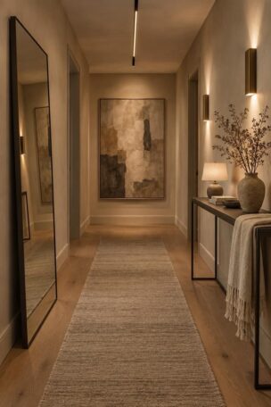
Paired Sconces Flanking the End-Wall Focal Point
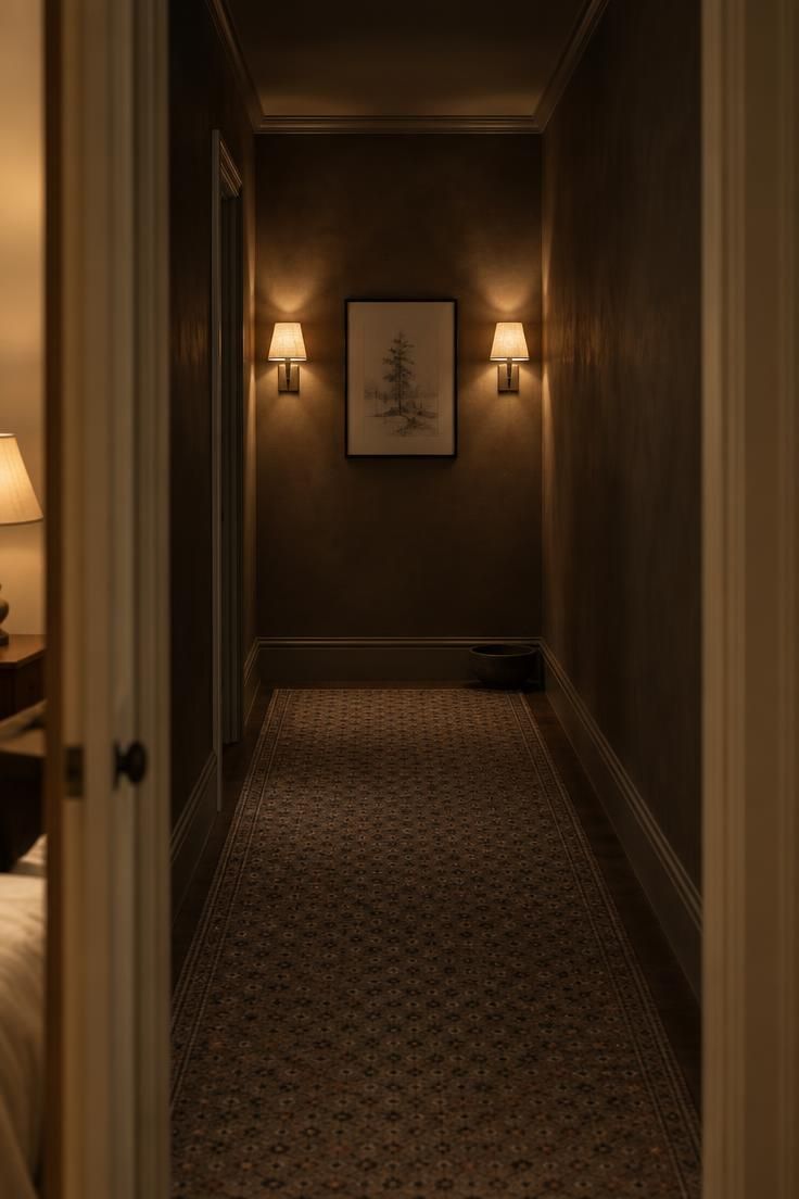
Light reaches the wall and art rather than pooling on the floor, which breaks the corridor's top-down shadowing.
Symmetry reads calm and hotel-like and gives the passage a formal axis the transit path can follow.
The visual effect matters most: where the pair sits relative to the framed piece and how the eye reads equal spacing from every approach angle.
Hardware becomes part of the composition, and in a narrow corridor sconces compete visually with the door casings on the opposite wall, which is the honest tradeoff.
Sconces set at unequal distances from the central piece read as a mistake from every direction, so the measurement is taken from the wall rather than from the fixture center.
Warm-toned linen shades against a warm-neutral wall read softer in a windowless run, while cool white shades against a cool wall read crisper and more graphic.
Artwork scaled so the outer edges of the sconce arms do not extend past the piece's width keeps the grouping tight.
Style Blueprint:
- one pair in a single matched finish, such as antique brass, blackened metal, or unlacquered brass
- small-scale shades, not oversized, so the corridor is not crowded by hardware
- equal distance from the focal piece on both sides, measured from the wall rather than from the fixture center
- warm-neutral or greige wall tone that reads as a continuous surface behind the pair
- artwork scaled so the outer edges of the sconce arms do not extend past the piece's width
A Slim Floating Shelf at the Corridor's Terminus
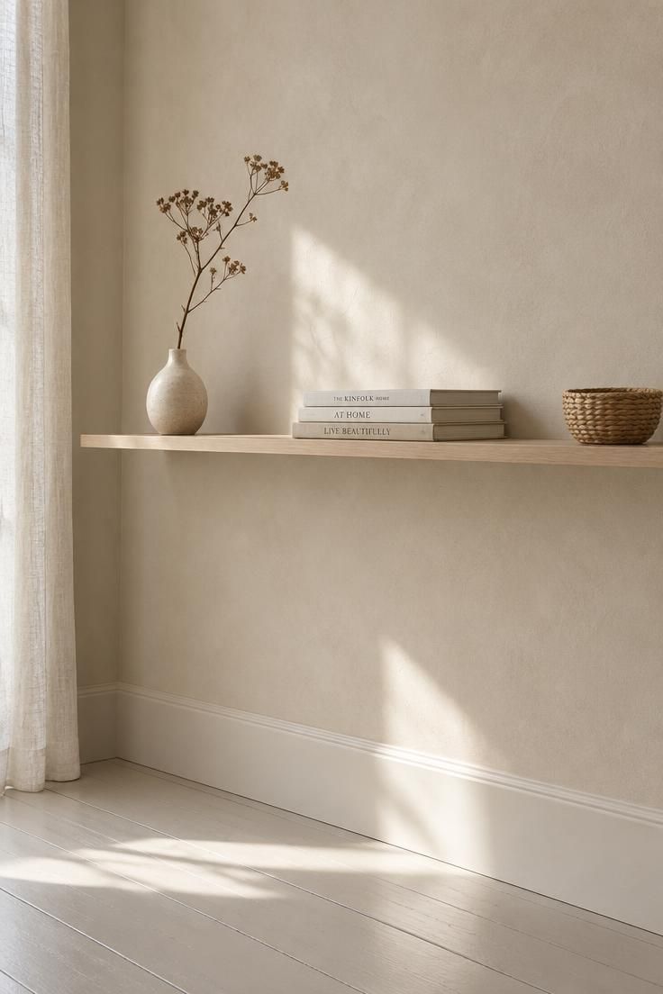
The shelf's horizontal line gives the end wall one piece of architecture, and negative space does most of the work.
Objects stay few, low, and staggered in height so the shelf reads as a composition rather than a display.
Open shelving collects dust and requires more frequent dusting than closed storage, and in a corridor with top-down light the shelf's top surface shows that dust first.
Scale matters: the shelf's length should be read against the wall's width, not against the corridor's length, because a shelf that nearly spans the wall reads as a band and loses the object-grouping effect.
A clean underside keeps the shadow line beneath reading as depth rather than as clutter.
Style Blueprint:
- one shelf in solid pale oak or ash with a squared, thin profile
- three objects maximum, with a height variation between them
- one organic element, such as a stem, a dried branch, or a woven basket
- one neutral book or paper element to add a horizontal layer
- keep the shelf's underside clean so the shadow line beneath reads as depth
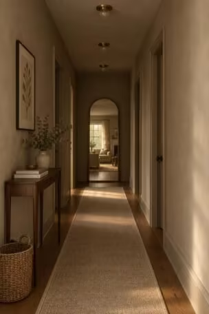
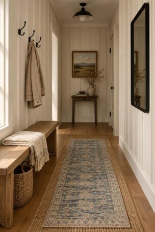
A Matched Runner with a Calm Allover Pattern
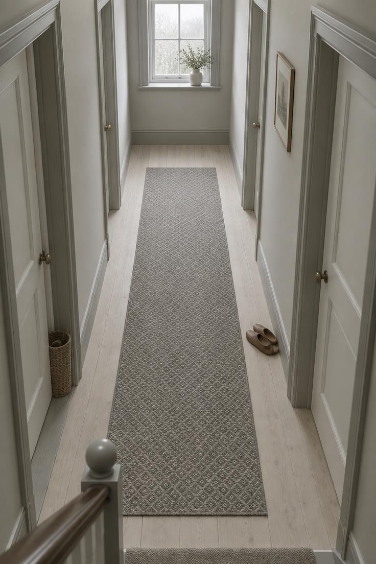
A hallway runner still earns its place here because it visually narrows a wide corridor and softens a long one, and in a dark passage it introduces the only warm-textured surface.
Pattern direction matters: a strong lengthwise stripe or large repeat exaggerates the corridor's length and makes it read tunnel-like, whereas a small allover pattern reads calmer.
Width matters more than length, since a runner that leaves generous floor visible on both sides reads intentional and one that nearly touches the baseboards reads like carpet.
Where the runner ends deserves the same attention as where it begins, because a runner stopping short of the terminal wall leaves a bare strip that can look like an afterthought.
Alternatives exist when a standard hallway runner does not fit: a series of small mats at each door threshold, a single flatweave in a corridor too short for a long runner, or leaving the floor bare and letting the walls and lighting carry the design.
Pale runners in a high-traffic corridor show soil quickly, so a mid-tone or a pattern that disguises the traffic path holds up longer between cleanings.
The hallway runners in a home are the single easiest element to change, so they can carry more color and pattern risk than any wall or trim decision.
Hallway lighting works best as a quiet layer that lets the runner's small allover pattern stay legible instead of competing with it.
Style Blueprint:
- low-pile wool or wool-blend flatweave, not a plush pile
- a small-scale allover repeat, or a subtle stripe at low contrast
- a width that leaves visible floor along both baseboards
- a color pulled from the corridor's quietest existing tone rather than a new color story
- a runner end that lands deliberately, not against the terminal wall
Wall-Mounted Linear Light Above the Corridor's Sightline
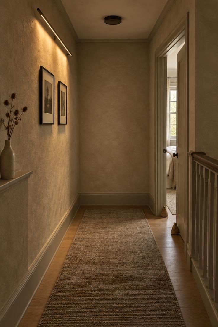
The corridor's single ceiling fixture lights the tops of walls and shadows the bottom third, and a wall-directed source reveals the wall and any art on it.
One long, low-profile linear fixture rather than two small ones keeps the visual weight down while covering the full wall run.
More visible hardware competes with the door casings and any wall decor, and in a narrow corridor every added fixture is a visual element rather than just a light source.
Mid-corridor wall segments that stay shadowed no matter what is hung there are where this approach solves a real problem.
A single well-placed wall-directed source is often more useful in a corridor than adding a second ceiling fixture, which would double the top-down wash.
Keep whatever hangs below the fixture quiet enough to benefit from the raking light rather than fight it.
Style Blueprint:
- one long, low-profile linear fixture rather than two small ones
- a matte or brushed finish that recedes, such as black, aged brass, or pale bronze
- warm-tone light for warm-neutral walls, cool-tone only when the palette is cool throughout
- position the fixture to graze the wall, not to spotlight the floor
- keep whatever hangs below the fixture quiet enough to benefit from the raking light
Design Pro-Tip: If the corridor's only daylight comes from an open bedroom door, leave that door open during the day and place the strongest end-wall gesture where that borrowed light lands first.
A Single Dark End Wall Against Pale Surroundings
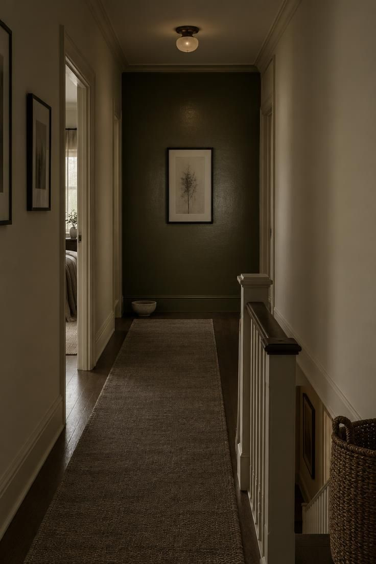
A dark end wall turns the corridor's dead end into a destination by contrast, giving the eye one full stop rather than a repeated beat.
Satin or an eggshell sheen on the dark wall keeps it from reading flat or swallowing light, while a matte finish reads deeper but loses the subtle reflection that helps a corridor.
The tradeoff is real: a dark end wall compresses the corridor's apparent length and can read heavier in a corridor with no daylight, so the effect is best reserved for corridors with at least one borrowed light source.
Trim running into the dark wall should be painted with it rather than stopped short, or the wall reads as a panel instead of a room surface.
No additional decor on the dark wall beyond the single piece keeps the contrast clean and the destination clear.
Style Blueprint:
- one dark end wall in a single deep tone, such as olive, teal-black, warm charcoal, or oxblood
- pale walls and trim through the rest of the corridor at a single matched tone
- artwork with a pale ground and a thin, dark metal frame
- no additional decor on the dark wall beyond the single piece
- a hallway runner or painted floor that stays quiet so the end wall holds the focus
A Painted Lower Band or Wainscoting for Horizontal Interest
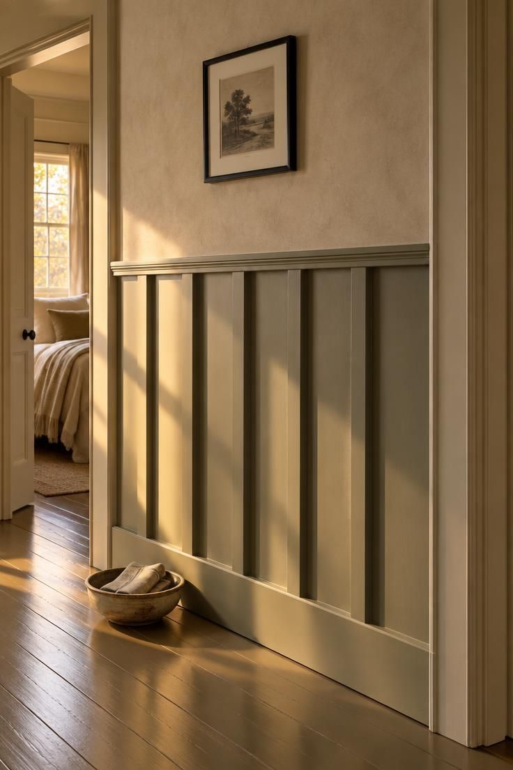
The corridor has almost no horizontal architecture besides the floor line, and a painted lower band introduces one horizontal to break the vertical repetition of doors.
Squared battens suit a very narrow corridor better than beadboard, whose vertical grooves would multiply the corridor's existing verticals.
Paneling and battens add visible joints and shadow lines, and in a very narrow corridor they can make the walls feel closer by projecting slightly, which is the tradeoff to weigh.
Batten edges trap dust along their top and side joints and need attention that plain painted drywall does not.
A painted lower band, meaning a two-tone wall with a horizontal paint break at chair-rail height, delivers a similar horizontal read without adding physical projection.
Limiting upper-wall decor to one piece per wall segment keeps the band as the main architectural gesture.
A slim chair-rail cap rather than a deep or heavily molded one keeps the profile from crowding a narrow passage.
Style Blueprint:
- a matte upper wall and a satin lower band with a clear tonal relationship
- squared battens, evenly spaced, with the spacing adjusted so no partial batten lands against a casing
- a slim chair-rail cap rather than a deep or heavily molded one
- upper-wall decor limited to one piece per wall segment
- trim color matching the wainscoting so the door casings read as part of the same band
Storage Between Doors That Reads as Architecture
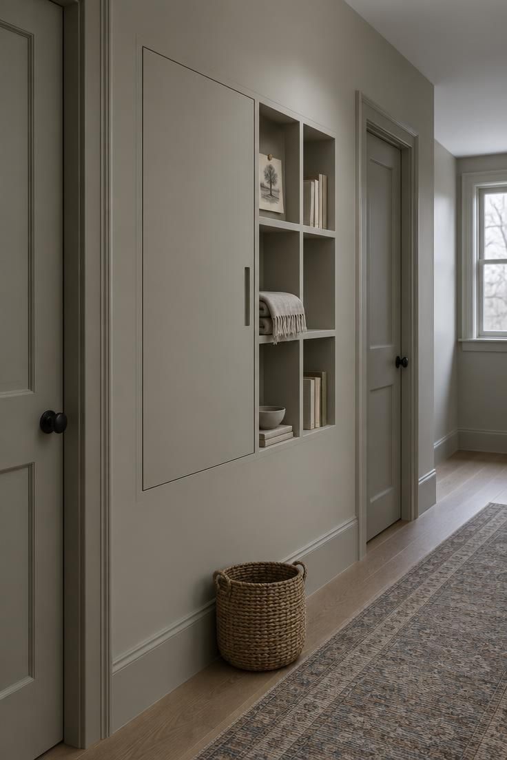
Short wall runs between door casings that are too narrow for art but wide enough for function are exactly what this addresses.
The cabinet's depth projection, the finish continuity with the wall, and the way the cubbies join the corridor's vertical rhythm are what stay visual.
Any door or drawer that swings or pulls out needs its clearance measured against the corridor's traffic path, and that path is the corridor's only walking room.
Anything with a door or drawer eats the traffic strip during use, so a shallow, finger-pull, wall-hung unit that stays out of the walking path is the version that works in a narrow corridor.
A corridor where the linen closet already swings out into the run is a place to skip this idea, since adding another out-swing compounds the problem.
Keeping the wall beside the unit clear lets the unit be the only feature on that segment.
Style Blueprint:
- same finish as the wall so the unit reads as part of the wall plane
- no visible pull hardware, or a flush finger-pull
- one aligned height across all cubbies
- contents limited so the interior does not become visual clutter when open
- keep the wall beside the unit clear so the unit is the only feature on that segment
Design Pro-Tip: Walk the corridor in the evening with only the existing overhead light on before choosing wall colors. The gap between how a finish reads under daylight and under a single warm bulb is what makes a color decision feel wrong after painting.
A Dimly Lit Niche with Layered Hallway Wall Decor
A shallow recess in an upstairs hallway can feel like an afterthought, but it becomes a quiet focal point when the hallway wall decor fills the depth instead of competing with it.
Lean a tall framed print against the back of the niche, then layer a smaller oval piece directly in front so the two frames overlap without hiding each other.
Rest a narrow woven basket or a short stack of linen-covered books beside the frames to keep the composition from looking flat.
For a softer effect, hang a small textile piece, such as a block-printed cloth or a vintage quilt fragment, on the back wall and place a simple ceramic vessel on the floor below it.
Avoid filling every vertical inch, since a little open space around the arrangement helps the alcove feel intentional rather than crowded.
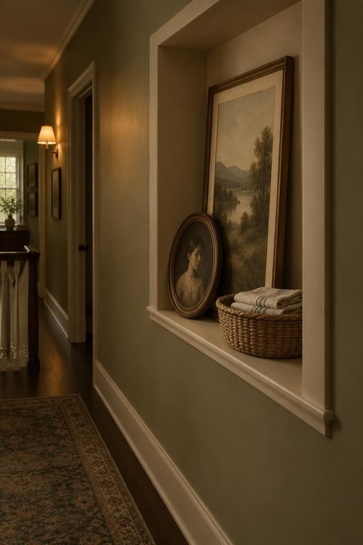
Where the niche sits near a stairwell landing, a slim hallway console table can anchor the composition without blocking the view down the corridor.
Set the table low enough that the layered frames remain the visual focus, and let its surface hold one small object, such as a candle or a bowl, to tie the grouping together.
Style Blueprint:
- One oversized framed print leaned at the back of the recess
- A smaller oval or round frame layered in front with slight overlap
- A soft textile or matte ceramic piece for added texture
- Neutral matting and warm wood tones to keep the dark corridor from feeling cold
- Empty space above or below so the niche does not look packed
Design Pro-Tip: Leave the front edge of the niche completely clear so the frames do not interfere with the doorway swing or catch a shoulder in a high-traffic upstairs hall.
Conclusion
Back at the top of the stairs, three questions deserve answers before any idea gets picked: where does the eye land, where does the light fall, and does anything block a door swing or the traffic path.
Dark, narrow upstairs hallways reward destination, rhythm, and wall-directed light over furniture and floor-first solutions.
A sensible order is to choose the corridor's one focal point, pick one rhythm strategy for the door sequence, then layer lighting, floor, and finish as support.
The tradeoff to keep in mind is that a corridor supports either a single strong gesture or a repeated beat, and mixing the two usually reads as visual noise.