This post may contain affiliate links. If you make a purchase through these links, we may earn a commission at no additional cost to you.
A small entryway asks a lot of a paint choice.
Its corridor is narrow, often windowless, and visible in one glance from the front door.
When a two tone hallway pairs a deep tone with a pale one, that pairing becomes the main visual event of the space, doing the work that furniture or artwork cannot fit into.
The second tone can divide the wall, outline the architecture, or land as a feature at the end of the sightline.
These ideas are organized by how that second tone is deployed, so a composition logic comes first and a palette follows.
Deep Lower Band with Woodwork Matched to the Same Tone
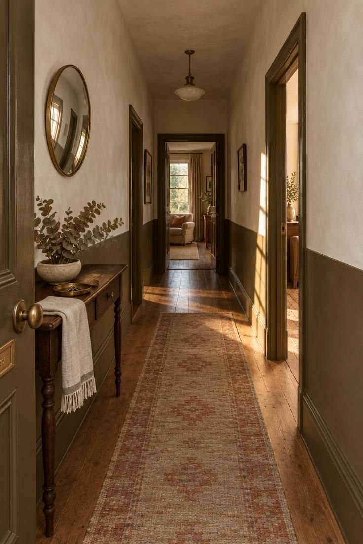
A continuous color mass runs along the bottom of this hallway, wrapping every doorframe and skirting so the lower zone reads as one carved object rather than a series of interrupted trim pieces.
Matching the woodwork to the lower band removes the visual outline that contrasting trim would otherwise draw, and the deep tone then carries uninterrupted from the first skirting to the last.
The lower tone needs to be genuinely deeper than the upper one, or the split line reads as a shadow rather than a deliberate horizon.
Every doorway passes through the band, so the effect depends on accepting the band's break at each opening rather than fighting it with a stepped line.
Scuff marks tend to show less visibly on a deep lower band than a pale one, though a single repaint touches the band, the trim, and the doors together.
With a low split height the pale upper field dominates the composition, which keeps a compact entryway from reading top-heavy.
Style Blueprint:
- Deep olive-brown paint for the lower band, doors, and all woodwork
- Chalky cream or soft off-white for the upper wall field
- Flat-weave wool runner in a warm neutral with one accent stripe
- A slim dark wood console with a shallow bowl and a single dried arrangement
- A thin-framed round mirror on the upper pale field
Pale Lower Band with a Deep Upper Wall
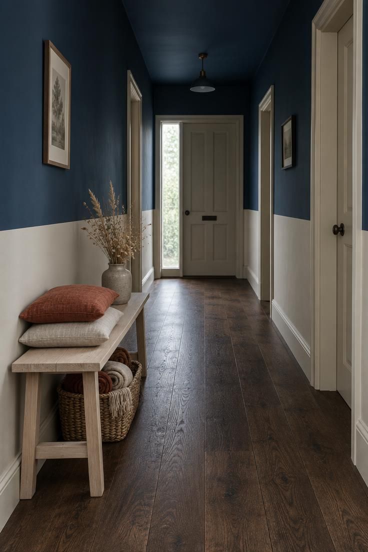
In this arrangement the upper wall carries the visual weight and the lower wall stays light, so the split line sits higher and the ceiling zone feels folded into the deep tone.
A deep upper field can make a hallway read as more enclosed overhead, which suits anyone who wants the entry to feel wrapped rather than open.
The position of the split line relative to the door heads matters, because the deep band reads differently when it begins above versus below the top of an opening.
This pairing usually needs a clearer value gap than a matched-woodwork scheme, since a pale lower band against a pale upper wall simply disappears.
A pale lower band in a busy entryway will collect visible marks sooner than a deep one, which is a wear observation rather than a reason to avoid the idea.
A slightly sheened finish on the pale lower field changes how light sits across it and reads brighter than a fully flat one.
This is a stronger choice for hallways with generous ceiling height and a desire for drama at the top of the frame rather than at the base.
Style Blueprint:
- Deep ink-blue paint for the full upper field above the split line
- Chalky pale putty for the lower band, skirting, and architraves
- Dark stained oak or walnut flooring for weight underfoot
- A low pale-wood bench for seating and shoe storage
- Linen cushions in a muted rust to warm the cool palette
Narrow Painted Dado Band Between Two Neutrals
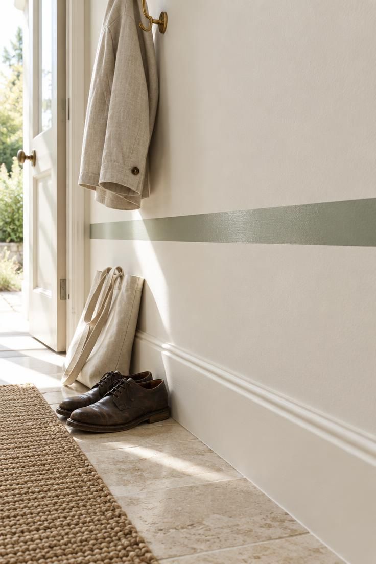
Here the two tones are light neutrals separated by a narrow strip of a third color acting as a graphic line rather than a field.
The split is a line, not a division, so the eye reads a single wall surface with a deliberate rule drawn across it.
Band width changes the character of the scheme: a hairline reads as a drawn line, while a wider strip reads as a miniature dado.
The band can run into the trim, stop short of it, or be interrupted by it, and each choice alters the graphic rhythm along the corridor.
In a windowless hallway, a low-contrast band between two close neutrals can become nearly invisible, so the strip usually needs more separation than the surrounding fields.
This is one of the more reversible two-tone schemes, since the band is a small area to repaint if the color choice does not hold up.
Where the band meets a doorway, decide whether the line continues across the opening or stops at the frame, because the answer changes how the whole corridor reads.
A thin band adds visual interest without segmenting the wall into two competing fields, which suits very narrow entryways.
Design Pro-Tip: Tape the band's path in painter's tape and live with it for a day before painting, since the line's relationship to the doorframes is easier to judge in place than on paper.
One End Wall in a Contrasting Color
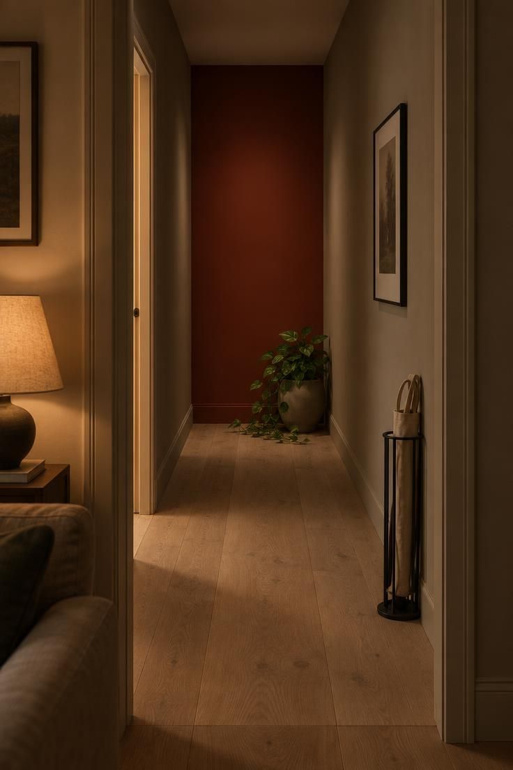
The split here is vertical and spatial rather than on a single wall, since the feature sits at the end of the sightline and the long walls stay quiet.
This works in a small entryway because the eye travels the length of the corridor and lands on a single color event rather than being divided along the way.
A strong end-wall contrast reads as a deliberate focal point, while a subtle one reads as a warm shift at the end of the view.
A feature end wall can make the rest of the palette feel unresolved if the side walls and flooring are not considered part of the same scheme.
Flooring and any stair visible from the entry become part of the composition whether intended or not.
This is one of the gentlest two-tone approaches for a very narrow hallway because it leaves the long wall planes uninterrupted.
Two tone hallway paint handles an end wall differently from a side wall, because the color change needs to sit where the sightline stops rather than run along the route.
Style Blueprint:
- Deep muted clay-red paint for the end wall only
- A single warm greige for both long side walls
- Pale wide-plank oak flooring to lighten the corridor
- One trailing plant in a matte ceramic pot near the feature wall
- A slim iron umbrella stand and one framed print for quiet detail
Two-Tone Paneled Lower Wall
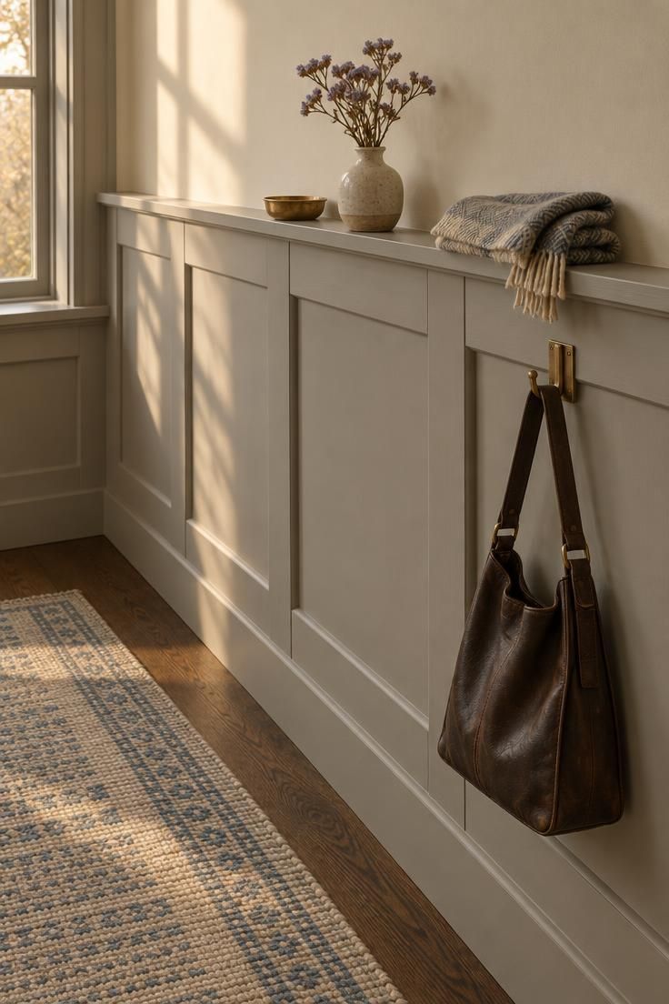
The two-tone effect here comes from both color and texture, since the paneled lower section introduces shadow lines that a flat wall does not.
Beadboard, shaker panels, and applied molding each catch light differently along the lower field, so the profile choice changes the character as much as the paint does.
Because the paneling already introduces shadow, the color contrast between the two fields can be quieter than in a flat-wall split.
Where the paneling meets the flat wall, a trim cap or a simple paint edge both work, but each gives a different graphic finish along the split.
The paneling's vertical lines interact with the hallway's horizontal length, sometimes reinforcing the corridor and sometimes fighting it.
Paneled lower walls have more surface area to dust than a flat wall because of the profile edges, which makes routine cleaning slower.
Applied paneling is more involved to undo than a painted split, which matters for renters or anyone planning to revert.
The paneling profile becomes more visible as the contrast between the two tones increases.
A paneled lower section adds depth to a narrow hallway without adding furniture, which is its main advantage in a tight entryway.
Design Pro-Tip: Paint a sample of both the paneled lower tone and the flat upper tone on the same board and view it at the hallway's darkest hour, since panel profiles read differently under low light than on a flat sample.
Ceiling as the Second Tone
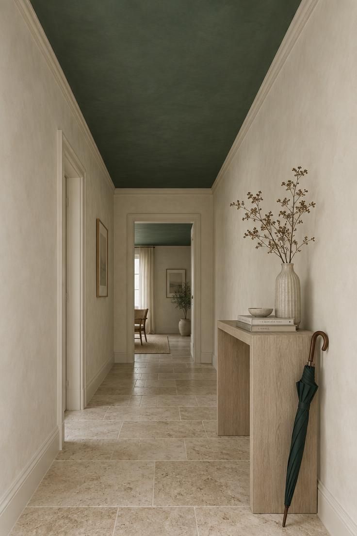
The fifth plane becomes the second tone, so the hallway reads as a two-tone volume rather than a two-tone wall.
Because the ceiling is seen at an angle in a narrow hallway, its color registers as a soft wash rather than a flat field, which makes even a strong tone read gently.
A deep ceiling over pale walls reads differently from a pale ceiling over deep walls, and each direction changes where the space seems to sit.
A deep upper wall with a pale ceiling tends to show less dust contrast than the reverse, which is a practical observation about upkeep.
Cornice or ceiling trim painted with the ceiling, the walls, or a third tone each changes the boundary between the two fields.
A ceiling tone is often the last thing a visitor notices on entry, so it functions more as a background quality than a focal point.
This approach can register even in a hallway too narrow to see the upper wall clearly from the door.
Two tone hallway walls can stop at the ceiling line, or the paint can climb onto the fifth plane so the corridor reads as a single wrapped volume.
With half painted hallway walls, the upper wall and the ceiling often share one tone while the lower wall stays light, which pulls the eye upward toward the entry.
Hallway trim contrast, kept close to the wall tone or deliberately deeper than both surfaces, helps the ceiling color read as part of a single composition.
Style Blueprint:
- Deep muted green paint for the entire ceiling plane
- Pale warm plaster tone for both wall fields
- Ceiling trim painted with the walls for a soft boundary
- Pale travertine or limestone flooring to keep the corridor light
- A tall narrow console in bleached oak with minimal props
Arch or Doorway Reveal Picked Out in a Second Color
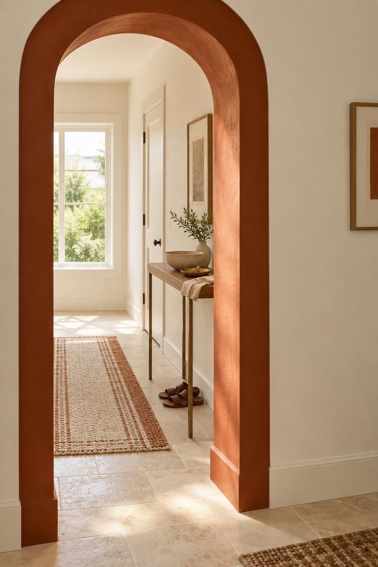
The two tones here are separated by architecture rather than by a straight line, with the opening itself acting as the boundary between them.
The reveal creates a frame within a frame, and the second color appears only at the transition between rooms.
Because the second color appears in a small area, it can carry more saturation than a full wall would without overwhelming the entryway.
When there are multiple openings down a single hallway, repetition turns the reveals into a rhythm rather than a single event.
The reveal edge is a high-contact area and will show marks sooner than a flat wall.
The arch or frame profile, whether square, rounded, or molded, changes how light catches the second color.
A strong reveal color can make the surrounding walls feel plain unless the palette is resolved as a whole.
This is a low-commitment two-tone approach that adds color punctuation without dividing the wall plane.
Design Pro-Tip: If the hallway has more than one opening, test the reveal color on the least prominent doorway first, since a color that works on a single arch can feel repetitive when repeated down a long corridor.
Used this way, the arch turns a colour blocked hallway into a sequence of framed openings rather than one long corridor.
Paint the hallway in one tone and the doorframe reveal in another to create a crisp example of hallway colour blocking.
Wallpaper and Paint Pairing
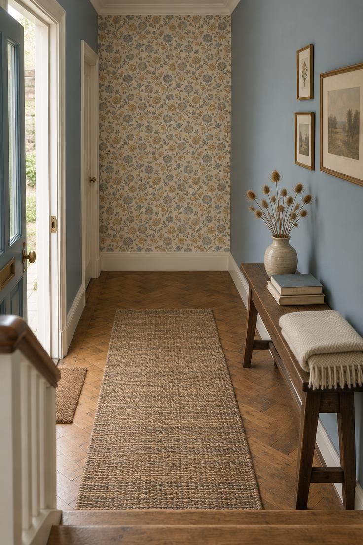
One tone here is pattern and the other is solid, so the two-tone effect is as much about density as about hue.
Drawing a color from the pattern ties the two fields together, while a contrasting solid makes the wallpaper read as a framed panel.
In a tight corridor, a busy pattern is seen at close range and can read as texture rather than motif.
Wallpaper near doorways is more exposed to hand contact than in a low-traffic room, which is an observation about wear rather than a product claim.
A paint-and-paper pairing brings pattern into an entryway without covering all four walls, which keeps the corridor from feeling visually compressed.
Style Blueprint:
- Small-scale floral wallpaper in faded ochre and soft blue for one end section
- Matte paint in a muted blue drawn directly from the pattern
- A slim dark wood bench for a landing surface and seating
- Worn warm oak parquet underfoot for contrast
- Stoneware and dried botanicals to keep the styling quiet
Low-Contrast Tonal Pairing of Two Close Neutrals
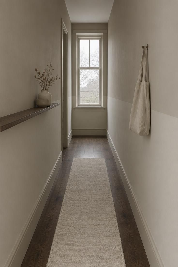
Two tones from the same family sit close enough in value that the hallway reads as one field with a subtle shift rather than a contrast.
A mid-wall split between two close neutrals can disappear entirely, so the line often needs a slight value gap to remain legible.
In a windowless entryway lit only by adjacent rooms, a low-contrast pairing can flatten into a single tone, which is either the goal or a disappointment depending on intent.
A matte upper field against a slightly sheened lower field can create a tonal shift even when the colors are close.
In a low-contrast scheme, trim painted the same tone as the wall keeps the effect quiet, while contrasting trim introduces the only strong line in the hallway.
This approach is subtle but depends on the hallway having enough light variation along its length to reveal the shift.
A low-contrast palette makes touch-ups less visible because the two fields are already close in tone.
Flooring and any visible stair color become the third tone in the composition and can either support or disrupt the pairing.
Low-contrast tonal pairing is a strong choice for very narrow hallways where a bold split would segment the wall into competing fields.
Design Pro-Tip: Photograph the two candidate tones side by side under the hallway's actual light at two different times of day, since close neutrals can read as identical in one light and clearly distinct in another.
A low-contrast pairing rewards anyone browsing two tone hallways who wants calm over drama.
For quiet two tone hallway inspiration, match two close neutrals directly at the vertical seam so the shift stays soft.
Warm-and-Cool Pairing Across the Split
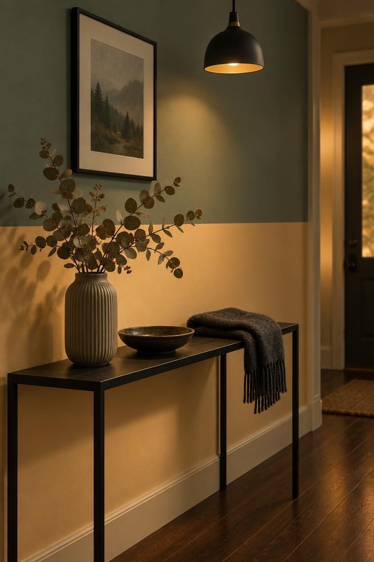
The contrast here is temperature rather than value, with one field warm and one cool and the split line as the meeting point.
Temperature contrast reads differently from value contrast, since the two fields can be similar in lightness yet still clearly distinct.
A warm lower field under a cool upper field reads differently from the reverse, and the choice affects where the space seems to sit visually.
Warm artificial light in a windowless entryway will push both fields toward the warmer end and can mute the contrast.
A warm-and-cool split makes the split line itself the main graphic element, so its height and continuity matter more than in a low-contrast scheme.
This is a strong two-tone choice when the hallway is too narrow for furniture but has enough length to show the split line running its full extent.
A two tone hallway colour scheme works best when the warm and cool fields differ enough in temperature to read as separate surfaces rather than one blended tone.
Style Blueprint:
- Warm apricot-cream paint for the lower wall field
- Cool greyed eucalyptus green for the upper field
- Dark walnut flooring to ground the warm-cool pairing
- A slim black metal console with minimal props
- Charcoal and dark ceramic accents to keep the palette resolved
Trim-Only Two Tone
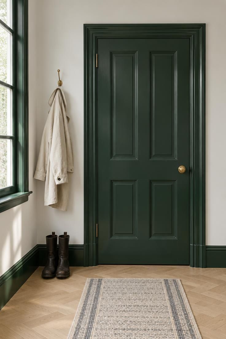
The second color appears only as outline here, since the walls stay a single tone and the trim carries the contrast.
This is the subtlest version of a two tone hallway, and its effect depends on the woodwork being in good visual condition because the contrast highlights every profile and joint.
Because the wall plane stays quiet, a narrow corridor keeps its full sense of length rather than being divided by a horizontal line.
A small area of deep color on the trim can carry more saturation than a full wall would, since the eye reads it as accent rather than field.
Trim-only schemes are easier to refresh in sections than a full two-field wall, since a repaint can be limited to a door or a run of skirting.
The contrast between the two tones becomes more pronounced as the trim profile grows more molded.
This approach keeps the long wall planes undisturbed, which suits very narrow entryways where a split line would emphasize the tightness.
Style Blueprint:
- Deep forest green paint for all doors, architraves, and skirting
- A single quiet stone-white for every wall plane
- Pale oak parquet flooring to keep the base light
- Brass hooks and hardware as small warm accents
- One canvas coat and a pair of leather boots for lived-in styling
Conclusion
What connects these ideas is a single decision made before any color is chosen: what the second tone is doing.
It might divide the wall, outline the architecture, or land as a feature at the end of the sightline.
The range runs from high-contrast graphic splits to low-contrast tonal pairings, and the right pick depends on the hallway's width, its length, and how light arrives from one end.
A few practical threads recur across all of them: how reversible each scheme is, how doorways interrupt a horizontal band, and how flooring joins the palette whether planned or not.
Choose the composition logic first and the palette second.
Then test the colors in the hallway's own light before committing, since the same pairing can read as one field in the morning and two distinct tones by evening.