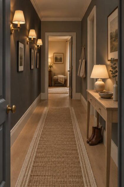
This post may contain affiliate links. If you make a purchase through these links, we may earn a commission at no additional cost to you.
A dark grey hallway often looks flat when every surface reads at the same value, and the result can feel like a tunnel rather than a room.
The usual fix is not a lighter grey but a deliberate pairing: warm metal against cool paint, a pale floor beneath a dark ceiling, a runner that draws the eye forward, or one strong object at the end of the corridor.
These ideas treat the hall as a sequence of visual moments, from the front door to the far wall.
Dark grey becomes a backdrop for contrast instead of an isolated block of color.
Charcoal Grey With Brass Accents and a Warm Wood Floor
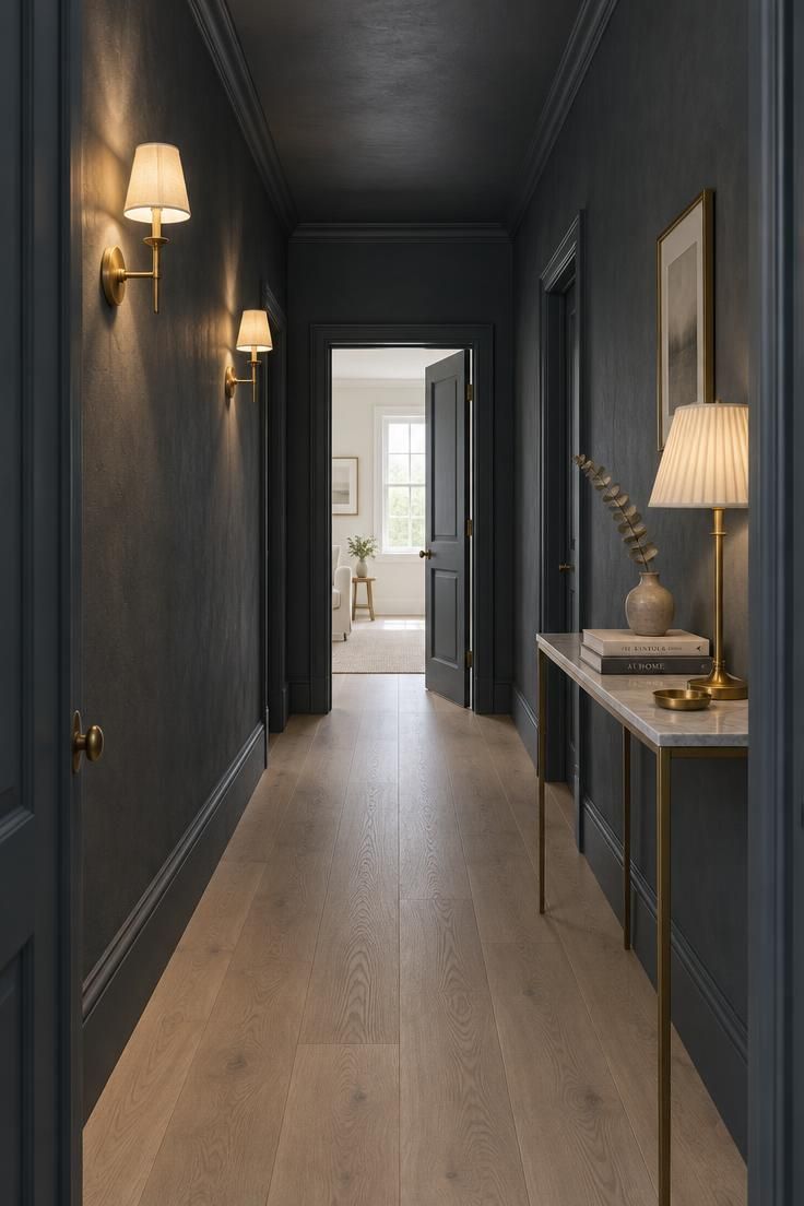
A full-height charcoal treatment gives the corridor a continuous envelope, which reads as intentional rather than unfinished.
The risk is compression: when walls, ceiling, and trim all sit at the same dark value, a low hallway can feel shorter, and the eye loses its sense of where the room ends.
A pale oak floor and a bright doorway at the far end balance that weight by giving the corridor two light anchors, one underfoot and one ahead.
Warm metal does most of the corrective work here.
Brass reflects a warm cast onto adjacent charcoal, which keeps the blue undertone from reading cold under evening light.
Unlacquered brass develops a patina over time, so the fittings shift in appearance rather than staying uniform, which suits a hallway where everything else is deliberately still.
Consider how the ceiling line interacts with the light sources.
Wall sconces placed at eye height wash the wall above and below, so the charcoal shows variation instead of a flat plane.
A single central ceiling fitting tends to flatten the same wall, because the light arrives evenly and reveals no texture.
For maintenance, dark trim shows pale dust along its top edge, and skirting in a hallway collects lint from foot traffic.
A dry microfiber cloth along the picture rail and skirting every couple of weeks keeps the dark surfaces clean without repeated washing.
Glossier finishes wipe more easily but show wall imperfections, which matters more on a dark wall than a pale one.
Design Pro-Tip: Paint a large sample patch that reaches from the skirting up to the ceiling line, then check it beside the hallway's actual bulbs at night before committing, since a charcoal with a blue undertone can shift noticeably under warm light.
Style Blueprint:
- Deep charcoal paint on walls, ceiling, and trim for a full envelope
- Unlacquered brass wall sconces with linen shades at eye height
- Pale white oak flooring to lift the dark surround
- Slim brass-leg console with a marble top and a pleated-shade lamp
- Small brass dish, stacked books, and a single dried stem as styling
Dark Grey Half-Wall With a Pale Upper Wall and a Picture Shelf
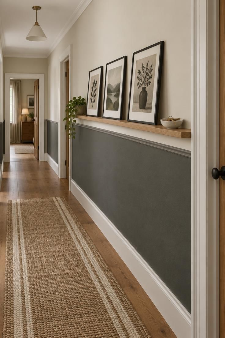
Splitting the wall at dado height solves a specific problem with dark corridors: the lower portion carries the depth, while the upper portion keeps the ceiling plane feeling open.
The rail becomes a strong horizontal line that gives the eye something to follow down the hall, and a picture shelf at that line breaks the vertical band into two readable zones.
The runner matters as much as the paint.
A jute and cream runner under the walking path adds a second light element at floor level, which keeps the dark lower wall from dominating the composition.
Stopping the runner short of each doorframe leaves a strip of bare wood, and that gap prevents the runner from looking wedged against the trim.
A dark grey hallway with a light runner works best when the runner reads as a spine rather than a broad floor covering.
Keep the runner roughly a third of the floor width, and let the wood show on both sides.
If the hallway is wide enough, two narrow runners can frame a central strip instead, though a single centered runner reads more strongly in a corridor.
The dado line also sets the proportions for anything hung or placed along the wall.
If the rail aligns with the door handles, the hallway gains a consistent rhythm that carries through every wall segment.
Picture shelf depth should stay shallow enough that the framed prints lean without protruding into the walking path.
Style Blueprint:
- Matte dark grey below a chair rail, warm cream above
- Slim oak picture shelf sitting on the rail line
- Three black-framed prints in a single row, leaning not hung
- Jute and cream runner stopped short of each doorframe
- White ceiling kept clean to preserve the open upper zone
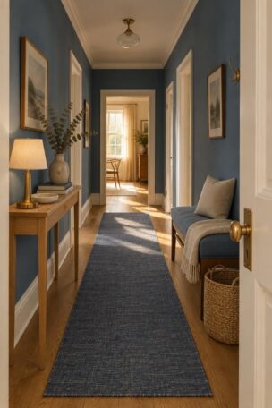
Blue-Grey Walls With White Trim and a Navy-Cream Runner
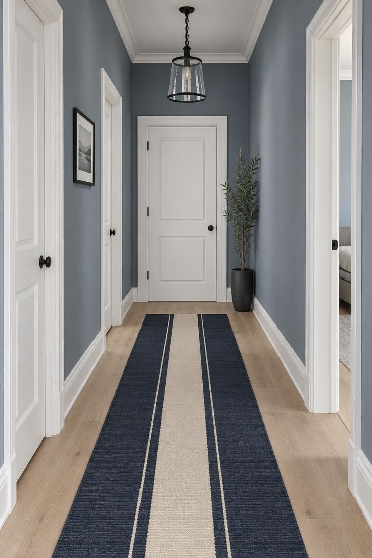
White trim is the defining move in this scheme.
The bright architraves outline every door and corner, so the blue-grey walls read as deliberate panels rather than one continuous dark surface.
In a windowless corridor, that outline gives the eye a set of frames, and the far white door catches what little light reaches it.
A blue-grey hallway with white trim relies on temperature discipline.
The wall color is slightly cool, the trim is neutral, and the pendant adds a clean black note.
Introducing a warm-toned bulb shifts the blue-grey toward a muddier appearance, so matching bulbs to the paint's temperature keeps the trim looking crisp against the wall.
The runner carries the dark anchor at floor level.
Navy with an ivory stripe repeats the wall-and-trim contrast in miniature, and its flat weave keeps the corridor easy to walk.
Because the runner is the only patterned element, it does not compete with the framed print on the left wall.
North-facing corridors tend to show blue-grey at its coldest.
A warm paint color elsewhere in the home, glimpsed through open doors, provides a compensating note.
Testing the blue-grey patch against the actual evening light is the way to catch an unwelcome shift before the whole hall is coated.
Style Blueprint:
- Cool blue-grey paint on walls with neutral white trim
- White panelled door at the corridor's end as the light focal point
- Black metal and glass pendant hung near the far door
- Navy runner with a narrow ivory center stripe
- One wispy black-framed print between doors, plus a slim dark planter
Warm Greige With Oak Furniture and a Linen Shade
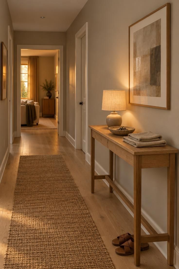
Greige softens the dark grey premise by pulling the wall color toward beige.
In a low-light hallway, that warm undertone reads less heavy than a true charcoal, and the surface takes on a stone-like quality that pairs easily with natural materials.
The risk is muddiness: greige can read brown when it sits next to another beige surface.
Keeping the ceiling a clean warm white prevents that drift.
The contrast between wall and ceiling stays subtle, but it preserves a clear division between vertical and horizontal planes.
Oak furniture then supplies the color warmth, and the linen shade over the lamp adds texture rather than another flat tone.
A charcoal grey hallway with brass accents elsewhere in the home can also flow into a greige hall if the two colors share a warm base.
Where the accent metal is brass, greige holds it comfortably, though the effect shifts from crisp to soft.
Choosing the accent finish is a good moment to decide which hallway in the home should feel sharper and which should feel quieter.
Natural linen shades show the weave when backlit, which is why a lamp tucked against the wall reads better than a shade placed high and away from the surface it lights.
On a console, that placement also keeps the light close to the objects that need it.
Style Blueprint:
- Soft greige wall paint with a warm beige undertone
- Honey-toned oak console table against one wall
- Natural linen lampshade on a compact table lamp
- Jute runner on a light oak floor
- Stoneware bowl, folded linen cloths, and one muted abstract print
Dark Grey Walls With a Light Runner as the Only Floor Pattern
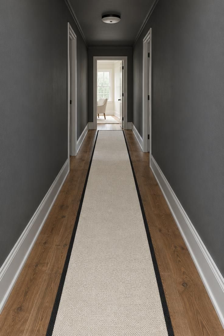
When the walls and ceiling share the darkest value in the corridor, the runner becomes the only pattern source.
A pale ivory field with a thin black border draws the eye forward, and the corridor reads longer because the pattern runs the full length without interruption.
This approach suits a hallway where wall space between doors is short and fragmented, since nothing competes with the floor.
The placement of the runner decides how much contrast the scheme carries.
Letting the runner end at each doorway keeps the dark walls as the dominant surface and reserves the pale tone for the walking path.
Extending it wall to wall would change the effect entirely, turning the floor into a light plane and the walls into a backdrop rather than a surround.
Practical upkeep matters here because a pale runner in a high-traffic corridor collects dirt quickly.
A flat-weave wool or cotton can be shaken out and spot-treated, and a reversible runner extends the interval between cleanings.
Choosing a runner with a subtle pattern rather than a solid pale field also hides light soiling between washes.
Ceiling color is the last variable.
Keeping the ceiling white preserves a bright plane above the dark walls, which offsets some of the enclosure.
Carrying the dark grey onto the ceiling would increase the enveloping effect and demand more from the runner's contrast.
Style Blueprint:
- Deep matte grey on walls with a white ceiling
- Pale ivory runner with a narrow black border, full length of the hall
- Medium-brown wood floor left exposed on both sides of the runner
- No wall art or furniture, letting the runner carry the pattern
Charcoal Walls With a Mirrored Console and a Single Table Lamp
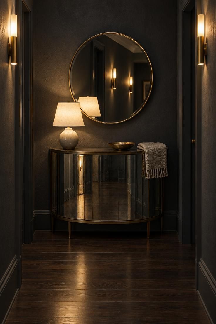
A mirrored surface at the dead end of a dark corridor does practical compositional work.
It reflects the hallway's own light sources back toward the viewer, so the far wall reads as a bright focal point instead of receding into shadow.
Angling the mirror slightly downward increases the amount of the hall it captures and pulls more of the illuminated floor into view.
The lamp shade color matters as much as the mirror.
A cream shade over a warm bulb bounces a soft tone onto the charcoal wall, which keeps the corridor from reading as a black void.
A pendant hung from the ceiling would push light downward and leave the upper wall dark, so a table lamp at console height distributes the light differently.
Dark grey walls with a mirrored console and a single table lamp suit corridors that end in a blank wall.
A narrow console shifts the visual weight of the corridor from one side to the other, which reads as a deliberate full stop.
A dark grey half-wall with pale upper wall elsewhere in the home would change the emphasis, so the end-of-hall console is best reserved for corridors painted dark on all surfaces.
Depth is the tradeoff.
A semi-circular console projects into the walking path, so in a narrow hall a wall-hung shelf or a slim console with a shallow footprint leaves more clearance.
Whatever the depth, the lamp cord and the objects on top should sit clear of the walking line.
Style Blueprint:
- Charcoal wall paint carried onto the corridor's end wall
- Semi-circular console with a mirrored front panel
- Compact ceramic lamp with a cream shade
- Round beveled mirror angled slightly downward
- Dark stained wood floor with no runner to keep the focus on the reflection
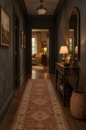
Dark Grey With Terracotta Accents and a Clay Vessel
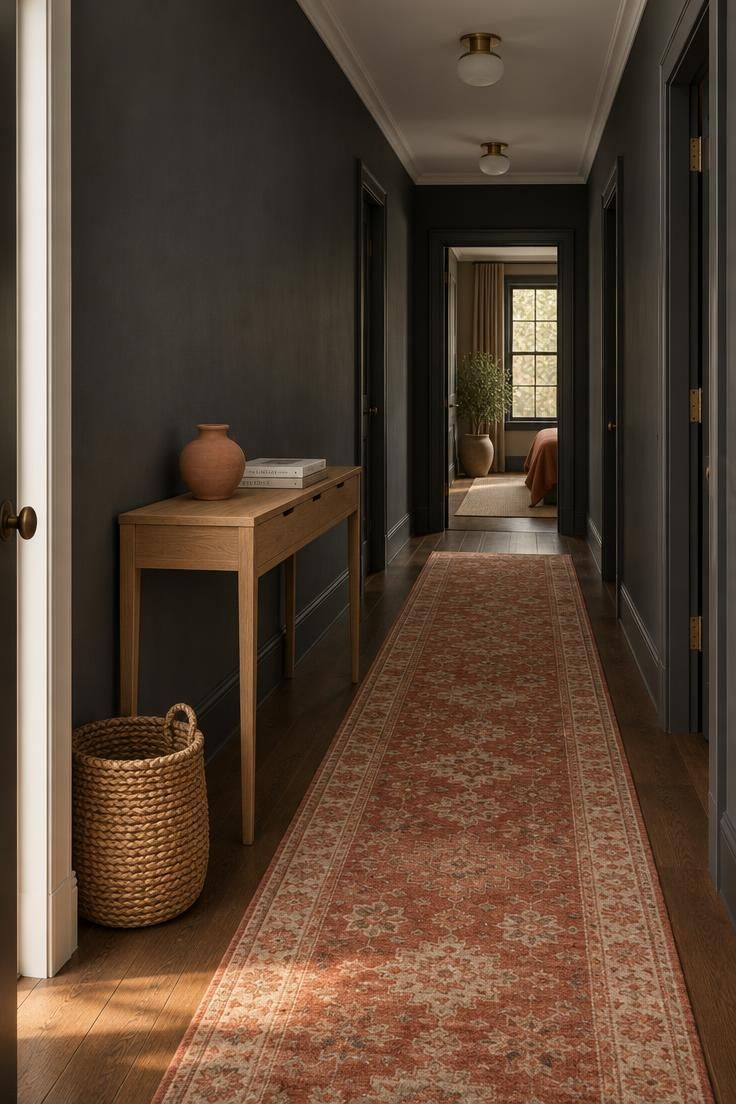
Terracotta and rust sit opposite cool charcoal on the color wheel, so the two read as a deliberate contrast rather than an accidental clash.
Repeat the warm note in a few zones: a floor-level runner, a small vessel on the console, and a woven basket near the door.
Three placements are enough to register as a palette; many more can make the grey look muddy by comparison.
Working the accent warm at floor level and on a tabletop keeps the dark walls as the dominant surface.
A rust-toned runner does the same job as a pale runner but with a warmer temperature, and the cream in the pattern prevents the floor from reading too dark.
Choosing the size of the clay vessel matters more than its shape.
A small unglazed vessel on the console leaves the wall above bare, which keeps the corridor calm.
A large sculptural pot at the door would shift the emphasis to the entry zone.
Books and a jute basket add texture without adding color.
Unglazed clay, woven jute, and softcover paper all show surface dimension on a dark wall, and none competes with the terracotta accent.
Their practical role is straightforward: the basket holds shoes and the books are ready to be read.
Style Blueprint:
- Cool charcoal paint on walls with a white ceiling
- Washed terracotta and cream runner down the center of the hall
- Shallow oak console with an unglazed clay vessel on top
- Woven jute basket near the door
- Bare wall above the console to preserve the calm plane
A Floor-Level Niche With a Plaster Sculpture and Warm Wash Light
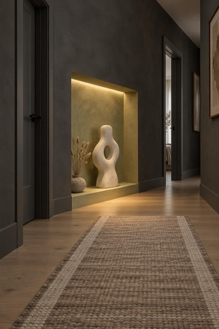
A dark hallway tends to draw the eye upward toward lighting or wall art, leaving the lower wall as dead space.
A floor-level niche works the opposite way by placing visual weight near the ground, which makes the corridor feel taller without adding overhead fixtures.
The recessed opening breaks the long grey wall into a simple recessed form rather than another hanging object.
The plaster sculpture gives the niche a three-dimensional center that changes with the angle of approach.
From one end of the hall it reads as a pale vertical form; from the other it catches the warm niche light across its curves and reveals deeper shadow lines.
Lime plaster treated with a soft matte surface keeps the recess from competing with the grey wall while still reading as a deliberate material shift.
Lighting inside the niche is part of the design, not just task lighting.
A warm LED strip hidden above the opening washes the lower portion of the wall and the floor in a controlled glow.
That lower pool of light balances the darker upper half and makes the grey read more layered than flat, especially in a hall with little natural light.
Maintenance on the niche should stay simple.
The shallow opening and smooth plaster surround wipe clean with a dry microfiber cloth, while the sculpture needs only occasional light dusting around its base.
Keeping the area free of small objects preserves the single-sculpture focus and avoids turning the niche into a shelf for clutter.
Style Blueprint:
- Floor-level recessed niche centered between two doorways
- Pale lime plaster lining with visible hand-trowel texture
- Single matte ivory plaster sculpture as the only object
- Warm LED strip hidden above the niche opening
- Muted taupe and cream wool runner that catches the low wash light, with dried grasses in a low stone pot at the niche edge
Pale Ceiling and Up-Lighting to Keep the Corridor From Closing In
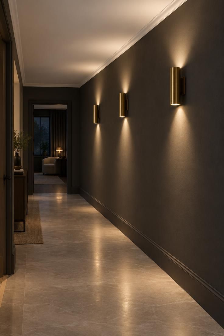
Up-lighting changes how the ceiling reads without adding another fixture to the corridor's center.
The cones of light wash the white ceiling and bounce soft illumination back down onto the dark walls.
Because the light arrives from the side rather than straight overhead, the wall shows texture and variation instead of a flat field.
The light ceiling itself stays part of the composition.
A bright horizontal plane above dark verticals keeps the top of the corridor from feeling pressed down, and it visually reflects the doorway's ambient light.
Where the ceiling is a dark tone, that relationship flips and the hallway closes in.
A bright ceiling also shows imperfections more clearly, so any cracks, ridges, or seam lines become visible under the up-light cones.
Smoothing the ceiling before the lights are placed is a sensible step, and a matte ceiling paint prevents glare spots that glossy finishes can create.
Spacing decides whether the pattern reads as one continuous wash or a series of distinct cones.
When the light pools overlap, the ceiling reads as evenly lit; when they stay separate, the rhythm of the fixtures dominates the wall.
The corridor's length dictates whether the two-thirds or one-third overlap emphasis reads better, and testing a temporary lamp at each proposed position clarifies the choice before anything is fixed.
Style Blueprint:
- Dark grey wall paint kept uniform along the corridor
- Bright white ceiling for a reflectant upper plane
- Three cylindrical brass up-down wall lights in a row
- Pale stone-look tile floor with a mild sheen
- Bare wall between sconces to preserve the rhythmic pattern
Green-Grey Paneling With a Low Bench Seat and a Recessed Mat Well
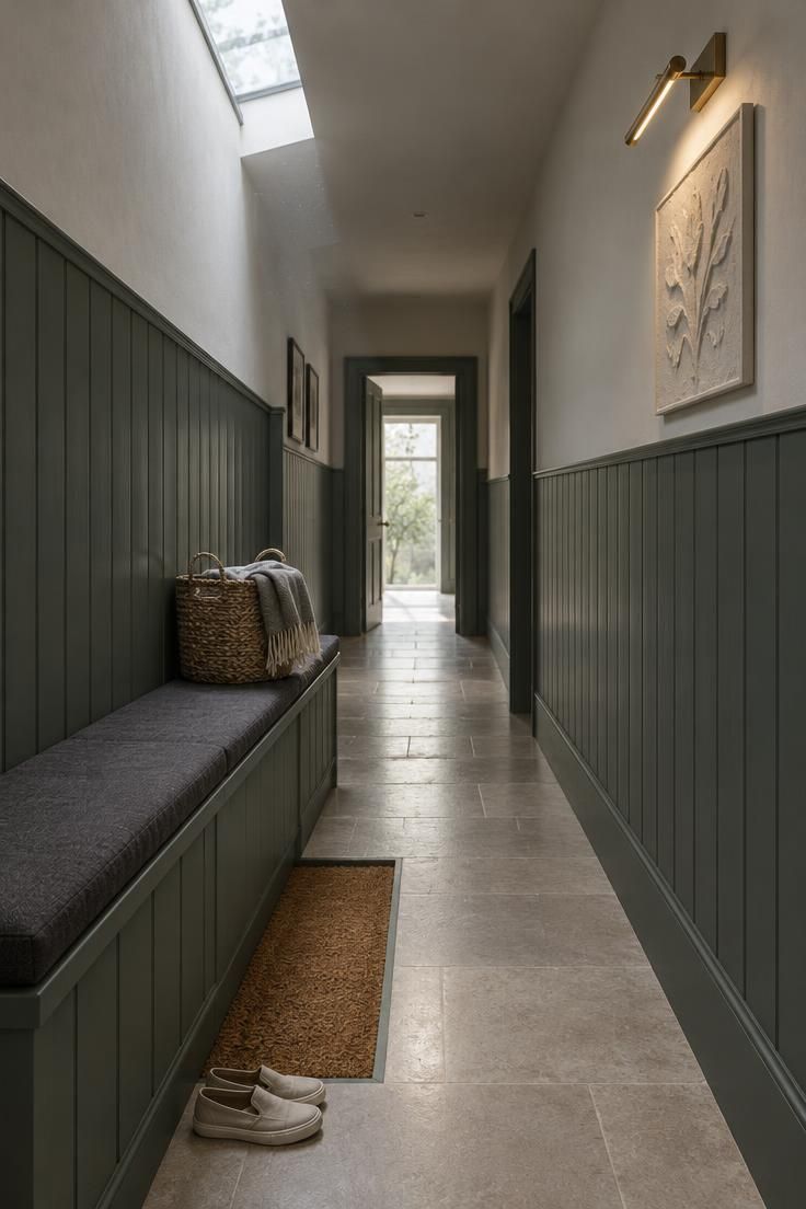
The paneling gives the corridor a built-in structure that flat paint alone cannot provide.
Vertical grooves catch the low daylight from the skylight, so the green-grey reads as a sequence of narrow highlights and soft shadows rather than a single unbroken surface.
Breaking the upper wall with chalky off-white keeps the ceiling from pressing down in a hall that already tilts toward shadow.
The bench and mat well work as one functional unit.
Shoes, bags, and daily clutter land in the mat well instead of drifting along the walkway, while the bench offers a place to sit without adding a freestanding piece that would crowd the passage.
Painting the bench the same green-grey as the paneling lets it recede into the wall, so the length of the hall still feels uninterrupted.
The brass picture light directs attention upward and sideways.
Instead of competing with the bench, it picks out the plaster relief panel, giving the eye a pause point before the far doorway.
Warm brass against cool green-grey introduces a metallic note that repeats in the basket's handle and the lamp's backplate.
This arrangement suits a hallway that serves more than one purpose.
A bench near the entry or stair landing can hold a phone, a folded throw, or a bag while also giving the corridor a subtle stopping point.
The recessed mat well requires floor space below the bench, so the idea fits better in a hall wide enough to absorb the built-in depth without narrowing the walking path.
Style Blueprint:
- Deep green-grey vertical tongue-and-groove paneling on the lower walls
- Chalky off-white upper wall to keep the corridor from feeling closed
- Built-in bench painted to match the paneling, topped with charcoal linen
- Recessed mat well with a flush coir mat directly below the bench
- Brass picture light washing a plaster relief panel on the opposite wall
Dark Grey Stair-Adjacent Hall With a Continuous Wall of Warm Paint
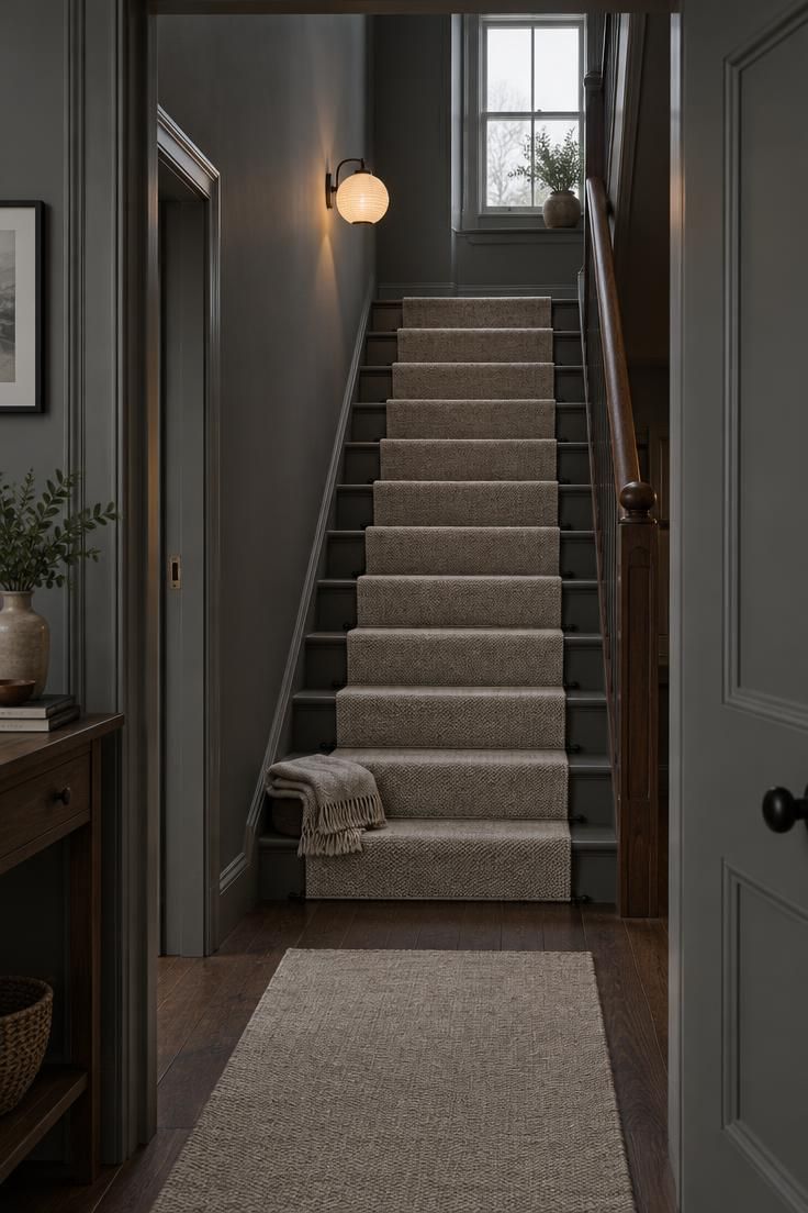
Continuing the wall color from the hall up the stairwell turns two spaces into one visual gesture.
Breaking the paint at the first step would make the transition look accidental, while carrying it past the landing and around the corner lets the eye travel upward along a single surface.
The stairwell becomes an extension of the hall rather than a separate zone.
The runner does most of the contrast work on the stairs.
A heathered oatmeal wool in a warm undyed tone sits against the dark wall and adds texture to the tread line, and holding it with simple rods keeps the runner the visual focus rather than the hardware.
Extending the same runner into the hall ties the two flooring zones together.
A single wall light at the mid-landing gives the stairwell one warm pool where the eye can rest.
Paper shades diffuse the light along the wall rather than throwing it straight up, which suits a narrow stairwell where the surfaces sit close to the walker.
Lower steps take the most wear from hands and bag straps, which is why a wipeable eggshell finish on the stairwell wall is the practical choice.
A washable wool runner also handles the traffic better than a delicate weave, and its fibers hide the incidental mark that a pale runner would show.
Style Blueprint:
- Warm dark grey paint continued from hall onto stairwell wall
- Heathered oatmeal wool runner climbing the steps
- Simple black rods holding the runner on each tread
- Single wall light with a paper shade at the mid-landing
- Wipeable eggshell finish on the lower stairwell wall
Dark Grey With a Light Oak Bench and a Single Coat Hook
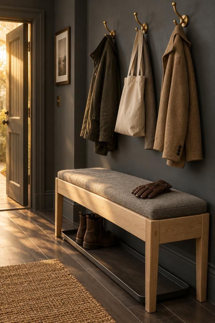
Treating the hallway as an entry zone shifts its role from pure passage to a small working room.
A pale oak bench against the dark wall breaks the color block at floor level and gives the eye a focal point, and the herringbone cushion adds a soft surface that reads warmer than the bench frame alone.
Brass hooks above repeat the metal accent used elsewhere in the corridor.
A greige hallway with oak and linen can adapt the same arrangement when the walls run slightly warmer.
In that case, the bench and hooks still anchor the composition, while the linen cushion replaces the herringbone for a softer note.
The bench depth, hook spacing, and mat size stay consistent across both palettes.
Seating in a narrow hall needs clearance discipline.
The bench should be shallow enough to leave a clear walking line past it, and the coat hooks should be spaced so that hanging jackets do not overlap the bench cushion.
A shallow boot tray underneath keeps wet shoes off the dark floor and away from the wall.
Small details finish the entry zone.
A jute mat in front of the bench catches grit, a canvas tote held by the center hook balances the jacket line, and gloves on the cushion suggest daily use.
Together they give the corner a lived-in quality without cluttering the hallway.
Style Blueprint:
- Dark grey wall paint kept consistent through the entry zone
- Pale oak bench with a single herringbone cushion
- Three brass coat hooks evenly spaced above the bench
- Slim boot tray underneath and a jute mat in front
- Neutral-toned jackets, a canvas tote, and a pair of gloves as props
Conclusion
Dark grey holds its depth in a hallway when it is handled as one layer within a stack of surfaces rather than a single all-over paint decision.
The ceiling, floor, trim, lighting, and one or two objects do more compositional work than the grey itself, and they create the contrast that keeps a corridor from turning into a shadowy tube.
A dark envelope reads best when the eye has a sequence: a light floor underfoot, a warm metal reflection along the wall, a runner leading forward, or a bright focal point at the far end.
Before committing to a shade, test large patches on the walls at different times of day and under the hallway's actual bulbs, because undertones shift between daylight and evening.
Decide what the eye should see first at the far end: a bright room, a lit piece of art, a runner, a mirrored console, or a pale bench.
That selected focal point is what makes the dark grey read as depth rather than darkness.