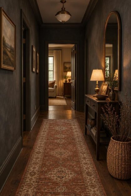
This post may contain affiliate links. If you make a purchase through these links, we may earn a commission at no additional cost to you.
A hallway asks for very little from the people passing through it, which is exactly what makes it such a rewarding place to commit to a strong scheme.
Deep, enveloping color turns a transitional corridor into a deliberate pause between brighter rooms, and the treatment costs far less wall area than a living room would.
“Moody” is not a synonym for black.
The effect comes from value, saturation, contrast, and texture, with darkness as the ground and controlled light as the figure.
A warm bulb, a woven runner, or a single reflective surface can carry an entire dark scheme.
Many corridors have few or no windows, so artificial light is already the working medium.
That makes it easier to layer sconces, lamps, and picture lights, and to dim them as the day shifts.
The ideas below move from full drenching to single accent moments, so a narrow passage or a wide landing can each find a version worth borrowing.
Drenched Charcoal Walls With a Wall of Woven Baskets
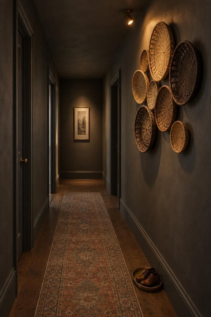
One matte tone spread across walls, ceiling, trim, and doors removes the visual breaks that make a hall read as a stack of panels.
Charcoal at this depth still shows tooth and brush texture under raking light, which keeps the surface from looking like a void.
The basket wall does the opposite job.
Natural cane, seagrass, and dark willow introduce warm midtones and shallow relief, so the eye has something to travel across rather than a long empty plane.
Grouping by size rather than by matched set gives the arrangement a collected rhythm.
Keeping the floor one step lighter, in dark oak, stops the scheme from closing in at foot level.
A faded runner defines the walking path without introducing a second color story.
Slim, faded patterns hide traffic marks better than pale solids in a hall that sees daily use.
Style Blueprint:
- One matte charcoal carried across walls, ceiling, and trim
- Shallow woven baskets in cane, seagrass, and dark willow grouped by size
- Dark oak flooring kept a step lighter than the walls
- A faded low-contrast runner to mark the path
- A single warm spot aimed across the basket texture
Design Pro-Tip: Group baskets in odd numbers for a less formal rhythm.
Deep Green Walls With a Patterned Wool Runner
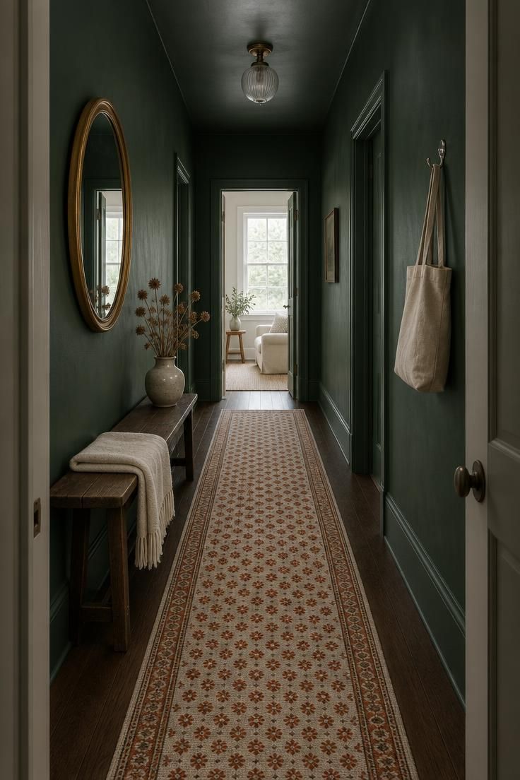
Forest green reads as grounded rather than funereal when it has warmth in the mix.
Carrying it onto the ceiling in a slightly lighter sheen holds the tone without flattening the ceiling line into a hard band.
The patterned runner does the heavy lifting here.
Rust and cream motifs break the merge between dark floor and dark wall, and a small repeat suits a narrow corridor better than a large-scale design that would only ever show a fragment.
A round gilt mirror above a bench introduces one warm metallic note and a second, softer light source by reflection.
Polished nickel on a hook or a small table keeps the green from reading muddy, and a restrained console table styling edit can introduce that same cool note without upsetting the runner’s pattern.
Pattern is where this scheme can go wrong.
A second motif on a cushion, a wallpaper border, or a lampshade would compete with the runner and dilute the green.
Letting the runner be the single pattern keeps the color dominant.
Runners in heavy traffic take the wear first, so a pattern holds its appearance longer than a solid pale ground.
Dark textiles also show light lint and pet hair, which is worth knowing before committing to a deep solid.
Style Blueprint:
- Deep forest green on walls with a lighter sheen on the ceiling
- A small-repeat wool runner in rust and cream
- Dark wood bench with a fold of cream textile
- A round gilt mirror to reflect doorway light
- One cool metal accent on a hook or side table
Limewash Walls With Picture Lights Over Dark Art
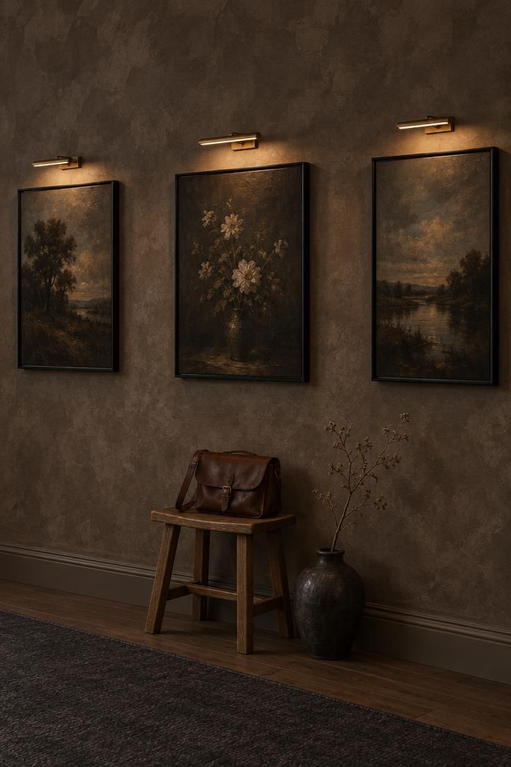
Limewash brings variation that flat paint cannot.
The mottled surface shifts across the day, and in a deep taupe or clay tone it reads as patina rather than as a solid block of color.
Picture lights turn each canvas into a small event.
A narrow warm beam over dark-ground landscapes or still lifes leaves the surrounding plaster in shadow, so the art glows and the wall recedes.
Carrying one frame style through the row keeps that rhythm from turning fussy.
A low-pile charcoal runner without pattern stays out of the way of the wall texture.
An oak stool under one painting gives a place to set a bag or a stack of mail, and its pale wood adds a lighter note at floor level.
Limewash finishes typically need refreshing over time depending on wear, and matte or chalky surfaces show scuffs more readily than mid-tones.
Keeping a small amount of the wall finish for spot repairs is a practical habit in a hall that sees daily traffic.
Dark floors and dark walls together can read as one mass.
The pale stool, the lit canvases, and the restrained runner each restore some legibility without breaking the scheme.
Style Blueprint:
- Deep taupe or clay limewash with visible hand-worked variation
- Dark-ground art in matching slim black frames
- A brass picture light above each canvas
- Low-pile charcoal runner with no pattern
- One pale oak stool for a lighter floor-level note
Design Pro-Tip: Use one frame style throughout for a clean rhythm.
Blue-Black Paneled Corridor With an Arched Mirror at the End
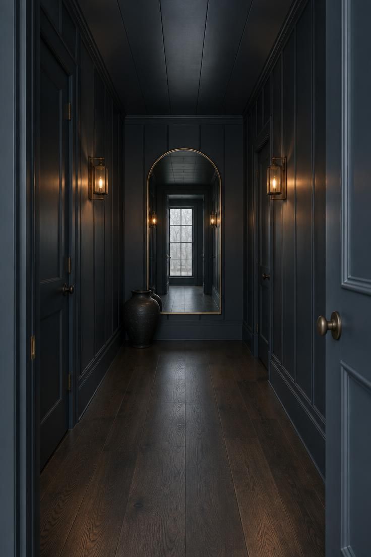
Satin is the useful choice on paneling because the grooves catch light and draw a line the eye can follow.
Carrying the same blue-black onto doors and baseboards removes the interruptions that would otherwise break a corridor into segments.
An arched mirror at the far end gives the corridor a destination.
It reflects the entry light back down the run, which visually extends the length and adds a second, softer source of illumination.
Two low lantern-style wall lights on the side walls place light at eye height rather than overhead.
That placement casts shadow across the paneling instead of flooding it flat, which is where the depth in this scheme comes from.
Skipping the runner lets the paneling and the mirror hold the composition.
Wide-plank dark wood in a satin or matte finish supplies a quiet floor plane without introducing another pattern or tone to manage.
This is a committed scheme with few objects, so mistakes show.
A mismatched door color or a glossy ceiling would each read immediately against the flat panel run.
Style Blueprint:
- Blue-black satin panelling carried across walls, ceiling, doors, and baseboards
- A large arched mirror with a thin brass rim on the end wall
- Two low lantern sconces on the side walls
- Dark wide-plank flooring with no runner
- One dark ceramic object for floor-level weight
Aubergine Hallway With a Velvet Bench and Gilt Frames
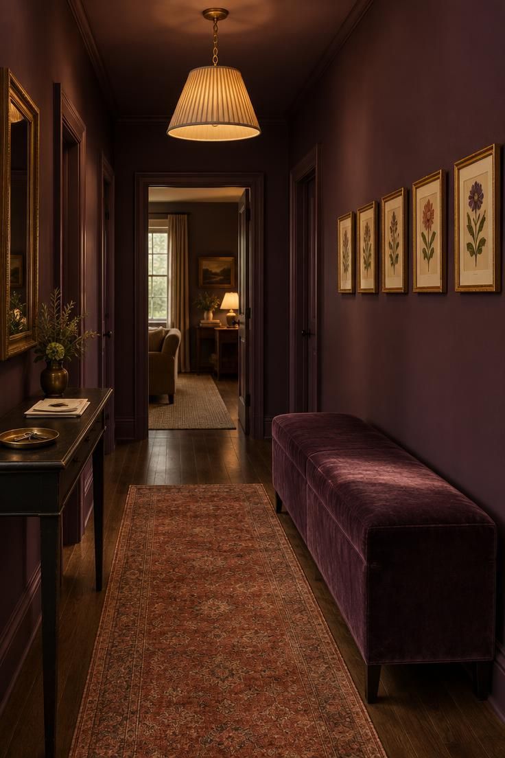
Aubergine sits between purple and brown, which makes it forgiving in low light and warmer than a straight black.
In a matte finish it absorbs light quietly, so the velvet bench and the gilt frames become the readable elements.
Velvet adds a directional nap that changes with the viewing angle, and a long upholstered bench gives the hall a genuine place to pause.
Gilt frames above catch whatever warm light reaches them, which is why the pendant is worth centering rather than doubling up on sconces.
A single pendant with a pleated linen shade keeps the light source concentrated.
Layering several fixtures would spread the glow and reduce the contrast that makes this palette work.
Bench length is worth thinking through before ordering.
Keeping it to roughly two-thirds of the wall leaves breathing room on either side and keeps the art above as the focus rather than the furniture.
Choosing among the many dark hallway paint colors comes down to undertone.
Aubergine leans warm, so it pairs naturally with brass, rust, and dark wood, and it can look disjointed beside a cool grey floor.
Style Blueprint:
- Deep aubergine in a matte finish on all walls
- A long bench in dark plum velvet
- Small gilt-framed botanical prints in a level row
- A single pleated linen-shade pendant at center
- A faded rust low-pile rug over dark wood
Dark Botanical Wallpaper on a Stair Landing
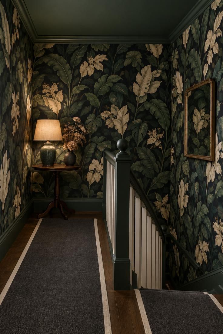
Large-scale botanicals in dark hallway wallpaper need room to be read, which is why a landing or a wide hall suits them better than a tight corridor.
On a narrow run, a visitor would only ever see a fragment of the repeat, and the design would lose its structure.
Stopping the paper at the ceiling line and painting the ceiling a matching deep green continues the tone upward without asking the wallpaper to wrap a plane that few people look at directly.
The result is a fuller envelope with one less seam line to manage.
A single lamp on a round table makes a small lighting vignette that does not hide the pattern.
The lamp sits at the height where the repeat is most visible, so the light explains the paper rather than competing with it.
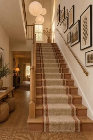
A solid charcoal runner with cream binding keeps the stairs legible against a busy surround.
Very dark floors and walls can make tread edges hard to read, and a contrasting binding is a common design response.
Patterned papers are less forgiving of imperfect wall surfaces than flat paint, since seams and bumps catch light at an angle.
A landing usually offers fewer awkward junctions than a long corridor, which is a point in its favor here.
Design Pro-Tip: Hang large-scale paper only on a landing or wide hall, where the eye can take in the full repeat.
Style Blueprint:
- Oversized botanical wallpaper in deep green, black, and cream
- Ceiling painted to match the paper’s darkest tone
- A small round table with a single ceramic lamp
- Solid charcoal stair runner with cream binding
- A small framed mirror to double the pattern
Deep Olive Board-and-Batten With Brass Hooks
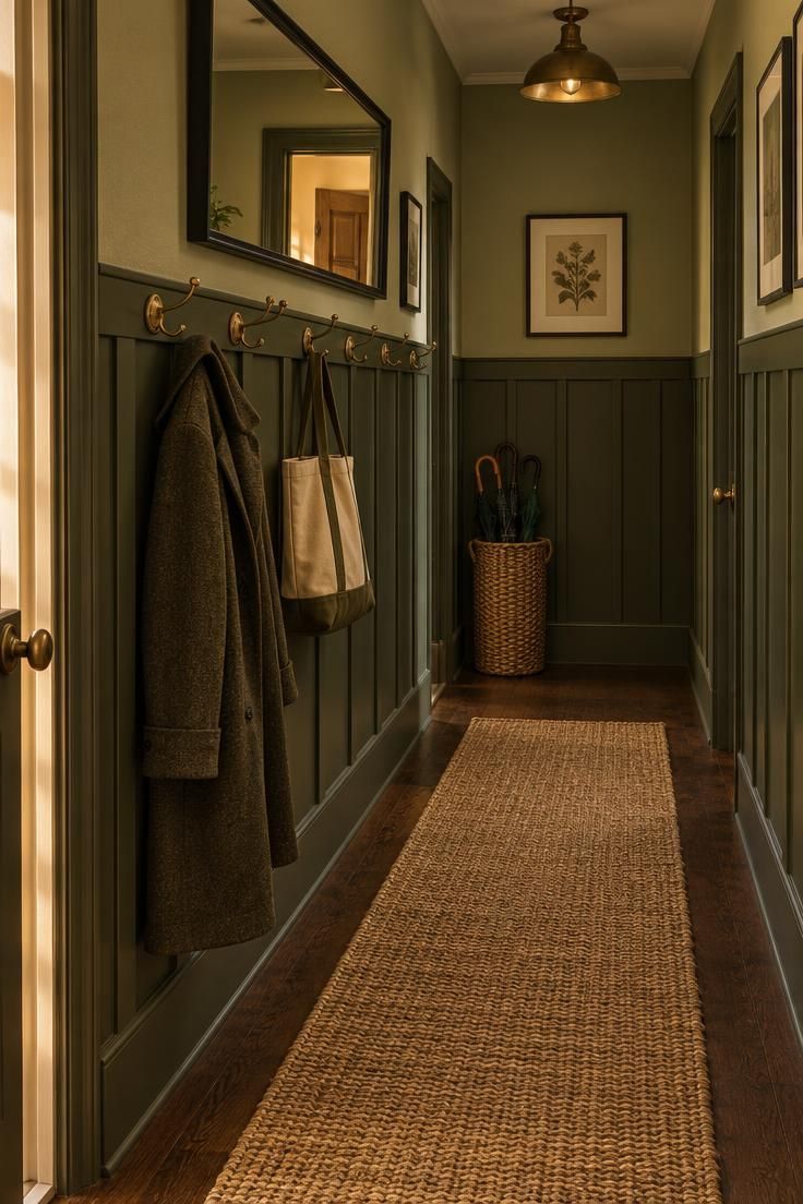
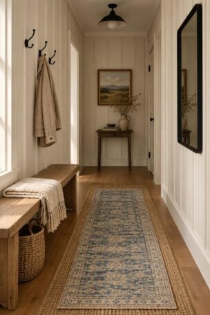
Board-and-batten reads more rustic than applied molding, and painting it in the same olive as the upper wall keeps the drench intact while the battens add vertical shadow lines.
A slightly lighter olive above maintains a sense of depth without introducing a second color.
A row of aged brass hooks along the top rail makes the paneling do real work, and coats and bags hang where the battens already create visual rhythm, so the storage disappears into the scheme instead of cluttering it.
A jute runner brings a dry matte texture that contrasts with painted wood and dark flooring.
Natural fiber also wears honestly in a high-traffic hall, which is one reason it shows up so often in hallway runner ideas for busy households.
Carrying one warm metal finish across hooks, mirror frame, and switch plates keeps the scheme coherent, since mixing brass with chrome or black hardware in a small space fragments the palette quickly.
The basket at the end handles shoes and umbrellas without adding a cabinet.
Open storage of this kind works best when there is one container rather than several, so the floor stays visually clear.
The black-framed mirror sits just above the hooks and reflects whatever light spills in from a nearby doorway, which keeps the dark olive from flattening at eye level.
Design Pro-Tip: Use the same hardware finish on hooks, mirror, and switch plates to keep the warm metal consistent.
Style Blueprint:
- Deep olive board-and-batten over the lower wall
- A lighter olive above to hold depth
- Aged brass hooks along the top rail
- A natural jute runner over dark wood
- One woven basket at the hall end
Moody Gallery Wall With Picture Lights on Smoky Blue
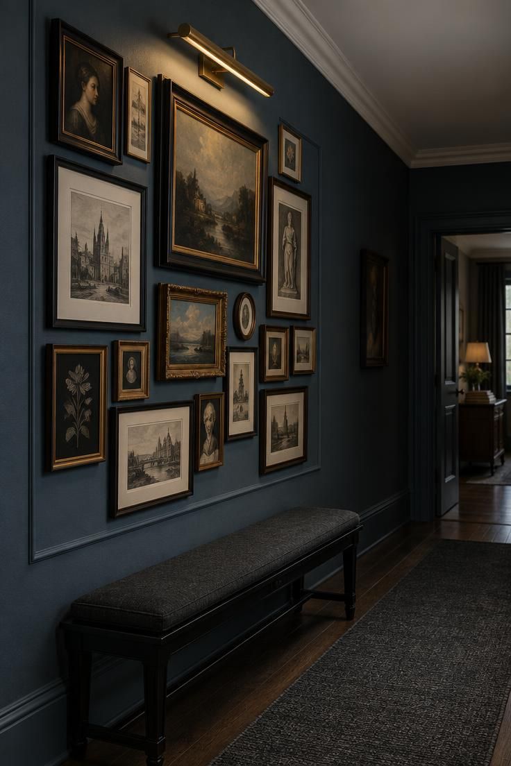
Dark walls change how a gallery wall behaves.
Frames and images read as objects set against a field rather than as shapes competing with a bright background, which is why dense salon arrangements sit so comfortably on a deep ground in a moody hallway.
A single picture light above the cluster covers the whole group and keeps the facing wall in shadow.
That one-directional wash gives the arrangement a center of gravity without the flatness that overhead lighting would produce.
Keeping the ceiling white lifts the light from the fixture and stops the blue from closing in.
Stopping the runner short of each doorway avoids an awkward interruption at the threshold.
A low ebonized bench below the gallery gives a place to sit and look, and it adds a dark horizontal that anchors the composition.
Varying frame sizes within a defined rectangle keeps the group reading as one unit.
Objects, ceramics, or a second motif elsewhere in the hall would start to compete with the density on this wall.
Style Blueprint:
- Smoky blue matte paint on the gallery wall
- A dense arrangement of dark-framed prints and small oils
- One brass picture light above the cluster
- A low ebonized bench with a dark cushion
- A white ceiling to lift the fixture light
Design Pro-Tip: Vary frame sizes but keep the group within a defined rectangle so the arrangement reads as one unit.
Dark Stair Hall With a Single Statement Pendant
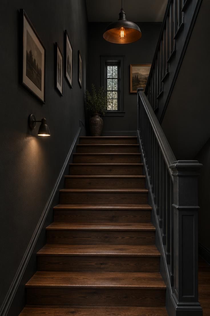
Coloring the walls, risers, and balustrade in one graphite tone lets the staircase read as a single sculptural form.
Keeping the treads in natural dark wood supplies the contrast the eye needs to follow the slope.
A single oversized pendant at the top of the stairwell becomes the bright point, and the walls recede around it.
That concentration is what separates a moody stair hall from a dim one, where light is spread thin and nothing leads the eye.
An open-bottomed shade casts light both upward and down, which avoids a harsh pool at a single level.
A slim wall-mounted lamp halfway down the stair adds a small secondary pool for the moments when the pendant alone is not enough light.
Skipping the runner here works because the wood treads and graphite risers already create their own rhythm.
In a stair hall, that alternation does the job a pattern would do on a flat floor.
Very dark floors, walls, and stairs together can make steps harder to read visually.
The natural wood treads against graphite risers are the design answer in this scheme, and they matter more here than almost anywhere else.
Style Blueprint:
- Deep graphite carried across walls, risers, and balustrade
- Natural dark wood treads for contrast
- One oversized pendant with a blackened metal shade
- A slim wall lamp on the lower stair for secondary light
Slatted Walnut Wall With a Low Bench and Soft Uplight
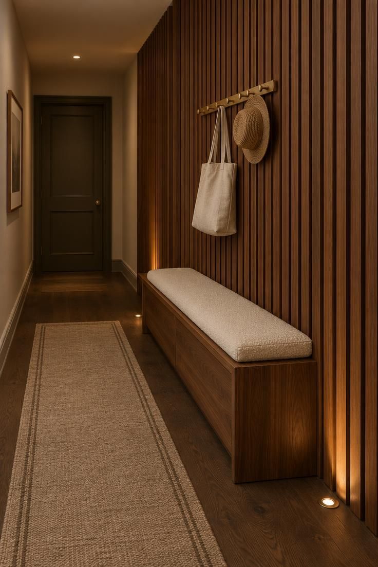
A slatted wall changes the way a narrow hall carries light and shadow.
Vertical walnut slats create a repeating rhythm that pulls movement forward without adding furniture depth to a tight passage.
The low bench serves more as a landing surface than as a seat.
A cream boucle pad softens the wood and gives the composition a small light plane against the dark slats.
The brass hooks do the practical work in this idea.
Hanging a linen tote and a woven hat keeps the space lived in while avoiding the look of a deliberately arranged wall vignette.
The flatweave beige runner follows the same warm range without competing with the slatted wall.
Its pale border picks up the bench seat and keeps the floor from disappearing into the dark oak.
This design suits halls where wall depth is limited but visual texture is needed.
Walnut slats require more careful edging around doors and switches than flat paint, and accumulated dust settles in the grooves, so a narrow vacuum attachment becomes part of regular upkeep.
Style Blueprint:
- Vertical walnut slats with dark shadow gaps
- A low built-in bench with a cream boucle seat pad
- Brass hook rail holding only practical entries
- Floor uplights sending amber light across slat edges
- A beige wool runner with a thin border on dark oak
Microcement Hallway With Blackened Steel Accents
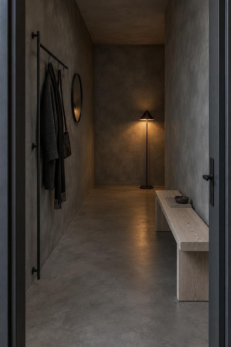
Microcement brings a plaster-like mottling that shifts with light, and running it across walls and floor as one continuous finish makes the corridor read as a single sculpted volume.
Without baseboards or trim, there are far fewer lines to break the surface.
Blackened steel supplies the cool accents: a narrow coat rack, a small circular mirror, and one slim floor lamp.
The finish is matte and slightly uneven, so it holds up next to a hand-worked wall in a way polished chrome would not.
A low bench in pale ash warms the otherwise cool material palette and adds the only light value in the scheme.
That single warm-neutral note is enough to keep the grey from reading clinical.
Using the floor lamp at the far end creates a soft glowing point that draws the eye through the corridor.
Instead of lighting the whole space evenly, this placement lets the walls fall away toward the light.
Restraint matters in a scheme this reduced.
Every added object competes directly with the surface, so the coat rack, mirror, bench, and lamp are close to the full inventory.
A finish like this shows marks differently than paint does, and microcement surfaces typically need attention over time depending on wear.
A matte sealer keeps the mottling readable rather than turning the floor into a reflective sheet.
Style Blueprint:
- Warm dark grey microcement across walls and floor
- Blackened steel coat rack, mirror, and floor lamp
- A low pale ash bench for contrast
- No baseboards or trim to interrupt the surface
- One floor lamp placed at the far end
Antique-Mirror Wall in a Deep Blue Hallway
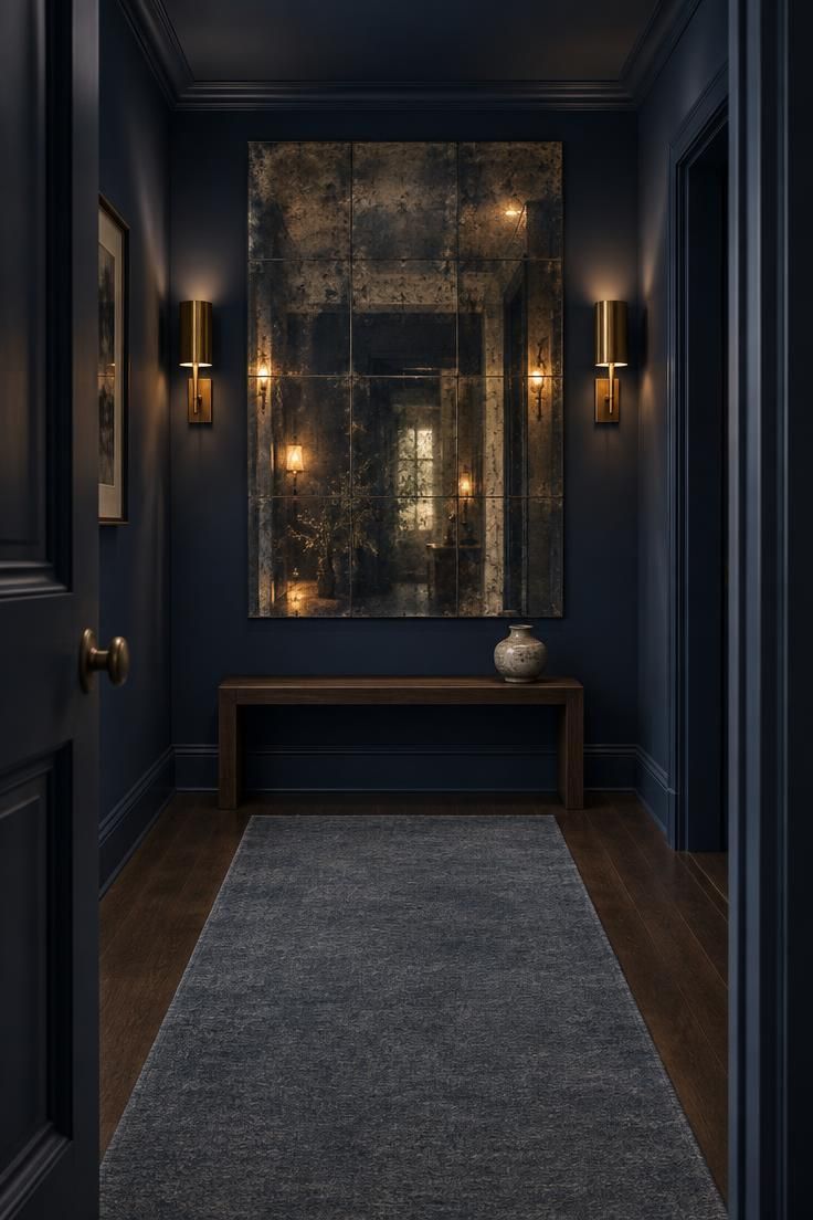
An antiqued mirror panel softens whatever it reflects, so the reflection reads as a warm glow rather than a hard duplicate of the hallway.
On an end wall in a deep blue setting, it becomes the one reflective event in an otherwise absorptive scheme.
Deep navy on walls and ceiling keeps the envelope consistent.
The blue has enough saturation to hold its own against the amber tint of the mirror, and it avoids the coldness that a grey-blue can bring.
Placing sconces beside the mirror rather than overhead lighting makes the reflection jump.
Light striking the glass at an angle from either side gives the panel depth and prevents it from reading as a flat sheet.
A low-pile solid runner in blue-grey lets the mirror be the only reflective element.
A patterned or glossy floor covering would compete with the panel and split attention at the end of the run.
Among the many ways to handle moody hallway lighting, side-mounted fixtures at mid height do more for an end-wall feature than a ceiling source.
The light lands where the surface is, which is the whole point of the arrangement.
Warm tones in the antiqued glass keep the blue from turning cold.
A mirror with a cooler tint would shift the whole scheme toward grey.
Style Blueprint:
- Deep navy walls and ceiling for a consistent envelope
- An antiqued mirror tile panel on the end wall
- Two brass sconces flanking the panel at mid height
- A low dark wood bench below the mirror
- A solid blue-grey runner with no pattern
Dark Hallway Opening Onto a Bright Room
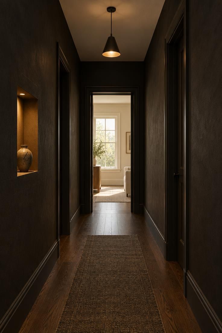
Matte off-black on the walls with a soft white ceiling keeps the corridor from reading as a tunnel.
The bright plane overhead lifts the overall value just enough while the dark walls stay dense.
Keeping the hall nearly empty makes the view at the end the main artwork.
A small lit niche or a single framed piece gives the eye something close to rest on before it reaches the opening, which is what separates deliberate contrast from an unlit passage.
Dark trim around the opening emphasizes the threshold.
The frame becomes a picture edge, and the bright room beyond supplies the focal point without any object in the hallway itself competing for it.
A barely-there runner leads the eye forward without adding a pattern or a second color.
One simple pendant makes a small pool of light in the middle of the run so the transition has a midpoint rather than jumping straight from dark to bright.
This is the most reversible version of the whole approach.
Walls, a runner, and one fixture can be changed without touching paneling, built-ins, or a floor finish, which suits a rental or anyone still deciding how far to commit.
A mirror at the end would compete with the room beyond.
The bright opening already supplies the destination, and a second reflective surface would divide the view.
Style Blueprint:
- Matte off-black walls with a soft white ceiling
- Dark trim framing the opening at the end
- A nearly empty hall with one lit niche or framed piece
- A barely-there runner leading forward
- One simple pendant for a mid-run pool of light
Conclusion
A dark hallway works when the deep surfaces are balanced by warm light, visible texture, and a clear focal point.
Full drenching, paneling, a single statement pendant, or one reflective end wall all reach the same destination by different routes.
The material choices matter as much as the color.
Wool, jute, velvet, limewash, microcement, brass, and blackened steel each respond to light in their own way, and layering two or three of them gives a dark scheme the relief it needs.
Trade-offs come with the territory.
Matte finishes show marks, dark textiles collect lint, patterned papers reveal imperfect walls, and a dim scheme without layered light reads as gloomy rather than atmospheric.
A runner, a lamp, or a mirror paired with a deep wall color adds depth without closing the space off.