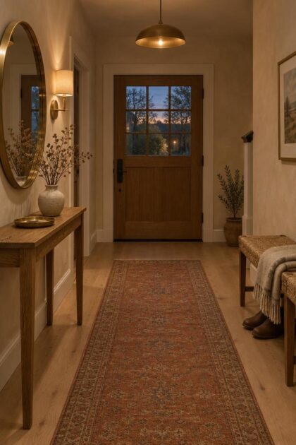
This post may contain affiliate links. If you make a purchase through these links, we may earn a commission at no additional cost to you.
The entry is the room every visitor passes through first, yet it often receives the least attention in a home.
A generous console, a thoughtful light fixture, and a couple of well-placed textures can shift that first impression from transitional to composed.
These ideas lean on warm plaster, natural wood, aged brass, and woven fibers, with each element chosen for how it greets the eye from the doorway.
Some call for a freestanding piece, others for a finish change, and every one keeps daily function in view.
Here are arrangements that make a luxury entryway feel less like a showpiece and more like a genuine welcome.
Warm Stone Niche with a Recessed Plaster Shelf
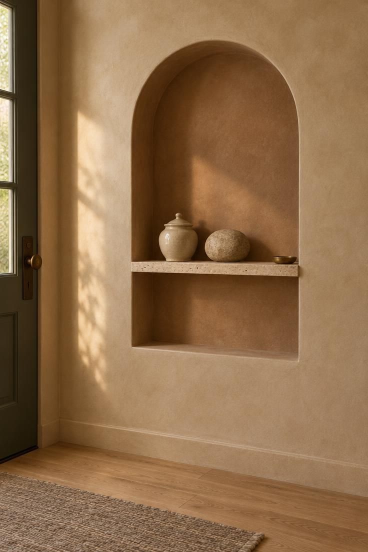
A shallow arched niche carries a lot of visual weight without taking up a single inch of floor.
Finished in warm plaster, the recess reads soft and matte, and the honed stone shelf offers a cool, slightly reflective counterpoint to the clay tone around it.
Keeping the shelf mostly empty lets the arch itself act as the focal point, with the jar, the rounded object, and a small brass dish providing just enough variation to hold interest.
From the front door, the niche becomes a quiet axis that draws the eye forward and gives the entry a deliberate center.
Consider how this choice fits the rest of the entry.
A carved or recessed feature is a larger commitment than a hanging mirror, and it works best where the wall plane is not needed for hooks or tall furniture.
The stone shelf earns its place by providing a landing surface for keys or mail, though anything left there should stay minimal to preserve the open feel of the recess.
Warm golden light flatters the plaster most, since it reveals the surface variation rather than flattening it.
Material choices matter more than quantity here.
A plaster finish with visible tonal movement pairs well with travertine, limestone, or a honed quartzite in a pale neutral, and a single unlacquered brass detail adds a soft glint without competing.
The lidded jar keeps small items out of sight, which supports the calm composition.
If the entry already has strong finishes elsewhere, this niche can stay quiet in one warm neutral so it reads as architecture rather than decoration.
Style Blueprint:
- Warm clay-toned plaster or limewash on the niche and surrounding wall
- Slim honed stone shelf in travertine or limestone
- One lidded ceramic jar and one rounded stone object
- Small unlacquered brass dish for keys
Soft Arch Alcove with a Low Upholstered Storage Seat
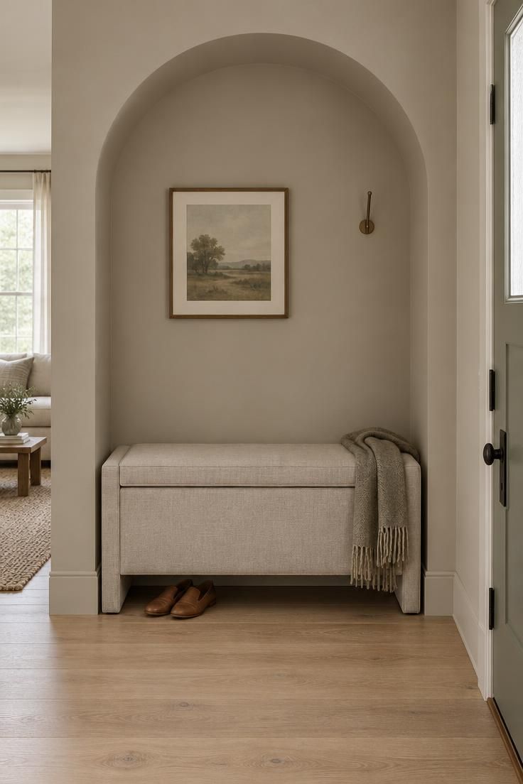
An arch alcove offers a softer version of a statement wall, using shadow and shape rather than contrast to define the entry zone.
Painting the recess and the surrounding wall in the same putty tone lets the curve show through shading, which keeps the entry calm while still giving it a clear focal point.
The low upholstered seat supplies a practical place to remove shoes, and a lift-top compartment hides scarves and gloves so the surface stays clear.
Placing the small framed print off-center keeps the arch as the dominant gesture instead of splitting attention.
Upholstery near an exterior door faces real conditions.
Dust, damp shoes, and the occasional wet umbrella make a removable, launderable cover the smarter choice, and a washable linen or cotton slipcover protects the seat beneath.
The single hook handles a daily jacket, which limits clutter without turning the alcove into a coat zone.
This arrangement suits an entry that needs one seat and a little concealed storage more than a full console.
The tradeoff is capacity: a lift-top compartment holds less than a drawer stack, so it works best for a smaller household or a secondary entry.
Keeping the palette to two or three related neutrals, with the print supplying the only strong tone, holds the composition together.
Style Blueprint:
- Matte putty paint carried across the arch and surrounding wall
- Low bench with a removable washable slipcover and lift-top storage
- One small framed print hung off-center above
- Single slim wall hook for a daily jacket
Sculptural Entryway Lighting with a Single Ceramic Pendant
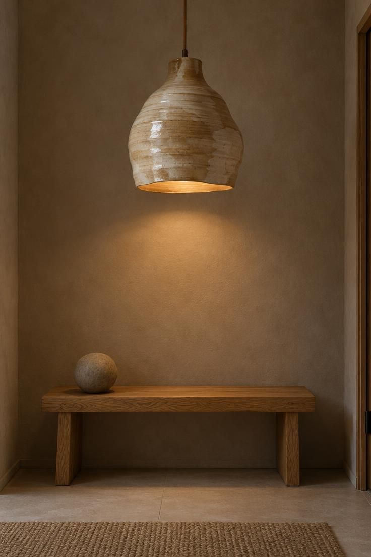
Sculptural entryway lighting shifts the visual weight upward and lets a small space stay minimal below.
An oversized ceramic pendant with an organic shape works as the single object in the room, drawing the eye from the threshold to the ceiling and giving the entry a vertical anchor.
With no competing wall art or heavy furniture, the ceramic reads as a hand-made piece rather than a utility fixture.
That restraint is exactly what makes the composition feel collected instead of crowded.
The light source shapes how the ceramic is perceived.
High-glare bulbs flatten the glaze and produce harsh reflections, so a warm, low-wattage bulb lets the surface texture show.
Pendant height deserves attention in an entry, where tall visitors pass beneath it; hanging it clear of head height keeps the fixture feeling deliberate rather than challenging.
This approach is a strong fit for a luxury entryway that already has good proportions and does not need much furniture.
The tradeoff is function: a pendant alone provides no landing surface, so a narrow ledge or a small dish on a bench handles keys.
Pairing the pendant with a single low object below, such as a stone sphere or a folded throw, keeps the composition balanced.
Style Blueprint:
- One oversized hand-thrown ceramic pendant in warm sand or cream
- Warm, low-wattage bulb to keep the glaze readable
- Low oak bench beneath, holding a single simple object
- Bare walls around the pendant
Design Pro-Tip: Before settling on a pendant, stand at the open door and check the sight line: the fixture should sit clear of both the door swing and the tallest visitor's path.
Entryway Runner Rug Ideas with a Flat-Weave Vintage Pattern
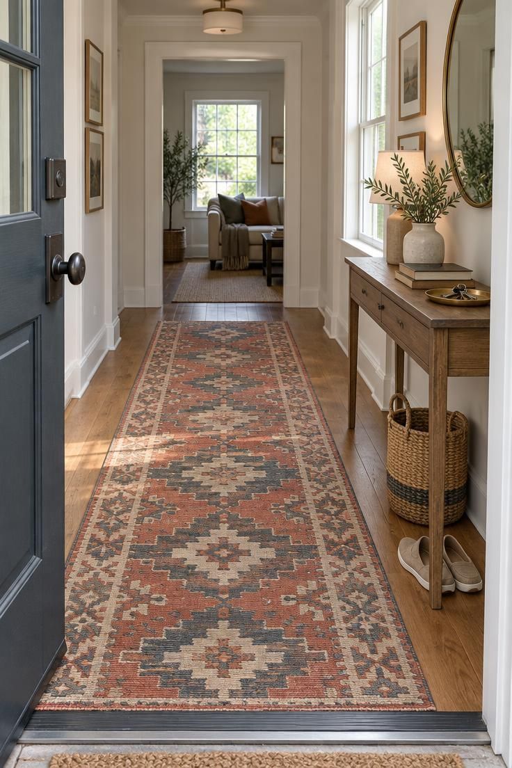
A runner does quiet spatial work in an entry: it marks the walking path from the door and gives a long, narrow hall a sense of direction.
Flat-weave entryway runner rug ideas center on patterns that sit close to the floor and add color without overwhelming a small space.
A faded vintage-style geometric in terracotta and charcoal introduces warmth and a little age, which keeps the hall from feeling new-build plain.
Because the rug carries the pattern, the surrounding console and walls can stay simple.
Flat-weave construction earns its keep in daily use.
With no pile, the rug vacuums easily and traps less grit than a plush style, and shoes glide over it without catching.
That same low profile means the rug can shift on smooth floors, so a thin nonslip pad keeps it in place, and heavy shoe traffic will wear the weave faster than a secondary entry would.
Placing it in a household entry where traffic is moderate gives the pattern a longer life.
Decisions come down to scale and durability.
The runner should read as a path, so a width that leaves some floor visible at each side keeps the hall from feeling carpeted wall to wall.
Wool handles footfall well and resists crushing, while a busy household might prefer a darker field to disguise marks.
A narrow console and a single key tray keep the composition edited around the rug.
Style Blueprint:
- Long flat-weave runner in a faded terracotta and charcoal geometric
- Thin nonslip pad beneath
- Narrow console with a small brass key tray
- Woven basket at one end for daily shoes
Round Entryway Mirror with a Wide Brass Frame
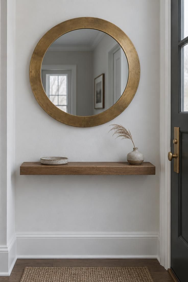
A wide brass frame turns a mirror from a useful reflection into a sculptural round.
Round entryway mirror ideas often hinge on proportion: the frame's thickness is what gives the circle presence, and a generous band of unlacquered brass reads as a deliberate object against a pale wall.
The slim floating shelf beneath supplies just enough surface for a tray or a low vase, and keeping it narrow preserves the passage in a tight entry where a deep console would crowd the walkway.
Positioning decides whether the mirror feels grounded.
Keeping the shelf at eye level for most adults places the mirror's center in a comfortable viewing zone, and leaving the wall around the frame bare reinforces the circular shape.
Unlacquered brass develops a patina over time, which many households welcome and others prefer to slow with occasional buffing.
Either approach works; the point is to decide which look is wanted before the finish ages on its own.
In a narrow entry, the combination of a shallow shelf and a wall-mounted mirror frees the floor entirely, which is the practical argument for this arrangement.
The tradeoff is surface area: a small tray holds keys, but mail and bags need another home.
A single small object on the shelf keeps the composition focused on the round form.
Style Blueprint:
- Large round mirror with a wide unlacquered brass frame
- Narrow floating shelf at eye level
- Single small stoneware tray for keys
- Bare wall around the frame
Entryway Console Table Styling with a Single Statement Vase
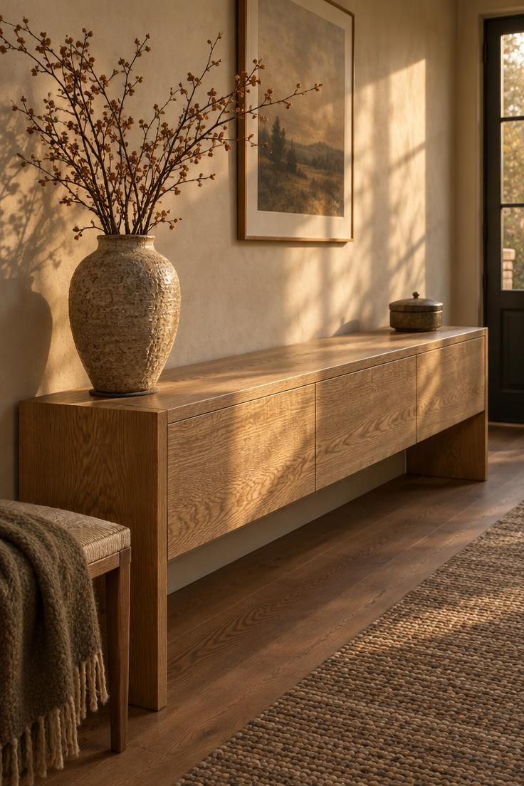
Entryway console table styling often fails when the surface carries too much.
Reducing the arrangement to one statement vase and a single lidded box at the opposite end gives the console a clear hierarchy and leaves the center open, which keeps the sight line from the door uncluttered.
A large textured vase with dried branches supplies height and movement, while the box handles keys and small items out of view.
That pairing is simple to maintain and reads as intentional rather than sparse.
The material logic supports the restraint.
White oak brings warmth and visible grain, and an unlacquered ceramic vase with a matte or heavily textured glaze gives the eye something to hold.
A felt pad under the vase protects the wood from scratches, a small detail that matters over years of use.
Dried material needs periodic editing as it sheds and gathers dust, so a quick pass with a soft brush keeps the arrangement looking considered.
This approach suits households that want a polished but low-maintenance entry.
The open center invites quick drop-offs without requiring a full reset each day.
The tradeoff is storage: a single lidded box holds less than drawers, so a household with heavy mail or multiple sets of keys may want a console with concealed storage to keep the top surface this quiet.
Style Blueprint:
- Long low console in white oak with visible grain
- One large textured ceramic vase with dried branches
- Small lidded box at the far end for keys
- Felt pad beneath the vase
- Center of the console left empty
Color-Drenched Entry in Deep Blue with a Woven Bench
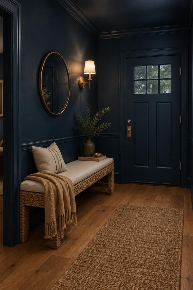
A color-drenched entry treats the whole envelope as one surface.
Carrying a deep ink blue across walls, trim, and ceiling creates a saturated, enclosing effect that makes the doorway feel like a threshold into somewhere distinct.
The color absorbs contrast, so warm materials placed against it stand out: an oak floor, a wheat-toned throw, and a woven bench with a cream cushion all read more clearly than they would on a pale wall.
A single sculptural entryway lighting moment, here a warm-white sconce, interrupts the blue and gives the eye a bright point to land on.
The choice carries practical consequences.
Deep paint shows scuffs and dusty handprints more readily than mid-tones, particularly around the door and at the bench, so a soft cushion covering the most-used seat area helps protect the finish and keeps the bench looking cared for.
A woven frame with a natural tone keeps the room from feeling heavy, and a slim brass mirror adds a reflective break in the blue without introducing a competing color.
This approach works best in an entry with some natural light or a generous artificial source, since the dark envelope depends on a bright accent to keep the composition legible.
In a windowless hall, a sconce and a lighter floor are doing much of the work.
The payoff is a first impression that feels enveloping and confident, with very few objects needed to complete it.
Style Blueprint:
- Deep ink blue paint carried across walls, trim, and ceiling
- Woven bench with a light cream cushion
- Small round mirror with a slim brass frame
- One warm-white wall sconce
- Warm oak floor and a wheat-toned throw for contrast
Fluted Wood Console with a Simple Woven Tray
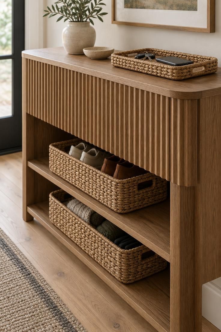
Fluting gives a console a ribbed texture that shifts with the light, and that vertical shadow play is the reason the piece can carry a formal entry without much else around it.
A simple woven tray on top corrals keys and a phone while leaving most of the surface open, and two open shelves below hold woven baskets that hide shoes and winter accessories.
The baskets matter because open shelves expose everything they contain; without them, the console would read as storage rather than furniture.
Depth deserves early attention in a narrow hall.
A console around 40 cm deep or less keeps the walking path comfortable, while a deeper piece can crowd the passage from the door.
Dust settles in the grooves of a fluted front, so a soft brush attachment on a vacuum handles the texture faster than a cloth.
The woven tray and baskets can be lifted off and shaken out periodically to keep the arrangement fresh.
This arrangement suits an entry that needs real storage but wants a polished face.
The open shelves make retrieval easy, and the baskets allow the contents to change with the season.
The tradeoff is that the console's top surface stays small, so a household with a heavy daily drop-off may need a second concealed spot nearby.
Style Blueprint:
- Fluted wood console in a warm mid-tone finish
- Shallow woven tray for keys and a phone
- Two woven baskets for the open shelves
- Soft brush for dusting the fluted front
Black Steel and Reeded Glass Partition as a Faux Foyer
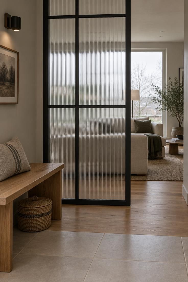
An entry that opens straight into a living room can feel undefined.
A black steel and reeded glass partition creates a visual pause at the threshold, giving the arrival zone its own identity while letting light move through.
The reeded glass distorts shapes slightly, so the living space beyond reads as soft suggestion rather than full exposure.
A low oak bench on the entry side supplies a seat and a place to set down a bag, with a small lidded basket beneath for gloves and scarves.
Because the screen is freestanding or lightly secured, it can be repositioned, which makes the idea practical for renters and for households that rearrange rooms.
The tradeoffs are real: glass gathers fingerprints near the door and needs regular wiping with a soft cloth, and without a nearby wall there is limited hook storage.
The bench and basket absorb that function, but a coat still needs a home, so a small hook on a nearby wall or a freestanding stand completes the zone.
The material contrast does most of the aesthetic work.
Black steel against warm oak, softened by translucent glass, gives the entry a graphic edge without blocking daylight.
In a space with cool overcast light, the screen reads crisp and modern; in warmer light, the same materials feel softer.
The partition suits open-plan homes that want a defined foyer without building walls.
Style Blueprint:
- Black steel-framed screen with reeded glass
- Low oak bench on the entry side
- Small lidded basket beneath the bench
- Soft cloth for wiping the glass
Gallery Entry with a Single Oversized Abstract Canvas
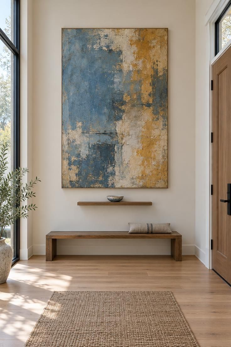
One oversized abstract canvas can replace an entire entry arrangement.
Hung above a very low bench, the artwork becomes the focal point, and its strong color fields substitute for the mirror-and-console pairing that many entries rely on.
A small floating ledge below holds a single ceramic dish, just enough to handle keys, and the wall around the canvas stays empty so the picture has room to breathe.
The composition suits a tall entry with limited furniture, where a large piece can fill vertical space without crowding the floor.
Scale and protection are the two practical concerns.
A canvas needs a margin of wall around it to read as deliberate, and a low bench beneath keeps the art above the main sight line from the door.
If the entry doubles as a coat zone, a protective varnish on the canvas helps it resist moisture and the occasional brush of a sleeve.
A household with rough daily traffic might place the bench slightly forward to keep bags and coats from pressing against the art.
This approach rewards editing.
The bench stays clear except for the dish, and the artwork does the visual work that a gallery wall of smaller frames would otherwise do.
The result is a gallery entry that feels confident and calm, with one strong image doing the greeting.
Style Blueprint:
- One oversized abstract canvas in two or three strong tones
- Very low wooden bench beneath the art
- Small floating ledge with a single ceramic dish
- Protective varnish if the entry doubles as a coat zone
Natural Woven Pendant and Rattan Bench Combination
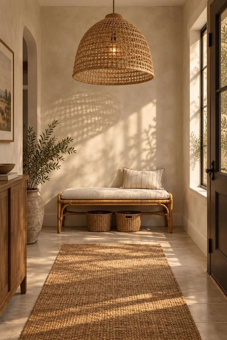
Natural fibers bring an organic softness to an entry, and limewash entryway walls supply the quiet, cloudy backdrop that lets those fibers read.
A large open-weave pendant casts patterned shadows across the wall and floor as light moves, changing the room through the day without a single piece of wall art.
A rattan bench beneath offers seating with slim baskets tucked under it, and a jute runner grounds the arrangement at floor level.
Together the materials build warmth with texture rather than color.
The pale palette needs variation to avoid flatness, and that is where a limewash wall helps: its cloudy shifts give the eye more to read than a flat white would.
Light tones also make a small or dim entry feel more open.
The tradeoffs are maintenance-related: the pendant's weave gathers dust and benefits from occasional vacuuming with a brush attachment, and rattan appreciates a dry-cloth wipe rather than a damp one.
In a high-traffic household, the jute runner should be shaken out weekly.
The combination suits an entry that wants warmth and texture with a light footprint.
The pendant provides the visual drama, the bench provides function, and the runner defines the path.
A cream cushion softens the bench, and the baskets keep the under-seat area useful without visible clutter.
Style Blueprint:
- Limewash wall in a warm white with cloudy tonal variation
- Large open-weave natural pendant
- Rattan bench with a cream cushion
- Jute runner, shaken out weekly
- Two slim baskets tucked beneath the bench
Paneled Wall Treatment with a Floating Cane Door Cabinet
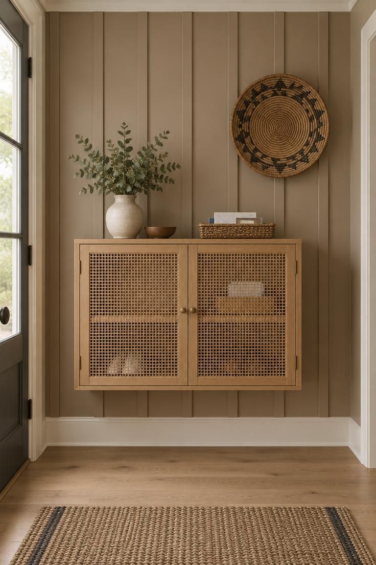
Vertical paneling adds a quiet rhythm to an entry without forcing a strong color block.
Batten spacing and a soft clay tone give the wall texture and shadow lines, and a floating cane-door cabinet mounted above the floor keeps the arrangement light.
Cane doors conceal keys, mail, and a small shoe shelf while showing a soft woven texture, and a round woven wall basket to one side offers a spot for a jacket or a folded throw.
The clay tone pairs comfortably with warm white trim and a light oak floor.
The mounting method gives the arrangement its floating character and keeps the floor clear, which helps in a small entry.
Access is the tradeoff: floating storage holds less than a full-height cabinet, so the arrangement suits a smaller household or a secondary entry where coat and shoe volume stays modest.
Paneled walls need very little care beyond dusting the ledges and wiping the cane doors with a dry cloth.
The palette holds the composition together.
Clay, warm white, light oak, and natural cane sit in a narrow tonal range, so the paneling's rhythm becomes the most visible gesture.
That restraint keeps the entry calm even with several elements present.
Style Blueprint:
- Vertical batten paneling in a soft clay tone
- Warm white trim and a light oak floor
- Floating cane-door cabinet for keys, mail, and a shoe shelf
- Round woven wall basket for a jacket
Checkered Tile Floor with a Pale Plaster Wall and Slim Cane Bench
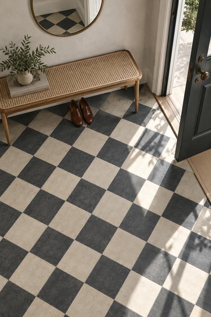
A checkered tile floor does the visual work of a feature wall, but underfoot.
The cream and charcoal pattern draws the eye across the entry and marks it as distinct from adjoining wood or carpeted rooms, which is useful when the front door opens into a larger living space.
Against a pale plaster wall, the floor becomes the dominant graphic element, and a slim cane bench adds texture without blocking the tile.
A small round mirror above the bench gives the arrangement a vertical accent.
A busy floor pattern asks for restraint elsewhere.
Wall art and furniture should stay minimal so the tile remains the focus, and a matte tile finish hides water spots better than a polished one in a high-traffic entry.
Grout lines need more frequent cleaning with a patterned floor, since dirt reads more easily against the light checks.
In a household with heavy shoe traffic, a doormat at the threshold keeps grit off the pattern.
The combination suits an entry that wants personality with a light footprint.
The cane bench supplies seating, the round mirror handles the final check, and the tile carries the visual interest.
Keeping everything else pale and simple lets the floor stay the leading element.
Style Blueprint:
- Cream and charcoal checkered encaustic-look tile
- Pale plaster wall
- Slim cane bench beneath a small round mirror
- Doormat at the threshold to keep grit off the pattern
Design Pro-Tip: Choose the palette's anchor element first, whether that is a patterned floor, a deep paint color, or a stone niche, and let the entry's other three or four pieces support it rather than compete.
Conclusion
The entry ideas here share a common thread: one clear focal point, quiet material contrast, and enough negative space for the composition to breathe.
A luxury entryway does not require many objects; it requires a few well-chosen ones and honest attention to daily use, from where keys land to how coats and shoes pass through.
Weigh each idea against the home's existing floor, ceiling height, and coat-and-shoe volume, then let the entry stay edited.
The right arrangement is the one that still looks composed after a busy week.