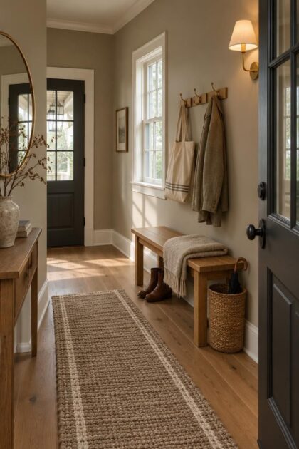
This post may contain affiliate links. If you make a purchase through these links, we may earn a commission at no additional cost to you.
Most advice about entryway paint colors treats a foyer like any other wall in the house.
The assumption falls apart the moment the same hallway is compared at two different hours.
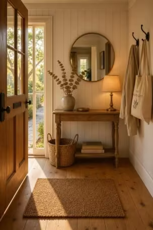
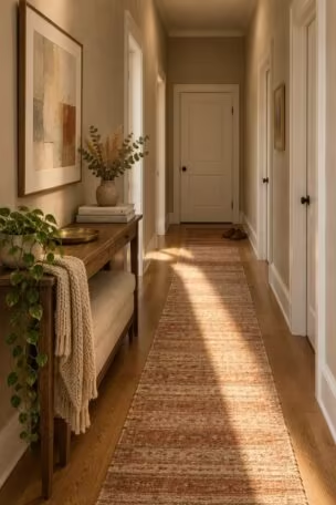
Bright afternoon light through a sidelight and the warm glow of one ceiling fixture at night can turn a single paint into two completely different colors.
Choosing well means treating an entry as a viewing-condition problem before an aesthetic one.
Why Light Direction Changes What the Color Looks Like
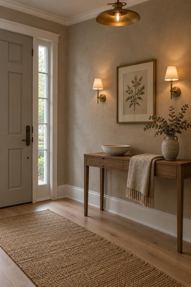
Identifying the entryway’s exposure comes before any sample is opened.
North-facing entries and windowless foyers receive cool, indirect light that pulls blue-based grays and icy whites toward flat gray, while warm creams, khakis, and greens keep their character.
South-facing entries take strong warm light for much of the day, and warm paints can read more saturated or slightly yellow by late afternoon.
East and west exposures split the difference in a way that surprises people.
An east-facing entry catches cool morning light that shifts to neutral by midday, so a color that looked balanced at breakfast may appear flatter by lunch.
West-facing entries take warm late-day light, meaning a paint judged in the morning can look considerably warmer at dinner, which is often when the front door sees the most use.
The same paint should be sampled in the actual space rather than chosen from a chip under store lighting.
This principle separates reliable selection from guesswork, because a foyer is frequently the darkest interior space in a home and depends on borrowed light from adjacent rooms plus whatever fixtures are installed.
Comparing daylight and lamp conditions is the point, not comparing paint names.
Design Pro-Tip: Paint large sample boards rather than small chips, move them around the entry wall, and view them at three different times of day with the entry lights on before committing to a full room.
Warm Neutrals That Hold Up in Mixed Light
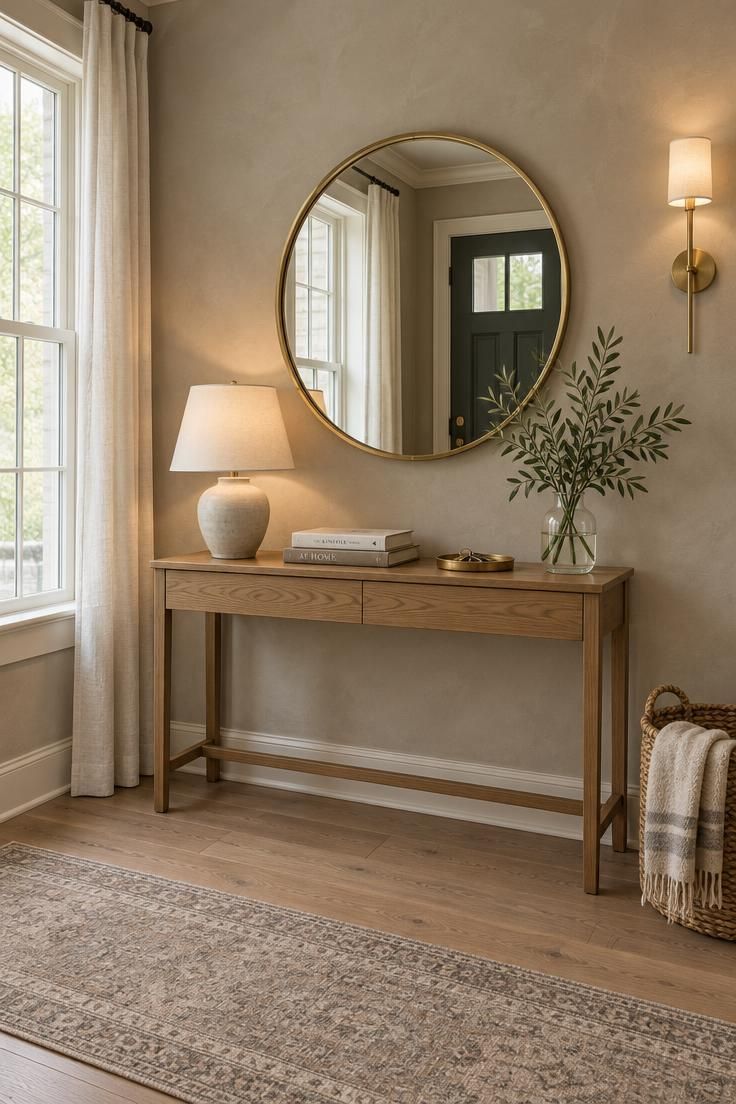
Warm khaki, mushroom, taupe, and creamy white are the neutral family that most reliably absorbs mixed lighting.
Their undertones lean toward yellow, brown, or green rather than blue, which keeps them from turning gray in cool daylight and prevents them from going sour under warm bulbs.
Sherwin-Williams selected Universal Khaki SW 6150 as its 2026 Color of the Year, describing it as a nature-inspired midtone neutral, which places it in the family that suits entries with both natural and artificial light.
For north-facing entryway color selection, this group does most of the work.
Cool indirect light drains blue-based grays and makes them look dingy on a wall that receives no sun, while a warm khaki or mushroom keeps its depth and reads intentional even in a dim corridor.
The same warmth helps in foyers where a warm ceiling fixture meets cool daylight spilling from the living room.
Pairing matters as much as the paint itself.
Wood floors in oak, walnut, or ash, brass or bronze hardware, and stone or ceramic surfaces all sit comfortably beside these neutrals because their own warmth echoes the wall color.
A cool chrome fixture or a pale gray tile floor can pull the same wall toward gray, which is useful to note before assuming the paint is at fault.
The neutral family also absorbs traffic gracefully.
Scuffs, fingerprints, and the daily contact of bags and coats show less against a midtone warm neutral than against a white or a very dark color, though sheen still governs how visible those marks become.
Choosing a warm, mid-depth neutral is one of the more forgiving decisions available in a foyer.
Broad national survey data supports the appeal without turning it into a rule.
Clever Real Estate’s August 2024 survey of 1,000 U.S. homeowners found white the most-liked interior color at 42 percent, beige at 35 percent, and light gray at 32 percent, which places warm neutral territory at the center of mainstream preference rather than the edge.
Greens and Blue-Greens That Feel Collected, Not Coastal
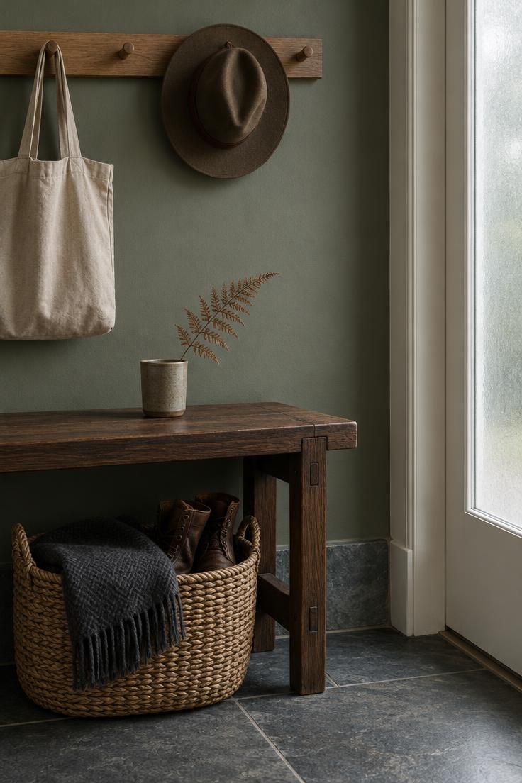
Green is the clearest direction in current color reporting.
A 2026 Fixr survey of 86 design professionals found restorative greens were the leading predicted interior color palette, chosen by 66 percent of respondents, which places green ahead of other families for the coming year.
The distinction that matters in an entryway is between muted, earthy greens and bright coastal pastels.
Sage, olive, moss, and eucalyptus carry enough gray or brown in their base to hold their depth in low light, while pale seafoam and bright mint tend to wash out in a foyer that receives no direct sun.
A deeper green reads as a decision rather than a default.
Behr’s 2026 Color of the Year, Hidden Gem, is described by the brand as a smoky jade suited to accent walls and full-room color.
The smoky quality is the useful part: it gives the wall enough density to feel grounded in a narrow hall without turning flat under a single overhead fixture.
Material pairings do a lot of the work with green.
Dark wood benches, natural stone thresholds, woven baskets, and wool textiles all read as collected rather than themed beside a muted green.
Brass and aged bronze hardware sit comfortably with olive and moss, while polished nickel tends to push green cooler.
Artificial light needs some attention here.
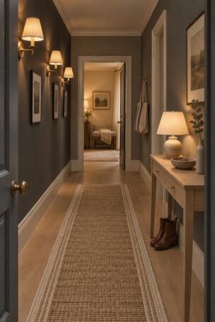
Under warm bulbs, olive and moss take on a yellow-brown cast that can look rich or murky depending on the fixture placement, so wall sconces that light the wall plane evenly show the color more accurately than one central ceiling fixture.
This is where the green either settles into the space or fights it.
For homes where a full green room feels like too much commitment, the front door, a console wall, or a stair wall can carry the color while the surrounding walls stay in a warm neutral.
That approach keeps the entryway connected to the rest of the house while giving the threshold its own identity.
Sheen Is a Color Decision in a High-Contact Zone
Entryway walls take more contact than almost any other painted surface in a home.
Bags, coats, shoes, leashes, and hands all brush the wall beside the door, and the finish determines how that contact reads over time.
Higher sheen, such as satin or semi-gloss, cleans more easily and resists wear, while lower sheen, such as matte or eggshell, hides small dents, patches, and uneven wall texture.
The tradeoff is real and worth stating plainly.
A durable satin on entryway paint sheen for high-traffic walls will show every imperfection in the drywall beneath it, and older or imperfect walls often look worse under a shinier finish.
Lower sheen forgives the wall but collects scuffs, which matters in a space that sees constant contact.
A practical starting point is to match the sheen to the wall condition and the amount of contact, not to aesthetic preference alone.
Sherwin-Williams offers a sheen selection guide that places walls in eggshell, washable matte, or low-luster categories, trim and doors in satin or semi-gloss, and ceilings in flat or matte, which gives a reasonable frame for the entryway’s mix of surfaces.
Historic Foyers Need Period-Thinking More Than a ‘Historic’ Label
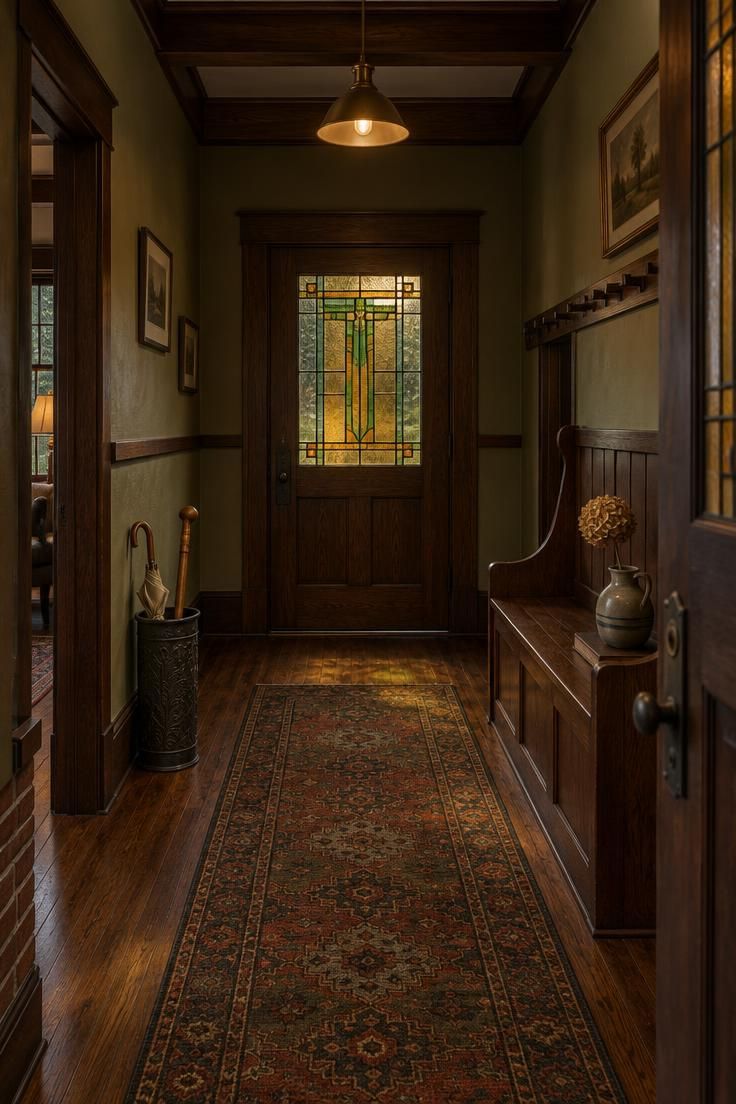
Older homes call for a different starting point than a generic old-house palette.
The useful question is what period the house was built in and how its trim, woodwork, and door style were meant to be painted, because a Colonial entry and a Victorian entry were not painted the same way.
This is where a historic foyer paint palette becomes an exercise in reading the house rather than applying a formula.
The National Park Service’s Preservation Brief 28 notes that early paints used natural pigments and oil binders, with decorative techniques that included graining, marbleizing, and stenciling, and that factory-made paints became widely available at reasonable cost after about 1875.
That timing opened up color choices in Victorian entry halls specifically.
Period directions vary by era.
Colonial, Georgian, and Federal entries were commonly painted in warm ivory, stone, putty, muted blue-gray, gray-green, soft ochre, or medium brown, often with stained woodwork.
Victorian and Italianate halls leaned toward deep olive, forest green, warm gold, ochre, rust, slate blue, burgundy, brown-red, and dark teal.
Craftsman and Arts and Crafts entries took moss, sage, olive, clay, terracotta, muted rust, ochre, warm taupe, deep brown, and creamy white.
Mid-century entries often used warm white, mushroom, beige-gray, muted mustard, pale aqua, olive, terracotta, and charcoal used selectively.
Historic New England also offers 20th-century palette guidance for homeowners sorting through era-appropriate choices, and both sources point to the same practical step: sample in the actual room before committing.
Warm muted mineral-based colors with considered trim contrast are commonly recommended for a period appearance, in contrast to stark white walls with bright white trim, which is a more modern convention.
Before any of this work begins on an older home, one technical point deserves a specific mention.
The National Park Service’s Treatment Guidelines note that lead-based paint was widely used in historic buildings before its U.S. ban in 1978, so avoid sanding or disturbing old coatings until the surface has been assessed and appropriate safety procedures are in place.
Connecting the Entryway to the Rooms It Opens Onto
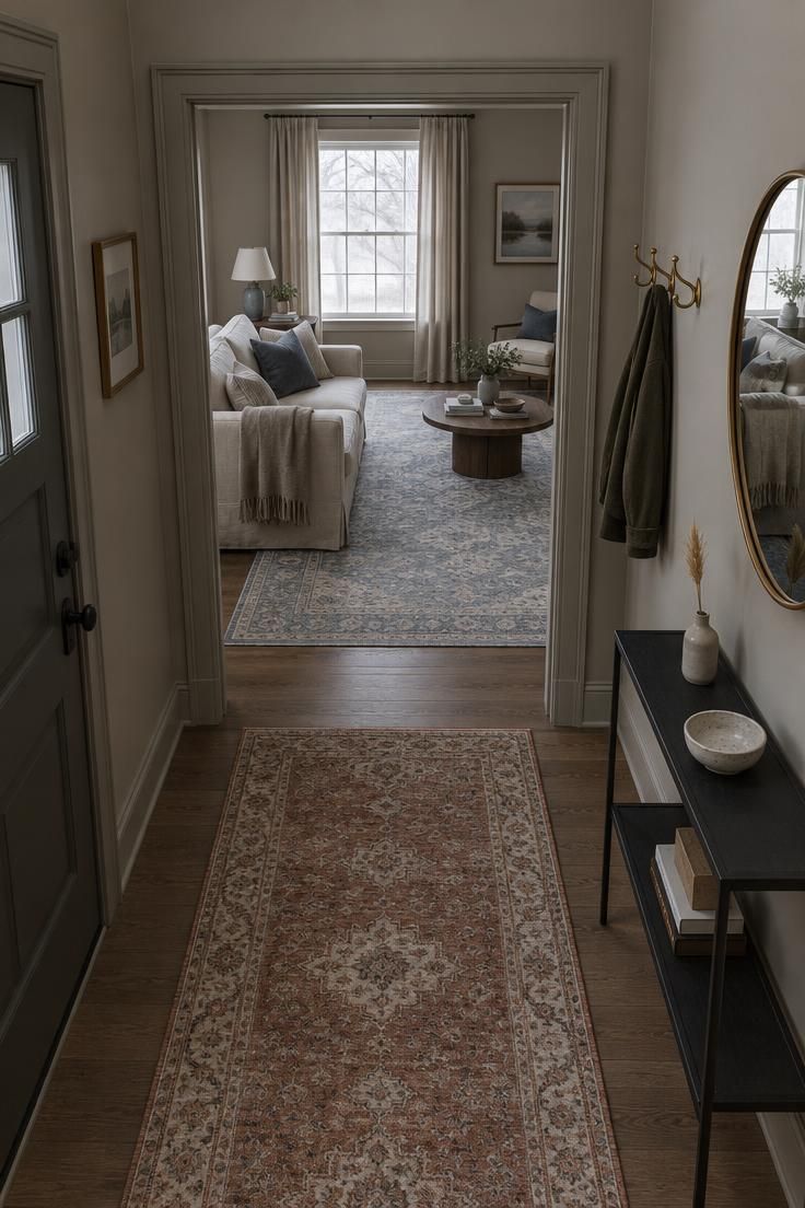
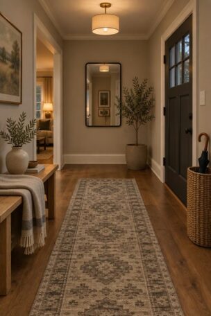
The connection between an entryway color that connects to adjacent rooms and the spaces beyond is a sightline question rather than a matching rule.
Step back into the entry and look toward the next room, then stand in that room and look back toward the door.
Both views matter, especially in open-plan layouts where the transition is visible from either side.
One approach repeats a color from an adjoining room in a darker or lighter version, keeping the same family while giving the entry its own weight.
A second keeps the entry wall neutral and puts the color on the front door, the ceiling, or the trim instead.
A third chooses a shared undertone, so the whole sequence runs warm or cool even when the exact colors differ.
Two more options work in specific situations.
Continuing the same wall color is the simplest solution when the entry opens directly into another room with no visual break.
Choosing a transition color such as muted olive, taupe, dusty blue, or warm gray gives the entry its own character while bridging the palettes on either side.
The entryway does not need to match every room, and a slight shift is often more interesting than an exact repeat.
What it should not do is feel disconnected, particularly when the front door opens toward a bright living room and the entry sits in shadow.
A shared undertone is often enough to hold the sequence together without turning the whole house into one color.
Color Drenching as a Way to Calm a Compact Entry
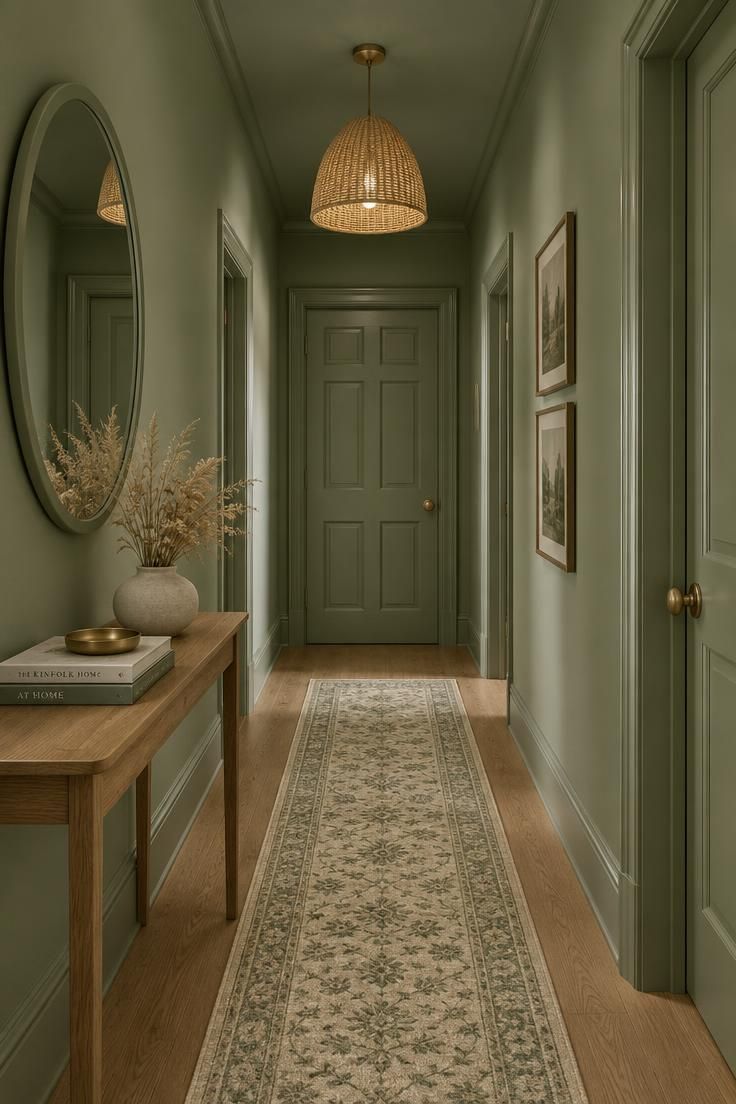
Color drenching a small entryway is a design intent rather than a guaranteed result: using one color across walls, trim, doors, and sometimes the ceiling to reduce the visual fragmentation that comes from many different paint colors in a tight space.
In a narrow hall, the eye reads the space as a single volume rather than a series of separate surfaces, which is often what makes a compact foyer feel considered rather than cramped.
The most common approach pairs matte walls with satin trim within the same color family.
The shift in sheen gives the trim a subtle presence without introducing a second color, and it keeps the composition from reading as one flat surface.
A satin front door against matte walls does the same work at the point of entry.
Saturation is the variable to get right.
A soft sage, muted olive, or warm taupe can carry a full drench without overwhelming a small hall, while a deep navy or burgundy asks for more light and more restraint in exchange for its atmosphere.
Homes and Gardens covers a range of color-drenched entryway ideas for readers exploring the approach typically.
Ceiling treatment is worth a moment of thought.
Painting the ceiling the same color reduces the visual break between wall and ceiling and supports the enveloping effect, particularly in a hall with no window.
Leaving the ceiling white creates a lighter overhead plane and a more conventional read of the space, which can be preferable when the entry is already bright.
A drenched entry also asks more of the sheen decision, because there is no second color to distract the eye from any flaws in the wall.
Matte surfaces forgive small imperfections, but the same matte in a high-contact zone near the door will show scuffs sooner than satin.
The color drench works best when the finish is chosen for the wall’s actual conditions rather than for the effect alone.
A Sample Process That Prevents the Most Common Entryway Mistake
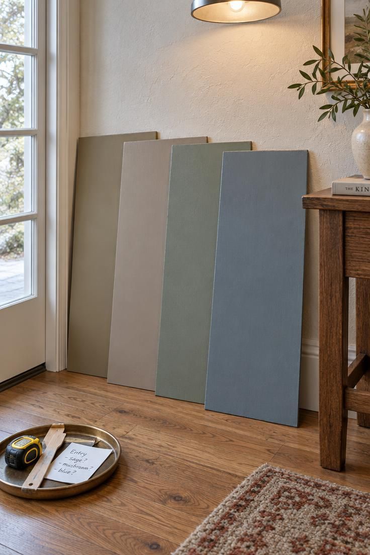
A workable sequence starts with fixed elements rather than color.
Flooring, tile, wood trim, metal hardware, rugs, and any stained glass all set the undertone the wall must live with, and identifying them first narrows the field more than any paint fan deck can.
Note the entry’s exposure and the artificial fixtures at the same time, since a warm sconce and a cool window create the mixed condition that causes the most surprises.
Three samples in the same family, a light, a medium, and a darker version, give a clearer comparison than three unrelated colors.
Large painted boards show the color as a surface rather than a chip, and the same product and sheen the reader intends to purchase should be used on the boards, because sheen changes how a color appears.
Viewing the boards at different times of day with the entry lights on is the step that prevents the most common mistake.
A sample that looks balanced in morning light can shift warmer under a warm bulb at night, and a color that reads muddy in the morning may settle by evening.
Checking the boards beside the trim, the flooring, and the front door shows how the color behaves where the eye will actually go.
The reason this step matters more now than it once did is that many homes mix LED color temperatures, with a cool white in the hall and a warm white in the living room.
In that environment, in-place sampling is the reliable check, and a store chip under fluorescent light is not.
Conclusion
An entryway is a threshold seen in changing light, which makes the color choice a matter of testing rather than trusting.
Start with warm neutrals or muted greens if the exposure is cool or mixed, and let the entry’s role as a connector guide whether it repeats, deepens, or shifts away from the next room’s palette.
Sheen deserves as much attention as hue.
Pick the finish based on how much the walls get touched and how much texture they carry, because the same color behaves very differently in matte and satin near a busy door.
For older homes, a period-appropriate palette paired with a lead-safe approach keeps the project realistic from the start.
The one step worth trying first is the simplest: paint a large board in the intended color and sheen, leave it in the entry for a day or two, and look at it in morning light and again after dark with the lights on.
A color that looks intentional when the door opens and just as considered at night has done its job.