This post may contain affiliate links. If you make a purchase through these links, we may earn a commission at no additional cost to you.
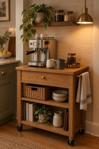
A coffee maker wedged against the backsplash, a tangle of cords, and a mug shelf that never quite fits the cups you actually use: that is the usual state of a small kitchen coffee corner.
The corner itself is rarely the problem.
What is missing is a plan for how the station should work before anyone decides how it should look.
Coffee bar styling in a compact kitchen is really a conversation between movement, storage, and a small number of warm details.
Get the sequence right, and the setup nearly styles itself.
Skip it, and even the most careful arrangement of ceramics will collapse by the third morning.
The Workflow That Decides What Your Coffee Bar Looks Like
The order in which you make coffee should dictate the order in which objects sit on the counter.
For most right-handed users, that sequence runs left to right: beans and grinder, espresso machine, a small tamp and preparation zone, milk and pitcher storage, then cups and a serving area at the end.
Left-handed users often prefer the same line mirrored, with the grinder on the right and the cups finishing on the left.
The point is not the direction but the reduction of reaching.
A station that looks tidy but forces you to stretch over a hot machine for a mug will feel wrong every single morning.
Placing the grinder at the far end from the machine adds a second daily annoyance: grounds travel across the counter, and so does your attention.
Test the arrangement before committing to anything permanent.
Masking tape on the counter can mark the footprint of each piece, letting you walk through the routine and notice where your hand naturally lands.
Move the tape, not the cabinetry, until the sequence feels obvious.
Choosing Between an Alcove, a Cart, and a Shared Counter Span
Three placements cover almost every small kitchen, and each one asks something different of the styling.
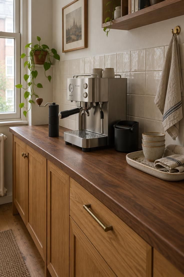
A dedicated alcove or a recessed section of counter reads as built-in even when nothing has been built.
It gives the station a clear boundary, which makes a small setup look deliberate.
The tradeoff is inflexibility: once the machine and shelves settle into an alcove, rearranging the kitchen around it becomes difficult, and a shallow alcove can crowd a full-size machine.
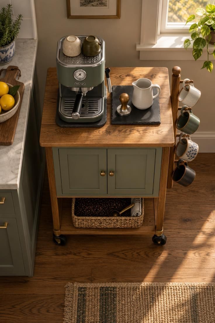
A rolling cart brings mobility and often more storage than a bare stretch of counter.
It can move aside for holiday cooking or roll into a dining area when guests want coffee after a meal.
A cart also carries a risk: without a wall or cabinet behind it, the station can look unanchored in the room, like furniture that wandered in.
Grounding it with a tray on top and a basket on the lower shelf helps.
The most common arrangement in a small kitchen coffee station layout is the shared counter, where the station occupies one end of the main work surface.
This placement costs nothing and keeps everything within arm’s reach of the sink and refrigerator.
It also demands the strictest editing, because the coffee bar has to coexist with food prep.
A tray or shallow basket solves much of that problem.
Small tools, pods, and spoons live on the tray, which lifts away in one motion when the counter is needed for chopping.
The station resets without a full rearrangement.
Whichever placement you choose, decide early how the station behaves when it is not in use.
That single question separates a layout that works from one that merely fits.
Design Pro-Tip: Load the cart or tray with the items you touch every morning, then remove one. The remaining set is usually the display.
Warm Contemporary Coffee Bar Materials That Earn Their Place on a Small Footprint
A compact station cannot carry five finishes without looking scattered, so the strongest approach is one material statement supported by quiet ones.
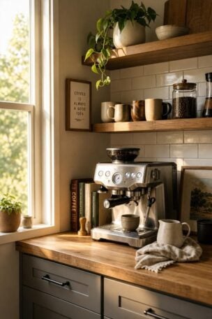
Warm oak or walnut paired with cream tile and brushed brass suits kitchens that already lean light.
The wood supplies depth, the tile keeps the wall from reading heavy, and the brass adds a small reflective note that catches under-shelf light.
This combination tolerates a busy household well, since a mid-tone wood hides light splashes better than pale laminate.
Soapstone or honed stone with pale maple and blackened steel moves in a cooler, more restrained direction.
The stone brings a soft, low-sheen surface that reads as furniture rather than laboratory, and the dark steel hardware gives the station a crisp edge.
Honed and soapstone surfaces show oil marks and water rings more readily than polished quartz, so they reward a household that wipes the counter daily.
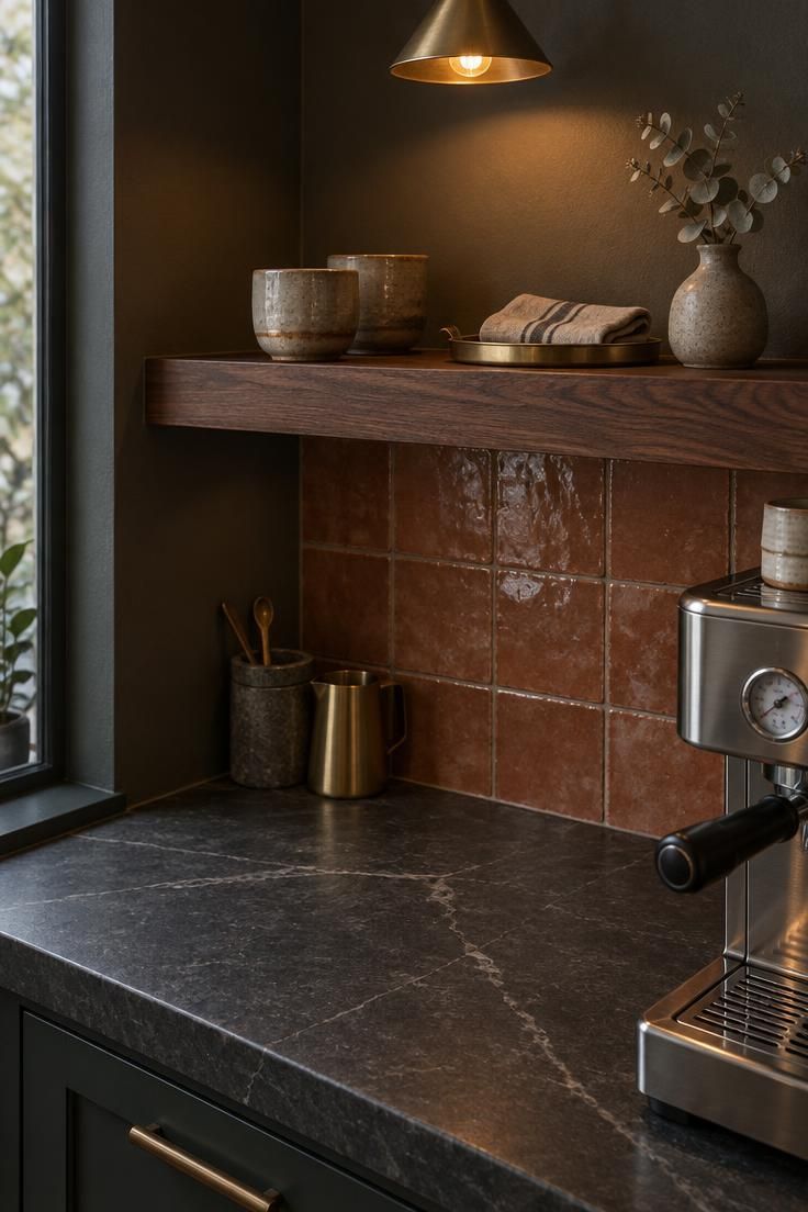
Terracotta or zellige-style tile with linen-toned walls and aged bronze brings the most texture.
Handmade tile varies in tone and surface, which is exactly what makes it feel crafted.
That variation also means the tile catches residue near steam, so keep it on the wall behind the machine rather than in the splash zone beside a sink.
These warm contemporary coffee bar materials share a logic: one surface carries the visual weight, and everything else supports it without competing.
A statement backsplash of handmade tile can define an entire station, which means the counter itself can stay plain and the shelving minimal.
Repetition matters more than quantity.
The same walnut tone appearing on a shelf edge, a tray, and a single knob reads as intentional.
The same walnut spread thin across a countertop, backsplash, floor, and open shelving reads as a theme.
Shop the pairing against the rest of the kitchen before buying anything.
A warm palette that clashes with cool gray cabinets will look like a mistake rather than a choice.
Closed Storage When You Need a Calm Kitchen
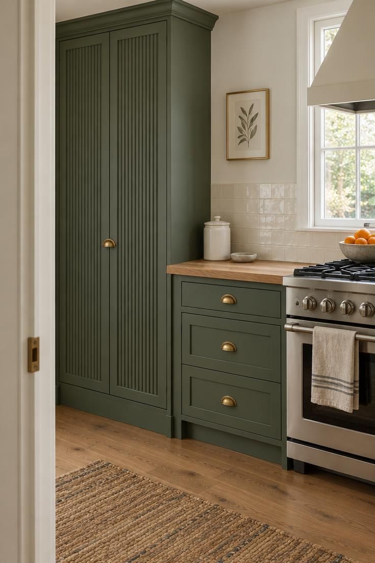
An appliance garage is a cabinet with doors that close over the machine and grinder, and in a small kitchen it solves a problem no amount of attractive shelving can address.
When the doors shut, the cords, the drip tray, the scattered pods, and the grinder’s static-clinging grounds all disappear.
The kitchen reads as calm at the exact moment nobody is making coffee.
Dust settles on the cabinet’s exterior rather than on the equipment inside.
Good appliance garage coffee cabinet design treats the interior as a working station rather than a closet.
A removable tray under the machine lets you slide the whole setup forward for refilling the water reservoir and back again without lifting anything heavy.
A small drawer or a shallow bin for dosing tools and filters keeps the interior ordered without visible clutter.
The format has real costs.
A garage consumes either vertical space, in the form of a tall cabinet, or horizontal space along a wall, and a large door can dominate a small room.
Reeding, a glass panel, or a warm paint color breaks up the flat plane.
Deep sage or a soft clay tone keeps a tall cabinet from reading as a blank slab.
Ventilation deserves a practical thought before the machine moves in.
An enclosed cabinet traps heat and moisture, and equipment requirements vary by model, so check the machine’s own documentation for clearance and airflow needs rather than assuming a closed door is fine.
One styling advantage is worth noting.
Because everything unattractive lives inside, the counter below the garage can stay nearly empty, with a single canister and a spoon rest carrying the entire composition.
Layering Warmth Without Adding a Second Overhead Fixture
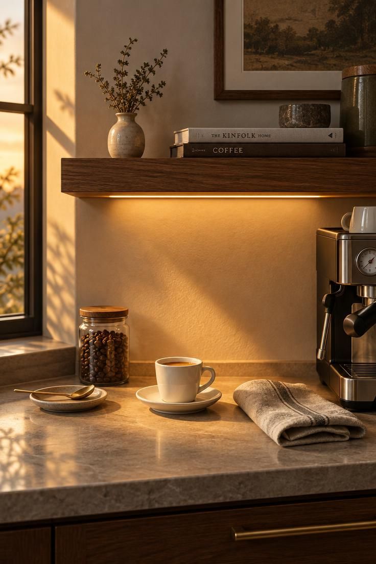
A slim strip fixed beneath an upper cabinet or shelf is the least intrusive way to give the coffee station its own light.
The effect is not dramatic, and that is the point.
A low, warm wash across the counter separates the coffee zone from the rest of the kitchen without a second ceiling fixture, a new switch, or a visible shade that competes with the cabinetry.
Early in the morning, that small pool of light makes the counter look intentional when the rest of the kitchen is dark.
Under-shelf task lighting for coffee prep is also the most space-efficient option in a compact room.
It occupies no counter footprint and no ceiling real estate.
A pendant over the station carries more personality and a portable table lamp carries more charm, but both take up room or demand an outlet that a small kitchen may not spare.
Color temperature matters for how the light feels.
A warm range around 2200 to 2700K suits the decorative layer and keeps the station feeling like a corner rather than a laboratory.
If the same spot hosts detailed work like weighing doses or cleaning the grinder, a brighter, cooler option at the same location helps, which is why two small sources sometimes beat one.
Test before you commit.
Hold a portable light or a battery lamp under the shelf in the evening and watch where the beam falls.
If it throws a bright line across your eyes while you work, or lands behind the machine instead of on the counter, the placement needs adjusting before any strip is fixed in place.
Design Pro-Tip: Choose the light color before the fixture style. A warm source makes the same shelf and tile look noticeably different from a cool one.
Editing What You See Without Hiding the Ritual
The honest version of this decision has nothing to do with whether open shelves look good.
They usually do.
The question is whether the person making coffee every morning will maintain a considered arrangement on those shelves, or whether the shelves will slowly fill with whatever mug was clean.
A simple rule handles most cases.
Display only the items you use at least twice a week, plus a small number of objects with personal meaning.
Store everything else behind a door or in a drawer.
Reserve one open surface for the daily reset, whether that is a tray, a small basket, or a single shelf row.
The contrast is easy to picture.
Three matching mugs and one small plant on a shelf read as a decision.
A dozen mismatched mugs, a stray lid, and a souvenir spoon read as accumulation, even though both shelves hold roughly the same category of thing.
Open storage carries an ongoing cost that closed storage does not: dust.
Shelves need emptying and wiping periodically, and objects left in place for months collect a film that shows against a dark backsplash.
A closed base cabinet with one open shelf above it tends to strike the better balance in a small kitchen, because the everyday clutter has somewhere to go while the display stays curated.
Display versus closed coffee bar storage often turns on your tolerance for routine, not your taste.
Choose open shelving only if the reset is something you will actually do.
Why the Coffee Bar’s Color Story Needs a Restrained Ratio, Not a Feature Wall
Trying to make a coffee bar interesting by giving it a contrasting feature wall usually backfires in a small kitchen.
The corner becomes a separate room, and the kitchen loses the continuity that made it feel larger.
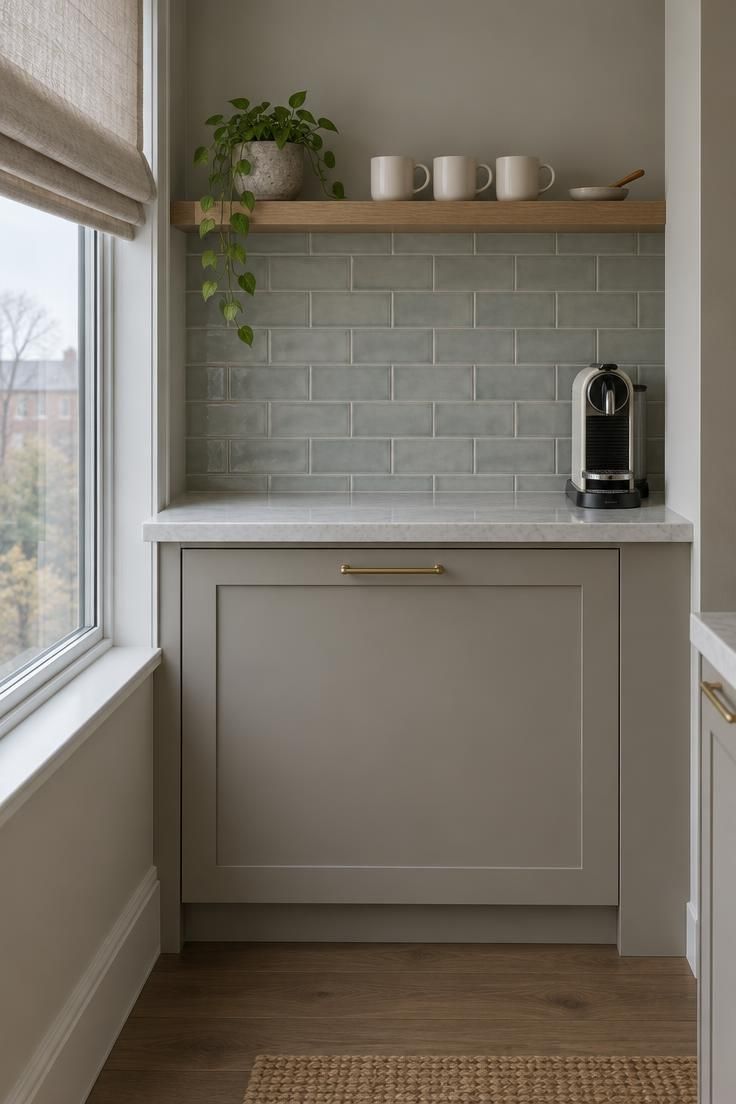
A working ratio is roughly sixty percent warm neutral or wood, thirty percent a darker tone on cabinetry, tile, or upholstery, and ten percent accent through ceramics, art, or small appliances.
The numbers are a guide rather than a rule, but they prevent the two common failures: a station so pale it disappears, and a station so dark it closes in.
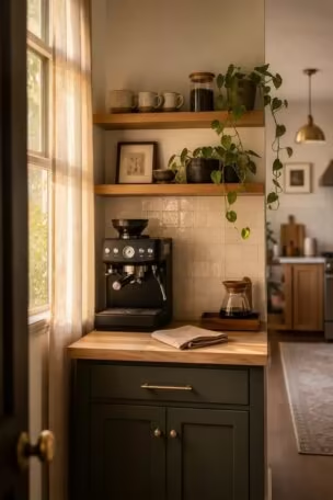
Warm cream and oak with one darker lower cabinet or a deeper tile backsplash is the most forgiving option.
Place the dark tone low, on the cabinet or the floor tile, and the counter stays bright while the base anchors the composition.
Dark tones placed overhead tend to press down on a compact space.
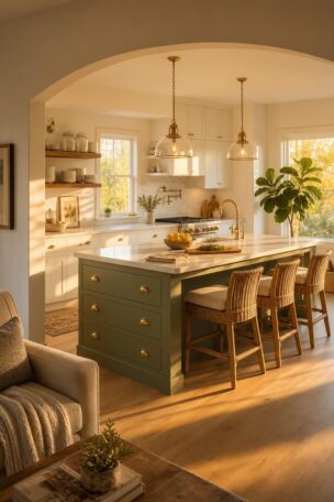
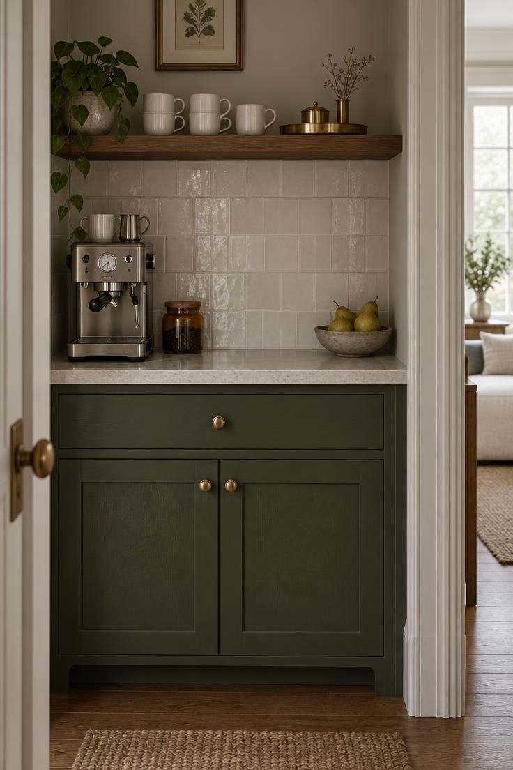
Olive or moss green with aged bronze and a pale stone counter suits kitchens with some natural warmth already present.
The green carries the middle value, the stone keeps the surface light, and the bronze repeats in hardware and a small tray.
Paint the lower cabinet rather than the upper, so the color reads as grounding rather than looming.
Burgundy or oxblood with walnut and a touch of cream or powder blue is the boldest of the three.
Here the dark tone belongs on a lower cabinet or a single upholstered stool, with walnut supplying the mid value and cream keeping the wall open.
Powder blue works as a cooling accent in a canister or a small piece of art, not as a second wall color.
Before committing, test the color on a small surface.
Painting a lower cabinet door is far easier to reverse than tiling an entire backsplash, and a swatch held against the existing counter in daylight will tell you more than a paint chip under store lighting.
Design Pro-Tip: Paint a lower cabinet before a wall. The color reads differently at counter height, and a door is the cheapest surface to change your mind about.
Personal Objects That Make a Small Coffee Bar Feel Collected, Not Staged
Small stations benefit more from personal objects than large ones do, because everything in a compact corner is close enough to be examined.
Three additions carry most of the weight.
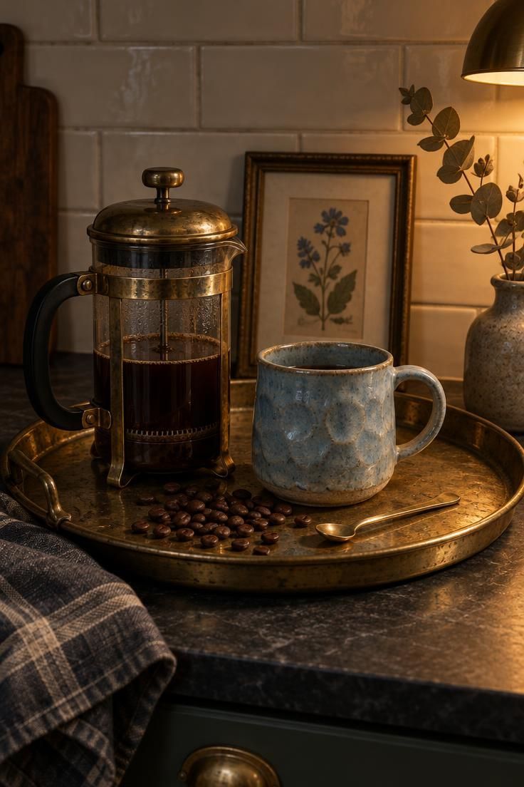
A pair of handmade mugs from a potter you found locally brings irregular glazes and slight variations in size that mass-produced stoneware cannot imitate.
A small framed print or photograph that already means something to you, propped against the backsplash, gives the corner a reference point no purchased café art can supply.
A vintage tray, brass canister, or old kitchen scale does double duty, holding spoons or beans while adding the kind of surface wear that new objects lack.
These pieces work better when they are in daily rotation rather than preserved on display.
A mug that gets used develops a life in the station; the same mug sitting untouched reads as a prop.
The generic alternatives age poorly.
A sign that says “coffee” or a set of matching café-themed prints could belong to anyone, and after a few months they stop registering at all.
A corner assembled from things you chose for reasons of your own keeps holding attention because it keeps meaning something.
The test is simple.
If the station could be swapped into a neighbor’s kitchen without anyone noticing, it has not been personalized yet.
What to Do When the Coffee Bar Shares a Wall with the Main Kitchen
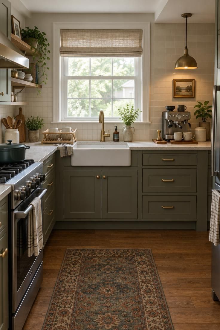
In most small kitchens, the coffee station sits on the same run of counter as the stove, the sink, or the main prep area.
Styling then has to negotiate with everything else in view.
Visual separation can happen without building anything.
A change in backsplash tile within one defined section gives the coffee zone its own boundary.
A different counter material on a narrow stretch, a pendant hung slightly lower over the station, or a small wood board beneath the machine can each signal that this end of the counter serves a different purpose.
The separation can also go too far.
A tile color that shifts dramatically at the coffee bar makes the kitchen feel chopped into pieces, especially in a galley layout where the eye travels along one continuous wall.
Keep the palette continuous and shift the scale, texture, or finish instead.
The same cream family in a larger format tile reads as a change without reading as a break.
Splashes are the practical constraint.
If a spill from the stove or sink would land directly on the coffee setup, a shallow tray or a few inches of distance solves it more gracefully than a barrier.
Equipment sitting in the path of daily cooking traffic also gets splattered, and a machine that needs wiping before every use stops feeling like a pleasure.
Step back and evaluate the whole composition.
A wide photograph of the kitchen, taken from the doorway, reveals whether the coffee bar styling holds together with the rest of the room or fights it.
Adjusting one element at the coffee end is usually enough to bring the whole wall into balance.
Conclusion
A small kitchen coffee bar works when the styling follows the workflow instead of the reverse.
Everything else is adjustment.
Four practical moves carry most of the result.
Mark the arrangement with tape and walk through the routine before buying anything.
Choose one material to lead and let the rest support it quietly.
Decide which objects earn a place on the open surface and which belong behind a door.
Add a single warm layer of light that gives the corner its own identity after dark.
Three questions will tell you whether the station is finished.
Does the layout let you make coffee without reaching across the machine?
Does the display hold only what you use or genuinely care about?
Would the corner still look intentional if the espresso machine were away for a week?
If any answer is no, the fix is usually smaller than expected: move the cups, remove four mugs, shift the light.
Start with the tray.
The best small-space coffee bars are not miniature cafés.
They are one well-lit, carefully edited ritual given a permanent home.