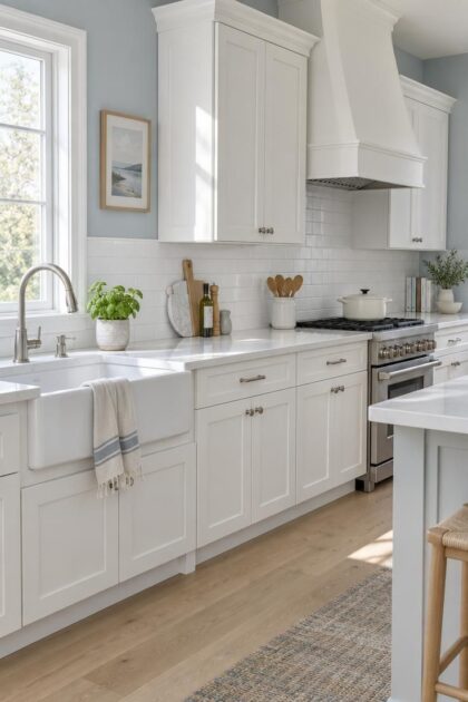
This post may contain affiliate links. If you make a purchase through these links, we may earn a commission at no additional cost to you.
White cabinets sit in a narrow zone in most people’s minds: pair them with beige, pair them with gray, move on.
That assumption collapses the moment the actual variables come into view.
The undertone inside the white, the countertop, the floor, the direction the windows face, and the hardware all shape the decision before a single wall color enters the conversation.
What looks like a choice between two neutrals is really a question about relationships.
What the Trend Data Actually Says About Wall Color Behind White Cabinets
The 2026 U.S. Houzz Kitchen Trends Study surveyed 1,780 homeowners, with fieldwork running July 6 through 30, 2025.
Among that group, the most commonly reported kitchen wall colors were off-white at 29%, white at 21%, gray at 10%, blue at 7%, and beige at 7%.
Those numbers look like a verdict on kitchen wall colors with white cabinets until you notice what they leave out.
Houzz publishes wall-color and cabinet-color percentages as separate lists.
There is no public cross-tab showing what share of white-cabinet kitchens chose blue walls, or green, or anything else.
The cabinet figures from the same survey tell a different story when read on their own: wood at 29%, white at 28%, off-white at 15%, green at 6%, and gray at 5%.
Two lists, two questions, no matched pairs.
For longer-range context, the 2018 Houzz study reported kitchen walls at gray 27%, white 24%, beige 21%, blue 7%, and green 6%.
The direction since then has moved away from gray and toward off-white, with blue holding steady.
The trend direction the source describes for 2026 points further from stark, cool, all-white kitchens and toward warmer neutrals, nature-inspired greens, muted blues, clay tones, and deeper accents.
An NKBA report cited in the same material shows momentum for neutrals, greens, and blues.
Beige and gray are statistically typical.
That is a description of what other renovating households picked, not a rule for any individual kitchen.
Design Pro-Tip: Treat survey percentages as background noise, not as shortlists. They describe what other people chose, not what your cabinets, counters, and daylight will support.
Why “White Cabinets” Is Not One Color
Walk down a paint aisle and the word “white” stops meaning anything useful within about ninety seconds.
White cabinetry spans a wide range, and white kitchen cabinet undertones, whether cool, warm, or neutral, are the first thing to identify before considering paint colors for kitchens with white cabinets.
Cool white kitchen cabinets carry a blue, gray, or slightly violet cast.
Wall directions the source lists for them include pale blue-gray, cool sage, crisp neutral gray, navy, blue-green, and clean white where other contrast already exists.
A strongly yellow beige can fight these cabinets unless the clash is intentional.
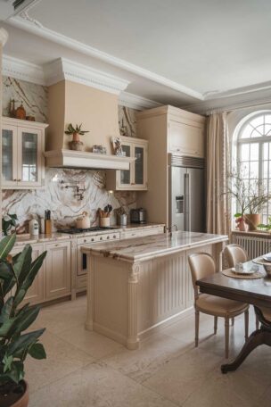
Warm white kitchen cabinets lean cream, yellow, beige, or tan.
Wall directions for them include cream, mushroom, warm greige, muted sage, dusty blue, soft taupe, and pale terracotta.
An icy gray or blue-white on the wall can make already-creamy cabinets look dingy by comparison.
Neutral white kitchen cabinets show little obvious undertone, which means the range is widest and the permanent finishes take over as the guide.
One visual relationship worth knowing: a very warm wall color beside bright, cool-white cabinets can make the cabinets read bluer or grayer than they do against a cooler wall.
There is a second-order warning the source gives.
If cabinets and walls are nearly the same creamy white, the kitchen can look muddy unless the countertop, backsplash, hardware, or wood flooring contributes contrast somewhere in the composition.
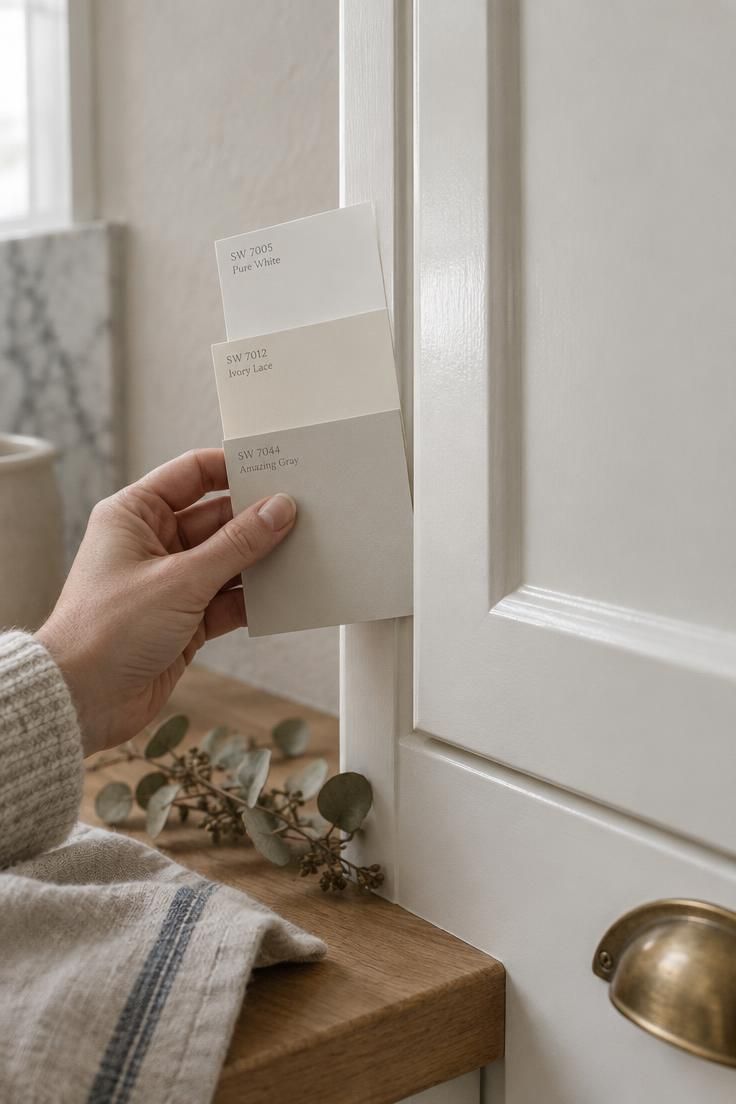
Match, Contrast, or Somewhere Between: The Three-Level Decision
Contrast is not a yes or no question about whether the walls should match the cabinets.
Think of it as a three-level choice, and pick the level before picking the color, because the level does more visual work than the specific hue.
Low contrast puts the wall close in value to the cabinets, which reads calm and continuous.
The failure mode the source identifies here is exact matching, which can leave a room looking unfinished or overly monochromatic rather than intentionally quiet.
Medium contrast sets a pale color against white cabinets, adding depth without drama.
This is the widest working range within kitchen wall color contrast, and it is where most rooms land.
High contrast goes dark or saturated, making a strong architectural statement.
Lower-reflectance dark colors can visually reduce a room’s brightness in a dim kitchen, so a dark wall asks more of the available light.
Light Reflectance Value, or LRV, is the source’s tool for comparing two candidates at that level.
It indicates roughly how much light a color reflects, which helps judge whether two colors will feel nearly the same brightness or noticeably different.
Pick the level first.
Then pick the family.
Then test.
Color Families and the Conditions That Make Each One Work
Warm white and creamy off-white suit traditional, farmhouse, cottage, Colonial, and country settings.
The wall white should sit slightly deeper or warmer than the cabinets rather than matching them exactly.
Named examples the source cites include Benjamin Moore White Dove OC-17 and Swiss Coffee OC-45, plus Sherwin-Williams Alabaster SW 7008 and Shoji White SW 7042.
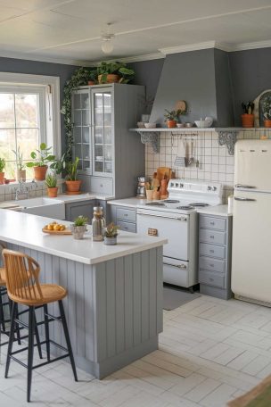
Pale blue kitchen walls pair with coastal, cottage, 1920s through 1940s-inspired, and relaxed kitchens.
They sit comfortably beside marble or light quartz, chrome or nickel, light wood, and white subway tile.
The source advises a blue with some gray or green in it rather than a vivid baby blue.
Named examples include Benjamin Moore Palladian Blue HC-144 and First Light 2102-70, plus Sherwin-Williams Sea Salt SW 6204 and Misty SW 6232.
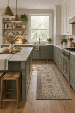
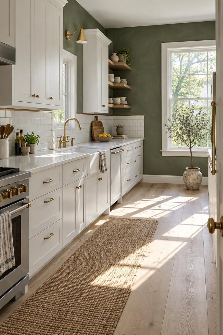
Sage green kitchen walls fit Craftsman, farmhouse, cottage, English country, and nature-inspired interiors.
These greens connect with wood floors, plants, brass, aged bronze, and stone counters.
Named examples include Benjamin Moore October Mist 1495 and Saybrook Sage HC-114, Sherwin-Williams Evergreen Fog SW 9130, Farrow & Ball Mizzle No. 266, and Valspar Warm Eucalyptus.
Light gray belongs to contemporary, transitional, minimalist, and cool-toned kitchens, with the undertone doing the deciding.
Blue-gray works with cool white cabinets and stainless appliances.
Green-gray works with natural wood and stone.
Warm gray works with cream cabinets and beige flooring.
Gray shifts noticeably under different lighting, which is the source’s explicit warning about this family.
Greige kitchen wall paint serves transitional, European, modern farmhouse, and warmer contemporary rooms.
The source frames it as the answer when pure gray feels cold but beige feels dated or too yellow.
A darker taupe or mushroom can add architectural depth behind white cabinetry.
Named examples include Benjamin Moore Revere Pewter HC-172 and Edgecomb Gray HC-173, Sherwin-Williams Agreeable Gray SW 7029 and Accessible Beige SW 7036, and Farrow & Ball Setting Plaster No. 231.
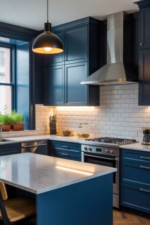
Deep navy, blue-green, and charcoal suit dramatic, traditional, eclectic, and Art Deco kitchens.
The source’s conditions: strong natural light, tall ceilings, white or light countertops, good task lighting, and a backsplash that connects the dark wall to the rest of the room.
If the whole room feels enclosed, the source suggests confining the dark color to one wall, a dining area, or a backsplash wall.
Named examples include Benjamin Moore Hale Navy HC-154 and Kendall Charcoal HC-166, plus Sherwin-Williams Naval SW 6244 and Iron Ore SW 7069.
Yellow, ochre, and terracotta belong to vintage, Mediterranean, country, eclectic, and mid-century-inspired kitchens.
They work with checkerboard or patterned floors, wood counters, encaustic or handmade tile, brass or aged metal, and warm wood trim.
The source advises muted ochre, butter yellow, clay, or terracotta rather than saturated primary colors unless a retro effect is the goal.
Named examples include Benjamin Moore Cinnamon 2174-20 and Southwest Pottery 048, plus Sherwin-Williams Redend Point SW 9081.
The honest tradeoff runs across all seven families: warm walls are more forgiving against warm cabinets and less forgiving against cool ones, and the reverse holds too.
The most-regretted pairings in the source’s list of mistakes are the ones that ignore undertone, not the ones that pick a hue someone else would have avoided.
Every shade named above is an example the cited sources list.
None of them has been tested here, and results depend on your own fixed finishes and light.
Reading Your Fixed Finishes Before You Read a Paint Chip
Start where the source starts: with the elements that are difficult or expensive to change.
Cabinetry, tile, flooring, and countertops come first.
Wall color comes last, because the fixed finishes narrow the candidate list before any wall color is evaluated.
Countertop trap one: a beige-speckled countertop can clash with blue-gray walls.
Countertop trap two: a cool white quartz can make warm beige walls look yellow by comparison.
Backsplash logic is simpler than it looks.
A backsplash can either mediate between the wall and the cabinets or repeat the cabinet white and let the wall carry the color on its own.
When cabinets are neutral white with no strong undertone, the flooring and other wood tones become the tiebreaker.
Appliances and hardware pull the palette too.
Stainless, black, brass, nickel, and aged bronze each tilt a room in a slightly different direction.
Sequence the decision this way: fixed finishes first, contrast level second, wall color last.
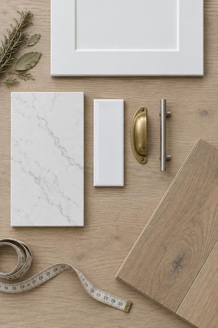
Design Pro-Tip: Line up your countertop offcut, a backsplash tile, and a cabinet door on the actual floor before you look at a single wall color. The finishes will eliminate half the options for you.
Light Direction, Sampling, and Why Gray Keeps Surprising People
North-facing rooms often benefit from warm white, cream, beige, warm greige, or muted green, according to the source’s light-direction guidance.
South-facing rooms can carry cooler gray, blue, green, or neutral white without turning cold.
East-facing rooms tend to shift warmer in the morning and cooler later in the day.
West-facing rooms can become very warm or golden in the afternoon.
Artificial light adds another variable.
Warm bulbs can make cream and beige look more yellow, while cooler LEDs may emphasize blue or gray.
The sampling method the source reports is worth following closely.
Benjamin Moore recommends sampling colors in the actual kitchen alongside existing finishes, and the source describes testing large samples at different times of day, including under artificial light and under-cabinet lighting.
The common mistake is choosing from a small paper chip without testing it in the actual kitchen.
Gray is the family most sensitive to this, since a store-neutral gray can read blue, violet, or beige at home.
Testing narrows uncertainty.
It does not remove the effect of your own finishes and light.
Where This Decision Sits Right Now
The direction the source reports for 2026 moves away from stark, cool, all-white kitchens and toward warmer neutrals, nature-inspired greens, muted blues, clay tones, and deeper accent colors.
That direction lines up with what the survey numbers show.
Off-white and white now dominate reported wall colors, while gray has fallen from its earlier position.
For anyone choosing paint colors for kitchens with white cabinets today, the practical consequence is straightforward: the neutral default is no longer the only widely used option, so the reasoning behind a choice matters more than the default itself.
The cultural drivers the source touches on include a general warming of interiors and the repeated appearance of greens and blues across reported trend directions from more than one source.
Read this as reported direction, not a prediction, and not a rule about what any individual kitchen should do.
A Short History of Why White Cabinets Read as Traditional or Modern
Before the fitted kitchen existed, kitchens relied on freestanding furniture, cupboards, dressers, worktables, and pantry storage rather than continuous built-in cabinetry.
The fitted kitchen developed gradually in the early twentieth century alongside ideas about labor-saving design, hygiene, and household organization.
The Hoosier cabinet, popular in the early 1900s, served as a compact freestanding workstation, commonly finished in oak or painted white enamel.
White became strongly associated with cleanliness in that era, because white-painted wood, porcelain, tile, and enameled metal made dirt easier to notice.
That is a cultural and design-history observation, not a claim about anything today.
White cabinetry and white enameled metal became characteristic of American kitchens roughly from the 1930s through the 1960s, working with chrome, porcelain sinks, linoleum, colorful appliances, and patterned wall treatments.
Pastel blue, green, yellow, and red finishes appeared too, especially from the late 1920s onward, as manufacturers marketed coordinated appliances and cabinetry.
White cabinetry returned strongly in the 1980s alongside European minimalism, bright open-plan interiors, and later farmhouse and transitional design.
This history explains why blue, green, cream, and yellow walls can read as historically sympathetic rather than trendy.
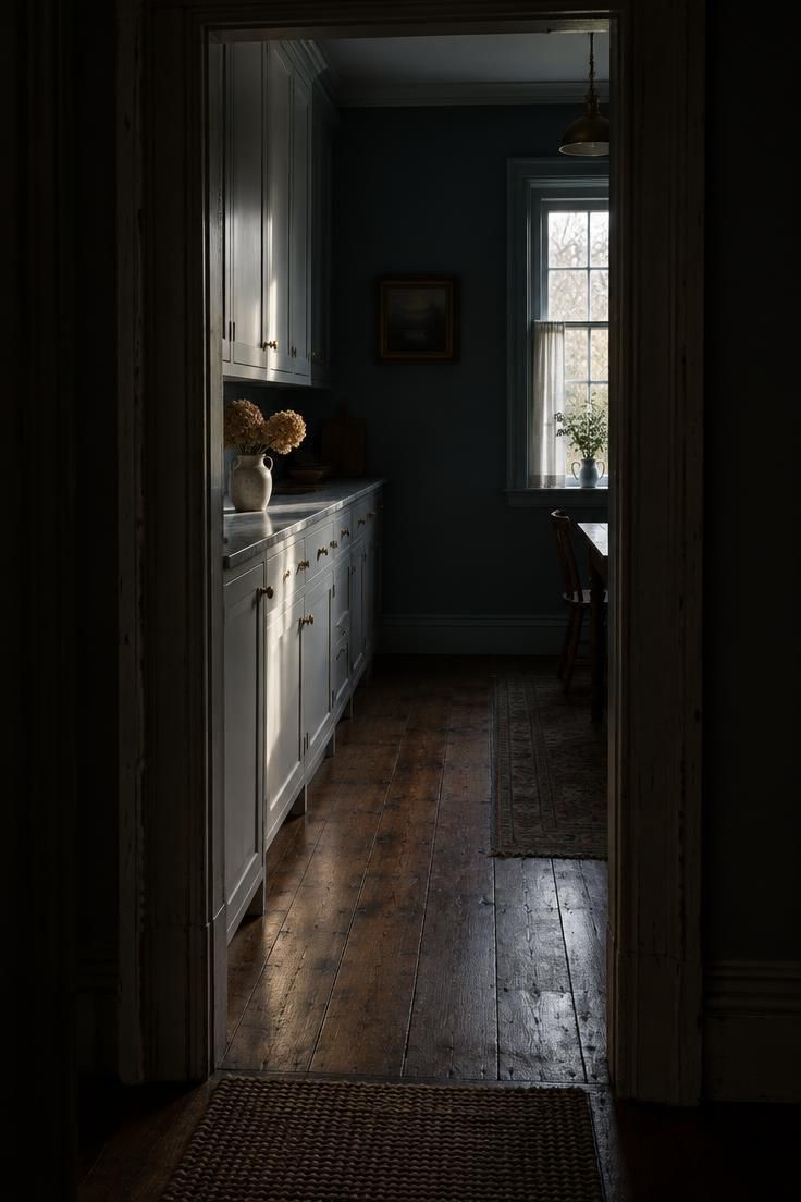
Design Pro-Tip: If the room feels historically rooted, with original trim, wide floorboards, and an older window profile, let a muted blue, green, cream, or yellow wall carry the color and keep the cabinetry white. It tends to read as more convincing than white-on-white.
The Mistakes That Undo a Good Palette
Matching the wall exactly to the cabinets is the first mistake, and the source says it can look unfinished or overly monochromatic.
Ignoring the countertop is the second.
The two clash patterns from earlier work as a decision criterion: a beige-speckled counter fights blue-gray walls, and a cool white quartz pushes warm beige walls toward yellow.
Choosing gray without testing it is the third, since gray is the family most sensitive to surrounding colors and light.
Using a very bright white everywhere is the fourth.
The source notes this can look sterile, particularly when combined with glossy surfaces and cool lighting.
Using a dark color in a dim kitchen without addressing lighting is the fifth, because lower-reflectance colors visually reduce the room’s brightness.
Every one of those five comes from the same habit: evaluating the wall color in isolation instead of against the room’s fixed elements.
Finish and Cleaning: The Practical Layer
For kitchen walls, the source’s practical guidance is that a washable eggshell or satin is usually more practical than flat paint, especially near the sink, range, and food-preparation areas.
There is a tradeoff inside that choice.
Satin reflects more light and is generally easier to wipe clean, but it also reveals more wall imperfections.
Matte or low-sheen paint can suit uneven walls.
Finish and light reflectance value kitchen paint connect more than most people expect, since how much light a paint reflects shapes how a surface reads alongside the sheen itself.
A shade with a lower rating can look deeper in a dim corner, and the same color in eggshell will behave differently than it does in flat.
Behind the range, a more washable finish is worth considering, and a good range hood reduces grease buildup over time.
Mold- and mildew-resistant formulas come up in the source as a finish-family consideration relevant in poorly ventilated kitchens.
That is the level at which the source presents it.
Cabinetry and trim are a separate matter.
The source says cabinet painting should use a product formulated for cabinetry or trim rather than ordinary wall paint, and that semi-gloss or satin on trim can make cabinetry and woodwork stand out against the wall.
Deciding
A broadly attractive, hard-to-regret baseline is warm white cabinets with soft blue-gray, muted sage, or warm greige walls.
Add a white or lightly patterned backsplash, natural wood or medium-toned flooring, satin or eggshell wall paint, and brass, nickel, or aged bronze hardware.
What makes the combination low-risk is that every element sits in the medium-contrast range.
None of the choices depends on a particular light direction to work.
For a contemporary kitchen, the higher-commitment alternative is cool gray, blue-green, charcoal, or a restrained warm neutral.
That set reads cleaner and more architectural, and it asks more of the countertops and lighting in return.
For an older house, the historically sympathetic alternative is a muted blue, green, cream, or yellow wall.
The source presents these as often more convincing than white-on-white in a home with original trim and wide floorboards.
The honest limitation of this entire framework is that the survey data cannot tell you which colors other white-cabinet owners chose.
The reasoning has to come from your own fixed finishes and your own light.
Before reaching for kitchen wall colors with white cabinets, work through the short decision sequence: identify the white kitchen cabinet undertones, read the permanent finishes, choose the contrast level, test large samples through the day, then select the specific hue.
Warm white kitchen cabinets sit differently against sage green kitchen walls than cool white kitchen cabinets do, and the same pale blue kitchen walls can shift under morning and evening light.
Greige kitchen wall paint may be the easiest middle ground when the countertop and flooring disagree.
Neutral white kitchen cabinets give you the widest range, but they also give you the fewest excuses for a wall color that fights the backsplash.
Kitchen wall color contrast matters more than the specific hue, so decide whether you want low, medium, or high separation before narrowing the family.
Paint colors for kitchens with white cabinets can include deeper options, yet a lower light reflectance value kitchen paint will visually reduce brightness in a room that already lacks daylight.
Beige and gray remain legitimate answers.
They are two of a wider set, and the reason to choose them should be that they suit the room, not that they were the safest option.
The pairing of white cabinets and a colored wall is a relationship between two whites and the finishes around them.
Wall color is the last decision in the sequence rather than the first.