This post may contain affiliate links. If you make a purchase through these links, we may earn a commission at no additional cost to you.
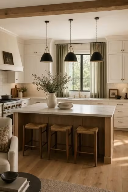
The reason most white kitchens look flat has nothing to do with the cabinets themselves.
It is the color surrounding them, the finishes layered beside them, and the undertones hidden beneath every surface that decide whether white reads as expensive or empty.
Getting this right does not require a full renovation, just a sharper eye for which combinations create depth and which ones drain it.
The Undertone Rule That Separates Expensive-Looking White Kitchens From Flat Ones
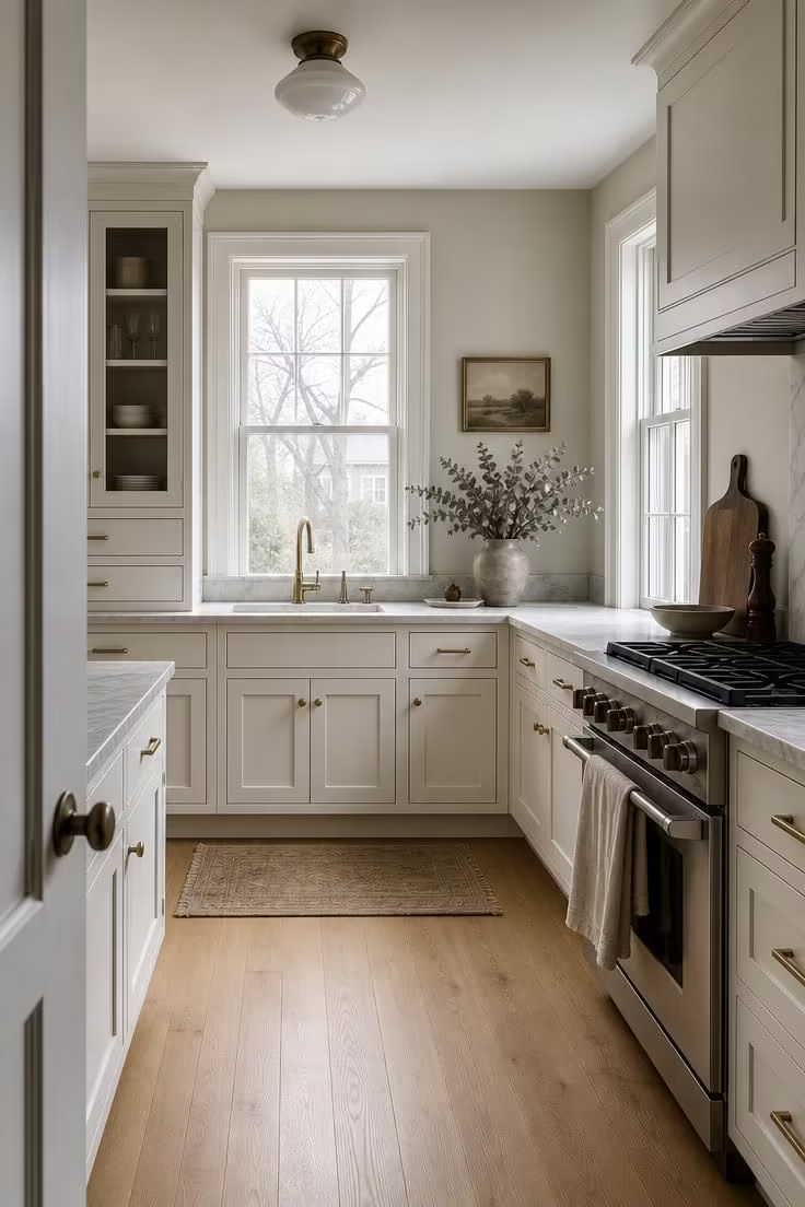
Every white paint hides a second color underneath.
Some whites lean warm, pulling toward cream, yellow, or peach, and others lean cool, pulling toward blue, violet, or ash.
The NKBA 2026 Kitchen Trends Report confirms the shift already happening in real kitchens: only 47 percent of industry professionals still list pure white as a popular cabinet color, down from near-universal dominance in prior years, with creamy off-whites, mushroom tones, and soft taupe taking the lead.
That statistic matters because the undertone of your white cabinet color dictates which wall colors, countertops, and finishes will feel intentional beside it.
Pair a warm white cabinet with a cool-toned wall, and the cabinet will look dingy by comparison, like a shirt washed too many times.
Designers call this the undertone matching rule, and it is the single fastest way to make a kitchen with white cabinets feel expensive: keep your warm surfaces in the same family, or commit fully to cool tones across every layer.
The 60-30-10 formula makes this practical: let 60 percent of the room carry your dominant color (usually the walls), 30 percent your secondary color (the cabinets), and 10 percent your accent finishes (hardware, pendants, faucet), all sharing compatible undertones.
Wall Colors That Push White Cabinets Forward Instead of Washing Them Out
Painting the walls white in a kitchen with white cabinets sounds logical, but it is the quickest route to a room that feels like the inside of a box.
Without contrast, the cabinets have nothing to push against, and the room flattens into a single undifferentiated plane.
A wall color for white cabinets needs to sit just far enough from white to give the eye a resting point, a place to land that makes the cabinets appear more intentional.
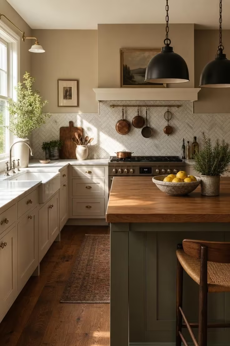
Warm greige, which sits between beige and soft putty, is one of the most reliable choices because it supplies depth without stealing attention.
Soft taupe works in a similar way, reading slightly sandier and pairing especially well with warm whites and natural wood accents.
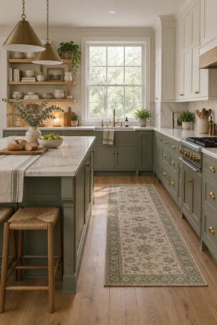
Sage green has become a designer favorite for 2026, introducing a nature-inspired quality that makes a white kitchen feel grounded rather than clinical.
Navy blue and deep charcoal are higher-contrast options, and they work best on a single accent wall or on the lower half of a room with white uppers, where they can anchor the space without overpowering it.
The common thread is that each of these wall colors gives the white cabinets a visual stage, creating the perception of a considered kitchen color palette rather than a default one.
Countertop and Backsplash Pairings That Add Weight Without Competing
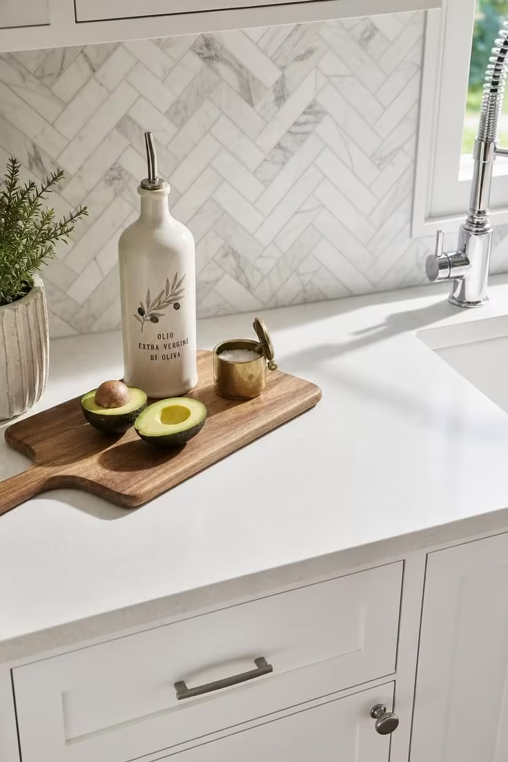
A white cabinet alone is a blank page, and the countertop and backsplash are what give it a voice.
The best countertop and cabinet pairing adds visual weight to the room without introducing competition, letting the cabinets stay clean and the surface tell a quieter story.
Honed marble or quartzite with natural veining is the combination designers reach for most often because the movement in the stone creates perceived value.
Soapstone and honed black granite bring a different kind of richness, grounding white cabinets with a darker surface that sharpens the contrast and reads as deliberate.
A backsplash for white cabinets does its strongest work when it introduces texture rather than color, and hand-cut zellige tile, with its uneven glaze and handmade imperfections, makes a white kitchen feel artisan rather than factory-made.
The “countersplash” trend, where the countertop material runs up the wall as a continuous surface, gives a white kitchen a streamlined, high-end look that removes the visual break between horizontal and vertical planes.
Hardware Finishes That Ground a White Kitchen Instead of Disappearing Into It
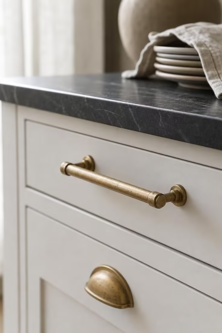
Hardware is often treated as an afterthought, but in a kitchen with white cabinets, it carries more visual responsibility than in any other color scheme.
The wrong finish disappears entirely, and the wrong scale makes the cabinets look generic.
Kitchen hardware finishes in 2026 have moved decisively away from polished chrome and toward warmer metals: brushed brass, matte black, unlacquered brass, and satin nickel are leading the conversation.
Brushed brass brings warmth and depth to a white kitchen without the flashiness of polished gold, reading as collected rather than decorator-showroom.
Matte black hardware creates the sharpest contrast against white surfaces, and it ties into the broader trend of black window frames and dark-finish faucets that has spread through farmhouse and modern kitchens alike.
Unlacquered brass develops a natural patina over time, which gives a white kitchen a sense of age and character that no new finish can replicate.
The principle behind every strong hardware choice is the same: the metal should feel like it was selected with intention, not pulled from a bin at the hardware store, and that intentionality is what separates a flat white kitchen from one that looks carefully built.
Why the Two-Tone Approach Gives White Cabinets More Credit
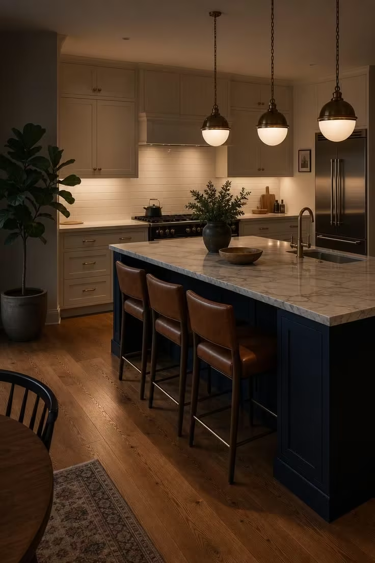
The all-white-everything kitchen had its decade, and the reason white kitchen cabinets on every surface are losing ground is that a single color offers the eye no journey, no surprise, and no visual hierarchy.
Two-tone kitchen cabinets solve this without abandoning white entirely.
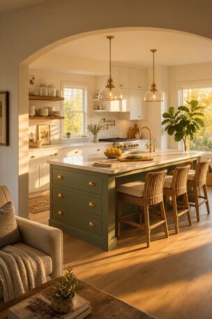
The most popular two-tone formula in 2026 pairs lighter upper cabinets with deeper-toned lower cabinets or a contrasting island, and it works because it creates a visual anchor that stops the room from floating.
A white upper cabinet paired with a navy, deep green, or warm charcoal island immediately introduces dimension and makes the white portions of the kitchen feel brighter by contrast.
This approach is especially useful in open-concept layouts, where a kitchen without visual weight can feel like a gap between rooms instead of a destination.
The white cabinet color scheme stays intact, but the single point of contrast gives the room a center of gravity, a place where the eye lands first and then moves outward through the rest of the space.
Interior designers point to two-tone kitchens as a low-risk entry into color for homeowners who are hesitant to leave white behind entirely.
From a practical standpoint, the contrasting island or lower run can be repainted in a few years if tastes shift, making this one of the most flexible commitments in kitchen design.
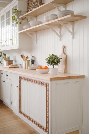
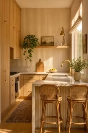
Design Pro-Tip: If you want the two-tone look but are not ready for a bold color on your island, try a warm white paint on the perimeter cabinets and a natural white oak finish on the island. The material contrast between paint and wood grain creates depth without introducing a second paint color, and it is the easiest two-tone combination to live with long-term.
The Lighting Mistake That Makes Every Color Combination Fall Apart
No countertop, wall color, or hardware selection can rescue a white kitchen from bad lighting.
Bulb temperature, measured in Kelvins, controls how every surface reads in the room: bulbs above 3500K cast a cool, bluish light that makes warm whites look yellowed and dingy, and bulbs below 2700K cast an amber light that flattens out the cool undertones in surfaces meant to read crisp.
The sweet spot for a kitchen with white cabinets falls around 3000K, where the light is warm enough to feel inviting but neutral enough to let your chosen warm white paint and finishes appear true to their samples.
Under-cabinet lighting is the single most cost-effective upgrade for a white kitchen because it floods the countertop and backsplash with even light, revealing the texture and veining that you paid for.
Pendant lighting above an island serves a different purpose, creating a focal layer that draws the eye down and gives the room depth from ceiling to counter.
The test that catches most lighting mistakes before they are permanent is simple: sample your paint, countertop, and backsplash together in the actual kitchen at three different times of day, under morning sun, afternoon light, and your evening fixtures, and note which combination reads consistently rather than shifting between colors.
How to Test Your Palette Before Committing
The most expensive color mistake in a kitchen renovation is not picking the wrong shade, it is committing to a shade you only saw in isolation.
Undertone matching starts with the white-paper test: hold a sheet of bright white printer paper against your cabinet sample, and if the cabinet looks yellowish against it, your white leans warm, and if it looks pinkish or bluish, it leans cool.
That baseline tells you which wall colors, countertop materials, and metal finishes will sit comfortably beside it.
Designers never evaluate a single finish alone, and you should not either: bring your backsplash tile, your countertop sample, and your cabinet door to the kitchen at the same time, and view them as a group rather than as individual selections.
Morning light, afternoon light, and your installed evening fixtures will each shift the undertones differently, and the combination that reads consistently under all three conditions is the combination that will look right for years.
If a paint color looks perfect in daylight but wrong under your overhead lights, the fix may be as simple as adjusting your bulb temperature rather than repainting.
The practical takeaway is to treat your kitchen color palette as a system of connected surfaces rather than a set of independent choices: when every material shares compatible undertones and every finish supports the same mood, a kitchen with white cabinets stops looking flat and starts looking like someone planned every detail with purpose.
Design Pro-Tip: Before ordering full countertop slabs or committing to a backsplash tile, ask your supplier for the largest sample they offer. Small chips compress veining patterns and mute color variation, which is why a 2-by-2-inch marble sample looks nothing like the finished slab. A 12-inch or larger sample, placed on your existing counter under your actual kitchen light, will tell you more in five minutes than any showroom visit.
Conclusion
A kitchen with white cabinets becomes expensive-looking when every surrounding surface works together rather than sitting next to each other by accident.
Start with the undertone of your white cabinet color and let that decision guide everything else: the wall color, the countertop material, the backsplash texture, and the hardware metal.
Use the 60-30-10 formula to keep the proportions balanced, and test your selections as a group, in your own kitchen, under your own lighting, at different times of day.
If the room feels flat, the fix is usually a single layer of contrast, a deeper island color, a textured backsplash, or a warmer wall tone, rather than a full redesign.
The goal is not to make the kitchen look decorated but to make it look decided, and that clarity is what turns a white kitchen from forgettable to finished.