This post may contain affiliate links. If you make a booking or purchase through these links, we may earn a commission at no additional cost to you.
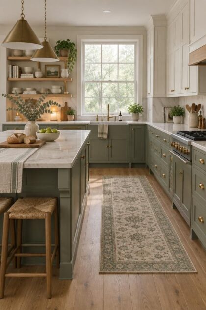
A kitchen with green cabinets looks like a settled decision the moment the sample goes up on the wall.
Then evening arrives, the bulbs warm the room, and the same paint shifts toward yellow.
Green hides its complexity inside a familiar name.
That gap between the paint chip and the lived room is where most of the real decisions happen.
The following sections separate what the market data actually shows from what green cabinetry asks of anyone choosing it.
The Homeowner Numbers Behind the Green Cabinet Trend
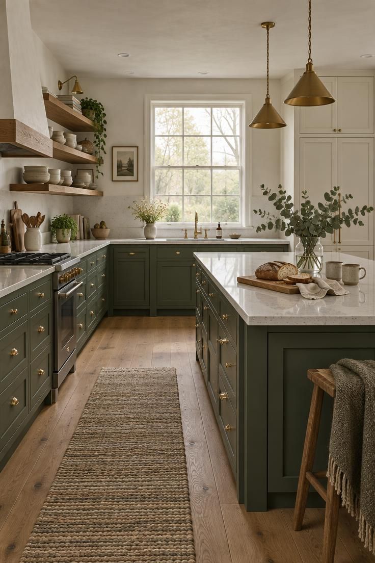
Most homeowners still do not choose green for their main cabinets, and the numbers explain why the decision deserves care.
In the 2024 Houzz U.S. Kitchen Trends Study, 4% of renovating homeowners selected green as the primary cabinet color, up from 1% in 2020, while white reached 46% and wood tones 25%.
Green is growing, but it remains a deliberate minority choice rather than a default one.
The same study found 10% of homeowners used green for a contrasting island and 11% chose it for lower cabinets.
That pattern matters more than the headline figure.
Green is appearing selectively far more often than it appears across an entire room.
Industry professionals are considerably more enthusiastic than homeowners.
The NKBA reported that 76% of surveyed professionals named green the leading kitchen color for 2025, and 86% expected it to remain popular over the following three years.
Those respondents were designers and industry figures rather than homeowners, which makes the gap between prediction and adoption part of the story rather than a contradiction.
A 2026 Houzz outlook placed wood at 29% of cabinet colors and white at 28%, with green at 6%.
Shaker doors remained the most common style at 58%.
What the data supports is a color in motion, gaining ground without displacing the established leaders.
Design Pro-Tip: When you compare shades, read the square footage estimate on the can against the visible cabinet face area rather than the room's floor size, because door fronts and end panels consume paint at a different rate than walls.
From All-Over Saturation to Selective Statement
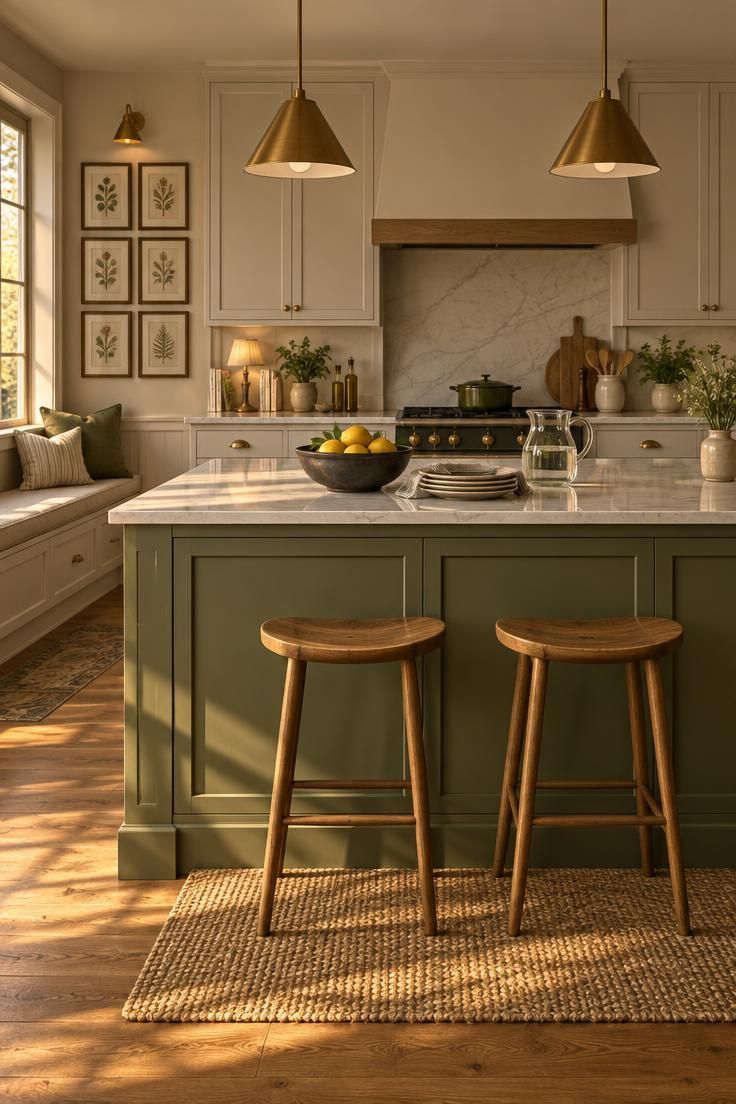
Saturated emerald across every cabinet is losing ground to a narrower, more selective approach.
Current reporting points toward sage, olive, moss, eucalyptus, gray-green, and deep forest, with the green concentrated on one element rather than the whole room.
The shift changes what the color communicates: a green island reads as a focal point, while green walls on every cabinet read as a commitment to the entire palette.
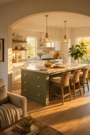
A green kitchen island with neutral perimeter cabinets is one of the most flexible arrangements in current use.
The island carries the color, the surrounding cabinetry stays quiet, and the room gains a center of gravity without turning every door front into a statement.
Lower-cabinet-only applications follow the same logic from a different angle.
Green below eye level draws the color into the room's working zone while upper cabinets remain light enough to keep the space feeling open.
A green pantry, beverage station, or range hood surround pushes the idea further by giving the color a single architectural moment.
This approach suits kitchens where the full cabinet run is already visually busy or where the island is too small to anchor the color.
Natural wood is increasingly replacing stark white as green's partner, which softens the contrast and gives the color somewhere warm to sit.
Combinations reported as holding up well include olive with medium white oak, sage with rift-cut oak, and forest green with walnut.
Why Green Reads Differently Under Different Light
Green changes character as the light moves across a room more visibly than most cabinet colors.
A shade that reads calm and gray in a showroom can turn yellow under warm evening bulbs, drift blue near a cool window, flatten toward gray in a north-facing room, or darken to nearly black on shadowed lower doors.
Sheen adds another variable.
Higher sheen reflects more light and can make a color appear brighter or richer, according to Sherwin-Williams guidance on how light and finish affect paint color.
The same green in satin and in semi-gloss can look like two different paints on the same cabinet run.
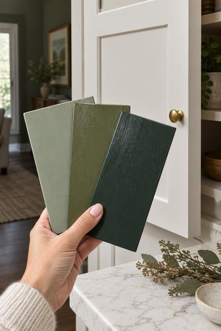
This is why a small paper swatch is close to useless for choosing a cabinet color.
The decision needs a sample large enough to occupy real cabinet area, viewed in the actual room under the lighting the kitchen receives at different hours.
The testing method that holds up across sources is straightforward.
Paint a sample board or an old door, then view it in morning daylight, afternoon daylight, and under the kitchen's evening lights, positioned next to the countertop and near the flooring.
A dark green cabinetry with a light countertop combination is a good case for this kind of testing.
The light countertop lifts the lower cabinets, but only if the green itself stays legible in the room's dimmest hours rather than collapsing into shadow.
Design Pro-Tip: Sample the green on a board that can be moved between upper and lower positions, because shadowed lower doors will show a noticeably darker version of the same paint.
The Vein Test for Countertop and Cabinet Alignment
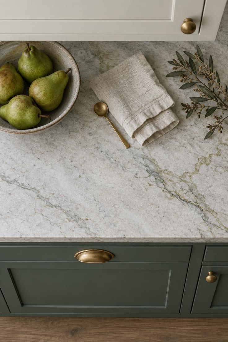
The stone, tile, or countertop already in the room carries its own color direction, and most people read it incorrectly.
The habit is to match a green to the countertop's overall background color, which is usually the least informative part of the surface because it has been toned and blended toward neutrality.
A better method is to isolate the thinnest vein, mineral fleck, or edge inclusion in the stone and let that secondary color guide the cabinet choice.
Veins carry the concentrated version of an undertone that the background has muted, so they point toward the color family the room is already leaning into.
A warm white quartzite with faint olive veining can support an olive green kitchen cabinets with brass hardware pairing even though the slab itself reads neutral at a glance.
A gray-veined marble may pull a green toward blue-green, which is worth knowing before the paint is mixed rather than after.
The countertop is not the only fixed element worth reading this way.
Flooring, backsplash tile, and any visible trim carry the same kind of trace information, and a green that agrees with one secondary color will usually agree with the others if the room's palette was coordinated to begin with.
Matching undertones, rather than matching named colors, is the principle behind this approach.
Benjamin Moore recommends comparing cabinet color with the undertones present in the countertop, noting that aligned undertones tend to read as more cohesive.
The Benjamin Moore kitchen cabinet guidance frames this as a coordination practice rather than a rule about any specific color.
The vein test also exposes mismatches early.
A cool gray-green cabinet placed above a countertop with warm cream veining will look unsettled no matter how carefully the paint was chosen, because the two surfaces are quietly arguing about temperature.
The Lineage From Historic Greens to Mid-Century Avocado
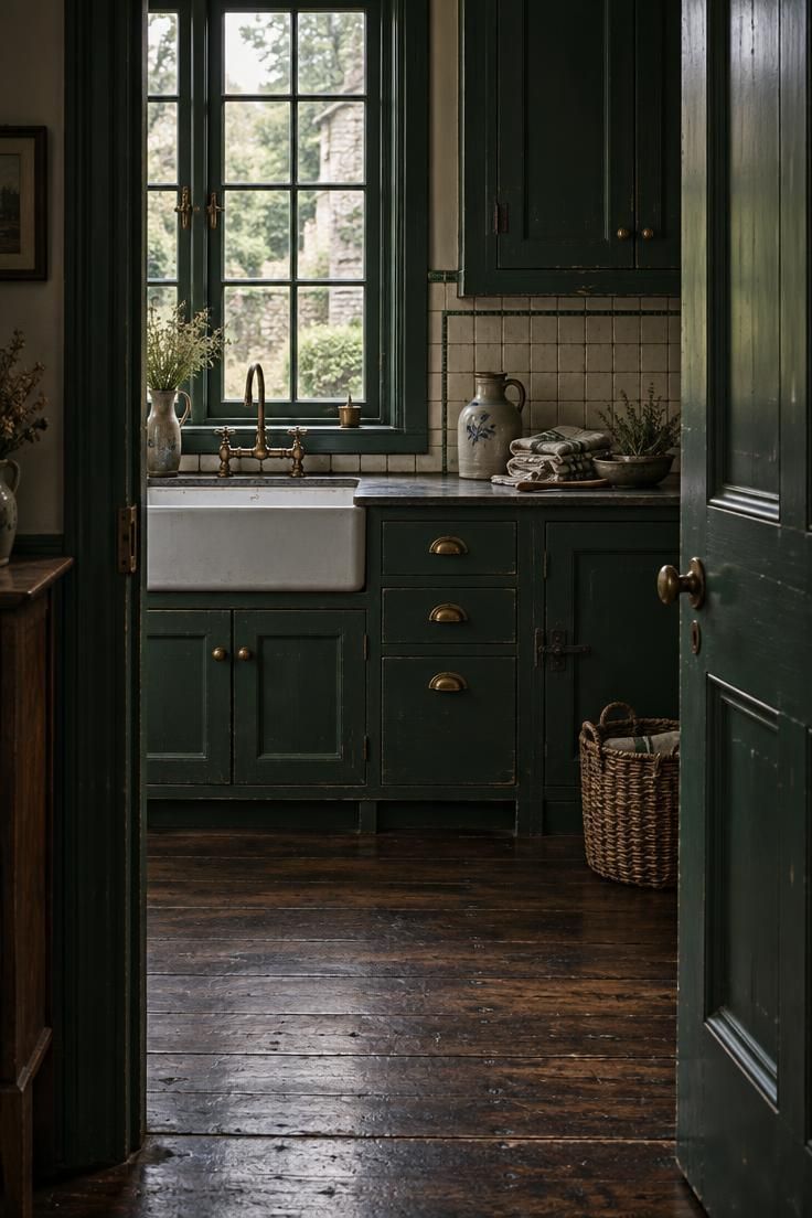
Green cabinetry has a longer record than most current trends suggest.
Early green pigments came from materials such as malachite, green earth, and verdigris, according to the Getty's history of the color green, which is part of why the color carries a natural, mineral association in interiors.
Some nineteenth-century greens were a different story.
Vivid pigments including Scheele's green and Paris green contained arsenic and appeared widely in wallpapers, textiles, and decorative finishes before their dangers were understood, as documented by the Cooper Hewitt on toxic beauty in nineteenth-century color.
That history explains the slightly artificial character of intense historic greens without saying anything about modern paint.
Victorian and Arts and Crafts interiors leaned on deeper greens such as olive, bottle green, sage, and forest, often alongside woodwork and layered pattern. This Old House notes green among the broader historic palette that included ochres, browns, and muted blues.
The modernist thread is easy to miss.
The Frankfurt Kitchen, developed by Margarete Schütte-Lihotzky in the 1920s, treated the kitchen as a standardized workspace, and early versions were painted blue-green, as described by the Museum der Dinge on the Frankfurt Kitchen.
Green cabinetry carries a functionalist lineage alongside its country and Victorian ones.
Mid-century interiors brought avocado, olive, and mint back into kitchens, and today's versions tend to be softer and more layered: sage gray, eucalyptus, moss, muted teal, and green-black.
The current palette borrows from both traditions without repeating either.
Two-Tone and Lower-Cabinet-Only Strategies
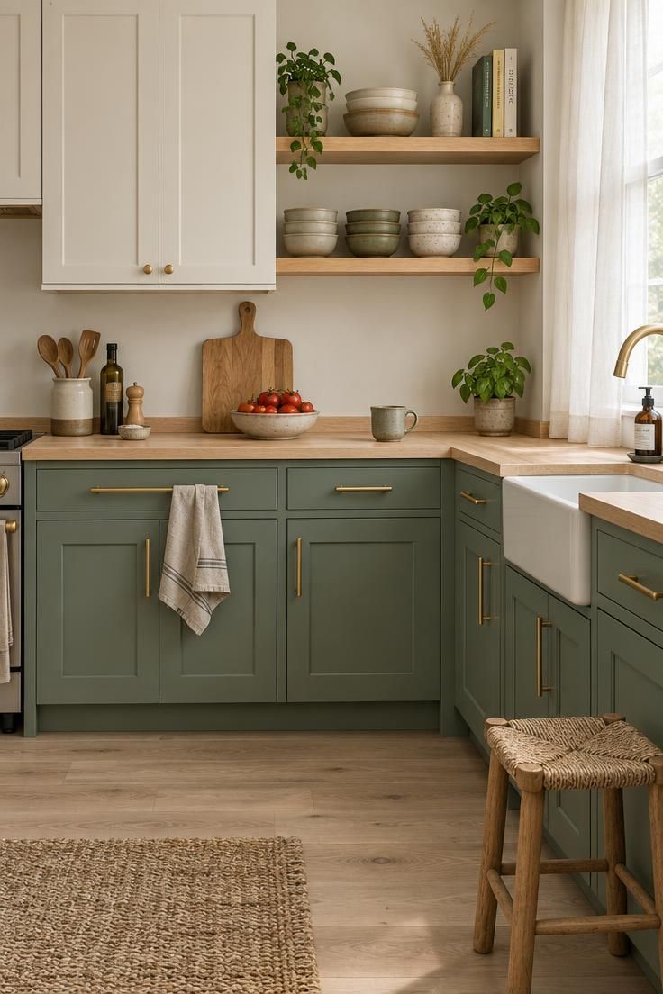
Sage green lower cabinets with warm white uppers are the arrangement most often recommended for readers who want green without committing the entire room.
Splitting the cabinetry this way keeps the upper half light and open while allowing the color to sit at working height, where it is closest to the countertop and the person using it.
The green island approach asks less of the room.
It gives a kitchen with green cabinets a single focal point, leaves the perimeter free to stay neutral or wood-toned, and makes the green easy to change later if the palette no longer suits the space.
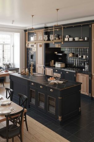
Dark green cabinetry with a light countertop is the more dramatic version of the same idea.
The countertop does the lifting, keeping the lower mass from reading as heavy, and the contrast between the deep green and the pale surface becomes the room's primary visual event.
Dark green benefits from attention to the room's overall brightness rather than the color itself.
In a small or low-light kitchen, the same deep green that feels rich in a bright room can read as enclosed, and the usual countermeasures are lighter walls, layered lighting, and a visually bright countertop.
Combinations that age less gracefully are worth naming.
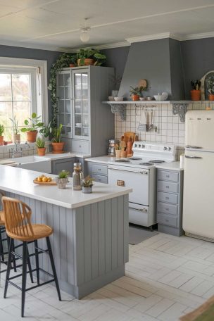
Highly saturated emerald across every surface, cool gray-green paired with blue-gray countertops, and green cabinets with gray walls and gray floors all concentrate risk because they leave the color with no warm counterweight.
Two-tone schemes also make maintenance and future changes easier to absorb.
Repainting an island or a lower run is a smaller project than repainting an entire kitchen, which matters if the green is a decision the household wants to revisit rather than a permanent commitment.
Finish, Durability, and the Painting Reality
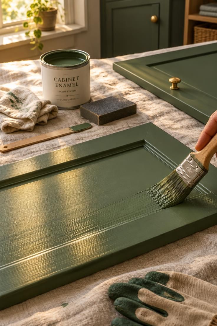
Finish choice affects how the same green appears on the cabinet, and it also affects how the surface holds up.
Satin is commonly recommended for cabinetry because it produces a softer appearance, hides minor surface imperfections better than higher sheen levels, and suits both traditional and modern door profiles.
Semi-gloss reflects more light and can make a dark green read brighter on a shadowed lower cabinet, but it also emphasizes door profiles and any imperfection in the surface beneath.
Matte and ultra-matte finishes can look refined on flat-panel doors, and they may need a specially formulated cabinet coating rather than an ordinary flat wall paint, since high-touch surfaces see repeated handling.
For anyone considering painting kitchen cabinets with satin enamel, the guidance from manufacturers concentrates on preparation rather than the color itself. Behr's cabinet painting guidance describes a sequence of degreasing, scuff-sanding, repairing, priming, and applying two thin coats of cabinet enamel with adequate curing time, and notes that grease, gloss, dust, and moisture can prevent adhesion and cause peeling or bubbling.
Laminate and melamine surfaces need particularly careful cleaning and surface preparation before any coating will hold.
That detail is worth knowing before deciding whether a repaint is a weekend task or a longer project, and it is the part of the work that determines how the finish looks after a year of use.
Sheen also changes the apparent color, which surprises many people mid-project.
A green in flat and the same green in satin can read as two different shades on the same cabinet run, especially where light hits the doors at an angle.
Design Pro-Tip: When comparing green cabinet paint, ask about the sheen level in the same color, because identical green in flat and satin can read as two different shades.
Countertops, Backsplashes, and Hardware That Hold the Green
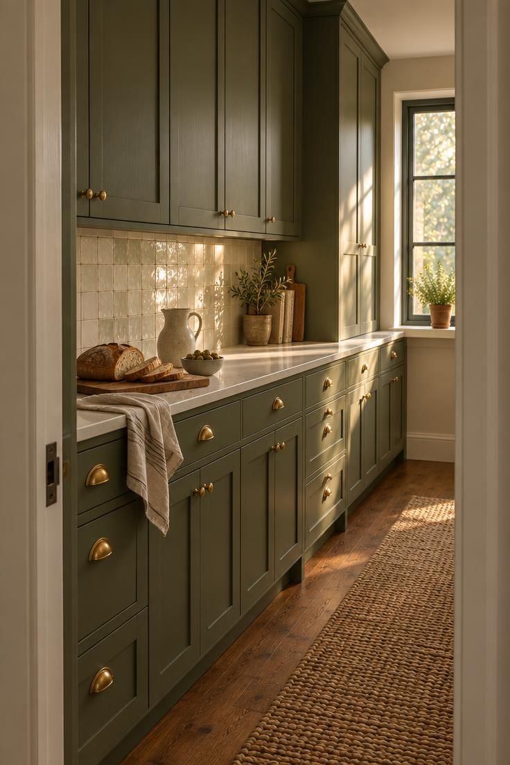
The surfaces around the green determine whether it reads as intentional or unresolved.
Light countertops are the most forgiving partners: white quartz, marble-look quartz, warm limestone, and pale soapstone all give the cabinets room to be the color event without competing for attention.
Temperature matters more than the color name on the countertop.
A warm white supports olive, sage, and yellow-leaning greens, while a stark blue-white can make the same green look sour.
A sage green lower cabinets with warm white uppers pairing is easiest to coordinate when the uppers, the backsplash, and the countertop all sit on the warm side of white rather than straddling both.
Dark green benefits from a countertop with some brightness and visible movement.
Plain white can read flat against a deep cabinet, and a subtle warm veining or a pale stone with gentle variation often gives the room more to look at without competing with the paint.
Backsplashes that hold the green are restrained rather than busy.
Warm white rectangular tile, handmade-look ceramic, and cream zellige all support the cabinet color, and a veined quartzite slab or full-height stone can carry the same role in a more dramatic kitchen.
Light beige and putty tile work in the same supporting register.
Metal finishes change the temperature of the green.
Brass and bronze sit comfortably with olive, forest, and blue-green cabinets, while black hardware sharpens the palette and adds visual weight, which works best when the kitchen has enough light to absorb it.
Polished nickel, by contrast, cools a warm sage and can push a muted green toward gray.
The metal choice is not a finishing detail applied after the color is settled; it is part of how the green will read once the room is finished.
Design Pro-Tip: Choose the metal finish after the green, not before, because polished nickel can cool a warm sage while aged brass can warm a cool eucalyptus.
What the Shift Toward Warmth Means for Green Cabinets
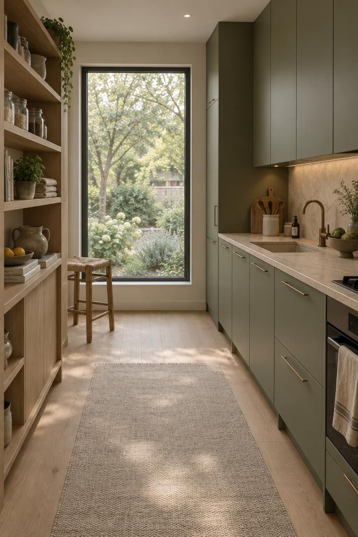
Green has moved from bold accent to warm neutral in much of the current design conversation.
The cultural turn away from cold gray interiors has repositioned the color as a softer, more natural alternative to the cool palettes that dominated the previous decade, which changes how it reads in a room.
That shift shows up in what green is paired with.
Natural wood, lower sheen surfaces, and warm metals are replacing stark white and high-gloss finishes, and the color now sits inside a broader movement toward natural materials rather than standing apart from it.
The NKBA expectation that 71% of professionals anticipate stronger indoor-outdoor connections in kitchens is a design-direction figure rather than a wellness claim.
It describes how kitchens are being organized and finished, not what the color does to anyone who lives with it.
For the reader, this context matters when weighing a personal choice against a resale calculation.
Green cabinetry is now a recognized direction rather than an exotic one, but the homeowner adoption data still places it well behind white and wood, which means it remains a preference-led decision more than a default one.
The Undertone-to-Wood Undercabinet Test
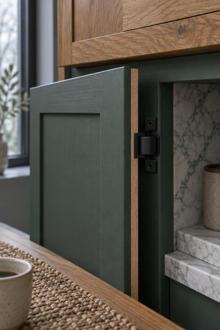
Green cabinet paint rarely fails on the front of the door.
It fails at the places where the cabinet meets something else, which is why an undercabinet test matters more than a wall or island sample.
Select one lower cabinet near the sink or dishwasher, where steam, heat, and daily traffic concentrate.
Paint the inner face of that door and the narrow side edge only, leaving the front untouched at first.
Cap the test with a strip of the real countertop material and a few inches of the planned backsplash tile or slab set vertically behind it.
Now the green is being judged the way it will actually sit: surrounded by wood, stone, ceramic, and shadow, rather than floating on a bright flat surface.
Let the test area dry for seventy-two hours before judging it, because cabinet paints and lacquers continue to shift in sheen and depth as they cure.
Check the edge where the green meets the unfinished cabinet frame, the hinge plate, and the underside return.
Slide a small lamp or flashlight across the surface at a low angle.
This reveals the brush marks, roller stipple, or spray texture that a straight-on view hides, which is exactly what guests will notice when seated at a table nearby.
Design Pro-Tip: Tape a paper label beside the test patch with the exact paint name, sheen, and primer used, so the final decision is based on the painted result rather than a half-remembered chip.
Conclusion
Green cabinetry rewards an intentional decision more than a spontaneous one, and the reason is not the color itself but the number of variables it touches.
Undertone, light, sheen, and the fixed surfaces already in the room all participate in how the green finally reads.
Start with the adoption picture, which places green well behind white and wood in homeowner choices while industry expectations run far ahead of that.
The gap is useful, because it frames the color as a considered preference rather than a safe default.
Then test before committing.
Move a large sample between upper and lower positions, view it in morning, afternoon, and evening light, and hold it beside the countertop, the floor, and any backsplash tile already in place.
The first thing worth trying is the vein test: enlarge a photo of the countertop, blur it, and identify the secondary color that remains, then compare that against the greens under consideration.
Selective placement manages intensity without giving up the color.
An island, a lower cabinet run, or a single pantry panel can carry the green while the rest of the kitchen stays quiet, and a light countertop or warm wood surface keeps the palette anchored.
The most durable green decision is the one that leaves room to enjoy the kitchen rather than wishing the color would behave differently in the hours the room is actually used.