This post may contain affiliate links. If you make a purchase through these links, we may earn a commission at no additional cost to you.
Color is the first thing a kitchen tells you, before you notice the counters or the cabinet doors.
The right palette can make a small galley feel calm or turn a plain box of a room into somewhere you want to linger.
Most kitchens that feel pulled together follow a simple rhythm: one main color, one support color, and one small accent.
These kitchen color palette ideas run from warm, cozy creams to cool blues and deep greens, each with real pairings for cabinets, walls, and hardware.
Every idea below is a scene you can picture and copy, so pick the mood that fits your home and start choosing your kitchen cabinet colors from there.
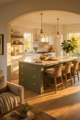
Sage Green Lowers With Creamy White Uppers and Aged Brass Pulls
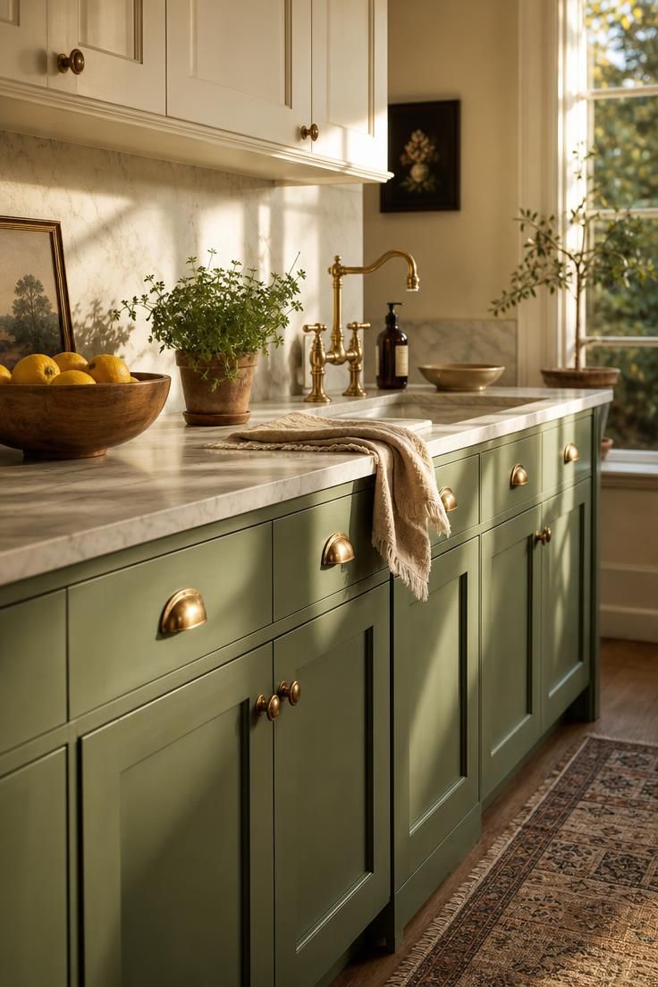
Sage green sits at the friendly middle of the color wheel, soft enough to blend easily with neutrals yet distinctive enough to give the kitchen character.
Pairing it with a creamy white above keeps the lower green from feeling heavy, so the room reads balanced rather than closed in.
The warmth of aged brass is what makes this sage green kitchen feel collected instead of cold.
The muted green also works naturally with wood, stone, woven textures, and botanical accents, giving the palette a cohesive connection to organic materials.
This is one of the softest kitchen color palette ideas for anyone nervous about committing to bold color.
Style Blueprint:
- Sage green paint for the lower cabinets, like a soft eucalyptus tone
- Creamy off-white for the upper cabinets and trim
- Aged or antique brass cup pulls and a bridge faucet
- Honed marble or a warm quartz counter
- Natural wood or woven accents to keep the palette warm
Navy Blue Cabinets Paired With White Marble and Polished Nickel
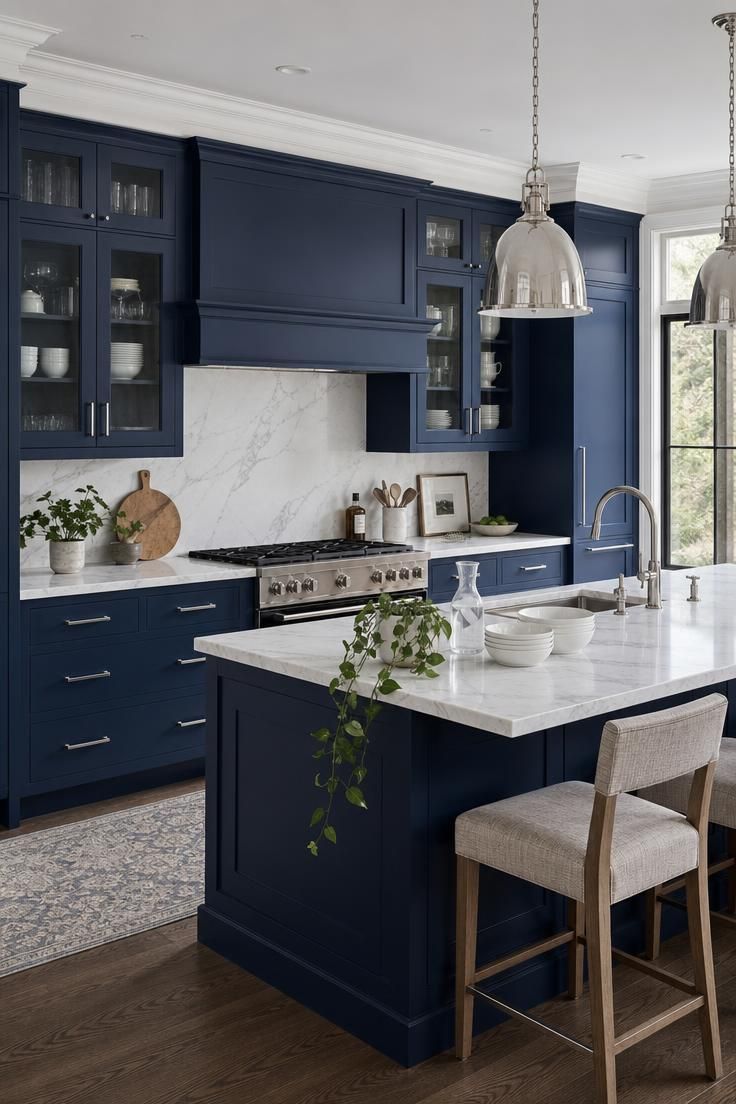
Navy blue is the color that lets a kitchen feel dressed up without trying too hard.
Set against white marble, the depth of the blue reads as confident rather than dark.
Polished nickel keeps the whole thing cool and clean, which suits a navy blue kitchen that leans modern.
Because navy is close to a neutral, it plays well with almost any counter or floor you already own.
The contrast between the dark fronts and the pale stone is what gives the room its quiet energy.
A palette like this rewards restraint, so let the two main tones carry the room.
Style Blueprint:
- Deep navy blue paint for the cabinets
- White marble or a marble-look quartz for counters and backsplash
- Polished nickel or chrome pulls and faucet
- Crisp white walls and trim
- A few glass or clear accents to keep the look airy
Warm Terracotta Walls Over Natural Oak Cabinetry and Unglazed Tile
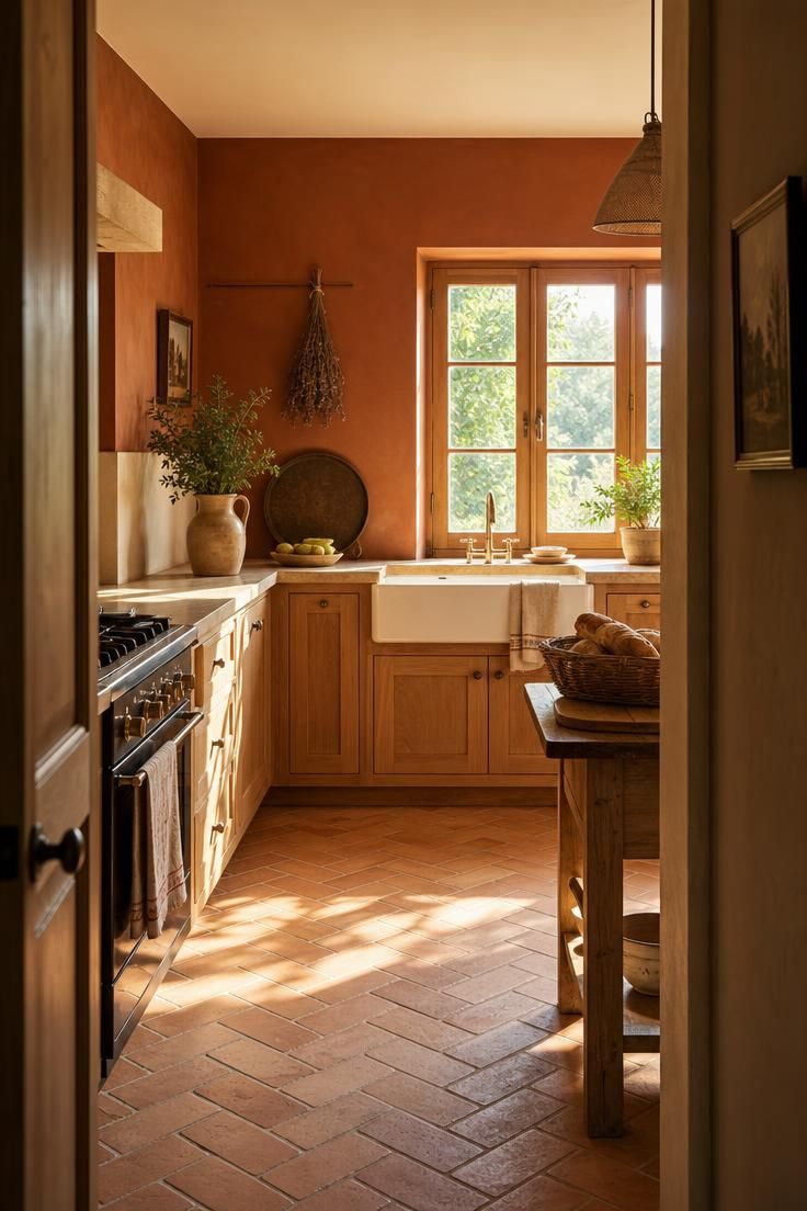
Terracotta brings the kind of warmth that makes a kitchen feel like it has been loved for years.
Over natural oak, the clay tone finds a partner that echoes its earthy, sunbaked mood.
This pairing shows how much kitchen wall colors can do, since the walls here are carrying most of the personality.
Unglazed tile underfoot keeps the palette grounded and adds a matte texture that soft light loves.
Warm colors like these physically read as cozier, which is why terracotta suits a room where people gather.
Style Blueprint:
- Warm terracotta or clay paint for the walls
- Natural oak cabinetry with a matte finish
- Unglazed terracotta or clay floor tile
- Aged brass or dark bronze hardware
- Woven baskets and ceramic accents in earthy tones
Charcoal Island Against Soft Alabaster Perimeter Cabinets
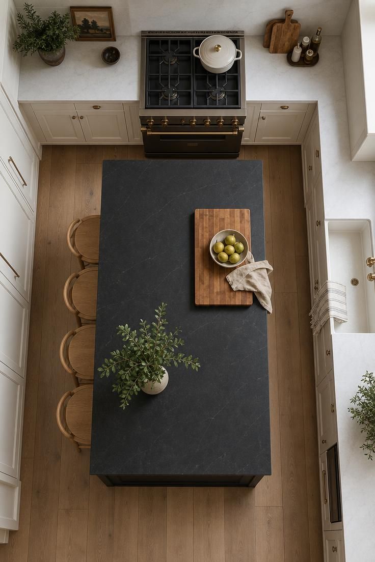
A dark island is one of the easiest ways to add weight to a warm neutral kitchen without darkening the whole room.
The charcoal grounds the space, giving your eye a place to land among all the pale cabinetry.
Alabaster around the edges keeps things light and open, so the island feels like a deliberate anchor rather than a heavy block.
Contrast like this makes a room feel considered, since the two tones clearly have different jobs.
Pale wood stools soften the meeting point between dark and light, warming what could otherwise feel stark.
The palette stays quiet, which lets the shape of the island and the grain of the wood do the talking.
Charcoal reads as a softer choice than true black, so it grounds a room without turning it cave-like.
Style Blueprint:
- Charcoal paint or stain for the island
- Soft alabaster or warm white for the perimeter cabinets
- A butcher block or warm wood counter on the island
- Pale oak stools to bridge the two tones
- Matte black or bronze hardware for a grounded finish
Design Pro-Tip: Build your palette around the one thing you cannot easily change, like existing counters or flooring, and match its undertone first. Everything else can be painted or swapped later.
Butter Yellow Cabinets With White Subway Tile and Wood Open Shelving
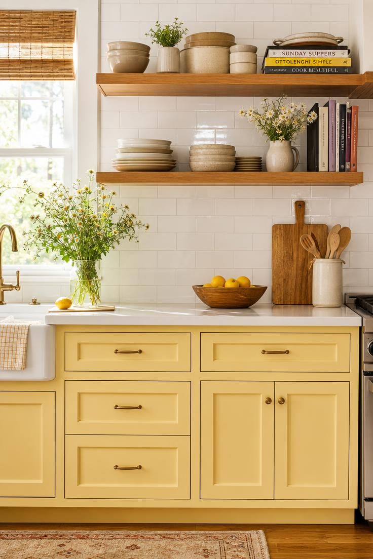
Butter yellow is having a real moment because it feels sunny without tipping into loud.
Against white subway tile, the color stays soft and buttery rather than bright and jarring.
Wood open shelving adds an earthy note that keeps the yellow feeling homey.
This is a fun place to bring in playful kitchen backsplash ideas, since a plain white tile lets the cabinets be the star.
A warm color like this lifts the mood of a room, which makes mornings in the kitchen a little brighter.
Yellow works best in small doses of true saturation, so a soft, milky version is the friendliest choice.
Style Blueprint:
- Butter or soft yellow paint for the cabinets
- Classic white subway tile backsplash
- Warm wood open shelving
- Simple black or brass hardware
- Fresh flowers or greenery to echo the cheerful mood
Deep Forest Green Cabinets Under Warm Brass Pendant Lighting
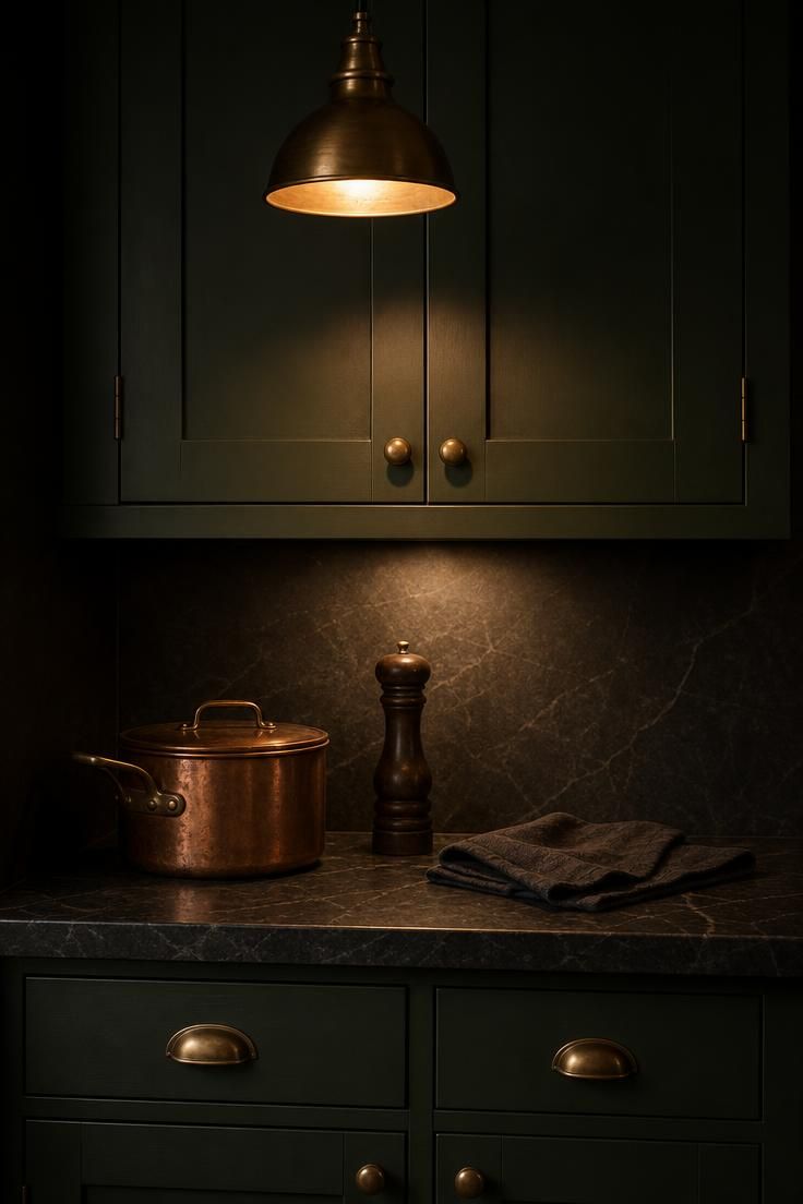
Deep forest green turns a kitchen into a room you want to retreat into after a long day.
Brass pendants are the perfect companion, their warm glow keeping the dark green from feeling gloomy.
The pairing feels rich and enveloping, more like a study than a bright morning kitchen.
Green this deep needs good light to shine, so layered lamps and pendants matter as much as the paint.
Against the green, warm metal reads almost like jewelry, catching the eye and softening the mood.
A dark palette rewards a little sparkle, so let the brass carry the warmth here.
Style Blueprint:
- Deep forest or hunter green paint for the cabinets
- Warm brass pendant lights over the island or sink
- Honed soapstone or dark stone counters
- Copper or brass cookware left on display
- Warm, layered lighting to keep the green from going flat
Two-Tone Mushroom and Cream With Honed Soapstone Counters
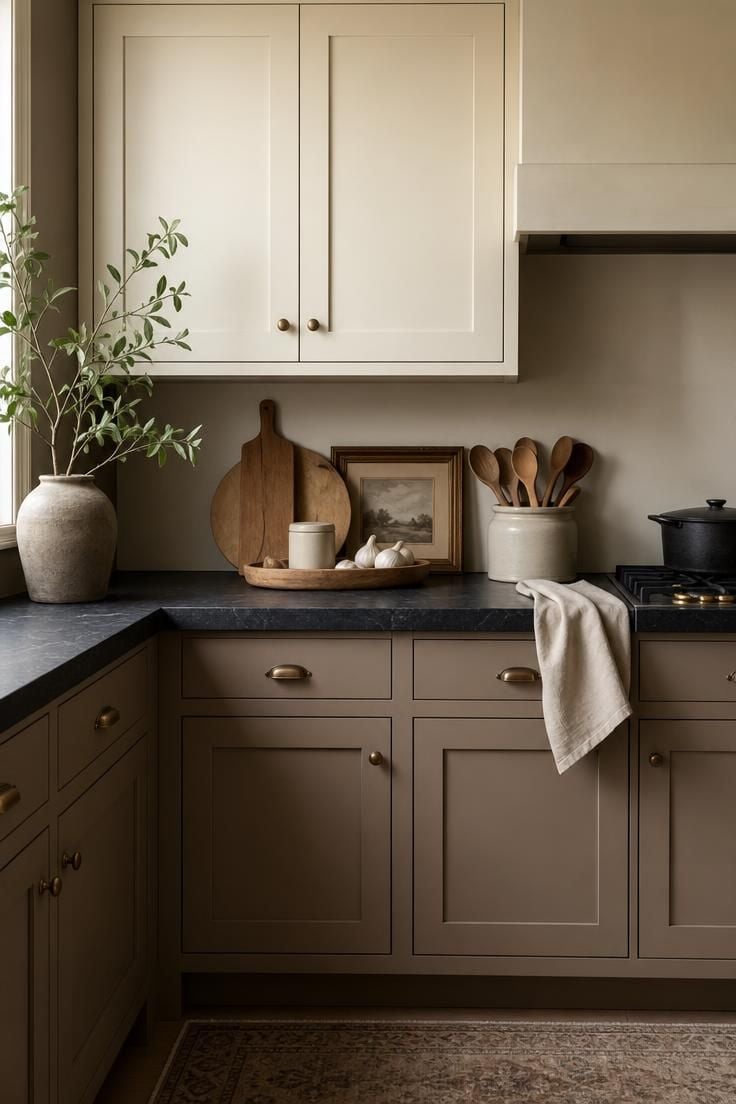
Mushroom is that hard-to-name color between taupe and warm gray-brown, giving the room a muted, grounded base.
Paired with cream, it creates a gentle tonal palette with very little visual competition between surfaces.
These two-tone kitchen cabinets show how contrast can remain soft rather than sharp.
Honed soapstone grounds the pale palette with a deep, matte anchor at counter height.
Because the colors stay close in value and saturation, the composition reads as cohesive, with no single surface dominating the room.
Style Blueprint:
- Warm mushroom paint for the lower cabinets
- Soft cream for the upper cabinets
- Honed soapstone or a dark matte counter
- Simple bronze or aged nickel hardware
- Linen and wood accents to keep the mood warm
Dusty Blue Cabinets With Whitewashed Brick and Black Iron Hardware
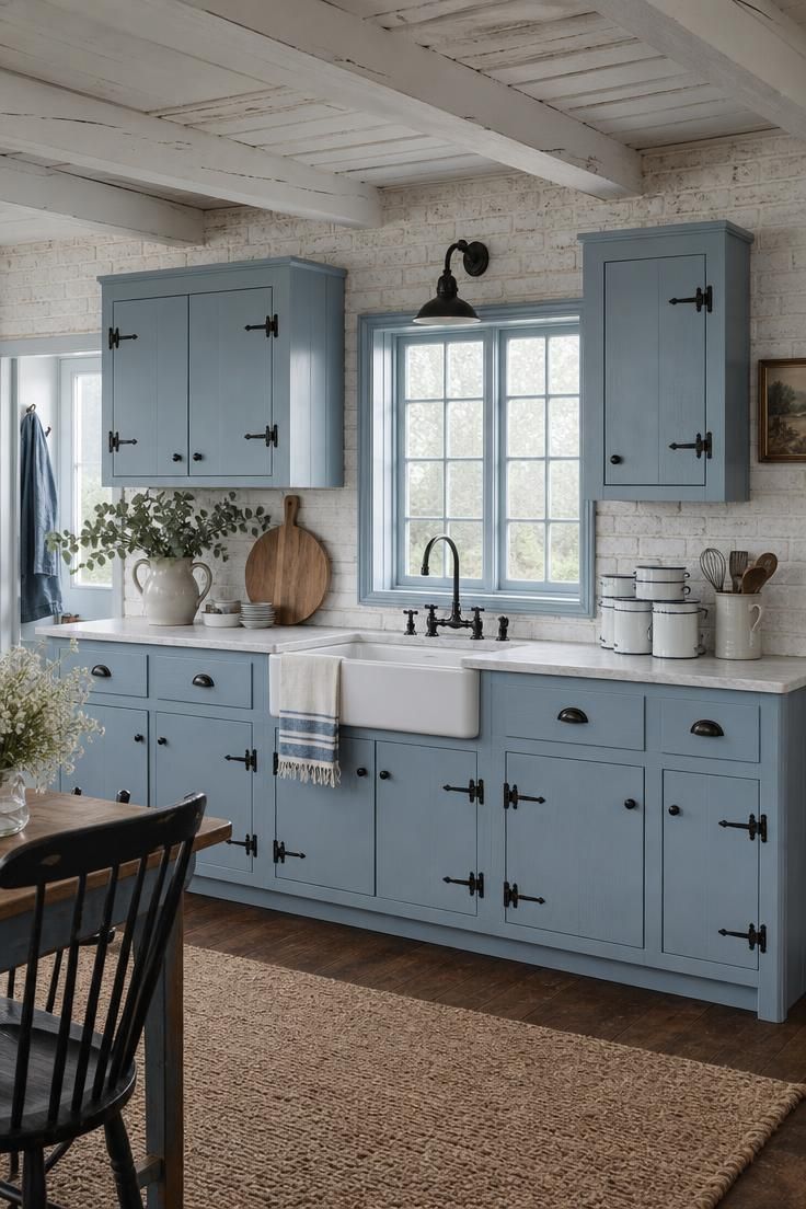
Dusty blue is the softer, dressier cousin of navy, closer to a faded sky than a deep sea.
It pairs beautifully with whitewashed brick, which brings texture without adding another strong color.
Black iron hardware keeps the sweet, chalky blue from feeling too precious.
This combination leans cottage, so it suits a home that likes a little history in its rooms.
Soft, cool colors like this can make a room feel a touch larger, since pale blues visually recede.
The texture of the brick is what keeps a quiet palette from feeling plain.
Style Blueprint:
- Dusty or chalky blue paint for the cabinets
- Whitewashed brick backsplash or accent wall
- Black iron latches, pulls, and hinges
- An apron-front or fireclay sink
- Enamelware and eucalyptus for gentle cottage styling
Design Pro-Tip: Repeat your accent color in at least two spots, like an island and a few open-shelf pieces, so it reads as a choice rather than an accident. A single splash of color can look stranded.
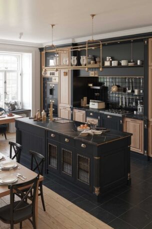
Black Lower Cabinets With White Oak Uppers and a Waterfall Quartz Island
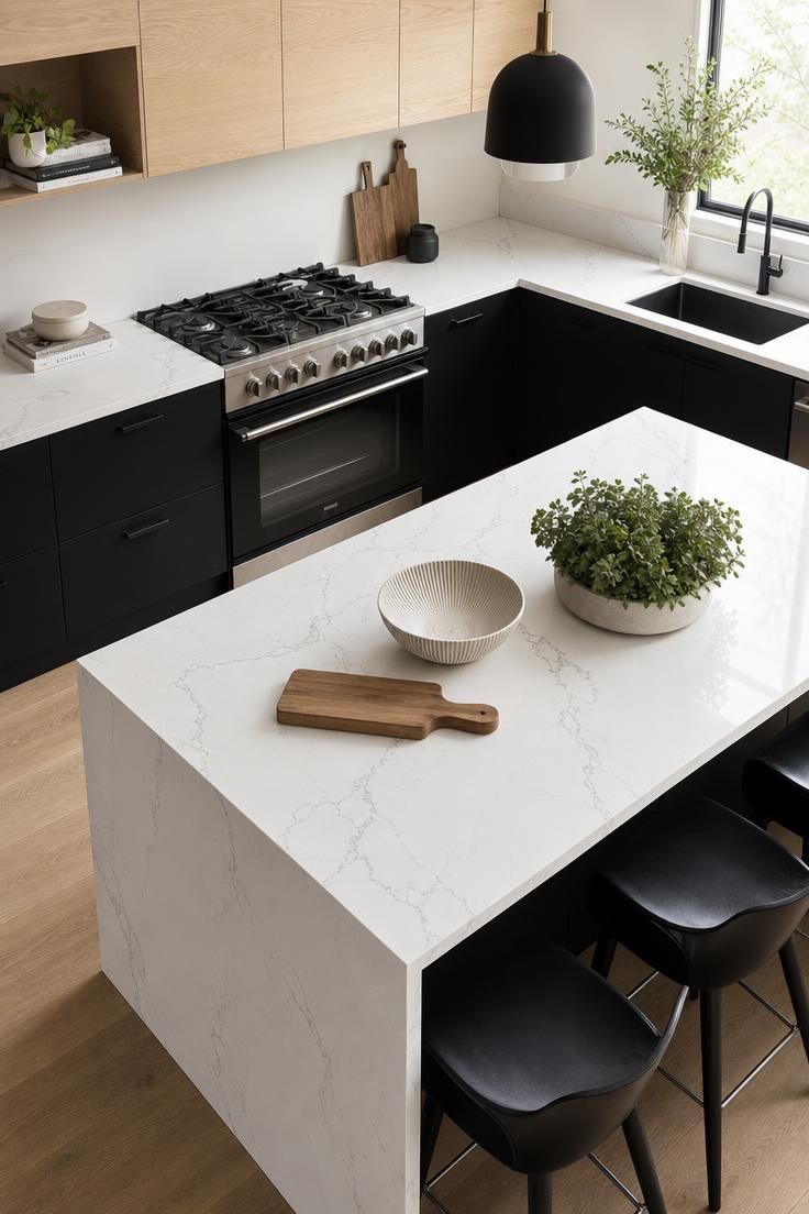
High contrast is the fastest route to a kitchen that looks current and intentional.
Black bases feel anchored and graphic, while white oak uppers stop the scheme from turning heavy.
The waterfall quartz island brings a run of bright white that keeps these modern kitchen colors from reading too severe.
Warm wood is the secret ingredient here, softening the black and white into something you actually want to cook in.
Pairing dark bases with white kitchen cabinets or wood above is a reliable way to get drama without gloom.
A palette this graphic looks best when the surfaces stay clean and uncluttered.
Style Blueprint:
- Matte black paint for the lower cabinets
- White oak or light wood upper cabinets
- Waterfall-edge white quartz island
- Black or matte hardware to match the bases
- A few warm wood or woven accents to soften the contrast
Warm Greige Walls With Walnut Cabinetry and a Cream Zellige Backsplash
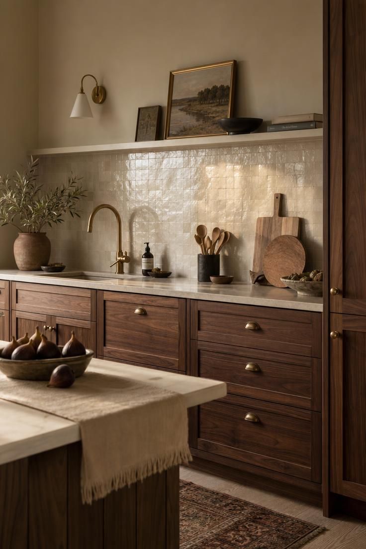
Greige is the great connector, a warm blend that bridges beige and a soft, warm neutral without going cold.
Against walnut, it lets the wood become the richest thing in the room.
A cream zellige backsplash adds handmade shimmer that keeps the warm palette from feeling flat.
This is one of the most livable kitchen color palette ideas, since nothing here will feel dated in a few years.
Warm neutrals like these make a space feel settled, the visual equivalent of a deep breath.
The slight irregularity of zellige is what gives an otherwise calm scheme a bit of soul.
Layering three warm tones this way reads as collected rather than matchy.
Style Blueprint:
- Warm greige paint for the walls
- Walnut or warm wood cabinetry
- Cream or ivory zellige tile backsplash
- Aged brass faucet and hardware
- Linen and fresh fruit for easy, warm styling
Olive Green Island Surrounded by Soft White Cabinets and Brass Faucets
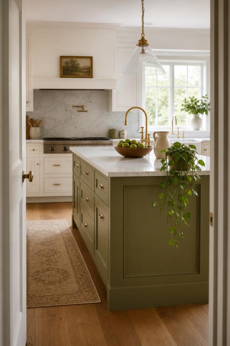
Olive green is grounded and earthy, a color that feels calm rather than showy.
Using it only on the island lets you enjoy green without committing the whole room to it.
Soft white cabinets around the edges keep the space bright and give the island more visual emphasis.
Brass faucets connect the warm and cool tones, so the palette feels intentional.
Because olive green echoes natural materials and muted landscapes, it gives the kitchen a softer, more grounded visual character without overwhelming the room.
Style Blueprint:
- Olive green paint for the island
- Soft white for the perimeter cabinets
- Brass or warm gold faucet and pulls
- Warm wood or butcher block on the island top
- Leafy greenery to echo the olive tone
Espresso Cabinets With Cream Counters and Copper Accents
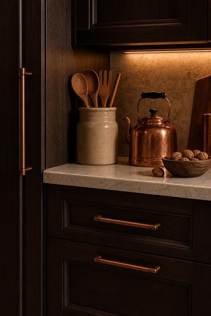
Espresso brown gives a kitchen a deep, coffee-warm richness that black cannot quite match.
Cream counters keep the dark cabinets from swallowing the light, holding the room in balance.
Copper is the ideal accent here, its rosy warmth echoing the brown tones beautifully.
This palette feels cozy and grown-up, well suited to evenings and slow weekend mornings.
Warm dark colors wrap a room, which can make a large kitchen feel more intimate and welcoming.
The play between deep brown and glowing copper is what gives the scheme its quiet luxury.
Style Blueprint:
- Espresso or dark walnut cabinetry
- Cream or warm ivory counters
- Copper faucet, hardware, or cookware
- Warm under-cabinet lighting
- Cream or oatmeal textiles to lighten the mood
Design Pro-Tip: Test paint on a large board and move it around the kitchen at morning, noon, and night. Kitchen light mixes daylight with warm bulbs, and a color can shift a lot between them.
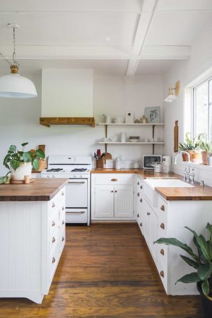
Crisp Black and White Palette Warmed by a Reclaimed Wood Shelf
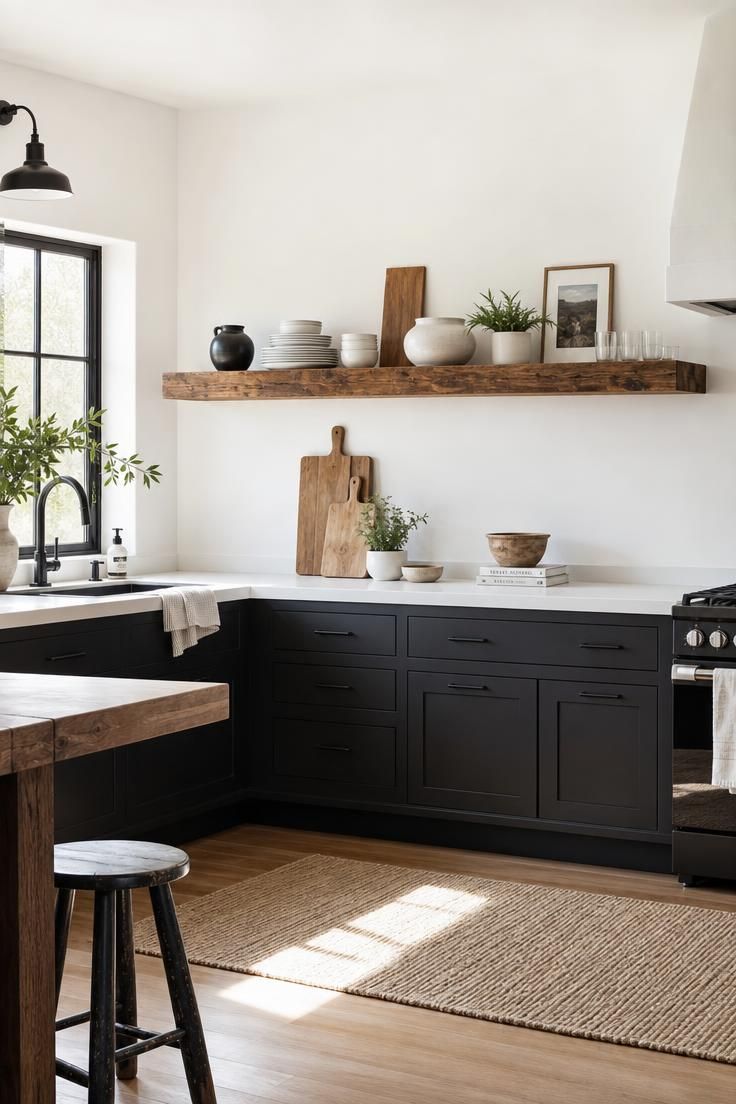
Black and white is the pairing that never really goes out of style, sharp and clean at once.
Left on its own, though, it can feel a little chilly and hard.
A single reclaimed wood shelf fixes that instantly, adding warmth and a story to the crisp scheme.
This is among the most flexible kitchen color palette ideas for a small kitchen color scheme, since black and white keeps a tight space feeling crisp rather than busy.
The wood is what turns a graphic look into a room that feels like home.
Style Blueprint:
- Black paint for the lower or full cabinets
- Bright white walls and counters
- One reclaimed or warm wood open shelf
- Black hardware and faucet
- White stoneware and a small plant for easy contrast
Conclusion
The strongest kitchens rarely use more color, they use color more deliberately.
Start with the pieces you cannot move, keep your true colors to two or three, and let wood and neutrals connect everything.
Repeat your accent so the room feels intentional, and test every paint chip in the actual room before you commit.
Warm creams, sage green, navy blue, and moody charcoal can each anchor a space, so the right pick is the one that matches how you want the room to feel.
Come back to these kitchen color palette ideas whenever a room feels flat, and let one confident palette do the heavy lifting.