This post may contain affiliate links. If you make a booking or purchase through these links, we may earn a commission at no additional cost to you.
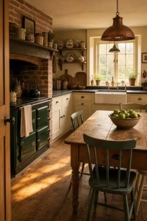
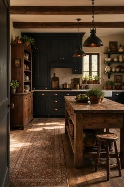
Most cottage kitchens play it safe with white cabinets and soft pastels, but the most memorable ones lean the other way entirely.
Dark cottage kitchens trade brightness for depth, wrapping familiar textures like reclaimed wood and handmade tile in charcoal, navy, and forest green.
The result is a space that feels collected, grounded, and impossible to rush through.
These 14 dark cottage kitchen ideas show you how rich tones, natural materials, and aged finishes create the kind of rustic kitchen ideas worth recreating in your own home.
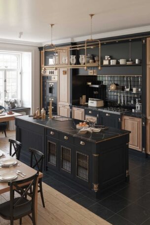
Charcoal Shaker Cabinets With Brushed Brass Cup Pulls
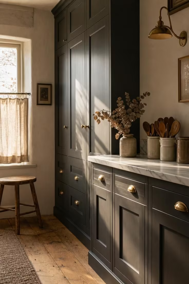
Charcoal paint on shaker-profile doors reads as both classic and bold, a combination that most lighter finishes struggle to pull off.
The matte surface absorbs light rather than bouncing it, which gives the cabinets a sense of weight and permanence that white never quite achieves.
Brushed brass cup pulls add just enough warmth to keep the palette from tipping into cold territory.
That warmth matters here because the charcoal sits against pale plaster walls, and without the brass, the contrast would feel stark rather than comfortable.
The honed marble countertop acts as a bridge between the two tones, its grey veining picking up the cabinet color while its pale surface reflects window light back into the room.
These dark kitchen cabinets reward you with a kitchen that looks better as it ages, since charcoal hides fingerprints and wear marks that white constantly exposes.
Style Blueprint:
- Charcoal matte-finish shaker cabinets with recessed panel detailing
- Brushed brass cup pulls and matching knob hardware
- Honed white marble countertop with grey veining
- Pale plaster walls for contrast behind the dark cabinetry
- Wide-plank reclaimed oak flooring with natural patina
A Soapstone Countertop Beside a Matte Black Fireclay Sink
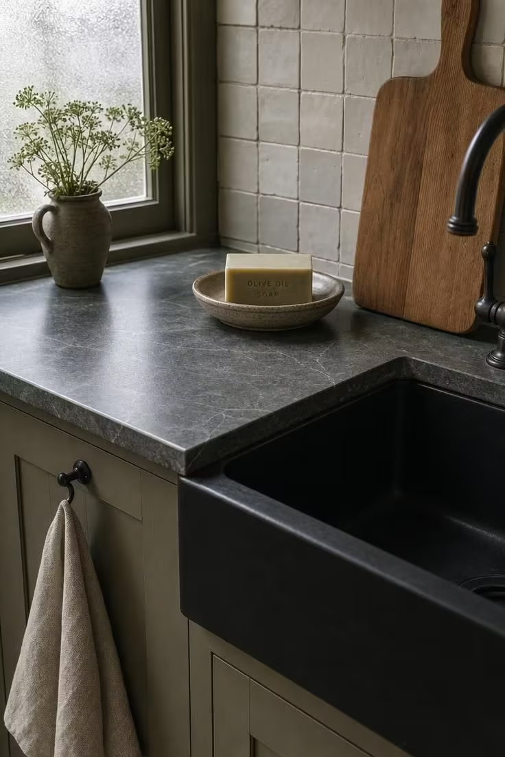
Soapstone starts with a pale grey-green tone and deepens to near-black over months of daily contact with oils and water.
That natural darkening means the surface actually grows into a dark cottage kitchen rather than being forced into one, which gives the space an authenticity that painted or laminated surfaces cannot match.
Beside it, a matte black fireclay sink holds its own without competing for attention because both materials share a similar visual density.
The apron-front profile adds a structural edge to the scene, its flat face catching low light and casting a faint shadow on the cabinet below.
A linen tea towel in oatmeal breaks the monochrome just enough, and a hand-thrown soap dish reinforces the handmade quality that makes cottage kitchens feel lived in rather than decorated.
The dove-glazed backsplash tile, with its irregular edges, adds the kind of surface imperfection that a factory-cut tile never delivers.
Together, these two dark surfaces prove that a dark palette does not have to feel heavy when the materials themselves carry texture and movement.
Style Blueprint:
- Honed soapstone countertop with natural veining
- Matte black fireclay apron-front sink
- Handmade square tile backsplash in a dove glaze
- Iron cup hooks for hanging linen towels
- Hand-thrown pottery soap dish and olive wood cutting board
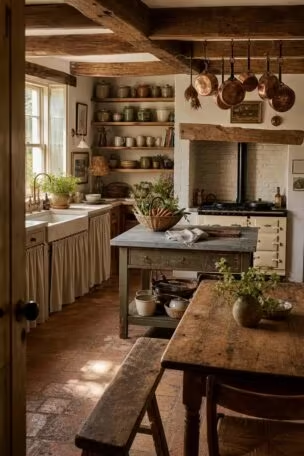
Exposed Chestnut Ceiling Beams Over Iron-Forged Pendant Lights
Most dark kitchens focus all their drama at counter height, leaving the ceiling as an afterthought in flat white.
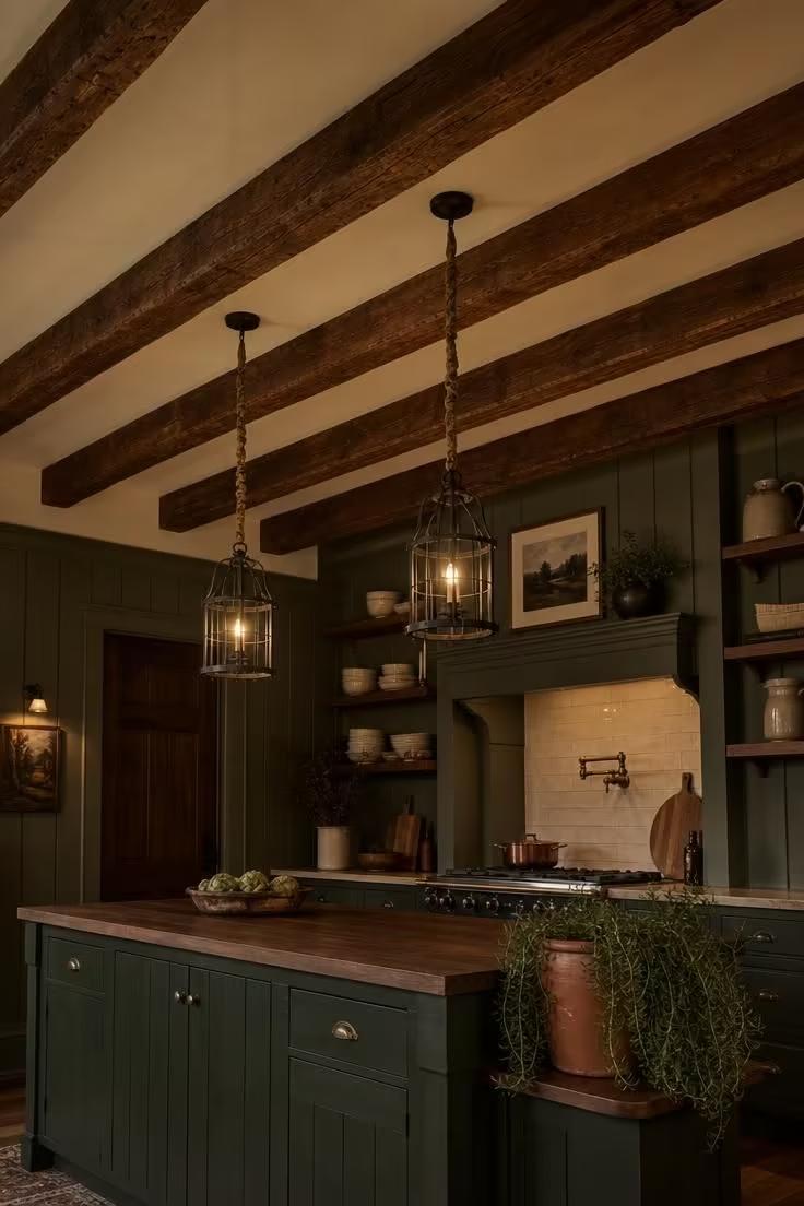
Exposed chestnut beams flip that pattern by pulling your eye upward and adding an entire layer of material richness that the lower half of the room does not have to carry alone.
The reddish-brown grain of chestnut reads warmer than oak or pine, which matters in a room where the walls and cabinets already trend cool and dark.
Iron-forged pendant lights with open cage frames hang directly from the beams, and the thick cloth-wrapped cords reinforce the handmade character of the whole scene.
Hanging them low enough to cast defined pools of light on the island surface below creates bright zones inside a room that is otherwise intentionally dim.
The rough-hewn tool marks on the beam faces catch that pendant light at angles, throwing tiny shadows that change as you move through the space.
This kind of moody kitchen design depends on contrast between dark and bright, not on flooding the room with even light from overhead fixtures.
A trailing rosemary plant at the island edge adds a single note of green that connects the interior tones to something living.
Style Blueprint:
- Exposed rough-hewn chestnut ceiling beams with visible tool marks
- Iron-forged open-cage pendant lights on cloth-wrapped cords
- Deep cream painted ceiling between the beam runs
- Dark sage board-and-batten wall paneling
- Trailing herb plant in a terracotta pot on the island
Dark Green Beadboard Walls Framing a Marble Pastry Slab
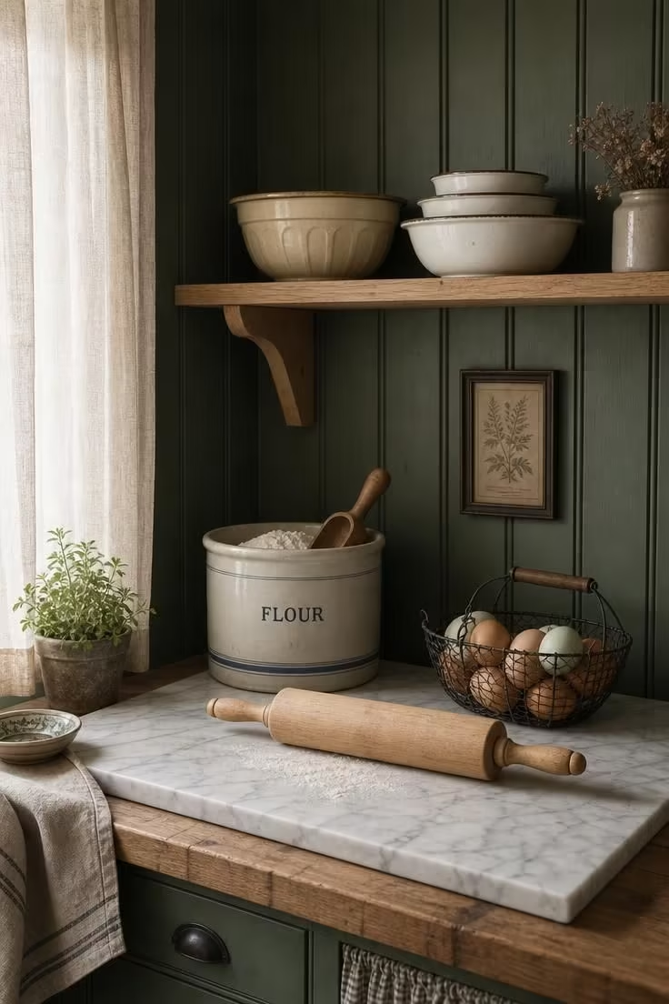
A beadboard kitchen wall in dark green does something that flat-painted walls cannot: it adds vertical rhythm to the surface, so the color reads as textured rather than solid.
That texture prevents the green from feeling like a painted box, and instead gives it the depth of something that has been there for decades.
The marble pastry slab sitting on a butcher block countertop introduces a deliberate material shift, a cooler, smoother surface that signals this is a working station with a specific purpose.
Flour, eggs, and a turned-maple rolling pin confirm the function without any labels or signs, which is exactly how cottage kitchen decor works best: through objects rather than decoration.
A single open shelf above holding cream enamelware mixing bowls keeps everything within reach and on display, reinforcing the idea that a dark green kitchen is a space you cook in rather than just look at.
The soft diffused daylight filtering through linen keeps the green from reading too dark, which is a detail worth noting if you are considering this look in a kitchen with limited natural light.
Style Blueprint:
- Dark green painted beadboard wall paneling, floor to ceiling
- Thick white marble pastry slab set on the countertop
- Butcher block countertop as the primary work surface
- Raw pine open shelf with cream enamelware
- Ceramic flour canister and wire egg basket for working display
Design Pro-Tip: Before committing to a dark wall color, tape large painted cardboard swatches at counter height and ceiling height, then observe them through a full cycle from morning light to evening lamplight. Colors shift dramatically between those two moments, and a shade that feels rich at noon can read almost black after sunset.
A Freestanding Walnut Hutch With Iron Latch Hardware
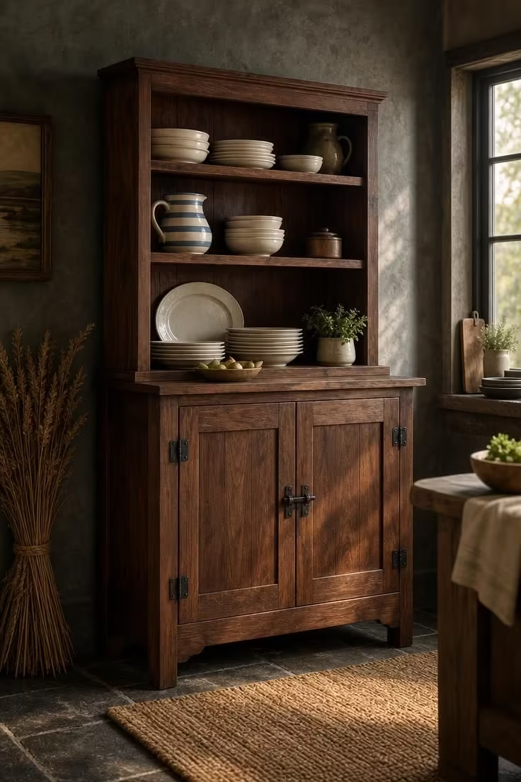
A freestanding hutch does something that built-in cabinetry never can: it makes the kitchen look like it was furnished over time rather than installed in a single day.
Walnut is a strong choice here because its natural grain runs dark enough to hold its own against charcoal plaster walls, while still reading as warm rather than cool.
The iron latch hardware on the lower doors adds a functional weight that modern pulls lack, and the matte black finish keeps the metal from reflecting light in a way that would compete with the wood.
Open upper shelves turn the hutch into a display case, and the mix of stacked white stoneware, a striped pitcher, and a wooden salt cellar tells you this is a kitchen that values use over decoration.
Each object earns its spot by being something you reach for daily, not something you dust around weekly.
That distinction is at the heart of farmhouse kitchen storage: visible, accessible, and worn from handling.
The dark slate tile floor below creates a continuous dark ground plane that anchors the hutch, while the woven jute mat in front of it introduces a softer texture underfoot.
A dried wheat bundle leaning against the adjacent wall is the kind of detail that costs nothing but signals a strong point of view about how this space should feel.
The whole scene, from aged brass hardware on nearby cabinets to the hand-thrown pottery on the shelves, reads as a collection rather than a catalog.
Style Blueprint:
- Freestanding walnut hutch with open upper and closed lower sections
- Matte black iron latch hardware on the lower cabinet doors
- White stoneware plates and a blue-and-cream striped pitcher on display
- Dark slate tile flooring with a woven jute mat
- Dried wheat bundle or botanical accent leaning beside the piece
Forest Green Open Shelves Holding Speckled Stoneware
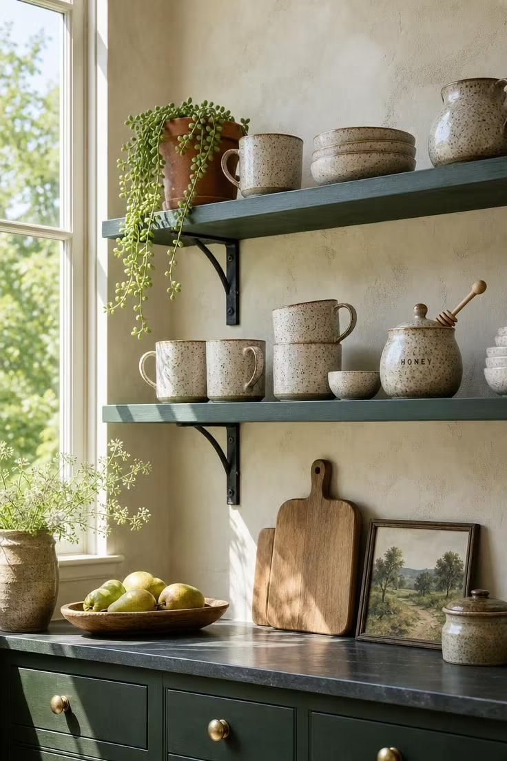
An open shelving kitchen gains its character from what sits on the shelves, not from the shelves themselves, but the color of the shelf changes the way every object on it reads.
Forest green paint behind speckled stoneware makes the cream and brown tones in the glaze pop with a clarity that a white shelf would flatten.
The contrast works because the green is dark enough to act as a backdrop but warm enough to avoid the clinical feel of grey or black.
Wrought-iron L-shape brackets hold the shelves in place without drawing attention, which is exactly right for a setup where the pottery and ceramics should be the focal point.
A ceramic honey pot with a wooden dipper is the kind of single-purpose object that makes an open shelf feel intentional rather than cluttered.
The trailing succulent in a terracotta pot at the shelf edge adds a living element, and its muted green ties back to the shelf color without matching it exactly.
Below the shelves, round brass knobs on the lower cabinets pick up the warm tones in the stoneware glaze, creating a vertical color thread from counter to ceiling.
Style Blueprint:
- Forest green painted open shelves mounted on limewash plaster
- Wrought-iron L-shape shelf brackets in matte black
- Speckled cream-and-brown stoneware mugs, bowls, and honey pot
- Round brass knobs on lower cabinetry
- Trailing succulent in a terracotta pot as a living accent
A Navy-Painted Dutch Door Leading to a Herb Garden
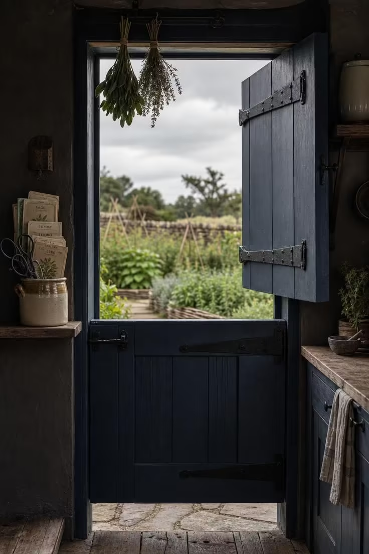
A Dutch door is one of the few architectural details that can shift the entire mood of a room just by being half open.
With the top swung wide and the bottom latched shut, it lets overcast daylight and garden air into a dark kitchen without losing the sense of enclosure that makes the space feel intimate.
The navy paint reads differently under cool light than it does in a sunlit room, leaning toward a muted blue-grey that feels more like natural dye than hardware-store paint.
Iron strap hinges and a thumb latch reinforce the age of the door, or at least the impression of age, which is what matters in a room built on layered character.
The small stoneware crock of garden scissors on the shelf beside the door is a detail that connects inside to outside, a tool you grab on your way through the threshold.
Fresh thyme and sage bundles hanging from an iron hook above the frame dry slowly in the cool air, filling the upper doorway with scent and texture.
That transition from reclaimed oak flooring inside to flagstone just outside the door marks a material shift that makes crossing the threshold feel like entering a different zone of the property.
The whole arrangement turns a simple exterior door into one of the kitchen’s most compelling features, proving that cottage kitchen decor does not have to live on the walls or the counters.
Style Blueprint:
- Navy-painted Dutch door with iron strap hinges
- Simple iron thumb latch on the lower door half
- Narrow wooden shelf with seed packets and a stoneware crock
- Fresh herb bundles hanging from an iron hook above the frame
- Flagstone transition flooring at the outdoor threshold
Honed Black Slate Flooring With a Faded Turkish Runner
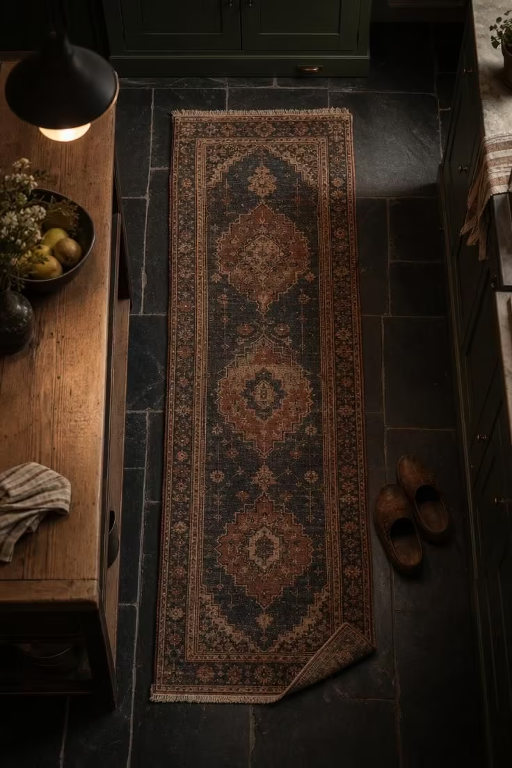
Black slate underfoot creates a continuous dark ground plane that anchors every piece of furniture and cabinetry above it.
The honed finish keeps the stone from reflecting light in a way that would compete with the objects at counter and eye level, so the floor recedes into the background while still carrying weight.
A faded Turkish runner in muted indigo, rust, and cream introduces exactly the kind of warm color and softness that a dark floor needs, without overriding the moody palette.
The frayed edges and naturally folded corner signal years of use, and that visible wear is what separates a styled kitchen from a lived-in one.
A pair of worn leather clogs at the runner’s edge tells you someone walked away from the stove and left them there, which is the smallest kind of storytelling a room can do.
Style Blueprint:
- Honed black slate tile in large irregular rectangles
- Pale grey grout lines for subtle contrast
- Faded Turkish runner in muted indigo, rust, and cream
- Dark green painted cabinet base visible at the periphery
- Worn leather clogs or similar lived-in accessory at the runner edge
Design Pro-Tip: Mix at least three finish temperatures in the same kitchen to prevent a dark space from reading flat. Pair cool iron hardware with warm brass accents and a neutral matte countertop surface, so the eye registers depth rather than a single dark mass.
An Iron Pot Rail Mounted Below a Dark Plaster Range Hood
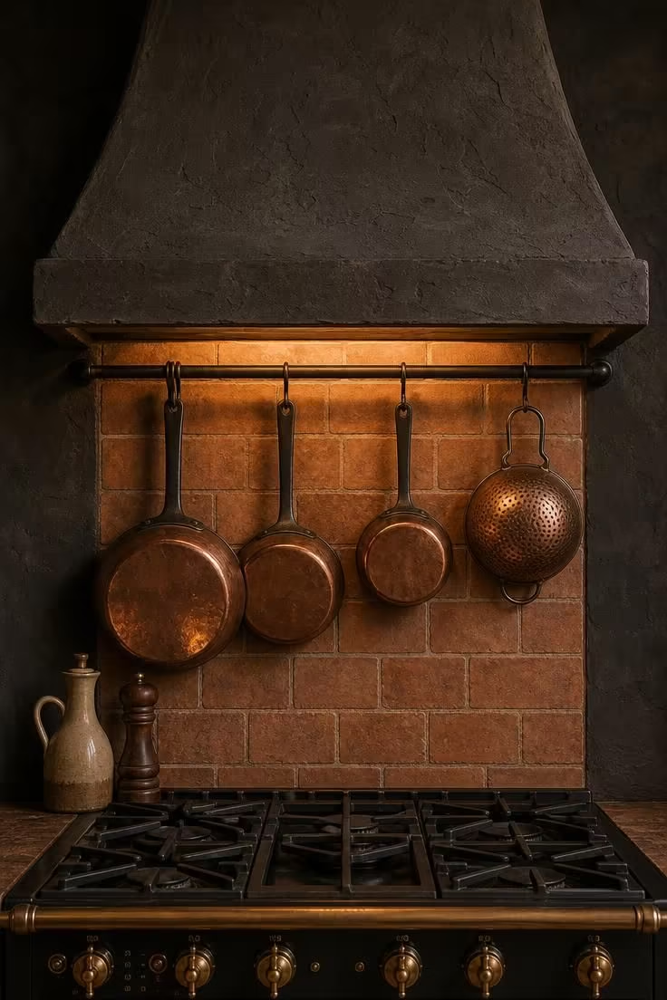
A pot rail turns dead wall space into active storage, and mounting it directly below the range hood puts your most-used pans within arm’s reach of the burners.
The matte black iron rail against dark charcoal plaster almost disappears into the wall, letting the copper-bottomed pans hanging from it become the visual accent rather than the hardware.
That restraint is a hallmark of moody kitchen design: the architecture does the heavy lifting so the objects can speak for themselves.
A hand-troweled plaster range hood adds a sculptural quality that a factory-made stainless hood cannot match, and the rough texture catches warm light from the cooktop in a way that flat surfaces miss entirely.
The terracotta backsplash tile in running bond pattern introduces a warmer clay tone to the dark wall, keeping the range area from reading as a single dark block.
A turned walnut pepper mill and a ceramic oil cruet on the range shelf are the only props needed, because the pans and the hood do most of the visual work.
This kind of setup rewards cooks who keep their pans seasoned and visible, since every piece hanging on the rail becomes part of the room’s character.
Style Blueprint:
- Matte black iron pot rail spanning the range hood width
- Dark plaster range hood with a hand-troweled texture
- Copper-bottomed pans hung from the rail by their handles
- Handmade terracotta tile backsplash in running bond
- Turned walnut or dark wood cooking accessories on the range shelf
Deep Espresso Tongue-and-Groove Paneling Behind a Copper Tap
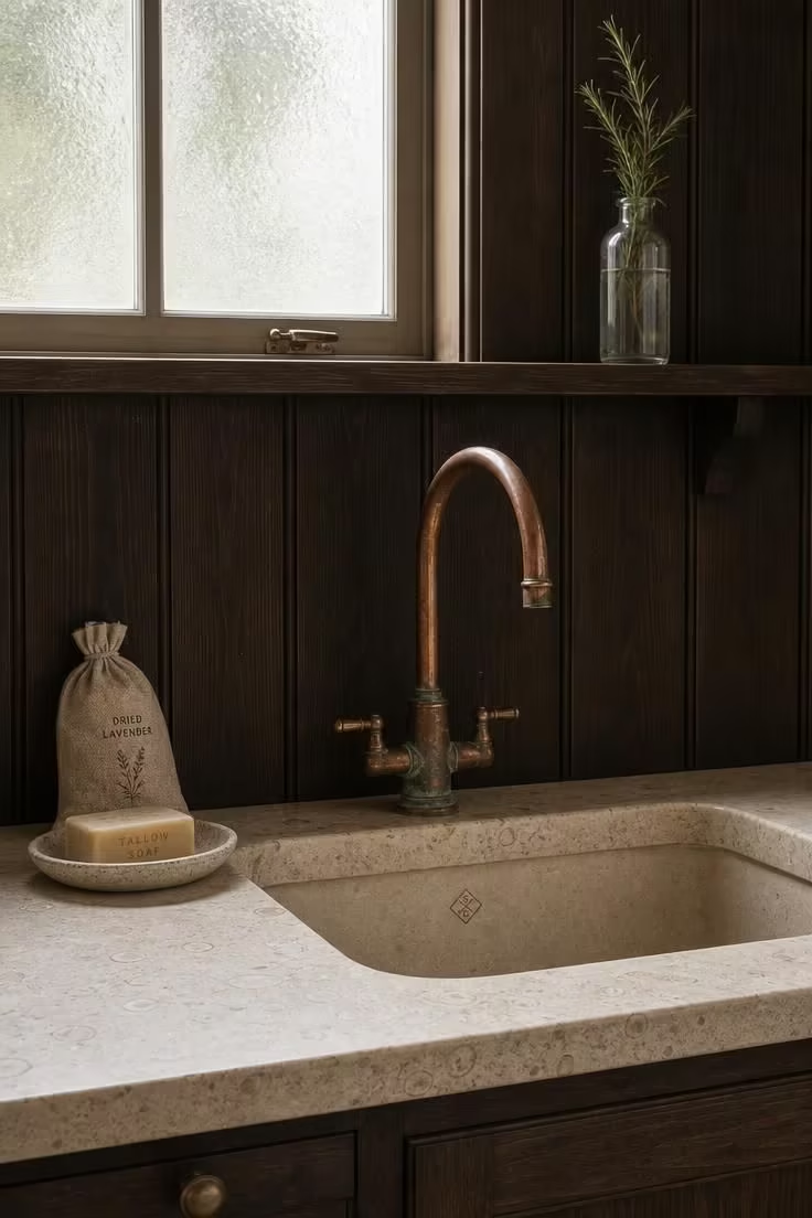
Tongue-and-groove paneling in a deep espresso stain gives the sink wall a warmth and grain richness that painted surfaces cannot replicate.
The vertical orientation of the boards draws the eye upward from counter to shelf rail, adding height to a section of the kitchen that usually gets treated as a flat backsplash.
Copper ages in a direction that most metals resist: toward green, toward patina, toward evidence of water and air contact over years.
That patina at the tap base is not a flaw to polish away but a feature that deepens the dark cottage kitchen palette by introducing a new color that the rest of the room does not contain.
The pale honed limestone countertop provides the necessary contrast, and the visible fossil marks in the stone add a layer of geological texture that manufactured surfaces lack.
A linen pouch of dried lavender and a handmade ceramic soap tray reinforce the sensory quality of this corner, where scent and touch matter as much as sight.
The shelf rail above the paneling holds just one thing: a sprig of rosemary in a clear glass bottle, which is enough to suggest an entire approach to kitchen styling.
That approach says less is more, but only when the “less” is chosen with care.
Rustic kitchen ideas like this succeed because every material carries its own history, from the fossil-marked limestone to the patina on the copper.
Style Blueprint:
- Deep espresso-stained vertical tongue-and-groove paneling
- Copper gooseneck tap with natural patina developing at the base
- Pale honed limestone countertop with fossil texture
- Narrow wooden shelf rail mounted above the paneling
- Handmade ceramic soap tray and linen lavender pouch
Dark Cottage Kitchen Styling With Aged Zinc Accents
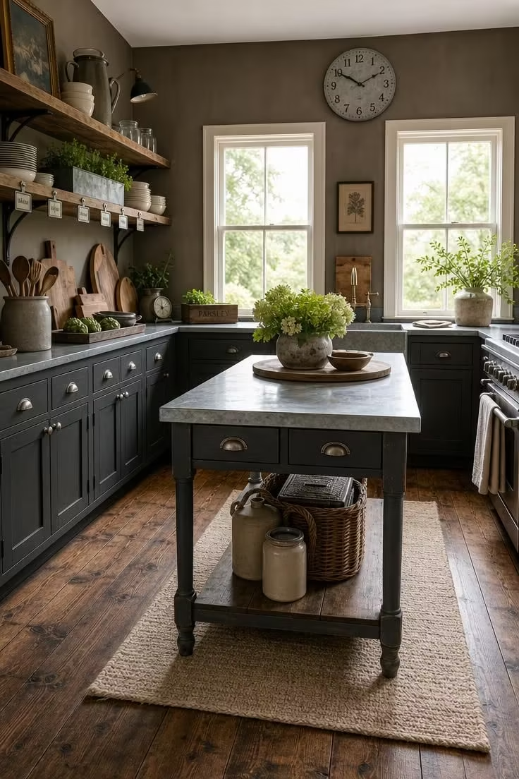
Zinc is one of the few metals that reads as both industrial and handmade at the same time, which is why it fits so well in a dark cottage kitchen where those two qualities already coexist.
Aged zinc bin pulls on charcoal cabinets add a cool metallic note that keeps the wood tones from becoming too heavy or too predictable.
A zinc-topped prep table in the center of the room serves as both a work surface and a visual anchor, its dull grey sheen picking up midday light without reflecting it sharply.
Small zinc label holders clipped to the open shelf edges are the kind of organizational detail that belongs in a working kitchen rather than a showroom.
The zinc herb planter on the shelf adds a living element inside a metal container, which is a pairing that feels natural rather than designed.
A weathered zinc clock face above the windows ties the metal thread to the upper part of the room, keeping your eye moving vertically through the space in a way that a single material on one plane cannot.
Style Blueprint:
- Aged zinc bin pulls on dark charcoal painted cabinetry
- Zinc-topped freestanding prep table as a kitchen island
- Small zinc label holders and herb planter on open shelves
- Wide-plank pine floor stained in dark walnut
- Weathered zinc decorative accent, like a clock face, mounted high
A Cast-Iron Range in Matte Black Set Into a Tiled Alcove
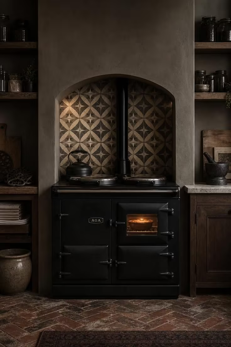
A cast-iron range set into an alcove creates a hearth-like focal point that no flat wall installation can match.
The alcove frames the range on three sides, concentrating your attention on the cooker the way a fireplace surround concentrates attention on the flame.
Encaustic cement tiles in charcoal and cream line the alcove interior, adding a geometric pattern that contrasts with the organic textures everywhere else in the room.
The rough-plastered arch above softens the transition from alcove to wall, and its deep warm grey pulls the eye up and over the range rather than stopping at the tile edge.
A faint warm glow through the oven’s glass door is enough light to reveal the tile pattern behind it, creating a layered depth that overhead lighting alone cannot produce.
Open shelves flanking the alcove hold dark glass storage jars that echo the range’s matte black finish, while a stack of linen napkins and a hand-forged iron trivet add texture variety.
The reclaimed brick floor in herringbone adds one more layer of pattern at the ground plane, connecting the kitchen’s material story to something older and more permanent than any cabinet or countertop.
A heavy stoneware mortar and pestle on the adjacent counter is the kind of tool that earns its counter space by being used daily, not weekly.
Style Blueprint:
- Cast-iron range cooker in matte black finish
- Handmade encaustic cement tiles in charcoal and cream for the alcove
- Rough-plastered arch above the range in deep warm grey
- Dark glass storage jars and a hand-forged iron trivet on flanking shelves
- Reclaimed brick flooring in a herringbone pattern
Design Pro-Tip: Balance dark surfaces with at least one reflective or translucent element per sightline, whether that is polished stone, glass-front cabinet doors, or metallic hardware. The reflection keeps light bouncing through the room and prevents dark finishes from absorbing all the energy in the space.
Dark Cottage Kitchen Corners Lit by Hand-Blown Glass Sconces
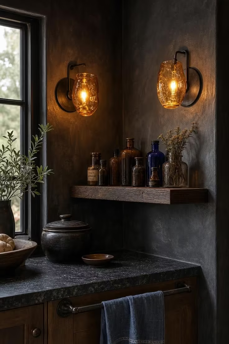
Corners are where dark kitchens either fail or come to life, because a dark wall meeting another dark wall at ninety degrees can read as a shadow rather than a design choice.
Hand-blown glass sconces solve that problem by placing a warm light source exactly where the room would otherwise go dim.
The amber tint of the glass shades shifts the light color toward a tone that flatters dark plaster rather than fighting it, and the irregular form of each shade confirms that these are handmade objects, not factory reproductions.
Simple iron backplates keep the sconce hardware from competing with the glass, which is where the real visual interest lives.
A narrow floating shelf between the sconces creates a small display zone, and the vintage apothecary bottles in amber and cobalt glass pick up and scatter the sconce light in colored reflections across the dark plaster.
The honed dark granite countertop below absorbs most of the downward light, which keeps the corner feeling intimate rather than exposed.
This is how you light a dark cottage kitchen without resorting to overhead recessed cans that would flatten the atmosphere you worked so hard to build.
Style Blueprint:
- Hand-blown amber-tinted glass wall sconces with iron backplates
- Deep charcoal lime-wash plaster walls with visible brush texture
- Narrow floating shelf in dark-stained oak between the sconces
- Vintage apothecary bottles in amber and cobalt glass
- Honed dark granite countertop and iron towel bar below
A Reclaimed Elm Island With Wrought-Iron Towel Bars
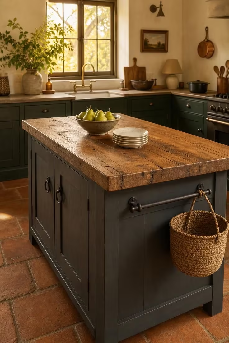
A reclaimed elm top carries the kind of surface character that new wood cannot fake: knots, grain shifts, and filled splits that tell you this material had a previous life.
That history matters in a dark cottage kitchen because the overall palette relies on patina and age, and a brand-new butcher block countertop surface would break the spell.
Wrought-iron towel bars on each end of the island serve a purely functional purpose, but their hand-forged profile adds one more handmade texture to a room that collects them.
The island base painted in deep slate grey bridges the darker cabinetry and the lighter upper walls, sitting in the middle of the room’s tonal range.
Cast-iron ring pulls on the base doors match the towel bar material, keeping the metal story consistent without being matchy.
A bowl of green pears and a stack of speckled cream plates are the only surface props, because the elm top itself is interesting enough to carry the scene with very little on it.
Style Blueprint:
- Reclaimed elm plank top with visible knots and filled splits
- Wrought-iron towel bars mounted on each island end
- Deep slate grey painted island base with flat-panel doors
- Cast-iron ring pulls matching the towel bar finish
- Woven market basket hung from a peg on the end panel
Conclusion
A dark cottage kitchen asks you to trust depth over brightness, patina over perfection, and texture over polish.
Every idea in this collection shares the same core principle: natural materials in deep tones, finished by hand or aged by time, arranged in a way that invites daily use rather than careful distance.
Start with one strong move, whether that is a charcoal cabinet run, a soapstone counter, or a single freestanding hutch, and let the rest of the room gather around it.
The most compelling dark cottage kitchens are never finished in a single weekend, and that slow, collected quality is exactly what makes them worth building.