This post may contain affiliate links. If you make a purchase through these links, we may earn a commission at no additional cost to you.
Dark cabinets arrive in most conversations already wearing the word “trend.”
The assumption is that everyone wants them, that they are the default of the moment, that a kitchen with dark cabinets is what the market has decided.
The remodeling data says something narrower and more interesting.
What follows is an attempt to separate the trend language from the measurement, and then to treat dark cabinetry as what it actually is: a deliberate, high-contrast composition with real tradeoffs.
A Niche Choice Wearing Trend Language
In the 2026 U.S. Houzz Kitchen Trends Study, dark wood accounted for 3% of primary cabinet color choices and black for roughly 2%, while white sat at 28% and wood overall at 29%.
Read that sentence twice, because the gap inside it is the whole story.
A trend report can describe a direction as still relevant while its own cited figures show a small share of actual remodels, and both statements can be true at once.
Only one of them, however, is a measurement.
The 2025 Houzz study, a year earlier, put dark wood at 3%, black at 2%, and brown at 1%, with wood overall at 23%, which suggests a stable minority rather than a surge.
A different question produces a different number: among homeowners in the 2023 Houzz study who chose contrasting island cabinets, 11% picked dark wood, up from 6% the prior year, and 12% picked black.
That island figure is worth holding onto, since it shows dark finishes performing well when the question is contrast rather than the whole room.
The myth is not that dark kitchen cabinets look good.
The myth is that they are the mainstream default, and the evidence points somewhere else entirely, toward a minority preference with a visible and consistent presence.
Design Pro-Tip: Before deciding dark cabinets are everywhere, count what percentage of kitchens you actually see versus what you see repeated in saved images, since the two pools are not the same.
What the Numbers Actually Say
The 2026 U.S. Houzz Kitchen Trends Study surveyed 1,780 homeowners and placed dark wood at 3% of primary cabinet color, black near 2%, white at 28%, and wood overall at 29%.
The 2025 Houzz study reported the same 3% for dark wood, 2% for black, and 1% for brown, with wood overall at 23%.
The contrasting-island data comes from a separate question in the 2023 U.S. Houzz Kitchen Trends Study, where 11% of those choosing contrasting island cabinets picked dark wood and 12% picked black.
Across the broader kitchen field, the NKBA 2026 Kitchen Trends Report describes neutrals as dominant, green and blue as strong directions, wood-grain cabinetry as growing, and white oak as the leading species.
Dark wood and black are two different decisions with two different shares: the first carries a natural-material reading, while the second is a painted-color choice.
Within the wider field of dark cabinet colors, these shares stay small and steady, which suggests a loyal niche rather than a passing spike.
Relevance is not the same as share.
A small share can still be a durable, loyal niche, and the phrase “still relevant” describes durability rather than volume.
A mass-market color signal points in a related direction, with TechRadar reporting an IKEA autumn direction toward anthracite and duck-egg blue, which is a retail color cue rather than a remodeling statistic.
What cannot be concluded from any of this is a total installed count, because these surveys measure self-reported primary cabinet color among respondents rather than every kitchen in the country.
The practical consequence is straightforward: choosing dark cabinets means choosing a minority position, which is entirely fine and which changes how the rest of the room gets planned.
Why Dark Cabinetry Reads the Way It Does
Dark surfaces absorb more light than pale ones, so in the same room they sit visually heavier.
That weight becomes an anchor when it is set against lighter uppers, pale stone, or natural flooring, and the contrast is what creates the composition.
A continuous dark run can also read as a single solid mass rather than a row of separate boxes, which changes how the cabinetry relates to the walls behind it.
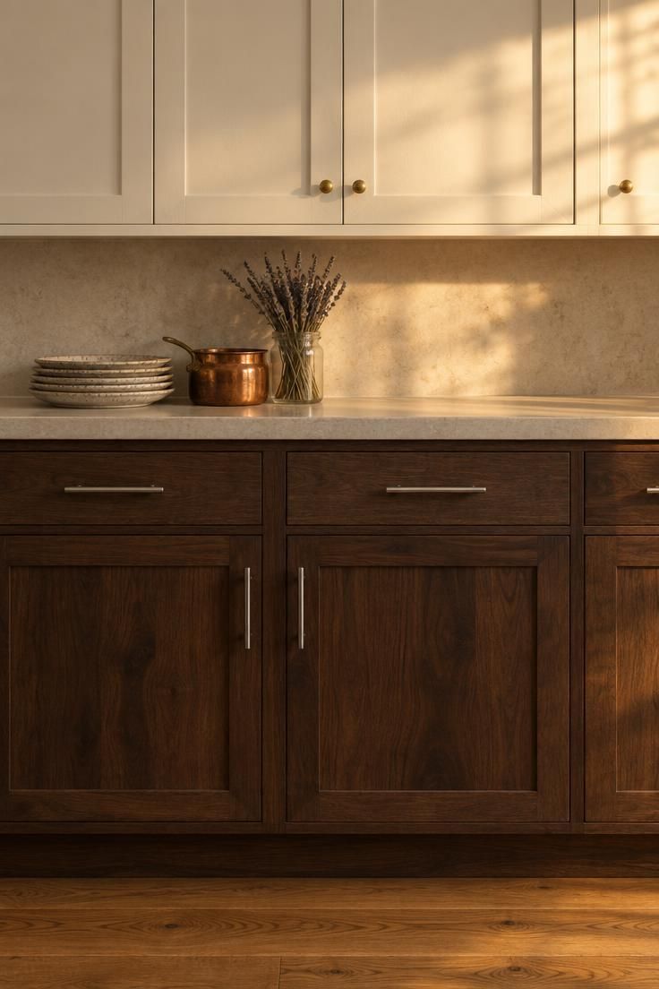
Warmth plays a role too, since dark wood cabinets often carry warm undertones that behave differently against a cool floor than against a warm one.
In a room with limited daylight, the same palette can read as a closed, compressed box rather than a grounded one.
Heavier is not the same as smaller, because visual weight comes from contrast and light absorption rather than from the physical size of the room.
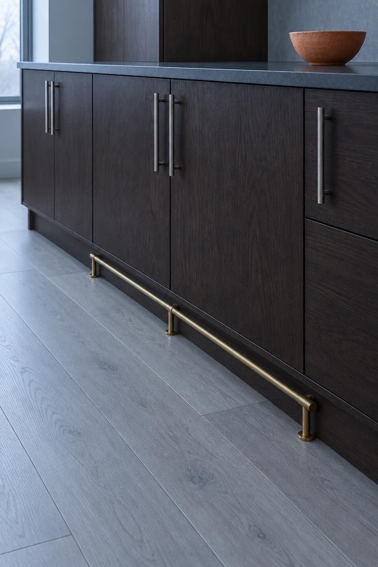
Hardware alters the reading as well: bright metal against dark fronts creates punctuation, while matched dark hardware lets the mass stay uninterrupted.
The same dark run can look intentional or flat depending almost entirely on what surrounds it, which makes the surrounding surfaces the real decision.
Design Pro-Tip: Photograph your sample door at three times of day in the actual room, since dark finishes shift more visibly with changing light than pale ones and the showroom board will not tell you that.
Where Dark Cabinets Appear Most Often
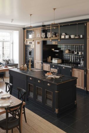
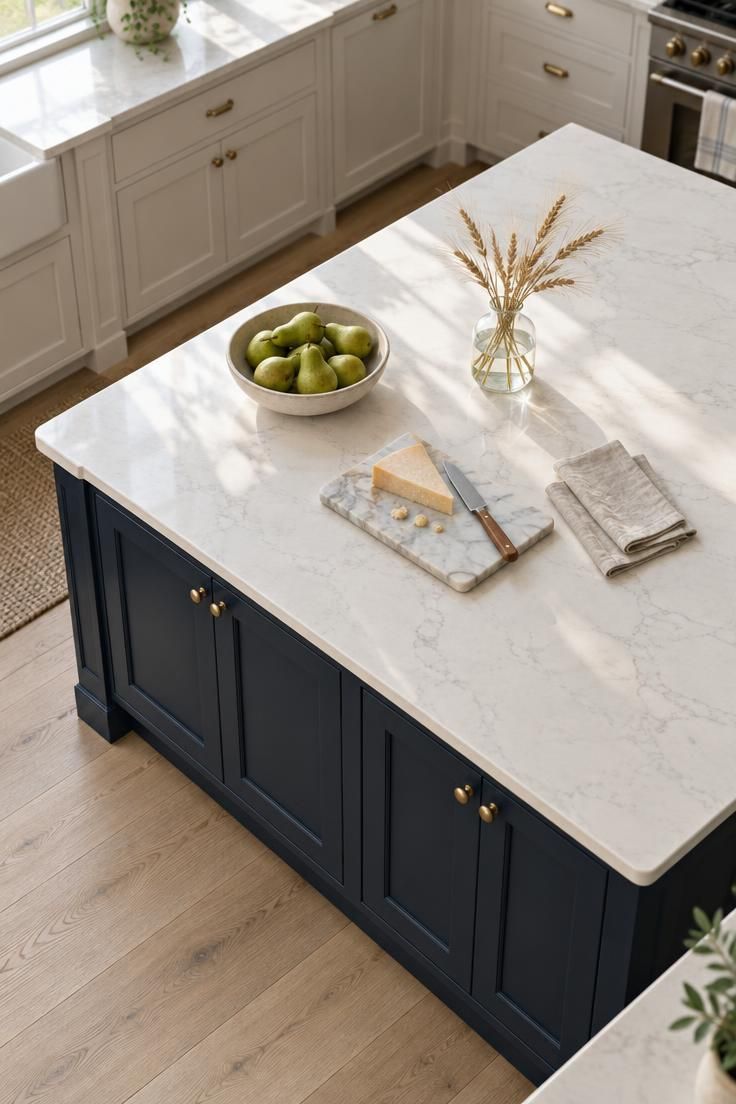
Islands are where dark finishes show up most often, and the contrasting-island data from the 2023 Houzz study supports that pattern: dark wood and black selections reach meaningful shares when the question is about contrast rather than the whole kitchen.
Lower-only application follows close behind, with dark bases under lighter uppers, a long-running composition that places the weight below eye level.
Pantries and single accent sections offer another path, letting one dark tall cabinet or pantry wall act as a focal moment instead of a full-kitchen commitment.
Full-kitchen application is the least common configuration in the data and the most visually committed.
A dark island in a light kitchen and a dark kitchen with a light island use the same palette in opposite visual hierarchies.
Placement decisions follow how much contrast a room can carry, which is a judgment rather than a fixed proportion.
A charcoal kitchen cabinets scheme, deep navy, or near-black paint each sits differently in that hierarchy, so the placement question and the color question are best answered together rather than in sequence.
Colors and Finishes in Use Today
Painted dark colors cover a wide field: charcoal, ink, and near-black at one end, navy and deep blue in the middle, and forest, olive, and deep green at the other.
The NKBA 2026 report places green and blue among strong directions while neutrals remain dominant, which means dark colors sit inside a neutral-led field rather than replacing it.
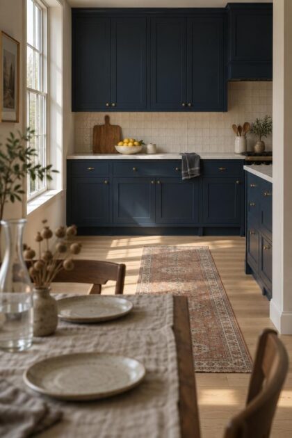
Navy kitchen cabinets occupy the middle of that painted range, sitting between true black and the brighter blues that read as accent colors rather than as a full run.
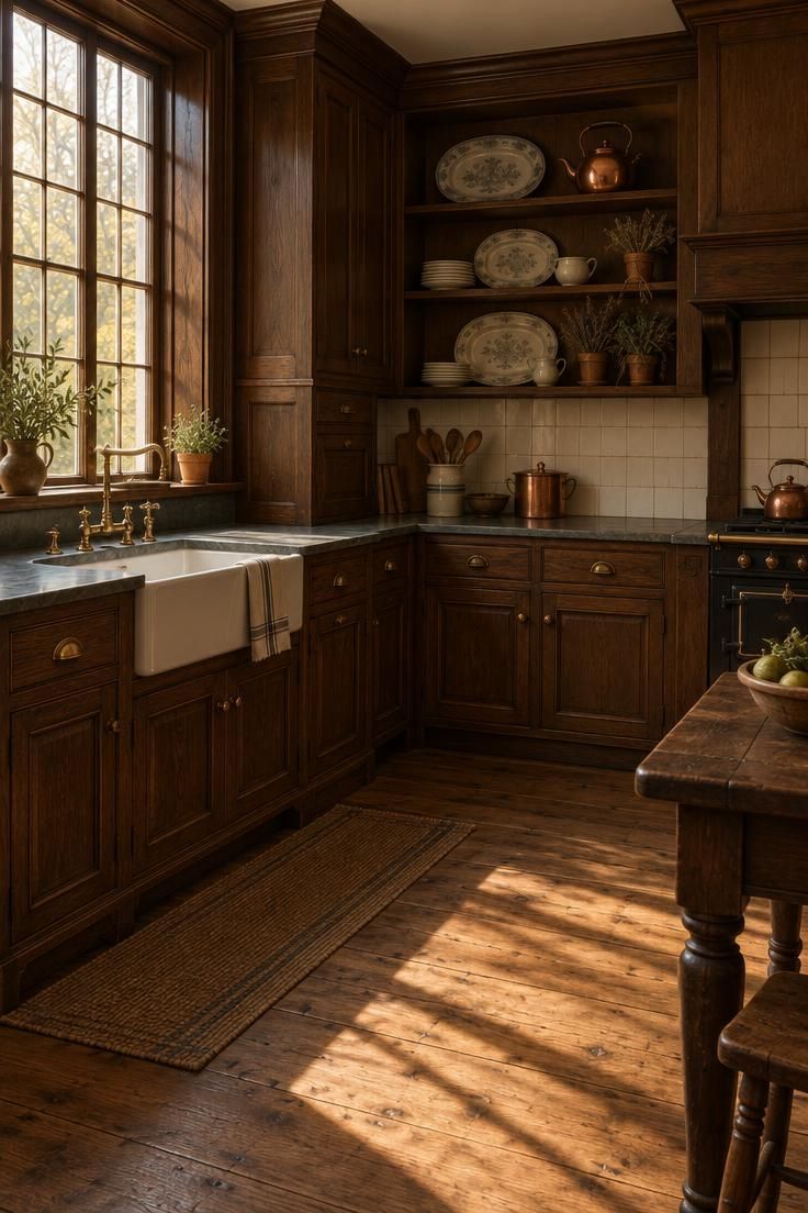
On the wood side, the vocabulary runs from espresso and dark-stained maple, familiar from the 1990s revival period, through walnut to darker oak finishes.
Wood-grain cabinetry is growing according to the same NKBA report, with white oak leading among species, and that matters because a visible grain changes how a dark cabinet reads compared with flat paint.
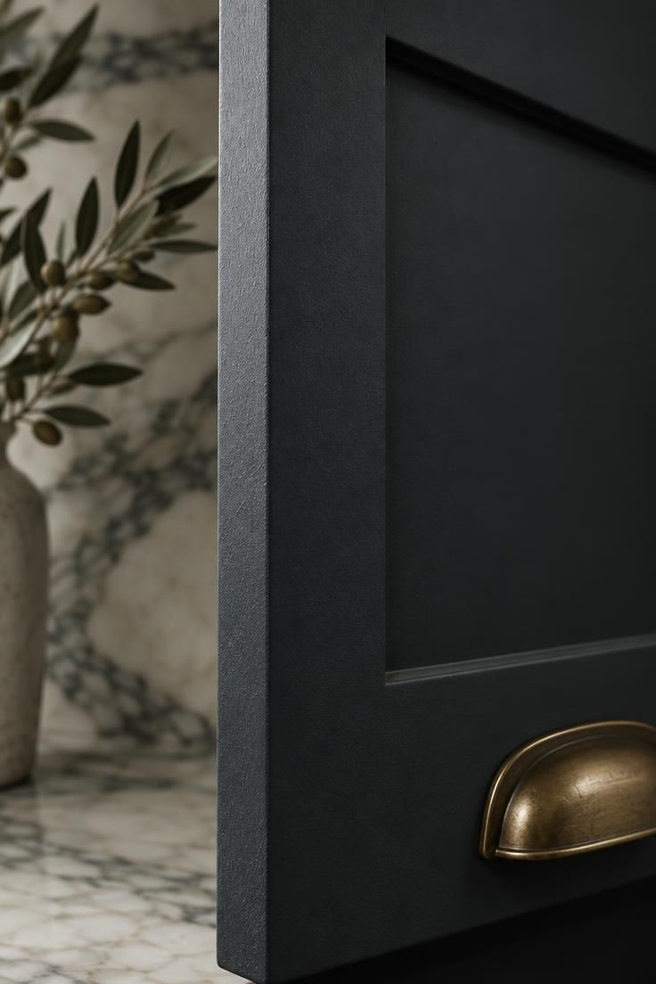
Sheen behaves as a handling characteristic: glossier painted finishes are widely described as showing fingerprints and everyday smudges more readily than matte or textured wood-grain finishes.
Undertone is the more useful selection criterion than color name, since a warm dark against a cool gray floor reads differently from a cool dark against a warm oak floor.
Flat black applied uniformly across every surface removes the tonal variation that keeps a dark palette legible.
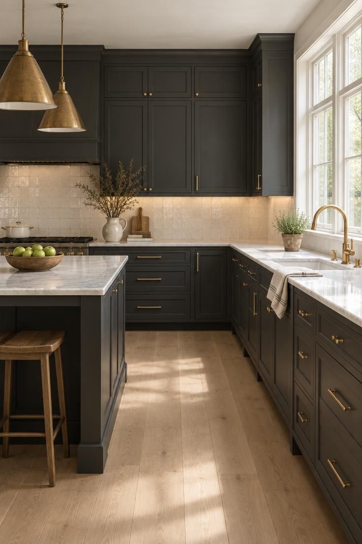
The two-tone path, dark lowers with lighter uppers or a dark island against a light perimeter, gives a middle option between a single dark run and a full dark envelope.
Choose the dark by undertone and sheen first and by name last, because the label on the sample chip carries the least useful information you have.
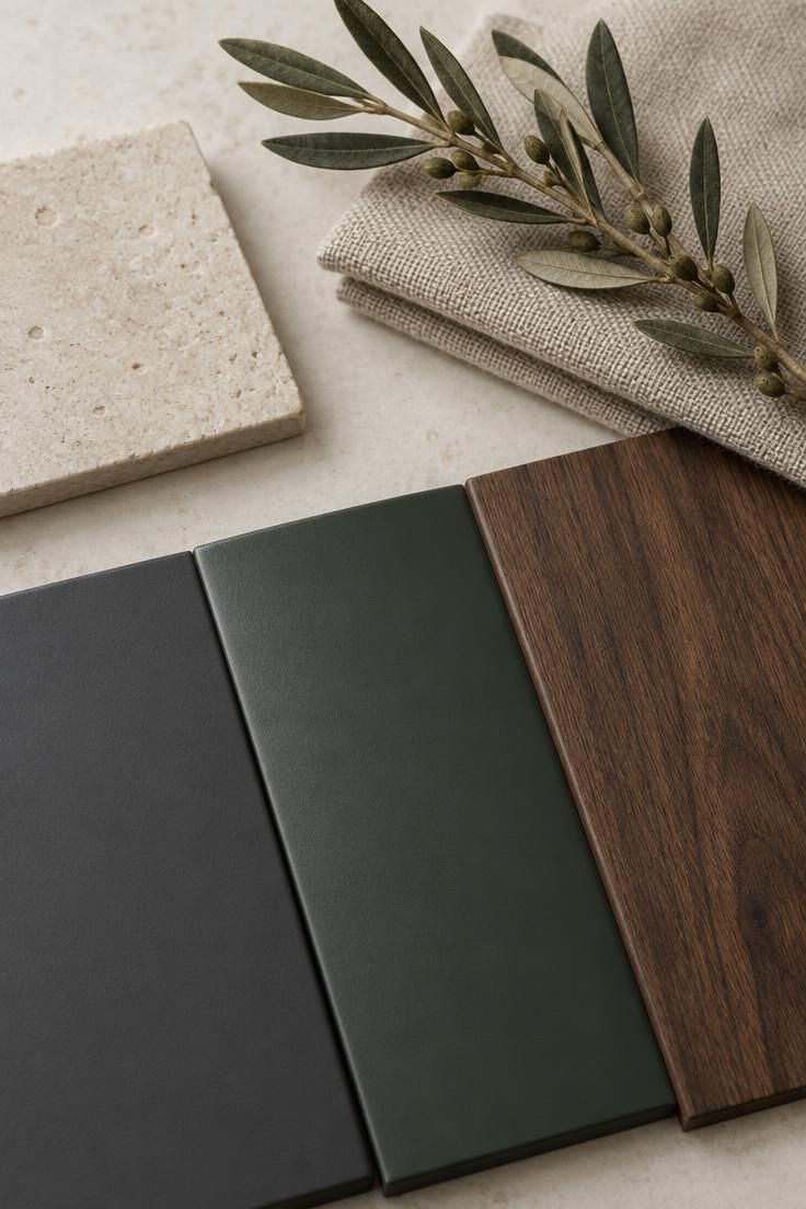
Design Pro-Tip: Compare your dark sample against the actual countertop, backsplash, and floor samples at the same time, because an undertone that looks neutral alone can turn visibly warm or cool beside a fixed surface.
Pairing Surfaces, Materials, and Hardware
Dark cabinetry usually needs a lighter or warmer partner surface to keep the composition readable.
Pale stone, honed light surfaces, and warmer-toned stone each produce a different relationship with a dark front, and the difference shows up most clearly where the cabinet meets the counter.
Backsplash choices repeat the same logic: pale tile and warm-toned tile both create contrast, but they read differently against an identical cabinet color.
Flooring sets the temperature of the whole room, and natural wood flooring tends to warm a dark run in a way that cool gray flooring does not.
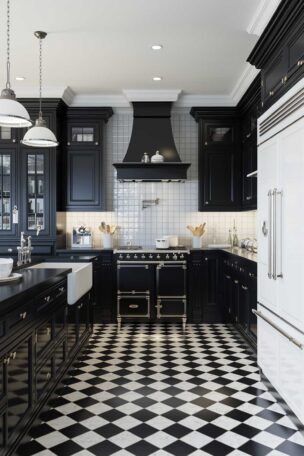
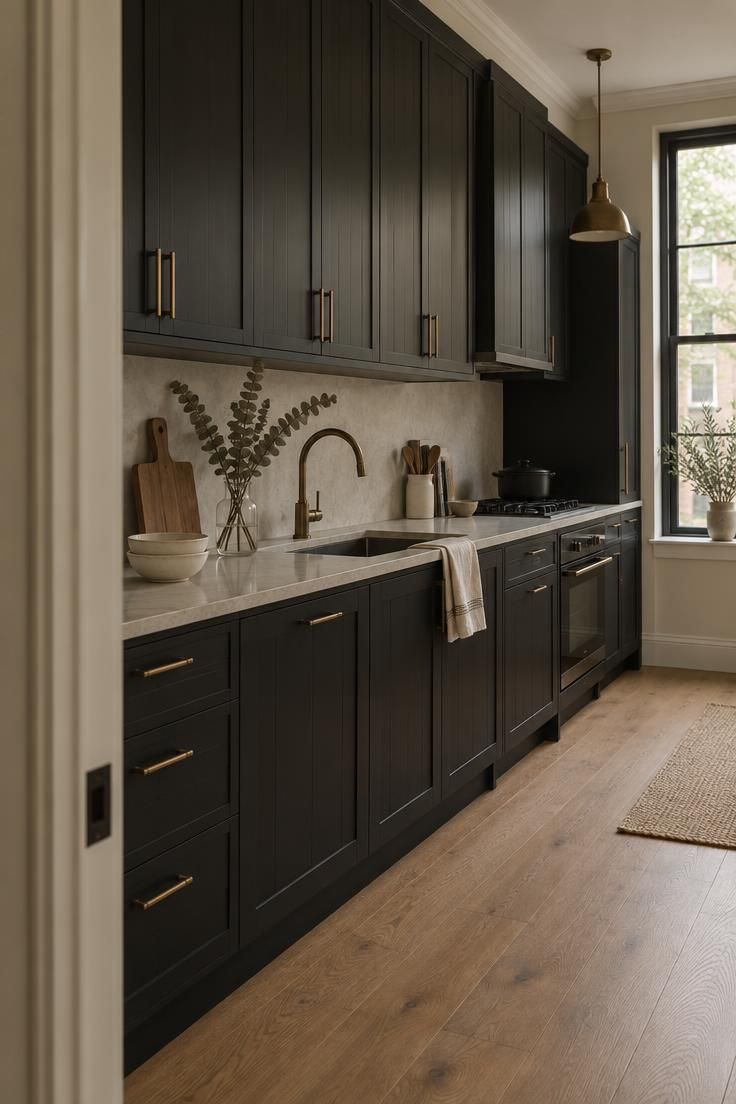
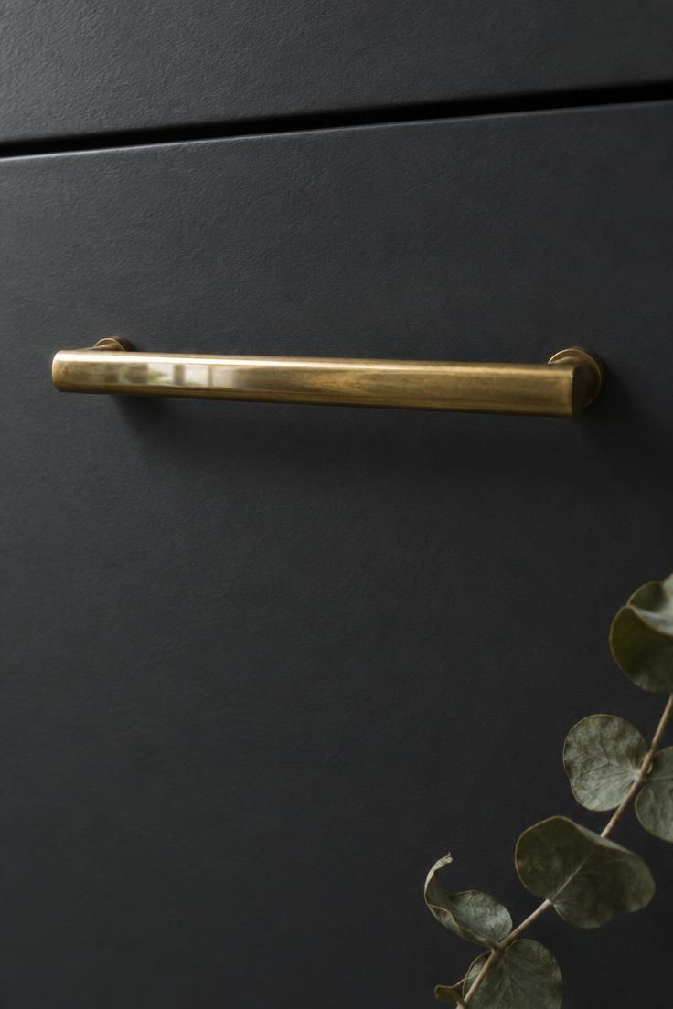
Hardware works as punctuation, with bright metal, aged brass, and matte dark finishes each changing how much the cabinet mass reads as one continuous form.
Countertop and backsplash act as a pair, and two competing focal surfaces beside dark cabinetry tend to spread attention rather than anchor it.
Think of two-tone kitchen cabinets as the same contrast principle applied inside the cabinetry itself, where a lighter upper run or a pale perimeter can give the dark fronts something to sit against.
Pick the pairing that gives you one dominant contrast and at most one secondary contrast, then stop adding surfaces.
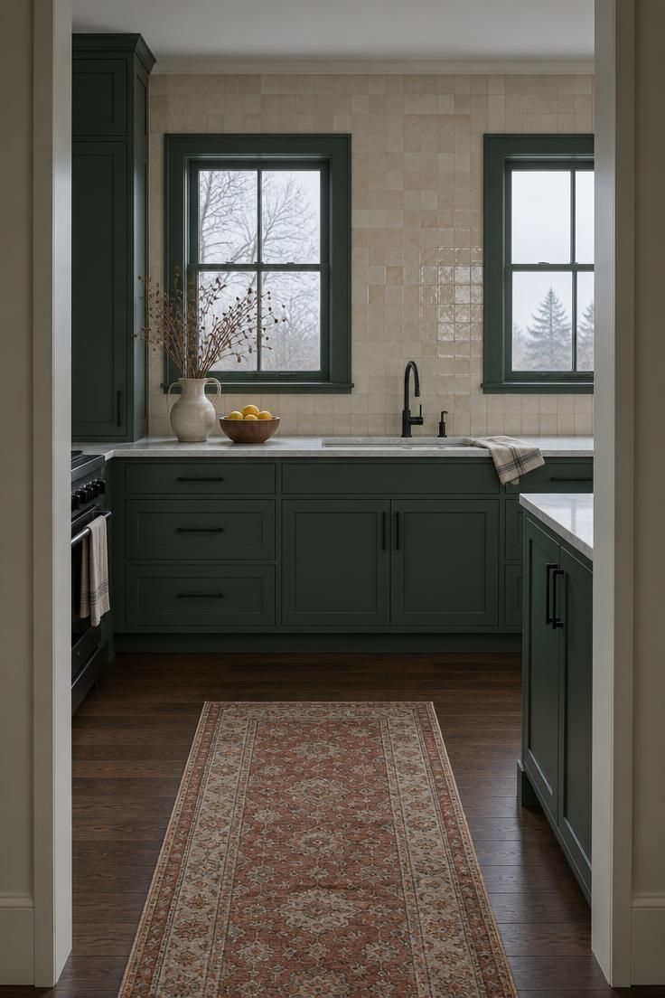
Does a Kitchen With Dark Cabinets Need Different Lighting?
Lighting decisions in a dark-cabinet kitchen are largely about making surfaces legible and giving the eye relief, not about correcting the color itself.
The NKBA 2026 report lists under-cabinet lighting and interior cabinet lighting among stated homeowner priorities, which places both layers squarely inside current kitchen planning.
Under-cabinet lighting puts illumination on the counter rather than on the cabinet front, which changes how the dark run reads without altering the cabinetry at all.
Interior cabinet lighting breaks up a solid dark mass when doors are open or when the fronts are glass.
Pendant and decorative fixtures add a second layer that establishes a focal point against the dark field, a role that grows more useful over a dark kitchen island than over a pale perimeter.
Daylight remains an uncontrolled variable, and the same dark front reads differently in a north-facing room than in one with direct afternoon sun.
Layered lighting adds fixtures, switching decisions, and later maintenance, so it is a design commitment rather than a free upgrade.
Plan the layers you will actually use daily, and leave structural and electrical work to manufacturer and code guidance outside this article’s scope.
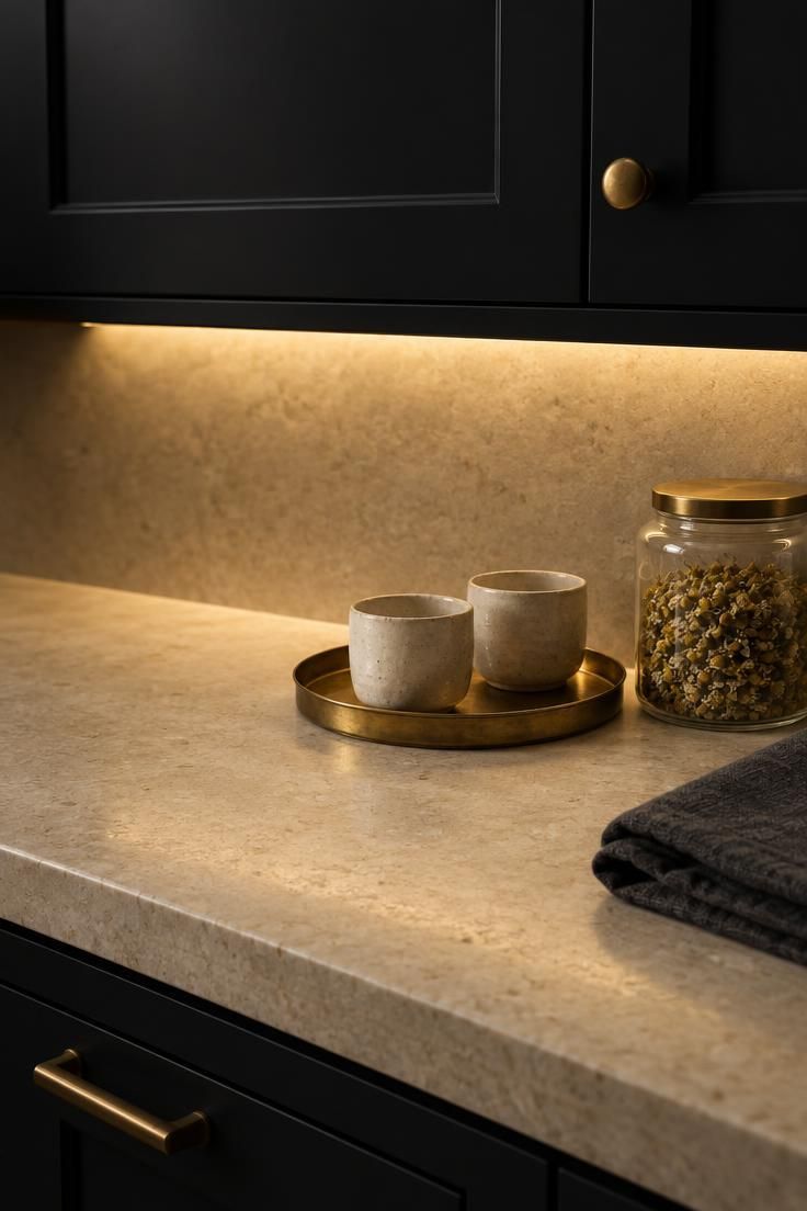
Design Pro-Tip: Test whether your planned lighting layers actually reach the counter surface by holding a plain white sheet of paper where the counter will be, since a paper that reads gray at that spot suggests the surface will read gray too.
The Lineage Behind the Look
Dark-stained woodwork long predates built-in kitchen cabinetry, arriving from furniture-making traditions rather than from kitchen design.
Victorian and Edwardian interiors used dark woodwork as a recurring convention, and the association between dark joinery and formality carried forward from there.
Arts and Crafts oak and English country painted cabinetry represent related but distinct traditions, each with its own approach to dark surfaces.
Dark wood cabinets of the espresso-stained maple period in the 1990s established much of the dark-kitchen vocabulary that current buyers return to, and its influence still shows up in wood-tone selections.
The current revival is one in a series rather than a novel moment, which is part of why the claim that everyone wants this does not hold up against the numbers.
That history also explains why surface finish matters so much to the look: the matte vs gloss kitchen cabinets question sits at the center of how dark fronts read, since period woodwork was almost always finished with a low-luster surface rather than a high shine.
Tradeoffs and Limitations to Plan For
Visual weight in a low-light or compact room comes down to preference: a dark run can compress a room that already lacks contrast, or anchor one that has light to spare.
The commitment level deserves honest accounting, since a dark palette is harder to walk back than a pale one and changing it means repainting or refacing every front in the run.
Glossy painted dark fronts are widely described as showing everyday marks more than matte or wood-grain finishes, which affects how the surfaces age in daily use.
An all-dark palette without a lighter counter, floor, or hardware loses the relief that keeps the cabinetry legible.
That gap matters most in a small kitchen with dark cabinets, where the surrounding surfaces carry more of the composition than they would in a larger room.
Cool gray flooring against warm dark cabinets is a recurring mismatch that removes the warmth the composition depends on.
For anyone weighing a dark cabinet kitchen design, the practical lesson is that the surrounding surfaces do more work than the cabinet color itself.
Dark cabinets ask more of what sits beside them than light cabinets do, and that demand is both the reason they look intentional and the reason they can look unresolved.
Recurring Composition Mistakes
Dark fronts, dark counters, dark backsplash, and dark floor together leave no tonal step for the eye to read, which flattens the whole room.
Flat black applied uniformly across every element removes the variation that distinguishes a considered palette from a single flat color.
Ignored undertones produce the most frequent mismatch, whether warm dark cabinets sit against cool fixed surfaces or the reverse.
Matched dark pulls can leave a large dark run without a punctuation point, which makes the cabinetry read as one undifferentiated plane.
Lighting that only illuminates the ceiling leaves the cabinet fronts and counters unlit, and the dark run becomes unreadable at the very surfaces people use.
The opposite failure is just as common: too many competing focal surfaces beside the dark run, which spreads attention in every direction.
In a small kitchen dark cabinets can be the right call, but the same missteps read with less forgiveness because there is less room to recover the composition.
Can you identify one dominant contrast and one secondary contrast in the room?
If not, the composition is unresolved regardless of the cabinet color.
Design Pro-Tip: Convert a photo of your planned palette to grayscale before committing, since an image that reads as one gray value suggests a contrast problem rather than a color problem.
Making the Decision: Practical Criteria
A kitchen with dark cabinets is a deliberate, minority selection in current remodeling data rather than a mainstream default, and that changes how you plan it.
Start by deciding whether the dark is the room’s anchor or its full envelope, since those are two different projects with two different plans for the surrounding surfaces.
Then fix the undertone relationship between cabinetry, counter, backsplash, and flooring before you choose a color name.
Choose sheen by how much surface variation you want and how much everyday marking you are willing to live with.
Plan the lighting layers you will use, and keep structural, electrical, and installation work with manufacturer and code guidance outside this scope.
Accept the commitment level, because dark cabinets are less forgiving to change than pale ones.
Build in one contrast and one secondary contrast, then stop adding surfaces that compete with the cabinetry.
The myth is that dark cabinets are what everyone is choosing.
The reality is that they are what some people choose deliberately, and the ones that look resolved are the ones where the surrounding surfaces were planned around the dark rather than in spite of it.