This post may contain affiliate links. If you make a booking or purchase through these links, we may earn a commission at no additional cost to you.
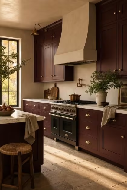
Most people hear “kitchen with red accents” and immediately picture a fire-engine cabinet competing with every surface in the room.
The gap between red that looks like a novelty and red that looks like it belongs in an architect’s portfolio comes down to one decision, and it has nothing to do with how much red you use.
It has everything to do with which red you choose.
Why Deeper Reds Read as Luxury While Brighter Reds Read as Novelty
Bright primary red activates urgency.
It is the color of stop signs, sale tags, and fast food logos, and it brings that same restless energy into a room where people are supposed to linger over morning coffee.
Deep red works the opposite way.
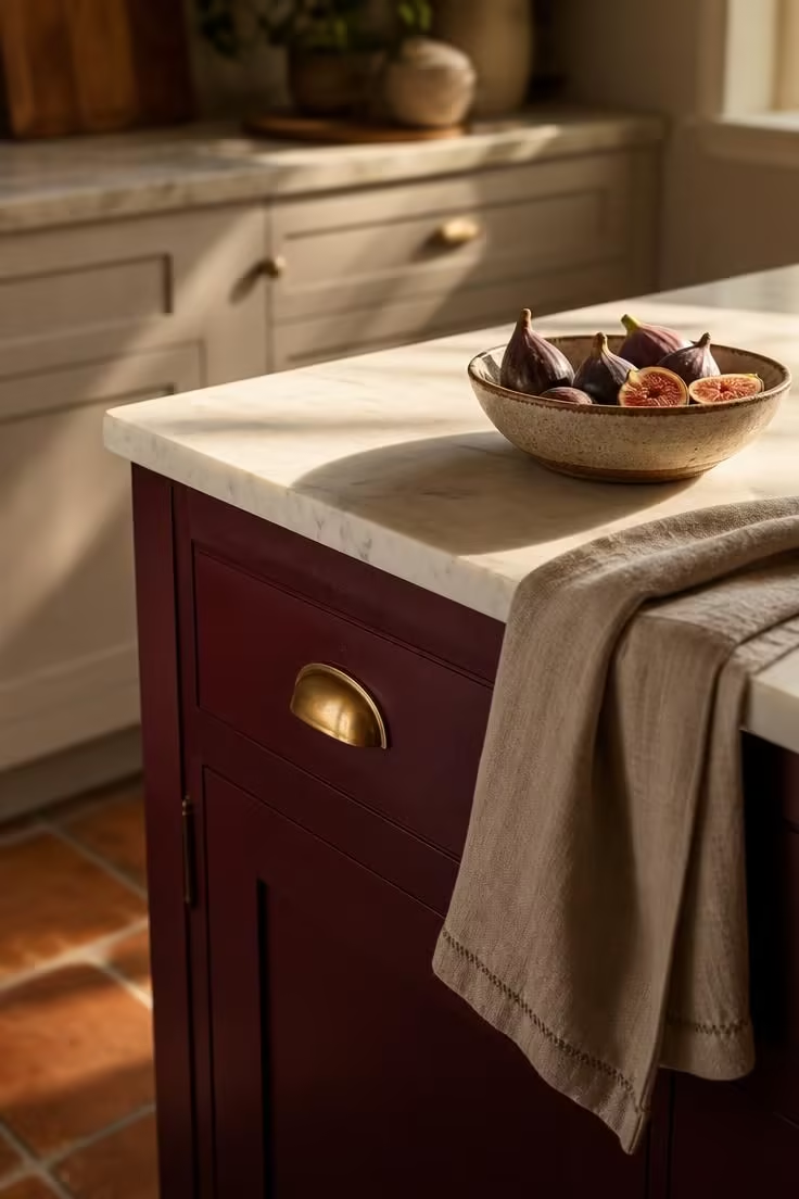
Merlot, burgundy, oxblood, and wine-toned reds sit lower on the visual intensity scale, and color psychology research consistently links these tones to feelings of warmth, comfort, and quiet confidence rather than alarm.
The distinction matters because high-end restaurants and luxury hotels have leaned on deep reds for decades to signal richness without shouting about it.
A merlot kitchen island grounded by honed stone reads like something a designer chose on purpose, not something a homeowner picked from a paint chip on impulse.
The shift from bright to deep changes how red interacts with light, too: deeper pigments absorb more ambient glow and create a velvety surface quality that makes even standard cabinetry look more expensive than it is.
The Undertone Match That Makes a Kitchen With Red Accents Look Intentional
Choosing the right depth of red is only half the equation.
The undertone beneath that depth determines whether your red looks planned or awkward, and this is where most kitchen with red accents projects quietly fall apart.
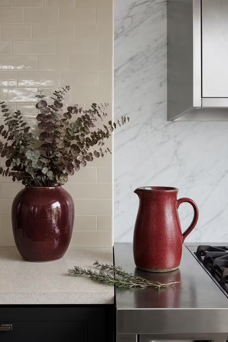
Warm reds carry orange or brown beneath the surface, and they pair naturally with cream, off-white, beige stone, and honeyed wood tones, making them the easier choice for kitchens that already lean cozy or traditional.
Cool reds lean blue or magenta underneath, and they need crisp white, stainless steel, or dove-toned stone to look sharp rather than muddy.
The most common mistake is pairing a warm burgundy kitchen color with a stark blue-white countertop, which creates a visual tension that makes the red look like a mismatch rather than a choice.
Existing kitchen lighting shifts this equation further: warm-toned bulbs push cool reds toward purple, and daylight-balanced fixtures can make warm reds look flat and dull by midday.
Where Deep Red Works Hardest in a Kitchen Layout
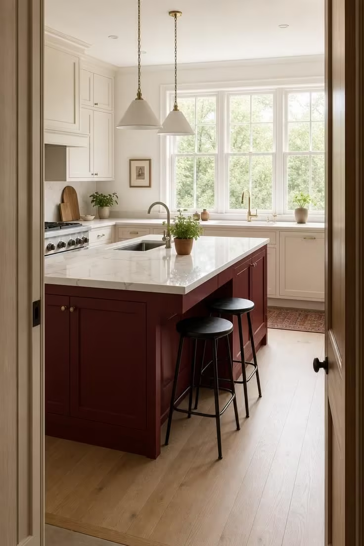
Full red cabinetry can work in larger kitchens where the wall space, countertop area, and flooring provide enough neutral ground to absorb the color’s weight.
In smaller or medium-sized rooms, painting every cabinet in deep red overwhelms the proportions and makes the space feel closed in rather than rich.
The island-only approach solves this by concentrating red in one grounding piece that anchors the room without asking every surface to compete.
A red kitchen backsplash offers another targeted option: glazed subway tile in a wine tone or handmade zellige in a merlot shade gives the wall between countertop and upper cabinets a focal depth that reads as a deliberate design move.
A red accent wall kitchen works best behind open shelving or behind a range alcove, where the color frames functional objects and creates a gallery-like backdrop without painting the entire room.
Lower cabinets in deep red paired with neutral upper cabinets split the visual weight at counter height, making the room feel grounded at the base and open at the top.
For a lighter commitment, deep red bar stools, a vintage range in a burgundy finish, or linen curtains in a muted wine tone introduce the color through pieces that can be swapped later without repainting.
The 60-30-10 balance applies directly here: 60 percent of the room should stay neutral (walls, most cabinetry, flooring), 30 percent carries the red, and 10 percent adds metallic or contrast accents.
Countertop and Stone Choices That Anchor Red Without Competing
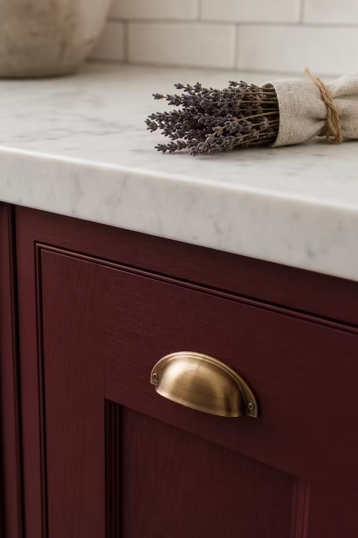
White marble against deep red cabinetry is the pairing that interior magazines keep returning to, and it is the reason a red and white kitchen reads as clean and intentional: the cool brightness of marble provides maximum contrast without introducing a second color that fights for attention.
Honed finishes on marble or quartz reduce glare and give the countertop a softer, more matte quality that sits better alongside the depth of merlot or burgundy kitchen color than a polished mirror finish.
Warm-toned alternatives like limestone or a quartz with sandy undertones bring the contrast down a few degrees, which suits kitchens aiming for a Mediterranean or cottage atmosphere rather than a sharp modern one.
Heavily veined or dramatically patterned stone competes with red for the eye’s attention, and quieter surfaces with subtle movement let the cabinetry remain the room’s main character.
Concrete and matte porcelain countertops pair well with red in industrial or contemporary kitchens, offering a raw, understated surface that makes oxblood cabinetry feel deliberate rather than decorative.
Natural wood countertops, whether butcher block or walnut slab, pair with red in a way that feels rooted and organic, particularly in farmhouse or cottage-style spaces where too much polished stone would feel cold.
The red countertop pairing decision also extends to edge profiles: a square or minimal eased edge reads modern and clean against deep red, a beveled or ogee edge reads traditional, and the wrong match can subtly undermine the style you are building.
Design Pro-Tip: Before committing to a countertop material, place a large swatch of your red paint or cabinet sample directly against a full-size stone slab at the supplier. Small chips tell you nothing about how these two surfaces will live together across six feet of counter space, and the relationship between them is the single most visible joint in the kitchen.
Metal and Hardware Finishes That Push Red Toward Refined
Brushed brass fixtures with warm reds create a combination that has anchored European kitchen design for centuries, and the reason is simple: both materials share warmth in their undertones, so they strengthen each other without clashing.
Matte black hardware offers a sharper, more contemporary read on deep red, drawing clean lines that make merlot kitchen cabinets feel architectural rather than decorative.
Aged bronze and oil-rubbed finishes suit rustic or traditional red kitchens, adding a patina that suggests the kitchen has existed for longer than it has, which is exactly the “collected over time” feeling that separates high-end spaces from newly decorated ones.
Polished chrome and shiny stainless steel can flatten the warmth of deep red undertones by reflecting cool light back into the room, which is why warm metal hardware tends to outperform cool metals in red-accented kitchens.
Mixing metals deliberately, one dominant finish on cabinetry hardware and one accent finish on light fixtures or the faucet, gives a kitchen with red accents a layered, considered look that avoids the matchy feeling of single-metal uniformity.
Brushed brass fixtures on cabinetry should connect visually to pendant lights or the kitchen faucet in a similar tone so that the warm metal reads as a second design thread running through the room alongside the red.
Why This Shade Shift Feels Right for Kitchens Right Now
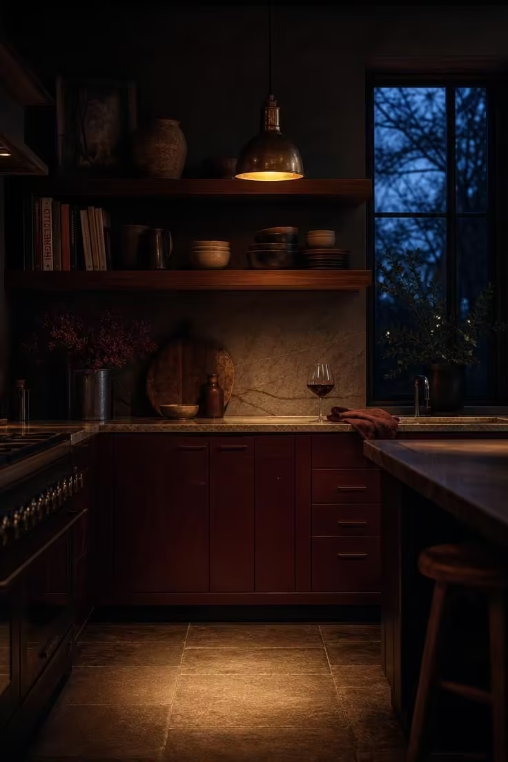
The kitchen color conversation in 2026 has moved decisively away from the cool greys and stark whites that defined the previous decade.
Warmer, earthier tones like mushroom, clay, stone, and taupe are replacing those cooler foundations, and deep reds are riding that same wave of warmth back into the kitchen.
Merlot and burgundy feel like the natural next chapter after sage green and navy blue dominated kitchen color palettes through 2023 and 2024, offering the same depth and richness but with a warmer, more emotionally charged register.
Major paint brands reflected this shift by centering their 2025 and 2026 color-of-the-year selections around warmer palettes, giving homeowners and designers permission to reach for bolder, wine-toned reds without feeling like outliers.
The “quiet luxury” movement that reshaped fashion, with its emphasis on rich materials, muted tones, and visible quality over visible branding, translated directly into kitchen design through the adoption of deep reds that look expensive without trying to look loud.
European and Mediterranean kitchen aesthetics have used deep reds alongside natural stone, raw plaster, and aged wood for generations, and the growing appetite for those styles in North American renovations has pulled merlot and oxblood into mainstream consideration.
Deep red ages gracefully in a way that trend-driven pastels and saturated primaries do not, making it a strong long-term choice for homeowners who plan to live with their kitchen for a decade rather than cycling through color updates every few years.
Design Pro-Tip: If you are drawn to deep red but worried about commitment, start with a red kitchen backsplash rather than full cabinetry. Tile is less expensive to replace than a full cabinet refinish, and a backsplash in a wine-toned glazed tile gives you the visual impact of the color shift without the permanence of painted cabinetry.
Building a Kitchen With Red Accents One Layer at a Time
The easiest entry point is a set of removable accents: two deep red bar stools, a merlot linen table runner, or a burgundy enameled Dutch oven displayed on a shelf.
These pieces let you live with the color in your kitchen’s specific light conditions for a few weeks before making any lasting decisions.
If the first layer feels right, the next step is a semi-permanent addition like a deep red pendant light fixture, a painted kitchen cart, or a single open shelf backed with a wine-toned painted panel.
Full commitment, whether that means painted cabinetry or a red accent wall kitchen approach, should come only after you have seen how your chosen red behaves in morning light, midday sun, and evening fixture glow in your actual space.
Sample boards matter more than paint chips: brush a large swatch of your chosen red onto a poster board and prop it against your countertop, your flooring, and your existing cabinetry for at least 48 hours before committing.
North-facing kitchens receive cooler natural light that can push deep red undertones toward muddy or purple, which means warmer reds with brown or orange bases tend to hold their richness better in those rooms.
South-facing kitchens get more direct warm light, which means cooler reds with blue undertones can maintain their crispness without shifting too warm.
Every red addition should be balanced by a neutral rest point, a section of open counter, a stretch of pale wall, or a simple run of white shelving, so the eye has somewhere to land between moments of color.
Conclusion
The single change that separates a kitchen with red accents that feels high-end from one that feels overwhelming is the move from bright, primary red to a deeper, earthier tone in the merlot-to-oxblood range.
Pair that deeper red with the correct undertone family in your whites, stones, and metals, and the color stops looking like a statement and starts looking like it was always supposed to be there.
Start with one red piece you can live with for a month, test it against your room’s light at different hours, and let the palette build from there.
The goal is not to create a “red kitchen” but to create a kitchen where deep red feels as settled and permanent as the stone on your countertop.