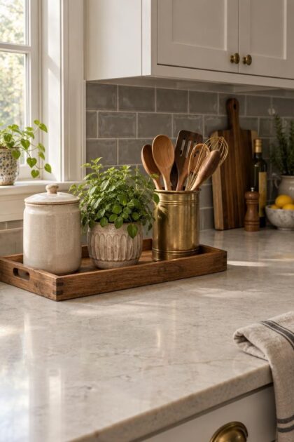
This post may contain affiliate links. If you make a purchase through these links, we may earn a commission at no additional cost to you.
A kitchen counter is asked to do two jobs at once.
It must absorb cutting, mixing, spilling, and the daily migration of mugs and mail, while also carrying the visual weight of the room's most visible horizontal plane.
The tension between those roles is where most decorating advice goes wrong.
Treat the surface as a stage and it stops working; strip it bare and the room reads unfinished.
A Short History of Why Counters Exist for Use First
Before the fitted kitchen, cooking happened at freestanding workbenches, wooden tables, stone slabs, and butcher blocks.
These were tools, not display surfaces.
Open shelving held vessels and dry goods within arm's reach because there was nowhere else to put them.
Marble, soapstone, zinc, and tile appeared in eighteenth and nineteenth century kitchens for their working qualities, not their pattern.
The early twentieth century consolidated those pieces into continuous built-in counters and cabinets, and the work triangle organized stations by distance and task.
Convenience, not composition, drove the layout.
What survives from those earlier kitchens is telling.
Crocks, boards, bowls, and baskets stayed in use across centuries because each one earned its place twice: it did a job, and it looked good doing it.
That inheritance sets the standard for a modern counter.
Anything placed on the surface should be able to explain what it does there.
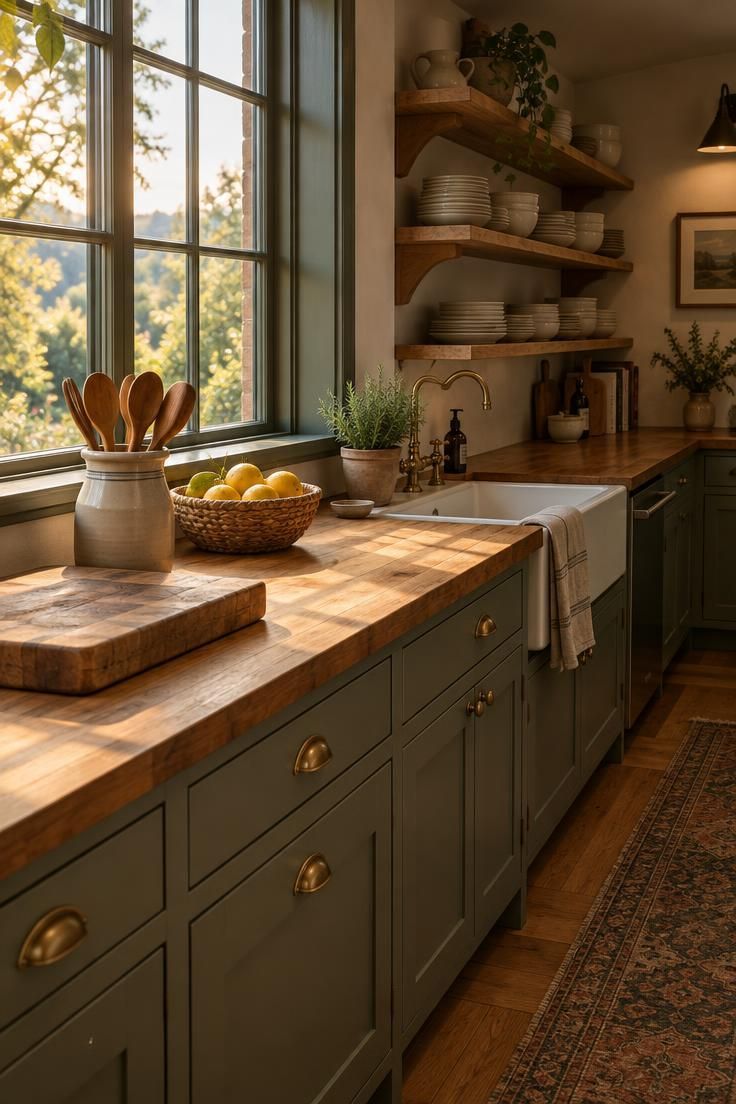
The Working-Surface Rule Most People Skip
Every object parked on a counter takes prep area away from the person using it.
That subtraction is easy to ignore because the loss is invisible until a baking project or a holiday meal needs the space back.
A workable default is to treat the counter as a workstation that happens to be styled, rather than a display that happens to be in a kitchen.
Items used daily can stay within reach.
Items used weekly belong in a cabinet, even if they look good out.
Judging which appliances have earned permanent counter space comes down to frequency and friction.
A machine pulled out and put away twice a day is a candidate for staying out.
A machine used twice a month is not, no matter how handsome its housing.
Designating one clear stretch of open surface protects the work that actually happens there.
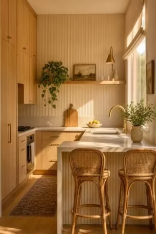
A single uninterrupted run of counter, wide enough for a cutting board plus a bowl, gives the room a place to function.
Containment does the rest of the work.
A small tray holding oil, salt, and pepper keeps those items grouped and movable, so the surface beneath can be wiped without lifting each piece individually.
The arrangement should also survive a busy Tuesday.
If a design only looks right when nothing is being cooked, it is a photograph rather than a kitchen.
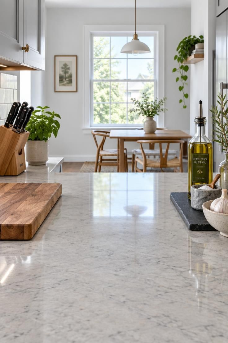
How to Decorate Kitchen Counters by Creating Functional Zones
Grouping objects by activity is the single most reliable way to make a counter look organized without emptying it.
A coffee station, a cooking station, a baking corner, and a sink-side cleaning set each gather related items into one footprint.
The logic is practical before it is visual.
When everything needed for one task sits together, the whole group can be lifted and the counter wiped in a single motion, and nothing has to be hunted down mid-recipe.
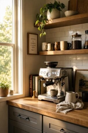
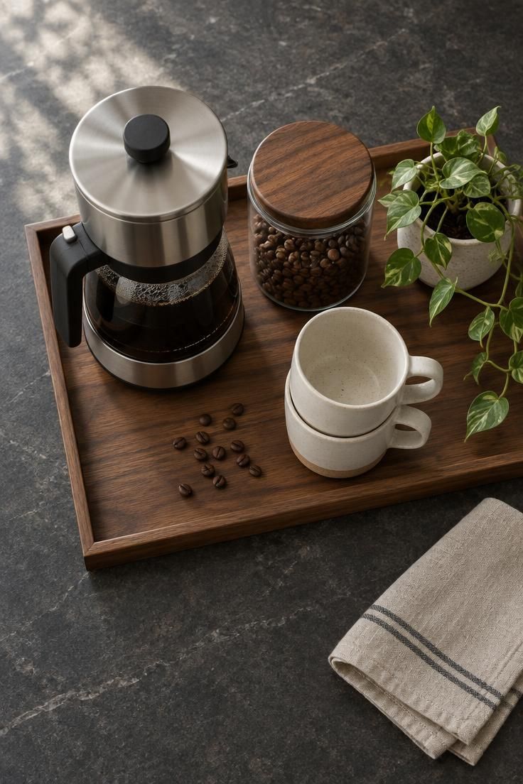
A coffee zone might hold the machine, a canister of beans, two mugs, and a small plant.
A cooking zone gathers a utensil crock, a board, oils, and a salt cellar.
A baking corner carries canisters, a mixer, and a bowl.
Scale each zone to how often it is used.
A daily coffee setup justifies more counter real estate than a stand mixer that appears for birthday cakes.
Trays act as the unifier inside a zone.
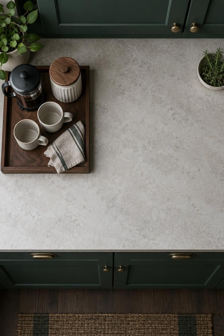
A wooden, stone, or metal tray turns four unrelated small objects into one visual unit, and it defines the boundary so the group does not creep outward over time.
Zones also prevent the slow scatter that makes a counter feel chaotic.
When each item has a home within a group, stray spoons and receipts have nowhere to accumulate.
Anyone working out how to decorate kitchen counters without losing workspace can start here, because zoning solves the visual problem and the practical one with the same move.
Basic Composition Moves That Make a Counter Look Deliberate
Height variation is what separates an arrangement from a lineup.
A tall element, a medium element, and a low element placed together give the eye a path to follow and keep the group from reading as a flat row.
A vase of branches, a stack of bowls, and a shallow tray of spoons demonstrate the pattern.
The specific objects matter less than the difference in their heights.
Color repetition ties unrelated pieces together.
Choosing two or three accent colors and echoing them across separate objects makes a ceramic pitcher, a folded towel, and a bowl of fruit feel like one family.
Texture does similar work.
Wood, stoneware, woven fiber, glass, and aged metal catch light differently, and mixing a few of them keeps a monochrome palette from going flat.
A simple formula helps when starting from nothing: one tray, one tall object, one natural element, and one useful everyday item.
It produces a complete grouping without overfilling the surface.
Restraint matters as much as arrangement.
A grouping that blocks the window, the under-cabinet light, or the sightline across an island costs more than it adds.
Design Pro-Tip: Take a phone photo from the doorway before and after rearranging. A photo flattens height differences, so a grouping that still shows as varied in the flattened view will read even more clearly in person.
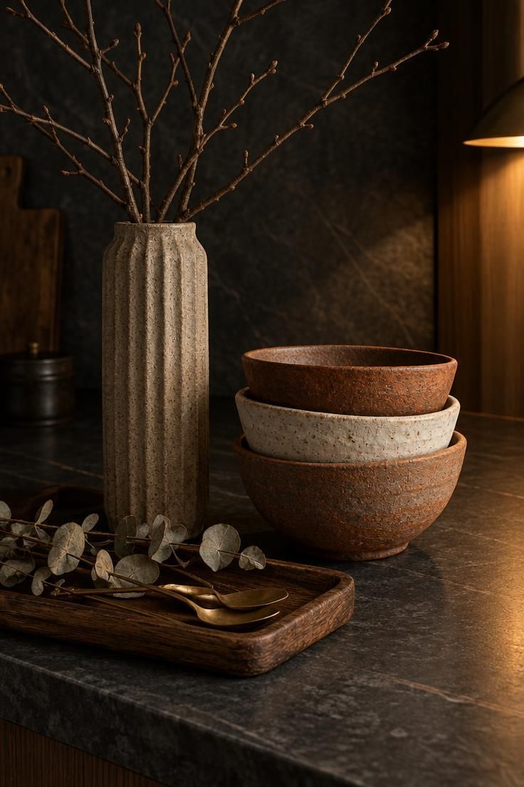
Countertop Styling Ideas for Specific Kitchen Zones
Each area of a counter carries different conditions, and the objects placed there should answer those conditions.
Near the sink, water and splashing shape what belongs.
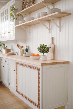
A dish brush in a ceramic holder, a soap dispenser, a folded towel, and a small board leaned against the backsplash cover the essentials.
Paper goods, unsealed wood, and delicate pieces fare poorly in a wet zone.
Around the stove, heat and grease narrow the options.
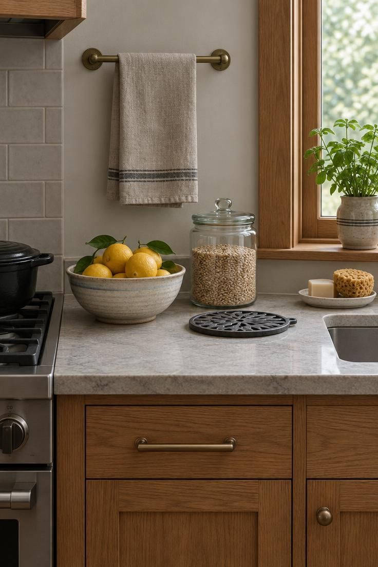
A utensil crock, salt and pepper mills, a heat-resistant trivet, and a small tray of oils keep cooking tools close without putting anything fragile in the splash path.
Corners tend to become dead space because they are awkward to work in.
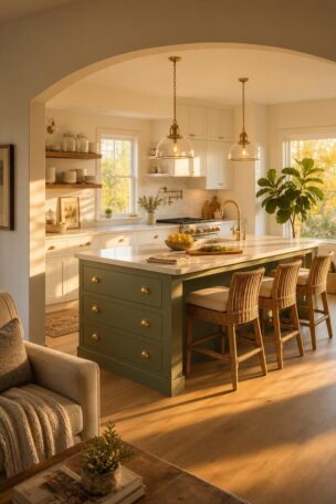
A large cutting board, a fruit bowl, a bread box, or a tiered stand fills that visual gap without competing for prep room.
Small counters demand a different strategy.
A wall rail for utensils, a narrow spice shelf, a magnetic knife strip, or a windowsill plant moves storage upward when horizontal space runs out.
There is no single correct set of countertop styling ideas, because the right answer depends on which station sits closest to the surface in question.
Start with the task performed there and let the objects follow.
Grouping by condition rather than by color also keeps maintenance simple.
Items near the sink get checked for moisture, items near the stove get checked for grease, and nothing gets overlooked.
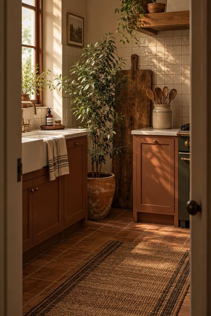
Styling Around a Veined or Statement Countertop
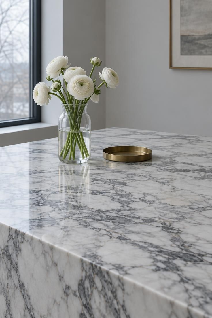
A countertop with dramatic veining or strong color is already doing the decorative work, and adding more creates competition.
The surface becomes the focal point, and the objects on it should step back.
Two or three accessories usually suffice.
A clear vase, a simple tray, and one bowl can hold the surface without arguing with the stone beneath them.
Pulling one color from the stone and repeating it in a small object creates a quiet link between the counter and everything on it.
A brass tray against a counter with gold veining does this without announcing itself.
Matte and handmade finishes tend to sit more comfortably on a busy surface than polished or reflective pieces.
Glare adds visual noise where the pattern already supplies plenty.
A patterned tray on a heavily patterned counter is the most common misstep.
Two competing designs cancel each other out and leave the eye with nowhere to rest.
This consideration reaches more kitchens than it once did.
In the 2026 U.S. Houzz Kitchen Trends Study, 75 percent of renovating homeowners selected veined patterns for countertop or backsplash materials, a figure drawn from homeowners using the Houzz platform rather than a random national sample.
Styling around a veined countertop is largely an exercise in subtraction.
Removing one object often improves the result more than adding another.
Renter-Friendly Kitchen Counter Decor That Leaves No Trace
Renters often work with someone else's countertop, backsplash, and cabinet color, which makes removable accessories the most practical route.
Nothing needs to be altered for the kitchen to feel considered.
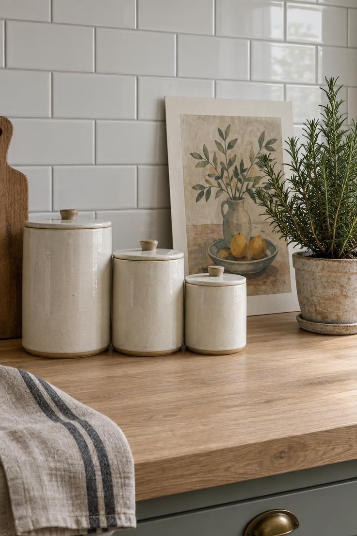
Ceramic canisters, a countertop lamp, framed art leaned against the backsplash, textiles, and plants all bring personality without touching the structure of the room.
Each can move to the next apartment.
A decorative tray defines a zone on a dated surface the way a rug defines a seating area.
It covers a small portion of an unattractive counter and gives the eye something intentional to land on.
Textiles soften hard finishes quickly.
A linen towel, a runner under a coffee station, or a cloth napkin folded over a board adds warmth to a kitchen full of builder-grade surfaces.
Countertop lighting is worth considering when the room has none.
A small plug-in lamp changes the character of a dark corner and can travel with the lease.
Renter-friendly kitchen counter decor works best when it stays contained.
A few strong pieces read as a decision, while many small ones read as an overflow of belongings.
Limited counter space rewards a tighter edit.
Renters with narrow surfaces get more from three well-chosen objects than from a full set of matching accessories.
What Current Kitchen Data Suggests About Countertop Choices
Survey data offers a rough read on what homeowners and kitchen professionals are choosing, provided the sample is kept in view.
These are not national polls, and the results describe specific groups.
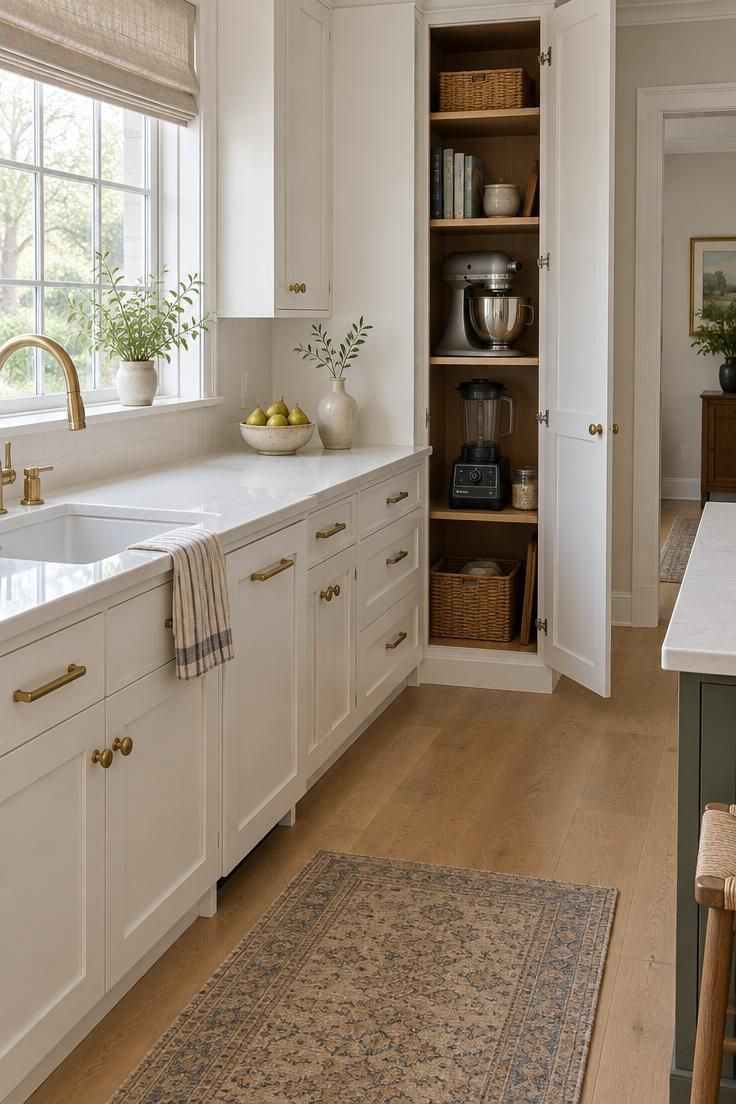
The 2026 U.S. Houzz Kitchen Trends Study found that 76 percent of renovating homeowners added built-in features, with pantry cabinets the most common at 47 percent.
Among those adding a butler's pantry, 67 percent included small-appliance storage.
That last figure speaks directly to counter clutter.
Built-in appliance storage moves machines off the work surface without removing them from the kitchen.
An earlier Houzz press release reported that 75 percent of homeowners prioritized decluttering counters during kitchen updates, and 63 percent prioritized storage.
Both figures come from Houzz platform users.
The NKBA 2026 Kitchen Trends Report, based on a survey of 634 kitchen professionals, found that 60 percent expect minimalism to remain popular and 55 percent expect color to arrive through decorative accessories rather than fixed finishes.
Read together, the numbers point in one direction: storage absorbs the equipment, and accessories carry the color.
That leaves the counter itself available for the work it was built to do.
Maintenance and Hygiene Realities That Shape Counter Decor
Anything left on a counter collects grease, dust, and the fine film that settles over a kitchen within days.
Decorative choices that ignore cleaning will look tired quickly.
Fruit belongs in bowls that can go into the sink and be washed, not in porous vessels that trap residue.
The same applies to any container holding food within reach of the stove.
Textiles need a safe distance from burners.
A towel or runner draped near an active flame is a hazard regardless of how well it coordinates with the cabinets.
Heat-resistant trivets under hot cookware protect both the surface and the objects nearby.
Setting a hot pan directly onto stone or wood risks damage that no arrangement can hide.
Lidded jars suit ingredients that are not used daily, since open containers gather dust and grease between uses.
Spices measured out twice a week can stay in a small open dish.
Cords and outlets deserve attention in any arrangement.
Overcrowding a strip of outlets or routing a cord through a wet zone creates a problem no styling choice justifies.
The best test of counter decor is whether the surface can be wiped in one pass.
If a cloth has to weave around a dozen small objects, the arrangement is working against the room.
Common Mistakes When You Decorate Kitchen Counters
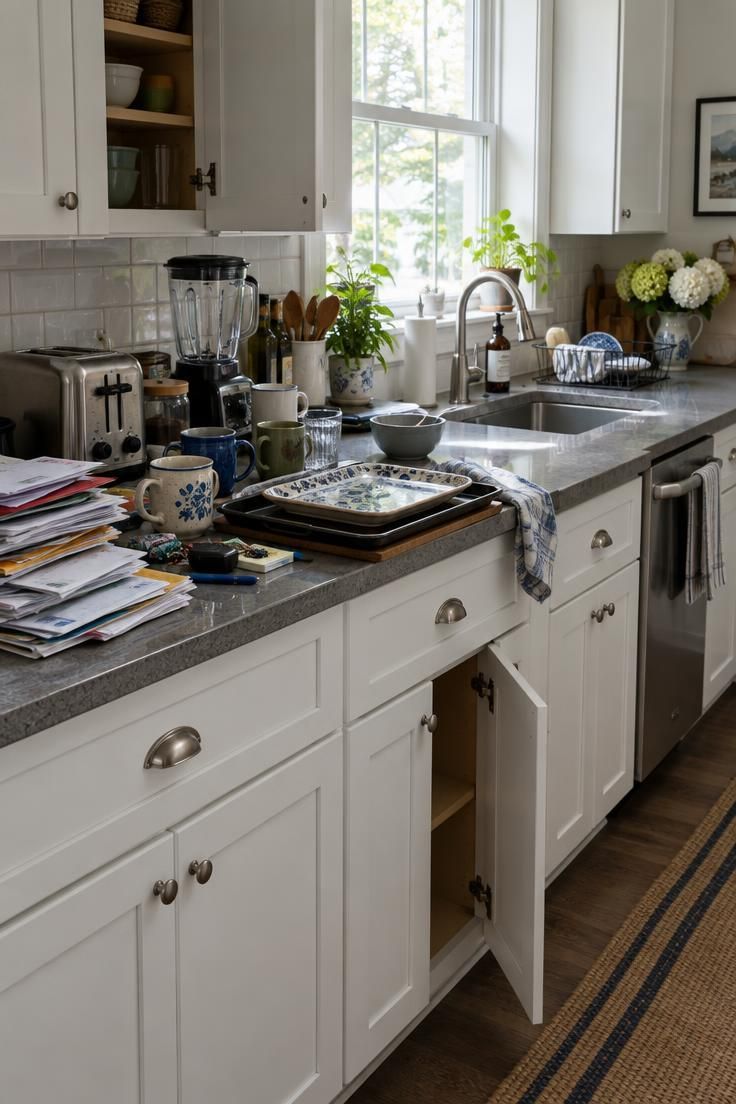
Too many small objects is the most frequently cited error, and it compounds itself.
Each addition looks minor, and the total turns the counter into a shelf.
Dead zones form when appliances and containers occupy the areas needed for actual work.
A coffee maker parked beside the sink can block the only stretch of prep room in a small kitchen.
Height causes its own problems.
Tall objects placed in front of a window, an under-cabinet light, or the sightline across an island cut the room off from its best features.
Unrelated colors create visual static.
Four accent colors competing on one surface undo the cohesion that repeated tones would have created.
Decorating every surface at the same intensity flattens the room.
Some areas should carry more, and others should stay quiet so the eye has somewhere to rest.
Treating an island like a coffee table is a related error.
An island is a work surface with stools, and styling it as a display removes the function that justifies its size.
Several small appliances left on display permanently consume space in the same way.
Functional kitchen zones keep the equipment that is used daily and store the rest.
These are patterns observed in current trend reporting, not rules.
A counter that suits the person cooking on it can break every one of them and still work.
Design Pro-Tip: Remove every object that has not been used in two weeks and set it on a table in another room. Return only what gets missed within a few days. The counter will reveal its own priorities.
Kitchen Counter Composition: A Simple Decision Order
A reliable order of operations starts with an empty surface.
Clearing everything first makes the available space visible and shows how much room the counter actually offers.
Daily-use appliances come back first, because they have the strongest claim.
Anything used once a week or less goes into a cabinet, even if the storage is imperfect.
Activity zones come next, one at a time.
Setting up the coffee station before starting the cooking zone keeps the process from turning into a simultaneous shuffle.
Decorative pieces arrive last, and only where they do not interfere with work.
This order prevents the common outcome where styling objects get placed first and the useful items have to squeeze around them.
Each object deserves one question: how often is it used, and could it live elsewhere.
Two low scores on those measures mean it leaves the counter.
Editing needs to be periodic rather than one-time.
Counters accumulate by default, and a monthly pass keeps the surface from drifting back toward clutter.
Good kitchen counter composition ends with a surface that supports comfortable meal prep and an easy wipe-down.
When both of those hold, the arrangement usually looks right as well.
Conclusion
Choosing which useful objects stay in view matters more than choosing which decorative ones to add.
A counter that works well tends to look better than one that has been overstyled, because the arrangement carries the logic of the room inside it.
Start by clearing one zone rather than the whole kitchen.
Set up a single functional grouping, live with it for a week, and notice whether the open space around it gets used.
That open space is the point.
Purposeful, contained, and easy to clean describes both a good counter and a good relationship with it, and the first step is simply leaving room.