This post may contain affiliate links. If you make a purchase through these links, we may earn a commission at no additional cost to you.
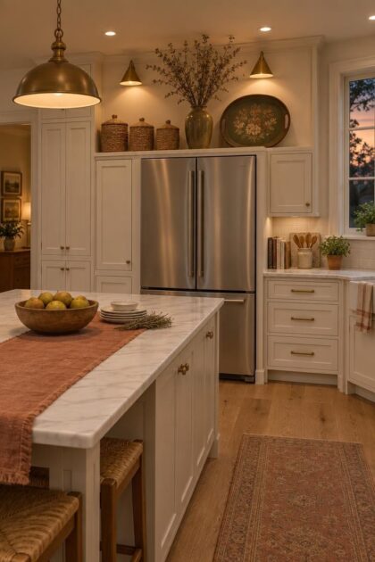
The gap between the top of a refrigerator and the ceiling or the underside of upper cabinets rarely starts as a design decision.
It becomes a dust ledge, then a dumping ground for party platters and half-used gift bags.
Height, depth, and distance from the work zone all point to the same conclusion: this is a spot for occasional-use storage and deliberate display, not everyday reach.
Treat the space as an intentional composition and it stops being leftover square footage and starts pulling its weight in the room.
The ideas below range from rental-friendly and freestanding to finished, integrated looks, with notes on materials and the tradeoffs each one carries.
Shallow Door-Front Cabinet Finished in Matte Sage
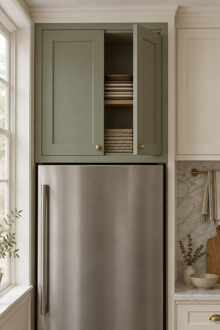
A shallow cabinet that spans the alcove turns the gap above the fridge into a finished part of the cabinetry run instead of a hole in the composition, making it one of the more effective over the fridge storage ideas for keeping the upper wall line tidy.
The over refrigerator cabinet reads as intentional because the door line continues the rhythm of the surrounding uppers, and the eye stops noticing the fridge’s bulk.
Interior depth in this zone tends to run shallower than base cabinetry, which shapes what belongs inside: flat trays, lightweight platters, spare linens, and holiday serving pieces that come out a few times a year.
Matching the door style to the rest of the kitchen keeps the wall quiet.
Choosing a contrasting finish, such as sage against warm white, makes the cabinet a deliberate accent and demands that the rest of the kitchen stay disciplined.
Access is the honest tradeoff.
A door that swings open above head height means two hands, a step stool, and clear floor space in front of the fridge, so the contents should be things you rarely need.
Style Blueprint:
- Shallow door-front cabinet with painted matte finish and simple panel molding
- Small brass knobs with an unlacquered finish
- Flat, lightweight contents: trays, linens, occasional platters
- Warm white surrounding cabinetry to keep the run visually continuous
Two Open Shelves in White Oak with a Limited Palette
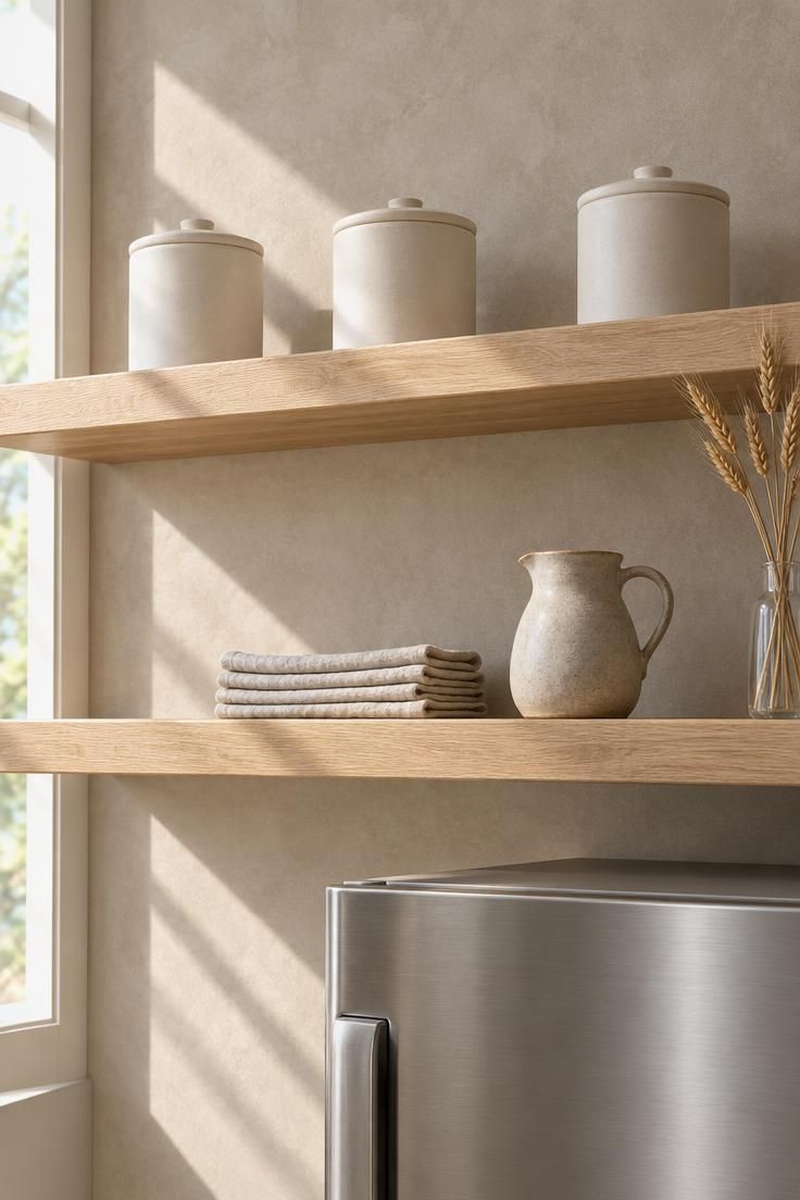
Open shelving reframes the void above a fridge as a display moment, and restraint is what keeps it from sliding into overflow.
Repetition beats variety here.
Three canisters of the same shape and finish read as a set; a mix of heights, colors, and materials reads as an accident.
A small object count matters more than the shelf length.
Filling the run edge to edge makes the zone look like a storage problem, and the visual weight above the fridge ends up heavier than the appliance itself.
Dust is the ongoing reality of open shelves, especially in a warm, high spot.
Items that wipe clean quickly, such as glazed ceramic and glass, ask less of you than textured or unsealed surfaces.
This approach suits households that want the zone to look composed at a glance and are comfortable with a light weekly pass rather than sealed storage.
Style Blueprint:
- Two white oak shelves with a clear oiled finish and visible grain
- Three matched ceramic canisters in one matte finish
- One low stack of linen napkins in a single neutral tone
- A narrow glass vase with dried stems for height variation
Design Pro-Tip: Before buying bins for this zone, measure the cavity’s interior depth and note it on your phone, because front-only placement is the most common reason a row of baskets looks unfinished from across the room.
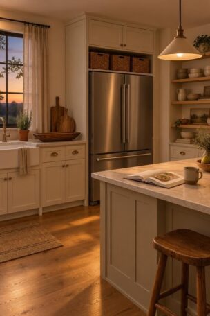
A Row of Lidded Woven Bins with Leather Pull Tabs
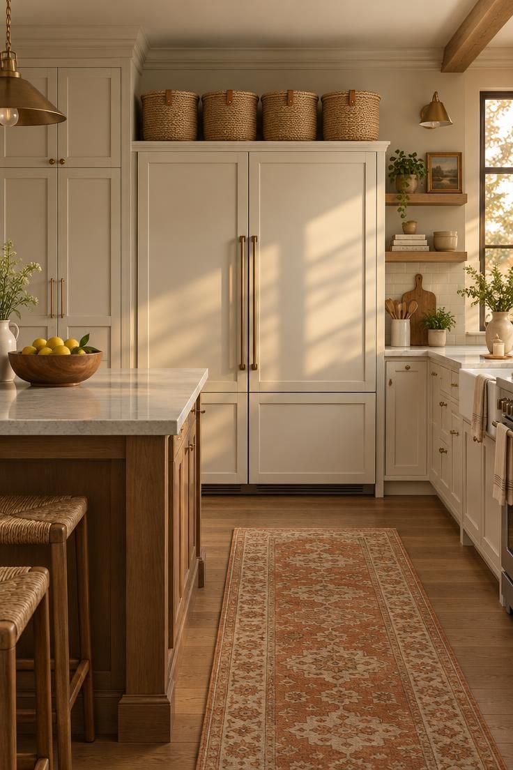
Uniformity is what makes a row of bins above a fridge read as design rather than storage spillover.
Four identical lidded baskets in the same weave, size, and tone create a horizontal rhythm that echoes the cabinet line, and the lids hide whatever is inside.
That concealment is the practical appeal: kitchen baskets for above the refrigerator can hold mismatched paper goods, extra napkins, or seasonal items without any of it showing.
Sizing to the cavity depth matters more than most people expect.
A deep cavity with bins pushed only to the front leaves a visible empty band behind them, which reads as unfinished from across the room.
Leather pull tabs give the row a small repeating accent and make the lids easier to lift at height.
For shared households, small stamped tags on the front edge keep everyone from opening four bins to find one thing.
Style Blueprint:
- Four identical lidded woven bins in natural seagrass
- Tan leather pull tabs on each lid
- Bins sized to the full interior depth of the cavity
- Small stamped tags or labels for shared households
Pair of Open-Weave Baskets on a Slim Wood Ledge
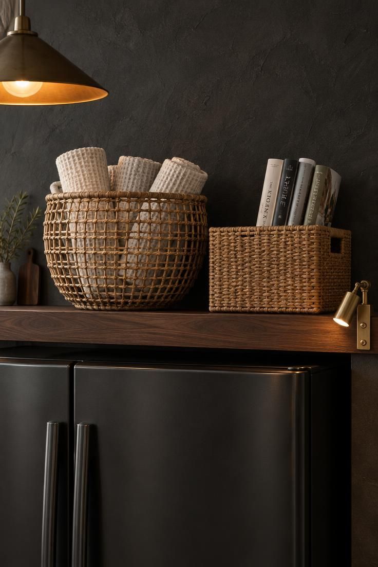
Open-weave texture reads lighter than solid containers, which helps above fridge basket storage sit quietly even when the baskets are full.
The visible gaps in the weave break up the mass, so the arrangement feels airy rather than stacked, and the reed shadows add depth against a dark wall.
Items you want to see or grab occasionally belong in open baskets: rolled towels, magazines, a folded throw.
Anything you would rather not look at belongs in a lidded version instead.
Pairing a round basket with a rectangular one works only when their heights differ enough to read as a deliberate contrast.
Two baskets of similar height and different shapes usually look mismatched rather than composed.
Open baskets show dust more readily than lidded ones, particularly in a warm, high zone, so a soft brush or a quick vacuum pass with a brush attachment keeps the weave looking clean.
Style Blueprint:
- Slim walnut ledge with a dark oiled finish
- One round open-weave rattan basket, one rectangular with a tighter weave
- Rolled towels and rolled magazines as visual contents
- A clip light or small practical fixture for warm accent glow
A Single Decorated Wooden Tray Leaning Against the Back Wall
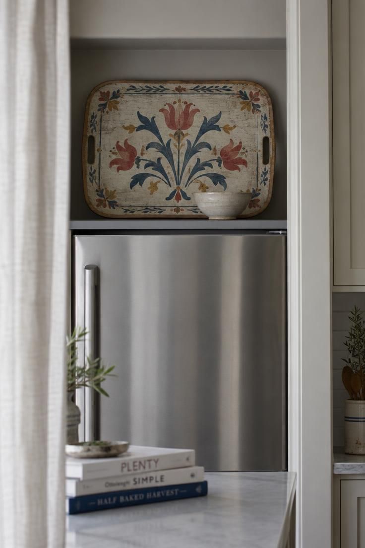
A single leaning tray fills the cavity with shape rather than mass, and it reads as chosen rather than accumulated.
The tray’s face becomes the focal point, so its finish does the heavy lifting.
A painted folk motif, a carved geometric pattern, or an inlaid wood design each sets a different tone without requiring anything else nearby.
Stability comes from a firm base and a flat surface behind.
This is a styling arrangement, not a mounting project, and the tray should simply rest in place.
One leaning object usually reads more deliberate than a cluster of small pieces, and the empty space around it gives the composition room to breathe.
A ceramic bowl or a small stack of plates placed in front of the tray adds depth and prevents the arrangement from looking flat against the wall.
Style Blueprint:
- One large tray with a painted, carved, or inlaid finish as the focal point
- A flat, stable resting surface and a wall to lean against
- One small ceramic bowl or shallow dish placed in front for depth
- A neutral wall tone that lets the tray’s pattern carry the color
A Fridge-Top Display Shelf with Seasonal Branches in a Tall Vase
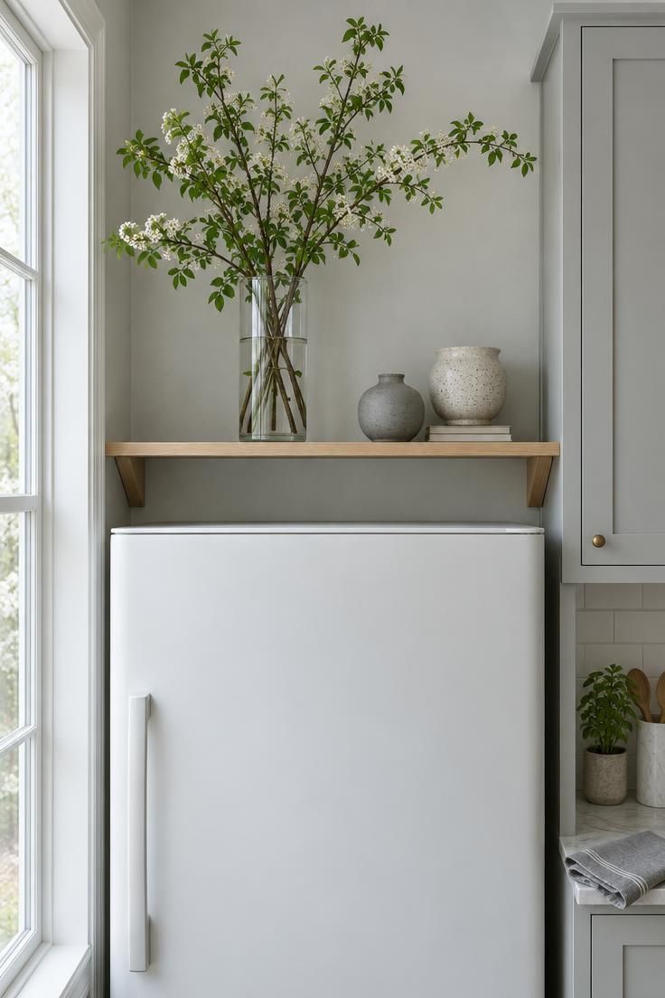
Treating this zone as a fridge top display shelf turns it into a rotating composition rather than fixed storage.
Seasonal swaps are what keep it looking intentional all year: green branches in spring, dried stems in autumn, evergreen clippings in winter, and a single bare sculptural branch in the quiet weeks between.
Vase height relative to the cavity drives the silhouette.
A tall vase that nearly reaches the top of the opening creates a clear vertical line, while a short vase gets lost against the wall behind it.
From across the room, the arrangement is read as shape and color first, so a simple palette of glass, stoneware, and green keeps the zone calm against the rest of the kitchen.
Branches and dried stems collect dust, and reaching them requires a step stool, so an occasional rinse or a quick pass with a duster is part of keeping the display looking fresh.
Style Blueprint:
- One tall clear glass vase sized to the cavity height
- A rotating set of seasonal branches or dried stems
- Two small stoneware pieces at varied heights for balance
- A narrow shelf in white oak or another quiet natural finish
Matched Kraft Boxes with Stamped Labels for Holiday Ware
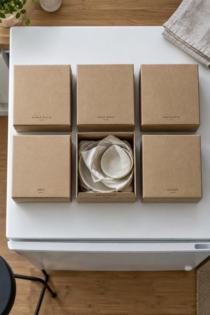
Uniform box sizes and one consistent color turn a row of storage into a hotel-like line, and the space above a fridge is a natural home for it.
Stamped or printed labels on the front edge make contents legible without opening anything, which matters when the boxes sit above eye level.
The zone’s height suits a seasonal rotation: holiday serving pieces, festive linens, and party platters come out a few times a year and spend the rest of the calendar tucked away.
Weight is the constraint to respect.
A heavy box is awkward to lift from above a refrigerator, so keeping each one light and limiting the contents to a few pieces per box makes retrieval manageable.
Kraft cardboard reads warm and honest, but it can show scuffs over time.
A stack of two boxes placed side by side on the floor near the kitchen makes repacking easier at the end of a season.
Style Blueprint:
- Six matching kraft boxes with fitted lids in the same size
- A stamped or printed label on each front edge
- Tissue paper for wrapping fragile serving pieces
- A light load per box to keep lifting reasonable
A Wire Utility Rack with S-Hooks for Hanging Flat Bakeware
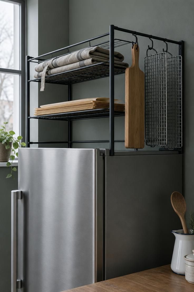
A wire rack splits the cavity into vertical sections without adding visual mass, which keeps the zone feeling light even when it holds a fair amount.
Small kitchen vertical storage tends to work best when flat, awkward-to-stack items hang rather than pile: bakeware sheets, cooling racks, thin cutting boards, and sheet pans.
S-hooks keep those pieces visible and reachable by the top edge, which is the only part you can comfortably grab at this height.
Rack depth should match the cavity so the vertical pieces do not tip forward or hide behind the front lip.
A shallow rack holds boards and thin sheets; a deeper rack invites heavier items that are harder to lift.
This direction suits kitchens where the fridge top already reads utility-forward, with stainless, matte black, or raw metal finishes nearby.
Style Blueprint:
- Slim metal wire rack sized to the cavity depth
- A set of S-hooks in a matching metal finish
- Flat bakeware, cooling racks, and thin boards for hanging
- One folded textile or paper stack on the upper tier
Design Pro-Tip: Look at your finished fridge-top arrangement from the doorway of the kitchen, not from up close, because that is the angle you will actually see it from, and it is where balance problems show up first.
Floor-to-Ceiling Cabinet Face in a Glossy Moss Tone
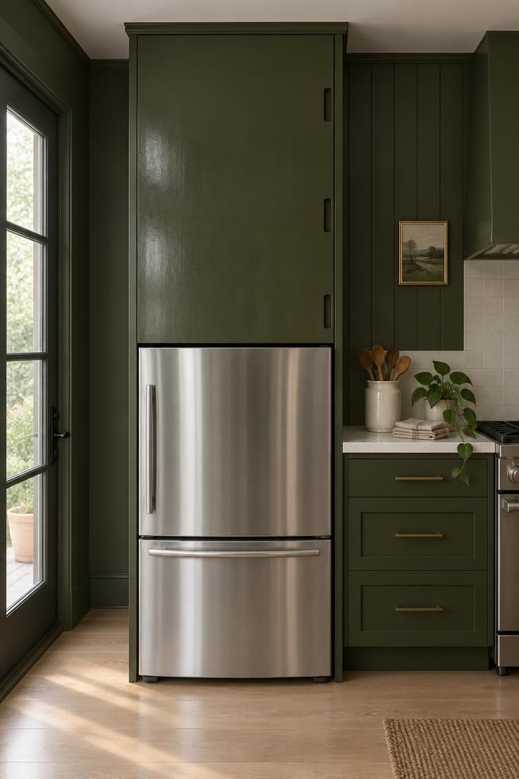
If a full cabinet is not available, a thin wall panel can be painted the same color beside or behind the area to suggest a taller vertical plane.
This works especially well when the refrigerator sits in a shallow recess or against an otherwise plain wall.
Extending the moss tone upward helps visually connect the fridge area to the surrounding cabinetry without requiring built-in storage.
Style Blueprint:
- Paint or finish the cabinet face, adjacent wall panel, or both in the same low-sheen color.
- Keep the fridge and lower cabinets in a brighter neutral to create a soft bottom boundary.
- Use one or two organic kitchen objects on the counter, not a full vignette.
- Limit hardware to a simple vertical edge or discreet finger pull.
- Repeat a related warm tone in the floor to keep the moss shade from feeling isolated.
Design Pro-Tip: Painting only the cabinet face over the fridge brings the eye to that empty band without adding stored objects, which suits a lower-clutter kitchen.
Conclusion
The space above the fridge rewards being treated as a deliberate zone, and every approach in this list comes back to the same habits: repetition over variety, restraint in object count, and awareness of depth front to back.
Choosing between freestanding, rental-friendly options and finished, integrated looks mostly comes down to how long you plan to stay and how much you want the zone to disappear into the cabinetry.
Height is the limitation that shapes everything here, and it is also the reason the zone works so well for the platters, seasonal pieces, and occasional-use items that have no better home.