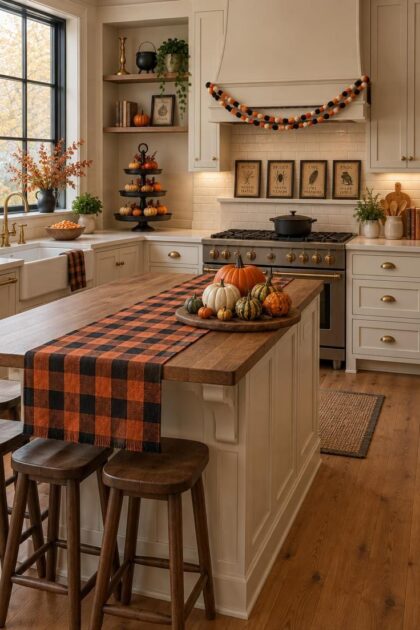
This post may contain affiliate links. If you make a purchase through these links, we may earn a commission at no additional cost to you.
The kitchen is where fall and Halloween decorating overlap most usefully.
Pumpkins, amber glass, and dried stems already belong near food and gathering, so seasonal styling here feels less like a theme dropped into a room and more like an extension of what the space already does.
Cozy beats scary in this room.
Warm palettes, tactile materials, and soft silhouettes sit comfortably beside everyday cooking, and they can stay up from early October well into November.
Each idea below shows where it lands in a working kitchen and what it takes to keep the look intentional, from wall-scale silhouettes to counter anchors, shelf scenes, and window sills.
Wall of Matte Black Bats Rising Past the Upper Cabinets
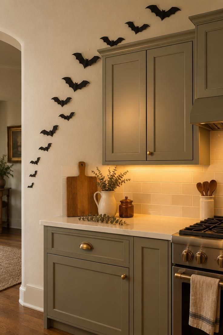
A sweeping line of matte black card bats in graduated sizes can climb from a side wall toward the top of the upper cabinets, held in place with removable putty.
The visual payoff is immediate: a rising silhouette reads from the doorway and gives an otherwise blank kitchen wall a sense of motion.
Mixing two or three bat sizes keeps the line interesting, and leaving generous negative space between them keeps the arrangement airy rather than crowded.
Among halloween kitchen decor ideas, this one works best on the wall beside or above the cabinets, away from a range hood and a steamy sink zone.
Paper can curl and spot in humid air, so matte finishes hide smudges better than glossy ones, and felt bats hold their shape longer at a higher cost.
A single brass pull or a warm white cabinet color behind the bats gives the black silhouettes something soft to sit against.
Style Blueprint:
- Matte black card bats in three sizes
- Removable putty dots spaced along the rising line
- Warm white upper-cabinet paint as the backdrop
- One antique brass cabinet pull peeking into frame
Pumpkin Cluster Anchored on a Wooden Board at the Island End
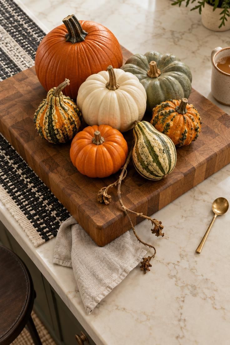
A cluster of real and faux pumpkins mixed with heirloom gourds in orange, cream, and sage can anchor the end of a kitchen island when it is grouped in odd numbers on a thick wooden board.
The logic is simple: a board or tray contains the arrangement as one liftable unit, so clearing the counter for cooking takes seconds.
Height variation matters, plus a couple of trailing dried stems and a low linen napkin tucked at the base to soften the group.
Under warm kitchen lighting, cream and deep red gourds read richer than flat orange, and the board’s wood tone adds another layer of warmth.
Real pumpkins soften over time and can eventually mark the board, while faux pumpkins give palette control and repeat annually but lack the same texture.
A slightly wider than tall footprint keeps sightlines across the island open.
Tucking the cluster at the island’s end rather than its center leaves the main work zone free.
Style Blueprint:
- Thick butcher-block board
- Three to five pumpkins in cream, orange, and sage
- Two heirloom gourds
- A bundle of dried wheat stems tucked behind
- A cropped linen runner underneath
Apothecary Bottles Lined on a Single Open Shelf
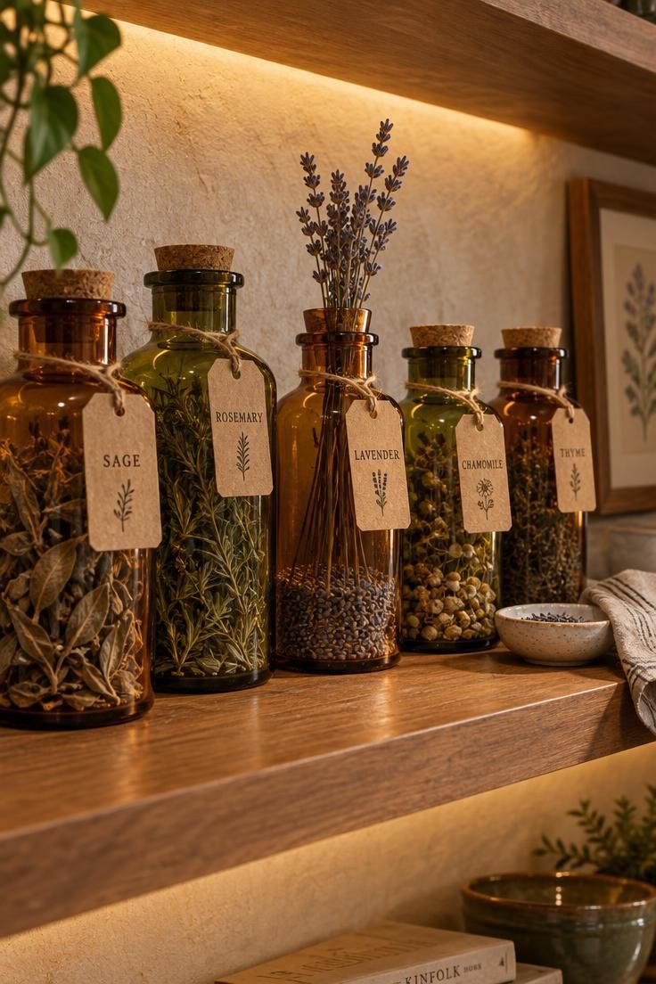
A short row of clear glass bottles with cork stoppers, some holding dried herbs and others left empty, takes on a witchy character when each is tagged with an aged paper label in a looping hand.
The idea suits a kitchen specifically because jars and bottles already read as kitchen objects, so the twist feels native rather than imported.
A restrained palette of amber, olive, and smoky glass with black label ink reads as the most cohesive version.
Placing the shelf high enough that the bottles sit above the food prep zone and away from counter traffic keeps the display out of the way.
Keeping one or two bottles holding a small seasonal stem rather than liquid gives the grouping a lighter, more seasonal feel.
Liquid-filled bottles can leak or evaporate, and glass near counter edges is easy to knock, so dry fillings are lower maintenance.
Handwritten kraft paper tags read softer than printed stickers and let the labels change from year to year.
A shelf with three or four bottles rather than a full row often reads more considered.
Style Blueprint:
- Four to six corked glass bottles in amber and olive
- Kraft paper tags with black ink lettering
- One sprig of dried lavender propped in a bottle mouth
Design Pro-Tip: Choose two or three colors for the whole kitchen and let every object answer to that palette; a themed room reads as intentional when the colors agree, even if the objects are varied.
Three-Tier Stand Styled as a Counter Corner Vignette
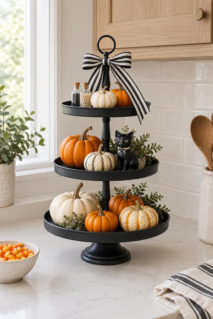
A black wire or aged brass three-tier stand loaded top to bottom with mini pumpkins, a striped ribbon bow, tiny apothecary bottles, and a small chalkware cat delivers a dense holiday vignette in a footprint the size of a dinner plate.
Editing the contents to a single palette and leaving one tier slightly sparser keeps the display from reading as clutter.
The back corner of the counter or the end of a peninsula is the right home, where the stand stays out of the busiest work path.
Its small objects are easy to knock and the tiers need dusting, and a stable base placed beside a wall reduces both problems.
A Halloween tiered tray like this also plays nicely with nearby fall kitchen decor by lifting small accents to eye level instead of letting them spread across the counter.
The vertical shape uses height rather than width, which matters in a small kitchen.
Keeping the stand’s contents together in one labeled bin makes seasonal pack-away quick.
Style Blueprint:
- Matte black three-tier stand
- Mini pumpkins in cream and orange
- Black-and-white striped ribbon bow
- Two tiny corked bottles and one small black cat figurine
Textile Swap with a Buffalo Check Runner and Black Cat Towels
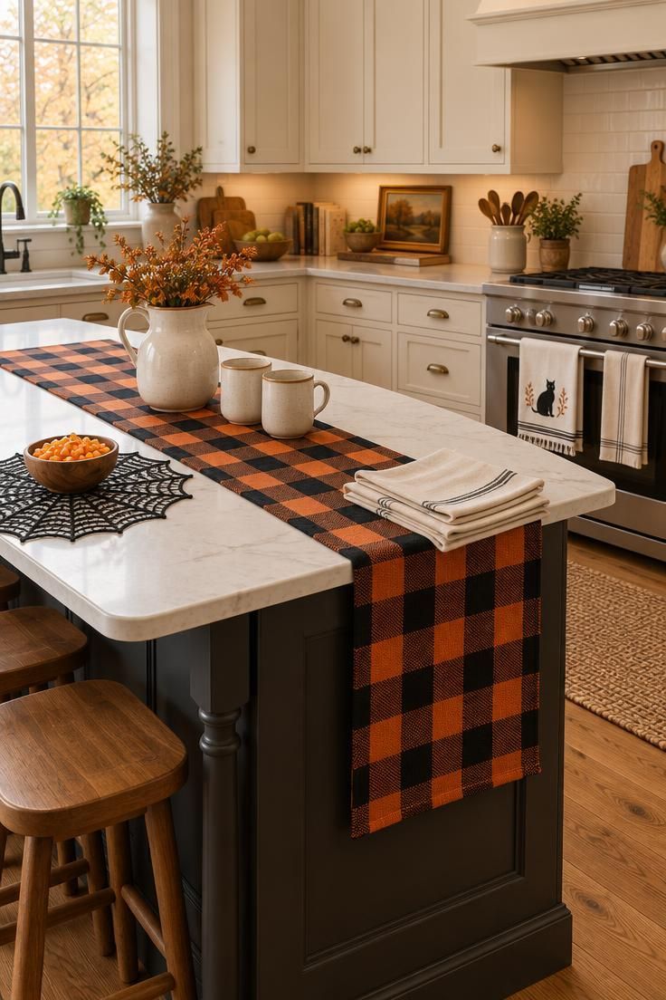
Swapping everyday linens for a black-and-orange buffalo check runner down the island, a black cat embroidered towel on the oven handle, and spiderweb lace placemats at the breakfast bar changes a kitchen’s entire read without adding a single object to the counters.
It is the highest-impact, lowest-effort seasonal change available in this room.
Picking one pattern as the lead and letting the other linens stay solid in cream or black keeps the mix from competing with itself.
A runner also visually segments a long island into a styled zone and a working zone, which can make the surface feel more deliberate.
Linens on working counters soil quickly, so reserving the themed towel for display and keeping a plain towel for wiping preserves the look.
Seasonal linens fold flat and store in a single drawer, which makes them the easiest category to keep year after year.
A matching set of napkins can carry the same pattern to a Halloween table setting later in the month.
A runner in a darker palette hides kitchen splashes better than a pale one.
Because the colors skew harvest, the textile layer can stay in place from early October through November.
Style Blueprint:
- Buffalo check runner in black and orange
- Cream linen napkins
- Black cat embroidered towel
- Spiderweb lace placemat
- Small wooden bowl of candy corn as the accent
Black Tapers Clustered on a Brass Tray Under the Window
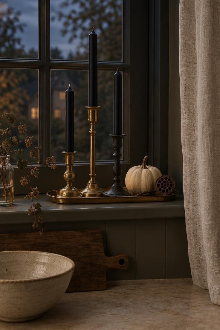
A cluster of matte black and deep purple tapers in mismatched brass and iron holders on a low tray beneath a kitchen window brings a moody vertical moment to a narrow sill or slim counter ledge.
Three heights, one tray, and a narrow footprint are the whole composition.
Unlit tapers deliver the full silhouette, and flameless tapers offer a middle path for anyone who wants a lit look.
Pairing the holders with one small pumpkin and one dried seed pod bridges the Halloween and fall seasons.
Black tapers read more elegant than orange, which helps the idea sit well in a neutral or modern kitchen.
A brass tray reflects ambient kitchen light and adds warmth without introducing another color.
A Halloween tiered tray can sit beside the brass arrangement, with its stacked levels repeating the vertical rhythm of the tapers.
That layered silhouette also keeps small fall kitchen decor pieces grouped instead of scattered across the counter.
Style Blueprint:
- Three matte black taper candles
- Mismatched brass and iron candlesticks at three heights
- Narrow antique brass tray
- One cream mini pumpkin and a dried seed pod
Felt Garland Swagged Across the Range Hood Without Touching It
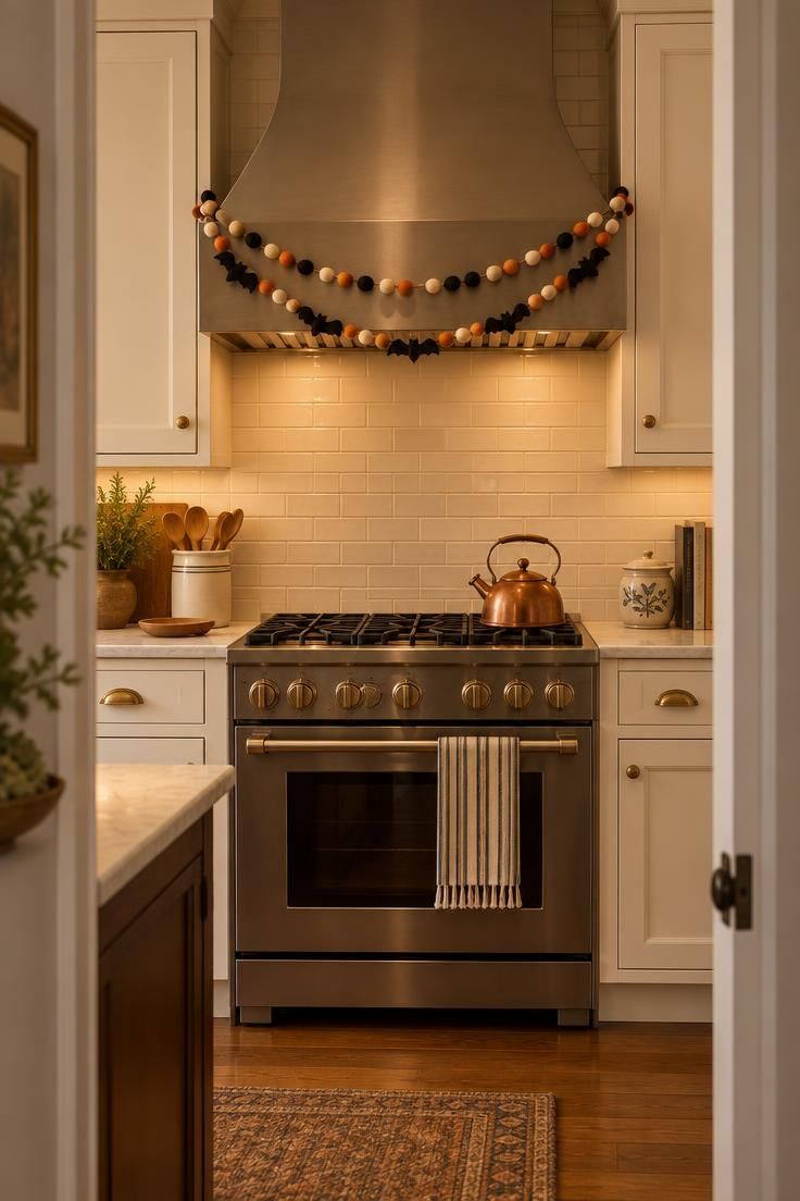
A felt ball and bat garland swagged gently across the front of a range hood or the tops of the upper cabinets, well clear of heat and steam, adds a soft seasonal signal at eye level.
Felt holds its shape and handles humid kitchen air better than paper, which makes it the sturdier choice for this placement.
A color story of black, cream, and burnt orange balls punctuated with a few small felt bats keeps the garland cohesive with the rest of the room.
Two shallow curves read more considered than one long droop.
Garlands across cabinet tops collect dust and are awkward to reach, so a swag attached to the front edge of a hood or a cabinet face is easier to take down at the end of the season.
The same garland can move to a window frame or shelf edge next season.
A garland is a strong candidate for high shelves, since it fills vertical space without adding to counters.
Keeping the drop short so it never reaches the cooking surface below is the simplest rule of thumb.
Style Blueprint:
- Felt ball garland in black, cream, and burnt orange
- Small black felt bats interspersed
- Hidden twine looped in two shallow swags
Design Pro-Tip: Lift decor onto a tray or board before styling a counter; the arrangement can then be cleared in one motion when it is time to cook, and the counter returns to work in seconds.
Styled Shelf Scene with a Tiny Cauldron and a Framed Print
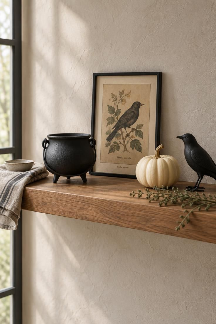
A dedicated shelf vignette built from a small black cauldron, one framed vintage-style print, a mini pumpkin, and a black bird figurine reads as a self-contained scene rather than a scattering of objects.
That quality matters in a kitchen, where surfaces are shared with work and a deliberate grouping looks more polished than a spillover of seasonal items.
Anchoring the group with a slightly taller object at one end and a low, wide object at the other gives the arrangement a visual frame.
An under-filled shelf looks sparse and an over-filled one looks cluttered, so three to five objects is a practical target for a small shelf.
A styled shelf needs objects to fill it, and those objects need a home in November, which a labeled bin per season solves.
Style Blueprint:
- Small matte black cauldron
- Framed vintage-style print with a slim black frame
- Cream mini pumpkin
- Matte black bird figurine
Framed Potion Labels Leaning Along the Backsplash Ledge
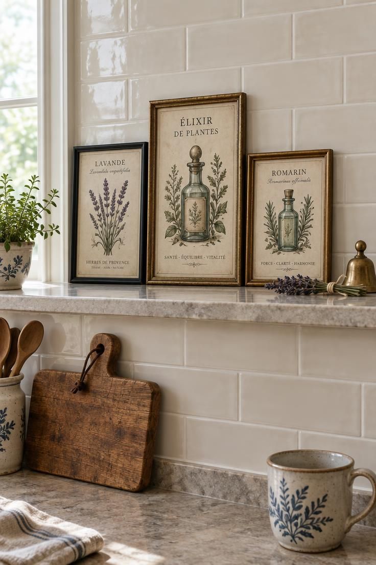
Three small framed potion and botanical labels leaning against the backsplash on a narrow ledge, in slim black and antique gold frames, fill wall and ledge space with almost no physical volume.
That makes the idea especially useful in a kitchen, where counter space is precious and wall surfaces above the work zone are often left bare.
A mix of fonts and a muted paper tone keeps the set from looking like a matching kit, and arranging the frames so the tallest sits in the middle or at one end gives the row a shape.
A ledge above a counter, not a working countertop itself, is the right home for leaning frames.
Glass catches kitchen splashes, so keeping the ledge away from the sink and range is worthwhile, and a quick wipe keeps the glass clear.
Black-and-white illustrations read as elegant Halloween rather than playful, which suits kitchens with a neutral or modern palette.
These lean rather than hang, which also makes them easy to rearrange as the season progresses.
A muted palette and small scale keep the arrangement on the elegant Halloween kitchen side rather than turning the wall into a busy display.
Style Blueprint:
- Three slim frames in black and antique gold
- Potion and botanical labels in muted ink
- Narrow stone ledge against a cream backsplash
Kitchenware That Doubles as Display in a Glass-Front Cabinet
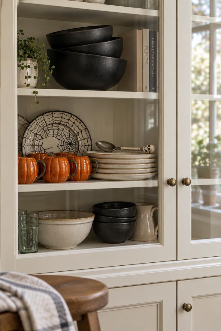
A glass-front cabinet or open shelf where black matte mixing bowls, pumpkin-shaped mugs, spiderweb plates, and a skull spoon are arranged as a display rather than hidden in a drawer makes decor that also works.
These pieces can be used through October and then stored after the season without any sense of waste.
Grouping by color across shelves, with cream stoneware as the neutral bridge between black and orange pieces, keeps the cabinet from looking busy.
Stacking bowls at an angle and hanging mugs on a short rail adds depth to a shallow cabinet.
The approach is only worth the space if the pieces will actually be used or displayed, since otherwise they become storage clutter after the holiday.
A single shelf of themed kitchenware often reads stronger than a full cabinet, so editing matters more than quantity.
Leaving two open spots keeps the display from looking packed wall to wall.
Black-and-cream pieces can carry into November while pure orange reads Halloween-specific.
Style Blueprint:
- Matte black mixing bowls
- Cream stoneware plates
- Pumpkin-shaped mugs in orange
- Spiderweb-patterned side plates
- One skull-handled serving spoon
Dried Herb Bundles and Mini Apothecary Jars on the Windowsill
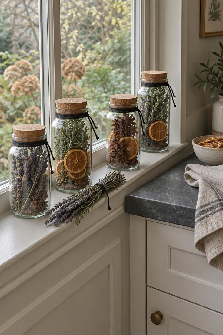
The windowsill is one of the few surfaces in a kitchen that catches light for most of the day, which makes it a natural spot for Halloween apothecary jars lined up in a neat row.
Small glass jars with cork stoppers, filled with dried lavender, rosemary sprigs, or star anise, read as old-fashioned pantry storage rather than novelty props, and that subtle shift keeps the sill looking collected instead of costumed.
Tie a length of black twine around each neck and leave the fill level uneven so the row feels gathered over time rather than bought as a set.
Group three or five jars, then break the line with one loose bundle of dried stems laid flat along the sill to soften the hard edges of the glass.
For Halloween kitchen counter decor that carries the same idea into the room, place a single jar and a short bundle on the island or the stretch of counter beside the sink, where they sit low enough to stay out of the way of everyday prep.
Choose jar heights that stay below the bottom edge of the window frame so daylight still reaches the room, and keep the fill dry rather than fresh so nothing wilts against the glass.
Wipe the outside of each jar with a dry cloth when dust collects, and refresh any faded botanicals at the start of each season so the row keeps its color.
Design Pro-Tip: Vary the jar silhouettes, a straight-sided one, a rounded one, a tall narrow one, so the grouping reads as an assembly of odd finds rather than a matching set, and repeat just one material detail such as cork or twine across all of them to hold the row together.
Style Blueprint:
- Three to five clear glass jars with cork stoppers, filled with dried lavender, rosemary, star anise, or dried orange slices
- Black twine or thin black ribbon tied once around each neck, ends left slightly uneven
- One loose bundle of dried stems laid flat along the sill to interrupt the row
- A single jar and short bundle repeated on the counter near the sink to echo the sill
- Jar heights kept below the window frame so daylight still reaches the counter
Conclusion
The range of options here runs from wall-scale silhouettes to shelf vignettes, counters, and sills, and a kitchen rarely needs more than two or three of them at once.
Two principles ran through every idea: pick a palette and pick a lane, so the room stays cohesive even when the objects are varied.
Liftable trays and boards, upper shelves, and a single labeled storage bin are the practical habits that make seasonal decorating painless.
Start with the textile layer, since it changes the room fastest and stores easiest, then layer objects in over the following weeks.