This post may contain affiliate links. If you make a purchase through these links, we may earn a commission at no additional cost to you.
October decorating works best as one evolving arrangement rather than two separate holidays crammed into a single month.
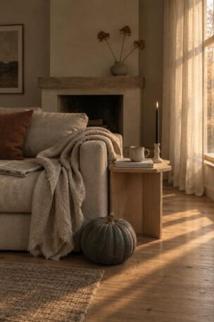
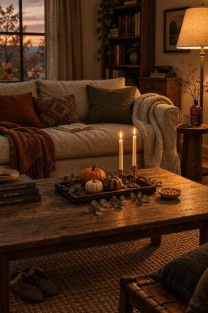
A harvest base goes up first: pumpkins, dried stems, warm textiles, amber light.
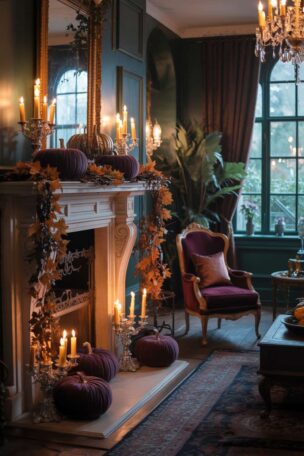
Then the darker theatrical accents arrive in waves, and the fall halloween decor that results sits somewhere between a farm stand and a candlelit parlor.
That overlap is the whole point.
Warm orange and cream keep a room hospitable.
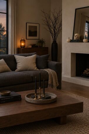
Near-black, bone, and deep green give it a Halloween read without turning the house into a haunted attraction.
Each idea below is a visual composition with a short blueprint for rebuilding it and notes on what it takes to maintain.
The setups move from porch to mantel to table to console, ending with small vignettes that can shift a single shelf or corner.
Build a Fall-First Porch with Lanterns and A Single Carved Pumpkin
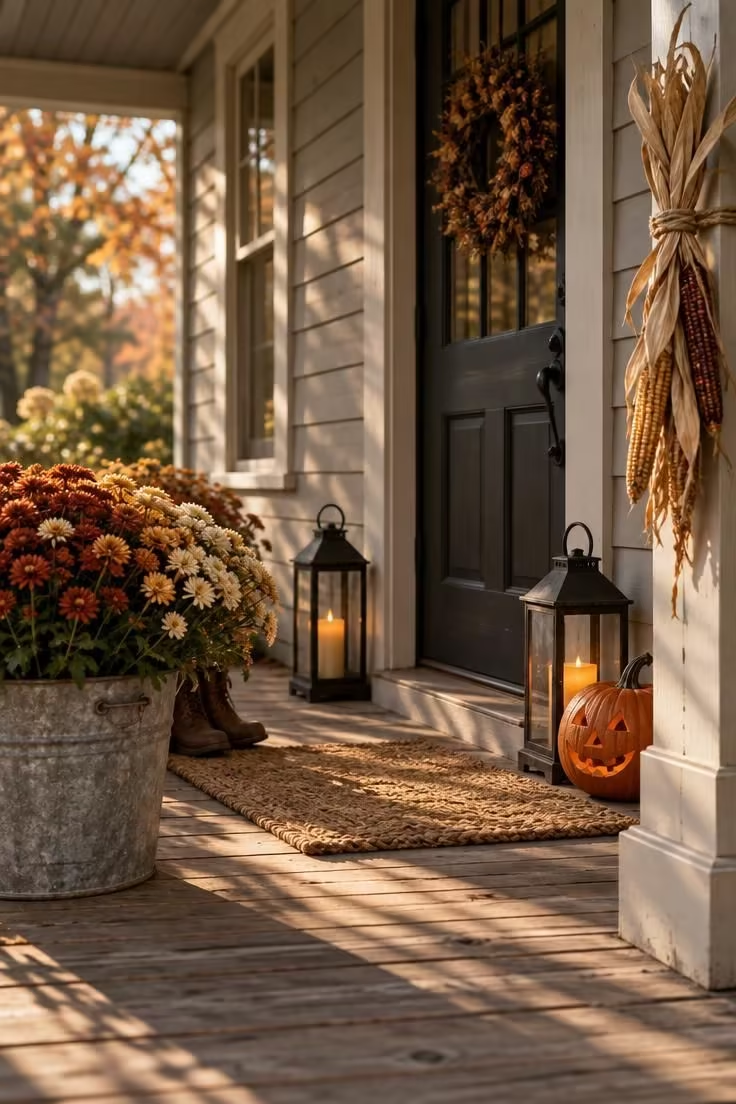
The porch reads as harvest first because only one carved element is present, and everything else stays in the fall register.
Lanterns and pumpkin sit on the ground plane rather than at the door, which keeps the entry itself visually quiet.
A single carved face carries more weight than three, since the eye has nowhere else to land on the darker motif.
Rust and cream mums against a matte black lantern pair give contrast without introducing a second palette.
Real pumpkins and mums have a limited window and may need refreshing mid-October, while faux mums and a reusable lantern pair extend the display.
Battery-operated candles allow the same low glow in a position where a flame would be impractical.
A cream, sage, and matte black combination gives a cooler, more restrained version of the same composition.
Style Blueprint:
- Galvanized or aged-metal bucket planted with mums in rust, ochre, or cream
- Pair of dark matte metal lanterns with amber battery-operated candles
- One medium pumpkin, carved or left whole, placed on a low step or ground plane
- Woven natural-fiber doormat in a neutral tone
- Dried corn husks or a wheat bundle at one column for vertical texture
Design Pro-Tip: Before adding any Halloween object to a fall arrangement, decide which single element of the existing fall composition it will replace rather than sit beside. The setups that read cleanest are the ones that swap rather than stack.
Drape a Dried Botanical Garland Across a Fireplace Shelf
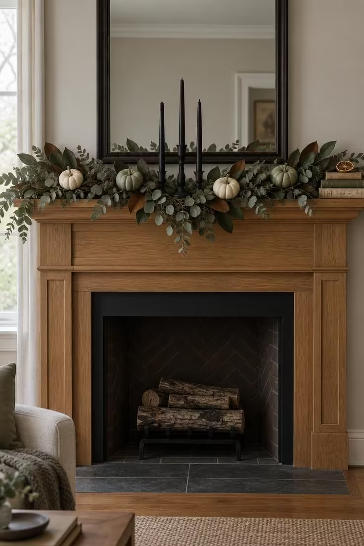
The garland does the connective work here, moving harvest tones across the shelf and into the Halloween register through the black candle accents alone.
Preserved magnolia holds its color for a season, while dried eucalyptus can shed, so a shallow tray beneath the arrangement makes periodic tidying easier.
Dried material is a one-season purchase, whereas a faux garland can be reused but reads flatter at close range.
A cream and sage base with a single near-black candle accent sits in the middle of the fall-to-Halloween range and can shift either direction with one swap.
Bone-white tapers against a light mirror frame give a cooler alternate version.
An odd number of pumpkins at three heights reads as intentional rather than scattered.
Keeping the arrangement sagged at the center rather than tight across the shelf preserves the loose, hand-gathered feel.
Tuck small halloween bookshelf accents into the gaps where the garland dips, using matte black ornaments or a tiny ceramic cat to echo the candle tone.
Style Blueprint:
- Dried eucalyptus and preserved magnolia garland, draped loose rather than wired tight
- Small cream and sage pumpkins tucked at alternating heights
- Three black taper candles in matte holders
- Dark-framed mirror or unframed art above to carry the palette upward
- Shallow tray beneath the arrangement for shed leaves
Set a Low Table Centerpiece with Gourds and Dark Tapers
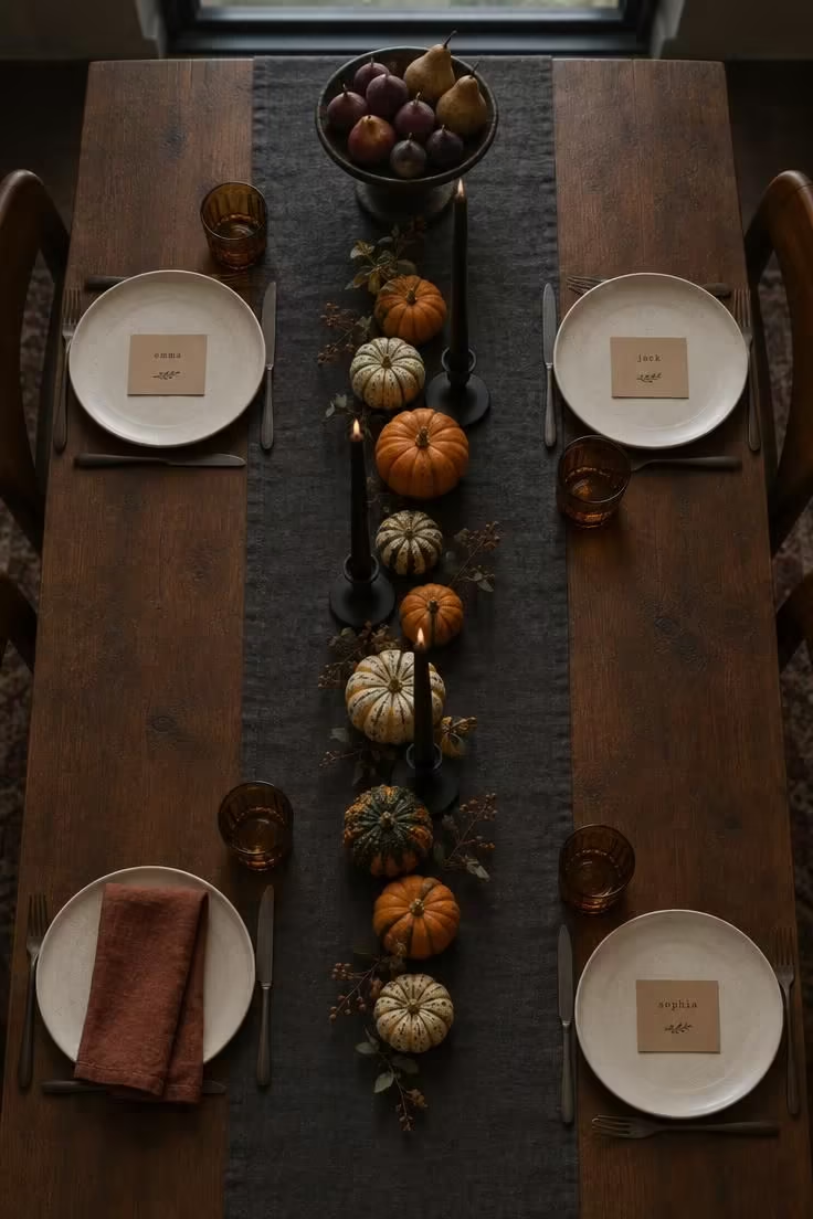
The runner defines the low centerpiece band, while the tapers supply the only vertical element and sit to preserve sightlines across the table.
Placing tapers away from where guests reach across keeps them out of the direct path of serving, and shorter tapers allow more sightline clearance in a narrower room.
A long low centerpiece reads generous but consumes elbow room, so a narrower line of gourds with a wider runner produces the same effect in less footprint.
Amber, charcoal, and muted orange hold the palette in the fall register while the black candleholders carry the darker note.
If the table is used daily, choose a composition that can lift off in one piece, either on a tray or a shallow wooden board.
Varying gourd heights between roughly two and five inches lets the line read as a cluster rather than a row.
A deep plum runner paired with cream and bone tableware shifts the same composition toward a cooler October table.
Matte black candle holders bring a deeper note to the table without pulling attention from the gourds and tapers.
Style Blueprint:
- Charcoal or deep plum linen runner
- Mixed gourds and small pumpkins in orange, cream, and sage
- Footed bowl of figs and pears at one end
- Three matte black taper holders with dark tapers
- Kraft-paper place cards and cream stoneware plates
Design Pro-Tip: Group dried and faux elements by material family, wood with wood, glass with glass, matte with matte, even when the palettes are different. Shared finish does more to unify a mixed-season vignette than shared color.
Stage a Console as a Dried Botanical and Apothecary Vignette
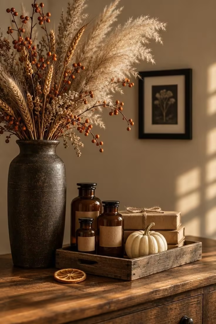
Dried botanicals provide height on the left side of the console, while the tray keeps the apothecary cluster bounded so the bottles read as a collection rather than a scatter.
Amber glass, kraft paper, stoneware, and dried stems are materials that carry both the fall and Halloween reads without forcing either.
Apothecary labeling can tip into novelty, and a plain kraft tag with a short word or a handwritten date reads softer than a busy printed label.
A low-sided tray under the vase makes it easier to gather shed stems on a periodic schedule.
Swapping the smallest pumpkin for a single small skull form or a raven figure shifts the entire vignette toward Halloween without changing the botanical anchoring.
Keeping the vase slightly off-center preserves space on the tray for the collection, and a single small framed print on the wall above avoids competing with the dried height.
Style Blueprint:
- Tall dark stoneware vase with mixed dried pampas, wheat, and bittersweet
- Wooden tray to bound the smaller objects
- Two or three amber glass bottles with simple kraft labels
- Books wrapped in kraft paper and tied with twine
- One small cream pumpkin and a single black framed print on the wall
Hang a Rising Row of Bat Silhouettes at Three Heights
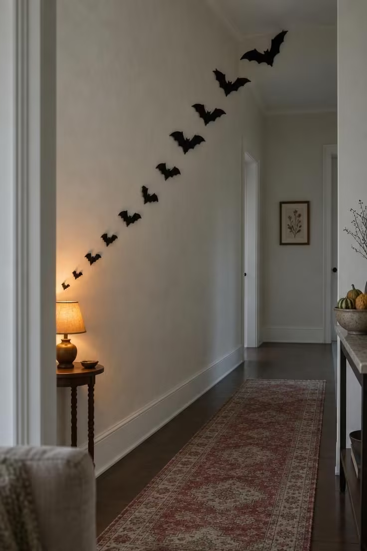
A rising arc reads more deliberate than a random scatter, and varying sizes within a consistent silhouette keeps the row from feeling like a repeating stencil.
Felt, card stock, or heavy paper all work, and matte finish reads better than glossy at a distance.
Three to five bats suit a hallway, while a tall wall can take more; the total span matters more than the individual bat size.
Silhouette motifs are strong, and once they read across a wall they dominate the room's visual character, which limits how fall-forward the rest of the space can remain.
Bone-white bats on a deep charcoal wall invert the contrast for a cooler alternate version.
Small cutouts near a fan, vent, or frequently handled surface are worth keeping out of the direct path of movement.
The same silhouette repeated across several rooms reads as a theme, whereas one rising row in a single hall reads as a moment.
Choose a bat silhouette wall decor arrangement that climbs diagonally across the wall, since a rising line of shapes suggests flight better than a straight horizontal row.
Style Blueprint:
- Matte black felt or heavy-paper bat silhouettes in three to four sizes
- Consistent wing angle across the row for a readable arc
- Single small warm lamp at the low end of the row
- Pale wall as contrast background
- One quiet accent print nearby, kept small so the arc stays the focal point
Arrange Mini Pumpkins in a Footed Bowl and on a Tiered Stand
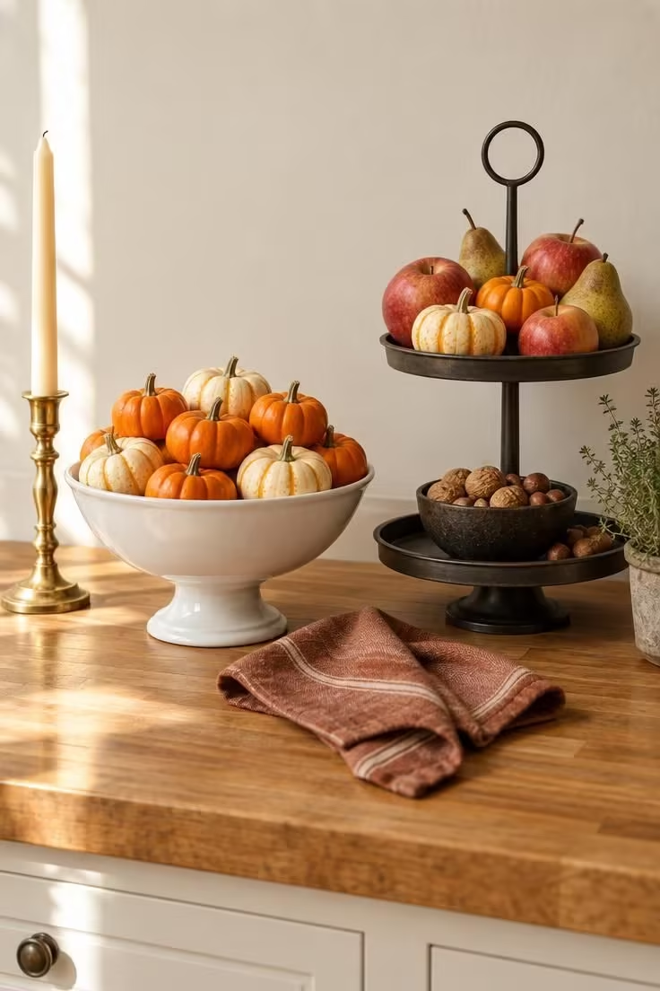
The footed bowl and the tiered stand share a vertical orientation, and placing them together keeps the cluster reading as one arrangement rather than two competing displays.
Ceramic, wood, or ironstone work well for the bowl, and the tiered stand reads in dark metal, brass, or matte ceramic.
Mini pumpkins are inexpensive and easy to scatter, and once there are too many in an open area the arrangement reads as loose rather than styled, which a bowl, tray, or stand solves.
Cream and sage minis leaning cooler pull the kitchen toward a cleaner October look, while orange-and-cream reads more classic.
A shallow footed bowl displays more pumpkins than a tall vase of the same diameter because it shows the whole surface, not just the top.
The same bowls can shift to a console in a different room for a second setup from the same materials.
Keeping a single brass candlestick nearby adds a warm metallic accent without introducing a third container.
Because the bowl and stand sit at different heights, mini pumpkin arrangements gain a stepped silhouette that keeps each piece visible from across the kitchen.
Style Blueprint:
- White or cream footed bowl filled with mini pumpkins
- Two-tier stand in dark metal or brass
- Apples, pears, and nuts on the tiers to bridge harvest and Halloween
- Single brass candlestick with a cream taper
- Small green herb or potted thyme at the edge for contrast
Design Pro-Tip: When a composition feels cluttered, remove one object from the middle of the arrangement rather than the edge. Edge removals shorten the composition, while center removals open a sightline that makes the remaining objects read as deliberate.
Line a Ledger Shelf with Dried Stems and Bone-Colored Objects
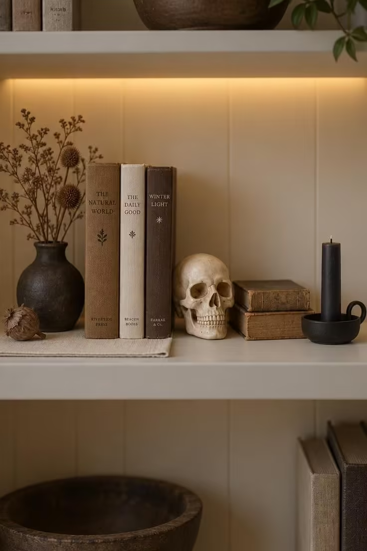
A single shelf-level vignette anchored by a consistent bone-and-brown palette reads as arranged rather than themed.
Shelf vignettes are the easiest to style but also the easiest to overfill, and leaving visible shelf surface between objects keeps the read clean.
Bone ceramic, matte black metal, and aged paper mix into a combination that carries both the fall and Halloween tones.
Swapping the skull for a small raven figure in a different month leaves the rest of the shelf untouched.
A short warm LED strip tucked under the shelf above gives the objects a defined pool of light that fades toward the shelf edges, sharpening the composition without adding clutter.
Keeping the shelf background pale and the objects dark produces the strongest contrast at the smallest scale.
Three to five objects per shelf is usually enough, since more begins to read as a shop display.
Style Blueprint:
- Small dark vase with dried stems
- Brown and cream books, spines out
- One bone ceramic skull or small dark figurine
- Single low candle in a matte black holder
- Warm LED strip tucked under the shelf above
Wrap a Stack of Books in Kraft Paper and Top with One Small Skull
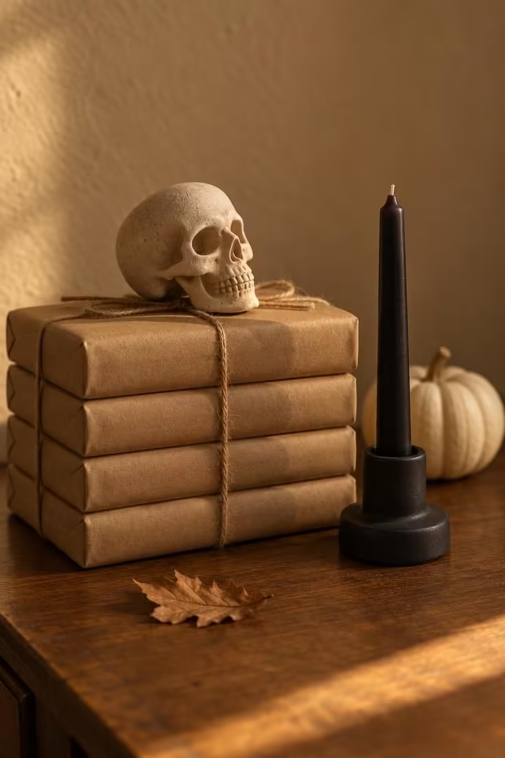
Wrapping the books removes color variety that would compete with the skull and pumpkin, and the kraft paper unifies the stack into a single shape; Kraft paper, twine, and unglazed or matte ceramic all read warm, and none read glossy.
Wrapped books are decorative rather than readable, which works on a side table but not on a working shelf.
Replacing the skull with a raven figure or a small bundle of wheat tied with twine gives the same composition a different read.
A four- to five-book stack reads as a deliberate pedestal, while taller stacks begin to read as storage.
Cream pumpkin against kraft paper is the softest version, and a black pumpkin against the same paper is the strongest.
A short matte black holder under the taper keeps the black elements from reading as a set.
Style Blueprint:
- Four or five hardcover books wrapped in kraft paper
- Plain twine tied in a single simple knot
- Small unglazed ceramic skull or raven figure on top
- Short matte black taper holder with a dark taper
- One small cream or black pumpkin beside the stack
Keep a Fall-Forward Entryway Bench with One Halloween Accent
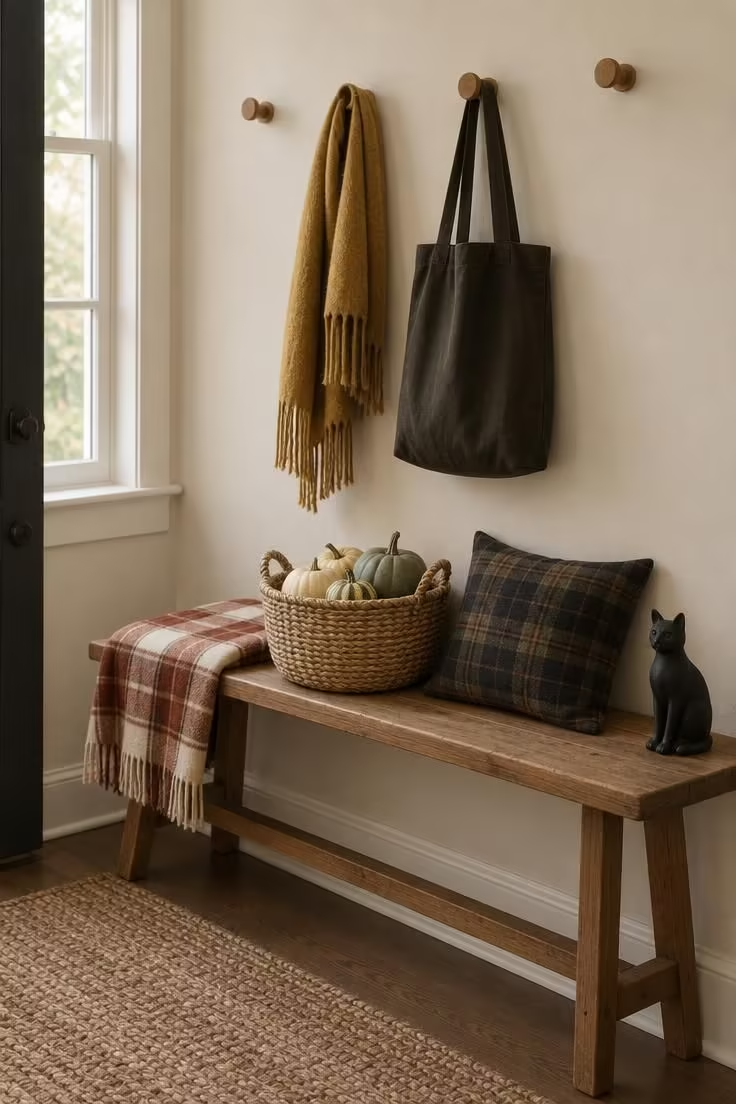
The bench reads as autumn because the palette leans plaid-and-gourd warm, and the cat figurine is the only Halloween-specific object, placed at the far end rather than at the center.
Wool, plaid cotton, wicker, and matte ceramic figures supply the material language.
Bench styling competes with daily use, and keeping one basket for real storage rather than display keeps the arrangement practical.
The entryway is a transition space, so the Halloween layer works best as a single object or the whole bench reads as a set piece.
Cream, rust, and one near-black accent hold the palette together.
Plaid throws and wool scarves need rotation rather than permanent layering, since the bench requires daily clearance.
A shallow wall ledge used the same way gives the same read where a bench will not fit.
Fall entryway bench styling works best when a wool throw, a plaid cushion, and one matte ceramic figure sit at different points along the seat rather than in a single tight cluster.
Style Blueprint:
- Slim wood bench beneath a row of pegs
- Woven basket of pale gourds in cream and sage
- Plaid throw in cream and rust, folded once
- Wool scarf and dark canvas tote on the pegs above
- One small black cat figurine at the far end of the bench
Cozy a Living Room Corner with Knit, Flannel, and a Single Amber Pool
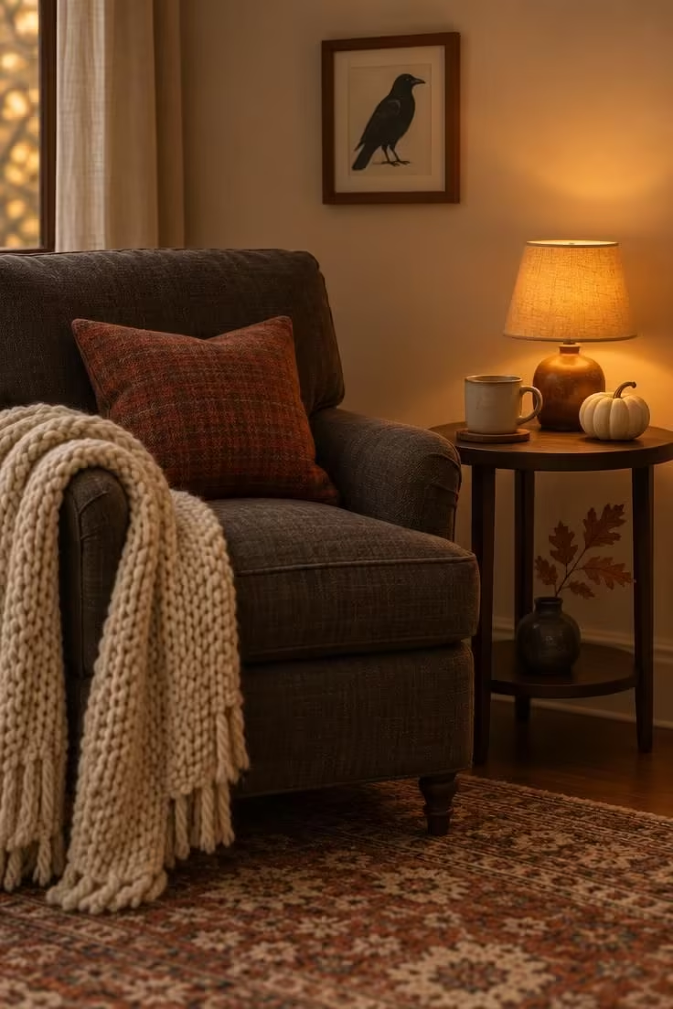
Everything in the corner reads warm, and the raven print is the only Halloween cue, with a cream background that keeps it from reading as a dark object.
Chunky knit, flannel, ceramic, and matte wood frame supply the material texture.
Warm lighting reads softer at night but can flatten colors in daylight, so the corner is best assessed under both conditions before committing to the palette.
Swapping the raven print for a moon-phase print shifts the note from Halloween to astronomy while keeping the composition intact for November.
Cream, rust, and one near-black accent ties the corner to the fall base used elsewhere in the home.
One throw and one pillow are enough, since a second throw begins to read as piled rather than styled.
The raven print keeps the composition from tipping into full Halloween because its cream ground stays bright on the wall.
A low tray on the ottoman can hold a cozy fall tablescape of small gourds, a cream pillar candle, and two stoneware mugs that echoes the knit and flannel already in the corner.
Style Blueprint:
- Deep armchair in a warm neutral upholstery
- Chunky cream knit throw draped over one arm
- One rust flannel pillow on the seat
- Small amber table lamp with a warm bulb
- Small framed raven or moon print on cream ground
Layer a Mantel with Bittersweet, Cream Pumpkins, and Dark Frames
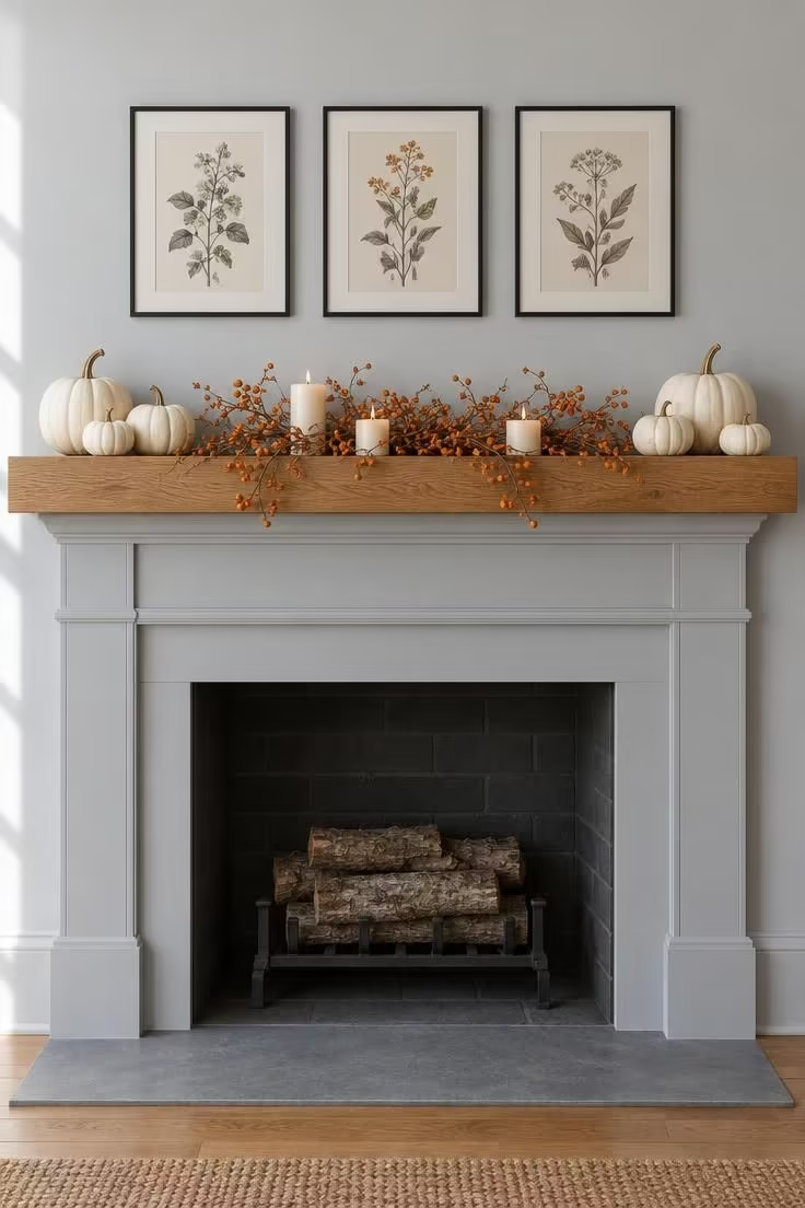
The tension between the cool wall and warm shelf is what makes this read as October rather than November, and the bittersweet's small orange berries supply the only saturated color.
Cream pumpkins, dried bittersweet, and thin matte black frames hold the composition together across the two seasons.
Dark frames with light prints need thicker margins than all-dark art to read at distance, and a mat helps.
A single charcoal pumpkin placed in the middle of the cluster pushes the Halloween read further.
The same frame-and-print formula used above a sofa elsewhere in the home keeps the wall treatment consistent.
The frame row should span roughly two-thirds of the mantel width so the shelf does not read as crowded or unanchored.
Cream candles interspersed with the bittersweet keep the vertical elements low enough that the dried berries stay the focal texture.
Dried botanical arrangements lean toward texture rather than color, with bleached stems and seed heads filling the space between cream pumpkins and dark frames.
Style Blueprint:
- Cream pumpkins clustered at both ends of the shelf
- Dried bittersweet running low through the middle
- Three thin black frames with matte botanical prints
- Small cream candles interspersed with the stems
- Pale cool grey surround to contrast the warm wood shelf
Style a Bar Cart as a Harvest and Apothecary Stand
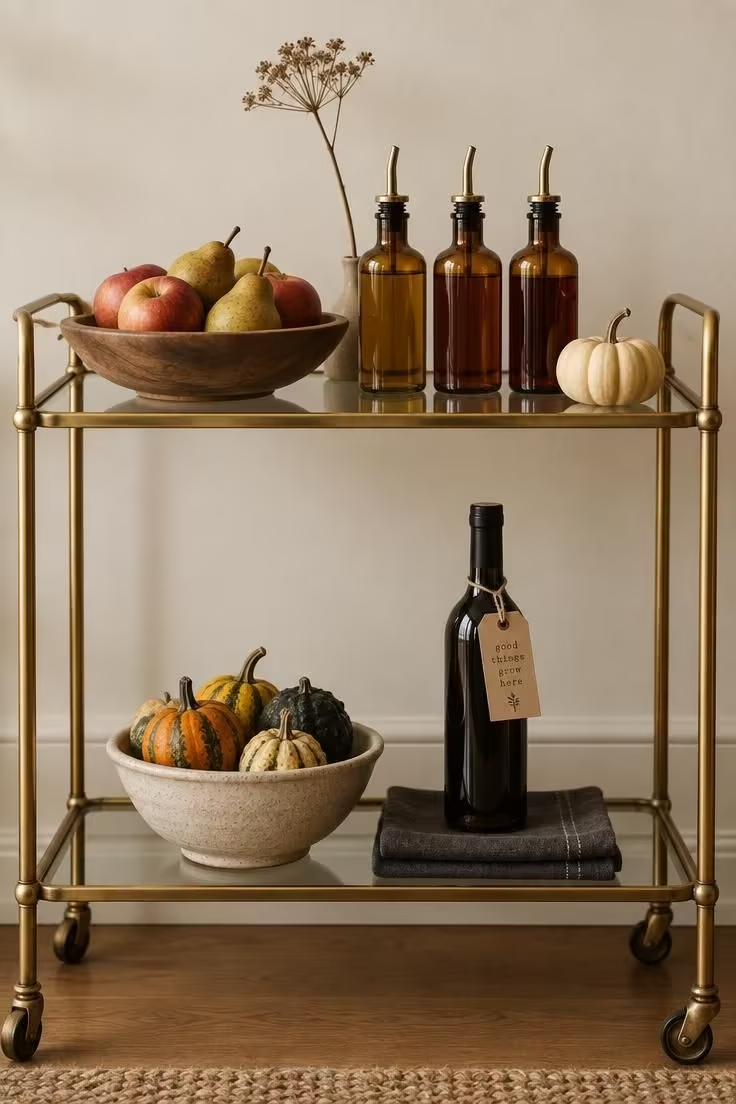
The cart is treated as two shelf vignettes, with the top tier reading harvest and the bottom tier leaning apothecary, but the same palette unifies both.
Brass, dark glass, kraft paper, and stoneware supply the material connective tissue between the two layers.
Bar carts invite daily use, so fragile orbs and tall tapers placed on a wheeled surface are best kept shallow and stable.
Swapping the amber bottles for matte black ones shifts the read darker without changing the composition.
Amber, brass, and cream stay warm and are easy to extend by adding one near-black object.
Keeping the top tier light on tall elements preserves sightlines across the cart when it sits in a walkway.
An apothecary bottle display earns its place on the lower tier, where amber glass in three heights clusters around a shallow stoneware tray.
Style Blueprint:
- Brass-and-glass two-tier bar cart
- Shallow wooden bowl of apples and pears
- Three amber glass bottles with pour spouts
- Stoneware bowl of mini gourds on the lower tier
- Kraft-paper tag on a single dark bottle for the apothecary note
Pair a Wreath of Dried Vines with Hanging Tin Lanterns
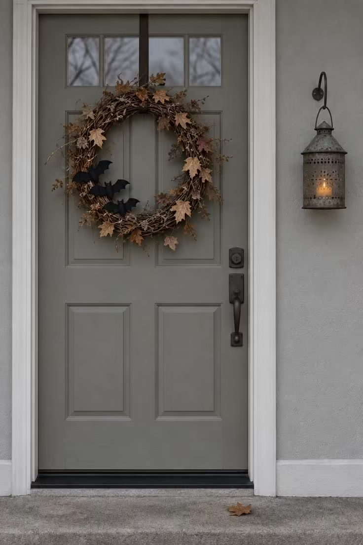
The wreath and the lantern read as one composition across the doorway, and keeping the bat cluster small and off-center keeps the wreath from reading as a Halloween prop alone.
Grapevine, dried leaves, and aged tin are materials that shift with the season's light.
Aged tin and grapevine hold up across the two seasons but absorb light at midday, so a lighter wreath base reads better against a dark door.
A cream ribbon bow instead of bats shifts the wreath entirely toward fall.
On a narrow porch, one lantern beside the door reads better than two narrow ones.
Keeping the lantern at eye height rather than lower preserves the doorway's clean lines and lets the wreath remain the focal element.
Style Blueprint:
- Grapevine wreath with dried leaves woven through
- Small cluster of black felt bats tucked off-center
- Single aged tin lantern with a battery-operated amber candle
- One hook beside the door, not two
- Pale or neutral porch wall as a quiet backdrop
Set a Small Domed Cloche Over a Bone Ceramic Object
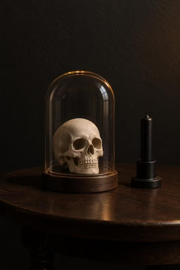
The cloche converts a single object into a composition, and removing everything else around it lets the object read as the subject rather than as part of a cluster.
Clear glass, wood base, bone ceramic, and matte black metal share a restrained material palette.
The cloche is a strong form, and more than one per room makes the setup read as a shop display.
Bone against charcoal is the strongest contrast available in this format.
Replacing the ceramic skull with a small gourd, a raven figure, or a single dried rose gives a completely different read from the same composition.
A cloche wide enough to hold the object with a finger's width of margin around it reads best, since a much larger cloche makes the object look lost.
Keeping the table bare around the cloche preserves the sense of a single staged moment.
Style Blueprint:
- Clear glass cloche with a wood base
- One bone ceramic object sized to fill the dome with a narrow margin
- Short matte black taper in a plain holder beside it
- Deep charcoal or dark painted wall as backdrop
- Bare table surface with no other objects nearby
Blend Fall Front Porch Decor with a Lantern Lit Halloween Mantel Indoors
A porch dressed for fall and a mantel styled for Halloween can share the same materials, which keeps the seasonal swap simpler and the whole house visually connected.
Start with lanterns.
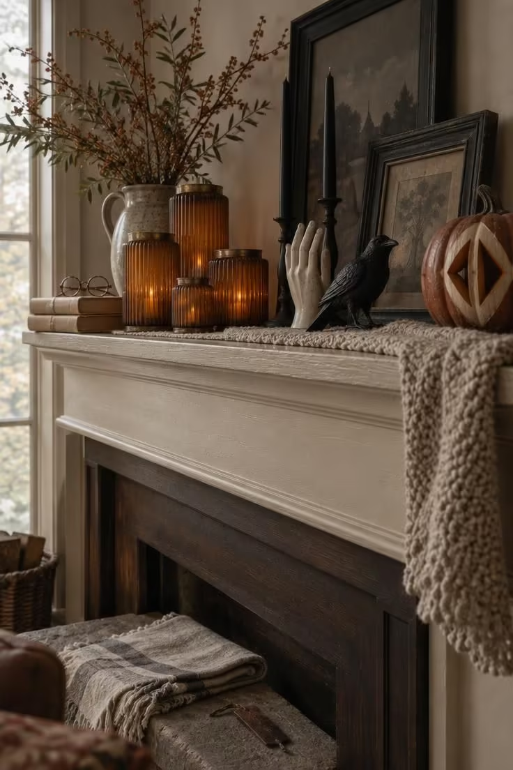
Ribbed glass or aged tin lanterns in two or three sizes read as autumn on the porch and as Halloween once they move inside.
Group them closely on the steps rather than spacing them evenly, since a tight cluster feels intentional while an even row can look like a store display.
Carry the same lanterns to the fireplace shelf, then add one dark accent per shelf level.
Black crows, a bone-colored ceramic hand, or a single matte black taper holder work without tipping the room into costume territory.
A pumpkin on the porch can be uncarved, and the mantel can hold its carved twin.
That pairing links the two spaces through shape and color instead of through matching props.
Keep the underlying palette quiet: cream, rust, charcoal, and faded olive hold up in daylight and by lamplight.
Add texture where the eye lands first, such as a chunky knit runner on the mantel and a coir mat at the door.
Height matters more than quantity on both surfaces, so vary object heights within each arrangement instead of lining everything up.
When Halloween ends, remove the dark accents and leave the lanterns, dried stems, and pumpkins in place through Thanksgiving.
That single subtraction turns the mantel back into a fall display without restyling it from scratch.
A shared material story between porch and mantel does more for a home than two separate themed displays. Pick four materials, carry them through both spaces, and let quantity change rather than the palette.
Indoors, halloween mantel styling can lean on the same lanterns, with the largest set beside a low bowl of pale gourds and the smallest resting near the candle cups so the mantel feels gathered rather than lined up.
Style Blueprint:
- Choose four shared materials: aged metal, dried stems, glass, and ceramic
- Assign the porch three heights and the mantel two
- Use black only in small, hard objects indoors
- Let orange appear in two tones, never three
- Keep one plain surface visible on each arrangement
Conclusion
The fall-first approach is what makes October decorating sustainable across a full month.
A harvest base of pumpkins, dried stems, and warm textiles goes up in September and carries into November, while a smaller set of Halloween accents layers over it in October and then peels away.
Choosing one porch moment, one mantel, one table, and one small shelf vignette usually gives a home enough of a warm October read without turning every room into a set piece.
The same composition can move into November by removing the Halloween layer, which is the practical argument for building the harvest foundation first.