This post may contain affiliate links. If you make a purchase through these links, we may earn a commission at no additional cost to you.
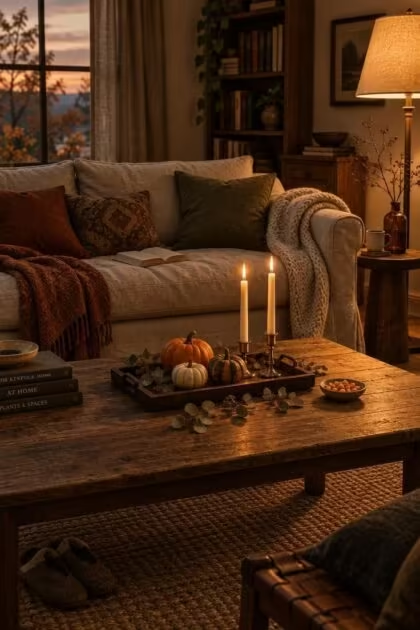
October asks for a little drama, but most homes still need to feel warm and livable well into November.
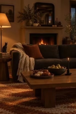
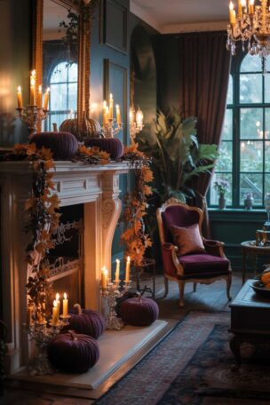
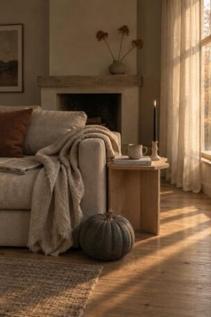
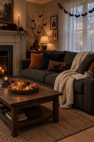
The most useful way to think about a halloween aesthetic is as a family of looks carried by palette, texture, light quality, and silhouette rather than by any single prop.
The same pumpkin can read farmhouse, black-tie, or storybook depending on what sits beside it.
The goal is composing rooms you already own, not buying a kit.
Dried Wheat, Amber Glass, and a Linen-Wrapped Pumpkin Tableau
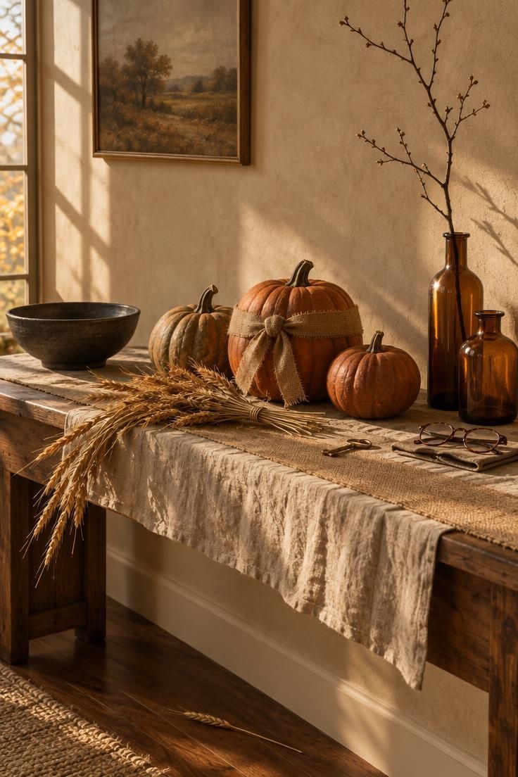
Rust, oat, and olive hold their character past October 31, so this vignette survives into November without a swap.
The dark bowl matters more than it looks.
Without one deep note, a neutral arrangement reads as generic fall rather than something with a Halloween point of view.
Dried wheat sheds as it settles, and a runner or tray underneath makes resetting a two-minute job instead of a vacuuming project.
Mixing one real gourd with faux pumpkins adds organic variation without a full shopping trip.
In a small space, reduce to three objects and keep the tallest at the back.
Graduated heights give the eye a path through the arrangement, while evenly matched sizes flatten it.
Building the whole arrangement around a low, wide Halloween tablescape keeps every stem and glass within easy reach across the table.
Style Blueprint:
- A washed linen runner in oat, wrinkled on purpose
- Three pumpkins in graduated sizes, one wrapped in burlap ribbon
- A bundle of dried wheat laid diagonally, stems over the edge
- Two amber glass bottles, one holding a bare branch
- A single charcoal ceramic bowl to stop the palette going flat
A Candlelit Parlor Corner with Cameo Frames and Tarnished Brass
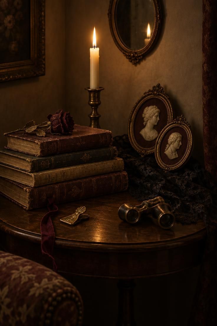
Sepia, ivory, and burgundy read antique rather than spooky, which suits rooms that already lean traditional.
Height layering does the work here: tall candle at the back, frames in the middle, books forward.
This direction rewards flea-market sourcing, so it assembles slowly across several weekends rather than in one order.
Matte aged paper against the gleam of brass keeps a monochrome corner from going flat.
Battery tapers in the same holders read nearly identically at low light, so the choice between wick and filament is a household preference.
Black lace and dried florals collect dust, and a soft brush every couple of weeks keeps them crisp.
Too many frames in one spot reads as a shop display rather than a styled corner.
Choose this look only if you already own brass or aged paper elements to build on.
Style Blueprint:
- A tarnished brass candlestick holding one ivory taper
- Two oval cameo frames leaning rather than hung
- A stack of aged hardbacks with a dried rose across the top
- Black lace draped loosely beneath the frames
A Single Matte Black Wreath Against a Cream Door
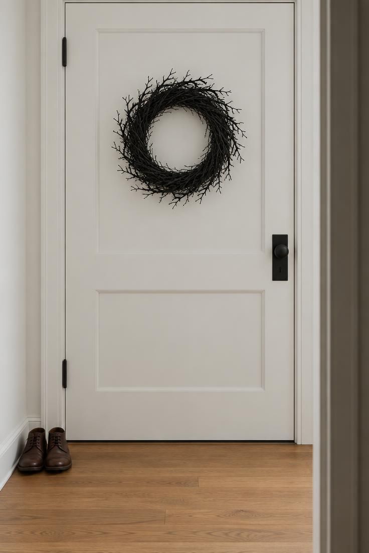
A threshold is seen in passing, so one strong silhouette registers faster than a cluster of small objects.
This is the whole display for renters and small apartments, and it costs one nail hole or one over-door hook.
Black on cream is high-contrast, and swapping to a charcoal door makes the wreath disappear entirely.
The limitation is real: a subtle gesture like this can read as undecorated to guests expecting a full Halloween treatment.
If the doorway needs more presence, a slim chalkboard sign propped beside the door extends the moment without adding clutter.
Twig wreaths drop small pieces, so a quick shake over a bin before hanging saves sweeping later.
After the season, the same wreath reads as plain winter, which makes it one of the easier purchases to justify.
Style Blueprint:
- A plain matte black twig wreath with no bow
- A cream or chalk-white door behind it
- Nothing else on the door or frame
Mushrooms, Moss, and a Twig-Wrapped Lantern on a Sideboard
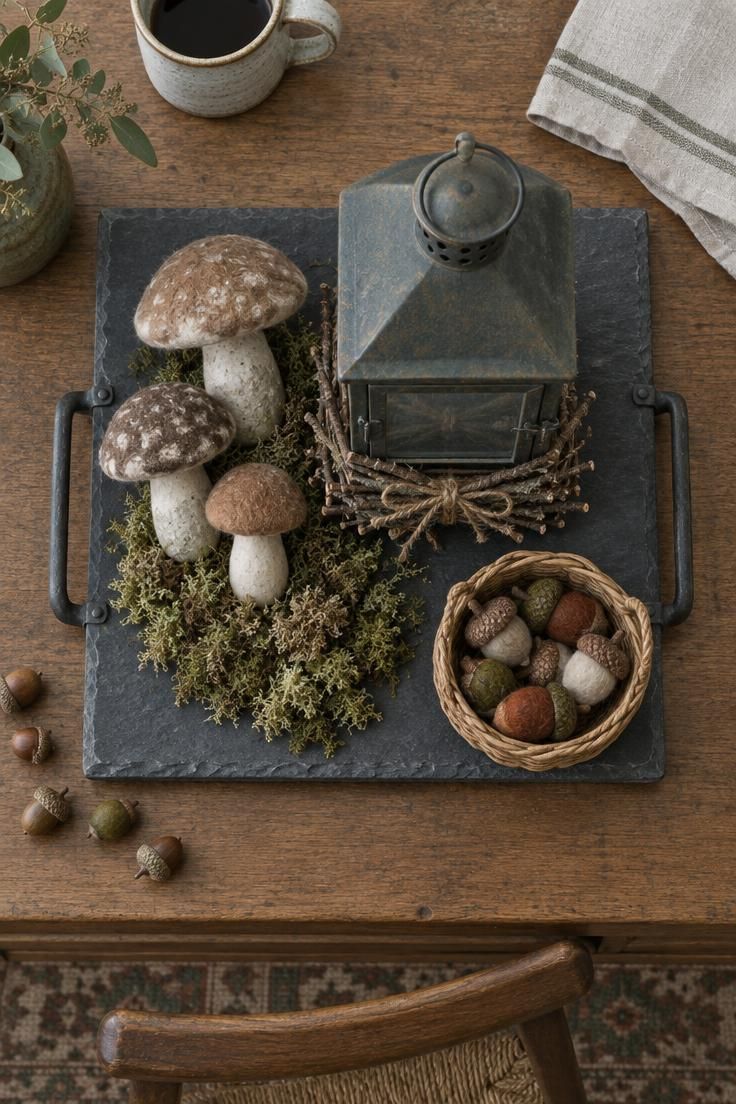
This is folklore and woodland rather than horror, so no gore and no jump imagery anywhere in the composition.
The tray is the practical hero.
It holds the arrangement together and makes the seasonal swap a matter of moving one object rather than clearing a whole surface.
Moss, twig, felt, and ceramic give four distinct surfaces in a single small footprint.
Dried moss and faux mushrooms are reusable year to year, which offsets the slower first assembly.
In a small space, drop the basket and keep the lantern, mushrooms, and moss.
Dried moss crumbles over time, and a shallow dish underneath catches the debris before it reaches the wood.
All-green palettes need one taupe or cream element, otherwise the arrangement reads as a terrarium instead of a seasonal vignette.
Style Blueprint:
- A slate or aged wood tray to contain the vignette
- A lantern with a twig bundle tied around its base
- Three faux mushrooms in varied heights
- A patch of dried moss tucked underneath
- A small woven basket holding felted acorns
A Black-and-White Console with Striped Ribbon and Marble
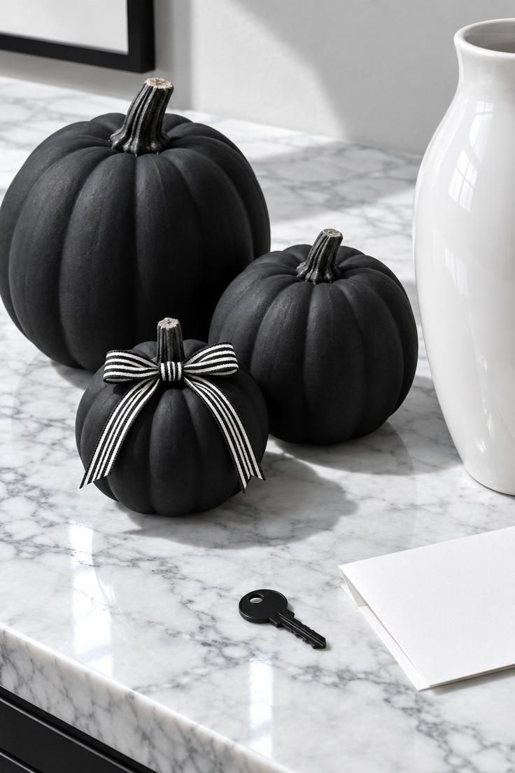
Monochrome slots into modern and rental interiors where orange and purple would fight the existing scheme.
Palette discipline is unforgiving here: black, white, and one metallic, because a single warm-toned object breaks the whole surface.
High-contrast is the strategy, and mixing it with a tonal approach on the same surface dissolves the effect.
Matte pumpkin against glossy vase against stone keeps three same-color objects visibly distinct.
Bats, cats, and branches read best in this scheme because shape carries the message rather than color.
The tradeoff is that this look can drift toward winter minimal if no recognizable silhouette appears.
Ribbon and small pumpkins pack into one box, making this the easiest look in the house to store.
Style Blueprint:
- A marble or slate console top
- Three matte black pumpkins in different sizes
- Narrow black-and-white striped ribbon tied in a plain bow
- One glossy white ceramic vase, left empty
Candlelit Study Shelves with Ink Bottles and Stacked Antiques
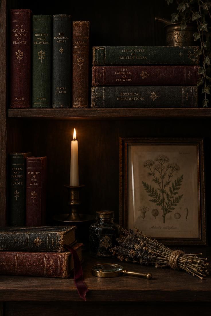
This reads as intellectual gothic rather than gory, which suits a home office or reading nook.
Height layering matters: tall taper at the back, books mid-depth, small objects in front.
The palette of oxblood, forest green, charcoal, and aged paper holds together because none of the four is bright.
Dark palettes absorb light, so the candle does most of the visual work, and flameless versions keep the effect without a wick.
Keep the arrangement to one shelf so it reads as intentional styling rather than as storage.
Too many props on one shelf hide the silhouette that makes the look legible from across a room.
Style Blueprint:
- A single ivory taper in a dark aged holder
- Stacked antique books with spines facing out
- One small ink bottle and a dried herb bundle
- A framed botanical plate leaning against the shelf back
- A length of dark velvet ribbon marking a page
Muted Pastel Halloween in a Light-Filled Room
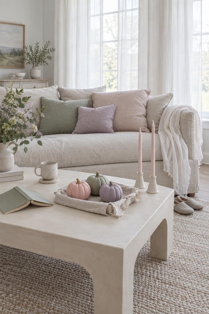
Pastels suit rooms that are already light and pale, so the seasonal shift is a tint rather than a takeover.
Palette discipline keeps it to blush, sage, cream, and soft grey with one accent.
Gauze against ceramic against painted pumpkin gives softness without color noise.
This direction works best in light-filled rooms and for readers whose everyday decor is already pastel.
Pastel pumpkins can read as spring if the surrounding objects are too fresh, and dried stems plus muted ribbon pull them back to autumn.
In a small space, two pumpkins and one candle on a tray is enough.
Gauzy fabric wrinkles and shows dust, so a quick shake and refold resets it in seconds.
Pastels plus bright even light can flatten an arrangement, and the fix is one darker element rather than more color.
Pastel Halloween home decor works best when the palette stays disciplined instead of drifting toward every candy color on the shelf.
Use the same soft scheme across pumpkins, candles, and table linens so the Halloween decoration ideas read as one calm arrangement rather than a scattered collection.
For autumn home decor in a light-filled room, pastel pumpkins read as a tint that belongs to the existing palette rather than a seasonal takeover.
Keep Halloween front porch decor in the same palette by repeating blush, sage, and cream in a wreath, a mat, and a few small gourds.
An entry table set with a blush gauze runner, ceramic pumpkins, and one soft grey bowl shows how Halloween entryway decor can stay pale rather than orange.
Sage ribbon tied around a cream pitcher keeps the front table calm and consistent with the pastel palette used elsewhere.
Style Blueprint:
- A cream coffee table with a linen tray cloth
- Three small pumpkins painted blush, sage, and dusty lavender
- A length of cotton gauze draped over one sofa arm
- Two pale pink tapers in simple holders
A Black-Tie Bar Cart with Crystal and Black Roses
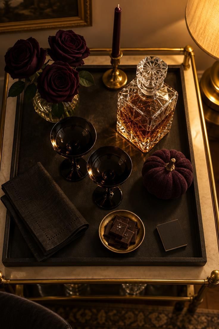
This is an elegant-gothic pocket inside an otherwise undecorated home.
Concentrating the look into one contained footprint means the rest of the room stays exactly as it is.
The palette of black, gold, crystal, and deep plum reads as an occasion rather than a season.
Keep the tallest item at the back so the cart still reads as a set from any angle.
This direction will not carry into November the way harvest neutrals do, which is a fair trade for a dinner-party moment.
Mixing crystal with too many matte props muddies the contrast that makes the look read as black-tie.
The matchbook and napkin are what keep a bar cart from looking like a store display.
Black roses tucked into a low crystal vase give the cart its spooky home decor weight without spreading the palette across the room.
Style Blueprint:
- A black or charcoal cart top, or a dark tray on a lighter cart
- A crystal decanter and two black-stemmed glasses
- One small black or deep plum pumpkin
- Three dark roses in a low vase
- A single taper in a slim brass holder
A Retro Kitchen Shelf with Honeycomb Paper and Tin Accents
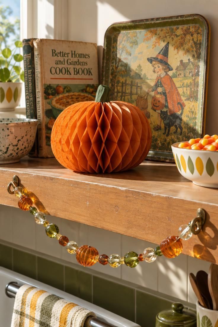
The mood here is nostalgia rather than scare, closer to a mid-century kitchen than a haunted house.
Paper, tin, and glass give three surfaces without adding a single new color.
Faded orange, mustard, avocado, and cream sit comfortably beside wood cabinets and enamel appliances.
Paper decorations crease and fade, so storing them flat keeps them usable across several seasons.
Honeycomb paper that never gets fully opened looks crumpled, and opening it completely before placing it is the one step that matters.
Keep paper decorations to one shelf run only.
Spreading them across several surfaces turns a charming retro note into visual clutter.
Style Blueprint:
- One honeycomb paper pumpkin, opened and set on a shelf edge
- A vintage-style tin lithograph tray propped upright
- A glass garland strung loosely along the shelf front
- A bowl of candy corn in a simple ceramic dish
A Layered Whimsigoth Sofa with Velvet, Tapestry, and Celestial Motifs
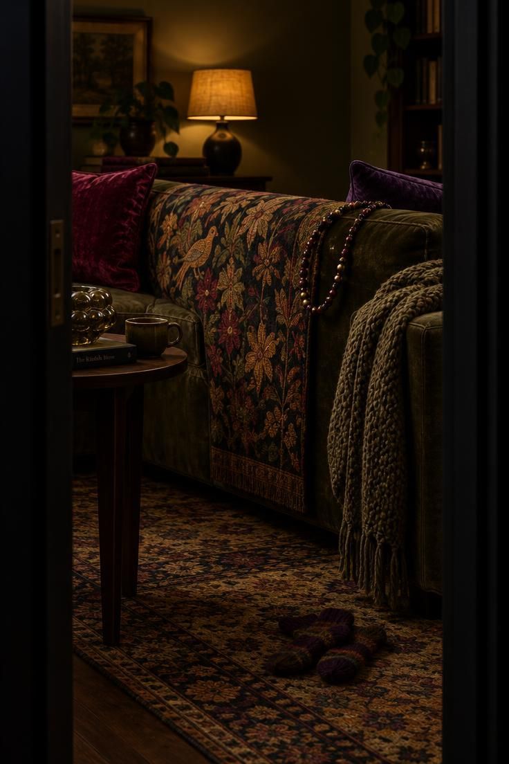
The look is carried by stacked textiles rather than novelty props, and layering is the entire method.
Amaranth, deep purple, ochre, olive, and black form the palette.
Celestial motifs such as moons and stars do the Halloween work without a single pumpkin.
Textile-heavy looks collect dust and need resetting more often than a single-object display, which is the honest tradeoff.
On a small sofa, one tapestry, one velvet cushion, and one garland are enough.
Rotating and shaking throws weekly keeps them fresh, and velvet responds well to a soft brush.
Keep the tapestry patterned and the cushions solid, since too many prints compete with each other.
Choose this look only if you are willing to reset the layers regularly.
Whimsigoth Halloween decor earns its mood from the same stacked textiles, so a velvet throw over a tapestry-covered cushion carries the theme without a single seasonal prop.
Style Blueprint:
- A tapestry or dark throw draped over the sofa back
- Two velvet cushions in amaranth and deep purple
- A chunky knit folded across one arm
- A beaded garland looped over a corner of the tapestry
- A small crystal or glass object on the side table
A Harvest-Neutral Entry Table That Carries Into November
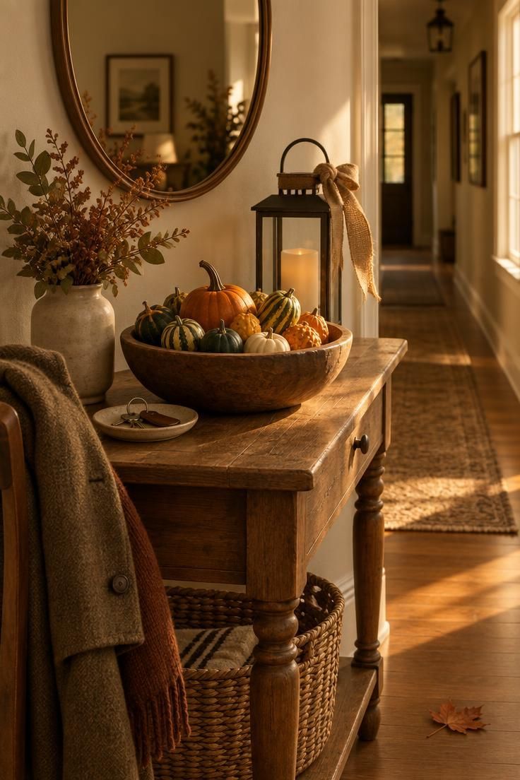
This reads as autumn first and Halloween second, which is exactly why it survives past October 31.
The palette of cream, oat, wheat, rust, olive, and warm brown works with almost any wall color.
A shallow bowl keeps the arrangement stable and easy to empty when the season turns.
Real gourds add organic variation, and faux gourds let you match a color and reuse them year to year.
Without a dark accent this can read as plain fall rather than Halloween.
In a small space, reduce to a bowl and one lantern.
Evenly distributed identical objects read as accidental, so odd numbers and graduated heights do the styling work here.
Build the Halloween color palette from cream, oat, wheat, rust, olive, and warm brown so the table reads as autumn and lingers well into November.
Style Blueprint:
- A wooden bowl filled with mixed gourds
- A lantern with a flameless pillar, placed behind the bowl
- A simple round mirror, or a framed print swapped for the season
- A burlap or linen ribbon tied once around the lantern handle
A Low Dining Centerpiece with Taper Clusters and Mini Pumpkins
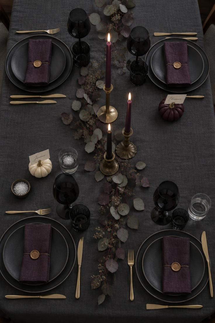
This is a contained project that can be assembled in an evening without touching the rest of the room.
Keep the centerpiece low enough to see across the table, which is a practical arrangement note rather than a rule.
The palette of black, charcoal, gold, and deep plum reads as occasion and pairs well with almost any dining room wall.
Matte plates against glossy glass against dried stems give the table surface variation in a single color family.
This suits readers who want one polished dinner moment rather than a season-long theme.
Black linens show crumbs and water spots more readily than mid-tones, so a lint roller and a quick wipe between courses help.
Battery tapers in the same holders keep the composition without a wick.
Too many tapers at one height flattens the arrangement, so vary height deliberately.
Style Blueprint:
- A charcoal or black tablecloth, or a wide dark runner
- Three tapers of varying heights in mismatched holders
- Mini pumpkins used as place-card holders at two settings
- Dried eucalyptus laid along the runner
- Black or dark-tinted glassware at each setting
A Porch Composition with Urns, Cornstalks, and a Weathered Lantern
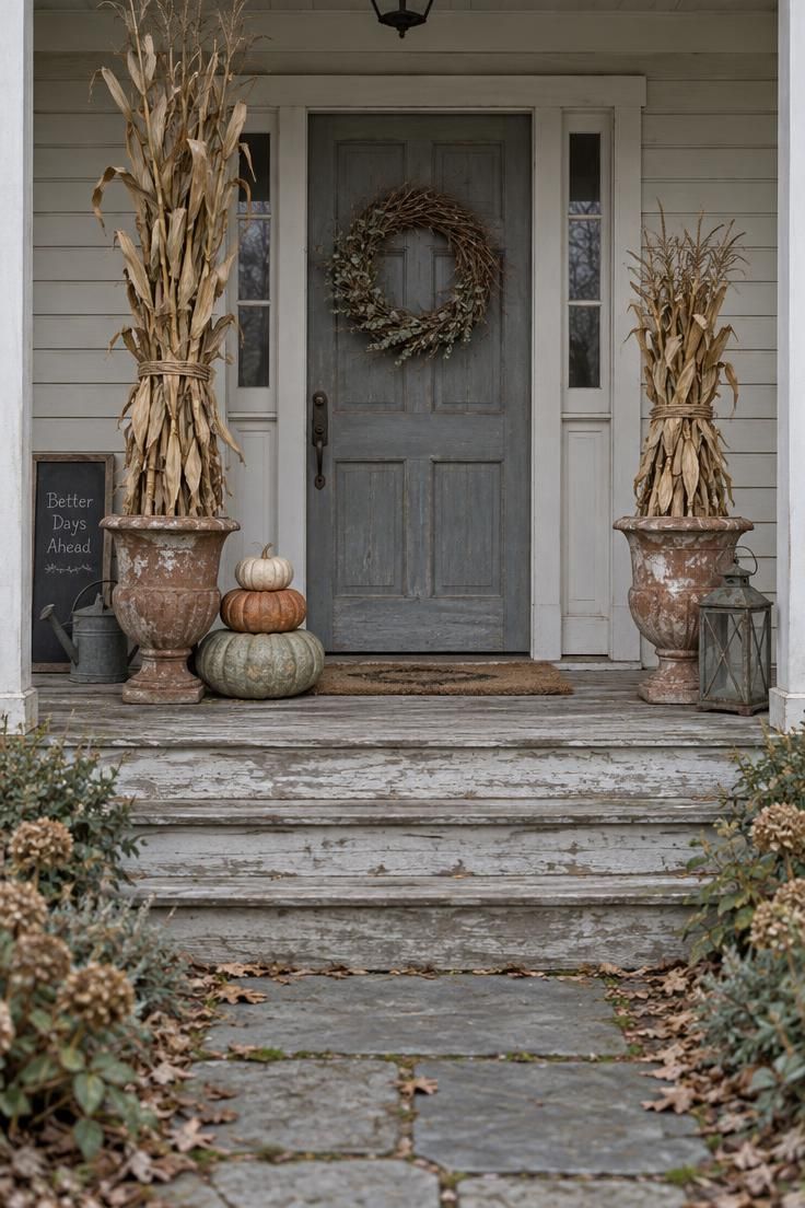
What matters visually is composition rather than construction, since the arrangement is read from the walkway at a distance.
Flanking identical urns reads formal, and offsetting one with a taller bundle reads more relaxed.
The palette of weathered grey, rust, cream, and dried green holds its own against brick, siding, and painted wood.
Outdoor arrangements change with weather and time, and they need to be assembled and disassembled more often than any indoor vignette on this list.
That said, a porch display takes longer to set up than a console or a table, so budget an afternoon.
Too many small objects on steps reads cluttered, and fewer, larger elements read stronger from the sidewalk.
This direction rewards readers who are willing to reset it regularly through the season.
Style Blueprint:
- Two weathered urns flanking the door, each holding a cornstalk bundle
- A stack of pumpkins in graduated sizes on one step
- A lantern placed on the porch floor beside the urns
- A twig wreath on the door, or a small chalkboard sign propped against the wall
Conclusion
These thirteen directions differ mainly in palette discipline, contrast strategy, texture, and how much of the room they take over.
Two decision criteria resolve most choices before anything gets purchased: how long the display needs to last, and what already exists in the room.
Harvest-led looks bridge into November, while motif-led looks read as a narrower window.
Mixing real and faux, and choosing between wick and flameless, are both legitimate, and a blend often looks more cohesive.
Pick one direction, one surface, and one dark accent to start.
A single tray, table, or doorway is enough to establish a halloween aesthetic that feels warm rather than borrowed from a store display.
Add Halloween aesthetics through texture and restraint, and the room stays livable long after the last candy wrapper is gone.