This post may contain affiliate links. If you make a booking or purchase through these links, we may earn a commission at no additional cost to you.
The space above a refrigerator often reads as an afterthought: a rectangle of unused height that draws the eye without giving it anything to rest on.
Over the fridge decor falls into three practical situations, and each one asks for a different approach.
Some kitchens already have a cabinet box above the appliance, some have an open gap above a freestanding fridge, and some have a bare wall sitting under a soffit.
Because this zone sits high, stays shallow, and gets viewed from below at a distance, scale and grouping matter far more than tiny decorative objects.
What follows is an image-led walkthrough of nine distinct treatments, each matched to one of those conditions.
Identify which situation describes the kitchen before choosing an idea, since styling a gap and closing one are two different projects.
Woven Basket Trio in Natural Seagrass Above the Fridge Alcove
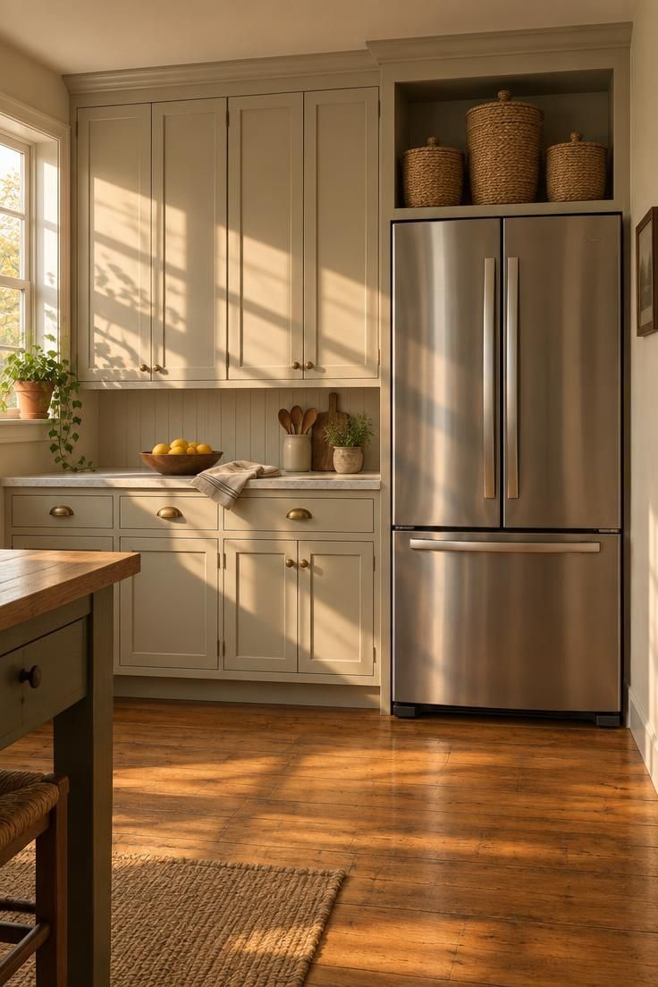
This arrangement fits the open gap above a freestanding fridge that has no cabinet box to close it off.
Three baskets in graduated heights turn an empty rectangle into a deliberate composition, and the repetition of a single woven material creates a rhythm that the eye can follow from across the room.
Lids do quiet work here: mismatched storage disappears inside, and only the woven surface stays visible.
Woven seagrass warms a cabinet run that might otherwise read as hard and uniform, especially when the surrounding cabinetry is painted rather than natural wood.
Grease and dust settle on woven surfaces over time, so a quick vacuum with a brush attachment or a damp wipe belongs in the routine.
Baskets of this size suit occasional-use items rather than daily dishes, because anything retrieved regularly means climbing for it.
If the alcove runs narrow, two baskets read better than three crowded together, since the visual breathing room around each one is part of what makes the grouping work.
Style Blueprint:
- Three lidded seagrass baskets in graduated heights, natural or whitewashed finish
- Baskets sized so the widest spans roughly two-thirds of the alcove width
- One cabinet finish or wall tone repeated in the basket lids to tie the display to the run
- Nothing stored loose beside the baskets; the trio is the whole composition
Large Matte Ceramic Urn as a Single Statement Object
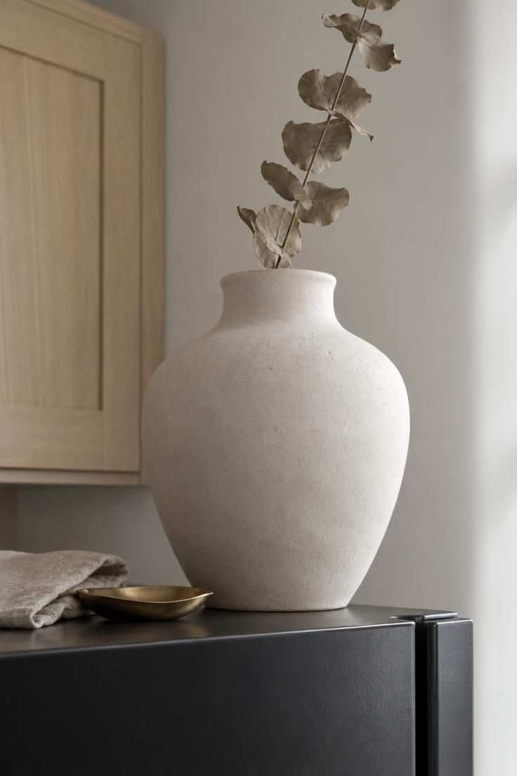
One large urn, nothing else, in an otherwise empty gap.
A single object at this scale reads as an intentional decision, where several small objects at the same distance read as accumulated clutter.
Considered as above fridge decor, the urn works because it occupies the zone as one deliberate mass instead of a row of small pieces competing for attention.
Contrast keeps the silhouette legible: a light urn against a dark appliance top, or a dark urn against a pale one, so the shape separates cleanly from whatever sits beneath it.
An urn this size is heavy to lift down for cleaning, which makes it a better fit for a wipe-in-place approach than for something that gets moved often.
The tradeoff against a grouped arrangement is flexibility, since one object cannot be rearranged seasonally the way a collection of smaller pieces can.
Matte finishes hide dust and grease sheen better than high gloss at this height, which matters more than most people expect before they commit.
Best for kitchens with a strong existing color story, since one bold urn amplifies whatever palette is already in place.
Style Blueprint:
- One oversized urn or jug, matte finish, in cream, terracotta, or matte black
- Height reaching roughly halfway up the visible gap so it reads as mass, not a small object
- A single dried branch or tall stem for vertical lift
- Chosen color contrasting the fridge top so the silhouette separates cleanly
Leaning Wooden Dough Bowl and Upright Serving Boards
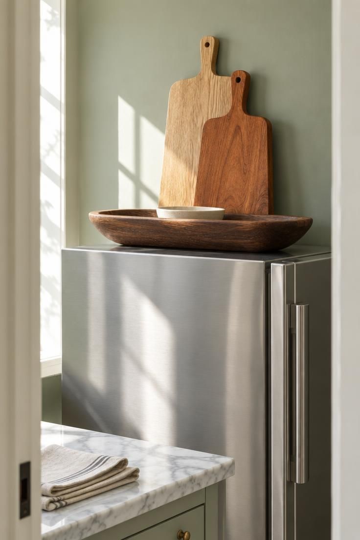
This layered arrangement anchors horizontally with the bowl and adds vertical rhythm with the boards.
Leaning boards create height without adding visual mass, which matters in the kitchen gap above fridge where depth is limited.
Mixing wood tones, one warm walnut beside one pale oak, keeps a same-material display from going flat.
Extra serving boards and platters get stored where they are seen rather than buried at the back of a cabinet, which is what makes this treatment read as over fridge storage rather than pure surface decoration.
Unfinished wood collects grease and dust differently than sealed wood, and oiled or sealed finishes wipe clean far more easily than raw grain.
The flat bowl is the easiest piece to reach; anything nested inside it should be the least-used item in the arrangement.
Leaning boards can shift when the kitchen sees a lot of activity, so this suits a still corner rather than a spot where people bump into the appliance regularly.
Best when wood already dominates the kitchen through counters, floors, or open shelving, so the display continues a material language the room has established.
Style Blueprint:
- A long wooden dough bowl or oval tray laid flat as the base layer
- Two or three cutting boards or platters stood upright and leaned, in graduated sizes
- Mixed wood tones, one warm walnut and one pale oak, for depth
- A small ceramic dish nested inside the bowl to break the flat plane
Design Pro-Tip: Before committing to any object above the fridge, stand at the far end of the kitchen and look toward the appliance. If the arrangement does not read as one clear shape from that distance, simplify it.
Lidded Vintage Trunk Corralling Rarely Used Party Ware
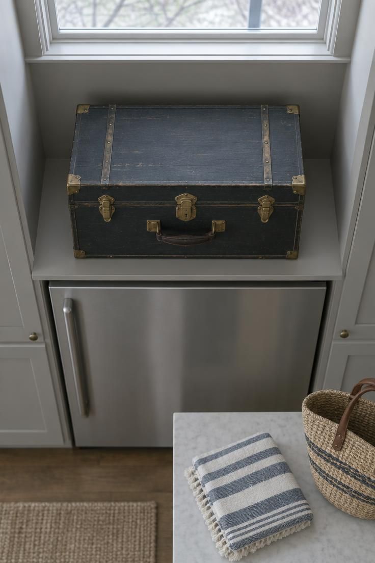
One closed trunk occupies the center of the alcove with clear space around it.
The trunk hides contents while reading as a single intentional object, echoing the storage-plus-display logic behind other above refrigerator ideas, where the container itself does the visual work.
Awkward access actually suits this arrangement, since the contents get retrieved a few times a year rather than weekly.
Smooth metal or sealed wood wipes clean far more quickly than woven surfaces, which gives this finish an edge in a kitchen where grease settles on everything over time.
A trunk wider than the alcove will look wedged rather than placed, so measure the opening before choosing a size.
Best for households with seasonal dishware, holiday platters, or party pieces that need a dedicated home rather than a shelf in the pantry.
Style Blueprint:
- One lidded trunk in wood, matte metal, or fabric-wrapped construction
- Footprint leaving visible breathing room on either side rather than filling the gap edge to edge
- A finish that echoes an existing kitchen metal, whether black hardware, aged brass, or paint matched to cabinetry
- Trunk contents limited to seasonal or occasional items, not everyday pieces
Single Oversized Framed Print Filling the Bare Wall Above
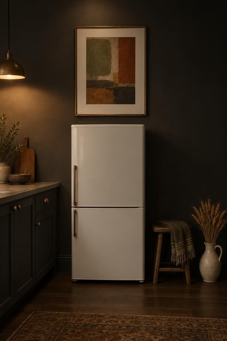
A bare wall above a freestanding fridge gets treated with one large framed piece rather than a row of small frames.
One large frame beats a cluster here because the wall is viewed at a distance, and small frames turn into visual noise from twelve feet away.
What fills the frame should hold up at that range: a simple landscape, an abstract, or a botanical with bold shapes reads clearly where fine detail would disappear.
Matching the frame to the cabinet hardware or an existing fixture ties the piece to the room instead of floating free.
For those without a soffit to work around, a kitchen gap above fridge can be closed with one oversized print rather than several smaller ones.
Painting the wall behind the fridge top or applying peel-and-stick wallpaper can do similar work without a frame, which offers a second route when art feels like too much commitment.
A large frame locks in one image rather than allowing a rotating display, which is the real tradeoff against a gallery arrangement or an open shelf.
Glass wipes easily, though grease film builds on frame edges over months and needs attention.
This treatment suits a soffit or recess with no cabinet above the fridge, where the wall itself is the surface being resolved.
Best when the wall is genuinely bare and there is no cabinet box to style in the first place.
Style Blueprint:
- One large framed piece, wide enough to visually span most of the fridge width
- A frame finish tying to cabinet hardware or an existing metal in the room
- Artwork with a simple composition that reads from across the kitchen, not fine detail
- A palette drawn from the room’s existing two dominant tones
Open Floating Shelf Styled with a Matched Ceramic Set
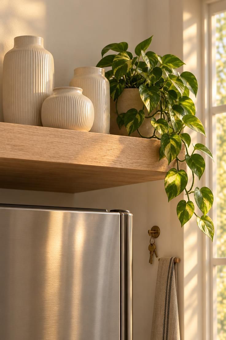
A shelf above a freestanding fridge holds a short, matched arrangement rather than a packed row.
Identical pieces in one color read as a deliberate set at height, where a mix of shapes and tones would scatter the eye.
The shelf closes the space above fridge while staying open, so the gap reads as designed rather than sealed.
Display-weight ceramic, dried stems, or decorative objects belong here; heavy daily-use items do not.
Dust and grease settle on both the pieces and the shelf surface over time, so a shelf at this height asks for periodic attention rather than a one-time setup.
An open shelf adds visual mass at the top of the kitchen, which can tip a small room toward feeling top-heavy.
Best for kitchens that already use open shelving elsewhere, so the treatment repeats a language the room has established.
Style Blueprint:
- A single shelf spanning the alcove width, in a finish echoing the cabinetry or an existing wood tone
- Three matched ceramic pieces in one color family
- One small trailing plant or dried stem for organic shape
- Empty space left at one end so the grouping does not read as a full row
Wall-Mounted Plate Rack Displaying Decorative Platters
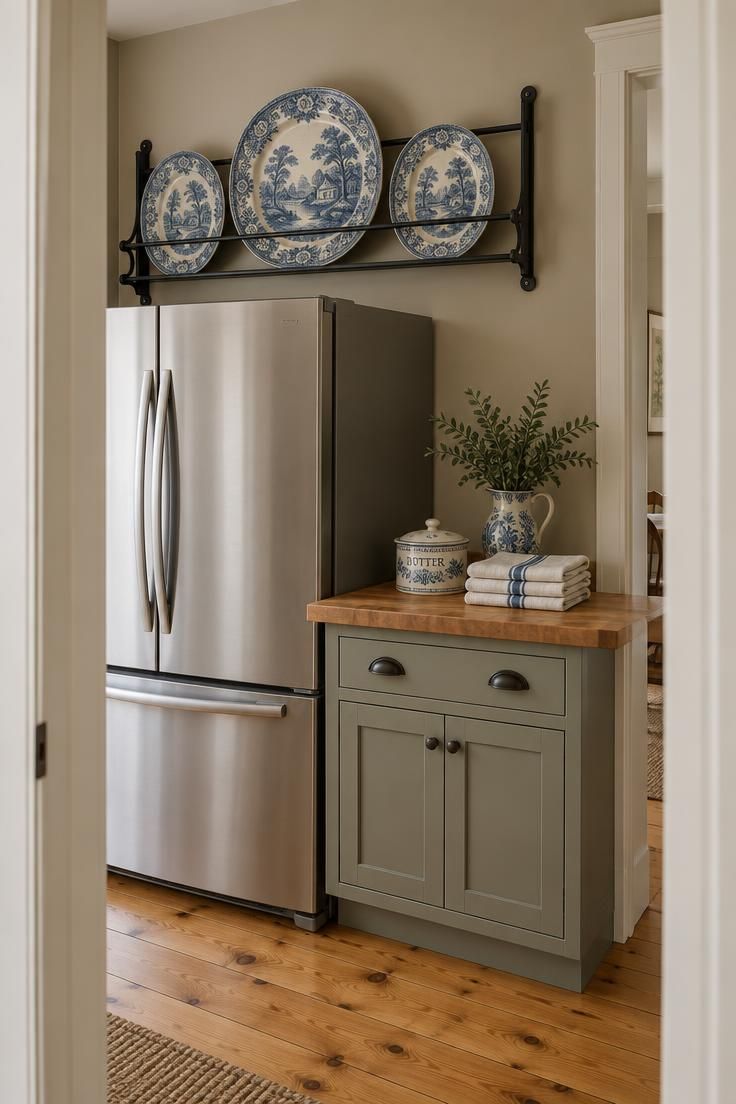
A rack above the fridge holds upright platters rather than stacked flat.
Upright platters face the viewer and read as a collection rather than as storage, which is the whole visual advantage of a rack over a shelf in this spot.
One color family keeps the group from looking like a jumble at distance, and a matched pattern does the same work even more clearly.
Where over fridge cabinets already frame the appliance, a rack becomes one more layer in that run instead of a standalone solution.
Decorative or seasonal platters belong on display, while the everyday stack that gets pulled down weekly stays in a cabinet.
Platters on open display collect kitchen grease film and need periodic washing even when they go unused, which is easy to forget about a surface this high.
Leaving one empty slot keeps a rack from feeling crowded, so a rack sized for five should hold four.
Centering the largest piece and flanking it with smaller ones creates a stable visual triangle that holds from any angle in the room.
Best when a set of decorative platters already exists but currently lives boxed in a cabinet.
Style Blueprint:
- A wall-mounted rack sized to hold three to five platters or plates upright
- Platters in a single color family, whether white, cream, or a matched pattern
- Rack finish in matte black, aged brass, or wood to relate to existing hardware
- Largest platter centered, smaller pieces flanking for symmetry
Black Metal Bin Pair with Chalkboard Labels as Hidden Utility
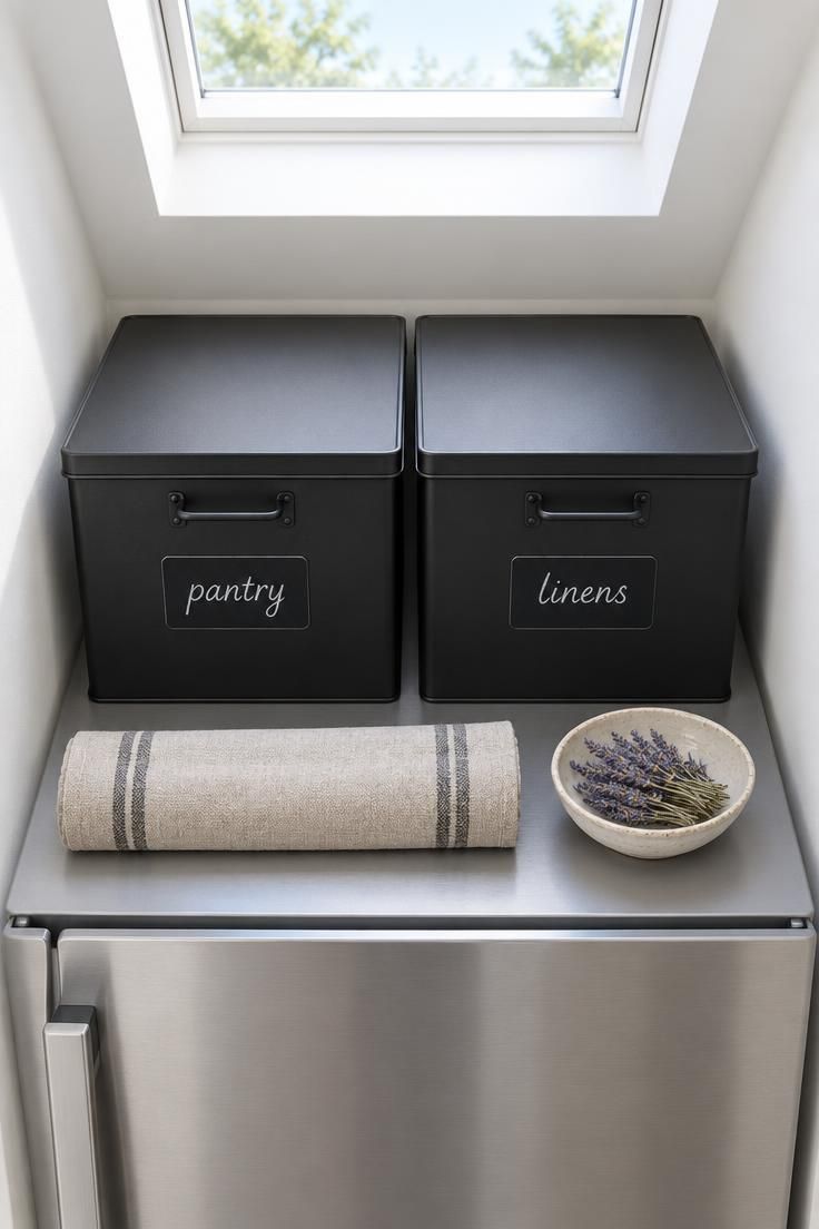
Two identical bins sit side by side, each labeled, doing quiet organizational work above the fridge.
The pair corrals loose items while reading as a composition rather than an accumulation of stray containers.
Matching matters here: two different bins read as clutter, while two identical bins read as design.
For anyone weighing over the fridge decor ideas that lean toward function, this approach treats fridge top styling as a working system first, with the bin pair carrying the visual weight that a vase or basket would otherwise hold.
This is also the one spot where the refrigerator’s own ventilation envelope deserves attention, since the space directly above and around the appliance is part of how it breathes, and bulky sealed enclosures or tightly packed fabric can work against that; the owner’s manual for the specific model is the correct reference for clearance guidance.
Labels face forward, so contents are known at a glance, though nothing is truly hidden the way it would be inside a lidded trunk.
Best for readers whose primary goal is containment rather than pure display, especially when the kitchen lacks a dedicated pantry.
Style Blueprint:
- Two matched black metal or matte-finish bins
- Chalkboard or wipe-off labels on the front face
- A single tone palette so the pair reads as one unit rather than two objects
- Contents limited to items that are genuinely occasional-use, not daily staples
Warm Rattan Wall Panel Layered Behind a Low Ceramic Vase
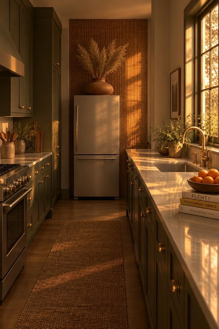
A textured wall panel behind the appliance resolves the gap without a frame, a shelf, or a single container.
Rattan adds warmth and pattern at a height where flat painted wall would otherwise leave the eye with nothing to hold.
The low wide vase sits in front of the panel rather than against bare wall, so the pairing layers two textures instead of one.
Where above fridge baskets have already claimed the open gap, the panel changes role: it becomes a backdrop for them instead of the main event.
Woven wall surfaces collect dust in their crevices and need a soft brush more often than a flat wall would.
A panel this size is a commitment to one texture and tone, which limits how easily the treatment can be swapped seasonally.
Best for kitchens with deep or saturated cabinetry colors, where a warm natural texture softens the intensity of the surrounding paint.
Style Blueprint:
- One woven rattan or cane wall panel sized to cover most of the wall above the fridge
- A low wide vase in unglazed terracotta or matte stoneware
- Dried stems with a soft neutral tone so the vase does not compete with the panel
- A palette limited to two or three warm tones so the layering stays calm
Conclusion
The right choice for the space above the fridge depends entirely on which condition the kitchen actually has, whether that is a cabinet box already in place, an open gap above a freestanding appliance, or a bare wall under a soffit.
Two principles ran through every idea here: scale matched to the width of the gap, and a restricted palette at height.
An above fridge shelf and a closed over fridge cabinets run solve different problems, so pick the one that matches how often you want to reach up there.
Maintenance and access are the quiet constraints that decide what still looks good a year later.
Whatever the arrangement, the refrigerator’s own manual remains the reference for clearance guidance before anything dense goes above or around the appliance.