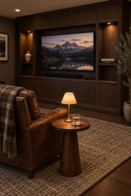
This post may contain affiliate links. If you make a purchase through these links, we may earn a commission at no additional cost to you.
The wall behind the television sets the tone for the entire room, yet it is often the last surface anyone plans.
A large dark screen on an empty wall can leave the space feeling unfinished.
Fill the area around it with too many objects, and the screen starts competing for attention rather than anchoring the room.
The trick is treating the screen as the anchor and choosing a surrounding composition that balances its weight without erasing the room’s personality.
The layouts ahead show different ways to frame that focal point, each with practical tradeoffs for real home rooms.
Built-In Media Wall With Dark Oak Cabinetry
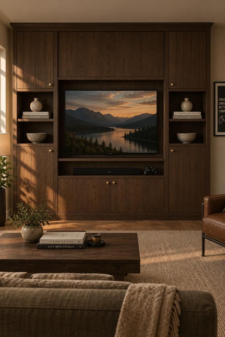
A floor-to-ceiling built-in turns the television into part of the architecture, making the man cave tv wall feel more anchored and deliberate than a basic console setup.
The dark oak cabinet doors give the wall a furniture-like presence, and the recessed screen sits slightly back from the cabinet faces so the whole assembly reads as one piece.
That small step in depth matters, because a screen mounted flush on a cabinet face looks applied rather than integrated.
Closed storage does most of the practical work here.
Consoles, controllers, spare cables, and the small clutter that accumulates in a game room disappear behind panel doors, which keeps the visible surface calm.
One open shelf on each side gives the composition a place for a few objects without turning the wall into a display case.
Keep that group small and in one material family so the shelves do not compete with the screen for attention.
The tradeoff is permanence.
A built-in is a fixed treatment, and once it is in place, the wall stops being flexible.
Rearranging the room means working around the millwork rather than starting fresh.
This direction suits a room that needs genuine storage and will keep the same seating layout for years.
Cabinet hardware deserves a quiet choice.
Small round pulls in a single finish let the grid of doors and shelves carry the design.
Ornate or mixed hardware adds visual noise right at eye level, exactly where the screen already commands attention.
Style Blueprint:
- Dark oak or walnut millwork running the full wall height
- A recessed niche sized to the screen so the television sits slightly back from the cabinet faces
- Panel-front cabinet doors with simple round pulls in one finish
- One open shelf per side with three objects in a single material family
- A soundbar housed on the lower shelf rather than mounted above the screen
Wood Slat Accent Wall Behind a Floating Console
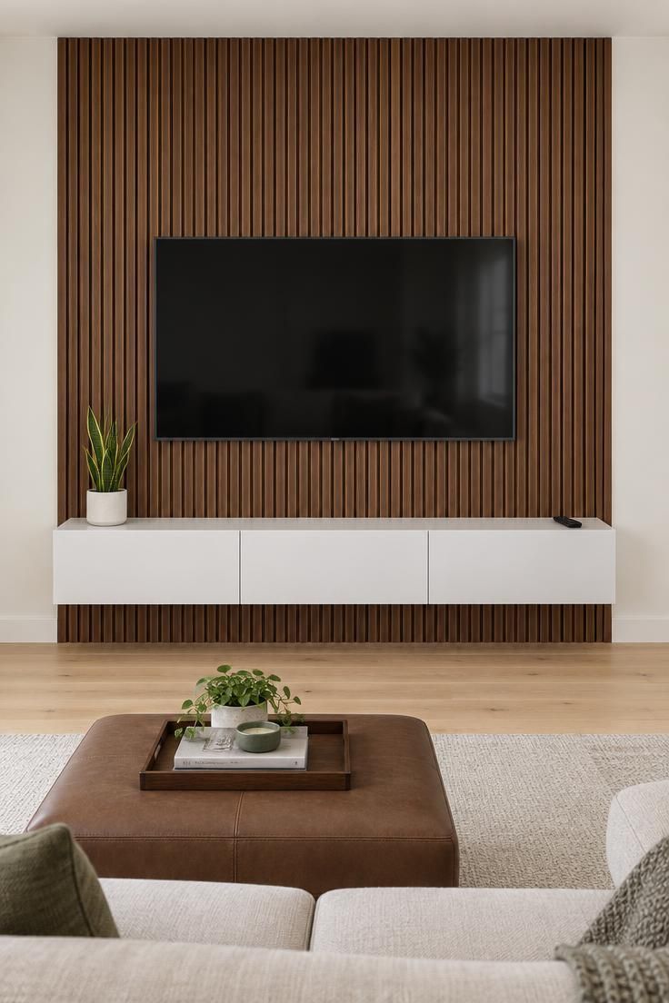
Vertical walnut slats give the wall rhythm without the busy quality of a patterned wallpaper.
The eye reads the repetition as texture rather than as a specific design, which keeps the screen as the clear focal point while the surrounding surface still has warmth and depth.
Wood tone drives most of that impression: a medium walnut feels grounded and slightly mid-century, while a paler oak reads quieter and more Scandinavian.
The floating console below does two things at once.
It keeps the floor clear, which makes a small room feel larger, and it creates a horizontal line that counters the vertical slats.
That crossing of directions is what keeps the wall from feeling like a fence.
A white lacquer front also provides contrast against the warm wood, so the console stays visible without adding another competing material.
Storage is the honest limitation.
A floating console with no legs usually offers one shallow drawer or an open bay, which is not enough to hide a receiver, several consoles, and a tangle of cables.
It suits a household with few devices or a room where equipment lives elsewhere.
Maintenance deserves a mention before committing.
Dust settles in the gaps between slats, and clearing it takes longer than wiping a flat wall.
A vacuum brush attachment reaches into the channels more easily than a cloth.
For a wood slat accent wall, slat spacing also changes the character of the wall.
Wider gaps read as architectural and calm, while tight spacing starts to look striped and can make the screen harder to distinguish.
Compare the spacing against the screen width rather than choosing it in isolation.
Style Blueprint:
- Vertical walnut or oak slats running the full wall height
- Slat spacing wide enough that the pattern reads as architecture rather than stripes
- A low floating console in white lacquer or pale wood to cross the vertical lines
- A black metal floor lamp at the seating end for a cool accent against the warm wood
- A gray upholstered sofa to keep the palette from turning uniformly brown
Gallery Wall Around a Black-Framed Screen
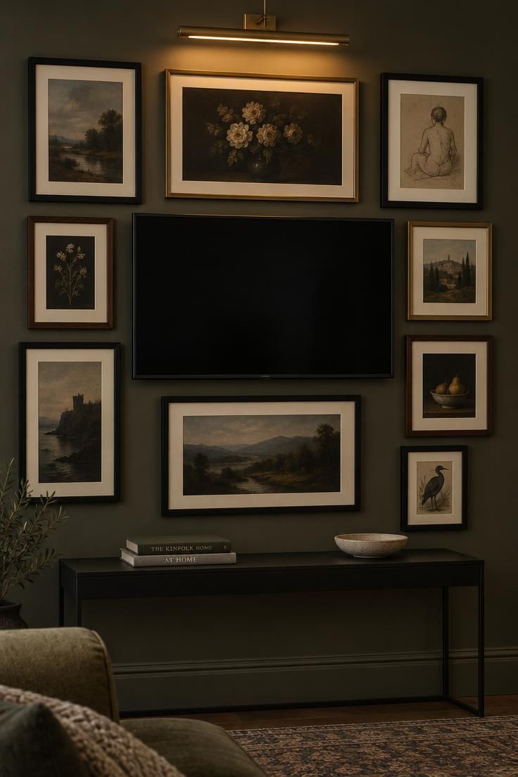
Treating the television as one piece inside a larger arrangement changes how the room reads.
For a gallery wall around TV, instead of a screen with decoration around it, the wall becomes a collection that happens to include a screen.
That shift works especially well in a small room, where the wall sits close to the seating and a dense arrangement feels intentional rather than crowded.
Frame variety does the heavy lifting.
Mixing black, brass, and walnut frames in different sizes gives the wall depth and keeps the eye moving, while matching mat widths hold the whole group together.
Without that shared mat, a mix of frame sizes can look like unrelated pieces placed near each other.
Dark tonal values in the artwork also help, because a screen turned off reads as a dark panel, and art in similar values lets it blend into the composition instead of standing out as a void.
The discipline this direction requires is specific.
Keep small objects, tiny prints, and busy patterns away from the area immediately around the screen.
The screen’s hard rectangular edge needs a margin of calm, and the largest frames belong on the outer edges of the arrangement where they can anchor the group without crowding the screen.
A slim console underneath gives the wall a base line and a place for remotes.
Two or three objects on top is enough; a fully styled surface starts to pull attention downward and away from the art.
Style Blueprint:
- A mix of frame sizes in black, brass, and walnut
- Identical mat widths across every frame to unify the group
- Dark, muted artwork values so the screen blends when powered off
- A slim console as a base line with only two or three objects on top
- A single warm picture light rather than general overhead illumination
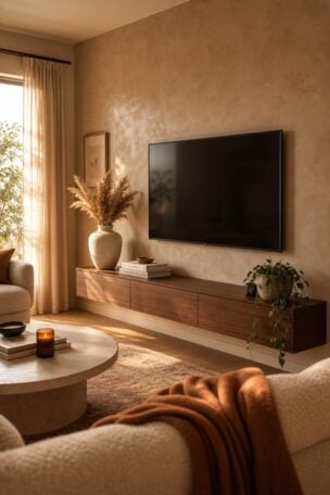
Fireplace and TV Wall With a Linear Electric Firebox
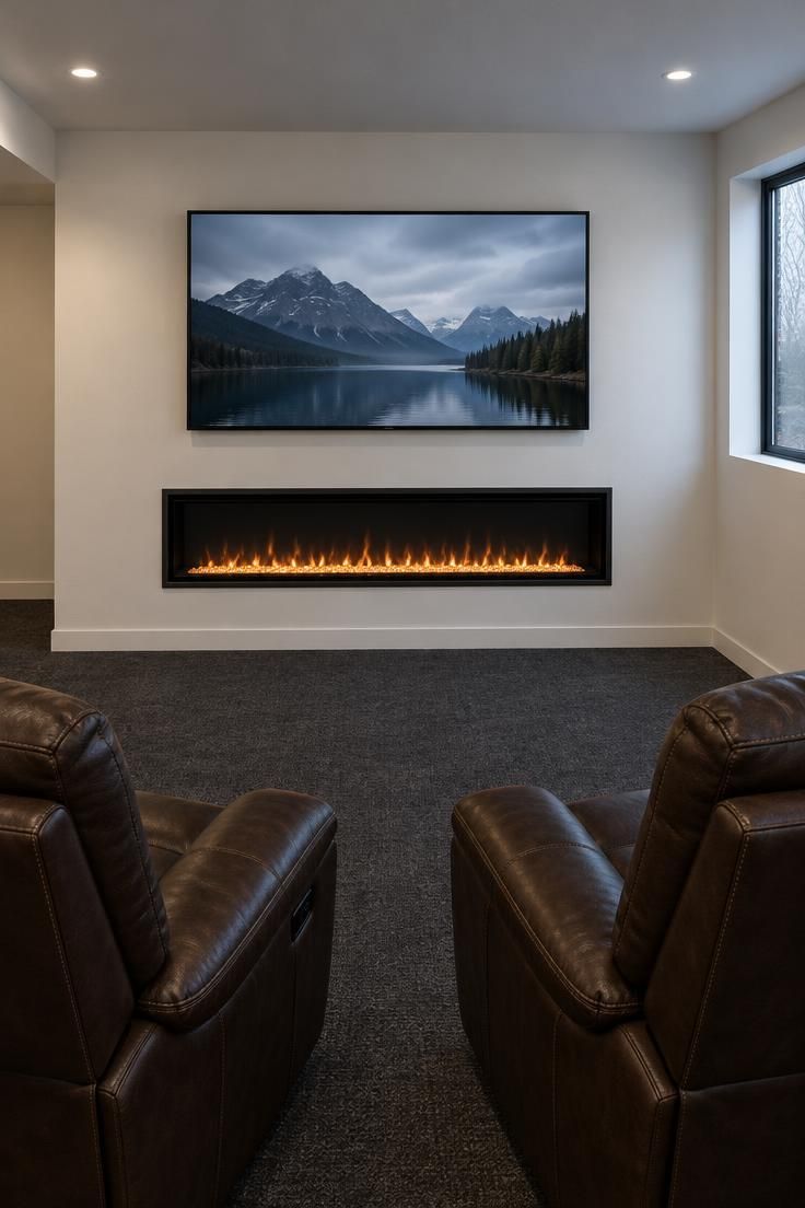
For a fireplace and TV wall, stacking a screen and a firebox on one wall creates two focal points in a direct vertical relationship.
The horizontal fire line does the most important work in this composition: it is long, low, and steady, which gives the eye a resting point beneath the much larger dark rectangle above.
The result feels deliberate rather than cramped.
The viewing height is where this direction asks for an honest compromise.
A screen placed above any firebox sits higher than a screen placed at seated eye level, and the taller the firebox assembly, the higher the screen goes.
In a deep room with recliners set well back, that lift is manageable.
In a shallow room with a sofa close to the wall, it becomes uncomfortable quickly, which makes room depth the deciding factor.
A shallow mantel, or none at all, keeps the composition from climbing.
Every horizontal shelf added above the firebox pushes the screen further up.
Omitting the mantel also lets the plastered wall stay a single uninterrupted plane, which is what gives this treatment its clean look.
Finish choice affects how the wall reads during use.
A matte plaster or matte paint diffuses the firebox glow instead of bouncing it back, so the screen stays legible against the wall instead of sitting inside a pool of reflected light.
A glossy surface would produce the opposite effect.
Keeping the visual plan simple, with a wide wall, a low fire line, and no mantel, gives the room a clear focal arrangement.
Style Blueprint:
- A wide wall with enough length for a horizontal fire line and a screen above it
- Smooth warm white plaster or matte paint in a single uninterrupted plane
- A long linear firebox with black glass and thin dark steel trim
- No mantel, or a very shallow one, to limit vertical lift
- Deep seating placed well back so the screen height stays comfortable
Gaming Wall With Blue Accent Lighting and Closed Storage
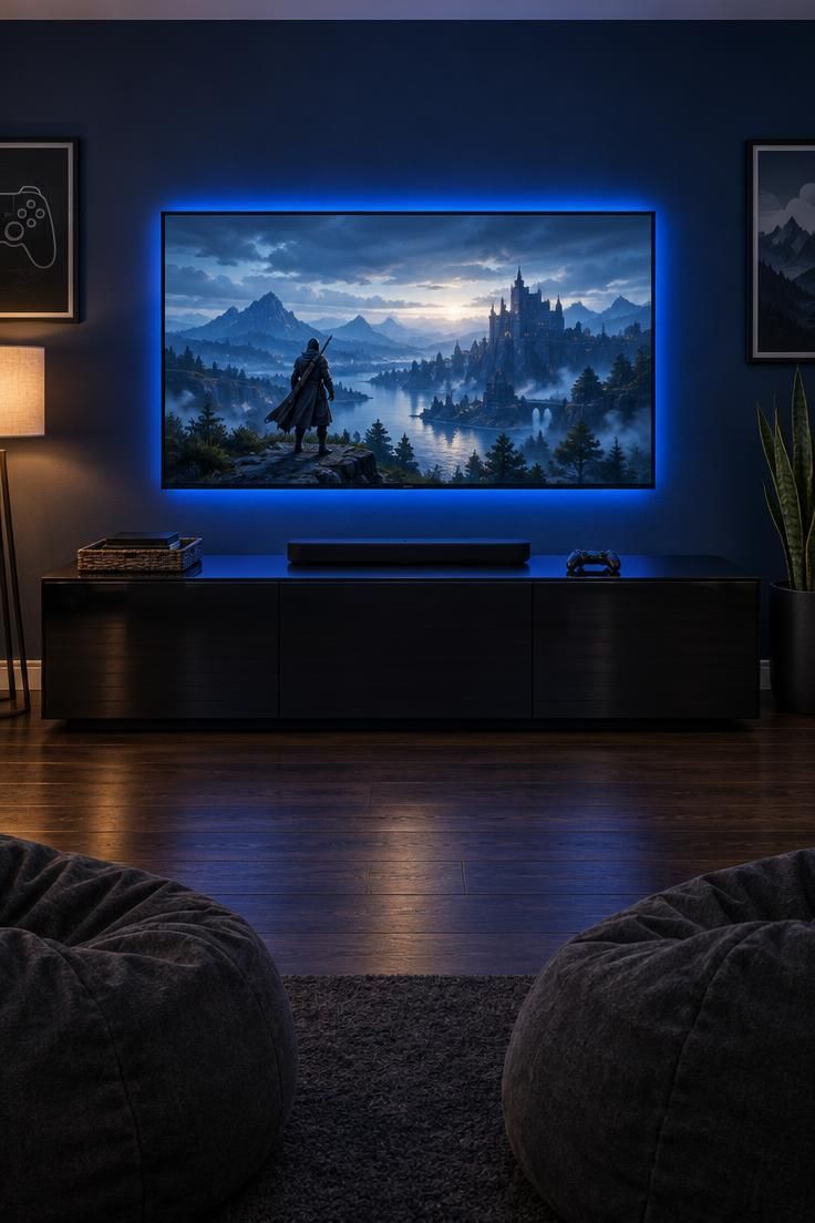
A gaming setup asks more of a wall than a movie setup does.
Consoles, controllers, headsets, and charging cables accumulate quickly, and every one of them is a potential visual interruption.
A matte navy wall with a low console gives those items somewhere to go while turning the screen into the only bright element in the room.
Closed storage is the practical core of this direction.
Push-to-open doors with no visible hardware keep the console face flat and uninterrupted, which suits the navy wall and the controlled lighting.
Anything stored inside stays hidden, and the room does not need restyling after every session.
The accent lighting is the part that is easy to change.
A thin LED strip set to cool blue adds character without committing to a permanent finish, and the color can shift with the season or the game.
The placement matters more than the color: running the strip along the top edge of the console rather than behind the screen spreads the glow across a wider surface and produces a more even result, with less risk of a bright hotspot behind one corner of the screen.
The main visual risk is cord clutter.
A glossy black console reflects light and shows cables clearly, so a woven tray or a low basket at one end of the console gives loose cords a defined place to live.
The same applies to controllers, which look intentional on a tray and messy scattered across a surface.
Style Blueprint:
- A matte navy or deep blue wall behind the screen
- A low black console with push-to-open doors and no visible hardware
- A thin LED strip along the top edge of the console rather than behind the screen
- A woven tray or low basket to contain cords and controllers
- Deep low seating in charcoal to keep the palette from competing with the blue glow
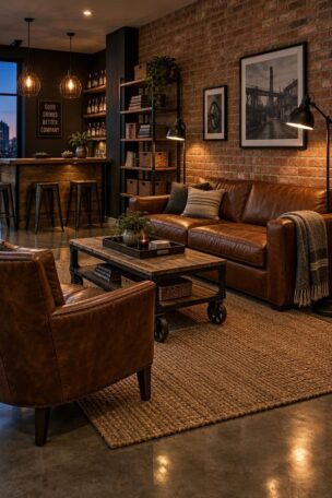
Industrial Brick Wall With a Wood and Steel Console
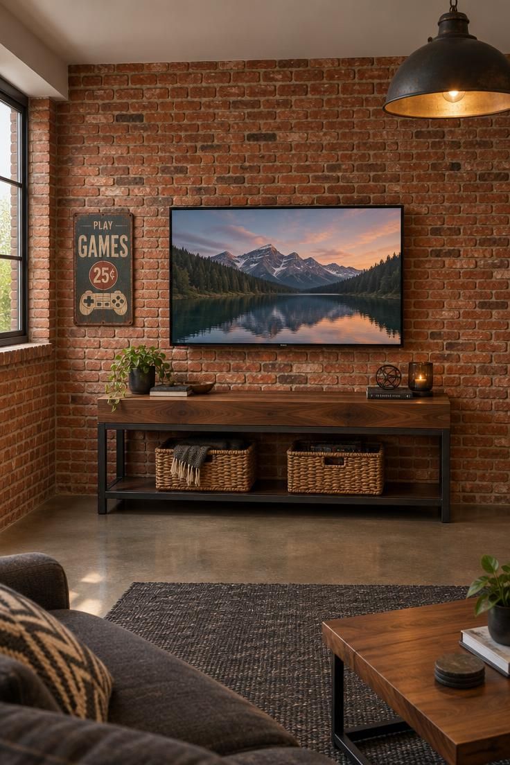
Exposed brick gives a wall immediate character that no paint or paneling can match.
The surface is uneven in color and texture, so it reads as older and more settled than a smooth finish.
A wall-mounted screen against brick appears to float, because the brick’s rough face carries no horizontal lines for the eye to rest on.
A wood and steel console supplies the counterpoint.
A thick walnut top gives the eye one smooth, warm plane in a room full of rough red surface, and blackened steel legs echo the industrial character without repeating the brick.
The combination looks collected rather than themed.
Light is where brick behaves differently from other finishes.
A rough surface absorbs and scatters light instead of bouncing it, which keeps the screen readable during daytime viewing.
The same quality means a small room can start to feel busy, because every brick carries its own shadow.
Rooms that stay generous in size handle this best.
Dust is the ongoing consideration.
Brick and mortar hold onto dust visually, and cleaning the texture thoroughly takes longer than wiping a flat wall.
A soft brush attachment reaches the surface more effectively than a cloth pressed flat.
Keep the accessories limited.
One oversized pendant in blackened steel ties the materials together, and a single vintage sign adds personality without turning the wall into a collection.
On the console, open lower shelving with baskets hides small items while preserving the industrial look.
Style Blueprint:
- A full brick wall from floor to ceiling with varied tone and texture
- A console with a thick walnut top and blackened steel legs
- Open lower shelving with woven baskets for hidden small-item storage
- One oversized blackened steel pendant as the main light source
- A single vintage sign or metal object on the brick, placed off-center
Dark Painted Wall With a Low Credenza and Leather Stools
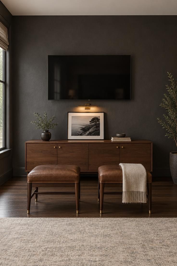
A deep charcoal wall changes the room’s whole reading.
When the screen is off, it nearly vanishes into the surface, and the wall becomes a single dark plane with furniture in front of it rather than a screen with objects around it.
Once the screen is on, it becomes the only bright rectangle in that plane, which makes the room feel focused without any additional styling.
The weight of the dark wall is the thing to manage.
A low walnut credenza brings a warm mid-tone into the lower half of the composition, and two leather stools in front of it stop the wall from reading as a solid block.
That combination of a warm wood, a natural leather, and one light textile gives the dark surface somewhere to sit against.
Maintenance is the practical cost.
Matte dark paint shows dust, fingerprints, and scuffs more readily than a light finish, and every mark sits against a high-contrast background.
This suits a room that is used a few evenings a week rather than one that sees daily traffic with children or pets.
One small picture light over a single piece of art breaks the dark plane without adding a second focal point.
Anything larger competes with the screen; a single framed photograph in black and white keeps the accent quiet.
A light rug and a warm white ceiling keep the room from closing in, since the dark wall needs some lighter surfaces around it to keep the contrast intentional rather than heavy.
Style Blueprint:
- A matte charcoal paint across the full wall, floor to ceiling
- A low walnut credenza with small brass pulls
- Two leather stools in brown or cognac to break the dark lower plane
- One framed photo or print with a small picture light above it
- A light area rug and a warm white ceiling to balance the dark surface
Two-Screen Sports Wall With a Bar-Height Console
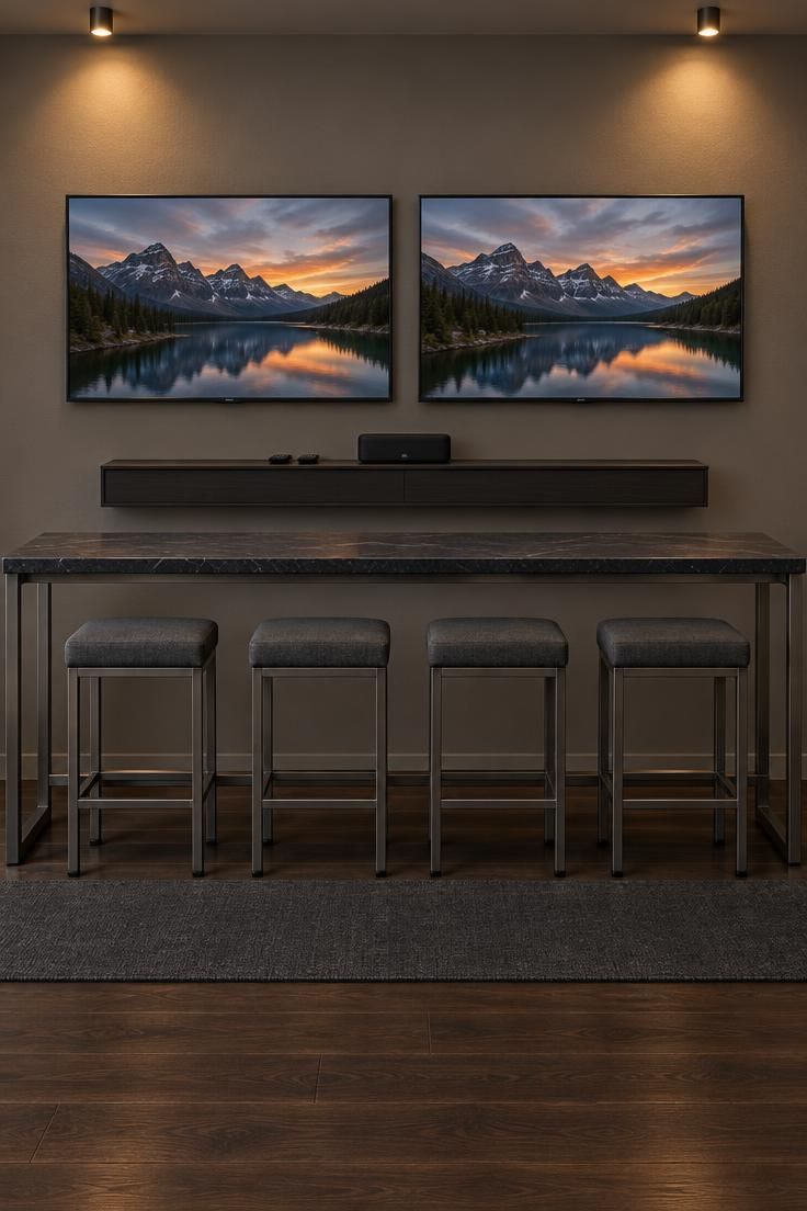
Two screens on one wall serve a different purpose than one, and the composition should follow that purpose.
Placement side by side creates a single horizontal band, which means the two screens read as a pair when identical in size and aligned at the same height.
Any difference in size or level breaks that band and the wall starts to look assembled rather than designed.
Below the screens, a bar-height console turns the wall into a place where a few people can sit close and face the screens.
A black stone-look top gives the console a clean surface for remotes or snacks, and four metal stools line up without blocking the view from the main seating.
That arrangement suits a room used for group viewing, where a few people want to sit near the wall and talk during breaks.
The shared floating media console shelf under the screens keeps remotes and a small speaker off the bar top and out of the seating area.
One shelf for the whole wall is enough; a shelf under each screen splits the composition and undoes the single band the two screens create.
Space is the constraint.
This layout needs a wall long enough for two screens plus a margin, and the stools in front require clear floor depth so they do not crowd the main seating behind them.
In a narrow room, the stools and the sofa end up competing for the same floor area, and the arrangement stops working.
Style Blueprint:
- Two identical screens at the same height to read as one horizontal band
- A bar-height console with a black stone-look top and a steel base
- Four backless stools with dark cushions stored under the console edge
- One shared floating shelf below the screens for remotes and a small speaker
- A charcoal runner along the console to define the viewing zone
Paneling Grid Behind a Minimal Media Wall
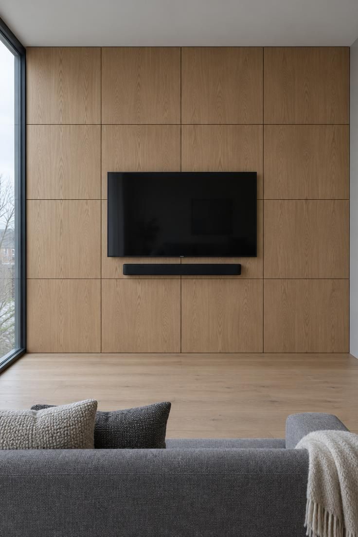
A grid of flat oak paneling creates texture through geometry rather than through material contrast.
For a built-in media wall, hairline joints between panels read as thin lines across a single wood surface, which gives the wall structure without the busy quality of slats or the flatness of plain drywall.
The pattern is quiet enough that the screen remains the primary event.
Scale is what makes the grid work.
Panels sized so they divide evenly across the wall length produce a rhythm that feels planned, while a partial panel at one end reads as an accident.
This matters more than the wood tone, because a mismatched edge line is visible from every seat in the room.
The minimal approach leaves no storage, which is the deliberate tradeoff.
Equipment lives elsewhere, or the household keeps only a soundbar and a streaming device.
That restraint is what keeps the center panel clear and the composition calm.
Adding a console, shelves, or art to this wall would undo the effect entirely.
This direction is also the least forgiving of installation quality.
A paneling grid with uneven joints, visible fasteners, or slight variation in panel alignment draws the eye to those flaws rather than to the screen.
It suits a room where the wall is already in good condition and the finish can be executed cleanly.
Style Blueprint:
- Flat oak panels arranged in a large square grid with hairline joints
- Panel widths chosen to divide evenly across the full wall length
- A wall-mounted screen and slim black soundbar centered on the middle panel
- No additional wall objects, shelves, or art
- A low pale gray sofa and one floor lamp to keep the room restrained
Design Pro-Tip: When you choose a wall treatment, compare its texture and tone against the screen in its off state, since that is how the wall will read most of the time.
Corner TV Wall With a Freestanding Console and Floor Lamp
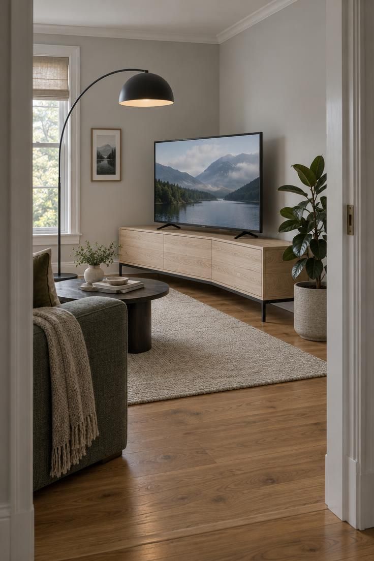
Not every room has a long flat wall worth building around, and a corner placement solves that problem directly.
Angling the screen across the corner faces it toward a diagonal seating position, which is often the most comfortable arrangement in a room where the sofa cannot sit square to a wall.
The corner itself becomes the anchor, and the two adjoining walls stay free.
A shallow freestanding console is what makes the diagonal feel intentional.
Depth matters here, because a deep cabinet projecting far into the room turns the corner arrangement into an obstacle.
A console with a closed back is also worth choosing, since the back faces into the room from one viewing angle or another, and an open frame exposes cords and shelving from that side.
The single tall arc floor lamp balances the composition.
Its height and curve fill the vertical space to one side of the corner, which stops the diagonal from reading as small, and it puts light where it is needed without adding a second wall object.
A plant on the opposite side softens the hard angle where the wall meets the console.
The tradeoff is empty wall space.
Both adjoining walls remain largely bare in this layout, which is fine in a room that needs breathing space and less useful in one that needs storage.
Corner placement also cuts glare from side windows, since the screen no longer faces them directly, which makes this a practical choice in bright rooms.
Style Blueprint:
- A low freestanding console angled diagonally across the corner
- A closed back on the console so cords stay hidden from both viewing angles
- A tall arc floor lamp on one side to fill the vertical space
- A potted plant on the other side to soften the wall junction
- Light gray walls and a small wool rug to keep the corner from feeling tight
Design Pro-Tip: If your equipment inventory is likely to grow, weight your choice toward closed storage over a larger screen, because visible devices age a wall faster than a slight size difference.
Conclusion
Choosing a man cave TV wall comes down to a few questions the room itself can answer.
How much storage the household actually needs, how much wall length is available, and how permanent a change feels right will narrow the options quickly.
The strongest versions make the screen feel like the intended center without letting the rest of the room feel like an afterthought.
Start with the surface behind the screen, then bring in furniture that either supports it visually or balances its dark weight.