This post may contain affiliate links. If you make a purchase through these links, we may earn a commission at no additional cost to you.
Nordic minimalism often gets flattened into a formula: white walls, pale floors, and almost nothing else.
That version looks calm in a photograph and chilly in daily life.
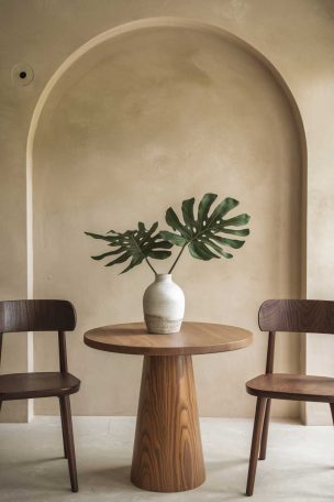
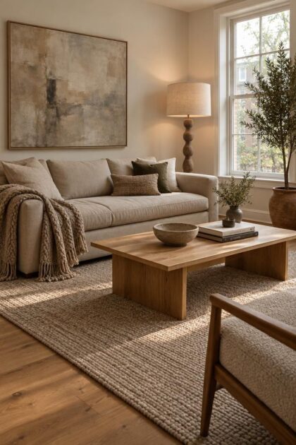
The rooms that hold up over years lean on wood grain, warm neutrals, and textiles that soften every hard edge.
Learning how to decorate with nordic minimalism means understanding what to keep and what to quietly let go.
Starting With One Honest Material Pair
Nordic minimalism becomes easier to copy when the room begins with one material decision instead of a full shopping list.
The most useful starting pair is pale solid wood and undyed paper or felt, because those surfaces already contain small irregularities that keep restraint from looking sterile.
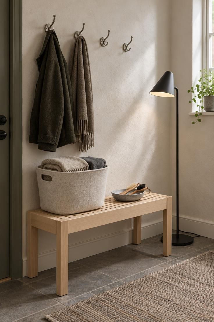
A light birch bench near a soft felt basket does more quietly than a matched furniture set.
That single pairing also gives the eye a place to land while the rest of the room stays open.
Once the wood and felt meet near a seating area or entry wall, other choices can stay deliberately simple.
Coat hooks in brushed steel, a low bench without turned legs, and one folded wool blanket repeat the idea without multiplying it.
Keep the next material addition visible but secondary.
A matte black floor lamp or a stoneware dish in a muted gray works because it reads as a small interruption rather than a new color scheme.
The room still feels cohesive when the palette counts four materials or fewer.
Design Pro-Tip: Test one wood sample against one paper or felt sample on the floor where daylight actually reaches them, then remove every other proposed material before adding anything back.
Choosing a Warm Neutral Color Scheme Without Going Flat
A warm neutral color scheme works when it layers related tones instead of repeating one shade everywhere.
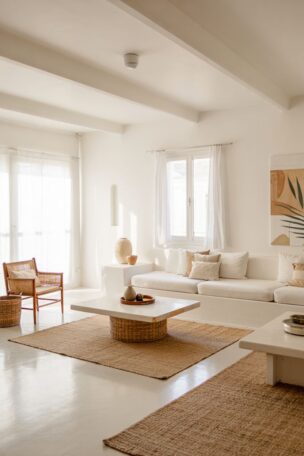
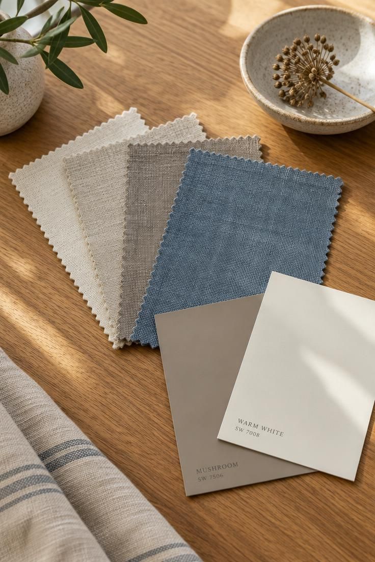
Start with a dominant neutral such as warm white, cream, or oatmeal, which covers most of the walls and large upholstery.
Add a secondary tone one or two steps deeper, like mushroom, taupe, or pale greige, for curtains, a rug, or a secondary chair.
Then choose one restrained accent, muted blue or moss green, used sparingly.
A rough ratio helps with decisions: most of the room in the base neutral, a meaningful share in wood, stone, and natural textiles, and a small fraction in accent color or darker contrast.
That final sliver is what keeps a soft room from reading washed out, and it is easier to adjust later than a wall color.
Two failure modes are worth watching.
Painting every surface the same shade produces a flat, slightly airless result, and leaning on cool gray with bright white throughout pushes the room toward clinical rather than calm.
For a mixing wood tones at home, warm tones in the whites, creams, and greige family sit more comfortably beside wood.
Treating the Stair Hall as a Quiet Gallery Wall
A stair hall often becomes a pass-through for coats and shoes, but Nordic minimalism treats it as a slow viewing space.
The vertical path naturally controls how artwork is noticed: one piece at eye level near the landing, another partway up the run, and a smaller object on the lowest step.
This placement creates pauses without adding furniture.
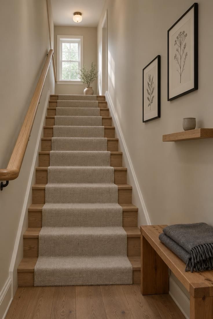
Pale oat walls and a single oak handrail give the gallery room to breathe.
Framed line drawings, a small textile hanging, and one narrow shelf holding a ceramic cup can share the wall while keeping the arrangement spare.
Each piece works as its own quiet statement rather than a cluster.
Leaving blank wall between the objects keeps the stairway from turning into a display case.
A simple cedar bench at the base, holding a folded wool blanket, gives the lower landing a practical anchor.
Adding Linen and Wool Textiles for Warmth and Texture
Linen and wool textiles carry most of the warmth in a Nordic room.
A wool rug underfoot, linen curtains at the window, and a bouclé or woven cushion on a wooden bench introduce softness that hard materials cannot provide on their own.
Against stone and timber, these fibers also add visual contrast without adding color.
Keeping the material list short helps the room stay cohesive.
Wood, wool, linen, and ceramic cover floors, windows, seating, and surfaces, and they play well together in almost any combination.
Adding a fifth and sixth fiber family tends to scatter the eye rather than enrich it.
Natural fibers ask for realistic expectations.
Linen wrinkles and softens with washing, wool pills in high-traffic spots, and pale wood marks.
Those changes read as patina rather than damage in this style, but they do require a household that tolerates a little imperfection.
Layering Lighting for Dark Evenings Without Losing Calm
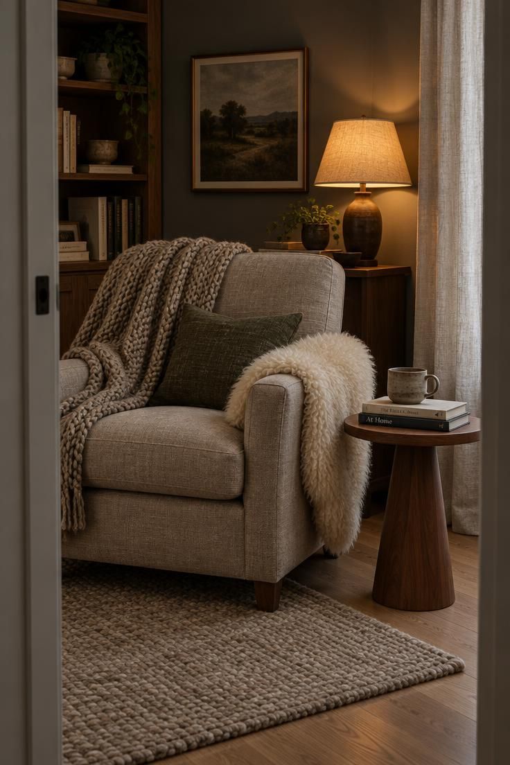
Layered lighting for dark evenings starts with rejecting the single ceiling fixture as the only source.
Three layers do the work: ambient light from a ceiling fitting or two, task light where reading and cooking happen, and atmospheric light from table lamps, wall lights, or a small portable lamp.
Each layer covers a different hour of the evening.
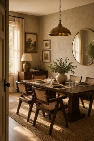
Warm bulbs are the usual convention in this style, commonly in the range of 2700K to 3000K, with shades that diffuse rather than expose the bulb.
Treat that figure as a styling starting point rather than a rule, and buy one bulb to test in a corner before committing to a whole apartment’s worth.
Fixtures themselves increasingly function as sculptural objects in Nordic rooms.
A rounded opal glass pendant, a paper shade, or a vintage-inspired table lamp earns its place in the composition the way a vase would.
That makes the lighting plan part of the decor rather than a technical afterthought.
Control matters as much as placement.
Dimmers and a few switchable lamps let a room shift from bright and practical in the morning to low and conversational after dinner without changing a single object.
Design Pro-Tip: Test one warm bulb in a single lamp before replacing every bulb in the home. Live with it for three evenings.
Using Functional Storage in the Living Room to Keep Visual Quiet
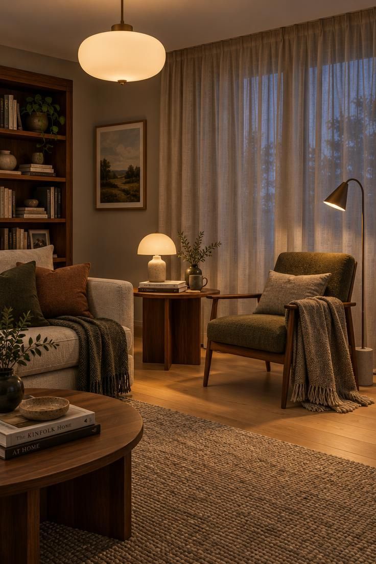
Functional storage in living room design is what makes the calm version of this style survivable.
Closed lower cabinets, a storage bench, or a built-in wall unit absorb the everyday objects that would otherwise collect on surfaces.
The visual quiet depends less on owning fewer things than on having somewhere for them to land.
Built-ins work especially well when they combine closed and open zones.
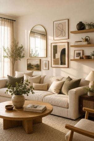
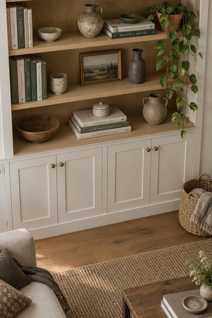
Lower doors hide the practical items, while upper shelves hold an edited collection: a few books, two or three ceramics, one small plant.
The shelves stay effective only if the display is reviewed occasionally rather than filled to capacity.
Open shelving fails when it becomes a display of everything the household owns.
A useful test is whether each shelf reads as a considered group rather than a storage overflow.
If it does not, some of those items likely belong behind a door.
Baskets and trays handle the small, movable clutter that closed cabinets cannot reach.
A natural-fiber basket beside the sofa corrals throws and magazines, and a shallow tray on a console keeps keys, remotes, and chargers in one predictable spot.
Storage planning is easier when it starts from routines rather than furniture.
Note where mail, shoes, and devices actually accumulate, then place a container at each of those points.
Containers that match daily habits stay in use; those placed for appearance alone rarely do.
Design Pro-Tip: Group accessories in threes with varied heights, such as a tall vase, a low bowl, and a small stacked pair of books.
Bringing in Plants, Art, and Personal Objects Without Clutter
The answer to how to decorate with nordic minimalism at the finishing stage is fewer, larger, more meaningful pieces.
One oversized artwork holds a wall better than six small frames, and a single sculptural plant carries more presence than a row of identical pots.
That same logic applies to ceramics, books, and inherited objects.
A useful guideline is one strong object per visual zone.
Each surface, shelf, or wall gets a single clear focal piece, with smaller supporting items only when they serve that piece.
When everything is an accent, nothing reads as one.
Artificial plants and scattered tiny accessories work against the style.
So does leaving personality until the very end, because a room assembled from furniture alone tends to feel anonymous no matter how good the individual pieces are.
Meaningful objects deserve an early place in the plan rather than a final layer.
A piece inherited from family, a print bought on a trip, or a bowl made by a local potter gives the room a reason to look the way it does.
Editing around those pieces is easier than adding them afterward.
Design Pro-Tip: Leave one surface in each room partially empty. Emptiness gives the chosen objects room to register.
Conclusion
Start with the pieces that are hardest to change: seating, storage, and the lighting plan.
Choose one dominant wood tone and one secondary tone, then repeat each at least twice so the pairing reads as deliberate.
Select two or three textile families, likely wool, linen, and cotton, and let them carry the softness against wood and stone.
Personality comes last, but it should not be skipped.
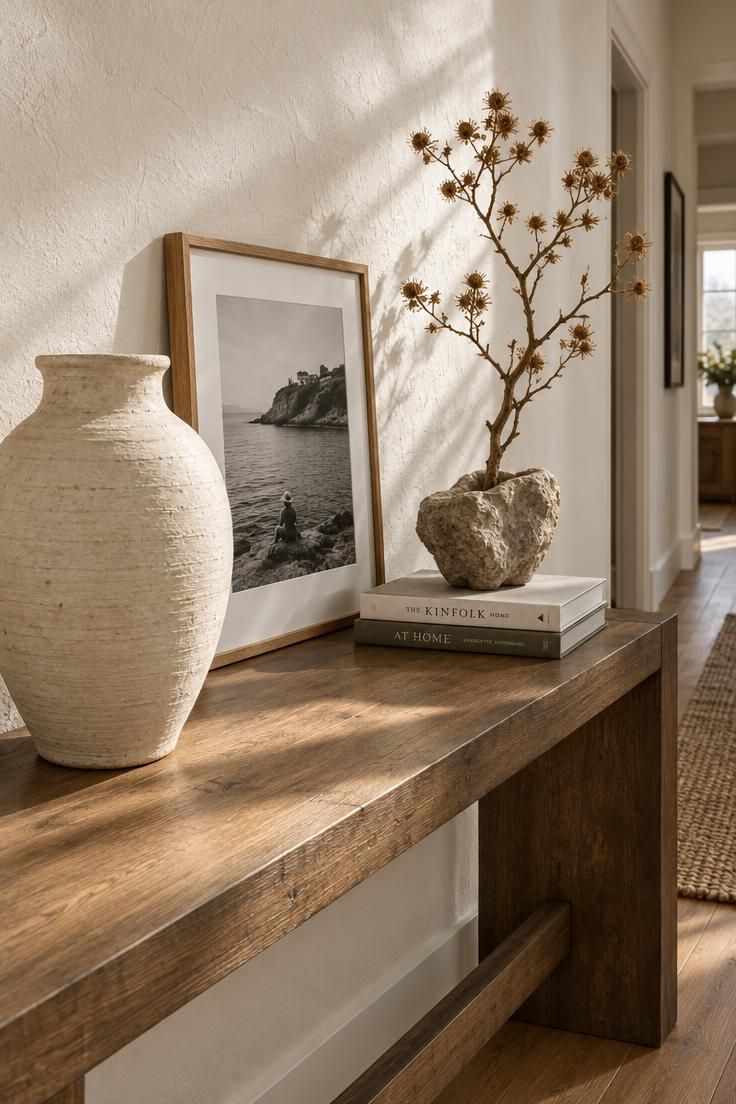
One large artwork, one plant with real presence, and one handmade or inherited object will do more than a shelf of small accessories.
Look for pieces you would keep if you moved, then build the room around them.
The one thing to try first: turn off the ceiling light after dinner and switch on two lamps in different corners.
If the room still feels welcoming, the lighting layer is working, and the rest of the palette has room to breathe.