This post may contain affiliate links. If you make a purchase through these links, we may earn a commission at no additional cost to you.
A styled coffee table often looks finished because nothing on it is expected to move.
Real tables hold mugs, remotes, laptops, and the occasional board game, and a surface covered end to end cannot do any of that comfortably.
The difference between a tabletop that works and one that merely photographs well comes down to editing.
An arrangement earns its place by leaving room for the life happening around it.
Why a coffee table is furniture first, display second
The low table we call a coffee table grew out of tea tables, occasional tables, and other small surfaces built to hold refreshments within reach of a seat.
Designer Eileen Gray’s adjustable table from 1927 became a celebrated design object partly because it responded so directly to how people actually sit and use a room.
That history matters because it explains the table’s job.
A low table is a shared surface, close to the sofa, sized for a cup, a plate, or a magazine someone is halfway through.
The term’s exact origin is not firmly established, and it does not need to be.
What is clear is that the furniture type spread alongside informal living room seating, low furniture, and the influence of Japanese interiors and modernist design.
Anyone searching for how to style a coffee table tends to find finished vignettes, but the surface underneath those vignettes was designed for use.
Styling becomes easier once the table is treated as furniture with a job rather than as a display plinth.
The usable-space rule most photographed arrangements ignore
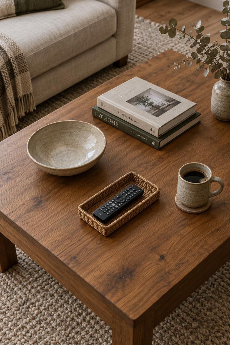
Leaving roughly a third of a coffee table’s surface clear is the single most useful guideline for a table that gets used.
That open area functions as visual negative space, and it changes how the objects around it read.
Crowd ten small pieces together and the eye has nowhere to settle.
Leave a section bare and each remaining object gains presence because it has air around it.
Empty surface becomes part of the composition rather than leftover space.
There is a practical reason to keep the open area too.
A mug, a plate, or a book lands somewhere without forcing a person to rearrange anything first.
Editorial photographs often show fully dressed tabletops because nothing is about to be set down.
That styling is built for a camera, not for a Tuesday evening with a bowl of popcorn.
The goal is an arrangement that feels collected rather than crowded.
Room remains for a tray, a book stack, and a single functional item on most tables once a generous bare section is left in place.
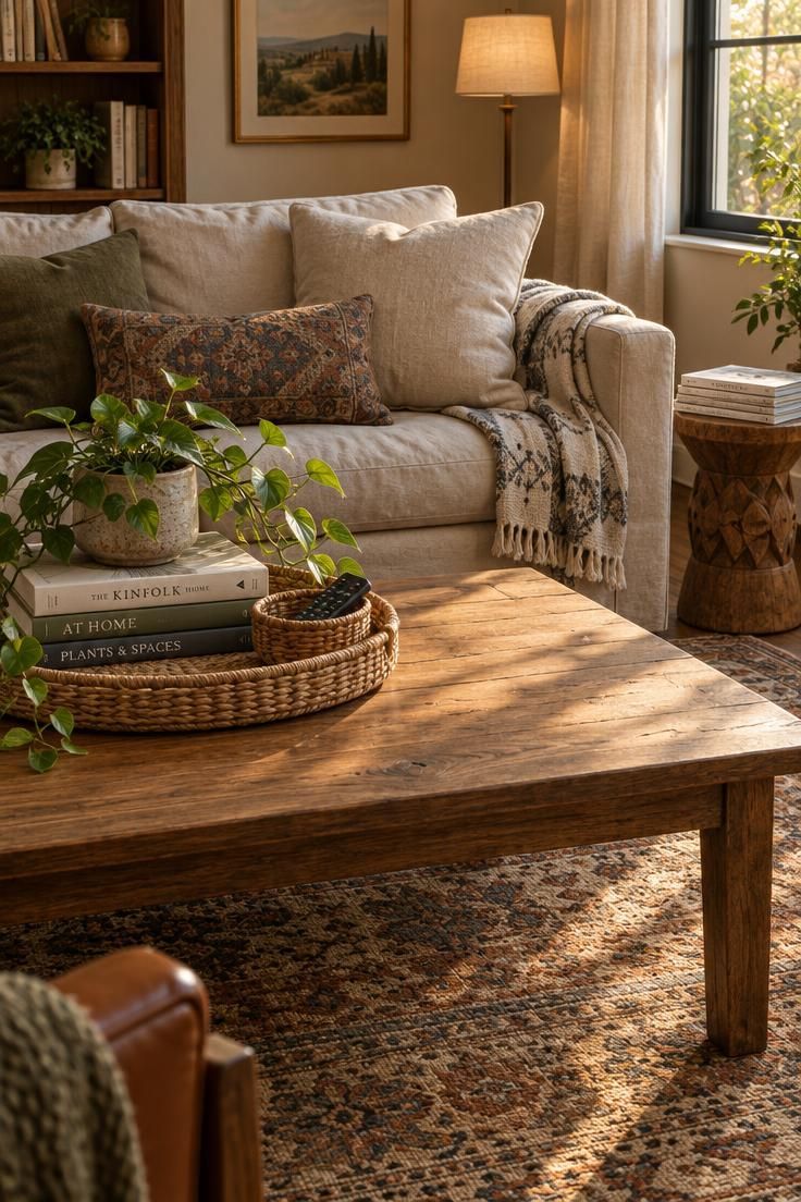
Design Pro-Tip: Before adding anything, mark the zone you want to keep clear with a coaster or a magazine. Style around that boundary instead of filling the table and hoping space remains.
Begin with the table’s size, shape, and material before choosing objects
Object selection comes after observation.
A table’s material, dimensions, and shape narrow the choices long before a single bowl is placed.
Some proportional starting points help: a coffee tabletop often sits level with or slightly below the sofa seat, and its length runs roughly two thirds of the sofa length.
Check the walking space with people moving past the table and sitting down, rather than judging the arrangement only while the room is empty.
Treat these as practical guidance, not requirements.
Shape steers the layout.
A round coffee table display works through a loose triangle of objects or one central grouping, while rectangular tables gain from zones, with a group near each end and open surface between.
Oval tables suit tighter circulation paths by softening hard corners.
Square tables pair well with sectionals, where a single strong arrangement at one corner reads better than a full perimeter.
For now, measure the table, note the material, and watch how the room’s traffic moves around it.
Those three observations determine nearly everything that follows.
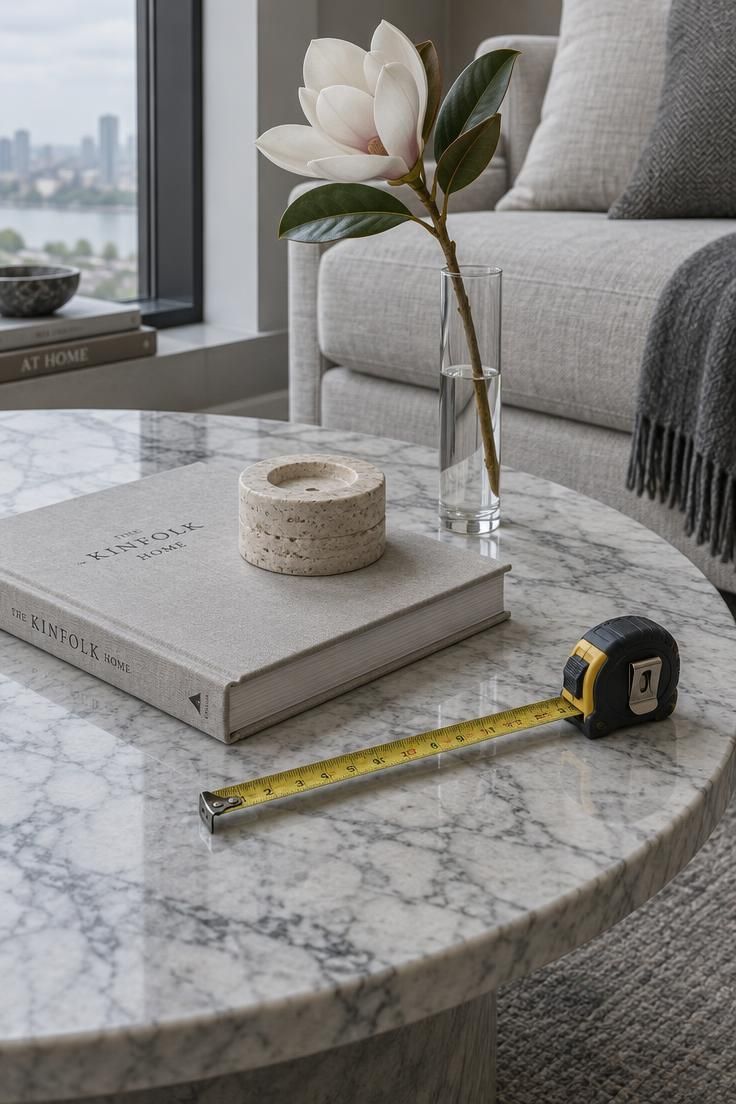
A repeatable composition method: anchor, vertical, functional, then subtract
One working sequence handles most arrangements.
Pick an anchor object that grounds the composition, add one element with height, add one small functional piece, then take one object away before finishing.
Starting with three to five groupings keeps the table from being covered.
Odd-numbered loose clusters tend to read more naturally than strict symmetry, largely because they avoid the look of a matched set.
Height is where most arrangements fail.
When a bowl, a book, and a tray all sit at the same level, the composition flattens.
A tall vase, a branch, or a slim candleholder next to a low stack restores the vertical range.
The subtraction step is the part people skip.
Removing one object after arranging forces a genuine edit and reveals which pieces were carrying weight and which were filling space.
Once this sequence has been run a few times, it stops feeling like a process.
The eye begins to make the same decisions before the objects are even placed.
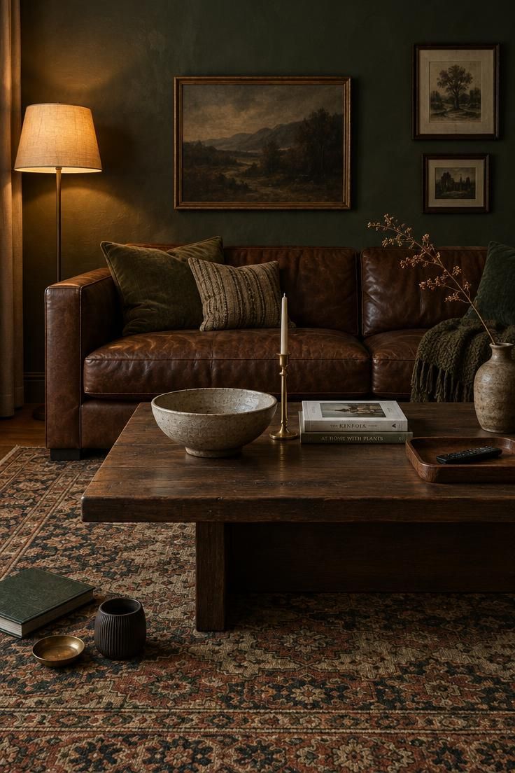
How table shape changes the arrangement from circle to rectangle to square
A round table resists edges, so a loose triangle of objects placed slightly off-center tends to work better than one symmetrical cluster in the middle.
A dead-center grouping on a round table makes the surface read like a target.
For a rectangular coffee table arrangement, thinking in zones gives the surface structure.
For coffee table book stack ideas on a rectangular surface, a low stack near one end can balance a tray at the other while leaving the middle open for a laptop or serving board.
Long sofas often sit well with that paired-zone layout.
The two groupings echo each other without competing, and the clear middle stays available.
Square tables with sectionals can handle a single tray arrangement at one corner.
Working the whole perimeter rarely helps because the shape doesn’t have a long axis to divide.
Oval tables sit between the two approaches.
A gentle curve of objects along the longer axis follows the table’s shape and keeps the ends usable.
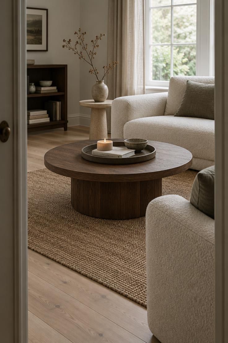
Design Pro-Tip: Assess the arrangement while seated on the sofa before deciding it’s finished. That position makes it easier to judge the height of the objects against the rest of the room.
Styling plans that respect glass, wood, marble, metal, and upholstered surfaces
Glass tables benefit from objects with visual weight.
A stack of books, a thick ceramic bowl, or a sculptural piece registers against the transparency, while many small scattered items get lost against whatever shows through from below.
Wood tables are forgiving.
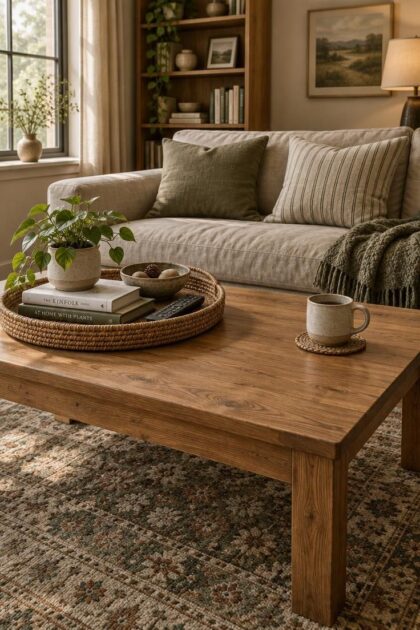
Ceramics, books, woven trays, greenery, and stone all sit comfortably on wood, and the grain stays visible when objects are grouped rather than spread across the whole surface.
Marble and stone ask for lighter partners.
A patterned surface already carries visual activity, so pale ceramics, glass, and slim books let the stone lead instead of competing with a heavy arrangement on top.
Metal tables warm up with wood, leather, linen, plants, and matte ceramics.
A shiny surface paired only with other shiny objects turns cold quickly.
Upholstered and ottoman tables need a firm tray to create any level zone at all.
That specific situation deserves its own approach rather than the general logic above.
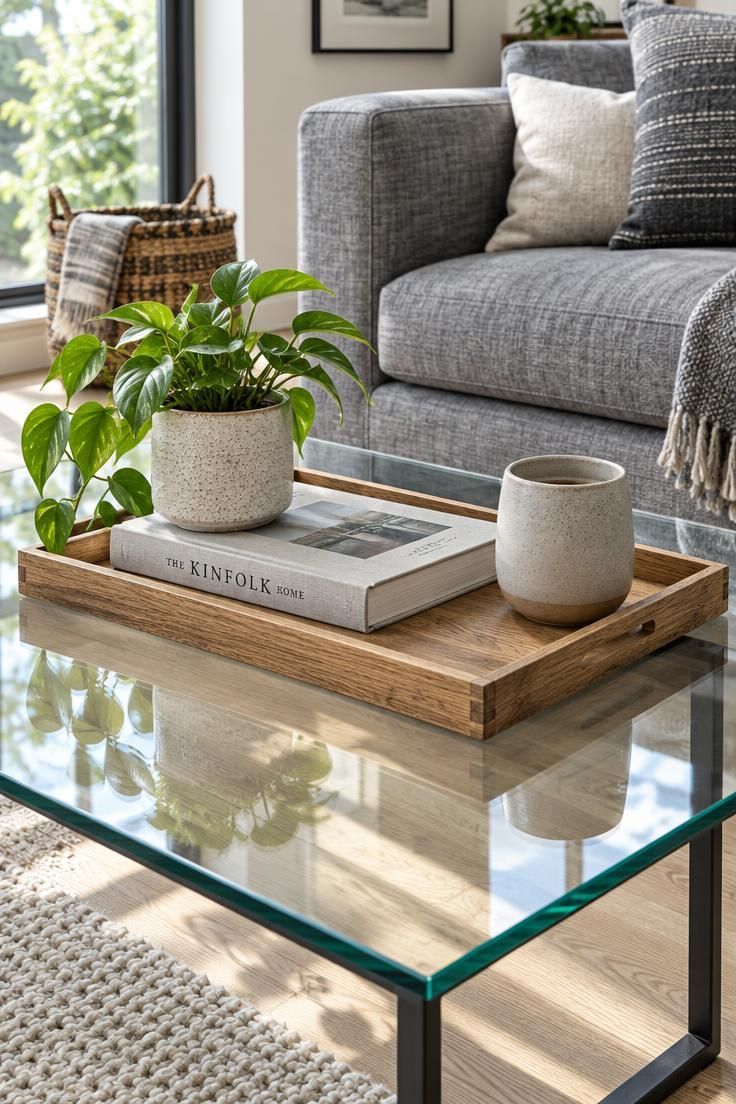
The ottoman coffee table tray is what makes an upholstered top usable
An ottoman coffee table tray solves a specific problem.
Fabric surfaces are soft, so a drink set directly on an upholstered top has nothing stable beneath it.
A large tray with a firm base creates a hard level zone where a cup, a remote, or a book can rest.
Choose a tray that contrasts in material with the upholstery.
A wood or woven rattan tray on a linen or velvet ottoman defines the functional zone clearly and gives the eye something to read.
Keep the tray’s footprint modest.
Coffee table styling by material means matching the tray’s scale to the ottoman, leaving enough visible upholstery around it that the piece still reads as fabric rather than as one enormous tray display.
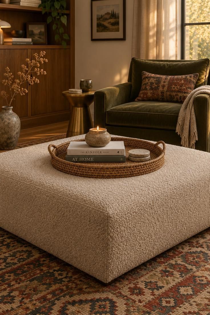
Use a low tray as the table’s only active zone
A shallow tray with a raised rim can turn one part of the table into a defined activity surface.
It does more work than scattered coasters because it gathers items without turning the whole tabletop into a display shelf.
Choose a tray with enough visual weight to anchor the composition, but not so wide that it claims the entire surface.
Materials such as unlacquered wood, tumbled metal, or woven seagrass age differently and change the table’s mood without adding another fragile object.
Place the tray slightly off-center, not squared to the front edge.
That shift leaves an open corner for a book, a plate, or a laptop until the tray returns to its original spot.
Inside the tray, limit the contents to a coaster stack, a small dish, and one handled vessel.
The tray becomes the obvious place for keys, jewelry, or a remote without turning the coffee table into a catchall.
Style Blueprint:
- Use one large tray rather than a group of small dishes.
- Keep tray contents low so the rim remains visible around each object.
- Let an empty tray read as an invitation, not an unfinished vignette.
- Pair opaque trays with transparent tabletops so the surface still feels open.
- Move the tray slightly when the table needs more usable area, then restore it.
Design Pro-Tip: Choose a tray finish that contrasts with the tabletop so the working zone is easy to find at a glance.
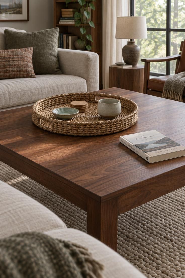
Let the same small table change with the day, not with more objects
A small table works better when it has one rotating role instead of several permanent displays.
The surface can shift between a coffee landing spot, a book and drink pause, and a tidy spot for a bowl of clementines or mixed nuts.
This keeps the table visually simple without making it static.
Each version uses roughly the same footprint, so the table never slides into clutter during a busy week.
Storage beside the seating area makes the rotation practical.
Keep three or four alternate objects on a nearby shelf or credenza, and swap only one layer at a time.
The table itself may need nothing more than a low bowl, a slim stack of reading material, or a single weighted object that will not move when someone sets down a mug.
The empty portion of the tabletop is the feature, not a design failure.
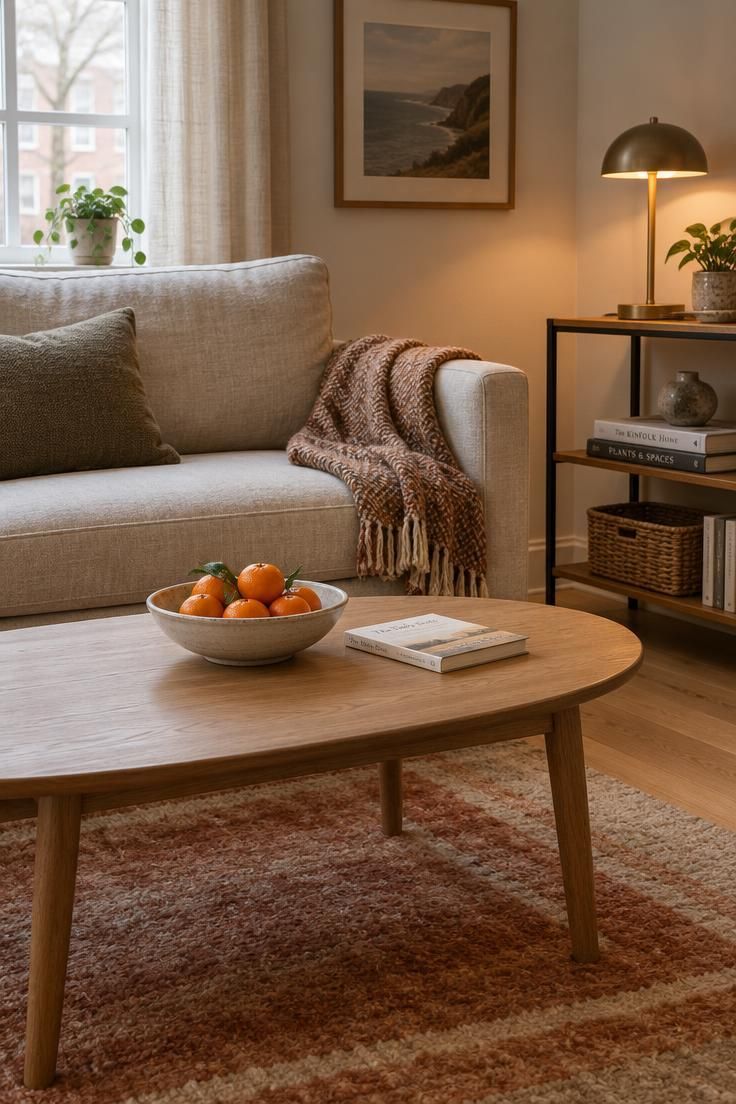
Design Pro-Tip: Remember that an empty small table still counts as styled. The open area is the part that says the room can actually be used.
Personality comes from one or two meaningful objects, not a full collection
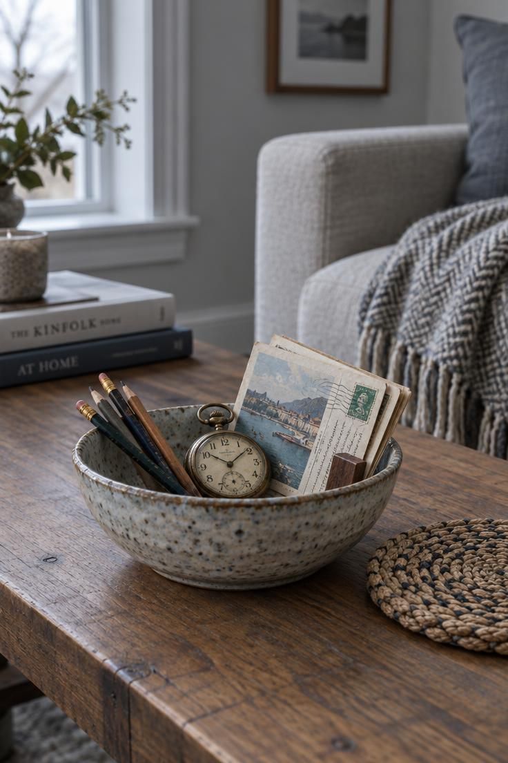
A handmade bowl or a well-worn book tells a visitor more about a room than a dozen anonymous accessories arranged with perfect symmetry.
Personal objects carry specific associations and tend to hold their place in a composition longer than trend-driven purchases.
One or two meaningful pieces is usually enough.
A third personal object often tips a tabletop from expressive into crowded, especially on smaller surfaces.
The underlying principle holds regardless of trend.
Objects chosen with intention keep a table from becoming a display shelf, and they rarely need to be replaced when the palette shifts.
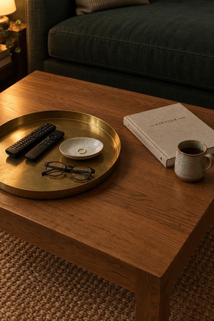
Let a low brass tray hold the small clutter that shifts throughout the day
A wide, shallow brass tray does the quiet work that most coffee table arrangements leave undone.
It catches keys, remotes, a glasses case, and a phone without turning the table into a loose scatter of objects.
The tray keeps a visible boundary around clutter, so it reads as an intentional collection instead of neglect.
Because brass has a warm gleam under lamplight, the tray also gives the table a subtle focal point that does not compete with larger furniture.
Choose a tray with a low lip rather than a deep rim.
A shallow edge makes it easy to slide things in and out while sitting on the sofa, and it keeps the tray from looking like a storage bin.
Place the tray slightly off-center toward the sofa or the chair most often used in the room.
That leaves the remaining tabletop open for a drink, a book opened flat, or a plate during a casual meal.
Inside the tray, limit the contents to whatever moves through the room during a typical week.
One remote, one small dish for jewelry, and a folded pair of reading glasses are enough to make the tray useful without testing how many objects it can hold.
This approach suits households where the coffee table already has a stack of larger books or a sculptural object that stays put.
The brass tray absorbs the functional clutter and lets the rest of the table stay relatively bare.
The final edit is removing one object before you call the table done
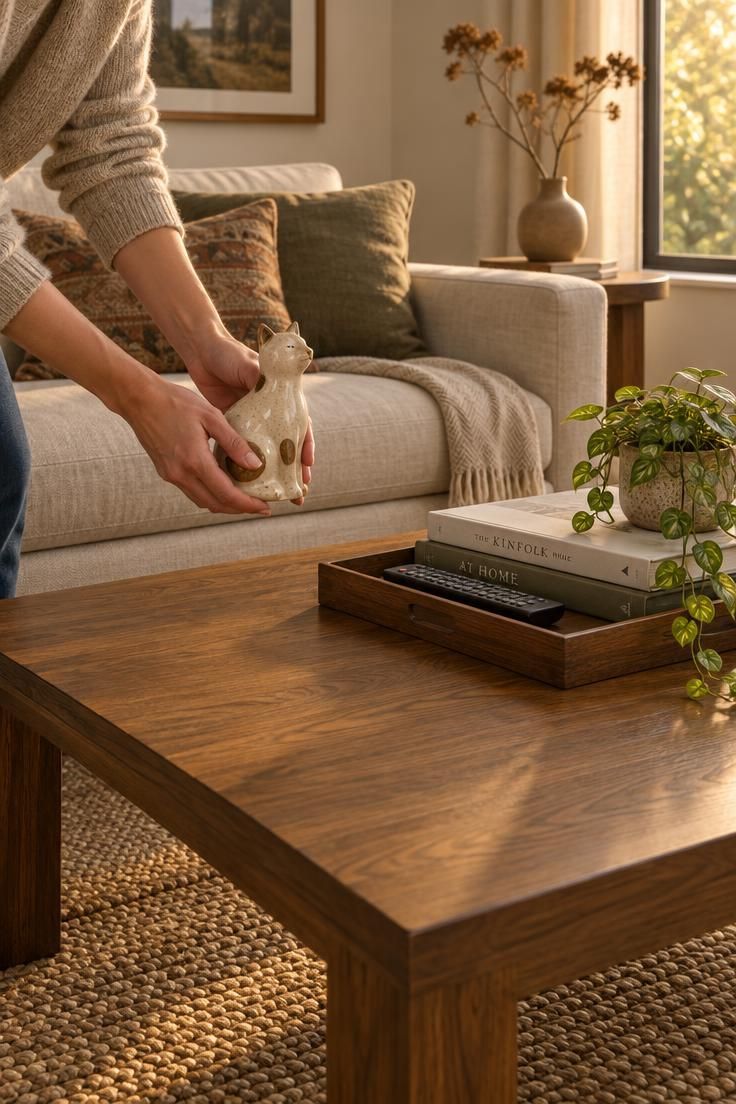
After arranging a tabletop, take one object off and return it to the room.
That single action is the most reliable way to open up negative space and to identify which pieces were doing real compositional work.
The habit also supports ongoing editing.
When the surface starts feeling crowded again, removing something is usually faster and more effective than rearranging what remains.
The aim is a composition that flexes with daily use rather than a fixed tableau.
A drink, a remote, and a book should be able to coexist on the tabletop without pushing anything out of place.
Conclusion
An arrangement that still gets used comes down to negative space and respect for the table’s function.
Match objects to the table’s shape and material, use a tray where the surface needs organization, and stop before every inch is covered.
Subtraction is the most useful habit to build.
Before finishing, take one object off the table and put it back in the room, then look at what remains.
Start with the table you already have.
Measure it, note its material and shape, pick one anchor object, add one element with height, and leave a third of the surface bare.
Then remove one thing and see how the arrangement reads with room to breathe.