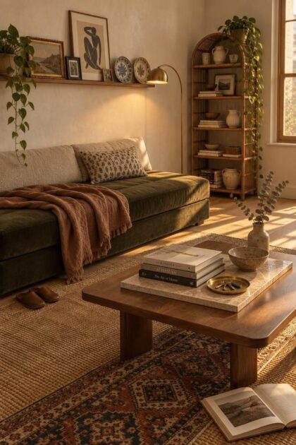
This post may contain affiliate links. If you make a booking or purchase through these links, we may earn a commission at no additional cost to you.
A small eclectic apartment asks for two things that pull against each other.
Layered visual information depends on a compact room that fills up fast.
The resolution is concentration, not restraint alone.
Variety lives in a few deliberate zones, a picture ledge, a shelf run, a bar cart, a rug edge, while walls, floors, and large upholstery stay quiet enough for the collected pieces to register.
Each idea below describes one specific composition, what it is made of, why it holds together, and what it demands in upkeep.
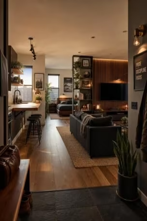
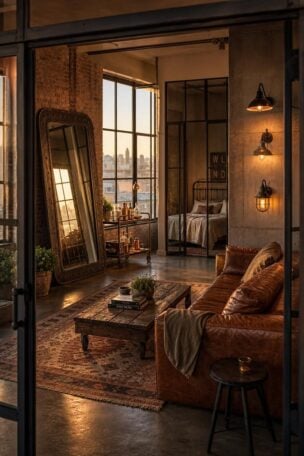
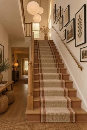
The text explains the decisions behind each arrangement, and the visual examples sit alongside each idea.
Structural, electrical, plumbing, and fixture work belong to separate technical trades and sit outside this scope.
What Makes a Small Eclectic Apartment Read as Warm Rather Than Random
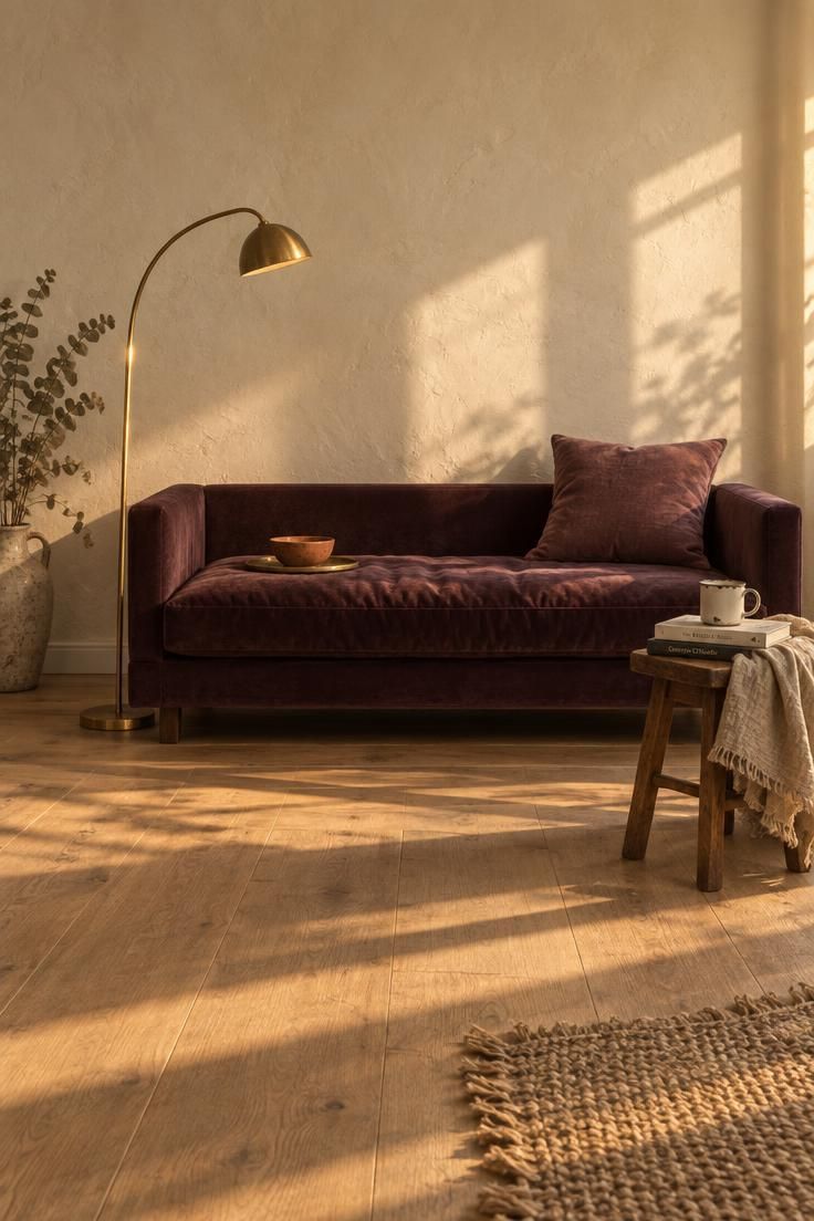
Mixed eras and mixed materials stay legible when one or two threads repeat through the whole room, such as a warm neutral base, a shared metal, or an accent color used at least twice.
For small eclectic apartment decor, the key is concentrating variety rather than spreading it across every visible surface.
The eye lands first on the fig daybed because it carries the most saturation and the largest soft mass, and every other object defers to it.
Guests in a 400 to 750 square foot apartment sit close to what they are looking at, so pattern and texture read at detail distance instead of dissolving into a general impression.
A cane frame, a glaze crackle, or a coarse linen weave registers clearly from three feet away, which is why close-range layering rewards more than it overwhelms.
Collected rooms also need more editing than matched ones, and a compact apartment has less tolerance for pieces doing neither visual nor practical work.
Set the working criteria early: one anchor piece per sightline, two or three repeated accents, and pattern deployed in two or three distinct scales rather than one.
The most common failure is styling every surface at once, so concentrate variety in a single zone and leave the rest of the room visibly underdone.
Design Pro-Tip: Choose the anchor piece first and let its color appear once more somewhere smaller, a bowl, a frame, a throw, so the boldest object reads as intentional rather than isolated.
A Deep Fig and Terracotta Nook Anchored by a Low-Slung Daybed
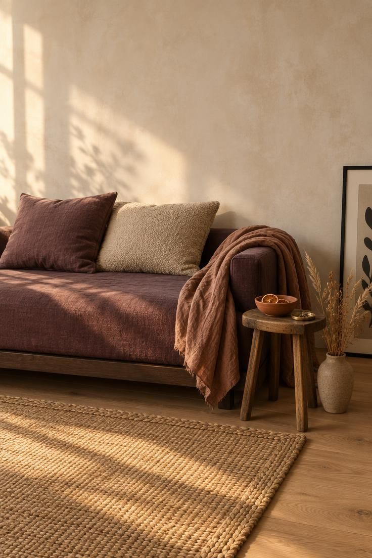
Fig and terracotta read as one warm family, and repeating the fig twice, once on the daybed and once on a smaller cushion, keeps the deep color from looking like an isolated purchase.
This approach sits at the center of eclectic apartment decorating because it lets saturated color carry the room without competing for attention.
The horizontal daybed keeps sightlines low, which matters in a compact room where a tall piece can visually cut the space in half.
A wood stool in place of a matched side table introduces a second material without introducing a second color.
The terracotta ceramic bridges the saturated upholstery to the neutral floor, giving the eye a stepping stone between the two.
Deep saturated upholstery shows lint and pet hair more readily than mid-tones, so a lint brush and periodic vacuuming belong in the routine.
This arrangement suits a studio or one-bedroom living zone with one clear seating area and no separate lounge.
It strains when the room already holds a large patterned rug or a bold gallery wall, because three competing focal points in one sightline cancel each other out.
Style Blueprint:
- One low daybed in a deep, saturated fabric as the anchor
- Terracotta ceramic in two small objects to bridge the upholstery to the floor
- A wood stool or crate as the side surface rather than a matching table
- A single cushion echoing the daybed color at a smaller scale
- Walls and floor held in one calm neutral so the anchor carries the room
A Rattan Etagere Styled With Stoneware and One Trailing Plant
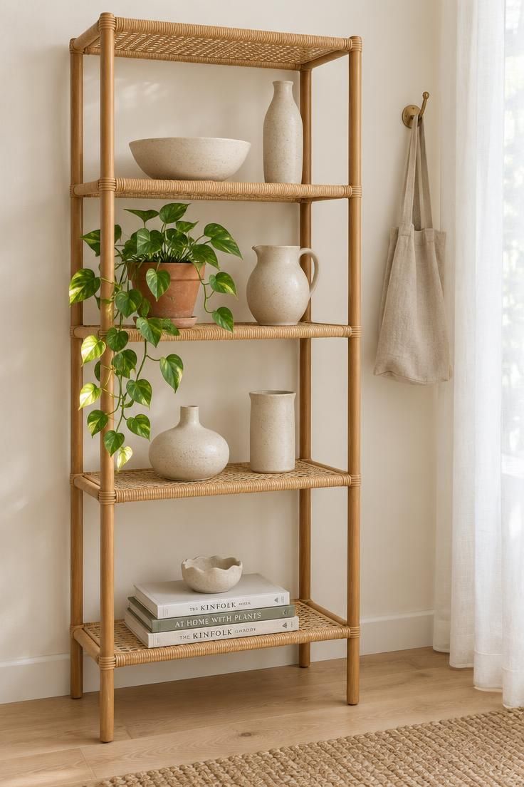
Open shelving lets the wall color show through, so a tall piece adds storage without adding visual weight.
Layered small-space decor works best when one surface carries the density while the surrounding areas stay open.
Stoneware in one glaze family but varied shapes holds the shelf together better than a mix of colors in matching forms.
One trailing plant is enough for a vertical display, and a second turns the shelf into a greenhouse that pulls attention from the ceramics.
Stacking books both horizontally and vertically breaks the grid that open shelving tends to create.
Leaving roughly a third of each shelf empty keeps the composition legible, since the empty space is what makes the objects read as chosen.
Dust accumulates on open shelves and the arrangement needs an occasional full rearrange when new finds arrive, which is part of the pleasure and part of the labor.
In a very small room, a tall open shelf can read as busy against a patterned wall, so keep the wall behind it plain.
Style Blueprint:
- One rattan etagere as the vertical collection zone
- Stoneware in one glaze family, varied in shape rather than color
- One trailing plant only
- Books stacked both horizontally and vertically to interrupt the grid
- Roughly a third of each shelf left empty
Design Pro-Tip: Repeat one material family, stoneware, brass, or wood, across at least three rooms in the apartment so the eclectic mix stays recognizably yours.
A Gallery Ledge Crowded With Small Frames, Plates, and a Leaning Print
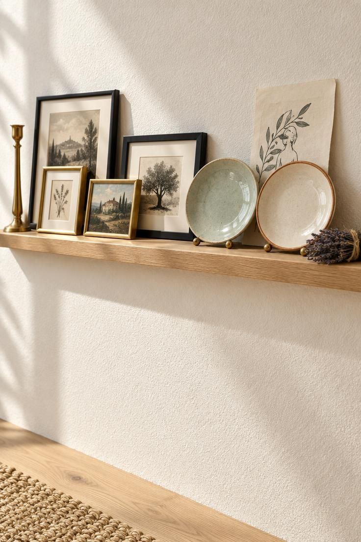
A picture ledge differs from a hung salon wall in one practical way, which is that it allows constant rearranging without new holes.
That quality suits renters and undecided collectors who want to live with an arrangement before committing to it.
This collected apartment style depends on a display surface that can change as often as the person living with it changes their mind.
Mixing frame sizes and orientations matters more than matching finishes, because a uniform grid reads as a grid rather than a collection.
Two or three non-frame objects, ceramic plates or a small vase, interrupt the rectangle rhythm and give the band a varied silhouette.
Overlapping frames slightly, so one edge sits behind another, produces the depth that separates a collected arrangement from a lined-up one.
Capping the total object count keeps the ledge a display rather than a storage shelf.
Dusting layered frames takes longer than dusting a single flat surface, and glass needs periodic cleaning to keep the composition legible.
Because ledges are shallow, objects must be light and stable, and a leaning print needs a slight wall angle to stay put.
Anything involving attachment to a wall is a separate technical question, and a freestanding shelf or a floor-leaning arrangement avoids that entirely.
Style Blueprint:
- One narrow ledge as the single collecting zone on that wall
- Mixed frame sizes and orientations rather than a uniform grid
- Two or three non-frame objects to break the rectangle rhythm
- Slight overlaps so the arrangement reads as collected
- A capped object count so the ledge stays a display
A Mismatched Chair Pair United by One Repeated Cane Back
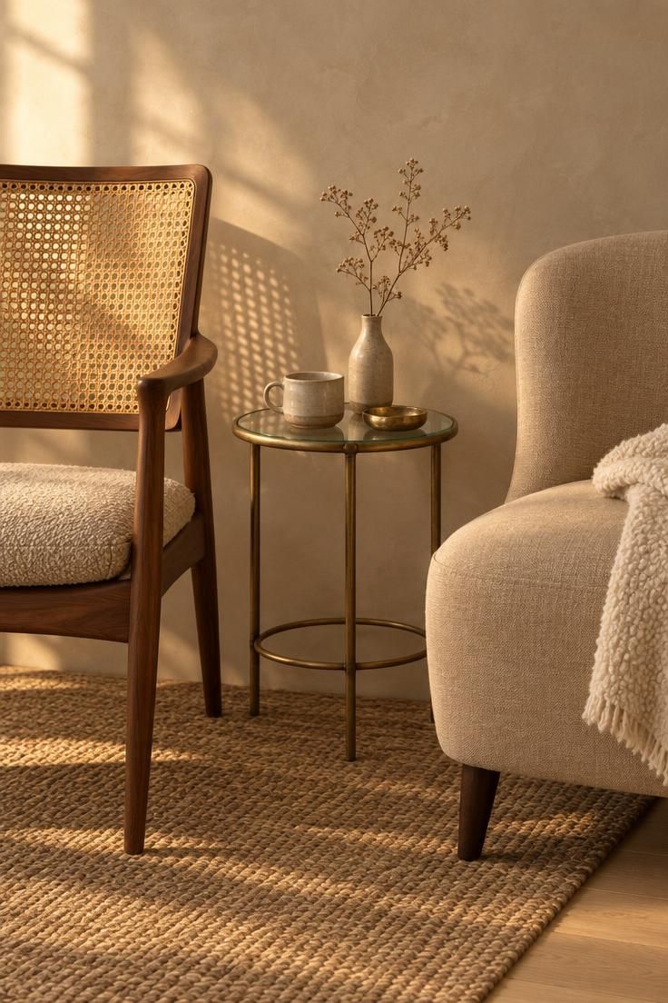
A single repeated detail, here the cane back in two different forms, gives two very different silhouettes permission to read as a pair.
Without that shared note, mismatched seating can look like two unrelated purchases that happened to land in the same room.
Compact apartment design rewards this kind of deliberate mismatch, where one repeated material does more work than a matched set ever could.
A round table between them keeps the floor walkable in a way a rectangle rarely does, which matters when the seating area doubles as a walkway.
Two chairs of very different visual weight need a bridging element, a rug, a shared metal, or a repeated cushion color, or the lighter chair looks unfinished beside the heavier one.
A cushion in the room's accent color ties the pair back into the wider palette.
The proportion between chair height and table height decides whether the grouping feels settled, and a table that sits noticeably higher than the chair seats interrupts the sightline.
This arrangement suits a compact apartment where the seating group sits near a window or in a corner that would otherwise hold one chair and feel thin.
Style Blueprint:
- Two chairs of clearly different eras
- One shared material detail on both, cane, blackened metal, or turned wood
- A small round table rather than a rectangle
- A single cushion linking the chairs to the room's accent color
- A rug or repeated metal to unify the pair
An Overhead View of a Coffee Table Made From a Travertine Slab and Stacked Books
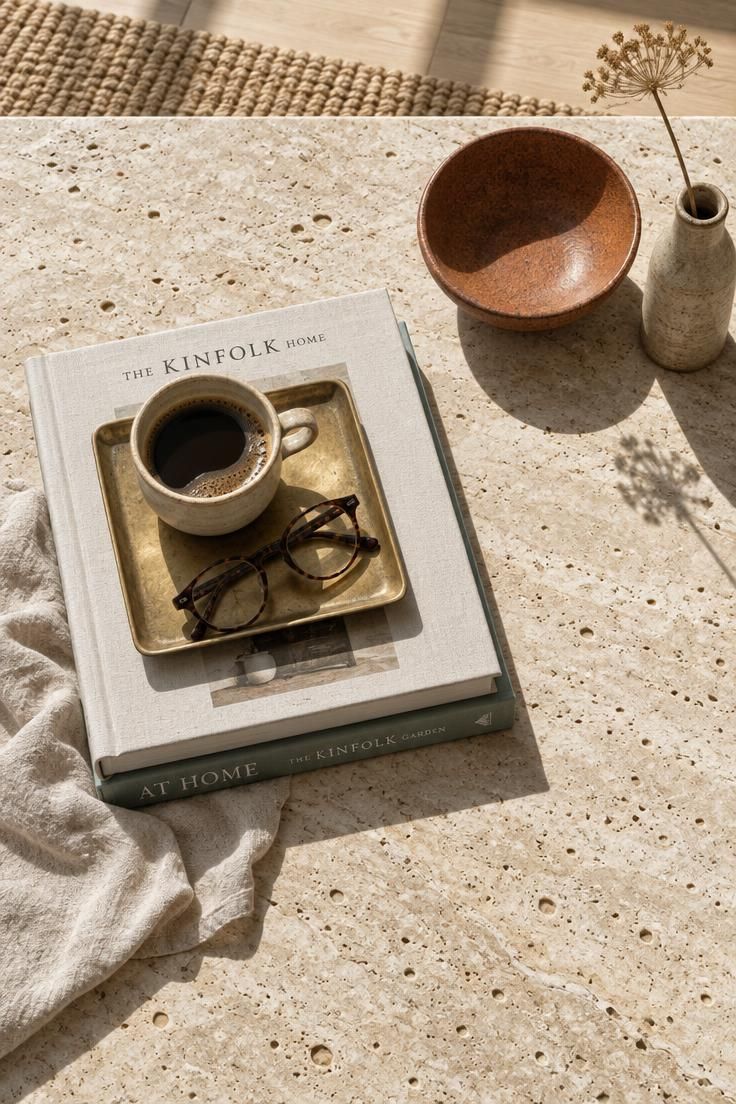
An overhead composition reveals whether a table is doing too much, because every object's footprint is visible at once.
The tray creates a defined edge within the tabletop, which makes a cluster of small objects read as a deliberate arrangement rather than spread clutter.
An eclectic gallery wall nearby can work with this table, but only when the table itself stays under control.
Using books as risers gives the composition height without adding another object type, and it keeps the books serving a function.
A single organic element, one stem or one dried branch, adds irregularity against the straight lines of the table edge and the book stack.
Leaving at least half the surface clear is the difference between a styled table and a crowded one.
Travertine and other porous stones need coasters and prompt wiping, since a ring on an unsealed slab is permanent in a way it is not on glass.
Nesting tables can replace one large table in a tight seating area, offering the same styling surface with a smaller footprint when not in use.
This approach suits a seating area where the coffee table is also the main styling moment.
Style Blueprint:
- One heavy material as the tabletop anchor, travertine, marble, or thick wood
- Books used functionally as risers
- One tray to corral small objects
- One organic element only
- At least half the surface left clear
Design Pro-Tip: On a coffee table, build height in three steps, a low book stack, a medium tray, a tall single stem, and keep everything inside one imaginary rectangle so the arrangement holds from every side.
A Doorway View Into a Sleeping Corner With a Textile Hanging Above the Bed
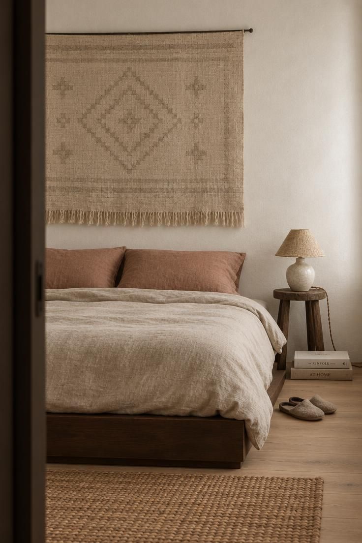
A single large textile gives the wall presence without the visual noise that many small frames create in a small bedroom.
A small-space storage bench at the foot of the bed could hold a blanket or a stack of books, but the textile above the bed remains the wall's single focal point.
Two mismatched bedside surfaces keep the corner asymmetric and relaxed, which reads as collected rather than unfinished when the lamp balances the composition.
One lamp only preserves that asymmetry and avoids the paired, hotel-like look that matched bedside lamps produce.
Bedding in a limited palette lets the textile carry the pattern without competition, and it also makes the bed easier to remake each morning.
The scale of the hanging must relate to the bed width, since a textile noticeably narrower than the bed leaves the wall looking underdressed.
Woven hangings collect dust and may need periodic cleaning, and their fringe can tangle if the wall behind them is not flat.
This approach suits a bedroom corner with one clear wall above the bed and no headboard already in place.
Style Blueprint:
- One large textile above the bed instead of a gallery arrangement
- Two mismatched bedside surfaces
- One lamp only, keeping the corner asymmetric
- Bedding in a limited palette so the textile carries the pattern
- A hanging width that relates clearly to the bed width
A Brass and Smoked-Glass Bar Cart Styled as a Small Drinks Altar
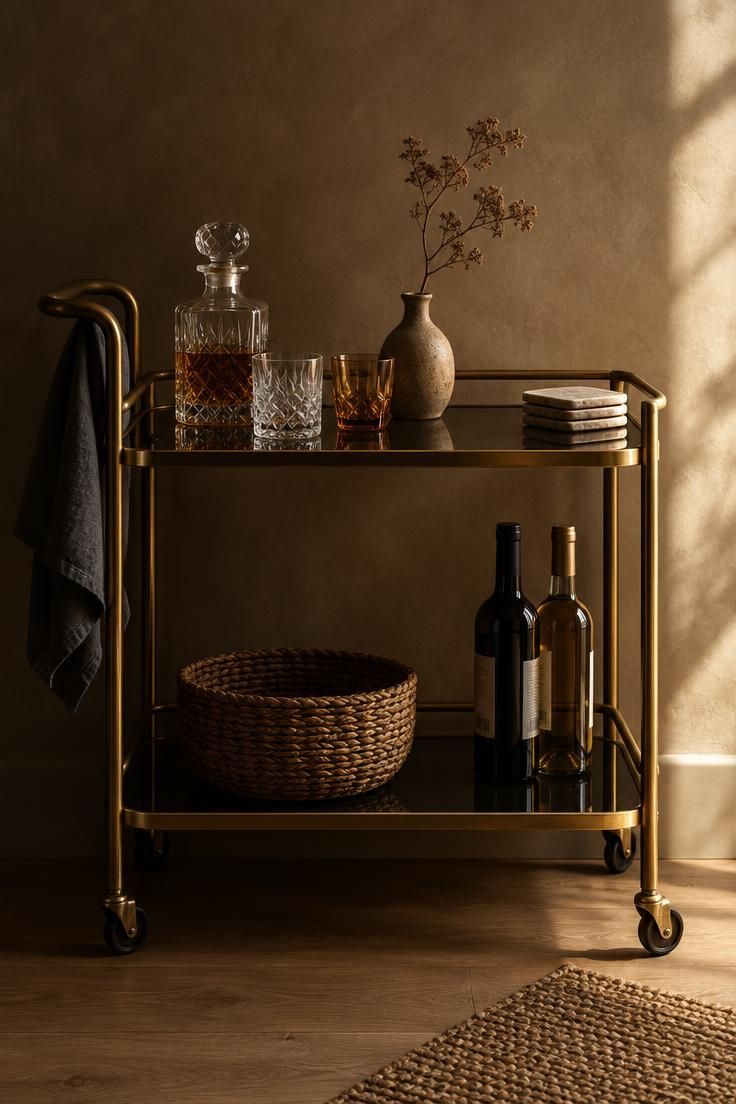
One brass cart works as the single metallic statement in a view, and adding a second brass piece nearby dilutes the effect.
Glassware in mixed shapes but one color family keeps the cart from looking scattergun while still reading as collected.
Mixed-material apartment furniture brings different textures into the same piece, as this cart does with brass and smoked glass.
A decorative object, a vase or a small sculpture, lifts the cart above pure utility and lets it belong in the living area rather than the kitchen.
Wheels mean the cart can move between the seating area and the dining edge, which matters in a compact apartment where one surface has to serve two functions.
Keeping the top shelf sparse and letting the lower shelf hold backups keeps the silhouette clean from across the room.
A cart with open sides shows every bottle and box, so a tray or basket on the lower shelf performs the same corralling job as a tray on a coffee table.
Low moody lighting flatters brass and smoked glass, but it also hides dust, so wipe the shelves on a regular schedule rather than waiting until they look dull.
Style Blueprint:
- One brass cart as the single metallic statement in the view
- Glassware in mixed shapes but one color family
- One decorative object to lift the cart above pure utility
- A sparse top shelf with backups moved below
- A tray or basket to contain the lower shelf
A Patterned Runner Layered Over a Plain Jute Rug at the Seating Edge
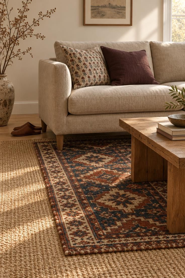
The plain base rug stops the patterned runner from fragmenting the floor, letting the runner read as a deliberate layer rather than a stray mat.
A woven natural fiber rug in undyed jute works best as the calm base because its color stays close to the floor tone while adding texture.
Placing the runner so it sits under the front legs of the main seating group visually ties mismatched furniture together, because the seating inherits a shared edge from the rug.
A rug that stops short of the walls can make a small floor look larger, since visible floor around the perimeter suggests depth.
Pattern scale in the runner should differ from the cushions, so one reads as ground and the other as accent.
Two rugs mean two surfaces to vacuum and two edges to catch a foot if the top layer is thin, which is worth weighing before adding a third.
More than two layered rugs in a small room fragments the floor, so one layering moment is enough.
In a very tight room, skip the base layer entirely and let the patterned rug do the whole job.
Style Blueprint:
- One plain base rug as the floor's calm layer
- One patterned rug, smaller, overlapping the base by a generous margin
- Pattern scale in the runner that differs from the cushions
- A base rug color kept close to the floor tone
- A single layering moment rather than several
Design Pro-Tip: When layering rugs, keep the base rug's color within a shade or two of the floor so the smaller patterned rug reads as the intention rather than as an accident of sizing.
A Slim Console Behind the Sofa With a Lamp, Tray, and Two Books
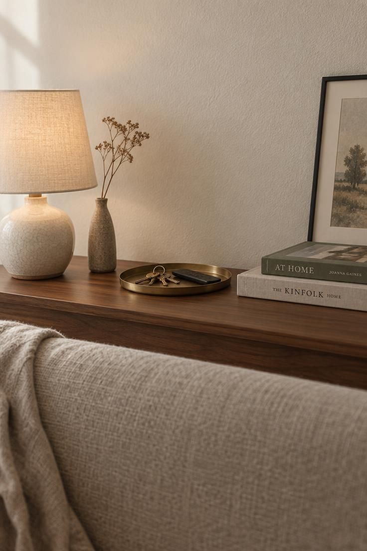
A narrow entry console works in a similar way, defining a small zone where objects can gather without spreading.
Behind the sofa, the same logic applies: a console adds a surface without consuming floor depth.
This matters in a narrow living area, where one lamp at seated height creates a second light layer.
The seating area gets its own pool of light instead of relying entirely on the ceiling fixture.
A tray keeps keys and small objects from spreading across the surface, and it gives the composition a defined edge.
One leaning frame rather than a hung arrangement keeps the wall above the console calm and allows the print to move when the arrangement changes.
The console's shallow depth limits what fits, and tall lamps or large plants can visually merge with the sofa back if there is not a visible gap.
Leaving a few inches of air between the sofa back and the console edge keeps both silhouettes readable.
This arrangement suits a living area where the sofa sits away from the wall and the space behind it would otherwise go unused.
Style Blueprint:
- One narrow console used as the behind-sofa surface
- One lamp to add a light layer at seated height
- A tray to keep small objects from spreading
- One leaning frame rather than a hung arrangement
- A visible gap between sofa back and console edge
A Kitchen Shelf Run With Stoneware, a Jar of Utensils, and One Small Print
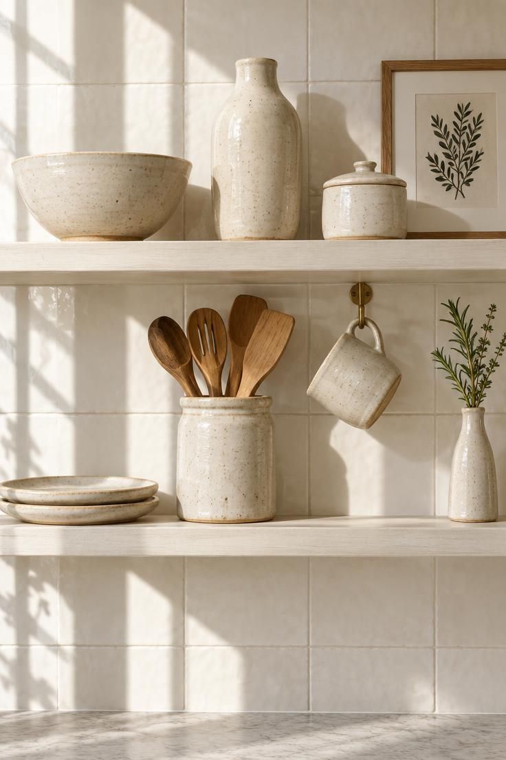
The shelf run repeats the collecting idea used elsewhere in the apartment, so the kitchen reads as part of the same visual language rather than a separate room.
Two shelves is usually the maximum in a small kitchen, since a third turns the wall into storage and removes the calm that makes the display work.
Stoneware in a single glaze family, varied in silhouette, holds together better than a set of matching shapes in different colors.
Including one working object, a jar of utensils or a hanging mug, keeps the shelf from looking purely decorative in a room that has to function.
Kitchen shelves need more frequent cleaning because cooking residue settles on surfaces near the counter, so objects should be easy to lift and wipe beneath.
Overloading the shelves with every dish makes the kitchen read as a cupboard with the door removed, so keep at least one shelf for display only.
This approach suits a rental kitchen where the cabinets cannot be changed but the wall above the counter is open.
Style Blueprint:
- Two shelves maximum in a small kitchen
- Stoneware in a single glaze family, varied in silhouette
- One working object among the display pieces
- One small print or postcard leaning on the upper shelf
- At least one shelf reserved for display only
Design Pro-Tip: Keep the objects on an open kitchen shelf to a count you can lift off in one trip, which makes the frequent wiping that cooking residue demands far less of a chore.
A Reading Chair by the Window With a Floor Lamp and a Cane Side Table
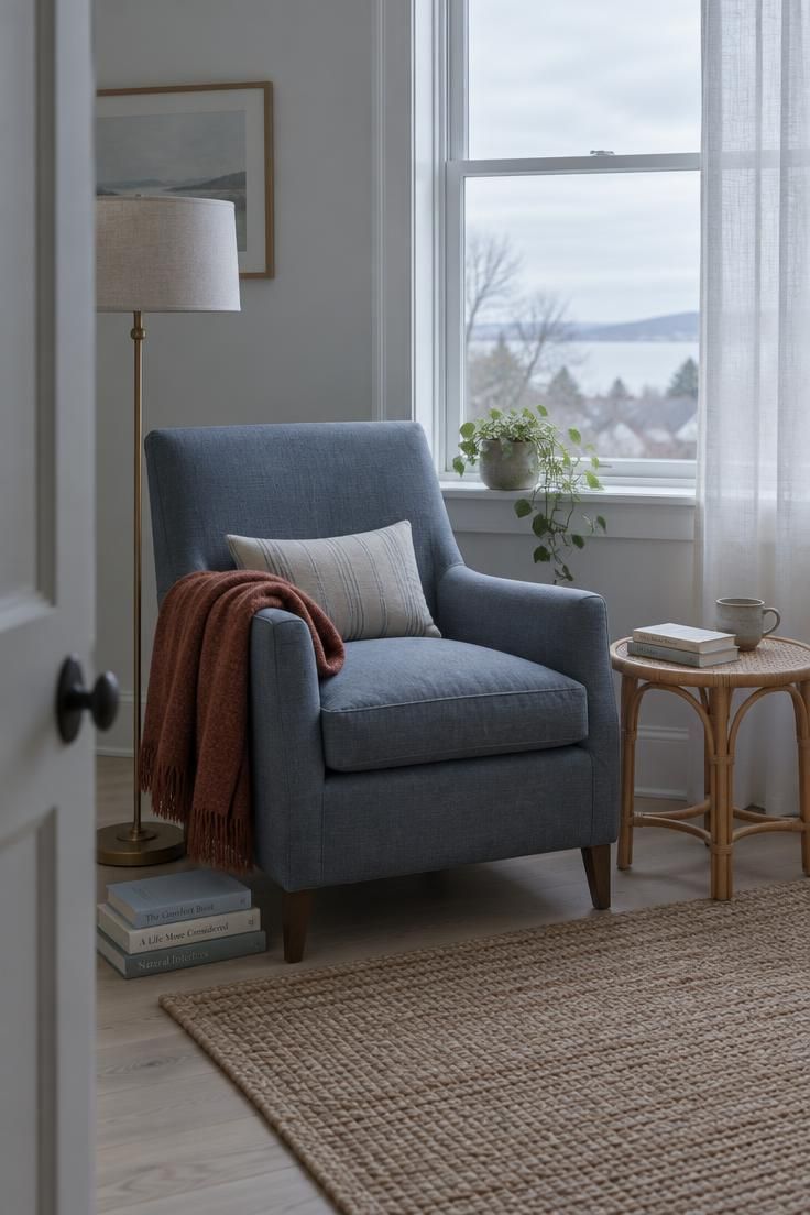
After several warm sections, this corner moves the palette cooler with a slate-blue upholstery and overcast light, showing that the same eclectic logic works at a different temperature.
A floor lamp rather than a ceiling fixture change keeps the light layering to a plug-in move, which suits a rental and avoids any work on existing wiring.
One side table in a natural fiber introduces texture without adding another color.
A throw in a color that repeats an accent from another room ties this corner back into the wider apartment, so the cool shift reads as intentional rather than a room from somewhere else.
Floor lamps consume a small amount of floor area and need a reachable outlet, and the chair and lamp together should not block the window's light.
A dark chair in a dim corner can disappear, and the lamp is what keeps the corner legible after dark.
Wool throws need occasional airing and cleaning, and natural fiber tables show water rings if a cup sits too long.
This corner suits a spot with daylight and no ceiling fixture positioned for reading.
Style Blueprint:
- One comfortable chair with a clear silhouette
- One floor lamp rather than a ceiling fixture change
- One side table in a natural fiber
- A throw repeating an accent color from another room
- A casual floor book stack as a low styling note
A Narrow Entry Console With a Tray, a Mirror, and One Framed Print
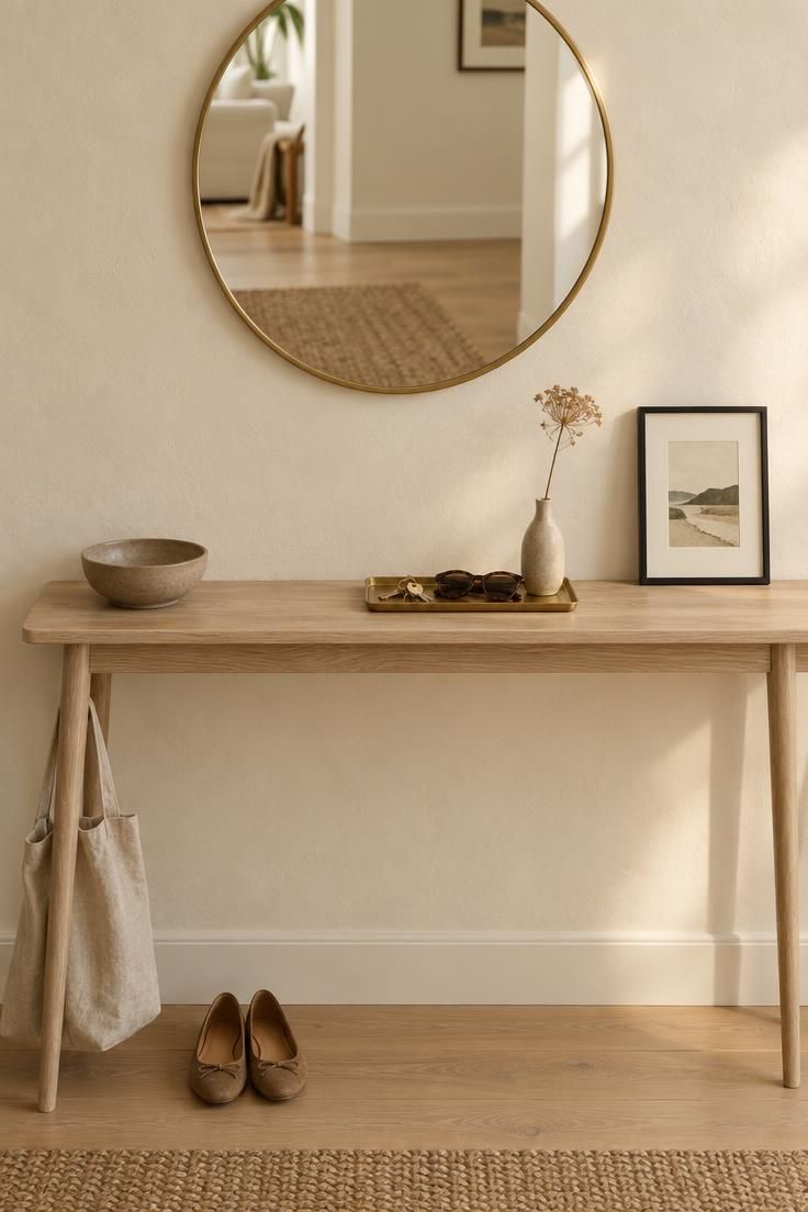
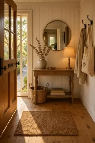
A narrow entry console gives a landing strip for keys, mail, and a bag without eating the walkway, which is the practical reason it earns a place in a compact apartment.
A tray performs the same corralling job here as it does on a coffee table, defining a small zone so the surface stays legible even when the day's objects pile up.
A round mirror above the console reflects part of the room, including the rug and floor, which makes the entry read as connected to the rest of the apartment rather than a dead end.
One leaning print rather than a hung arrangement keeps the wall flexible and lets the composition change without new holes.
Console depth limits what fits, so a large lamp or a tall vase can crowd the walkway and should be weighed against the traffic that passes the entry.
The tray and bowl need periodic emptying so the entry does not become a permanent drop zone.
This arrangement suits an entry with a wall on one side and open passage on the other, where a full-depth piece of furniture would pinch the route.
Style Blueprint:
- One narrow console used as the landing strip
- A tray to define the small-object zone
- A round mirror above to reflect the room beyond
- One leaning frame rather than a hung arrangement
- A low bowl for a single collected object
Design Pro-Tip: Empty the entry tray at the end of each week and return anything that belongs elsewhere, which keeps a landing strip from quietly becoming a permanent storage pile.
Conclusion
The thread running through every idea here is concentration: variety lives in a few deliberate zones, a picture ledge, a shelf run, a bar cart, a rug edge, a vanity tray, while walls, floors, and large upholstery stay quiet enough for the collected pieces to register.
A repeatable accent palette is what keeps those zones reading as one apartment rather than a series of unrelated corners, and repeating each accent at least twice does more work than adding a new color.
The honest tradeoffs are upkeep and editing.
Collected arrangements need dusting, rearranging, and periodic thinning, and natural fibers, stone, and unsealed ceramics need care in wet or high-use areas.
Each idea above is a starting composition rather than a finished room, and what fills it depends on what has already found its way into your hands.