This post may contain affiliate links. If you make a booking or purchase through these links, we may earn a commission at no additional cost to you.
A dark room can feel enveloping rather than gloomy.
A mixed room can feel collected rather than chaotic.
The difference comes down to two separate jobs: one layer sets the atmosphere, and the other brings in personality through mismatched eras, materials, and origins.
Moody eclectic decor lives in that split, where a deep base tone holds everything together while the objects inside it stay deliberately varied.
These eleven visual moves each anchor to a specific material, finish, or object.
Commitment levels range widely, so starting with the reversible pieces is a reasonable way in.
Deep Ink Walls With a Scattered Mix of Frame Finishes
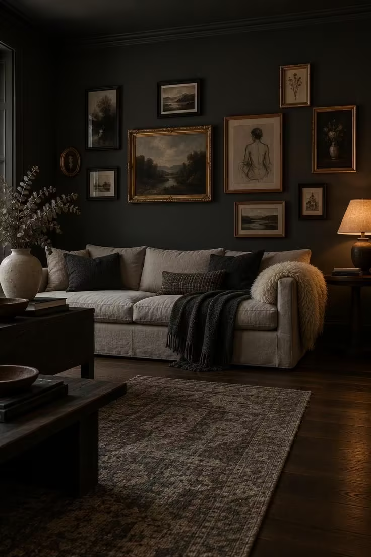
The deep envelope does the unifying work here.
Frames can be as mismatched as they like once the walls step back.
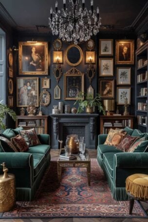
Painting walls and trim the same ink or charcoal tone lets the architecture recede, so the art and the light pools become the subject.
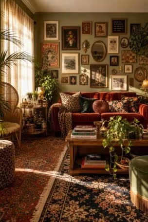
A scattered hang, roughly five to nine frames in at least three finishes, reads as collected rather than accidental when the spacing stays loose.
One light-valued anchor, such as a pale linen sofa, a cream shade, or a sheepskin throw, keeps the wall from flattening.
A single repeated thread, whether a frame finish, a mat tone, or a motif, holds the mix together without making it look matched.
Matte dark walls show scuffs and fingerprints more readily than mid-tones, so a small touch-up pot earns its place in a closet.
Paint is the commitment here, and the art is not, which makes this a medium-lift idea overall.
Style Blueprint:
- Matte ink or charcoal walls and trim in the same tone so architecture recedes
- Five to nine frames in at least three different finishes and sizes, hung with irregular spacing rather than a grid
- One light-valued anchor such as a pale linen sofa, a cream shade, or a sheepskin throw
- A single repeatable thread, whether frame finish, mat color, or motif, tying the mix together
Design Pro-Tip: Pick your unifying thread before you hang a single frame. One repeated element, whether brass, black, or a shared mat tone, does more for cohesion than any amount of careful spacing.
The Single Jewel-Tone Statement Chair Against Dark Neutrals
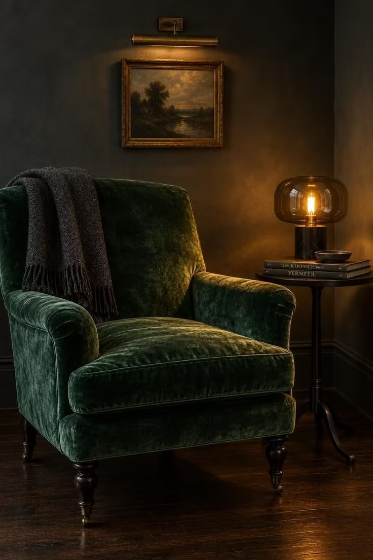
A single saturated note reads richer against deep neutrals than a whole room of medium tones.
An emerald, oxblood, aubergine, or rust upholstered piece carries the color story on its own, while everything around it stays in charcoal, ink, warm brown, or aged stone.
Give the chair something to sit against by introducing a second material: aged brass, dark wood, or smoked glass all work.
Keep competing brights out of the same sightline, since a second saturated piece dilutes the first rather than doubling it.
Velvet shows crushing and collects pet hair, and a linen or mohair version trades some depth for easier upkeep.
Testing the color before committing is simple: drape a jewel-toned throw over an existing chair and see how it reads against the walls.
This idea suits living rooms, bedrooms, and reading corners where a single chair can anchor the palette.
In a dark eclectic living room, the chair itself is a medium commitment, and the color test is not.
Jewel tone home decor works best when one saturated piece leads the room rather than several competing pieces dividing it.
Style Blueprint:
- One upholstered piece in a saturated jewel tone such as emerald, oxblood, aubergine, or rust
- Everything around it in deep neutral: charcoal, ink, warm brown, or aged stone
- A secondary material contrast in aged brass, dark wood, or smoked glass
- No competing brights within the same sightline
Layered Rugs With Contrasting Pattern and Texture
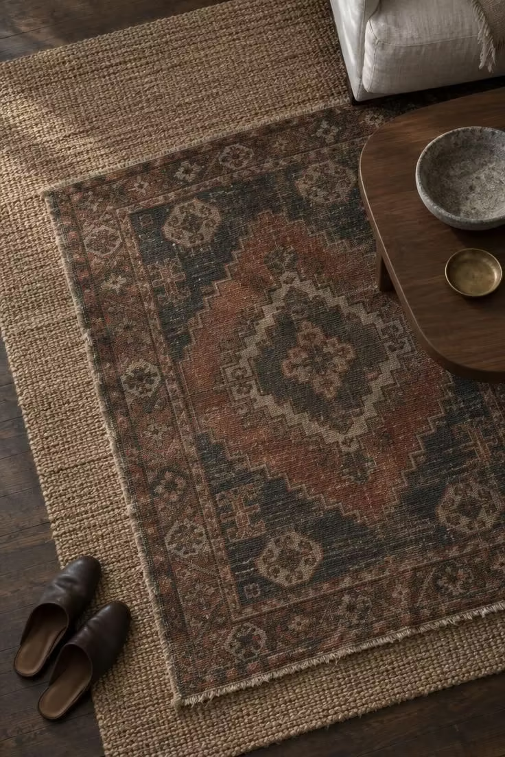
Layered rugs styling adds depth and softness to a dark room in a way that a single flat rug cannot.
Start with a larger neutral or textured base in jute, sisal, or flat-woven wool.
Then set a smaller patterned or vintage rug on top, offset or rotated rather than squared.
A shared color between the two layers, whether rust, indigo, or charcoal, makes the pairing read as intentional instead of incidental.
Leave enough of the base rug exposed around the edges to show that layering is happening.
The practical side deserves attention: layered rugs need periodic rotation and separate cleaning between layers, and edges curl and shift over time.
In tight rooms, a single well-chosen rug usually reads cleaner than a layered pair.
High-traffic areas will show wear on the top layer first, so choose the upper rug with that in mind.
This is a low-commitment idea that can be reversed in an afternoon.
Design Pro-Tip: Angle the top rug by just a few degrees, not a full diagonal. A slight rotation signals deliberate layering; a heavy tilt reads as a trip hazard.
Warm Metal Threaded Through Unmatched Objects
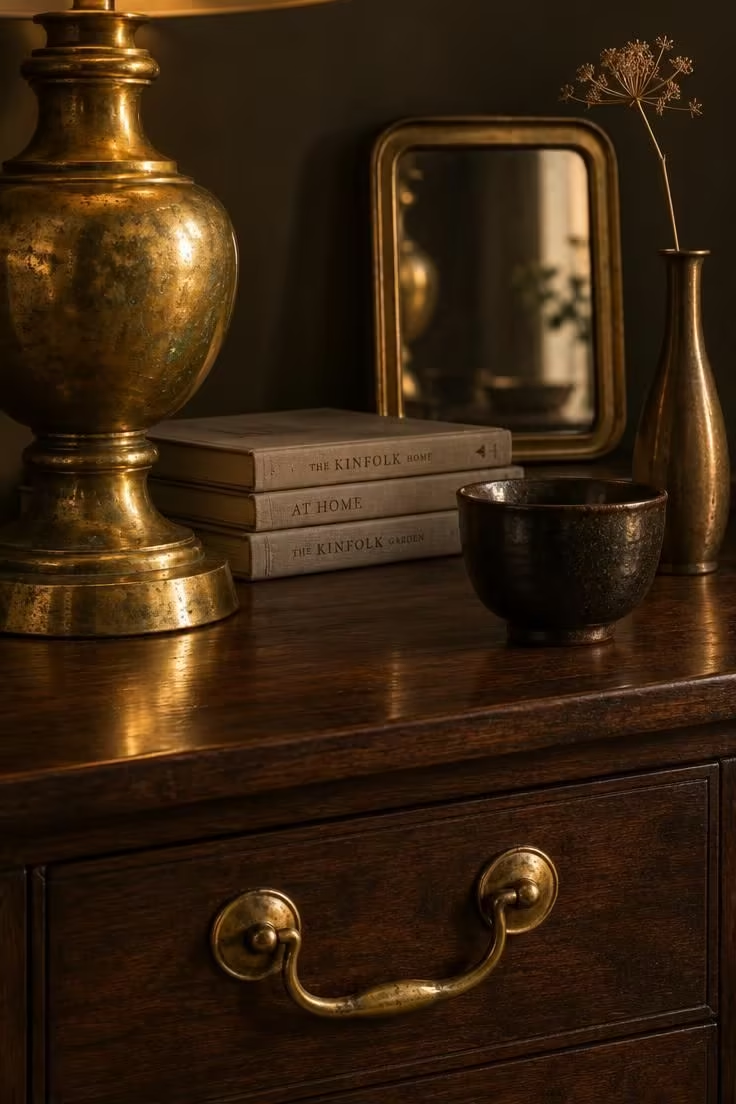
A repeated finish is the quietest bridge in an eclectic room.
It holds even when nothing else matches.
Choose one metal, whether aged brass, unlacquered brass, or copper, and repeat it across at least three object types in the room.
Warm metal accents can gather across eras and origins without losing their connective thread.
Keep the patina level consistent: all aged or all polished, never a mix of both.
Placing at least one metal moment at a different height, a sconce above and a tray below, creates a rhythm the eye can follow.
Unlacquered brass patinas over time, and leaving it or polishing it is a commitment either way.
This is one of the lowest-lift ideas on the list, since most of the objects can be gathered gradually rather than bought together.
It also pairs easily with nearly every other idea here.
Style Blueprint:
- One metal, whether aged brass, unlacquered brass, or copper, repeated across at least three object types
- Objects otherwise unrelated in era, origin, or function
- A consistent patina level: all aged or all polished
- At least one metal moment at a different height to create rhythm
A Dark-Painted Ceiling as the Envelope Device
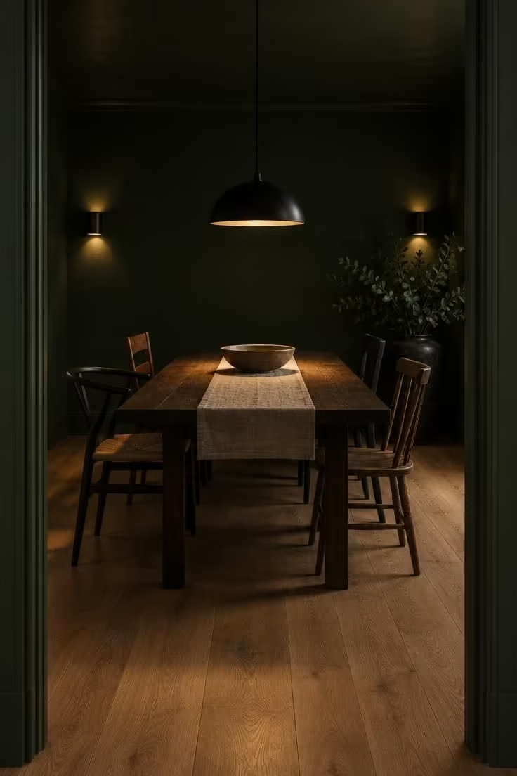
An unbroken envelope makes the architecture recede, so objects and light pools become the focus; paint the ceiling and walls the same deep tone, or take the ceiling one shade deeper.
A dark painted ceiling closes the top of the room without making the space feel smaller when a light floor answers it.
Decide deliberately whether the trim matches or contrasts.
Leaving trim bright white by default often breaks the effect, though sometimes that break is the point.
A light floor, pale textiles, or a reflective surface bounces the eye back into the room.
Low, warm light sources serve the scheme better than a bright central fixture, which flattens the envelope.
A dark ceiling can feel heavy in a low room, and a lighter floor or a large mirror helps offset that weight.
Painting a ceiling is a commitment, though it is the most reversible of the envelope moves.
Style Blueprint:
- Ceiling and walls in the same deep tone, or a ceiling one shade deeper than the walls
- Trim either matched to the walls or deliberately contrasted, not left bright white by default
- A light floor, pale textiles, or a reflective surface to bounce the eye back
- Low, warm light sources rather than a bright central fixture
Design Pro-Tip: Test a deep ceiling color on a large sample board held overhead rather than judging it from a small swatch at eye level. Ceilings read darker than walls under the same light.
Collected Shelf Styling With Intentional Gaps
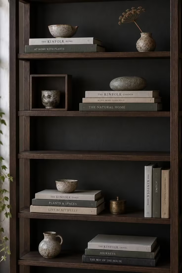
Gaps give the eye somewhere to land.
Fully packed shelves read as storage rather than styling.
Stack books both horizontally and vertically rather than all one way.
Group small objects in odd numbers and leave clear space between each group.
A mix of materials on every shelf, ceramic, stone, glass, metal, and dried botanical, keeps the composition varied without needing more pieces.
At least one shelf with mostly empty space serves as a visual rest.
Rotating objects seasonally works better than adding more, since density tends to creep over time.
Dried botanicals shed and fade, so treating them as replaceable rather than permanent is realistic.
On shallow shelves, fewer and larger objects read better than many small ones, which makes this idea adaptable to tight spaces.
A shelf unit can also borrow the logic of a gallery wall arrangement, treating each opening as its own frame.
That approach keeps the gaps deliberate instead of accidental, even when the objects change.
Style Blueprint:
- Books stacked both horizontally and vertically, never all one way
- Small objects grouped in odd numbers with clear gaps between groups
- A mix of materials on every shelf: ceramic, stone, glass, metal, dried botanical
- At least one shelf with mostly empty space as a visual rest
Design Pro-Tip: Style shelves in a loose triangle: one tall object, one horizontal stack, one small object nearby. Repeat the triangle at different sizes across the unit.
Low, Layered Lamp Light Replacing a Central Fixture
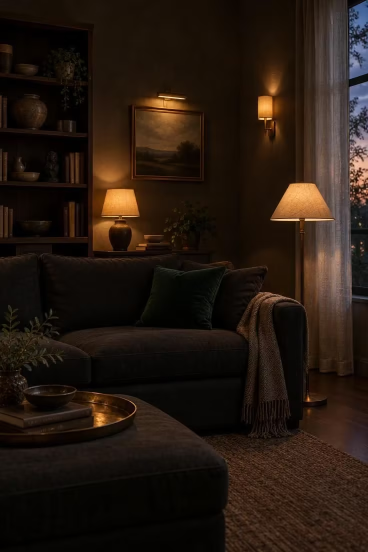
Layered low light is the atmospheric backbone of a moody room.
A single bright overhead removes that layering entirely.
Multiple small warm-toned sources at different heights, a table lamp, a floor lamp, a wall sconce, and a picture light, create pools rather than an even wash.
Shades that direct light downward and outward support that effect.
Placing at least one lamp near a reflective surface multiplies the glow without adding another fixture.
Leaving the central fixture off or dimmed works as well as removing it, which keeps the change reversible.
More lamps does mean more cords, more shades to dust, and more switches to manage.
Lamps and shades swap easily, which makes this idea one of the simplest to try.
A moody boho interior leans on this kind of layered lighting instead of a single ceiling source.
Style Blueprint:
- Multiple small warm-toned sources at different heights: table, floor, wall, and picture light
- Shades that direct light down and outward, creating pools rather than even wash
- At least one lamp near a reflective surface to multiply the glow
- The central fixture left off or dimmed rather than removed
Heavy Curtains and Soft Textiles as Counterweight
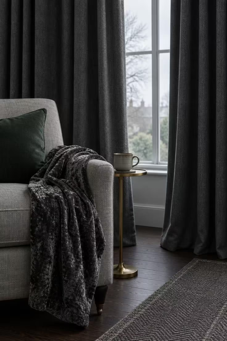
Heavy textiles soften the hard finishes that dark, moody rooms tend to accumulate.
Curtains in velvet, wool, or lined linen, in a tone that relates to the walls, add weight and absorb some of the room's hardness.
At seating height, at least one soft piece, a draped throw, a floor cushion, or an upholstered ottoman, completes the counterweight.
Texture does more here than pattern, so letting the fabric weight carry the effect is usually enough.
One contrast note, a lighter throw or a metallic trim, keeps the softness from turning to mush.
Heavy curtains hold dust and are harder to clean than sheers, and velvet throws crush and show pet hair.
This idea sits low on commitment since curtains and throws can be changed without touching the walls.
Style Blueprint:
- Curtains in a heavy fabric such as velvet, wool, or lined linen, in a tone that relates to the walls
- At least one soft textile at seating height: a draped throw, floor cushion, or upholstered ottoman
- Texture over pattern, letting fabric weight do the work
- A single contrast note such as a lighter throw or a metallic trim
Tonal Pattern Mixing on a Shared Color Leash
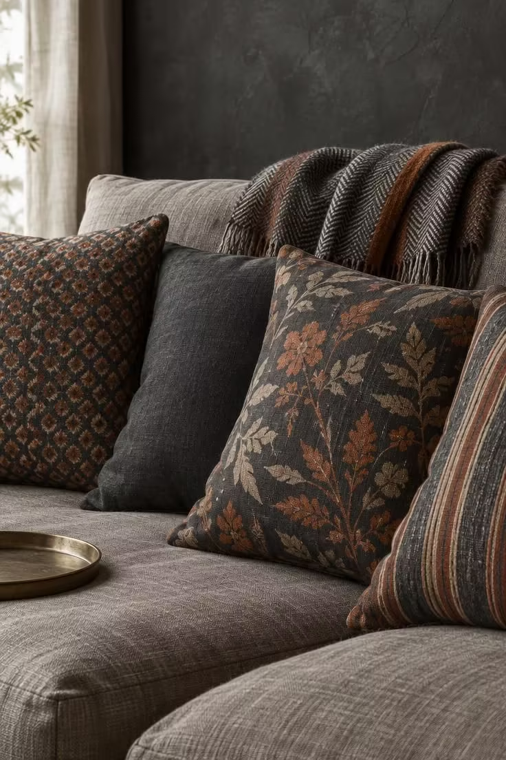
A shared palette makes wildly different patterns read as variations rather than collisions.
Choose three or more patterns that share at least two colors.
Vary the scale so one is small, one medium, and one large.
A solid cushion or throw placed between the patterns acts as a spacer and gives the eye a break.
Keep no more than one high-contrast pattern in the mix, since a second one shifts the balance from collected to chaotic.
This is the easiest idea on the list to overdo, and adding a fourth pattern usually tips it.
Swapping cushion covers is the cheapest way to refresh a moody eclectic room seasonally, and it is fully reversible.
Style Blueprint:
- Three or more patterns that share at least two colors
- A mix of pattern scales: one small, one medium, one large
- A solid cushion or throw between the patterns as a spacer
- No more than one high-contrast pattern in the mix
Design Pro-Tip: Lay your candidate patterns side by side in daylight before committing. Colors that match under lamplight can read as clashing by a window.
Smoked Glass, Antiqued Mirrors, and Reflective Surfaces
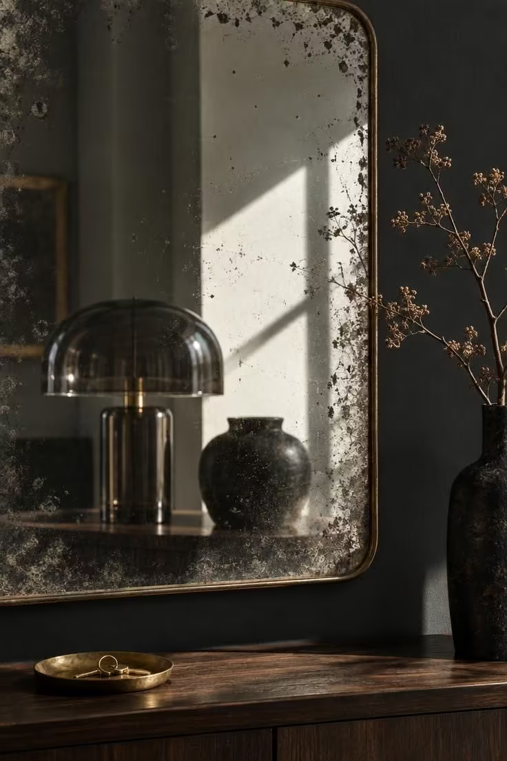
Smoked glass mirror decor multiplies lamp light in a dark room and adds a jewel-like quality without introducing new color.
One large reflective surface, an antiqued mirror, a smoked glass panel, or a lacquered piece, anchors the idea.
A smaller reflective moment nearby, a glass lamp base, a mirrored tray, or a smoked glass vessel, repeats the effect at a different scale.
Position a warm light source so it catches the reflection, and keep the surround matte so the reflection stays the exception rather than the rule.
Mirrors and glass show smudges quickly, and smoked or antiqued finishes hide them better than clear glass does.
This idea layers well with lamp lighting and with warm metal accents.
The mirror itself may be the largest purchase in the room, which makes this a medium commitment.
Style Blueprint:
- One large reflective surface such as an antiqued mirror, smoked glass panel, or a lacquered piece
- A smaller reflective moment nearby: a glass lamp base, a mirrored tray, or a smoked glass vessel
- A warm light source positioned to catch the reflection
- A matte surround so the reflection reads as the exception, not the rule
Velvet Armchair Styling as a Soft Focal Point
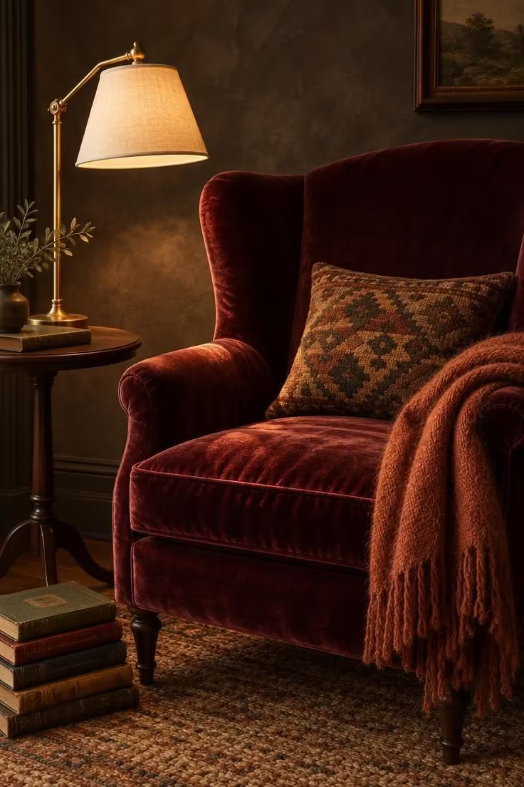
Velvet armchair styling can give a corner its own identity without needing to change the surrounding surfaces; the chair works as the soft focal point, while a smaller side table and a single lamp keep the arrangement functional.
Choose a velvet with a visible pile direction, since it catches low light differently across the seat and back.
A throw in a related but not identical tone adds another layer without introducing a new color family.
Tuck a second material into the corner, such as a brass lamp or a dark wood side table, so the softness has something to push against.
Velvet creases with use, and regular light brushing keeps the pile from flattening too quickly in high-contact spots.
This works as a smaller version of the jewel-tone statement chair, scaled tightly to one corner.
Style Blueprint:
- One velvet armchair with visible pile texture in a deep tone
- A small side table in dark wood or brass beside the chair
- A single reading lamp with a warm shade placed close to the chair
- A folded throw or cushion in a related but not identical tone
Conclusion
Most of these moves fall into one of three jobs: building the moody base, introducing eclectic contrast, or bridging the two so they read as one room.
They combine in nearly any order, and nothing here requires doing all of it at once.
Starting with the reversible pieces, lamps, textiles, rugs, and shelf styling, lets the room evolve as objects are gathered rather than bought in a single outing.
One or two unifying threads, whether a repeated metal, a shared palette, or a consistent patina, do more for cohesion than matching everything.
A collected room is built over time.