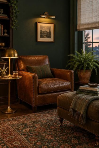
This post may contain affiliate links. If you make a purchase through these links, we may earn a commission at no additional cost to you.
Choosing man cave paint colors usually starts with a favorite swatch, but the color that works depends on how the room is used.
A media room benefits from dark surrounds that keep attention on the screen, while a workshop corner needs lighter tones that make small parts easier to spot.
The palette should also respond to existing flooring, trim, and natural light rather than fight them.
These color directions organize the options by visual effect and practical tradeoffs, from moody charcoal to warm clay.
The goal is a room that feels personal without becoming a one-note cave.
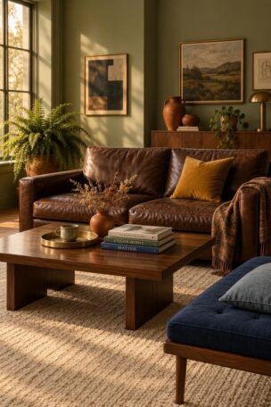
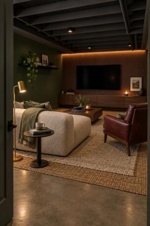
Forest Green With Brass Picture Lights Above a Leather Sofa
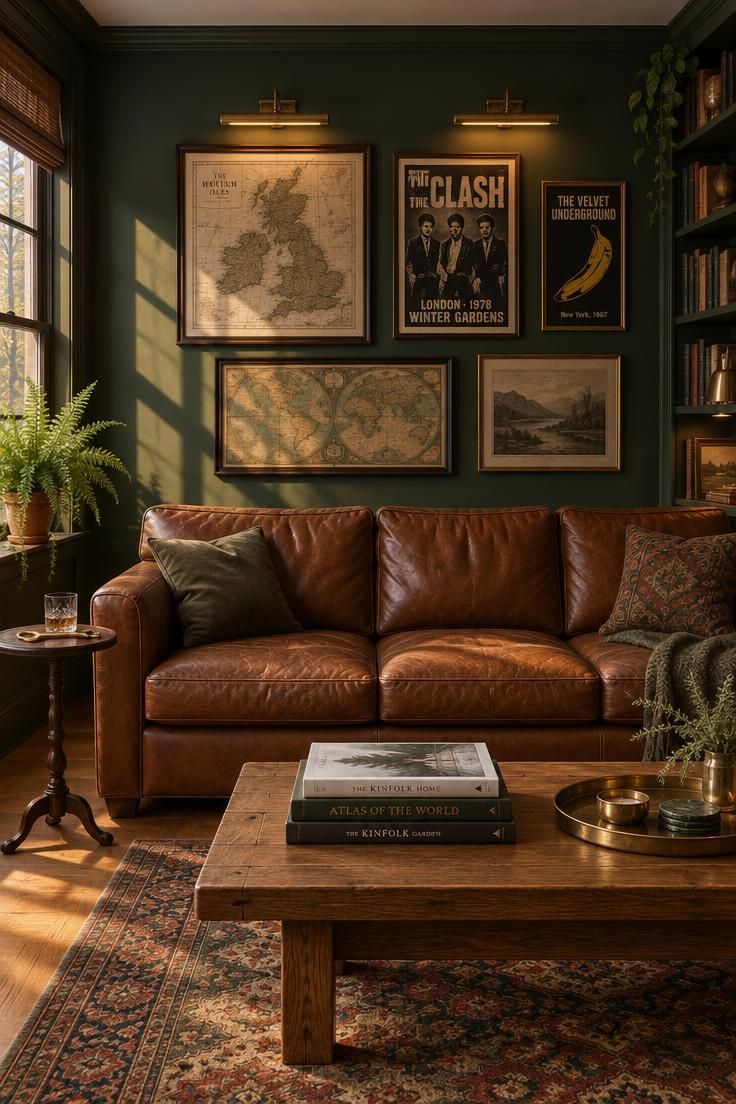
Deep forest green on all four walls creates a backdrop that reads like a private library, especially when the color carries a slight gray undertone rather than a bright grass green.
The tone works hardest in a room with at least one moderate window or a lighter wood floor, since low light can pull the green toward black and swallow the furniture silhouettes.
Brass picture lights over framed maps or band posters add a warm counterpoint to the cool depth of the green, and cognac leather picks up the same amber notes.
Picture lights also serve a practical purpose: they throw light onto the wall itself, so the color stays readable after dark instead of disappearing into shadow.
An eggshell sheen is worth the small loss of flatness near a drink shelf or bar cart, because it wipes clean without leaving a dull patch.
This palette suits a reading or listening room more than a busy game table, where scuffs and spills tend to concentrate.
The pairing of green walls, oak, and leather tends to look intentional even when the furniture is mismatched, because the colors share warmth.
A single chair in a contrasting fabric, such as a dark plaid or a cream boucle, keeps the room from reading as a single continuous tone.
For rooms with very little daylight, a lighter ceiling or a pale rug can lift the lower half of the space enough that the green still reads as green.
Testing a large patch on two different walls helps, since the same color shifts across corners and near windows.
Style Blueprint:
- Deep forest green in eggshell for all four walls
- Cognac leather sofa or armchair as the warm anchor
- Brass picture lights over a grouped frame arrangement
- Low oak coffee table with a brass tray and stacked books
- Worn Persian or wool rug in muted reds and greens
Navy Blue Walls with a Slate Blue Ceiling and Warm Wood Shelving
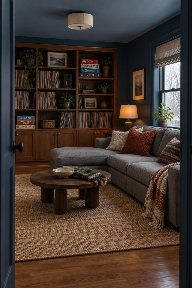
Navy is the default den color for good reason: it flatters screens, dark furniture, and warm wood, and it hides scuffs better than charcoal.
A slightly lighter slate blue ceiling keeps the room from feeling top-heavy, since the eye reads the ceiling as a continuation of the wall rather than a separate heavy slab.
Warm wood shelving for vinyl records or board games brings out the blue in the navy instead of fighting it, and the shelves double as storage that keeps the floor clear.
Gray upholstery sits comfortably between the cool walls and the warm wood, while a jute rug adds texture without introducing another strong color.
Comparing navy swatches under both daylight and evening lamps matters more than it does for mid-tones, because the undertone can shift from true blue to almost purple in warm light.
A few true-blue test patches on different walls will show which direction the room actually pulls.
Navy also pairs with almost any metal finish, from blackened steel to unlacquered brass, so hardware and lighting can be chosen for shape rather than color matching.
This flexibility makes navy one of the more forgiving choices for a man cave paint colors scheme that may evolve as furniture changes.
For a dark media room, a charcoal media room paint is another option, though navy tends to read slightly warmer and hides fingerprints on door edges more gracefully.
The tradeoff is that navy can look almost black in a north-facing room with only one small window, so a lighter ceiling or a pale rug becomes more useful there.
Style Blueprint:
- Navy blue in eggshell for the walls
- Slate blue in flat for the ceiling to soften the height
- Warm wood open shelving for records, games, or books
- Gray sectional with cream and rust throw pillows
- Jute rug over wood flooring for texture
Charcoal on Two Walls Only with a White Ceiling and Media Cabinet
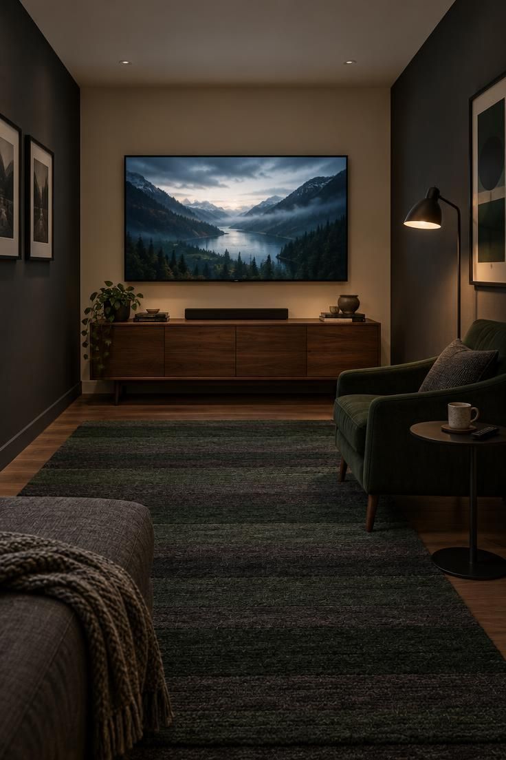
Painting only the two side walls charcoal while keeping the front and rear walls a warm off-white creates a viewing tunnel effect without making a small room feel like a closet.
The bright ceiling above dark walls can make a low ceiling read as higher than it is, since the contrast draws the eye upward rather than across.
A matte finish on the charcoal walls avoids glare from the screen, which matters more here than cleanability.
The tradeoff is that dark walls make fingerprints on switches, door edges, and light plates more visible, so a wipeable paint near the door and around the switches saves repainting later.
If green is the direction you prefer over gray, a dark green man cave paint approach can achieve a similar enclosure effect with warmer undertones.
The two-wall technique works with either color, and it also leaves room for the media cabinet and screen to stay the visual focus.
A low media cabinet under a wall-mounted screen keeps the sightline clear from a sofa, and a wool rug in two colors ties the dark side walls to the light front wall.
Small practical choices, such as a floor lamp near the chair, keep the room usable when the screen is off.
Style Blueprint:
- Charcoal in matte for the two side walls
- Warm off-white in eggshell for the front and rear walls
- Crisp white ceiling to lift the room height
- Low walnut media cabinet beneath the screen
- Striped wool rug in charcoal and deep green
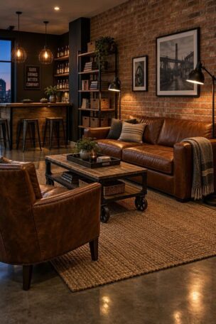
Warm Greige Walls with a Blackened Steel Bar Cart and Tan Stools
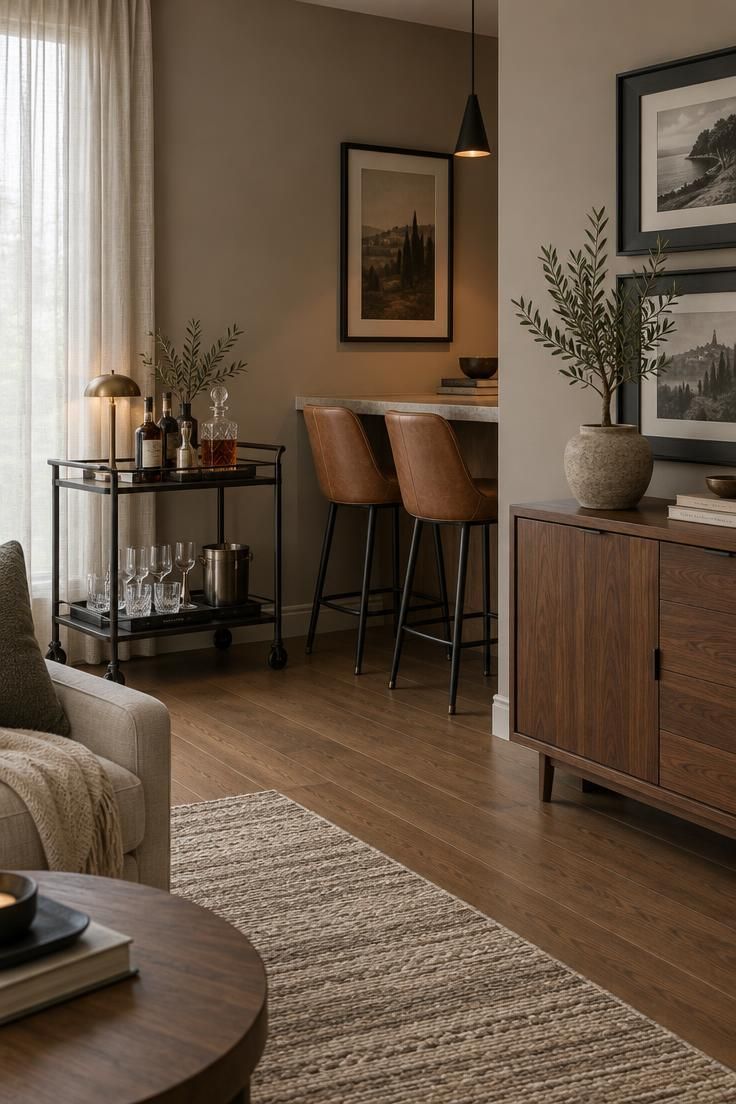
Warm greige, a gray with a taupe undertone, works as a flexible base for a room that also functions as a home office or guest space.
This palette keeps the room feeling less like a themed cavern and more like a general lounge, which matters when the space has to serve more than one purpose.
A blackened steel bar cart, tan leather counter stools, and a walnut sideboard bring warmth and contrast to the neutral walls.
Greige can look flat without a few higher-contrast pieces, so plan for dark picture frames, a deep charcoal throw, or a black metal lamp to anchor the scheme.
A satin finish reflects enough light to keep the walls from looking muddy, and it wipes clean more easily than flat in a room that sees daily use.
The tradeoff is slightly more visible wall imperfections, which matters less in a room with furniture and art covering large areas.
Because greige sits between warm and cool, it also handles a change of furniture over time more gracefully than a strongly saturated wall color.
If a future sofa is charcoal instead of tan, the walls still work.
Choosing greige also keeps a man cave paint colors palette from committing to a single mood, which suits a room that shifts from work calls during the day to drinks in the evening.
The color holds its own under both cooler daylight and warmer lamps.
Style Blueprint:
- Warm greige in satin for all four walls
- Blackened steel bar cart as a dark contrast point
- Tan leather counter stools for warmth
- Walnut sideboard with dark charcoal picture frames
- Flatweave rug in taupe and cream
Tobacco Brown Accent Wall Behind a Freestanding Dartboard Setup
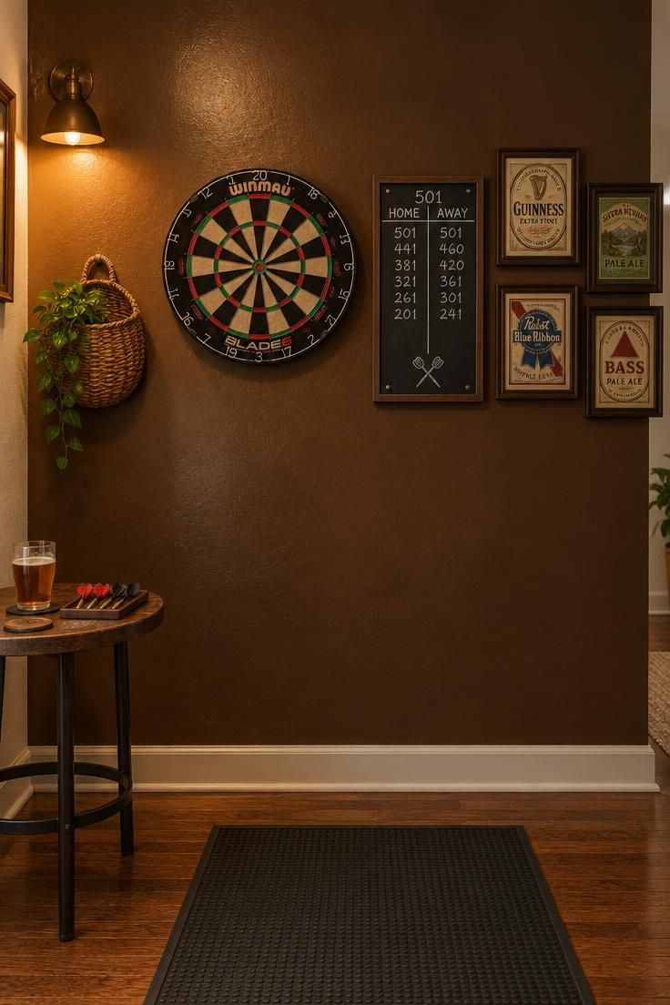
Tobacco brown, a deep umber with red undertones, gives a game corner warmth without the dated feel of flat brown walls.
Using it only on the wall behind a dartboard and scoreboard while the other walls stay a soft off-white keeps the brown from dominating the whole room.
An accent wall works best on the wall people face when entering, not the one behind the sofa, because the eye lands on it first and the contrast registers as intentional.
A woven wall basket or a tight grouping of framed vintage beer labels adds depth to the brown without competing with the board.
Brown shows scuffs from darts, barstool backs, and stray shoes, so a semi-gloss finish on this wall makes wiping down easier than a flat or matte would.
The sheen also catches wall-sconce light, which keeps the deep tone from going muddy in the evening.
Because brown is a base color rather than a statement color, the accessories around it tend to carry the personality of the room.
Off-white on the adjacent walls gives the eye a place to rest, which keeps the corner feeling curated rather than heavy.
Style Blueprint:
- Tobacco brown in semi-gloss for the single accent wall
- Soft off-white in eggshell for the surrounding walls
- Bristle dartboard with a small chalk scoreboard
- Woven wall basket and framed vintage beer labels
- Dark rubber floor mat beneath the board
Deep Rust Color Drenching with a Low Slab Coffee Table
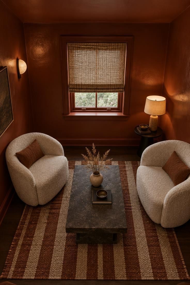
Color drenching means painting the walls, ceiling, and trim in the same deep rust tone, and the effect depends heavily on finish choices.
A flat finish on the ceiling reduces light bounce so the color reads as a single continuous envelope, while a slightly higher sheen on the walls wipes clean more easily than flat.
This approach works in a small room where a cocoon effect is the goal, but it can feel heavy if every surface is glossy.
A low slab coffee table and cream boucle chairs break up the rust and give the eye a clear focal point.
Rust can shift toward orange under warm bulbs, so swatching a large area before committing matters more here than with a neutral.
Man cave color drenching also hides architectural quirks, such as an awkward soffit or an off-center window, because there is no trim line to draw attention to them.
Cream chairs and a woven shade soften the saturation, and a striped rug in rust and cream ties the palette together without introducing a new color.
Dried grasses in a small vase add an organic note that keeps the room from feeling one-dimensional.
Style Blueprint:
- Deep rust in flat for the ceiling
- Deep rust in a slightly higher sheen for walls and trim
- Low slab coffee table in dark stone
- Two cream boucle chairs for contrast
- Woven window shade and rust-and-cream striped rug
Design Pro-Tip: When testing a saturated color like rust or oxblood, paint two large patches on different walls of the room and check them in both daylight and evening lamplight before committing to a full gallon.
Oxblood Red Paneling with a Vintage Drafting Table Desk
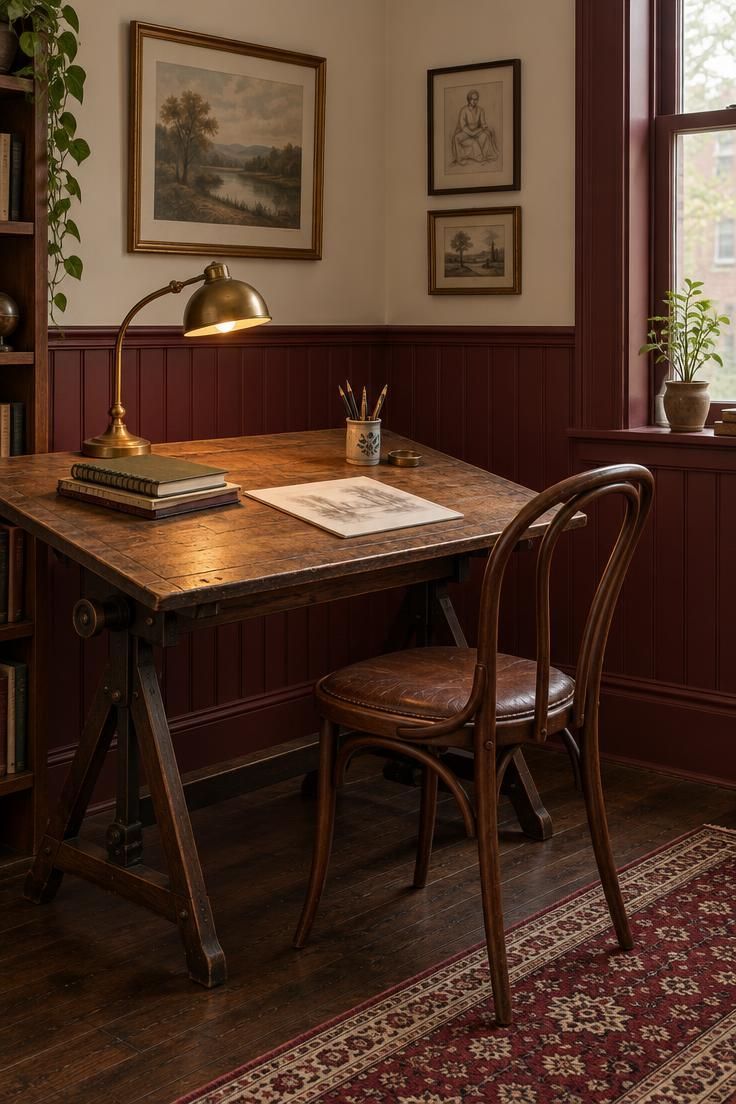
Oxblood red on vertical wood paneling gives a study-like formality without the neon brightness of a brighter red.
The paneling adds shadow lines that break up the saturation, and the red itself carries enough brown in the mix that it reads as settled rather than loud.
Using oxblood below a chair rail while keeping a warm cream above prevents the room from feeling overly dark, and the horizontal split gives the eye a rest point.
A vintage drafting table as a desk, a bentwood chair, and a brass desk lamp finish the look with a work-focused function.
Red paints often need more coats for even coverage than lighter colors, so plan for a primer and compare test patches before committing to gallons.
A satin finish on paneling makes dusting easier than flat, and it holds up better against the scuffs that happen around a desk.
Because the paneling carries most of the visual weight, the objects on the desk and walls should stay simple.
A single brass lamp and a small stack of sketchbooks do more for the room than a busy gallery wall would.
Style Blueprint:
- Oxblood red in satin for vertical wood paneling below the chair rail
- Warm cream in eggshell above the chair rail
- Vintage drafting table used as a desk
- Bentwood chair with a leather seat cushion
- Brass desk lamp and a small wool runner
Slate Blue-Gray Walls with a Black Metal Bike Rack Display
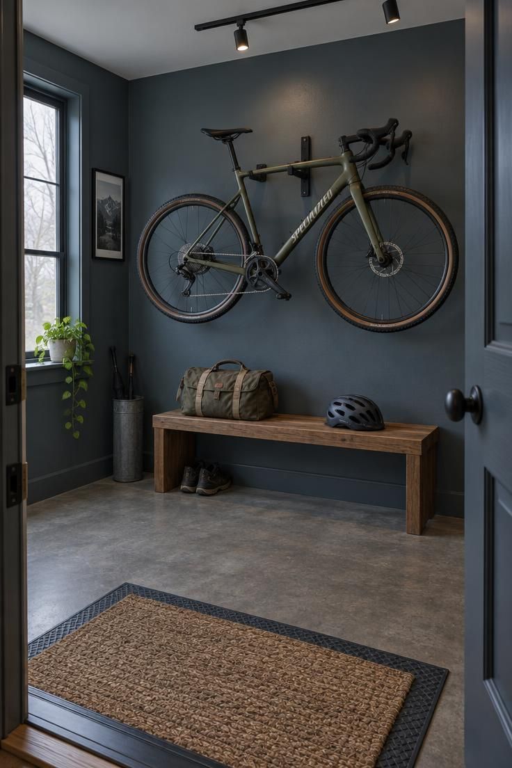
Slate blue-gray is cooler than navy and less stark than a plain gray, so it works for a room that displays a bike or another large metal object.
The color pairs well with both silver and black components, which makes it easy to accommodate whatever the bike or shelving happens to be.
A black metal bike rack mounted as a display on the main wall turns the bicycle into artwork rather than clutter, while a low bench for putting on shoes gives the room a clear entry-and-exit function.
Minor scuffs from pedals or tires disappear against the mid-tone wall more readily than they would on white, and a matte finish avoids glare from an overhead track light close to the wall and bike surface.
If the room has low natural light, a light gray ceiling keeps the walls from feeling cold, and a rubber-and-jute mat adds a warmer texture at floor level.
Navy man cave wall colors can feel more traditional, while slate blue-gray reads more contemporary and industrial.
The choice between them often comes down to whether the room leans toward leather and brass or toward metal and rubber.
Style Blueprint:
- Slate blue-gray in matte for all four walls
- Black metal bike rack as a wall display
- Low wood bench with a canvas bag and helmet
- Light gray ceiling for lift in a dark room
- Rubber-and-jute floor mat by the door
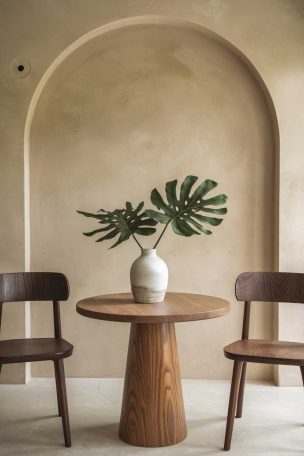
Clay Beige Walls with a Floor Cushion Circle and Palm Fronds
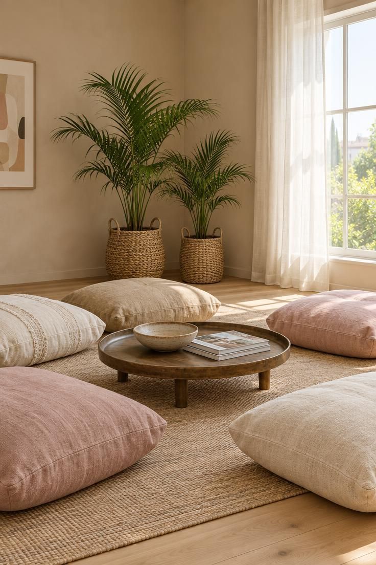
Clay beige, a warm sand color with a touch of pink, creates a lighter alternative to taupe for a relaxed lounge with floor cushions.
A circle of large cushions around a low round tray table keeps the furniture minimal, and a few potted palm fronds in the corner add height and a soft green contrast.
This palette feels airy, and it works best in a room with modest furniture rather than a full sofa arrangement.
Clay beige can look washed out under cool LEDs, so bulbs around 2700 to 3000K give the walls a warmer cast that suits the pink undertone.
A flat finish keeps glare off the walls, but it scuffs more easily, so an eggshell is worth considering if the room sees heavy use or if cushions get dragged across the floor.
The warm neutral man cave palette also handles woven textures and natural materials more gracefully than cool grays do.
Because the furniture sits low, wall color becomes the dominant visual element in the room.
That makes test patches on two walls especially useful, since the clay tone will shift across a corner and near the window.
Style Blueprint:
- Clay beige in flat for all four walls
- Floor cushions in cream, sand, and soft pink
- Low round tray table in light wood or matte metal
- Two potted palm fronds in woven baskets
- Flat woven rug in sand tones
Dark Teal Color Drenching with a Pool Table and Pendant Lights
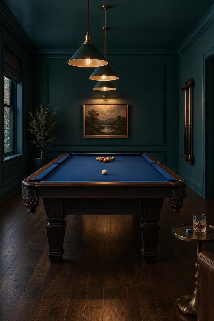
Dark teal on walls, ceiling, and trim creates a club-like atmosphere, and the green undertone keeps the color from feeling as cold as navy.
A pool table with deep blue felt becomes the obvious focal point, and three pendant lights over the table give the room a clear center of attention.
A satin or eggshell finish on the walls resists chalk dust and wipes clean more easily than flat, which matters in a room where chalk and cue tips leave marks.
The tradeoff is slightly more visible wall imperfections, though the drenched palette tends to disguise them.
Teal color drenching works because there is no trim line to interrupt the color, so the walls and ceiling read as one continuous surface.
If the room has no window, a small gallery light or a wall washer keeps the walls from turning black after dark.
A wall-mounted cue rack keeps the cues off the floor and reinforces the room’s function, and a small side table with chalk and a glass makes the space usable during a game.
Dark wood flooring grounds the saturated color without fighting it.
Style Blueprint:
- Dark teal in satin for walls, ceiling, and trim
- Pool table with deep blue felt
- Three pendant lights with warm bulbs over the table
- Wall-mounted cue rack for two cues
- Small side table with chalk and a glass
Warm Taupe Walls with a Pegboard Guitar Wall and Amp Nook
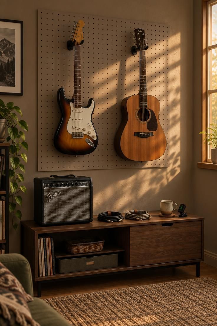
Warm taupe, slightly darker than greige, anchors a room with a pegboard wall for hanging guitars and a small amp nook.
This color works well with light maple or walnut guitar bodies, and it hides dust better than pure white.
Black metal pegboard hooks, a low console for pedals, and a woven rug soften the sound and give the corner a clear function.
Pegboard holes make a visual grid, so painting the pegboard the same taupe keeps the wall from looking busy and lets the instruments carry the color.
An eggshell finish on the walls resists scuffs from instrument cases and cables, which tend to mark lighter colors quickly.
Because the pegboard grid is already a strong pattern, the surrounding wall benefits from staying quiet and uniform.
Warm taupe also sits comfortably between gray and brown, so it adapts if the room later shifts toward a desk or a reading chair rather than staying purely a music corner.
That flexibility makes it a practical base for a hobby room that changes over time.
Style Blueprint:
- Warm taupe in eggshell for all four walls
- Pegboard painted the same taupe, with black metal hooks
- Low console for pedals and coiled cables
- Small guitar amp with a tuner and mug nearby
- Woven rug beneath the pegboard wall
Design Pro-Tip: Keep a small labeled jar of each wall color and its sheen in a closet or drawer, because touch-ups on dark and saturated paints are far easier to match while the original gallon information is still on hand.
Conclusion
Man cave paint colors work best when the palette matches the room’s main activity, not just a favorite color found online.
Darker tones like slate blue-gray and dark teal support media and game rooms by keeping attention on screens and tables, while warm neutrals and clay beige give mixed-use spaces more flexibility.
Finish and ceiling choices shift the whole feel, so test swatches under the room’s actual lighting before buying gallons.
A drenched ceiling in the same color as the walls reads quieter than a white ceiling above a dark wall, and a semi-gloss accent wall handles scuffs better than flat in a busy corner.
The room should feel intentionally styled rather than like a dark box that fights the furniture already in it.
Start with the activity, choose the color family that supports it, and let trim, sheen, and ceiling decisions finish the palette.