This post may contain affiliate links. If you make a purchase through these links, we may earn a commission at no additional cost to you.
There is a moment every plant owner recognizes: the collection has quietly outgrown the room.
What began as one fern on a console becomes a windowsill, a shelf, a side table, and a cutting station, and the space stops looking decorated and starts looking like a nursery overflow.
The problem is rarely the number of plants.
It is that each addition was chosen and placed in isolation, so nothing in the room establishes rank, scale, or rest.
Decorating with plants works best as an editing discipline: choosing fewer, better-placed plants, and letting containers, light, and the architecture of a room do as much work as the foliage.
The Shift From Jungle to Curated
The 2026 U.S. Houzz Emerging Summer Trends Report describes a reported 112% increase in searches for “biophilic design,” alongside a shift toward plants used as architectural elements, focal points, and curated groupings rather than surface-filling decoration.
Meanwhile, Garden Media Group’s 2026 houseplant trends reports that 41% of Gen Z respondents describe themselves as plant collectors rather than casual owners.
Those two figures come from different sources with different methods, so read them as directional signals rather than a matched comparison.
One points toward restraint, the other toward accumulation, and both are legitimate impulses.
The scale of the practice is not in question: U.S. growers sold 145.85 million potted foliage plants for indoor or patio use in 2024, valued at roughly $844.4 million, according to the USDA Census of Horticulture Specialties.
What follows from all of this is a simple framework: every placement decision involves the plant, the container, and the room.
The room sets the constraints, the plant and container answer them, and the skill that holds it together is not acquisition but editing.
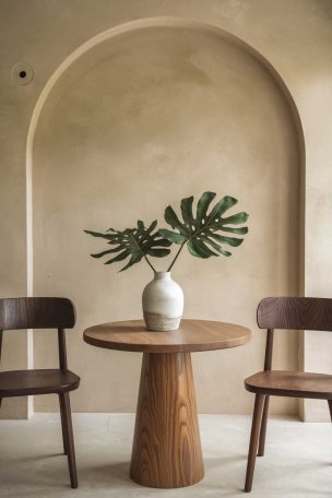
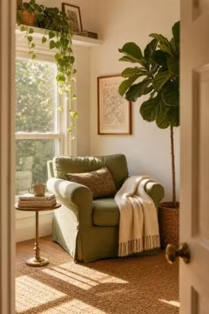
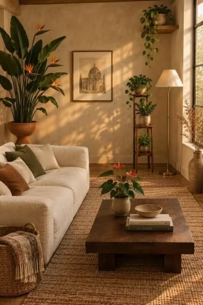
Treat architectural indoor plants as deliberate structural notes: one tall trunk near a bare corner or a broad-leafed specimen beside a low sofa reads as a considered placement rather than a collection.
Let the surrounding room stay quiet so that single silhouette carries the visual weight, with smaller pots grouped loosely nearby instead of distributed across every available flat surface.
What Actually Makes a Room Read as a Greenhouse
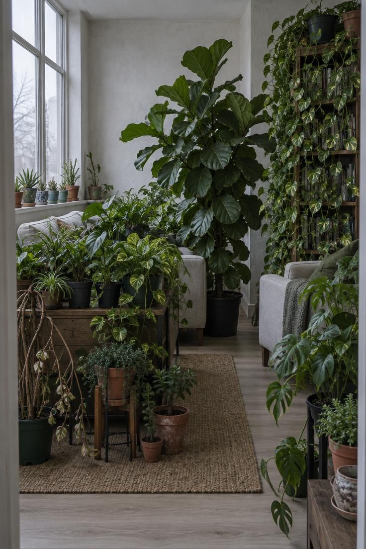
A room reads as over-planted through a recognizable set of conditions rather than through sheer quantity.
Plants occupy every available horizontal surface with no visual hierarchy to guide the eye.
Container materials, sizes, and finishes have no relationship to each other or to the room’s existing palette.
Plants block circulation paths, sightlines, artwork, or architectural features that the room needs to function.
Scale relationships get ignored, so a tiny plant sits on a large console while an oversized specimen wedges into a narrow passage.
Light conditions were never considered, which shows up as long bare stems, small pale leaves, and foliage leaning hard toward the nearest window.
And there is no negative space, so the eye has nowhere to rest.
The central point is that this outcome comes from absent hierarchy, not from plant count.
A room with twelve plants that has a clear focal point and a deliberate rhythm can read as designed, while a room with five that ignores scale and circulation can read as cluttered.
Editing, then, is not subtraction for its own sake.
It is establishing rank, rhythm, and rest, in that order.
Design Pro-Tip: Before adding anything new to a room, remove one thing. If the room looks better without it, the display was carrying more than it needed, and the next plant has somewhere to go.
Light Is the Constraint That Shapes Every Placement
Light is the primary practical determinant of where a display can live, and it is usually the thing chosen for last.
The working categories are planning vocabulary rather than growing instructions: bright direct, bright indirect, medium, and low.
Bright direct means near an unobstructed south- or west-facing window, which suits cacti, many succulents, and jade.
Bright indirect means strong light filtered through a sheer curtain or a position slightly away from a bright window, which suits monstera, rubber plant, bird of paradise, and fiddle-leaf fig when transitioned carefully.
Medium means a bright room without intense direct sun, or a spot several feet from a window, which suits pothos, spider plant, dracaena, Chinese evergreen, peace lily, and heartleaf philodendron.
Low means a dim location with little natural light, and it does not mean no light at all.
Tolerance of low light does not mean a plant will grow well there indefinitely, and that distinction matters for both plant health and how a display looks over time.
The University of Maryland Extension guidance on selecting and caring for indoor plants notes that improper light and watering are among the most common causes of plant failure.
Light also shapes layout, not just plant choice.
A display that can live near a window is composed differently from one that has to sit several feet back, and a dim corner limits how dense a grouping can go before it looks tired rather than full.
Acclimation deserves a mention here: a plant moved suddenly from shaded nursery conditions into strong sun may scorch, so the transition is worth making gradually over time.
A windowless bathroom is a difficult location for most plants because natural light is limited.
Deciding placement after choosing plants is the most reliable way to end up with a display that quietly declines.
Building a Composition: Hierarchy, Rhythm, and Rest
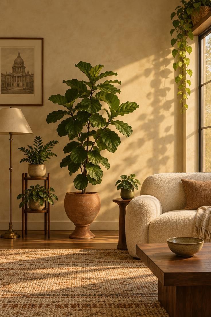
The strongest recurring recommendation is a tiered composition built around one large architectural plant as a focal point, two to three medium plants, and a small number of trailing or tabletop plants.
That is design reasoning rather than a rule, and it is worth understanding why it works.
A single large plant can anchor a room the way a piece of furniture does: it holds a corner, gives the eye a starting point, and makes surrounding objects read as arranged around something.
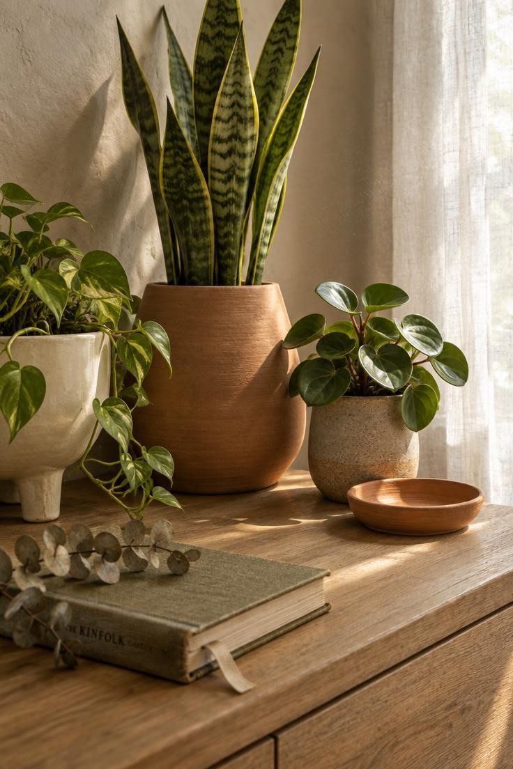
The thriller, filler, spiller formula is a common design convention that applies the same logic inside one container: one tall or dramatic focal plant, a fuller mid-height plant, and a trailing plant that falls over the edge.
A standard worked example uses a snake plant as the thriller, a peperomia as the filler, and a pothos as the spiller, though any plants with those growth habits can play the roles.
Height rhythm across a room matters as much as any single grouping.
Combining floor plants, low tabletop plants, plants on stands, and trailing plants at different levels creates a more intentional composition than clustering everything on windowsills.
Grouping in odd numbers, three or five rather than isolated pairs, tends to read more naturally.
Variation across height, leaf size, pot shape, texture, and growth direction keeps a group from looking like a retail display.
The counterweight is repetition: a shared container finish or a limited color palette creates unity, while identical everything creates sterility.
Negative space deserves its own place in the plan because it is what allows hierarchy to register, and it is the element most often sacrificed when a collection grows.
The tradeoff is real: a tiered composition with a clear hero plant makes it harder to display a large collection at once, which is the actual cost of editing.
Placement suggestions like beside a sofa, at an entry console, near a fireplace, on a stair landing, or beside a large window all share the same underlying logic, which is anchoring a zone rather than filling a surface.
A thriller filler spiller planting gives a single pot three distinct roles to fill, which keeps the arrangement legible from more than one angle.
Containers Carry Half the Visual Weight
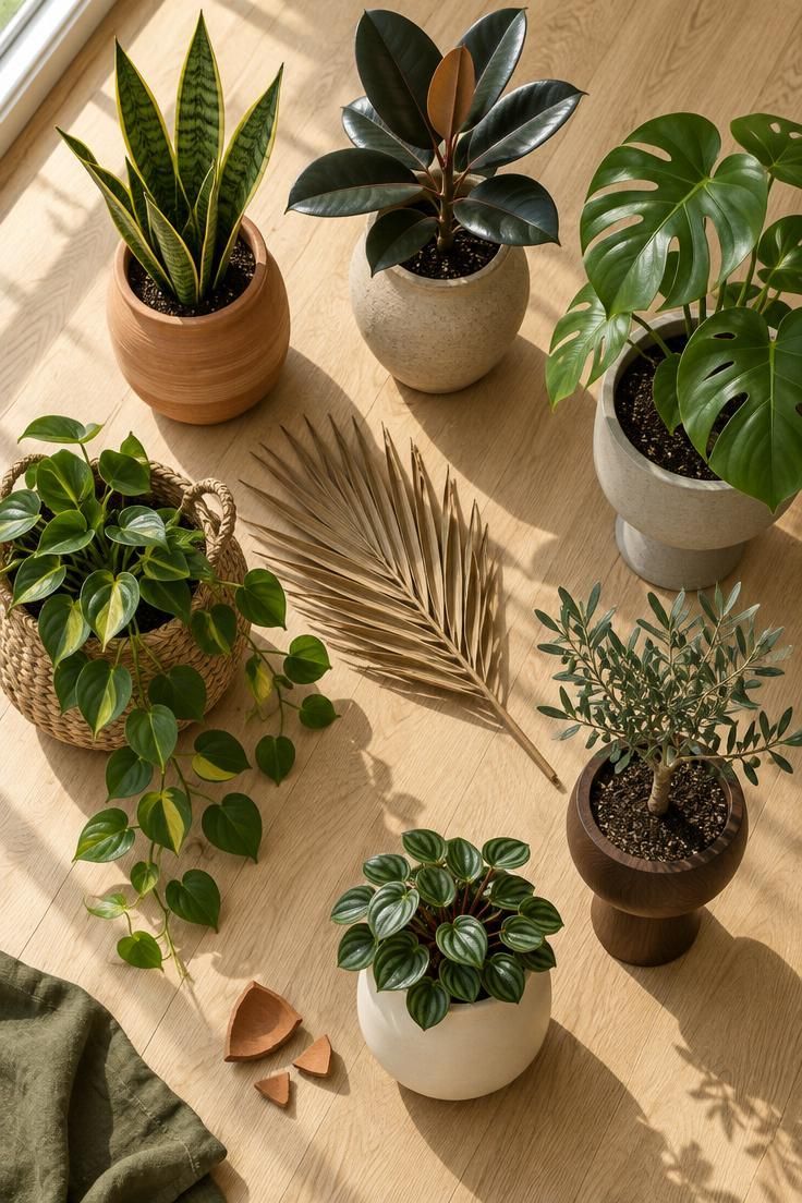
Planters are design elements in their own right, and a display’s coherence often depends more on container discipline than on plant selection.
Materials favored in current trend reporting include hand-thrown terracotta, raw ceramic, stone and concrete, woven baskets, dark wood, textured or imperfect finishes, footed planters, and pedestal vessels.
Warm earthy palettes work well with green foliage because they connect to the room’s existing wood, stone, and textile tones.
Brown, clay, moss, olive, and cream are the range most often cited for this purpose.
What has been fading from favor, according to the same trend reporting, is mismatched nursery containers left on display, cheap-looking plastic pots, and overly coordinated planter sets that erase any sense of collection.
The unifying thread concept is the practical core of this section.
A shared finish, material, or palette across dissimilar pots achieves cohesion without matching, so a terracotta saucer, a stoneware footed pot, and a seagrass basket can all belong together if they live in the same warm neutral family.
One care note belongs here because it affects how containers function.
A decorative outer container works best holding a nursery pot with drainage, or used so water does not accumulate around the roots.
Scale coordination between pot, plant, and surface is the other structural concern: an undersized pot makes a large plant look unstable, and an oversized pot visually swallows a small one.
The honest tradeoff is that cohesive containers require patience and repeat purchases, and the fastest route to a coherent display is usually to replace containers rather than add plants.
Design Pro-Tip: Choose containers the way you would choose picture frames: one material family, two or three sizes, and a shared palette. The plants can then vary freely without the grouping falling apart.
A single silhouette carried across planters and cachepots ties a scattered collection together, even when the species change from room to room.
Matching Foliage to the Room You Actually Have
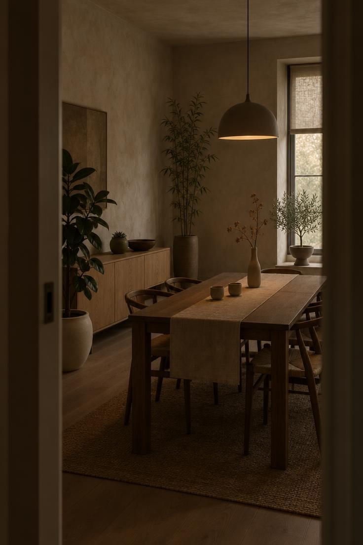
Style pairings are design inspiration rather than prescription, and growing conditions still govern what can live where.
Minimalist rooms tend to work with a few sculptural plants such as snake plant, rubber plant, fiddle-leaf fig, or ZZ plant in simple containers with generous space around each.
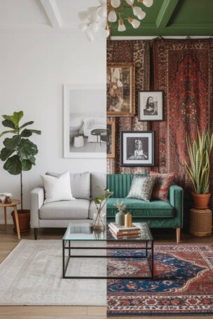
Bohemian and eclectic rooms absorb hanging plants, woven baskets, ferns, trailing vines, mixed ceramics, and collected objects.
Traditional and Victorian-inspired interiors pair well with ferns, palms, begonias, dark wood stands, brass or ceramic pots, and glass cloches.
Mid-century modern rooms often use rubber plants, monstera, bird of paradise, and snake plants in pedestal planters and tapered ceramic pots.
Japandi and natural modern rooms favor restrained groupings of bamboo-like plants, ficus, olive trees where conditions permit, and simple succulents in matte ceramic containers.
A useful design vocabulary treats plant types by the role they play: bird of paradise as a tall focal point for resort or contemporary interiors, monstera as large sculptural foliage for casual modern rooms, rubber tree for dark polished leaves in warm modern or traditional settings.
Olive tree brings an airy Mediterranean feel to dining rooms and entries, fiddle-leaf fig acts as a formal vertical accent in bright rooms, snake plant offers a minimal architectural shape, and pothos handles trailing displays and shelves.
Ferns add softness and texture for layered arrangements, anthuriums contribute seasonal color and glossy foliage, and rare philodendrons suit collector displays and personalized interiors.
Read that list as a design-language tool rather than shopping guidance, because the point is to match leaf scale and growth habit to the room’s existing lines.
Large foliage holds up against heavy or dark furniture, while fine-textured plants read better against lighter, more delicate interiors.
Existing architecture and finishes should outrank any style label, which is a starting point rather than a target.
The honest limitation is that the most visually appropriate plant for a spot may not be one that can live there, and the reverse is also true.
Biophilic interior design leans on leaf shape, scale, and repetition rather than quantity, so a single large plant can carry a quiet corner.
Choosing foliage for interior styles comes down to matching leaf texture and container finish to the room’s existing palette and level of ornament.
Where Each Plant Goes, and Why
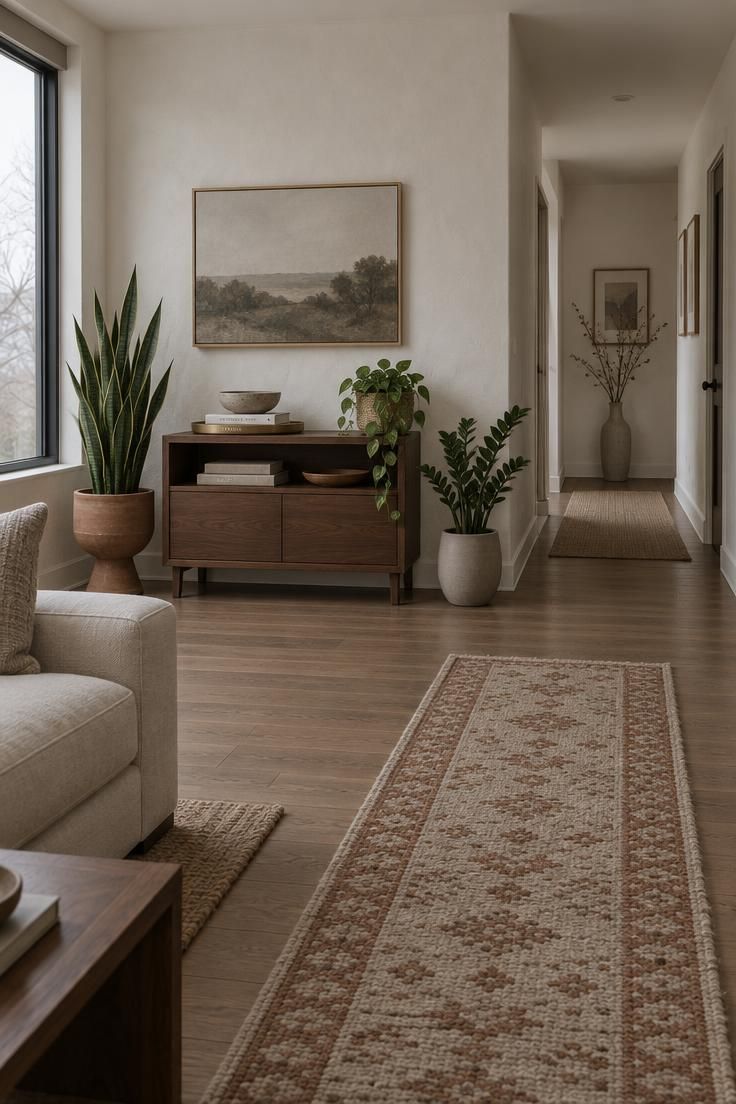
Room-by-room reasoning comes down to constraints: light, circulation, and sightlines.
In a living room, empty corners, the space beside a sofa, positions near but not pressed against windows, bookcases, and areas beside media consoles all work because they anchor a zone rather than fill a surface.
One large anchoring plant generally reads better than filling every corner, and circulation should stay open.
In a bedroom, plants with manageable watering needs are the practical choice, kept away from radiators, heating vents, and very cold windows.
Air-quality or sleep-related benefits are not part of this article’s claims, and they are worth setting aside entirely.
A kitchen suits herbs, spider plants, pothos, peperomia, small succulents, and compact flowering plants, positioned away from cooking grease, hot appliances, and strong temperature swings.
Herbs need very bright light, which limits where they can realistically live.
A bathroom can be excellent for humidity-tolerant plants such as ferns, calatheas, pothos, philodendrons, and orchids when there is enough natural light.
A windowless bathroom is a difficult location for most plants because natural light is limited, and humidity alone does not resolve that.
An entryway calls for hardy architectural plants because it sees drafts, door openings, and inconsistent light, which makes snake plant, ZZ plant, cast-iron plant, and dracaena sensible choices with walkways kept clear.
A home office benefits from plants at different visual levels: one medium near the desk, a small one on a shelf, and a trailing one above or beside the workspace, without overcrowding the work surface or interfering with cables, screens, or task lighting.
Small apartments run into the same wall, which is floor area, so the composition moves upward and onto walls, with visual height carrying the greenery that floor space cannot.
Across every room, the pattern holds: the room sets the constraints, and the plant and container are chosen to satisfy them while forming a composition.
Vertical and Modular Thinking for Tight Floor Plans
Vertical and modular approaches are the sophisticated small-space direction, and they take several forms.
Wall-mounted planters, hanging plants, slim plant stands, window shelves, corner trellises, plant ladders, terrariums, and plants used as visual room dividers all move greenery into space the floor does not have to give up.
A mounted or hanging display adds a layer of depth between the wall and the furniture, which is a compositional gain that a floor plant cannot produce.
A plant used as a divider defines zones without a solid partition, so a room can read as two areas without any construction.
Terrariums and compact displays introduce greenery without consuming floor space, which makes them useful where every square foot of floor is spoken for.
The best-practice note at the level of composition is simple: use vertical height, but avoid blocking circulation, artwork, or architectural details.
What this section describes is visual composition only, and composition ideas involving a floating, wall-mounted, or hanging element are design concepts rather than installation plans.
The tradeoff is that vertical displays are harder to keep looking intentional because they are seen at eye level and in silhouette, so container shape and plant silhouette matter more than they do at floor level.
Keeping a Display Looking Designed Over Time
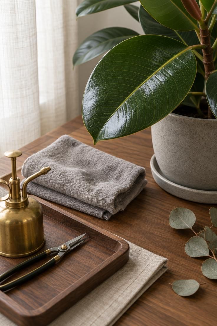
A display that looked composed at purchase drifts as plants grow, lean, and lose leaves, so editing is continuous rather than a one-time event.
Watering is a check-first practice rather than a schedule.
Checking soil moisture before watering, watering slowly and thoroughly, allowing drainage, and emptying saucers or outer containers keeps the display from degrading at the roots, and the Texas A&M AgriLife “Houseplants 101” guidance describes checking soil moisture roughly one to two inches below the surface as a general method.
Rotation matters because plants lean toward light, so turning them occasionally keeps growth even and preserves the silhouette a composition depends on.
Leaf cleaning is the most overlooked maintenance task: dust dulls foliage and interferes with light reaching the leaf surface, so broad leaves benefit from a gentle wipe with a damp cloth, and the research advises against unnecessary leaf-shine products.
Fertilizing follows a seasonal rhythm, with most houseplants needing more nutrients during active growth than in winter, and overfertilizing is a real risk that can damage roots and cause salt buildup.
Pest inspection belongs in the routine, checking leaf undersides, leaf joints, new growth, soil surface, and stems, with new plants isolated when practical.
Grooming is what separates a display that looks curated from one that looks neglected, and it is a smaller ongoing task than most people expect.
Design Pro-Tip: Photograph your display once a season. The camera flattens a room the way a visitor’s eye does, and it will show you the plant that has quietly outgrown its spot long before you notice it in person.
Editing keeps curated houseplant displays from looking like a table at a plant sale.
Rotating low light houseplants more often can slow the lean that builds on one side of a pot.
When to Edit Down Rather Than Add
The useful question is not whether a display has too many plants but whether any individual plant has stopped earning its place.
A plant that has outgrown its surface and now dominates a zone that should belong to something else is the clearest signal.
A grouping where two plants occupy the same visual role creates redundancy that flattens the composition.
A container that no longer matches anything around it pulls the eye away from the hierarchy the room needs.
A plant that has declined so far that it reads as damage rather than greenery subtracts from the display every time the eye lands on it.
Readers with genuine collections, particularly the segment the research identifies as identifying as collectors, need a way to keep a collection without letting it take over a living space.
Concentrating the collection in one designated zone rather than distributing it across every room is the most practical answer, and rotation between primary and secondary locations keeps a room composition stable while still allowing a collection to exist.
The hierarchy principle scales to the room level: one hero plant, a small supporting group, and negative space is a composition that can absorb a rotating cast of smaller plants without losing its shape.
Editing down requires deciding what to keep, and there is no formula that removes the judgment call.
Decorating with plants works best when it is treated as a design problem with three variables, and the most useful skill is knowing what to keep, what to group, and what to remove.
Plant collection editing works best when it follows the hierarchy of a room rather than a headcount.
Begin by removing the plant that competes with a stronger focal point, then reassess the zone before making a second cut.
A Short History of Why This Is Harder Than It Looks
Matching plant biology, available technology, and visual composition is a long-standing problem rather than a contemporary one, and the historical record makes that clear.
Ancient and classical Mediterranean cultures used plants in religious festivals, courtyards, atriums, and domestic gardens, where early indoor plant use was often practical, sacred, or ornamental rather than what we would now call houseplants.
The Renaissance and the era of orangeries, glasshouses, and conservatories changed that, as medicinal gardens helped establish systematic plant collecting and expanding trade brought tropical plants indoors under glass.
The Wardian case is a detail worth dwelling on: a sealed or semi-sealed glass container that protected plants in transit and then became a decorative indoor object in its own right, an early example of a functional object becoming a styling element.
The Victorian fern craze known as pteridomania, from the 1850s onward, appeared not only as living plants but in ceramics, textiles, furniture, wallpaper, and jewelry, which is evidence that plant motifs and plant objects have always been part of interior decoration, not just the plants themselves.
Across periods, the successful indoor gardens were the ones that matched plant biology, available technology, and visual composition.
Early indoor plant composition often depended on access to glass, heat, or a sheltered courtyard, so the rooms that worked best were the ones already suited to keeping plants alive.
Plant styling ideas for living rooms owe a debt to those Victorian glass cases, where a practical traveling container became a decorative object placed on tables and windowsills for its own visual interest.
Why This Conversation Changed in the Last Few Years
Trend reporting describes movement away from casual jungle styling toward intentional, design-led biophilia, with plants used as architectural elements, focal points, room dividers, and curated collections rather than surface-filling decoration, according to the 2026 U.S. Houzz Emerging Summer Trends Report.
The reported 112% increase in searches for “biophilic design” signals that readers are looking for a design framework rather than more plant suggestions.
Set against that is the counter-current the same reporting identifies: plant collecting remains strong, particularly among younger consumers, with Garden Media Group’s 2026 houseplant trends reporting that 41% of Gen Z respondents describe themselves as plant collectors rather than casual owners.
The two directions coexist rather than cancel out because collecting is about the plants and composing is about the room.
They only conflict when a collection is distributed without hierarchy, which is a layout problem rather than a plant problem.
As plant decorating becomes mainstream, the bar for composition rises rather than falls: more rooms have plants, so an unedited display stands out more than it used to.
One caveat on the figures, which come from different countries, years, sample sizes, and methodologies, so they should be read as directional rather than directly comparable.
Practical Criteria for Deciding What Stays
The framework restated plainly is the plant, the container, and the room, with the room setting the constraints.
A workable set of decision criteria starts with function: does this plant anchor a zone or fill a gap.
Then coherence: does its container belong to the same family as the others in the room.
Then rhythm: does it sit at a height that adds to the room’s vertical pattern rather than repeating a level that already exists.
Then respect for the room’s existing features: does it leave sightlines, artwork, and circulation intact.
Then viability: can it live where it is placed given the available light.
And finally, occupancy: does it still earn the surface it occupies.
Applying the criteria to a room rather than to a single plant means starting with the largest plant and the room’s clearest constraint, then adding in descending order of visual weight.
Scale is a decision rather than a detail, because pot, plant, and surface should relate to one another and to the surrounding furniture, and mismatches in scale are the most persistent cause of displays that look off balance.
Container coherence is the fastest available improvement, since replacing containers is often more effective than rearranging plants.
Maintenance belongs in the decision too, because a plant that requires care the reader will not reliably provide is a plant that will eventually undermine the composition, which makes manageable watering needs a legitimate selection criterion.
The greenhouse outcome is not caused by plant count but by missing hierarchy, scale, container coherence, and negative space.
Conclusion
Decorating with plants works when the room leads and the collection follows, and the criteria that make that possible are mostly decisions rather than purchases.
Start by choosing one large plant for the room’s most visible empty zone, then add two or three medium plants that differ in height and leaf size.
Use containers from a single material family so the grouping holds together without matching.
Leave at least one surface empty on purpose, because negative space is what allows hierarchy to register.
Reassess once a season rather than once a week, since plants grow and lean and drift out of the composition they were chosen for.
The one thing to try first is the removal test: take one plant out of the room and look at what remains.
If the room reads better without it, that plant has told you where the editing should begin.
The match between plant biology, available technology, and visual composition has always determined whether a room feels designed or merely full, and it still does.