This post may contain affiliate links. If you make a booking or purchase through these links, we may earn a commission at no additional cost to you.
A carved bergère with a curved frame can sit a few feet from a clean-lined mid-century sofa and look completely intentional.
That contrast is the heart of french eclectic decor: French furniture and architectural references used as a base vocabulary, then layered with pieces from other periods, cultures, and materials.
The looseness is real, but so is the discipline underneath it.
A repeated color, a repeated material, and consistent scale relationships are what keep a mixed room from reading as a jumble.
Each idea below works as a visual starting point for a room assembled over time rather than bought as a matched set.
The Gilded Mirror Above a Marble Console
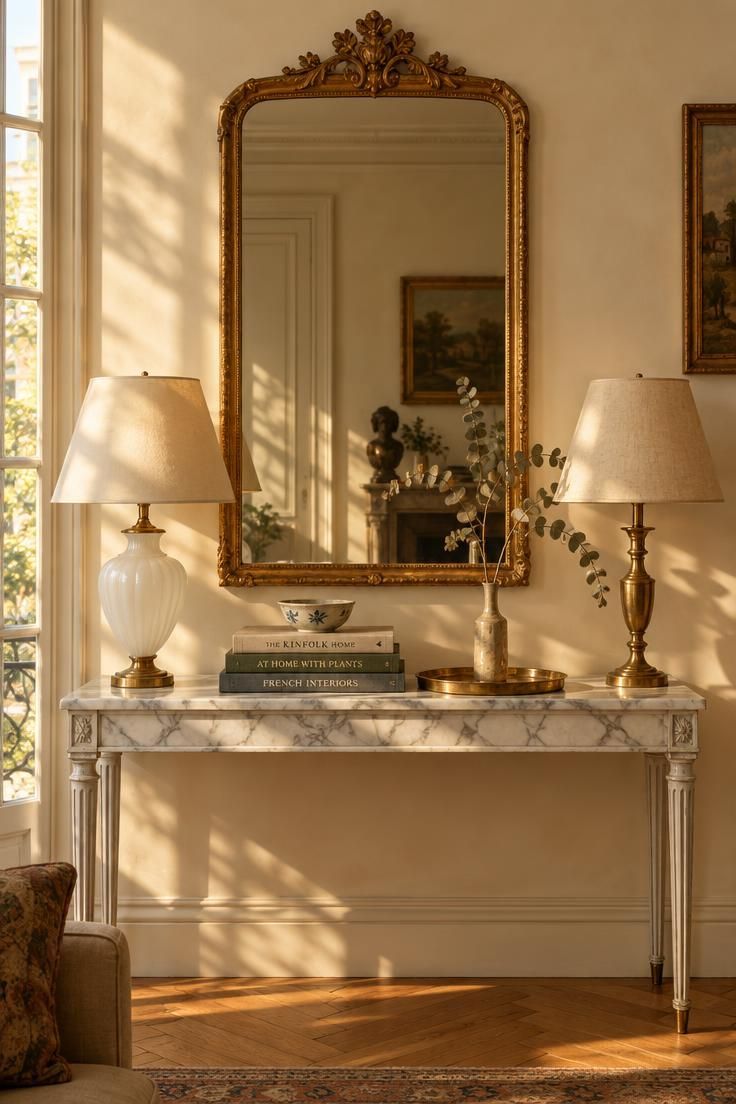
The mirror's carved frame gives the eye one traditional anchor, while the marble and brass below stay cooler and quieter.
Scale matters more than ornament here.
A mirror roughly two-thirds the console's width keeps the pairing proportional, and a shallow tabletop keeps objects reading as a cluster rather than a spread.
Mixing the flanking lamps works when one base is opaline or ceramic and the other is brass or tole, both at matching height so the symmetry reads deliberate.
Repeat the gilding once more elsewhere in the room, on a tray edge or a small frame, so the gold has an echo.
A mirror placed opposite a window throws glare at certain hours, which can dominate the wall's look depending on the time of day.
Gilded and silver-leaf surfaces flake under abrasive cleaning, so a soft dry cloth is the usual approach.
Style Blueprint:
- Gilded or silver-leaf mirror
- White marble top with grey veining
- Two lamps of different eras at matched height
- Books, ceramic, and one small tray in a defined zone
- One repeated metallic accent elsewhere in the room
Design Pro-Tip: Pick the mirror before the console. The frame's proportions set the vignette's height and width, and a console that fits the mirror will be easier to find than the reverse.
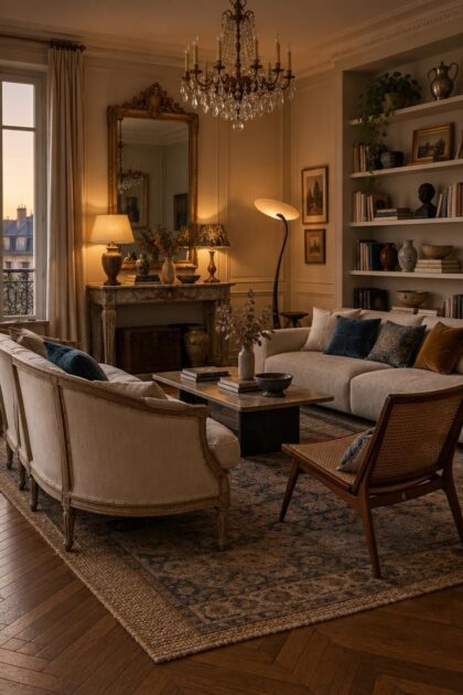
A Curved-Frame Settee Facing a Clean-Lined Sofa
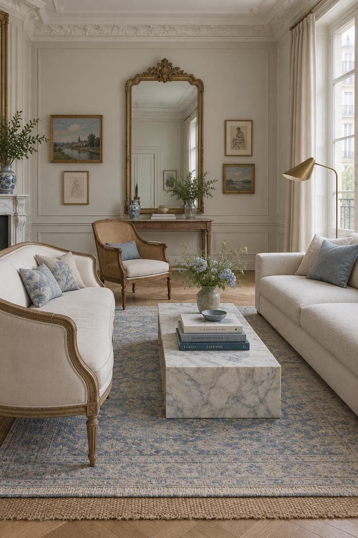
An exposed-wood frame with visible legs set against a fully upholstered, low-profile piece gives the clearest read of an intentional mix.
Lower-profile seating on the clean-lined side keeps a tall mirror or tall window as the focal point instead of competing with it.
The angled third chair softens the facing arrangement, and turning it about thirty degrees off the axis is usually enough.
Height rhythm does quiet work here: stepping settee back to chair back to sofa back deliberately avoids letting all three sit at one level.
Scale mismatches are the most common failure in this arrangement.
A delicate chair next to a heavy sofa reads accidental, so match the visual weight of frames, not just seat heights.
Legs visible on at least two pieces keeps the floor plane open and the group from feeling rooted.
Style Blueprint:
- One French-origin curved or exposed-frame seat
- One clean-lined low sofa
- A cane, rattan, or bamboo chair set at an angle
- Layered rug under the whole group
- Legs visible on at least two pieces
Layered Rugs in a Herringbone Room
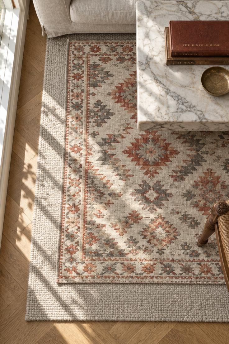
A kilim or flatweave over a plain wool ground pairs a global textile with the formal geometry of parquet.
Keeping the top rug's edge shallow over the base reduces the trip edge where the two meet, and tucking the overlap under a coffee table hides it almost entirely.
The base rug should extend well past the seating group, while the smaller rug defines the coffee-table zone rather than the whole room.
Pattern volume works best as one busy pattern plus one plain texture.
Two strong patterns in the same sightline usually need a third plain element between them.
Layered rugs shift, curl, and collect grit between the layers, so they need more frequent straightening than a single rug.
A rug pad under the top layer helps it hold position through daily traffic.
Style Blueprint:
- Large neutral base rug in wool or sisal
- Smaller patterned kilim or flatweave on top
- Herringbone, chevron, or basketweave floor beneath
- Overlap tucked under a table
- Plain upholstery above the pattern line
Mismatched Frames on a Single Wall
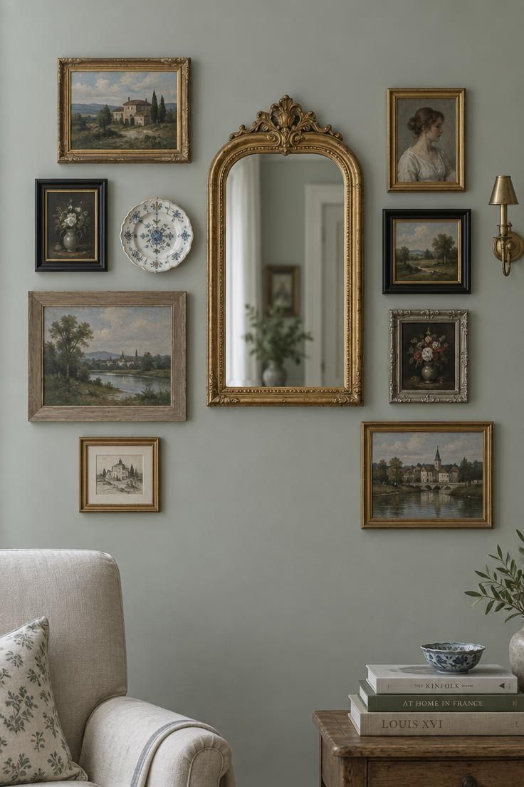
A mirror hung alongside other wall elements reads differently from a mirror treated as the only object on the wall.
Frame variety carries the composition: gilt, black-painted, raw wood, and silver finishes in different sizes, tied together by keeping mat widths and hanging gaps consistent.
Setting the gilded mirror off-center rather than dead center keeps the grouping from reading as a formal symmetrical arrangement.
A decorative plate, a small sconce, or a textile hanging breaks up the all-frames rhythm.
More frames means more nail holes, more dusting, and more re-hanging when one piece changes, so keeping the layout loose enough to rearrange without patching is worth planning for.
Leaning one or two unframed pieces on a picture ledge can reduce the commitment further.
Style Blueprint:
- A gilded or silver-leaf mirror as one element
- Small paintings in at least three frame finishes
- One non-painting object such as a plate or sconce
- Consistent hanging gaps between pieces
- An off-center anchor rather than a centered grid
Design Pro-Tip: Lay the whole composition out on the floor first, then photograph it from standing height. Wall groupings almost always look tighter and better balanced in a photo than in your head.
Brass and Crystal Against a Modern Pendant
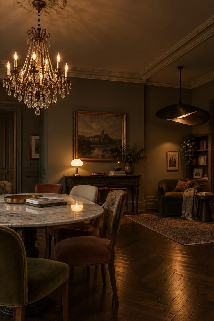
Two lighting eras minimum keeps the room from reading as one period: a chandelier or pendant that reads traditional, plus a table lamp, sconce, or floor lamp that reads modern, industrial, or sculptural.
Brass and crystal signal formality and verticality, which is why they work best over a table or in a room with height to spare.
Opaline, ceramic, and tole read softer and more domestic, and they are easier to place at eye level on a console or side table.
Mismatched lamp color temperatures across one sightline is a common way the room reads unresolved, so keeping bulbs consistent is a small but visible decision.
Crystal and gilded fittings need gentle dusting rather than spray cleaners.
Ceiling fixtures are the least flexible element if the furniture plan changes later.
Style Blueprint:
- One traditional chandelier or pendant
- One modern table or floor lamp
- One small accent lamp in opaline, ceramic, or tole
- Matching bulb color temperature across the room
- Metal finishes echoing a material used elsewhere
Books, Ceramics, and Silver on Open Shelving
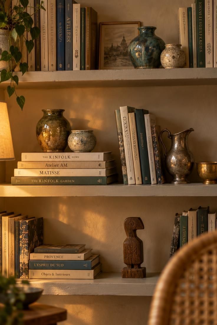
Grouping objects into two or three loose clusters per shelf gives the eye rest and keeps the wall from reading as storage.
Book handling matters as much as book choice: mixing upright, stacked, and leaning books, with a ceramic or a small sculpture weighting one stack, keeps the rhythm uneven in a good way.
A tray, a small pitcher, or a bowl adds a reflective, slightly tarnished note that reads collected rather than new.
One non-Western piece per cluster introduces a new culture or material without tipping the room toward a different style.
Open shelving and collected objects raise the dusting load considerably.
Heavily carved frames and cane are harder to clean than flat ceramic or glass, so those pieces benefit from being placed at eye level rather than on the top shelf.
Style Blueprint:
- Books in a mix of upright, stacked, and leaning positions
- Two or three ceramics of different glaze finishes
- One silver or brass tray or vessel
- One object from outside the French reference set
- Bare shelf space left in each zone
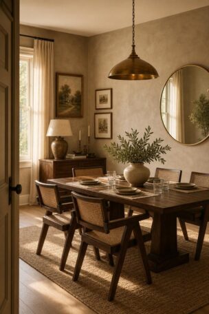
Rattan and Cane Bridging French and Global
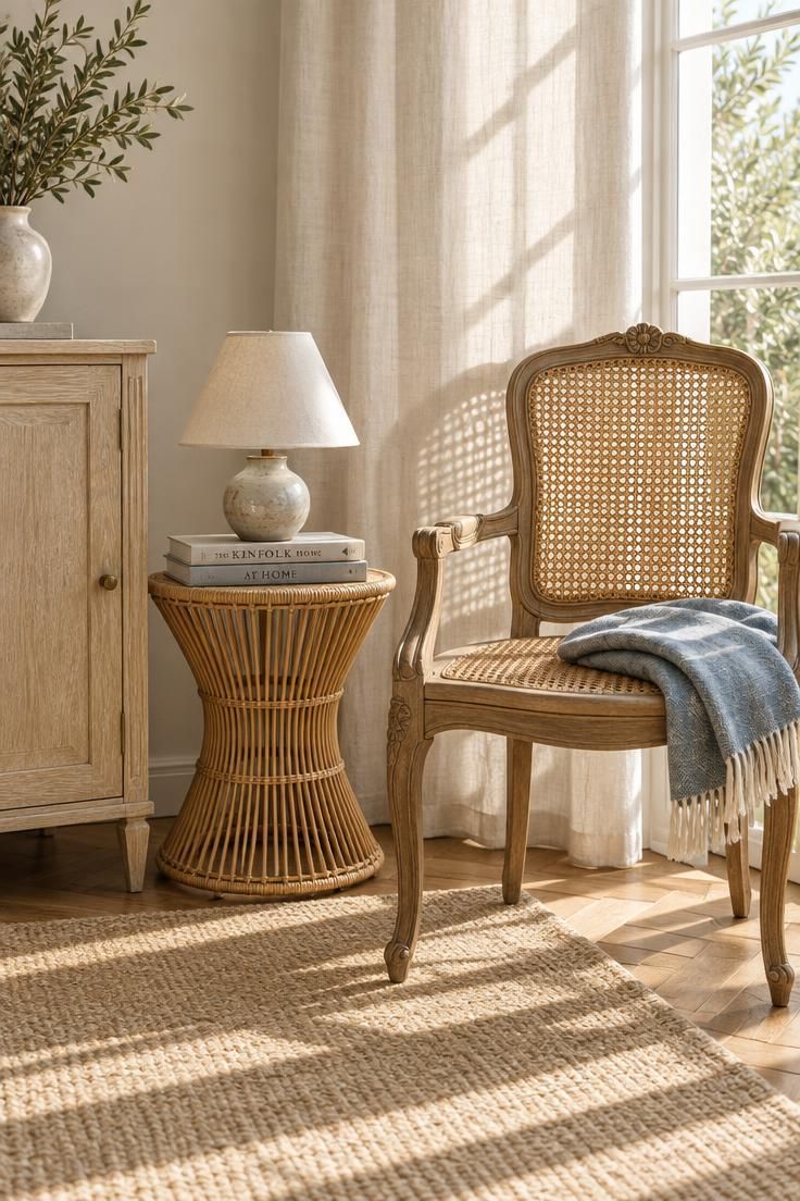
Rattan, cane, bamboo, wicker, and seagrass sit comfortably next to both French frames and global textiles, which makes them useful connectors; A caned back reads lighter in a small room than a fully upholstered back of the same footprint, and that visual weight difference matters more than the actual measurements.
Pairing a fine cane grid with a chunky rattan frame gives texture variety without adding another pattern.
Keep cane and rattan out of direct, intense sunlight, since the material can dry and split over time.
Cane has small openings that collect dust and are awkward to wipe.
A soft brush works better than a damp cloth, and a quick pass once a week keeps the weave from looking tired.
Style Blueprint:
- One caned-back chair or settee
- One rattan or bamboo side table
- A fine-weave piece paired with a chunky-weave piece
- Position shaded from intense direct sun
- A soft brush kept for cleaning
Design Pro-Tip: Put the cane piece where its silhouette shows against a plain wall or a plain curtain panel. Cane reads as texture only when there is no pattern directly behind it.
Marble-Topped Side Tables as Connective Tissue
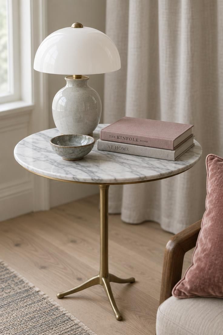
Repeating a white-and-grey stone across a console, a side table, and a small accessory ties unrelated furniture together.
Nesting tables, gueridons, and small rounds let a room hold several surfaces without visual heaviness.
Glass tops reduce mass in smaller rooms, while marble adds weight and a cooler note, and the choice usually follows the room's existing density.
A lamp base that looks right on a console can look oversized on a gueridon, so test the lamp on the actual table before committing.
Marble tops can stain and etch from acidic spills.
Coasters within reach of the seating and prompt wiping are the usual practice.
Style Blueprint:
- One marble-topped table at seating height
- A second marble or glass surface in the same sightline
- A lamp sized to the table, not to the room
- Small objects grouped in odd numbers
- Coasters within reach of the seating
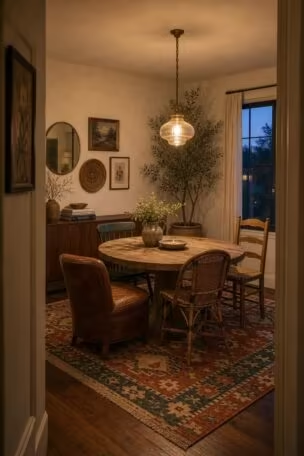
Bistro Table and Mismatched Chairs
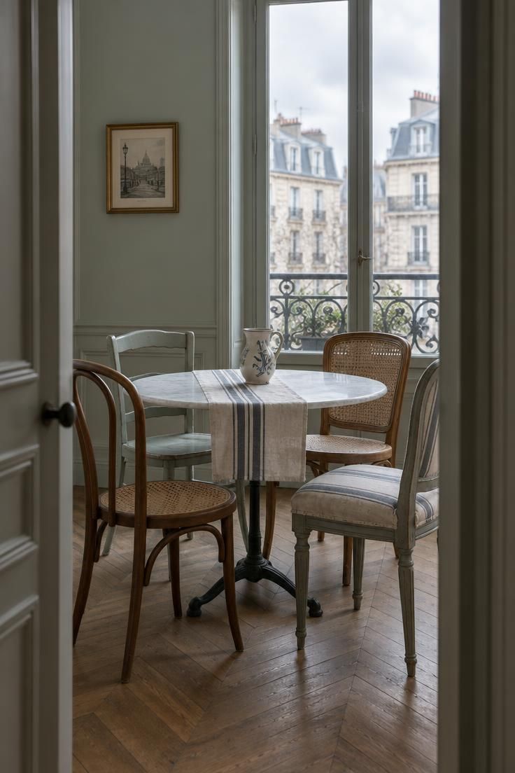
A small round or square bistro table with two to four chairs of different origin but similar seat height and visual weight is the basic formula.
Chairs of wildly different heights read as accidental, while mismatched-but-comparable chairs read as collected, and that distinction is the whole game.
Plain linen or a single stripe keeps the eye on the chair silhouettes rather than on competing patterns.
Arranging the group so it reads as a composition from the doorway matters more in a small nook than in a large room, since the view from the threshold is the one seen most often.
Mismatched chairs can mean mismatched comfort and mismatched wear.
Keeping one spare and rotating the most-used chair spreads the wear and keeps the mix flexible.
Style Blueprint:
- Bistro-style table in marble, wood, or metal
- Two to four chairs of similar seat height
- One plain or striped textile element
- Composed to read from the doorway
- One spare or rotatable chair
Toile and Chinoiserie Used as an Accent, Not a Scheme
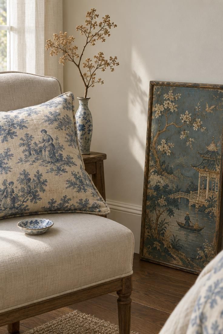
Using a toile cushion or a single chinoiserie panel rather than papering an entire room keeps the historical reference as a note instead of a theme.
When two patterned elements share a sightline, a plain linen or solid surface between them prevents a visual collision.
Scale matching helps: a small-scale toile reads calmly against a large-scale chinoiserie motif, while two small-scale patterns together read muddier.
Toile and chinoiserie carry specific historical associations, and readers vary on whether they read as charming or dated, which is a taste consideration rather than a rule.
Patterned textiles and wallpapers are harder to swap than solid ones.
If the room is still evolving, keeping the commitment small leaves room to change direction later.
Style Blueprint:
- One toile or chinoiserie element, not a full scheme
- Plain linen or solid fabric as a buffer
- Deliberate contrast in pattern scale
- A second patterned piece used sparingly
- A plan for swapping the accent later
Design Pro-Tip: Limit the palette to about three color families even when the objects come from a dozen sources. The variety lives in the objects, not in the colors.
One Oversized Mirror in a Room That Needs Height
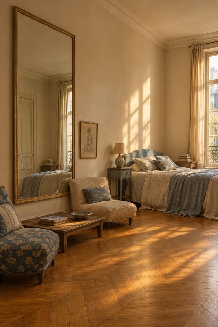
One large statement, such as an oversized mirror, generally reads better in a small room than many small objects distributed evenly; hanging art and mirrors to draw the eye upward rather than outward keeps a narrow room from feeling compressed.
A plain or minimally ornate frame lets the size do the work, while a heavily carved frame shifts the emphasis to detail and can compete with the mirror's scale.
Low seating and low tables beneath a tall mirror preserve the composition instead of chopping it up.
Glare opposite a window can dominate a room's look depending on the hour, so what the mirror faces is worth considering before committing to the wall.
A mirror hung on a side wall rather than directly opposite a window avoids the worst of it.
Style Blueprint:
- One mirror at or near full wall height
- Plain or restrained frame finish
- Low-profile seating and tables beneath
- Art hung to pull the eye up
- Awareness of what the mirror reflects
Painted and Limed Wood Frames Against Dark Polish
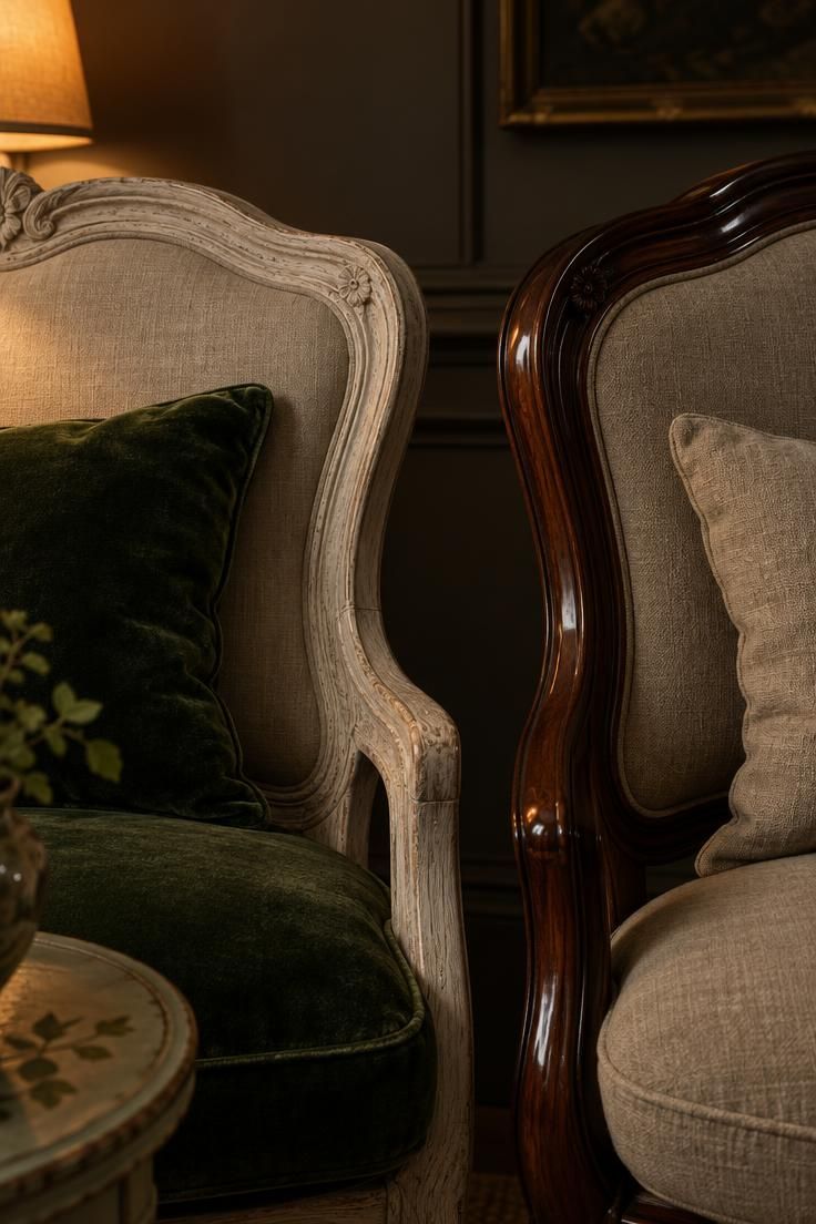
Light, chalky, painted or limed wood set against a dark polished surface gives range without adding color.
Distressing as a finish reads differently from structural damage, and the two should not be confused when buying, since one is intentional and the other affects how a piece will hold up.
Lighter finishes sit naturally near the room's brightest side, while darker polished pieces hold shadow well and can anchor a dim corner.
Using one painted finish twice, on a chair and a small table, gives the mix a spine.
Antique frames may have loose joints or old repairs, so inspecting wood joints and gilding in person or through detailed photos before committing is a reasonable step.
Style Blueprint:
- One limed, painted, or distressed wood piece
- One dark polished wood piece
- A repeated painted finish on a second object
- Inspection of joints before purchase
- Placement matched to room light
Upholstery in Velvet, Linen, and Silk Together
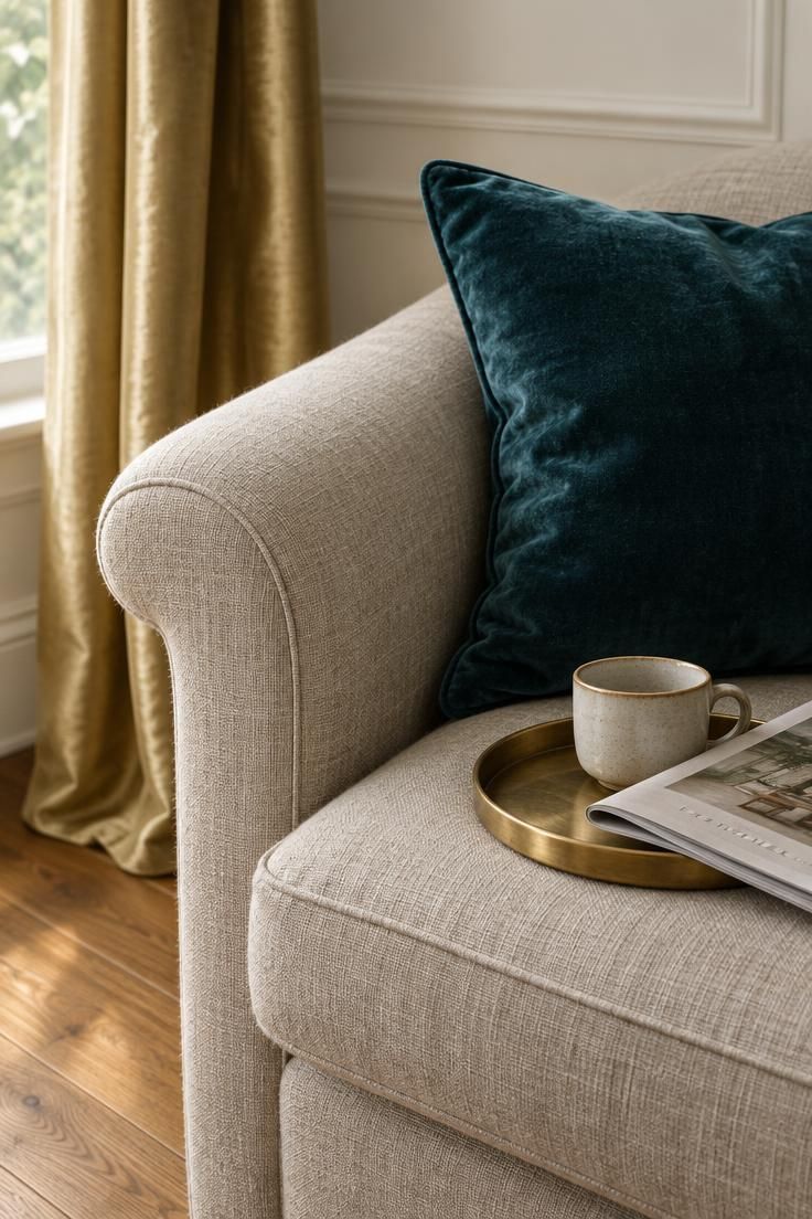
Mixing velvet, linen, and silk gives depth without introducing more print.
Where each material sits matters: velvet on cushions and small upholstery, linen on larger slipcovered pieces, silk on curtains or a single accent.
Deliberately simple plain linen panels and deliberately heavy, floor-puddling trimmed curtains both read French, but they create opposite moods, so the choice usually follows the room's existing formality.
Velvet crushes and silk marks differently than linen or wool, and material choice should follow how the piece will be used, not just how it looks on day one.
High-pile and silk fabrics need more careful cleaning than linen and tend to show seating wear sooner.
Keeping velvet off the most-used seat and reserving silk for curtains often extends both.
Style Blueprint:
- Velvet on cushions or a small upholstered piece
- Linen on a larger slipcovered or plain piece
- Silk or a silk-blend on curtains
- Curtains either plainly simple or deliberately heavy
- Material chosen around actual use
Design Pro-Tip: Photograph the room in black and white on your phone. If the composition still holds without color, the shape and scale mix is doing its job and the palette is a bonus rather than a crutch.
A Collected Console with French Antiques and Modern Art
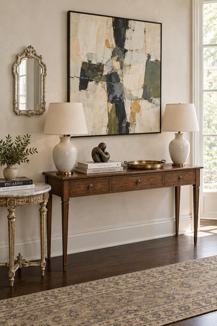
Placing a contemporary painting above a French antique surface is one of the most direct ways to show that the room's references come from more than one era.
A small silver-leaf mirror hung beside a large painting rather than above the console keeps the wall from reading as a single symmetrical arrangement.
Modern ceramic lamps at matching height on the console give the display structure without making it formal, and a loose cluster of books and objects in one zone leaves the rest of the surface open.
French antiques vary widely in condition, so wood joints, cane, and gilding are worth inspecting closely before purchase.
Pairing one antique with one contemporary piece keeps the contrast legible without crowding the composition.
Style Blueprint:
- One French antique surface, such as a marble-topped table
- One large contemporary artwork
- A small silver-leaf mirror hung beside it
- Two modern lamps at matching height
- A single loose cluster of books and objects
Conclusion
French eclectic decor holds together through repetition rather than matching: one repeated color, one repeated material, and consistent scale relationships do most of the work while the objects themselves come from many places.
The style accumulates over time by design, and buying a full matched room works against its premise.
When deciding what to add next, ask whether a piece introduces a new era, culture, or material, whether it repeats something already present, whether it adds a new height or silhouette, and whether it fills a real functional gap rather than only adding ornament.
The tradeoffs are honest ones: more dusting, more editing, and the occasional rescale when a new piece shifts the balance.
What comes back is a room that reads as collected rather than ordered from a catalog.