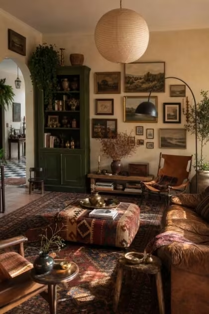
This post may contain affiliate links. If you make a purchase through these links, we may earn a commission at no additional cost to you.
A vintage eclectic home succeeds when aged materials, mixed wood tones, and collected objects are held together by an invisible thread of restraint.
This guide focuses on image-driven moments that make a room feel warm, layered, and intentional rather than cluttered or haphazard.
Each idea isolates one visually legible composition, whether a fireplace, a hutch, or a reading corner, and explains the concrete choices that make it work.
The result is a field guide for creating spaces that look gathered over decades, not decorated in a weekend.
A Deep Olive Hutch With Unlacquered Brass Pulls and a Stoneware Still Life
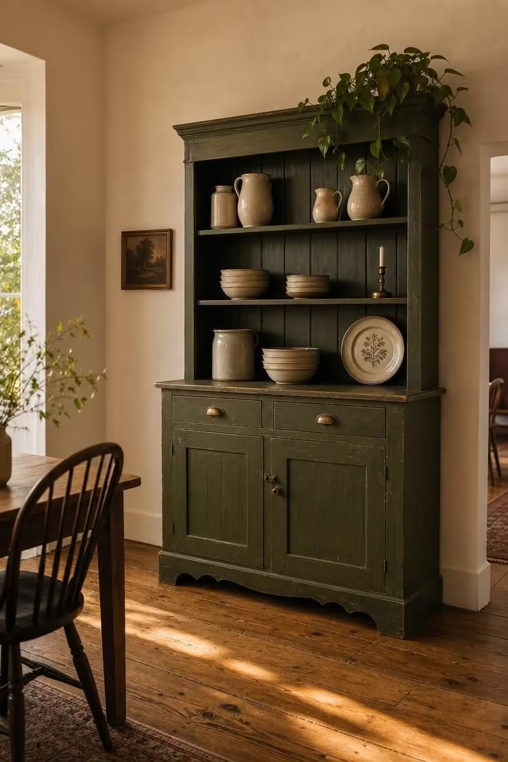
The deep olive hutch anchors the room without shouting for attention.
That muted green reads as a natural layer against the warm white plaster behind it.
Visible brush marks and worn corners give the piece a sense of age that a flawless factory finish never could.
The unlacquered brass pulls have darkened unevenly over time, so the metal shifts from bronze in shadow to soft gold at the edges.
Grouping the stoneware in odd numbers makes the shelves feel collected, not merchandised.
A single trailing plant breaks the hutch's boxy silhouette and brings a living warmth to the composition.
The matte finish absorbs the warm-golden light instead of bouncing it back, which keeps the room feeling calm.
The wide oak floorboard with original varnish picks up the same warmth as the brass hardware.
Style Blueprint:
- Paint the piece in a matte, muted green rather than a saturated jewel tone, and let visible brush marks and worn corners remain
- Keep the original hardware, or source aged brass rather than polished replacements
- Style shelves in groups of three or five, mixing heights, materials, and functions
- Let the wall color stay warm and recessive so the green hutch remains the room's anchor
- Add one living element, such as a vine, a branch, or a small fern, to keep the vignette from feeling static
Design Pro-Tip: When styling a tall hutch, keep the highest shelf sparser than the others. Negative space near the top makes the piece feel taller and prevents the eye from reading it as storage clutter.
A Worn Tobacco Leather Banquette Against a Striped Plaster Wall
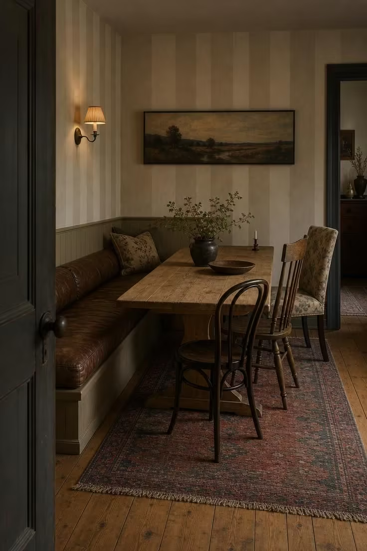
A worn leather banquette gives the corner a physical memory of long meals and slow mornings.
The creases and darkened spots on the tobacco leather look like places where people have sat for years.
Painting the stripes in tones only a few shades from the base color keeps the wall from becoming a busy backdrop.
The long horizontal oil painting stretches the eye across the banquette, making the corner feel wider and calmer than it is.
Mismatched chairs on the opposite side break any hint of a furniture set.
That deliberate asymmetry is central to eclectic vintage style.
The sconce's pleated fabric shade throws light low and warm, so the whole corner feels pulled together by glow rather than brightness.
The narrow pine table keeps the visual weight low and light under the textured wall.
Style Blueprint:
- Let the leather show its history, with creases, darker oil spots, and softened edges treated as assets
- Paint the wall stripe in a tone only two or three shades from the base color so it reads as texture, not pattern
- Pair the built-in banquette with unmatched chairs to break any sense of a furniture set
- Hang one horizontal piece of art instead of a cluster to preserve the long, low sightline
- Use a single sconce with a fabric shade to pull the light low and warm
A Raw Plaster Arch Framing a Turned-Wood Stool and a Single Clay Vessel
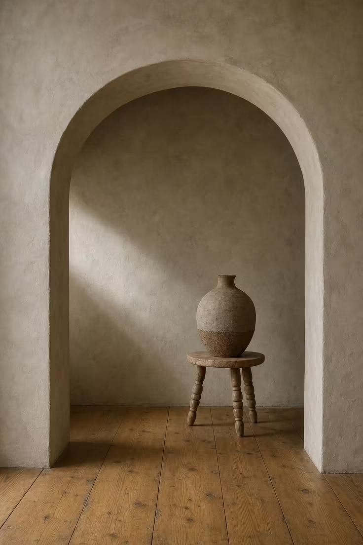
The arch functions as a picture frame, and the empty space inside it becomes part of the still life.
Soft daylight raking across the mottled plaster reveals every small irregularity in the hand-troweled surface.
A single turned-wood stool placed slightly off-center keeps the composition from feeling arranged like a store display.
The clay vessel's rough texture asks to be seen up close, where the throwing marks and unglazed surface become the point.
Leaving generous floor around the arch makes the moment feel discovered rather than staged.
Style Blueprint:
- Treat the arch as a frame, not just an opening, and style the negative space within it deliberately
- Keep the floor finish light and matte to let the plaster tone dominate
- Use one sculptural object on a simple stool and resist the urge to add more
- Choose pieces with visible hand-tooling or throwing marks so the texture reads up close
- Leave generous empty floor around the arch so the moment feels discovered, not staged
A Wall of Thrifted Landscapes in Mismatched Walnut and Brass Frames
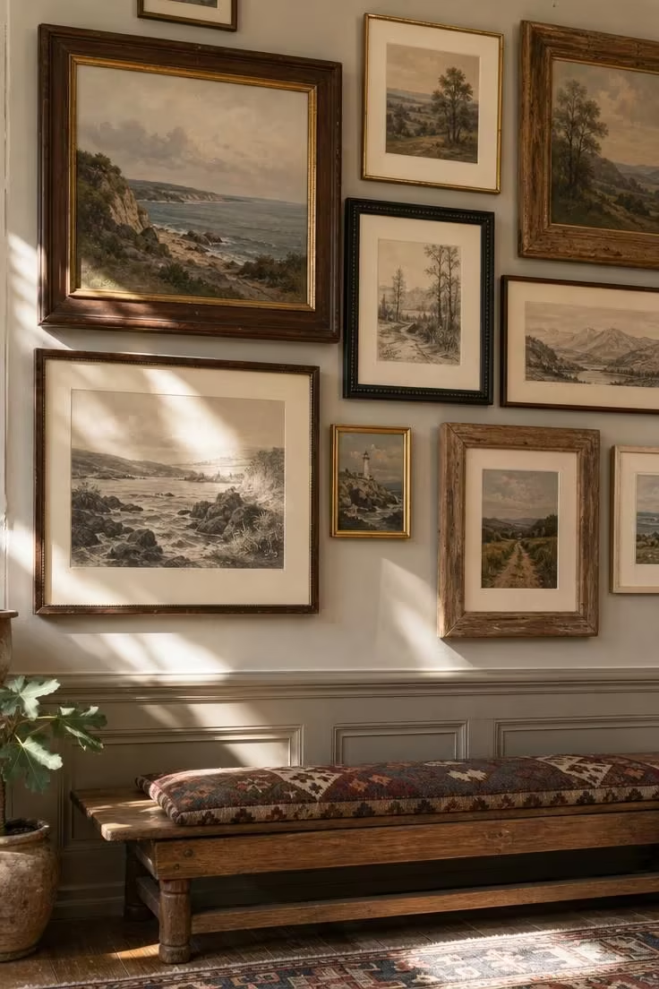
A wall of mismatched landscapes holds together because every frame shares a warm material language.
Cream mats act as the visual thread that keeps the arrangement from becoming noise.
Hanging the pieces closer than convention suggests creates the density of a collection built over decades.
The varying frame widths and finishes, from chunky oak to thin brass, add rhythm without repeating any single style.
The low oak bench beneath the wall gives the composition a boundary, so the art feels anchored rather than floating.
Sunlight moving across the frames picks out small chips and darkened varnish, the evidence of age that makes the whole wall feel real.
This is vintage eclectic home decor at its most direct: ordinary old things arranged with enough order to read as intentional.
The salon wall also shows how vintage home decorating ideas work best when one material theme stays consistent.
Style Blueprint:
- Choose one subject category, such as landscapes, portraits, or botanicals, so the mix feels collected
- Standardize on cream mats and warm-toned frames in wood or brass only
- Hang pieces closer than convention dictates, with small gaps of two to four inches creating density
- Anchor the bottom edge with one simple piece of furniture to ground the arrangement
- Let one or two frames show chipping or darkened varnish, since perfection reads as reproduction
Design Pro-Tip: When hanging a salon wall, lay the entire arrangement on the floor first and photograph it from above. Adjust spacing based on the photo, not your eye at ground level.
A Checkerboard Encaustic-Tile Floor Under a Pale Plaster Arch
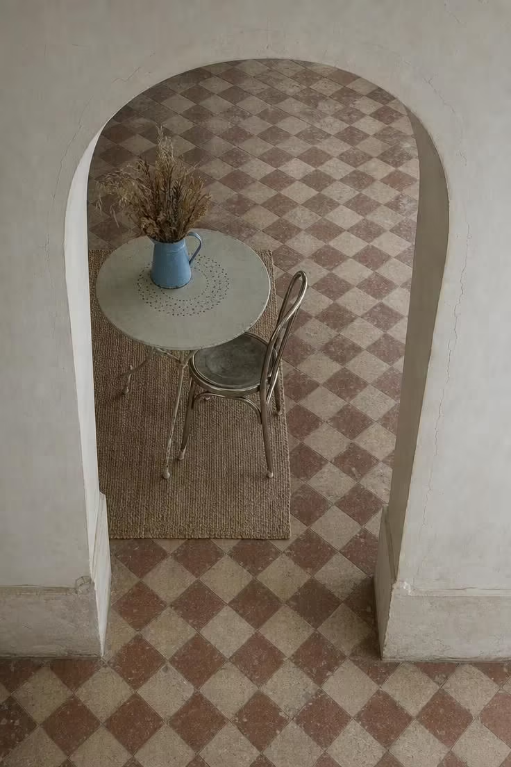
The checkerboard floor supplies pattern, history, and a sense of place in one surface.
Muted terracotta and bone read as softer than sharp black and white, so the floor supports the room instead of demanding attention.
Chips and uneven grout lines are not flaws in this setting.
They are the reason the floor works.
Keeping the furniture count inside the tiled area low lets the pattern remain visible and intact.
A single jute rug layered off-center softens the hard surface without hiding it.
The pale plaster arch frames the whole composition, holding the eye inside the tiled threshold.
Cool overcast light keeps the terracotta from overheating and lets the faded blue enamel pitcher register as a quiet accent.
This kind of floor anchors vintage eclectic kitchen and dining spaces with a sense of permanence.
Style Blueprint:
- Choose encaustic tiles in muted earth tones rather than sharp black-and-white for a softer period feel
- Accept chips, uneven grout lines, and surface wear as character
- Use only one or two pieces of furniture in the tiled area so the pattern remains visible
- Layer a jute or sisal rug to add softness without hiding the tile entirely
- Keep the wall finish pale and flat to frame the patterned floor without competing
A Kilim-Covered Ottoman Under a Paper-Lantern Pendant and a Plate Gallery Wall
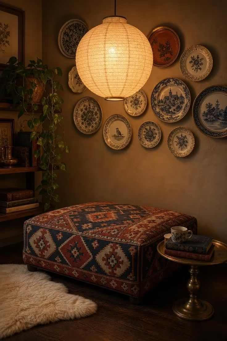
The kilim ottoman anchors this corner because its faded dyes already carry the warmth the whole room leans on.
Hanging the paper lantern low creates a pool of light that makes the seating area feel contained, almost private.
The plate wall above uses one repeated color, cream, to hold together plates of different patterns and origins.
A single small brass table beside the ottoman keeps the corner informal and useful without adding visual weight.
The bare floor around the sheepskin lets the kilim pattern and the plate wall hold the eye.
Warm light through the paper shade softens the entire composition, muting the contrast between the rug and the walls.
This corner demonstrates how mixing vintage and modern pieces, the lantern against the kilim and plates, can feel unified rather than random.
Style Blueprint:
- Upholster the ottoman in textile that already shows fading and uneven dye, since new kilims can look too bright
- Hang the paper lantern low enough to create a pool of light directly over the seating
- Mix plate patterns loosely, but repeat one color, such as cream or blue, across at least half the plates
- Add one small metal table rather than a matched set to keep the corner informal
- Keep the floor mostly bare so the kilim pattern and plate wall hold the visual weight
A Black-Framed Mirror Leaning Against a Wall Above a Clay-Vessel Still Life
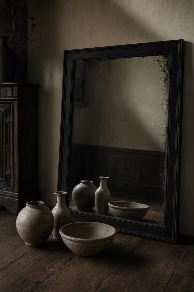
Leaning the mirror at a low angle shifts its reflection toward the floor and the vessels, not the ceiling and empty wall.
The foxed edge on the glass gives the mirror a physical age that new mirrored surfaces lack.
Three vessels in the same earthen family but different silhouettes create quiet variety without needing color.
Their clustered placement on the floor feels less decorated than displayed, as if they were set down naturally.
The warm grey plaster recedes behind them.
The black frame supplies the only sharp contrast in the scene.
Moody low light deepens the walnut floor and makes the clay surfaces look almost soft.
This is collected home style reduced to its simplest parts: a mirror, three vessels, and enough shadow to make them matter.
Style Blueprint:
- Lean the mirror at a low angle so it reflects the floor and low objects rather than the ceiling
- Choose vessels in the same earthen tone family but varied silhouettes for quiet interest
- Keep the floor and wall colors muted so the black frame and clay tones dominate
- Allow one imperfection, such as foxing on the mirror or a chip on a vessel, to anchor the vintage feel
- Use an odd number of objects, clustered closer than expected
A Worn Leather Sling Chair Beside a Blackened-Steel Arc Floor Lamp
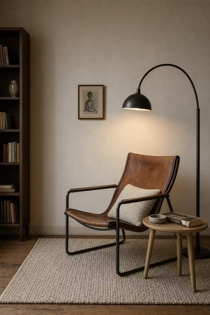
This corner reads as designed because the chair and lamp share one metal finish, the blackened steel.
Unpainted steel with visible weld marks has a weight that polished chrome never offers.
It suits the worn leather.
The oak side table is small and light enough to counterbalance the heavy chair without competing with it.
One ivory boucle cushion is the only soft-textured contrast the chair needs.
The bare wall with a single charcoal drawing keeps all the attention on the furniture's sculptural lines.
An oatmeal wool rug sized to extend only a foot beyond the chair and lamp defines the corner without filling the room.
This is vintage eclectic living room design at its most restrained, where every object has weight and breathing room.
The torn dust jacket on the book reinforces the sense that the room has been lived in for years.
That detail matters more than it first appears.
Style Blueprint:
- Let the chair and lamp share the same metal finish so the corner feels designed, not random
- Keep the side table small and light in visual weight to counterbalance the heavy chair
- Add exactly one soft-textured cushion in a neutral color to soften the leather
- Use bare walls with one small piece of art to keep the focus on the furniture's sculptural lines
- Place the rug underneath so it extends only a foot beyond the chair and lamp
Design Pro-Tip: When pairing a heavy leather chair with a curved floor lamp, position the lamp so the light lands at reading height over the chair arm, not the center of the seat. The off-center pool of light feels more natural and less staged.
A Vintage Steamer Trunk Repurposed as a Coffee Table With a Brass Tray Still Life
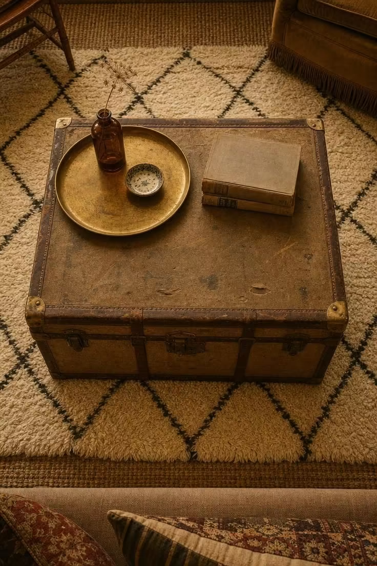
A steamer trunk with a flat top functions as furniture.
A domed lid would always read as something being stored.
The dented canvas and cracked leather straps give this coffee table a history no new piece could imitate.
Grouping the amber glass, ceramic dish, and dried stem on a brass tray keeps the tabletop from looking scattered.
The tray's off-axis placement creates a relaxed balance that feels more like real life than a styled tableau.
Faded cream wool beneath the trunk softens the hard edges and adds another layer of texture.
Leaving a third of the trunk's surface empty preserves the calm that makes the still life visible.
The stack of flat art books adds horizontal weight without introducing visual busyness.
Vintage furniture like this trunk works hard without demanding the room's attention.
Style Blueprint:
- Choose a trunk with a flat top so objects sit securely, since domed lids read as storage, not furniture
- Group small objects on a tray so the tabletop reads intentional rather than cluttered
- Stack books flat instead of standing them up for a calm, horizontal silhouette
- Layer a faded textured rug beneath to anchor the trunk and soften the hard edges
- Leave at least one-third of the trunk's surface empty
A High-Back Cane Chair With a Blush Velvet Seat Cushion Beside an Oxblood Runner
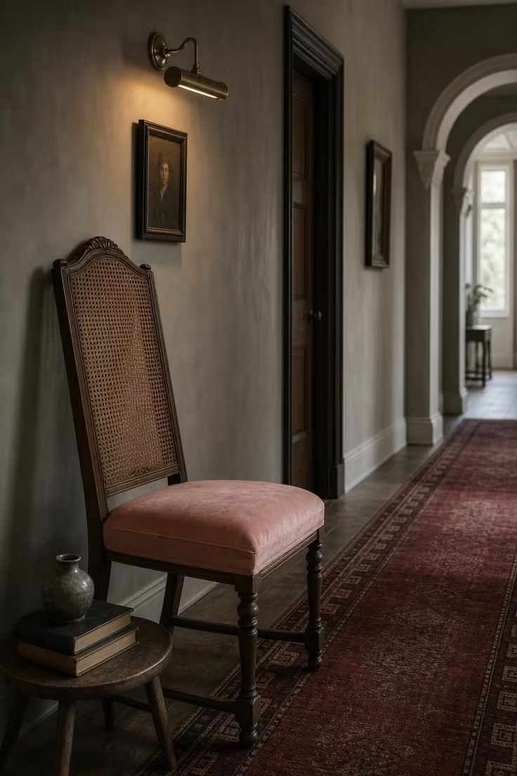
Putting an upholstered chair in a hallway turns a pass-through space into a small room with its own character.
The blush velvet cushion plays against the oxblood runner without matching it.
That push-pull of related reds feels deliberate.
The repair patch on the cane is not hidden.
That small trace of mending adds to the chair's story.
A brass picture light over one portrait draws the eye down the hall and gives the wall a reason to be looked at.
Keeping the runner as the largest pattern means every other element can stay quieter.
The pale plaster arch at the far end carries the eye through the space and suggests another room waiting beyond.
This hallway moment shows how a vintage eclectic bedroom or reading nook can borrow the same layering logic.
Soft velvet against aged cane, blush against oxblood, light against shadow: the contrast does the work.
Style Blueprint:
- Use one piece of upholstered furniture in a hallway to make the transitional space feel like a room
- Choose a cushion color that contrasts with the runner, such as blush against oxblood, for warmth without matching
- Leave visible signs of repair on the cane, since they contribute to the collected character
- Mount a single focused light over a small piece of art to draw the eye down the hall
- Keep the floor runner as the largest pattern in the space and everything else quieter
A Fluted Walnut Console With a Swing-Arm Sconce and a Gallery Ledge Above
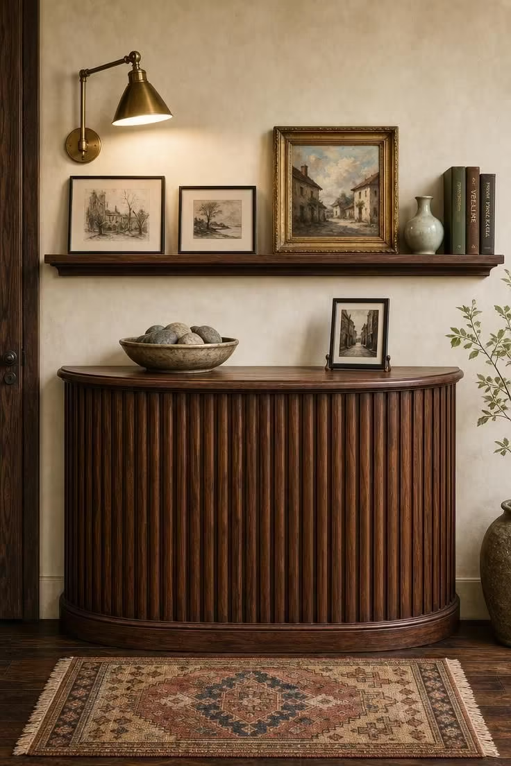
The fluted walnut front catches the midday light unevenly.
Those alternating grooves of shadow and warm wood become the console's main ornament.
A picture ledge instead of multiple hooks means the arrangement above can change without leaving holes or shifting frames out of alignment.
Mixing art mediums and frame styles on the ledge works because the palette stays tight: cream, charcoal, warm wood, and one soft celadon accent.
The swing-arm sconce allows the light to wash across different pieces at different times.
That keeps the wall feeling alive.
On the console below, the ceramic bowl and framed photograph sit low and quiet, so the eye travels up to the ledge naturally.
The faded kilim rug underneath echoes the length of the ledge and ties the floor to the wall composition.
This setup shows eclectic interior design holding together through material repetition: walnut on the console, walnut on the ledge, walnut warmth in the frames.
The wall uses its full height without anything touching the floor except the console and rug.
Style Blueprint:
- Choose fluted or reeded wood for its ability to catch light and add vertical rhythm
- Use a wall-mounted picture ledge instead of multiple hooks for flexibility in styling
- Mix art mediums and frames on the ledge but keep the palette to cream, charcoal, and warm wood
- Mount a swing-arm sconce that can be adjusted to spotlight different pieces
- Anchor the floor with a narrow rug in muted colors to echo the ledge's length
Design Pro-Tip: A picture ledge styled with overlapping frames and a few standing objects reads as collected, not decorated. Change one element every few weeks, since the act of restyling keeps the wall feeling alive.
Conclusion
The vintage eclectic home is not assembled by following a single era or matching a furniture set.
It emerges from deliberate layering: a worn leather chair under a curved steel lamp, a checkerboard tile floor through a pale plaster arch, a wall of thrift-store landscapes held together by cream mats and warm frames.
Across these image-driven ideas, the same principles repeat.
Visible age operates as an asset, a controlled palette holds the mix together, odd-numbered groupings create natural rhythm, and enough negative space lets each object carry weight.
The practical starting point is simple: choose one anchor piece, build a color story around it, and let the rest arrive slowly.