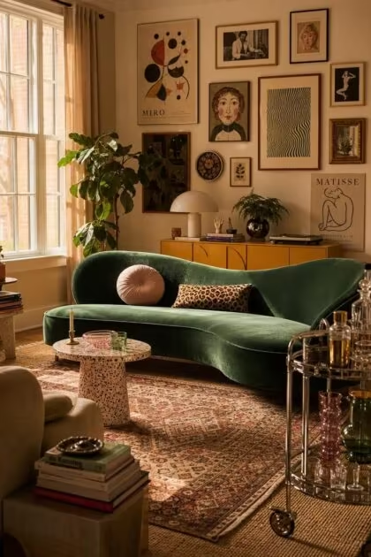
This post may contain affiliate links. If you make a purchase through these links, we may earn a commission at no additional cost to you.
Most homes get talked into playing it safe.
Walls stay white, sofas stay gray, and every room starts to look like the one before it.
Funky eclectic decor is the opposite instinct.
It mixes eras, colors, and textures on purpose, and it rewards a home that looks collected rather than matched.
This roundup gathers 11 specific looks, each built around a real piece of furniture, finish, or object, so you can see exactly what the style takes to pull off.
Funky Eclectic Decor Starts With an Emerald Velvet Kidney Sofa
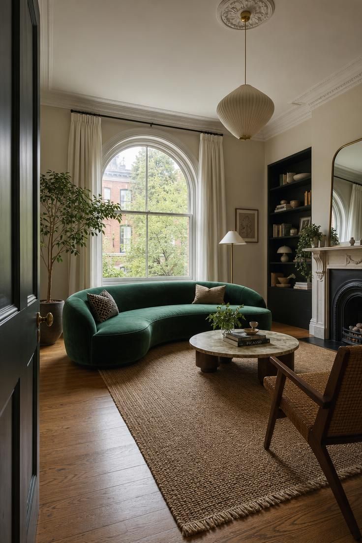
Soft warm golden hour light spills across the room, catching the velvet’s texture and casting long shadows from a nearby brass floor lamp.
A mustard bouclé throw pillow and a striped wool blanket rest on the sofa, with a low walnut coffee table holding a stack of design books and a small terracotta vase of dried pampas grass.
The wall behind the sofa is painted a warm putty tone, hung with two mismatched vintage frames.
The floor is a wide-plank oak with a faded vintage rug layered beneath the coffee table.
The mood feels lived-in and warm, like a Sunday afternoon in a well-loved home.
Shot on 2:3 ratio, editorial style, shallow depth of field on the sofa’s texture.
A curved sofa changes how a room feels before anyone even sits down.
Straight lines read formal, while a kidney shape softens the whole space and pulls the eye around the room instead of stopping it at a corner.
Emerald green works as a base color precisely because it reads as neutral once you start layering brighter accents around it.
The velvet catches light differently depending on the time of day, which gives the piece a sense of movement that flat fabrics don’t have.
Placing the sofa at an angle rather than flush against the wall breaks the boxy feel most living rooms fall into.
A single bold anchor piece like this lets you build the rest of the room’s retro eclectic style around one confident choice instead of a dozen small ones.
The result is a room that feels intentional even when the rest of the decor is thrifted and mismatched.
Style Blueprint:
- Curved kidney-shaped sofa in emerald velvet
- Mustard bouclé throw pillow
- Brass floor lamp
- Low walnut coffee table
- Faded vintage area rug
Mismatched Rattan Chairs Around a Lucite Dining Table
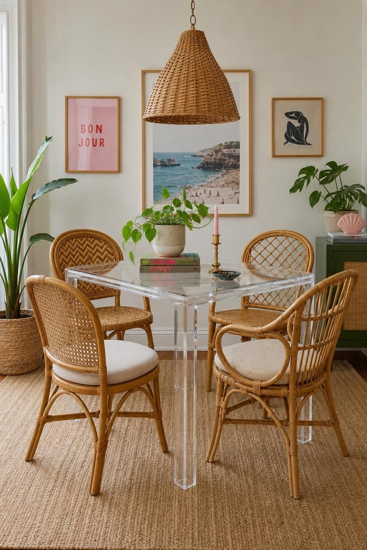
Bright midday light pours in from a large side window, creating crisp shadows across the table’s clear surface and the terracotta floor tile beneath it.
A small stack of woven placemats sits at one end of the table, alongside a ceramic bowl of citrus fruit in orange and yellow tones.
A pendant light with a woven rattan shade hangs low over the table, and a gallery of small botanical prints lines the wall behind the chairs.
The scene feels casual and sun-drenched, like a weekend brunch about to happen.
Shot on 2:3 ratio, editorial style, natural daylight, crisp focus throughout.
A see-through table is one of the easiest tricks for funky eclectic decor to feel less crowded in a small dining nook.
Because the tabletop disappears visually, the chairs become the real design statement in the room.
Mixing four different rattan weaves instead of buying a matched set adds texture without adding visual weight, since the natural material keeps everything in the same tonal family.
Bright, even daylight suits this kind of vignette because it shows off the texture of the woven chairs without heavy shadows competing for attention.
A woven pendant shade overhead repeats the rattan material at a different scale, which ties the ceiling and floor levels of the room together.
This combination works especially well for anyone building a colorful eclectic living room that flows directly into a dining space, since the natural textures act as a visual bridge between rooms.
Style Blueprint:
- Clear Lucite dining table
- Four mismatched rattan dining chairs
- Woven rattan pendant light
- Ceramic fruit bowl
- Small botanical print gallery
A Sunburst Mirror Wall Above a Mustard Console Table
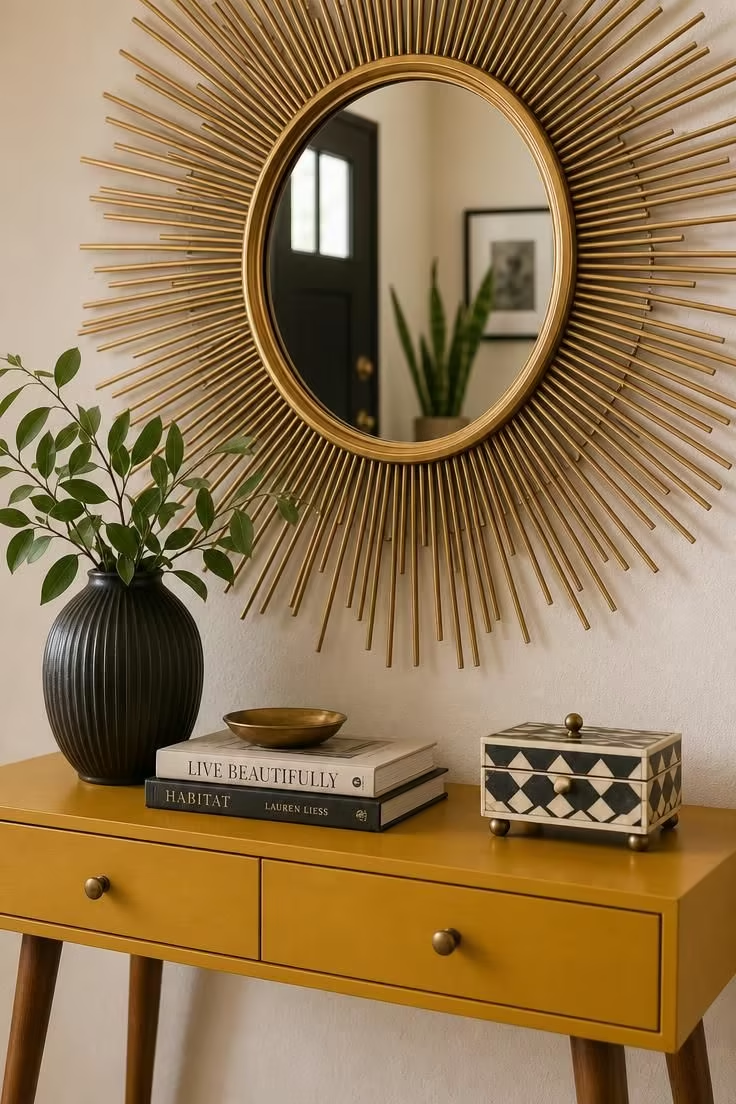
Soft, diffused light fills the frame, likely from an overcast sky through a nearby window, giving the brass a muted, warm glow rather than a harsh shine.
A small collection of ceramic vessels in cream and rust tones sits on the console, alongside a stack of woven coasters and a single dried eucalyptus stem in a slim glass vase.
The wall behind is a warm off-white, and a strip of vintage floor tile in a faded terracotta pattern is visible at the bottom edge of the frame.
The mood is quiet and inviting, the kind of corner that makes someone pause on their way through the door.
Shot on 2:3 ratio, editorial style, tight crop on the mirror and console styling.
In funky eclectic decor, a sunburst mirror does double duty in a small entryway.
It bounces available light around the space, and its radiating shape draws the eye upward instead of letting the room feel low and boxed in.
Mustard as a console color works because it sits between warm and earthy, so it pairs easily with brass, rust, and cream without fighting for dominance.
Soft, diffused light is the right choice here because it lets the texture of the woven coasters and ceramic glazes show without glare bouncing off the mirror’s surface.
Keeping the styled objects on the console to a small, curated handful, rather than crowding the surface, gives the eye a place to rest before it travels up to the mirror.
Small vignettes like this one are often the easiest place to start layering funky boho decor touches into a home, since an entryway console is low commitment and easy to change.
Style Blueprint:
- Brass sunburst mirror
- Mustard yellow console table
- Ceramic vessel collection
- Woven coasters
- Dried eucalyptus stem in glass vase
Layered Moroccan and Shag Rugs in Clashing Patterns
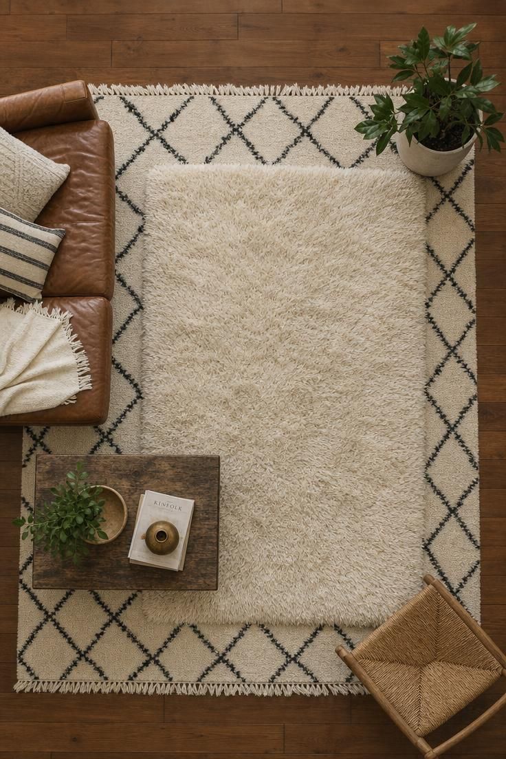
Cool, overcast light fills the frame evenly, giving the wool fibers a soft, matte texture without warm undertones.
A pair of woven leather sandals sits near the shag rug’s edge, next to a small stack of magazines and a low brass ashtray repurposed as a catchall dish.
The wood flooring peeking out from beneath the rugs is a warm honey oak, providing contrast against the cooler-toned textiles.
The overall feel is tactile and inviting, a floor someone would want to sit on.
Shot on 2:3 ratio, editorial style, direct overhead angle, soft even lighting.
Layering two rugs instead of choosing one is a fast way to add depth to a room without touching the walls or furniture.
The geometric Moroccan pattern grounds the space with structure, while the plush shag on top softens the edges and adds a tactile element underfoot.
Cool, overcast light is well suited to this vignette because it keeps the black and cream pattern crisp instead of washing it out with warm tones.
Sizing the top rug smaller than the bottom one, and setting it slightly off center rather than perfectly centered, keeps the layering from looking like a mistake.
This kind of bold pattern mixing works best when the color palette stays limited, here just black, cream, and warm wood, so the eye reads it as intentional rather than cluttered.
Rug layering is one of the most forgiving ways to experiment with maximalist home decor because it can be swapped out entirely without touching a single wall.
A third layer, like a small vintage runner near a doorway, can extend the same idea into a hallway.
Style Blueprint:
- Black and cream Moroccan Beni Ourain rug
- Cream shag rug, smaller scale
- Warm honey oak flooring
- Brass catchall dish
- Woven leather sandals or slippers
Design Pro-Tip: When layering two patterned rugs, keep one of them solid or low-contrast so the eye has a place to rest between the busier pattern and the rest of the room.
A Gallery Wall of Mismatched Frames and Vintage Posters
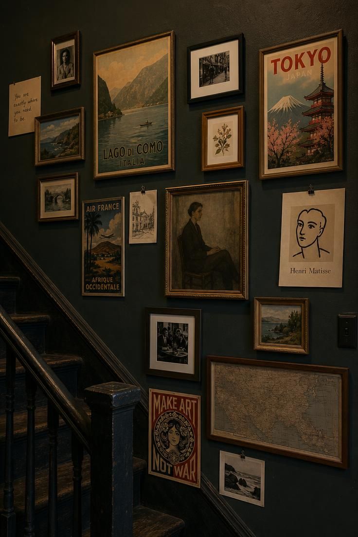
Low, moody light comes from a single wall sconce just outside the frame, creating pools of warm light against deep shadow along the staircase.
The frames range from thin gold metal to chunky dark wood, and one small round mirror is worked into the lower left corner of the arrangement.
A single trailing pothos plant in a woven hanging planter sits just outside the gallery’s edge, its vines reaching toward the frames.
The wall color is a deep forest green, which makes the lighter frame edges pop against the shadow.
The atmosphere feels intimate and a little dramatic, like a hallway with real stories on its walls.
Shot on 2:3 ratio, editorial style, dramatic single-source lighting, deep shadow retained.
A gallery wall built from mismatched frames rather than a matched set tells the viewer, correctly, that this collection is a hallmark of funky eclectic decor grown over time.
Dark, moody light works especially well here because shadow makes a gallery wall feel like a discovery rather than a display, drawing someone in to look closer.
Deep forest green as a backdrop lets metallic and wood frame tones read as warm accents instead of clutter.
Working a small round mirror into the arrangement breaks up the rectangle shapes and adds a little reflected light back into a dim hallway.
A trailing plant softens the hard edges of all those frame corners and keeps the wall from feeling like a museum installation.
This kind of eclectic gallery wall is one of the most flexible ideas in this list, since it can grow one frame at a time as a collection expands.
Style Blueprint:
- Mismatched picture frames in varied metals and woods
- Vintage travel posters
- Small round accent mirror
- Wall sconce for directional light
- Trailing plant in a hanging planter
A Chrome Bar Cart Anchoring Funky Eclectic Decor in Colored Glass
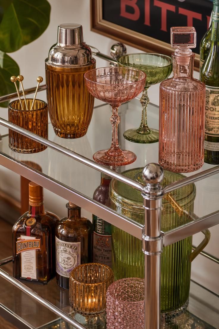
Warm golden hour light streams in from a side window, catching the chrome frame and throwing colorful reflections from the glassware onto the wall behind.
A small brass tray holds a few cocktail tools, and a single stem of dried grasses sits in a slim glass vessel on the bottom shelf.
The wall behind the cart is a soft blush pink, which picks up warmth from both the light and the glassware.
The floor beneath is a checkered black and white tile, visible at the bottom edge of the frame.
The mood feels playful and a little glamorous, like a small at-home cocktail hour waiting to happen.
Shot on 2:3 ratio, editorial style, warm directional light, reflective surfaces emphasized.
A bar cart is a small piece of furniture that carries a large amount of personality per square foot.
Chrome and glass keep the structure light and see-through, which means the colored glassware becomes the real focal point instead of competing with a bulky cabinet.
Warm, golden light is the right choice for a styled bar cart because it makes glass and metal both glow rather than glare.
Grouping barware by color rather than by function, so the amber pieces sit together and the green pieces sit together, reads as more curated than scattering them randomly.
A blush pink wall behind the cart adds warmth without stealing focus from the glassware’s own color story.
Vintage funky furniture pieces like a chrome bar cart are often easy to find secondhand, which makes this one of the more budget-friendly ideas to recreate.
Style Blueprint:
- Chrome and glass two-tier bar cart
- Colored glass barware in amber, pink, and green
- Brass cocktail tool tray
- Small vase with dried grasses
- Checkered floor tile, if renovating
A Macrame Wall Hanging Over a Boucle Accent Chair
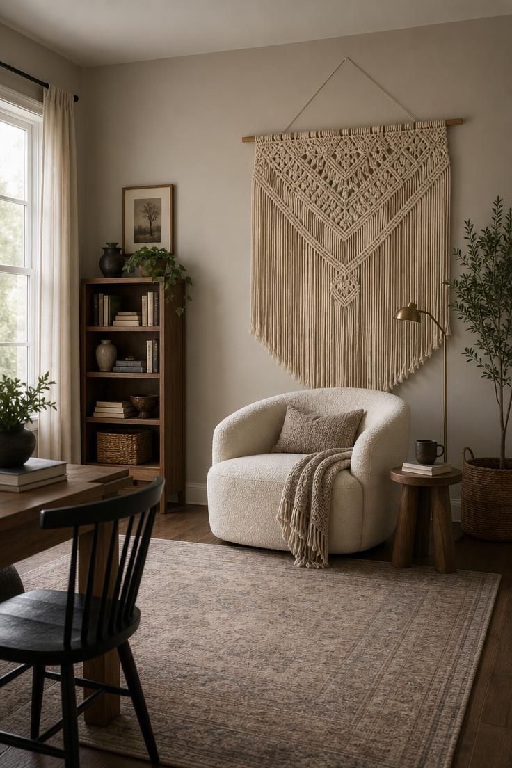
Bright, even midday light fills the frame from a large window just out of view, giving the space a fresh, airy quality.
A small round side table in blonde wood holds a stack of books and a single trailing plant in a woven basket planter.
The chair’s boucle texture is highlighted by the flat, even light, and a striped wool throw sits folded over one arm.
The wall is painted a cool sage green, which contrasts gently with the cream and natural tones of the chair and macrame.
The mood feels calm and cool toned, a corner built for slow mornings.
Shot on 2:3 ratio, editorial style, wide angle, bright natural light throughout.
Texture does a lot of the work in funky eclectic decor rooms like this one, where the color palette itself stays fairly quiet.
Boucle’s looped, nubby surface catches light differently than a flat linen or velvet would, giving the chair visual interest even without a bold pattern.
Bright, even light suits this vignette because it lets the layered textures, boucle, macrame, and woven basket, all read clearly against each other.
Hanging the macrame piece oversized rather than a smaller version keeps it from getting lost above a large, plush chair.
Sage green as a wall color leans cooler than most funky eclectic palettes, which keeps the room from tipping into visual overload when so many textures are already at play.
This kind of pairing is a good entry point into playful home decor for someone who wants texture and personality without committing to loud color first.
A round side table softens the mostly rectangular lines of the chair and wall hanging.
Style Blueprint:
- Cream boucle accent chair
- Oversized natural cotton macrame wall hanging
- Round blonde wood side table
- Striped wool throw
- Trailing plant in woven basket planter
A Curved Chartreuse Bench Beneath a Row of Woven Pendant Lights
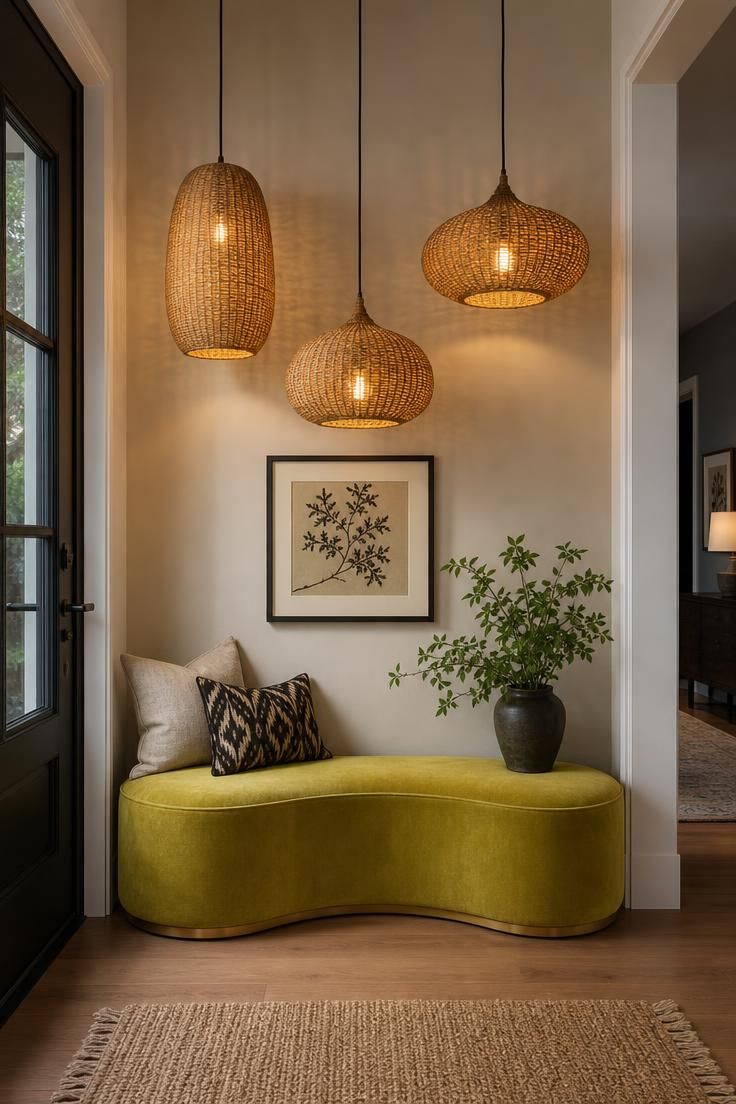
Soft, diffused light fills the space, likely from a skylight or frosted window just out of frame, giving the chartreuse fabric a muted, gentle glow.
A pair of woven storage baskets sits beneath the bench, and a small stack of folded linen throws rests on one end of the seat.
The wall behind the bench is painted a warm cream, and a narrow runner rug in a faded vintage pattern lines the floor in front of it.
The scene feels welcoming and a little whimsical, the kind of spot that makes putting on shoes feel less like a chore.
Shot on 2:3 ratio, editorial style, soft overhead lighting, varied pendant heights emphasized.
A curved bench in a color as bold as chartreuse works because the shape itself is already unusual, and that kind of confidence is exactly what funky eclectic decor asks for, so it earns the right to wear a loud color without the room feeling overdone.
Hanging three pendant lights at staggered heights rather than in a perfectly even row adds a sense of movement overhead, echoing the curve of the bench below.
Soft, diffused light is the right call here since it keeps the chartreuse from looking neon and instead lets it read as warm and inviting.
Storage baskets tucked beneath the bench keep the practical function of an entry seat intact while still leaving room for a bold style statement above.
A neutral cream wall behind such a saturated color choice gives the eye a place to reset before taking in the rest of the space.
This is a good example of mismatched furniture styling done through lighting rather than seating alone, since the pendant trio does as much visual work as the bench itself.
Style Blueprint:
- Curved chartreuse velvet bench
- Three woven rattan pendant lights, staggered heights
- Woven storage baskets
- Folded linen throws
- Faded vintage runner rug
Design Pro-Tip: Hang multi-light fixtures at slightly different heights instead of a perfectly even line. The small variation reads as intentional and keeps the eye moving through the space.
Terrazzo Side Tables Paired With a Hot Pink Ottoman
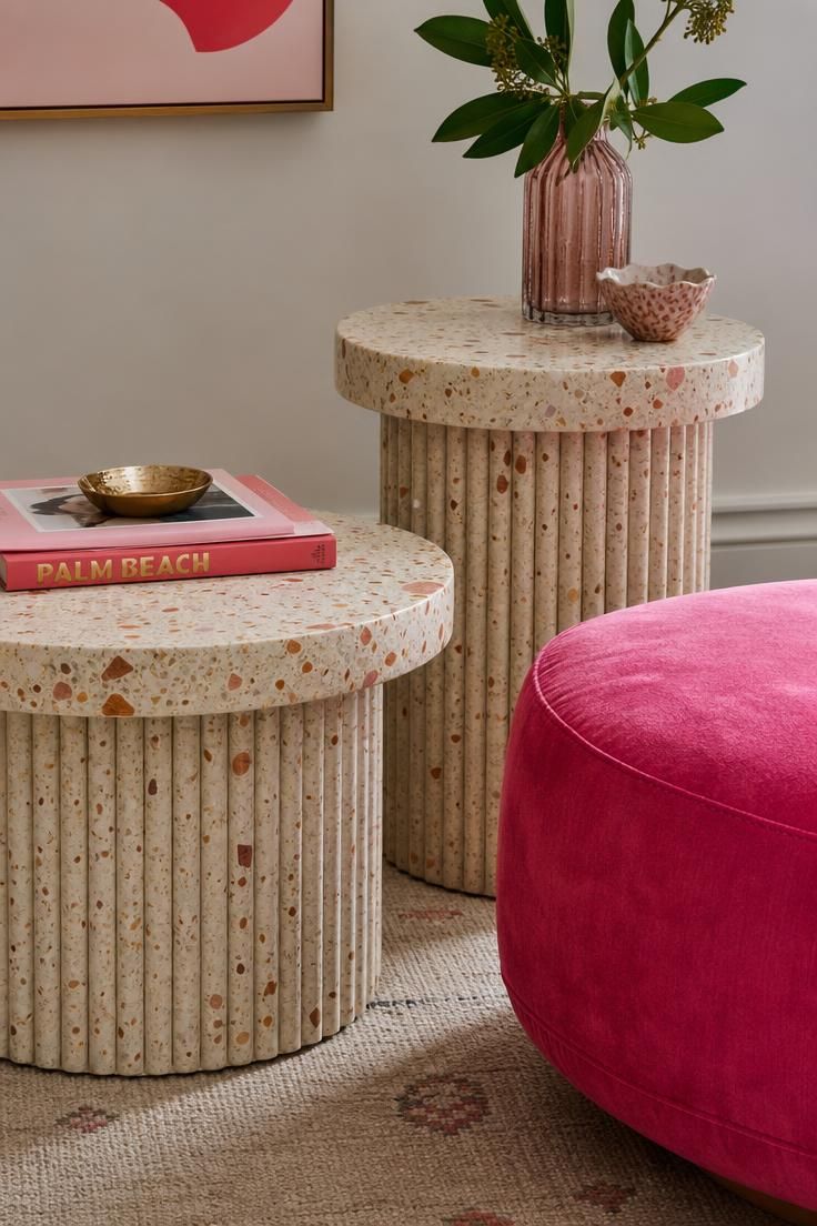
Cool, overcast light fills the frame, keeping the terrazzo’s flecked surface crisp and reducing glare on the stone.
A small stack of coffee table books sits atop one terrazzo table, and a single dried protea flower rests in a slim ceramic bud vase on the other.
The ottoman’s velvet catches just enough texture from the flat light to show its nap without appearing overly shiny.
The floor is a pale bleached oak, and a corner of a cream boucle sofa is visible at the frame’s edge.
The mood feels fresh and a little bold, a corner that surprises without overwhelming the room.
Shot on 2:3 ratio, editorial style, tight crop, cool even lighting.
Terrazzo brings a controlled kind of chaos to funky eclectic decor, since its flecked surface already contains a mix of colors within a single material.
Pairing it with a solid, saturated color like hot pink lets the terrazzo’s subtler pattern stand out instead of getting lost next to another busy print.
Cool, overcast light suits stone surfaces particularly well, since warm light can sometimes make terrazzo’s cooler flecks disappear into the base tone.
Using two terrazzo tables of the same material but different heights adds functional flexibility, one for drinks, one for books, without doubling the visual noise.
A pale oak floor keeps the whole vignette feeling grounded and bright rather than heavy.
This pairing is an easy way to work retro funky furniture pieces into a room that otherwise leans fairly neutral, since terrazzo has genuine midcentury roots.
Style Blueprint:
- Round terrazzo side tables in varying heights
- Hot pink velvet ottoman
- Dried protea in ceramic bud vase
- Coffee table book stack
- Pale bleached oak flooring
A Wall of Vintage Botanical Plates in Graduated Colors
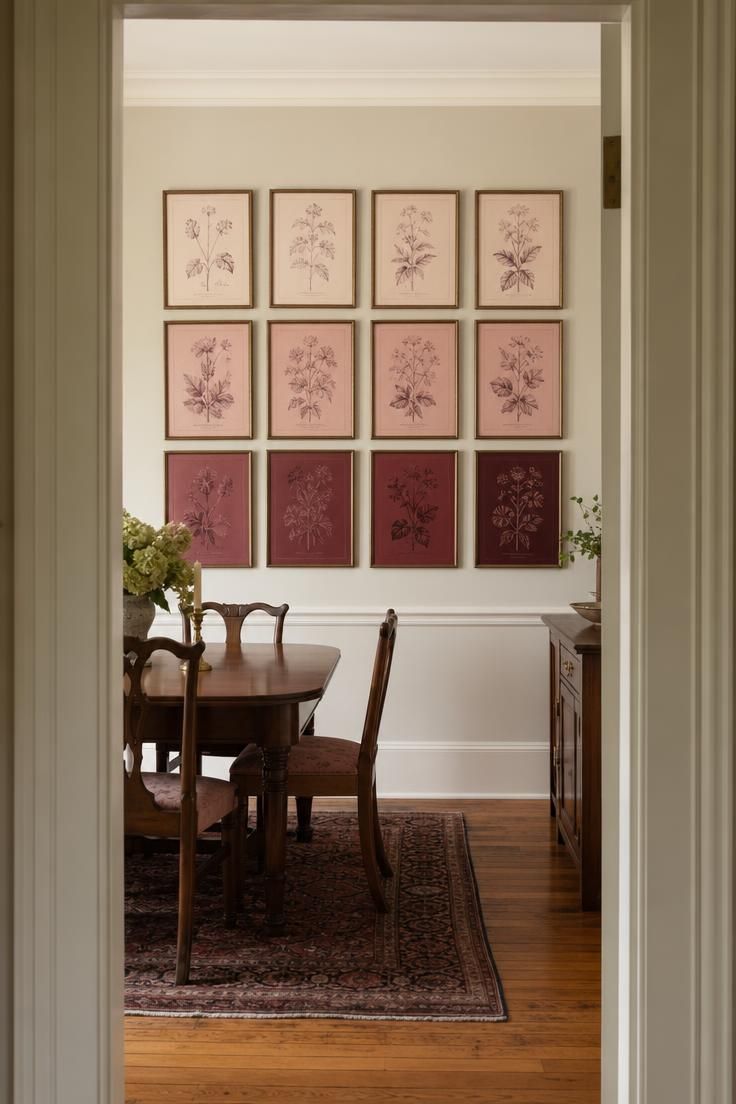
Low, moody light comes from a pendant fixture just out of frame over the dining table, leaving the plate wall lit by soft ambient spill.
A long wood dining table with mismatched chairs sits beneath the wall, set with a few pieces of colored glassware.
The wall itself is painted a deep charcoal, which lets each plate’s pattern and color stand out clearly against the dark backdrop.
A single trailing plant on the table’s far end adds a touch of green against all the warm and cool plate tones.
The mood feels a little dramatic and celebratory, like a dinner party about to begin.
Shot on 2:3 ratio, editorial style, doorway framing, soft ambient light retained.
Arranging plates by color rather than by pattern or size gives an otherwise busy funky eclectic decor collection a clear sense of order.
A dark charcoal wall works as a backdrop because it absorbs the light rather than reflecting it, letting each plate’s edge and glaze stand out on its own.
Low, moody lighting suits a dining room built for evening use, since it mirrors the kind of light the room actually sees at dinner time.
Grading the colors from deep burgundy near the floor to pale blush near the ceiling creates a gentle visual gradient that guides the eye upward without any single plate demanding attention.
Framing this shot from the doorway rather than head on gives the wall a sense of arrival, the way it would actually be experienced walking into the room.
A collection like this one often starts small, a handful of thrifted plates, and grows into a full wall over months or years.
Style Blueprint:
- Vintage botanical plates in graduated colors
- Dark charcoal accent wall
- Long wood dining table
- Mismatched dining chairs
- Colored glassware place settings
A Tulip Table Surrounded by Cane-Back Chairs in Clashing Fabrics
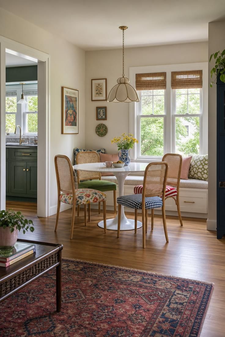
Warm golden hour light streams through a nearby window, casting soft shadows across the table and highlighting the cane weave detail on each chair back.
A small ceramic pitcher holds a loose bunch of dried wildflowers at the table’s center, alongside two mismatched woven placemats.
The wall behind the nook is painted a warm terracotta, and a small potted fig tree stands in the corner of the frame.
The floor is a warm honey wood, echoing the tones in the window light.
The mood feels cheerful and a little chaotic in the best way, like a table that has hosted a lot of long breakfasts.
Shot on 2:3 ratio, editorial style, warm directional light, full scene visible.
A tulip table’s single pedestal base clears out visual clutter at floor level, which is exactly what makes it possible for funky eclectic decor to get away with four wildly different chair fabrics around it.
Choosing four distinct patterns, rather than four solids or four matching prints, is the boldest move in this entire list, and it works because the cane backs on every chair repeat the same material regardless of fabric.
Warm, golden light flatters this kind of high contrast pattern mixing because it softens the transitions between fabrics instead of making each one compete under flat, cool light.
A terracotta wall behind the nook pulls warm tones out of each patterned fabric, tying the whole palette together even though no two chairs match.
Keeping the tabletop styling minimal, just a pitcher of dried flowers and simple placemats, gives the eye a resting point among all that pattern.
This is one of the clearest examples in this list of how retro eclectic style leans on repetition of shape and material, cane backs, a pedestal base, rather than repetition of color to hold a room together.
Style Blueprint:
- White tulip-base dining table
- Four cane-back chairs in clashing fabrics
- Ceramic pitcher with dried wildflowers
- Woven placemats
- Potted fig tree
Conclusion
Funky eclectic decor rewards confidence more than it rewards a big budget.
Most of these looks start with one bold piece, a curved sofa, a terrazzo table, a wall of plates, and build outward from there.
Trying to add all 11 ideas into one room at once would flatten the effect that makes the style work in the first place.
Pick two or three that feel closest to pieces already sitting in a home, thrifted or otherwise, and let the rest of the room grow slowly from there.
The goal is never a perfectly matched showroom.
It is a home that looks like it was collected by someone with real taste and a little nerve.