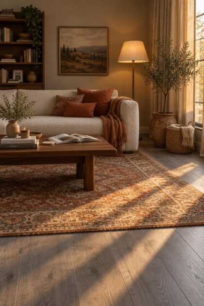
This post may contain affiliate links. If you make a purchase through these links, we may earn a commission at no additional cost to you.
Grey flooring solved a coordination problem for a generation of homes, then created a different one.
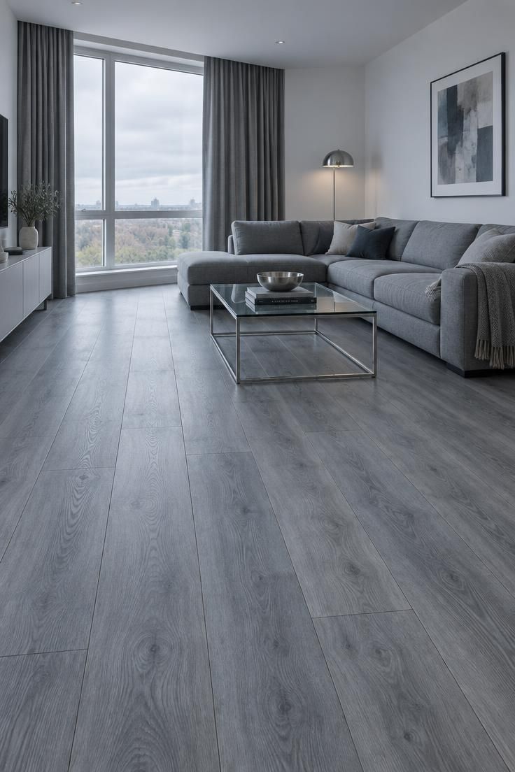
A room finished entirely in cool tones can read as flat, dim, or simply unfinished, even when every surface is clean and new.
The floor is rarely the real issue.
What surrounds it decides whether grey feels like a deliberate backdrop or an accident nobody corrected.
Why Grey Reads Cool and Why That Matters
Grey flooring arrived through several routes at once.
Industrial concrete, cement, slate, and weathered timber supplied the raw vocabulary.
Scandinavian and minimalist interiors made pale grey and white stand for calm and order.
Modern farmhouse finishes and the 2010s neutral palette turned grey into the safe alternative to beige, and low-cost wood-look vinyl, laminate, porcelain, and engineered planks carried it into millions of homes.
Builders liked it because it coordinated with almost everything: white kitchens, stainless appliances, black fixtures, modern furniture.
That flexibility was genuine.
The tradeoff showed up later.
When walls, cabinetry, upholstery, and curtains all lean cool, nothing in the room offers contrast, and the eye reads the whole space as one temperature.
Design coverage through 2025 and 2026 describes a broad shift toward honey oak, caramel, walnut, taupe, and warm off-white.
That direction matters less as a trend to follow than as confirmation that grey is no longer carrying the room alone.
Anyone asking how to warm up grey floors is really asking a balancing question.
Warmth here is visual: materials, colour, and light quality working against a cool field.
It is not a claim about how a room affects anyone.
Design Pro-Tip: Screw a warm bulb into one existing lamp before buying anything. Judging paint and fabric samples under that light, next to the actual floor, prevents most ordering mistakes.
Identify the Undertone Before Choosing Anything
Not every grey floor behaves the same way.
Blue-grey is the coolest and the hardest to warm visually.
Green-grey tends to accept olive, camel, terracotta, and natural wood with little resistance.
Taupe and greige greys combine easily with beige and warm neutrals.
Charcoal responds well to lighter walls and materials with clear warmth and contrast.
Grey oak with brown variation is the most forgiving of the group and takes almost any earth tone.
Undertone decides which warm colours harmonize and which ones fight.
A blue-grey floor placed beside a beige carrying strong yellow or pink undertones can look discordant rather than balanced, and the mismatch is often hard to name until samples sit side by side.
The test costs nothing.
Lay paint swatches, fabric squares, and wood offcuts directly on the floor and look at them in daylight, then again in the evening under the lamps the room actually uses.
Direction matters too.
A north-facing room tends to make grey appear cooler through the day, while warm bulbs can pull the same floor toward brown or beige after dark.
Designers quoted in the research describe this sampling step as the difference between a scheme that looks intentional and one that looks almost right.
Painting first and hoping accessories will fix an undertone mismatch is the most expensive version of that error.
Use Warm Wood as a Structural Anchor
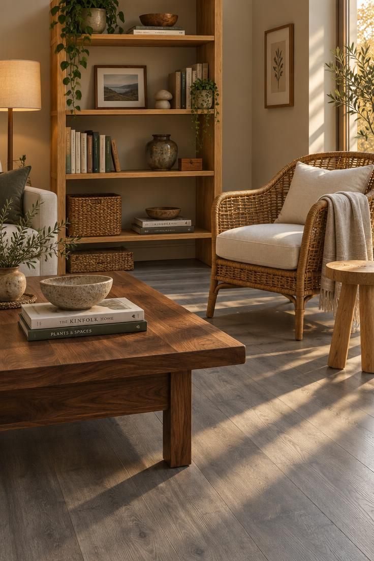
Natural wood is the single highest-value move against a grey floor.
Species that appear repeatedly in the guidance include medium oak, white oak, honey oak, walnut, ash, teak, and bamboo, with rattan and cane doing similar work at smaller scale.
Grey-washed wood works against the goal.
Choose pieces with visible grain and a tone that separates from the floor rather than echoing it.
Coordinating beats matching.
A wood tone slightly warmer or deeper than the floor reads as a decision, while an attempted exact match tends to look like a near miss.
Scale matters as much as species.
A few large pieces, a coffee table, a console, a dining table, a set of chairs, carry more weight than a scattering of small wooden accessories that get lost against the floor.
Placement follows the same logic.
Wood reads strongest where it meets the grey directly: table and chair legs, shelf uprights, a bench standing on bare plank.
Elevating every wooden object onto a rug dilutes the contrast the room needs.
Repeat the floor's grey in small amounts somewhere in the scheme, through a pillow, a vase, or a frame, so the warm pieces look placed rather than imported.
Design Pro-Tip: When two wood tones compete, find the undertone they share, whether that is a brown base, a red base, or an ashy base, and choose every additional piece from that same family.
Choose a Large Rug as the Fastest Intervention
No other change covers cool floor as quickly or as affordably.
Size matters more than count.
One large rug shifts the balance of a room in a way that several small ones cannot, and a scatter of small rugs tends to make a space feel fragmented rather than warm.
Choose a rug large enough to sit under at least the front legs of the main seating.
That single criterion separates rugs that anchor a room from rugs that float in it.
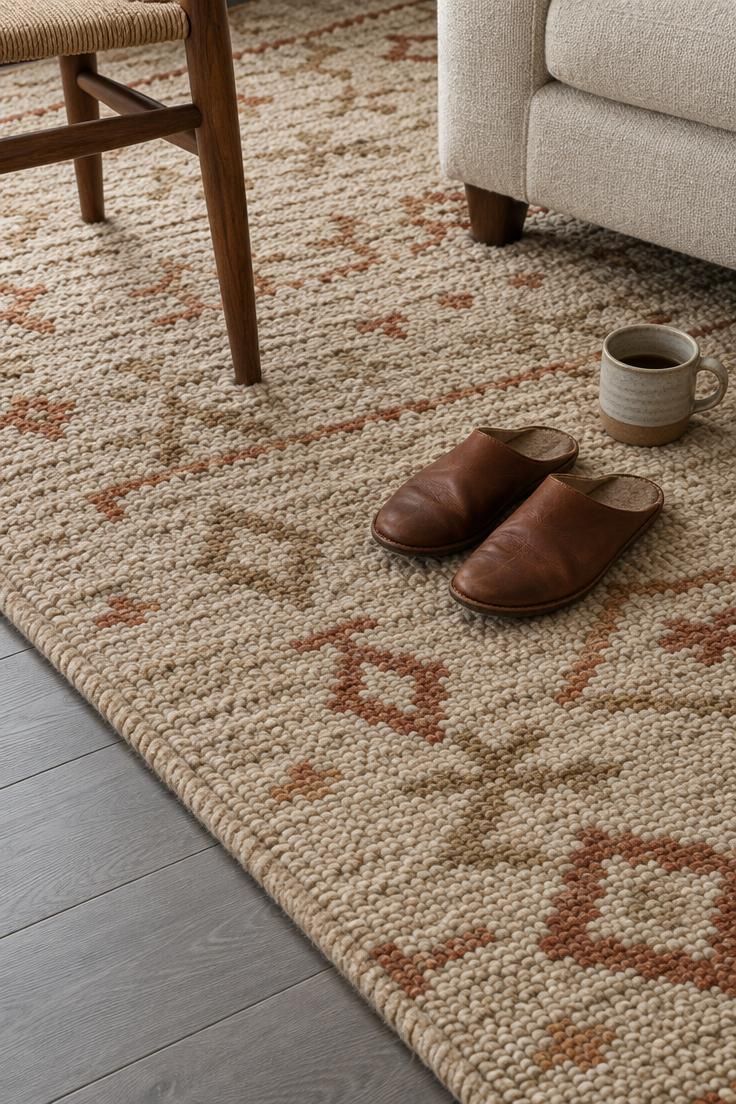
Palettes that work include cream, ivory, oatmeal, camel, tan, rust, terracotta, ochre, cognac, and muted olive.
Patterns can bridge the two temperatures when they contain both the grey of the floor and a warm accent, which is why a faded Persian design with rust and gold sits so comfortably on grey.
Fibre choice affects both feel and upkeep.
Wool, jute, sisal, and cotton all appear in the guidance, with low-pile wool offering a practical balance of durability and softness underfoot.
Rugs to leave on the shelf include blue-grey, stark white, cool black, and flat grey designs with no pattern variation.
Each one repeats the problem instead of solving it, and a cool rug under warm furniture can neutralize the effect of the wood entirely.
Warm lighting for grey floors belongs in the same conversation, because a rug reads differently under a lamp than under a window.
Carrying the rug sample to the room's evening light before buying shows which of the warm tones holds up after dark.
Design Pro-Tip: Layer a flat-weave rug over a larger neutral base. The top layer adds pattern and warmth while the base extends coverage toward the walls.
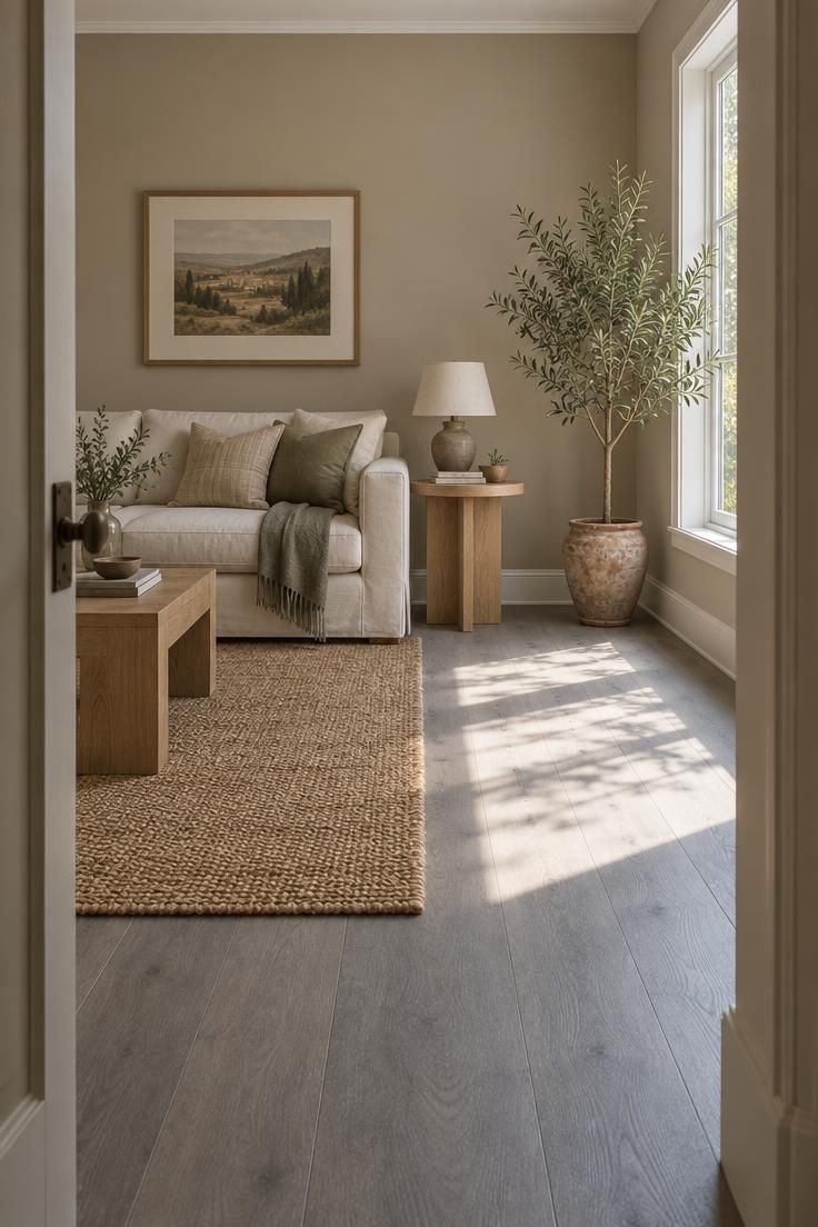
Select Warm Wall Colors That Don't Fight the Floor
Wall colour sets the temperature of everything else in the room, which is why it deserves a decision rather than a default.
Warm white, cream, ivory, greige, mushroom, taupe, sand, light beige, putty, soft clay, muted sage, and dusty blue-green all appear repeatedly as safe pairings.
Warm wall colors with grey floors work best when they stay away from both extremes.
Icy white, blue-white, blue-grey, and stark cool grey add to the coolness of the floor instead of balancing it.
The distinction that matters most is warm, not yellow.
A wall with a strong yellow cast can fight a blue-grey floor rather than settle it, and pure beige with pink undertones does the same thing.
Muted greens and blue-greens deserve a closer look, particularly against green-grey flooring, where the shared undertone creates continuity rather than contrast.
Sample against the floor, not against a paint chip held in the store.
A colour that looks warm on its own can turn cool the moment it sits beside an actual grey plank, and the reverse happens just as easily.
Design Pro-Tip: Paint a large board rather than a small patch, then move it around the room through the day. Wall colour shifts with the light each orientation receives.
Layer Earthy Accent Colors in Moderation
Accent colour is where restraint pays.
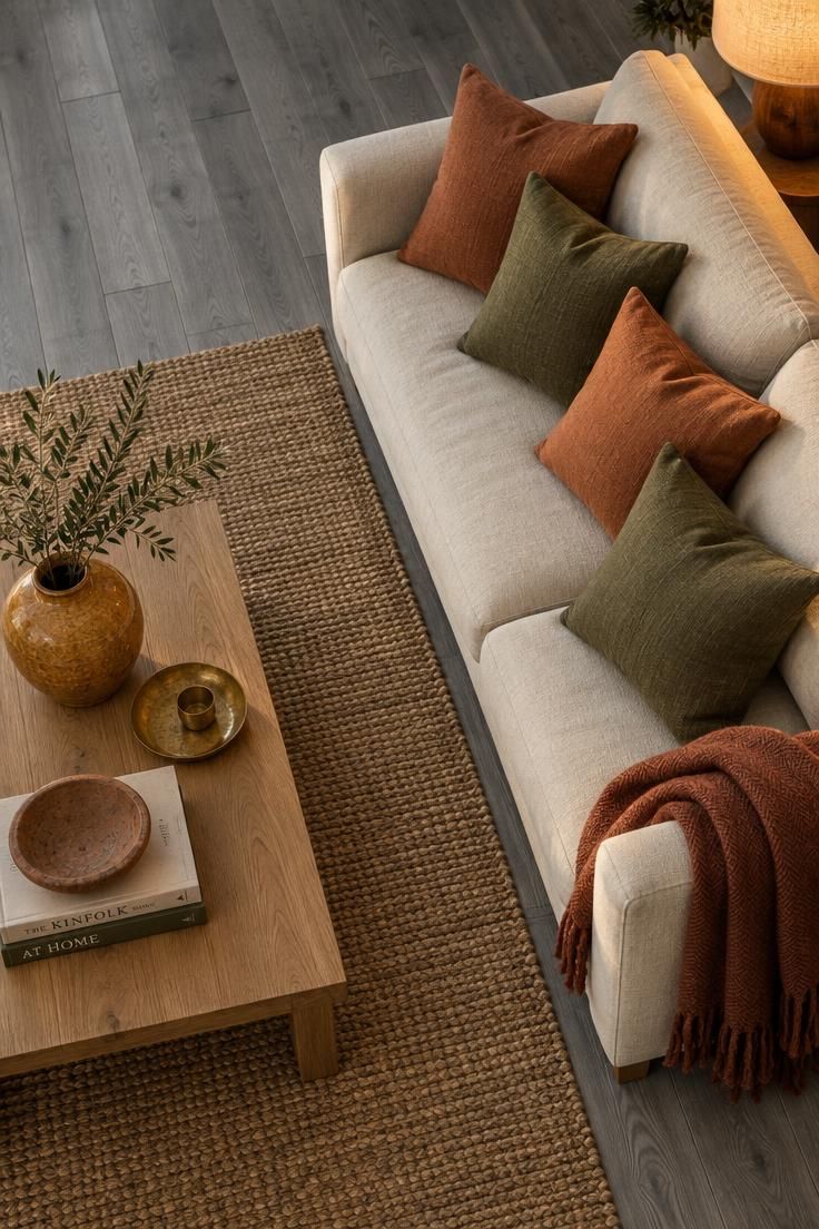
Terracotta, rust, burnt orange, camel, cognac, ochre, mustard, olive, moss green, tobacco brown, chocolate brown, caramel, warm navy, dusty rose, and deep plum all sit comfortably against grey, but a room holding all of them at once loses the effect each one could have had.
Choose two or three and repeat them across the room.
Repetition is what makes an accent look intentional, while a single appearance of each colour reads as leftover.
Muted and natural tones outperform bright or sugary ones here.
A dusty terracotta sits more easily beside grey than a saturated orange, because the muted version shares the floor's low chroma.
Cushions, throws, pottery, and artwork carry accents without requiring commitment.
A rust throw can be folded away; a rust sofa cannot.
Deep navy works best in small doses, as a lamp base, a frame, or a patterned pillow, where it supplies contrast without competing for dominance.
Notice the 2026 direction toward caramel and warm brown neutrals if a major purchase is on the horizon.
A camel sofa will outlast a grey one as the room's centre, and it does most of the warming work on its own.
Design Pro-Tip: Repeat one accent at three scales. A large cushion, a medium vase, and a small tray in the same terracotta create rhythm without crowding the room.
Rely on Warm Lighting and Metal Finishes
Light decides how the floor reads at every hour, which makes it the most underrated lever in the room.
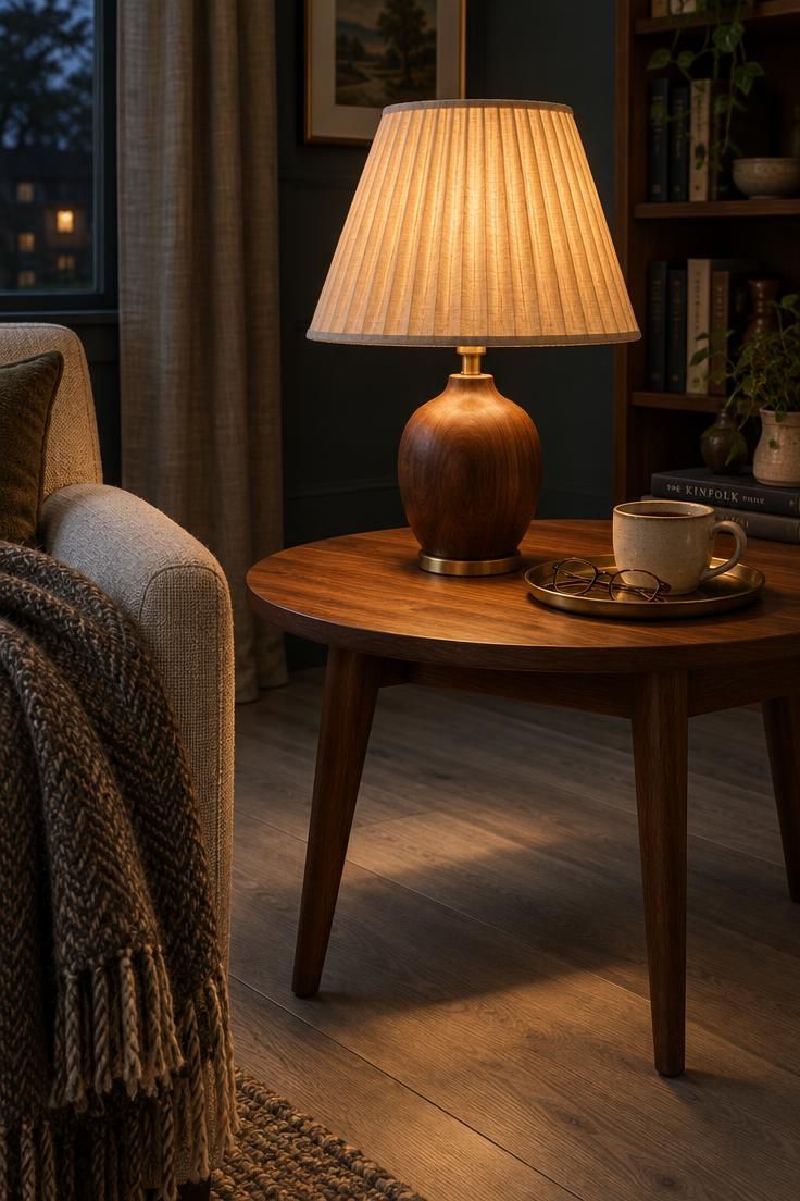
Bulbs around 2700K to 3000K give grey a warmer cast, with 2700K described as warm white that does not tip into yellow.
Warm wood tones for grey floors often get credited to furniture when lighting is doing half the work.
The same walnut table looks cool under a blue-white bulb and warm under a lamp with a linen shade.
Layer the light rather than relying on one ceiling fixture.
Table lamps, floor lamps, wall sconces, picture lights, and under-cabinet lighting each put warmth at a different height, and the room reads richer because the light comes from several directions.
Shade material shapes the quality of that light.
Linen, parchment, rattan, and fabric diffuse a bulb's output and spread it across nearby surfaces instead of concentrating it in one bright pool.
Metals carry temperature too.
Aged brass, antique brass, bronze, copper, and champagne gold add warmth without adding colour, while an all-chrome scheme keeps the room in the same cool register as the floor.
Black metal still works when wood, textiles, or warm accessories sit alongside it.
Fixtures do not need to match.
A lamp in aged brass beside black cabinet hardware and natural wood gives grey floors a collected, deliberate look rather than a showroom one.
Design Pro-Tip: Put every lamp in the room on one switch or smart plug. Layered light only helps when it is easy to turn on all at once.
Build Texture With Natural Materials
Texture does more for a grey floor than colour alone, because the coolness often comes from a lack of visual variation rather than from the hue.
Layering differing surfaces gives the eye more to read and softens the hard plane of the floor.
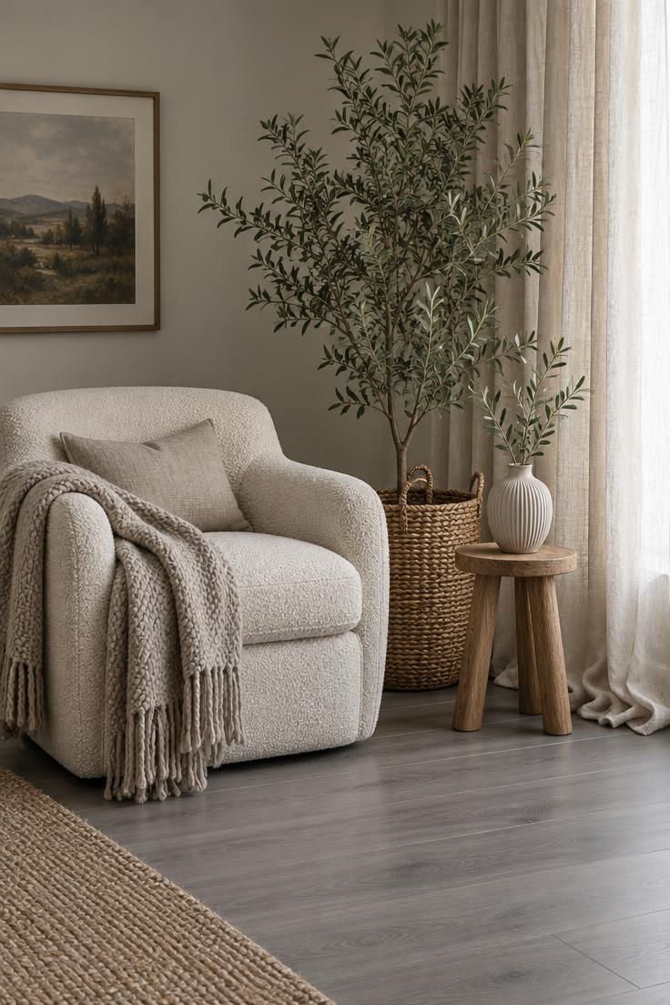
Texture layering on grey floors takes many forms: linen curtains, bouclé and chenille upholstery, velvet cushions, chunky wool throws, leather, jute, sisal, woven baskets, ceramic pottery, quilted and knitted textiles, and stone with beige or cream veining.
Floor-length curtains in ivory, flax, oatmeal, or warm taupe deserve particular attention.
They break up the vertical surfaces that otherwise repeat the cool tone, and their length connects wall to floor in a way that shorter panels cannot.
Plants supply living texture at a scale that objects cannot match.
Olive, rubber plant, fiddle-leaf fig, and palm all carry generous foliage, and a woven basket around the pot adds a second material in the same gesture.
Layer a few textures of different weights rather than many of the same.
A smooth leather chair beside a ribbed ceramic vase and a nubby wool throw reads richer than a room of soft textiles alone, and matte finishes tend to sit more comfortably against grey than high-gloss ones.
Design Pro-Tip: Pair one texture per gesture. A ribbed vase next to a smooth chair, or a woven basket beside a polished wood table, creates contrast without clutter.
Avoid the Common Pitfalls That Undo the Warmth
An all-grey scheme is the most common version of the problem: grey walls, grey sofa, grey curtains, grey floor.
With every surface sharing a temperature, nothing provides the contrast the room needs to feel finished.
Warm one layer, usually the walls or the largest upholstered piece, and the room changes immediately.
Icy white, blue-white, and stark cool grey paint repeat the same mistake in a lighter key.
Warm white, cream, or greige gives the same brightness with an undertone that cooperates.
Chrome everywhere keeps the room cool even when the furniture is warm.
Swap at least one metal finish, a lamp or a faucet or a frame, to brass or bronze.
Very orange wood against a blue-grey floor is a mismatch rather than a warming.
Medium oak, walnut, or ash carries warmth without the red-orange clash.
Small rugs leave most of the cool floor exposed and divide the room.
One large rug under the main furniture does more than three small ones scattered around.
Mixing many wood tones without a unifying thread reads as accidental rather than layered.
Pick the shared undertone first, then add only pieces that belong to it.
Painting before sampling is the mistake that costs the most, because wall colour is the hardest thing to change once the furniture has arrived.
Test on the floor, in daylight and evening light, before committing.
Design Pro-Tip: Keep any grey accessory under a tenth of the visible surfaces. A single grey pillow or frame repeats the floor without letting it take over.
Know the Limits: What Surrounds the Floor Cannot Change
Everything described here changes the surroundings, not the floor.
The planks stay grey.
That distinction matters most in hallways, open-plan spans, and large rooms where the exposed floor is wide, because rugs and furniture cover proportionally less of the total surface.
A large rug for grey flooring does more work in a contained room than in a long open plan.
In a big space, plan for more than one anchoring zone rather than one enormous rug, and give each zone its own warm furniture group.
Rug upkeep belongs in the budget alongside the purchase.
Wool, jute, and sisal need regular vacuuming and periodic cleaning depending on the fibre, and a non-slip pad underneath keeps the rug in place and protects the floor surface.
Refinishing raises a question of floor type.
Real wood floors may accept a warmer clear coat or a natural-oak or brown stain at some future point, while vinyl, laminate, and tile generally do not offer that route.
For those floors, rugs, furniture, paint, lighting, and accessories are the available levers, and together they change a wide area.
Design Pro-Tip: Rotate rug positions once or twice a year. Wear and light exposure distribute more evenly across the surface and the colour stays consistent.
Distinguish Visual Warmth From Underfoot Warmth
Visual warmth and physical warmth are two different problems, and this article addresses the first.
A room can read as hospitable while the floor stays exactly as cold to the touch as it was before.
Underfoot warmth responds to other measures.
Rugs with a quality pad, attention to drafts around exterior doors and windows, and the question of what sits below the room all play a part, and none of them changes how the floor looks.
Naturally, radiant heating sits well outside styling advice.
Product suitability varies, and the flooring manufacturer's requirements govern what can be installed beneath a specific floor.
Check that documentation directly rather than treating a decorating decision as a heating decision.
The useful takeaway is that perception and temperature are separate, and styling can improve one without touching the other.
Layering rugs and warm light produces a room that feels more welcoming at the same thermostat setting.
Design Pro-Tip: Combine layered rugs with warm bulbs in every corner lamp. The two together shift how the room reads more than either one alone.
Conclusion
Grey floors are a workable neutral, and the goal is balance rather than replacement.
Start with the undertone, because every later decision depends on whether the planks lean blue, green, taupe, or charcoal.
From there, four moves carry most of the weight: a large warm rug, one solid wood piece in a coordinating tone, warm bulbs in layered fixtures, and a warm neutral wall colour that avoids both icy white and strong yellow.
Add earthy accents two or three at a time, repeat them across the room, and let texture handle the rest.
Keep in mind what the approach cannot do, particularly in open spaces where the exposed floor dominates, and treat rug upkeep and pad cost as part of the decision.
The first thing to try is the cheapest and the most informative: put paint, fabric, and wood samples on the floor, look at them in daylight and again at night, and let the floor tell you which warm direction it will accept.
Order the rug after that.