This post may contain affiliate links. If you make a purchase through these links, we may earn a commission at no additional cost to you.
Most advice about sage green stops at cream and beige, as if the color's only job were to keep things quiet.
That framing undersells it.
Sage is muted enough to absorb a genuinely bold companion, whether burgundy, chocolate, terracotta, or mustard, without the room turning loud.
The colors that go with sage green matter less for their own sake than for where they sit on that spectrum.
The Shift Away From Sage as a Safe Neutral
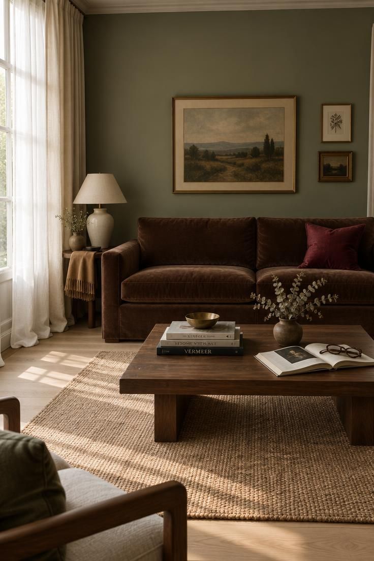
Trend reporting has begun treating sage as a supporting color rather than the main event, with chocolate brown named as central to that change.
The older formula of sage, cream, and gray produced rooms that were pleasant but easy to forget.
The newer direction pairs sage with deeper, warmer colors that carry the visual weight sage lacks.
This is not a rejection of the calm palette.
It is a correction to it.
Sage's low saturation and gray undertone mean it recedes rather than competes, which is exactly why it works beside stronger colors.
Used alone, it has nothing to recede from.
Understanding why requires looking at saturation rather than color family.
Sage contains enough gray to read as restrained, but enough green to register as intentional.
That combination makes it forgiving as a base and weak as a focal point.
Most strong sage palettes solve this by pairing the green with something warmer, such as cream, camel, terracotta, or brass, or something darker, such as charcoal, navy, black, or walnut.
The accent colors do most of the emotional work.
The remaining question is which accent, and the answer depends less on taste than on the sage's undertone.
Design Pro-Tip: Before choosing any accent, hold your sage sample next to a warm cream and a cool white. Whichever one makes the sage look cleaner and more deliberate is pointing you toward its undertone, and toward the half of the palette that will work.
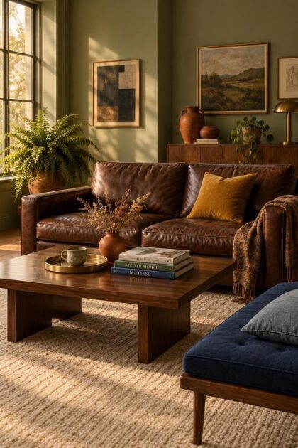
Building a sage green color palette around a warmer brown gives the softer tone a grounded partner instead of leaving it to carry the room alone.
Warm Neutrals: Reliable, and Easy to Overshoot
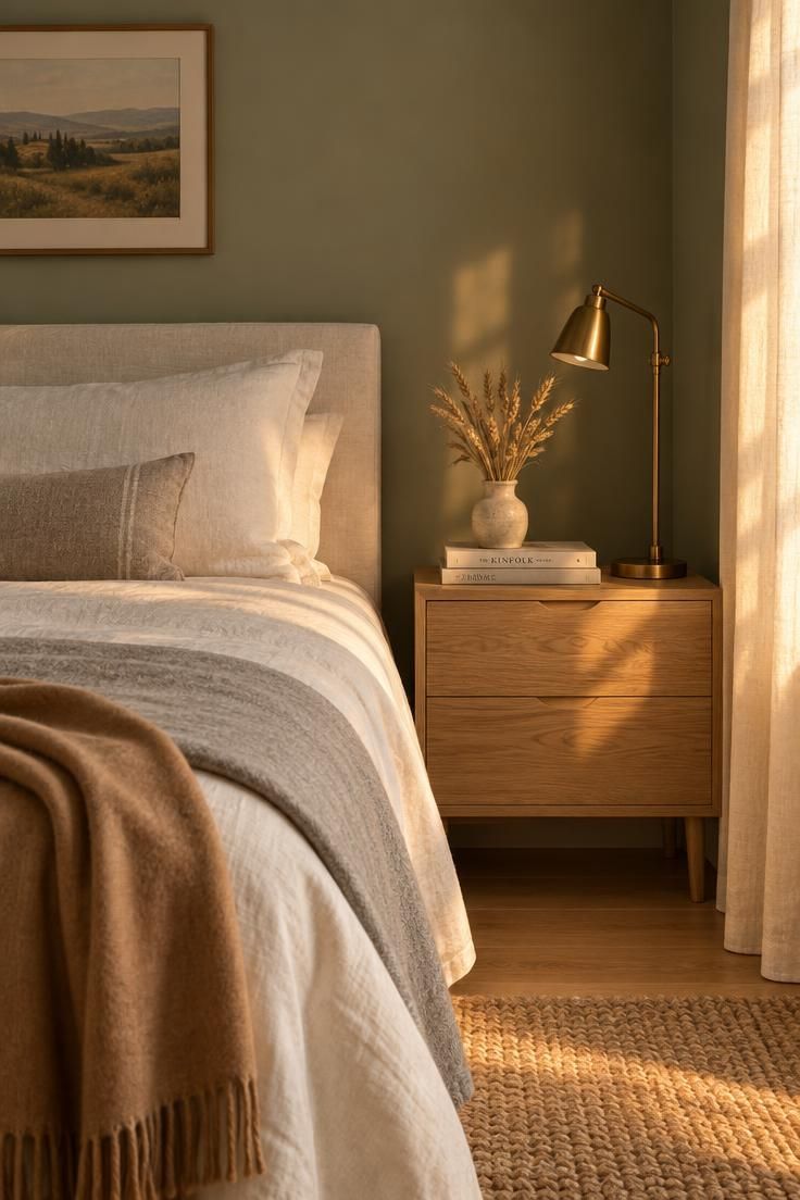
Ivory and warm white keep sage from turning cool or clinical, and they read as softer and more organic than bright white.
The distinction is worth preserving: ivory makes sage feel warmer, while bright white produces a fresher, more contemporary effect.
Neither is better, but they point in different directions.
Cream and beige add warmth and give sage an earthy feel, which suits traditional, farmhouse, Scandinavian, and relaxed interiors.
Cream paired with camel is soft and elevated, with a natural quality that reads as considered rather than styled.
The failure mode here is specific and common.
Sage plus gray plus beige, with nothing darker or warmer anywhere in the scheme, tends to go limp.
Too many pale neutrals together produce a washed-out result rather than a serene one.
The room does not look calm.
It looks unfinished.
The fix is rarely a new color family.
It is usually one darker element, such as a walnut table, a charcoal frame, or a black lamp, or one warmer element, such as a camel throw or an aged brass fixture.
A single anchor prevents the whole palette from flattening.
Warm neutrals are the safest foundation for sage, which is also their limitation.
A room built entirely from sage, ivory, and cream will be pleasant and forgettable.
If the goal is a room with personality, the warm neutrals should be the base layer, not the whole scheme.
Treat this family as the floor of the palette rather than the ceiling.
Warm Earth Tones: The Most Consistently Recommended Direction
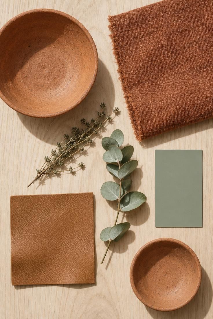
Warm orange-based tones contrast with sage's cool gray-green quality, and the result reads as earthy and balanced rather than harsh.
Terracotta, rust, burnt orange, and clay are frequently recommended for exactly this reason: they bring energy to a muted green without shouting.
Sage combined with terracotta and cream is one of the most consistently recommended combinations across the research.
It is natural and welcoming, and it works at almost any scale, from a full wall palette to a few objects on a shelf.
The family extends into wood and leather, which is where it becomes practical rather than theoretical.
Oak, walnut, rattan, tan leather, and terracotta all ground sage and add visual weight.
The choice within that group changes the room's character: dark walnut produces a more formal result, while pale oak feels lighter and more modern.
Terracotta and clay work particularly well in pottery, textiles, and kitchens, and in Mediterranean-inspired spaces where the combination has a long visual history rather than a trend lifecycle.
Camel and tan sit at the softer end of the same family.
They warm sage without introducing a strong hue shift, which makes them useful when the room already contains a lot of pattern or texture.
The tradeoff is intensity.
Terracotta at full saturation across large surfaces can overwhelm a quiet sage, which is why the research consistently places it in the accent role rather than the field role.
Cushions, ceramics, a single upholstered piece, or a rug carry the warmth without taking over.
Wood is the exception.
Because it reads as a natural material rather than a color choice, it can occupy much more area than a saturated paint or fabric without the same risk.
The most reliable version of this palette uses three temperatures: sage as the cool base, cream or ivory as the warm neutral, and one terracotta or camel element as the warm accent.
Each has a distinct job.
If the room still feels flat after adding terracotta, the missing element is usually contrast in value rather than another hue.
Design Pro-Tip: When adding terracotta to a sage room, vary the finish as well as the color. Matte clay, glazed ceramic, and woven natural fiber in the same warm family give the palette depth that a single flat tone cannot.
Sage green color combinations with warm earth tones tend to read as natural and welcoming at almost any scale.
Deep Browns: The Current Direction
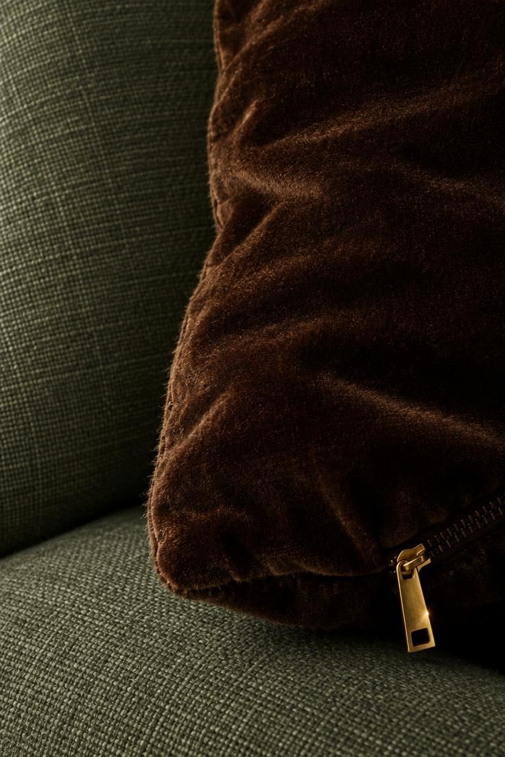
Chocolate brown is central to the shift away from sage as a pale safe neutral.
The combination of sage, chocolate brown, and ivory is described as a strong current palette: warm, grounded, and more sophisticated than sage with gray.
Dark browns add the weight sage lacks on its own, which is precisely what prevents the washed-out problem described earlier.
Where cream lightens and terracotta warms, brown anchors.
This is a meaningful update to older sage advice, which tended to stop at cream and beige.
The newer direction treats sage as a supporting color rather than the main event, and brown as the element that carries the room.
The range within brown matters.
A warm mid-brown reads as relaxed and organic.
A deep chocolate reads as formal and deliberate.
Both work with sage, but they produce different rooms, and mixing them without intent tends to look accidental.
Brown also solves a problem that darker neutrals like charcoal can create.
Charcoal introduces a cool, architectural contrast that can make sage look sharper than intended.
Brown keeps the palette in the same warm-to-neutral register as the green, so the contrast is quieter even when the value difference is large.
The risk with this direction is heaviness.
A room with sage walls, a brown sofa, brown wood, and brown textiles has no relief.
The research pairs brown with ivory alongside sage for exactly this reason.
The ivory gives the eye somewhere to rest.
Used with that balance, brown is the most efficient way to give a sage room gravity without introducing a second strong hue.
The pairing of sage green and chocolate brown reads grounded and warm, while sage green and terracotta brings a livelier, sunbaked counterpoint that keeps the darker scheme from turning flat.
Deep Reds: Burgundy, Oxblood, Wine, Plum
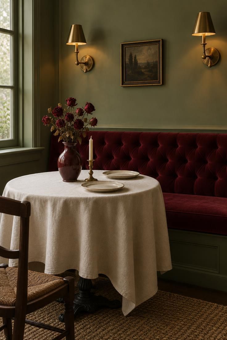
Deep reds give sage drama and sophistication, and trend coverage identifies burgundy and oxblood as a fashion-forward direction reflecting broader interest in deep reds and dramatic earthy tones.
The distinction between bright red and deep red is the whole point of this section.
Bright red can look seasonal or overly dramatic against sage.
Burgundy, oxblood, wine, and brick read as intentional rather than themed.
The hue family is the same.
The value and saturation are not.
Burgundy works best in small amounts: cushions, artwork, curtains, flowers, accessories.
The research is consistent on this.
It is an accent color in the literal sense, not a field color, and its impact comes partly from its scarcity in the scheme.
Sage combined with burgundy and antique brass is described as richer and moodier.
The brass matters here.
It keeps the deep red from reading as heavy or autumnal by adding a warm reflective element at a much smaller scale.
Plum and mauve sit in the same family with a softer effect.
They share the red-violet direction but at lower saturation, which makes them easier to use across larger surfaces if the burgundy version feels too strong.
If a vivid red accent is genuinely wanted, the research suggests treating it as a deliberate, non-seasonal contrast rather than a default pairing.
That means keeping the surrounding palette free of other holiday-adjacent cues and letting the red be the only strong note.
For a room that needs personality without risk, burgundy in a single textile, such as a throw, a pair of curtains, or one upholstered chair, is the lowest-commitment way to test the direction.
Design Pro-Tip: Test a burgundy accent against your sage in daylight and again at night. Deep reds shift more than most colors between the two, and a shade that reads rich by day can read brown or black after dark.
Blues: Navy, Denim, and Soft Blue
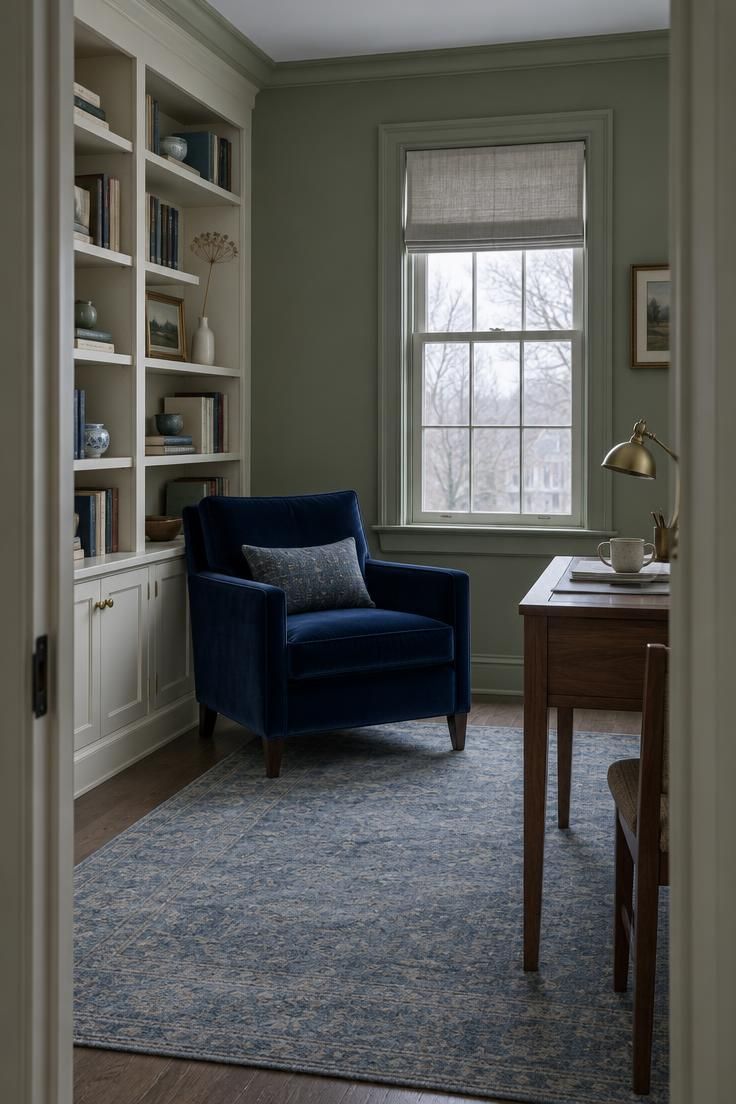
Navy adds structure and contrast while keeping a palette restrained, which makes it one of the most versatile sage companions.
It works across interiors, clothing, branding, and kitchens without modification.
Sage with navy and warm white is clean and classic.
The warm white is doing specific work here.
Navy and sage are both relatively muted and relatively cool, so the cream supplies the warmth the pairing otherwise lacks.
Soft and dusty blues produce a fresher, more tranquil, nature-inspired result.
Denim blue is casual and easy, especially for clothing, and behaves more like a neutral than the other blues in this group.
The risk in this family is specific: cool blue-gray combined with cool sage can make a space feel cold.
Two cool, muted colors together leave the palette without a warm anchor, and the room reads as flat rather than crisp.
The fix is not to abandon blue but to bring warmth from somewhere else in the scheme, such as a wood floor, a camel textile, a brass fixture, or a warm white wall.
The blue and sage can stay.
The third element changes the result.
This is where undertone matching becomes practical rather than theoretical.
Blue-gray sage pairs best with white, navy, charcoal, pale blue, and cool stone.
Yellow-gray sage pairs best with cream, tan, terracotta, camel, and warm wood.
Matching the sage's undertone to the accent's temperature is the difference between a cohesive palette and a muddled one.
A yellow-gray sage paired with navy will still work, but it will need more warm material in the room to hold together than a blue-gray sage would.
Pink, Blush, and the Muted Pastels
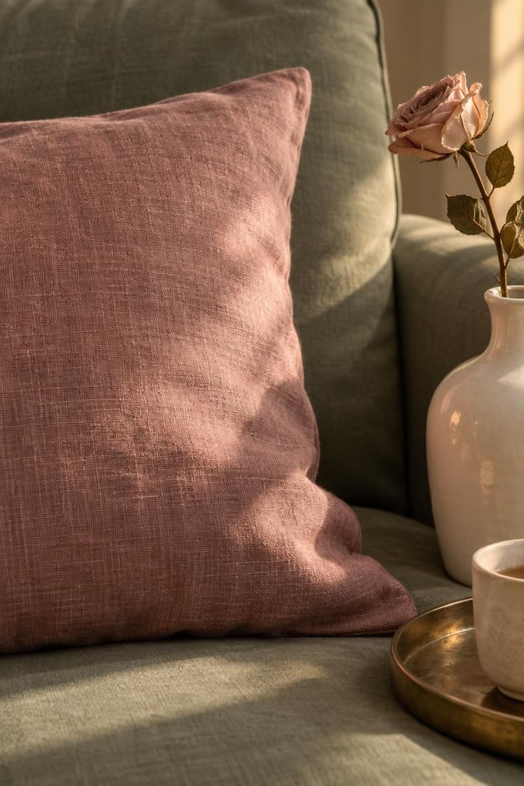
Muted pink provides gentle complementary contrast to sage.
Dusty rose or blush softens the palette and reads as modern when kept muted rather than saturated.
Sage with blush and warm white is soft and refined, and the combination works well for bedrooms, floral design, packaging, and clothing.
It is one of the few pairings in this list that reads as delicate without becoming sweet.
The main constraint is saturation.
Neon or highly saturated pink undercuts the effect entirely, because it introduces a brightness that sage cannot answer.
Kept muted, pink sits comfortably beside sage.
Pushed brighter, it overwhelms it.
Dusty lavender sits adjacent to this family as a muted, unexpected complementary pairing.
It shares the low-saturation logic and works with the same warm white base.
This group carries the most risk and the most reward in the palette.
It is also the least common, which means a sage-and-blush room will read as a deliberate choice rather than a default one.
For anyone unsure, a single blush element, such as a cushion, a lampshade, or a piece of framed art, tests the direction at low cost and can be removed without repainting anything.
Yellows: Mustard, Ochre, and Butter
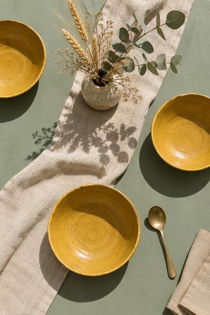
Warm yellows add energy and visual interest to sage without overwhelming its muted character.
This is a vintage-inspired direction rather than a contemporary one, and it reads that way.
Mustard and ochre are warm and energetic with a vintage feel that suits kitchens, dining areas, and textile-heavy rooms.
Butter yellow is a lighter, more cheerful accent that carries less weight and works at smaller scales.
Sage combined with ochre and natural beige is a balanced warm scheme.
The beige does the same work the warm white does in other palettes.
It keeps the two more saturated colors from competing directly.
Yellows and sage share a warm undertone in many versions, which makes the pairing feel related rather than contrasted.
That is an advantage in rooms where the goal is cohesion rather than contrast.
The limitation is range.
Ochre and mustard are strong enough that a little goes a long way, and they can shift a room toward a specific era quickly.
If the rest of the space is contemporary, the yellow becomes the element the eye reads first.
As with the other warm accents, the practical move is to test at small scale before committing to a surface.
Design Pro-Tip: If a mustard accent feels too strong against your sage, try the same hue one or two steps lighter rather than switching color families. Ochre and butter yellow sit on the same line and change the intensity without changing the direction.
Dark Neutrals: Charcoal, Black, and Metallics
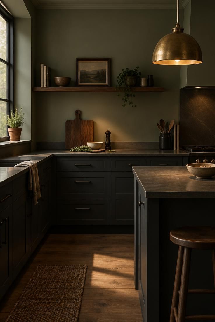
Charcoal creates a contemporary, architectural effect and is particularly useful for offices, kitchens, and menswear.
It is the coolest and sharpest of the dark neutrals used with sage, and the contrast it produces is deliberate and graphic.
Black sharpens sage and prevents it from appearing washed out, but the research suggests using it in small doses rather than on large surfaces.
Cabinet hardware, light fixtures, window frames, furniture legs, and typography are the natural places for it.
This is a meaningful distinction.
Black as a field color and black as an accent produce entirely different rooms, and the accent version is the one that works reliably with sage.
A full black wall beside sage is a different design conversation than black hardware on a sage cabinet.
Charcoal sits between the two.
It can occupy more surface than black without the same severity, and it carries the architectural quality that makes it useful in kitchens and workspaces.
Metallics deserve separate treatment because they function differently from paint.
Aged brass or warm gold can lift a sage palette while keeping it soft, which is why brass recurs in recommended combinations alongside burgundy and cream.
The warmth of the metal matters.
Aged brass and antique gold add warmth and polish without overpowering sage's softness.
Cooler metals produce a sharper, more clinical result that pairs better with the cool-half palettes described earlier.
The decision criterion is straightforward: if the sage leans cool, cool metals and charcoal keep the palette coherent.
If it leans warm, brass and warm gold do the same work in the other direction.
Layering Greens Without Collapsing Into Mud
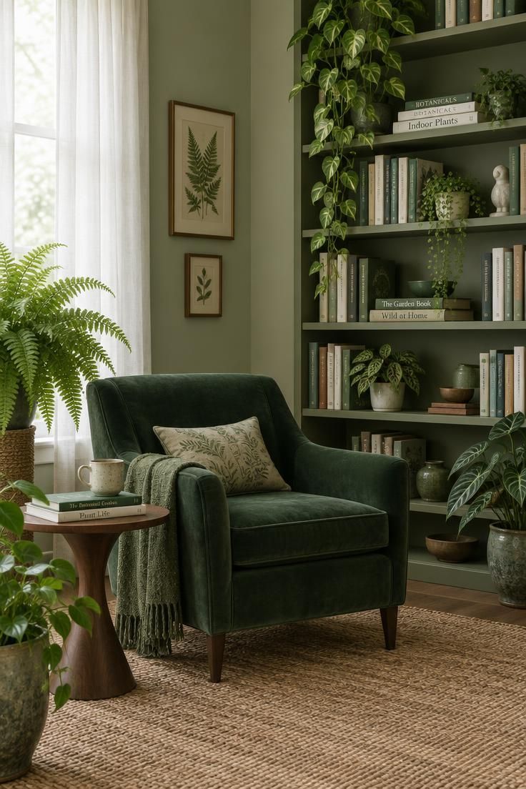
Sage can be combined with other greens rather than treated as the only green in the scheme.
Pale sage, olive, and forest green together create a botanical, tonal effect that reads as intentional rather than accidental.
The recommendation here is to vary lightness and texture so the greens do not blend into one indistinct mass.
A tonal green scheme needs contrast in value, not just in hue, or it collapses into a single muddy field.
Typically that means the greens should differ by at least one clear step in lightness, such as a pale sage wall with an olive cabinet and a forest green chair, rather than three mid-tone greens at similar values.
Texture carries additional weight in this palette because the color variation is narrow.
Woven, matte, and reflective surfaces in the same green family keep the eye moving where hue alone would not.
The advantage of a layered green scheme is coherence.
Where terracotta or burgundy introduces a second color conversation, greens keep the palette within one family, which is useful in rooms where other elements are already visually busy.
The disadvantage is that it offers less of the punch that makes a room memorable.
Layered greens read as calm and considered.
They rarely read as bold.
Undertone Matching as the Actual Decision Rule
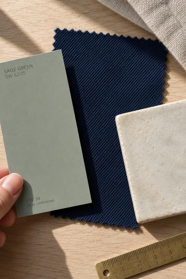
The single most useful practical framework in the research is undertone matching.
It replaces the question of which accent color you like with which accent color belongs with this specific sage.
Blue-gray sage pairs best with white, navy, charcoal, pale blue, and cool stone.
Yellow-gray sage pairs best with cream, tan, terracotta, camel, and warm wood.
Both sets are correct.
They are answers to different versions of the same question.
Because there is no universal standard for sage green, the same accent color can look harmonious against one sage and discordant against another.
Common digital approximations range from soft sage through classic sage to muted and deep sage, and some versions lean cool while others lean warm.
This variation is not a technicality.
It determines the pairing.
Dark sage needs enough light or contrast to avoid looking muddy.
In a low-light room, a deep sage with dark accents can collapse into a single dark field, which is why the research pairs deeper sages with lighter or warmer elements.
Very pale sage can disappear beside gray or beige.
It needs darker wood, black, or a saturated accent to hold its own.
This is the opposite problem from dark sage and it requires the opposite solution.
The research also notes that paint and fabric should be tested in the actual space, because natural and artificial light can shift sage noticeably, particularly in north-facing rooms.
This is a practical caution about testing color in context rather than a claim about how light affects perception.
Testing means painting a reasonable-size sample on more than one wall, viewing it at different times of day, and checking it against the fixed elements that will not change, such as flooring, cabinetry, and large furniture.
Undertone matching narrows the field.
Testing confirms the choice.
Design Pro-Tip: Compare your sage sample against your fixed finishes before you look at any accent colors. The accents that work are determined by the sage-plus-floor-plus-cabinetry combination, not by the sage chip on its own.
Bold accent colors for sage green work when they share the sage's underlying temperature rather than fighting it.
A blue-gray sage handles a saturated pairing exceptionally well, which is why sage green and navy blue sits among the most dependable combinations a room can carry.
Proportions That Prevent Both Failure Modes
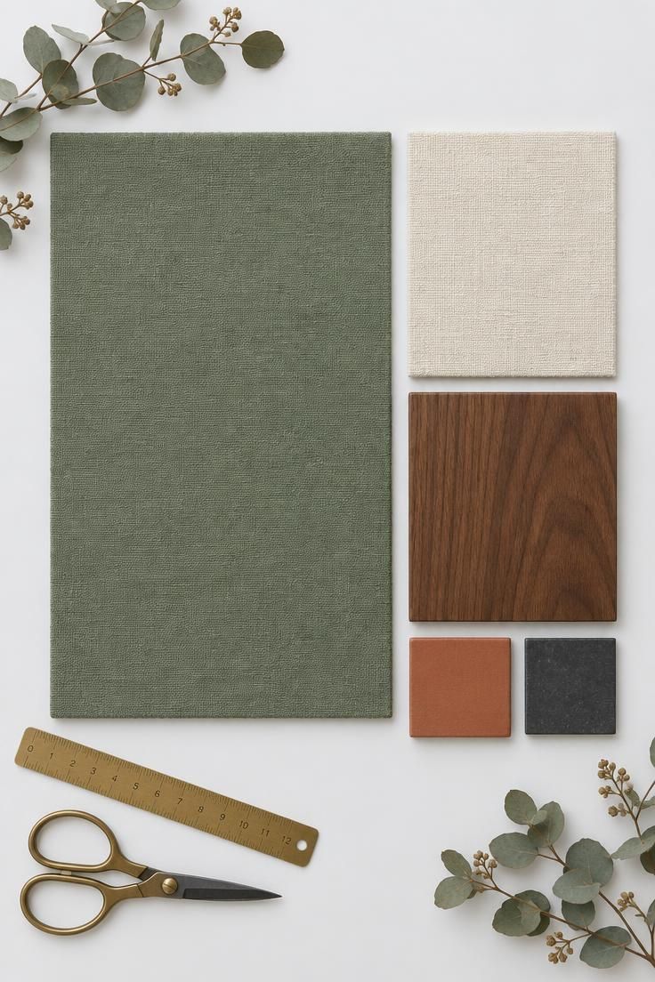
The research offers a 60/30/10 starting point rather than a strict rule.
Sixty percent sage or a neutral wall color, thirty percent cream, beige, wood, or gray furniture, and ten percent a stronger accent such as rust, navy, burgundy, black, or mustard.
A more trend-specific version of the same idea reverses the roles: sixty percent warm ivory or cream, twenty-five percent sage green, ten percent chocolate brown, and five percent burgundy or brass.
In this version sage is no longer the field color.
Both versions work, and choosing between them is itself a design decision.
The first treats sage as the room's dominant surface.
The second treats it as one note among several, which is closer to the current direction described in the trend coverage.
The value of the formula is that it prevents the two most common errors: too much sage, which produces a flat room, and too many competing accents, which produces a chaotic one.
The ten or fifteen percent allocated to the strong accent is smaller than most people expect.
This is deliberate.
Burgundy, mustard, and terracotta read as more present than their surface area suggests, especially against a muted base.
Proportion also interacts with the size of the room.
A small room makes each element more visible relative to the whole, so the accent percentage should be judged by what the eye reads, not by strict measurement.
The formula is a starting point for planning rather than a rule to enforce after the fact.
Where This Palette Sits Right Now
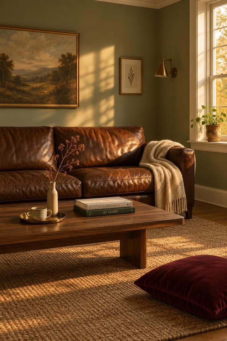
Recent trend reporting points to a shift away from sage as a pale safe neutral and toward sage paired with warmer, deeper, and more expressive colors.
Chocolate brown is central to that shift, and burgundy reflects broader interest in deep reds and dramatic earthy tones.
The timing is not arbitrary.
The pale-neutral version of sage has been widely used for long enough that it now reads as a default rather than a choice, and the deeper pairings offer a way to keep the color while changing what it communicates.
This matters practically for anyone choosing colors now.
A sage room built on cream and gray will read as slightly dated within the current direction, not because it is wrong but because it is the version that has been most thoroughly absorbed into the mainstream.
The colors that go with sage green in this newer reading are the ones that carry weight: brown, burgundy, terracotta, ochre, charcoal, and brass.
Each of them gives sage something to push against.
The older pairings have not stopped working.
Cream, ivory, and natural wood remain the most reliable foundation, and the current direction builds on them rather than replacing them.
What has changed is which element leads.
In the newer palettes, sage supports rather than dominates.
Against that backdrop, the strongest sage green pairing colors lean warm and deep rather than soft, letting the quieter green act as a backdrop instead of the whole story.
Practical Takeaway and Starting Points
Begin with the sage itself.
Identify whether it leans blue-gray or yellow-gray, because that single determination eliminates roughly half the accent options in this article and points toward the other half.
Then check the fixed elements.
Flooring, cabinetry, countertops, and large upholstered pieces constrain the palette more than any paint chip, and they are the elements that will not change when the accent colors do.
Choose one direction from the warm half or the cool half, not both.
Terracotta, camel, chocolate, mustard, and burgundy sit on the warm side.
Navy, dusty blue, charcoal, and black sit on the cool side.
Mixing them without a clear reason produces the muddled result that undertone matching is designed to prevent.
Then choose one anchor and one accent.
A walnut table and a pair of burgundy curtains.
A navy sofa and a black lamp.
A terracotta rug and a brass fixture.
Two elements are usually enough to give a sage room personality.
More than that starts to compete.
Use the proportion formula as a planning tool rather than a constraint.
Roughly sixty percent base, thirty percent secondary, and ten percent accent keeps the room from failing in either direction, and the exact numbers matter less than the ratio between them.
Test the accent at small scale first.
A cushion, a vase, a single framed print, or a throw costs little and can be removed.
Large surfaces such as a wall, a sofa, or curtains should come after the direction has been confirmed in the actual space and under the actual light.
Approach a few combinations with caution.
Too much gray can make sage look dull or institutional.
Bright primary green may clash with sage's muted quality.
Cool blue-gray paired with cool sage can make a room feel cold.
Too many pale neutrals can create a washed-out scheme.
Bright red can look seasonal; burgundy or brick is a better fit for the same impulse.
For a balanced starting palette, the research offers sage, warm white, walnut brown, terracotta, and charcoal together, a scheme that preserves sage's natural calm while adding warmth, contrast, and depth.
Adjust the proportions to shift the mood, but keep all five elements present, because each one is solving a different problem.
Place a swatch of sage green and burgundy side by side before committing, since deep wine reds read warmer next to cooler sage tones and can shift the room's mood from calm to dramatic in an instant.
Sage green and mustard yellow make a livelier pairing, with the golden yellow pulling the muted green toward a brighter, more energetic feel that suits dining nooks and playful corners.
Sage green undertones decide which accents feel intentional and which ones fight the wall color.
Sample the paint on two walls and check it at morning, afternoon, and evening light, since a green that reads gray at noon can turn olive by dusk.
Pull the strongest accent from a color already present in the fixed elements, then repeat it once in a smaller object so the pairing reads as a choice rather than an accident.