This post may contain affiliate links. If you make a purchase through these links, we may earn a commission at no additional cost to you.
The best cottage dining rooms never look like they were ordered from a single catalog page.
They look like years of slow collecting, where a flea market chair sits next to a hand-me-down table and somehow everything belongs.
That lived-in quality comes from layering natural textures, mixing finishes that share a mood rather than a color code, and choosing pieces that feel good under your hands as much as they look right in the room.
These 13 cottage dining room ideas each focus on one specific pairing, material, or arrangement you can recreate at home.
A Bleached Pine Trestle Table With Mismatched Windsor Chairs
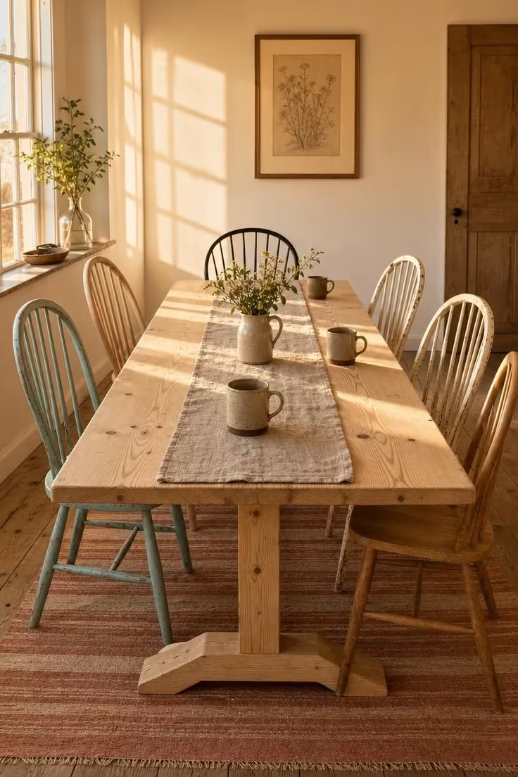
A trestle table in bleached pine does something no round or pedestal table can do for a cottage dining room: it stretches the room’s hospitality.
The long, unbroken surface invites more plates, more elbows, more conversation than a tight four-top ever could.
Pairing it with mismatched Windsor chairs turns what could feel like a catalog setup into something personal, as if each seat arrived from a different chapter of the house’s story.
The trick is keeping the finishes within the same tonal family, letting one painted chair in faded blue sit comfortably beside another in stripped oak because both share a soft, lived-in quality.
This kind of farmhouse dining table arrangement works especially well under a rattan pendant light, where the woven shade echoes the organic curves of the Windsor backs.
When the chairs differ in color but share the same silhouette, the grouping reads as deliberate rather than random.
Style Blueprint:
- Bleached or whitewashed pine trestle table with visible grain
- 4-6 Windsor chairs in at least 3 different finishes
- Oatmeal or flax linen table runner
- One stoneware pitcher with garden clippings
- Flat-weave cotton rug in muted stripes beneath the table
Woven Seagrass Placemats Layered Over a Striped Linen Table Runner
The texture underneath the plate matters more than most people realize in a cottage dining room.
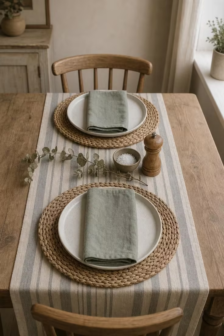
A woven seagrass placemat adds a layer of organic depth that a bare table surface cannot, and when you set it on top of a striped linen table runner, the two textures create a conversation between coarse and soft.
This layered approach gives each place setting its own defined zone without the formality of a full tablecloth.
The linen runner acts as a visual spine running the length of the table, while the round seagrass mats break its straight lines into softer shapes.
Choose a runner with a muted stripe rather than a bold one, so the weave of the seagrass stays visible through the textural contrast.
Linen napkins in a color pulled from the stripe, folded simply and placed on the plate, complete the layering without adding fuss.
The whole arrangement takes about five minutes to set and makes even a Tuesday lunch feel worth sitting down for.
Style Blueprint:
- Round woven seagrass placemats (12-14 inch diameter)
- Striped linen table runner in faded gray, sage, or cream
- Matte speckled ceramic dinner plates
- Linen napkins in a tone pulled from the runner stripe
- One dried botanical sprig for the table center
A Tiered Wooden Cake Stand Holding Dried Wildflower Bundles as a Centerpiece
Most dining room centerpieces in a cottage end up being a single vase of flowers plunked in the middle of the table, and most of them get moved the moment someone needs to pass the bread.
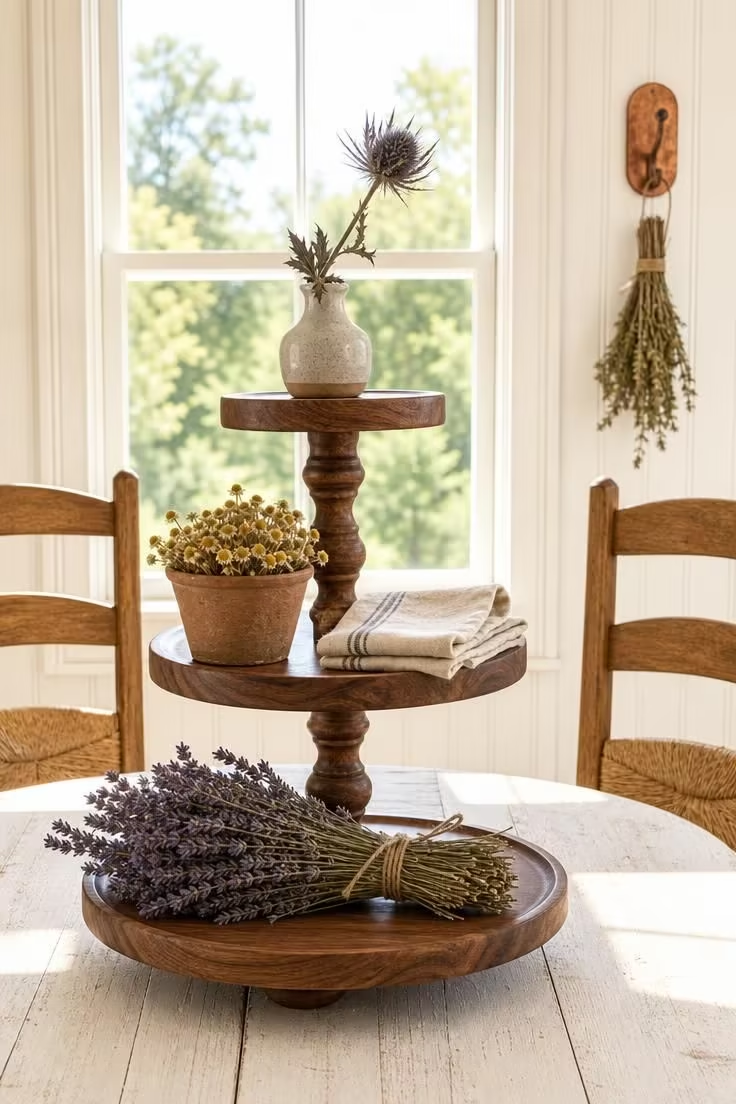
A tiered wooden cake stand solves both problems at once: it lifts the arrangement above plate level so it never blocks sightlines, and its vertical structure gives you three surfaces to style instead of one.
Filling each tier with dried wildflower bundles rather than fresh blooms means the centerpiece holds its shape for months without wilting or shedding petals onto the food.
Dried lavender, chamomile heads, small thistle stems, and pressed herb bundles all carry the kind of quiet color that fits a cottage palette without screaming for attention.
The stand itself should look handmade, with slightly uneven tiers and visible tool marks in the wood, because a factory-perfect version would fight the room’s character.
Position it off-center on the table rather than dead in the middle, so the arrangement feels placed rather than staged.
This is one centerpiece that actually gets better as it ages, as the dried flowers fade into softer tones and the wood develops a patina from handling.
Keeping a small stack of extra dried bundles in a basket nearby makes seasonal swaps simple: dried wheat in fall, dried hydrangea in winter, fresh herbs in summer.
Style Blueprint:
- Three-tiered wooden cake stand in walnut or maple with a handmade finish
- Dried lavender, chamomile, and thistle bundles tied with natural twine
- Small clay or ceramic bud vase for the top tier
- Whitewashed or scrubbed wood dining table as the base surface
- A copper hook or peg rack nearby holding additional dried bundles
Sage Green Board-and-Batten Wainscoting Below a Cream Plaster Upper Wall
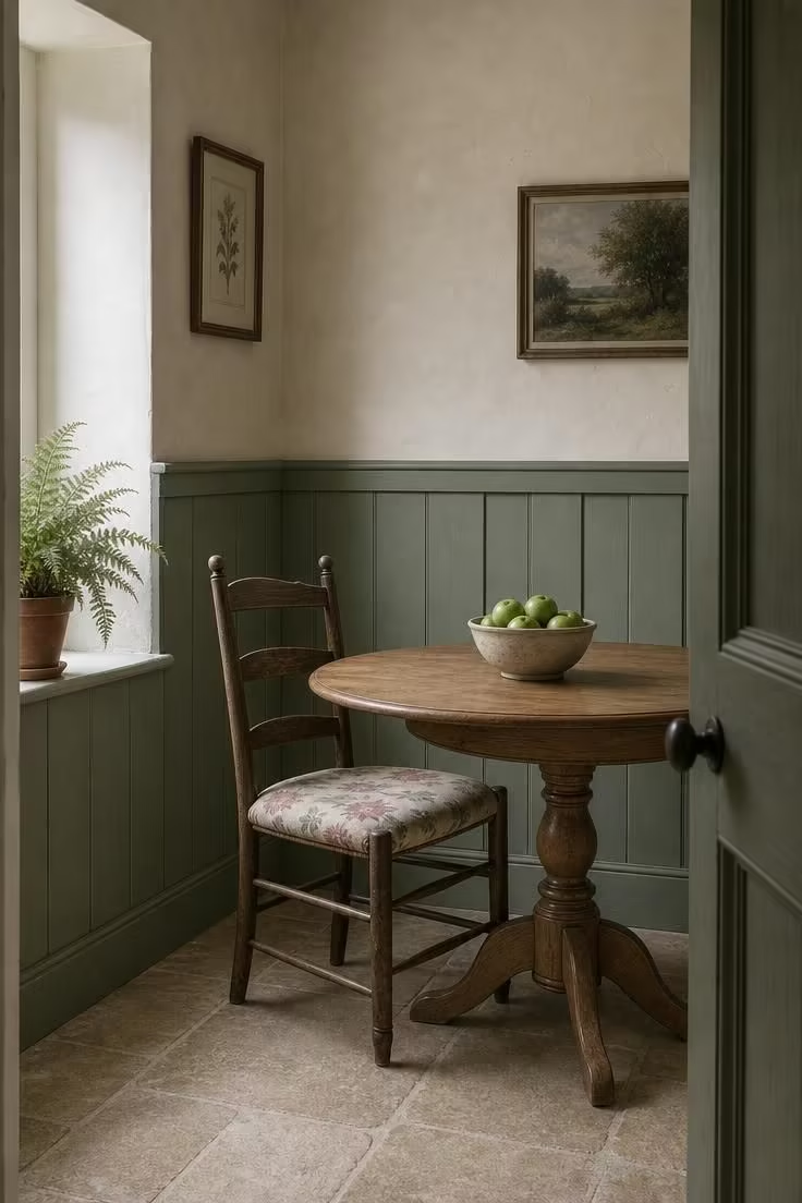
A two-tone wall treatment gives a cottage dining room the kind of architectural weight that paint alone cannot deliver.
Board-and-batten wainscoting in sage green anchors the lower portion of the room, making chairs and table legs feel grounded against a textured backdrop.
The cream plaster above lifts the ceiling visually, and when the plaster has a slight mineral texture from lime or chalk finish, the wall itself becomes a quiet focal point.
Beadboard walls are common in cottage spaces, but board-and-batten reads slightly more structured, which helps a dining room feel intentional rather than just casual.
The sage green works because it sits in the same tonal range as the garden outside the window, connecting the room to the landscape without competing with table settings or food colors.
Keeping the chair rail at standard height (about 32 inches) ensures the color break lands just below most seated sightlines, so diners see cream and sage in roughly equal measure.
Style Blueprint:
- Board-and-batten wainscoting painted in muted sage green (chalky matte finish)
- Cream lime plaster or limewash on the upper wall
- Simple wood chair rail separating the two finishes
- Honey oak or pine pedestal table against the wainscoted wall
- Floral seat cushions in tones that reference both the sage and cream
Design Pro-Tip: When painting board-and-batten, apply the color after installation so paint fills the seams between boards. This creates subtle shadow lines that change depth throughout the day and keeps the texture from looking flat under overhead lighting.
A Milk Glass Schoolhouse Pendant Hung Low Over the Table Center
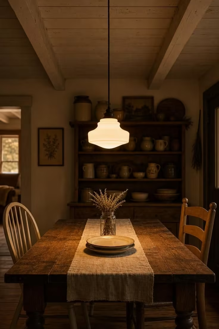
Hanging a light fixture lower than convention suggests changes everything about how a cottage dining room feels after dark.
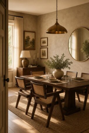
A milk glass schoolhouse pendant, when dropped to about 30 inches above the table, creates a concentrated dome of warm light that makes the dining surface feel like its own world.
The rest of the room falls into gentle shadow, and suddenly the table is not just a piece of furniture in a lit room but the brightest, warmest spot in the house.
Milk glass diffuses the bulb completely, so there is no glare, no hot spot, just a soft pour of light that flatters food and faces alike.
This single pendant approach works better than a multi-arm chandelier in a cottage space because it keeps the ceiling visually open and lets those exposed ceiling beams remain the overhead feature.
The black cloth cord adds a thin vertical line from ceiling to shade that reads as honest and industrial in the best way.
Position the pendant slightly off-center if the table is pushed against a wall, aligning it with the seating zone rather than the table’s geometric middle.
A dimmer switch on this fixture is worth the small expense, because the difference between full brightness and a soft 40% glow is the difference between lunch and a dinner party.
One pendant, one cord, one shade: sometimes the simplest lighting plan is the most generous.
Style Blueprint:
- Milk glass schoolhouse pendant (8-12 inch shade diameter)
- Black cloth-covered cord, adjustable drop length
- Dark oak or walnut farmhouse dining table with turned legs
- Whitewashed or natural plank ceiling overhead
- Dimmer switch for adjustable light levels
A Painted Pine Corner Hutch Displaying Collected Blue-and-White Plates
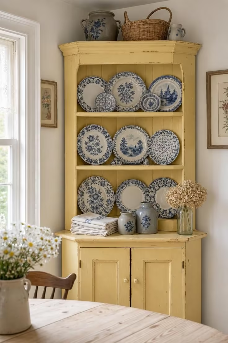
A corner hutch does something for a dining room that no amount of wall art or floating shelves can match: it turns your daily dishes into a display and your display into a story.
Each plate on those shelves represents a different flea market morning, a different vacation town, a different grandmother’s kitchen.
Blue-and-white is the classic combination because those two colors never clash with food, never fight with a table setting, and never go out of circulation in the cottage world.
Painting the hutch itself in a warm color like butter yellow or soft apricot makes the blue-and-white plates pop forward rather than receding into a neutral background.
The key is mixing patterns freely: a floral transferware plate next to a geometric Delft tile next to a pastoral scene, all unified by the blue-and-white palette rather than by matching sets.
Leave one shelf slightly less filled than the others, with a gap where a stack of folded napkins or a small piece of vintage stoneware breaks the rhythm of plates.
This open shelving display approach works because a hutch has depth that a flat wall shelf lacks, allowing you to lean plates against the back and layer smaller pieces in front.
Style Blueprint:
- Painted pine corner hutch in butter yellow or soft apricot
- 8-12 collected blue-and-white plates in mixed patterns
- Folded linen napkins stacked on a lower shelf
- 2-3 pieces of vintage stoneware in complementary blue-gray tones
- One dried hydrangea stem or botanical in a clear glass vessel
Cotton Ticking Stripe Slipcovers on Parsons Dining Chairs
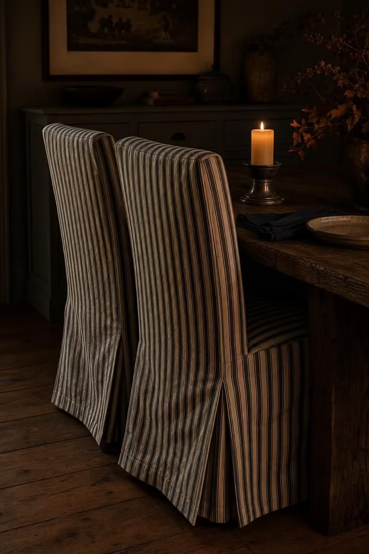
Parsons chairs have clean, boxy lines that belong more to a modern apartment than a cottage, which is exactly why they work so well here once you add a slipcover.
Cotton ticking stripe fabric turns a generic chair into something with personality, and the navy-and-cream combination reads as both classic and slightly nautical without tipping into a theme.
The slipcover should fit with enough ease to show a few soft wrinkles when someone sits down, because an overly fitted cover looks corporate rather than cottage.
A box-pleat skirt reaching the floor hides the chair legs entirely, which gives the seating a grounded, heavy feeling that counterbalances a lightweight dining table.
Ticking stripe is one of the most durable upholstery cottons available, and it launders beautifully, which matters in a room where red wine and pasta sauce are part of the scenery.
Ordering two sets of slipcovers, one in navy stripe and one in a seasonal alternative like faded red or sage, lets you rotate the room’s mood without buying new furniture.
The fabric’s vertical lines also add a subtle sense of height to each chair, making the seating feel sturdier than a flat-weave or solid cover would.
These slipcovers work best when not every chair matches: four ticking stripe seats mixed with two painted wood chairs or a bench keeps the room from feeling uniform.
Style Blueprint:
- Parsons dining chairs (any base finish)
- Fitted cotton ticking stripe slipcovers in navy and cream
- Box-pleat skirt reaching to the floor
- Dark reclaimed elm or oak dining table
- Pewter or tin pillar candle holders for the table
A Row of Terracotta Pots Lining a Windowsill Behind the Dining Table
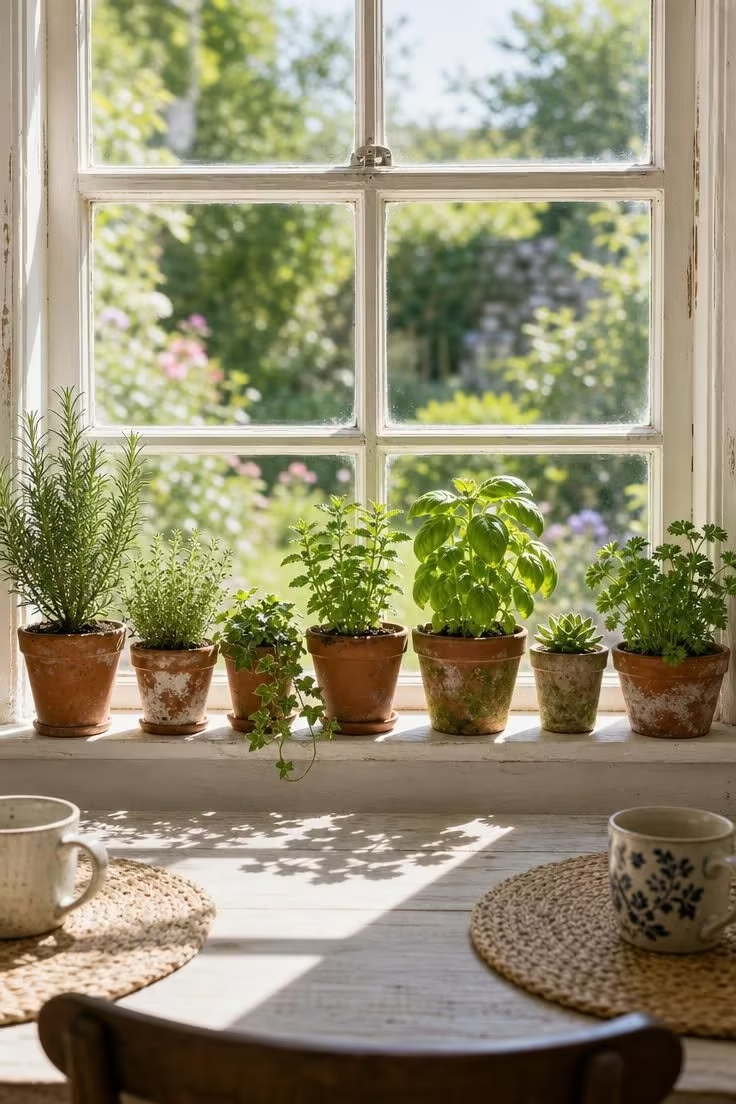
A windowsill behind the dining table is wasted space in most homes, but in a cottage dining room it becomes the room’s connection to the garden outside.
Lining it with a row of small terracotta pots, each holding a different herb or trailing green, turns the window into a living backdrop that changes with the seasons.
The pots should be genuinely mismatched, collected over time rather than bought as a set, because the variation in size, shape, and patina is what makes the arrangement feel real.
Herbs like rosemary, thyme, and basil do double duty here: they soften the window visually and they are within arm’s reach of the table when someone needs a sprig for a dish.
When midday light hits the pots from behind, it backlights the leaves and makes even a small kitchen herb look lush and luminous.
Terracotta absorbs moisture and develops white mineral deposits over time, and those marks of age make each pot look more at home in a cottage setting than a clean glazed planter ever could.
Style Blueprint:
- 5-7 small mismatched terracotta pots in varying sizes
- Mixed herbs: rosemary, thyme, basil, mint, parsley
- One trailing plant like ivy or string of pearls for cascading texture
- Deep windowsill (at least 6 inches) behind the dining table
- No saucers, let the pots sit directly on the sill for a casual look
Design Pro-Tip: Water windowsill herbs from the bottom by placing a shallow tray beneath the pots and adding water to the tray rather than pouring from above. This prevents soil splashing onto the sill and keeps the roots growing downward, which produces stronger, healthier plants that look fuller on the dining table backdrop.
Wide-Plank White Oak Floors With a Faded Kilim Runner Beneath the Table
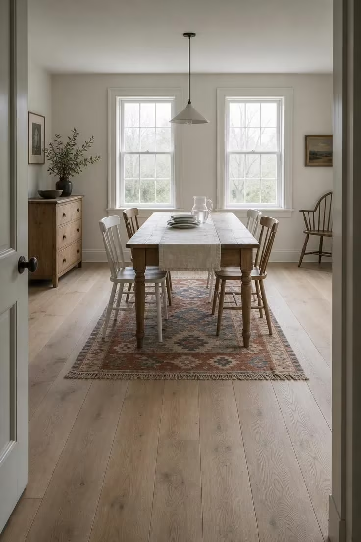
The floor in a cottage dining room sets the tone for everything above it, and wide-plank white oak in a matte natural finish is one of the quietest, most forgiving foundations you can choose.
Each plank’s grain variation and slight color difference tells the eye that this is real wood, not a printed surface, and that difference registers even when you are focused on the table above.
Laying a faded kilim runner beneath the table adds warmth and pattern without the bulk of a full area rug, and the kilim’s flat weave means chair legs slide on and off it without catching.
The runner should be faded rather than new, because a bright kilim will compete with the table setting, while a softened one integrates into the room’s palette like a piece that has always been there.
Terra cotta, dusty blue, and cream are a reliable kilim color combination for cottage spaces because they reference both earth and sky without pushing toward any single decorating style.
Leave 18-24 inches of bare floor visible between the runner’s edge and the wall so the oak planks frame the rug rather than disappearing beneath it.
This floor-and-rug pairing is practical too: the kilim catches crumbs and spills beneath the table while the oak remains easy to sweep in the open areas of the room.
Style Blueprint:
- Wide-plank white oak flooring (7+ inch planks) in matte natural finish
- Faded kilim runner in terra cotta, dusty blue, and cream (approximately 3×8 feet)
- Scrubbed pine or light oak dining table
- Mix of painted and natural wood chairs
- No rug pad needed for flat-weave kilims on hardwood
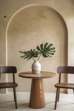
An Iron Candle Chandelier With Beeswax Tapers Over a Round Oak Table
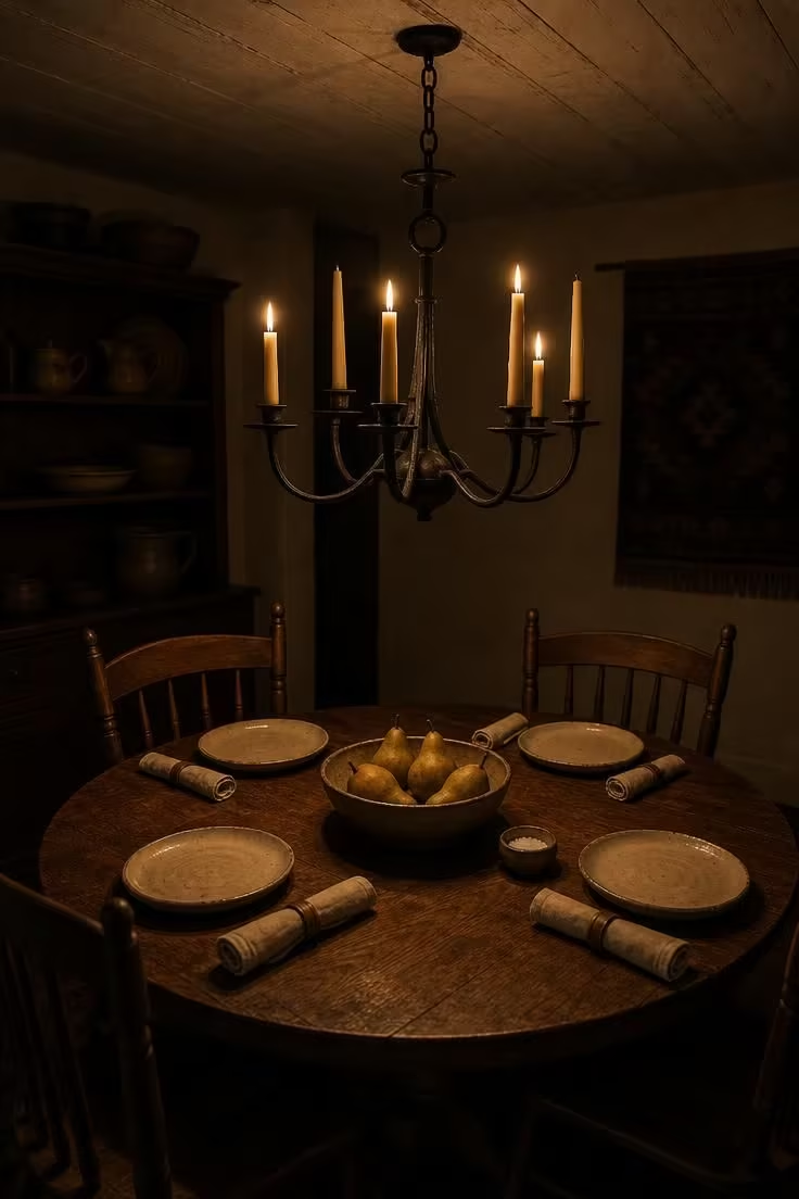
A round table changes the social physics of the dining space, putting everyone at equal distance from the center and eliminating the head-of-table hierarchy that a rectangular surface creates.
Hanging an iron candle chandelier above it, with real beeswax tapers rather than electric bulbs, pushes the mood toward something older and slower.
Beeswax tapers burn with a warm amber tone that is distinctly different from paraffin, and they release a faint honey scent that no electric fixture can replicate.
The chandelier itself should look hand-forged, with visible hammer marks and slight asymmetry in the arms, because a perfectly machined iron ring would feel too manufactured for this setting.
When the tapers are lit and the overhead lights are off, the room contracts around the table, and the conversation changes, getting quieter, more personal, more present.
A round oak pedestal table in a 48-inch diameter seats four comfortably without cramming, and the single pedestal base means no table legs interfere with anyone’s knees or the chairs’ positions.
The vintage stoneware and handmade ceramic plates in this setting matter because factory-perfect dinnerware reflects candlelight as a hard glare, while the uneven surfaces of handmade pieces absorb and scatter the light softly.
Keep a box of spare beeswax tapers in the hutch so you never find yourself reaching for a paraffin substitute on a night when the light matters.
This is the kind of fixture that makes Tuesday dinners feel like occasions without any extra effort beyond striking a match.
Style Blueprint:
- Wrought iron candle chandelier with 4-6 arms and hand-forged finish
- Beeswax taper candles in natural honey or cream color
- Round oak pedestal table (42-48 inch diameter)
- Handmade ceramic plates with uneven edges in oatmeal or cream glaze
- Rolled linen napkins placed directly on each plate
A Linen Curtain Panel Hung as a Room Divider Between Kitchen and Dining Area
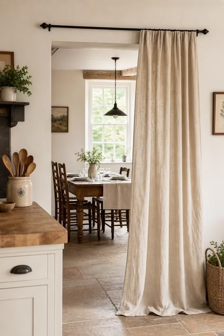
Open floor plans solved one problem and created another: the kitchen gained views into the dining room, but the dining room lost any sense of being its own space.
A single linen curtain panel hung from a simple rod across the opening gives you the best of both arrangements, closing for a quiet dinner or pulling aside for the everyday traffic flow.
The fabric should be a heavy-weight linen in natural flax, the kind that wrinkles beautifully and filters light rather than blocking it completely.
When the panel is pushed to one side, it gathers into a soft column of fabric that becomes a textural accent rather than a barrier.
The rod should be a plain black iron bar, mounted just above the door frame, with simple ring clips that let the panel slide freely with one hand while carrying a plate with the other.
This divider works especially well when the kitchen has a different mood than the dining area, separating a busy cooking zone from a calmer eating space without the permanence or expense of a wall.
Style Blueprint:
- Heavy-weight linen curtain panel in natural flax (floor length)
- Simple black iron curtain rod with ring clips
- Mounted just above the doorway or pass-through opening
- Panel width 1.5 times the opening width for proper gathering
- Stone tile or hardwood floor that runs continuously through both spaces
Pressed Herb Prints in Thin Oak Frames Grouped in a Grid Above a Sideboard
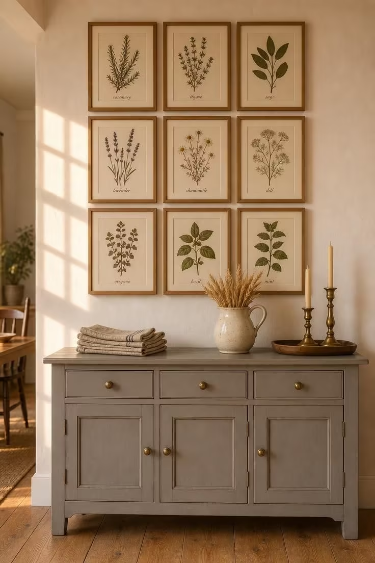
A gallery wall in a dining room should feel like it grew from the room’s own interests, and pressed herb prints do exactly that by connecting the wall art to the kitchen garden just outside.
The grid arrangement, three rows of three, gives the grouping a clean structure that prevents the wall from looking cluttered even though nine frames is a generous number.
Thin oak frames keep the focus on the botanical specimens rather than the framing, and the cream mat inside each frame adds just enough breathing room around the pressed herbs.
Each print should show a different herb, labeled in small italic text, so the grid reads as a reference collection rather than a decorative afterthought.
Positioning the grid above a sideboard or credenza creates a visual unit where the art and the furniture support each other, with the sideboard’s horizontal surface grounding the vertical arrangement.
The sideboard itself does practical work here, holding napkins, serving dishes, and the small objects that a dining table needs nearby but does not want cluttering its surface.
Keeping the spacing between frames tight, about 2 inches between each, makes the grid read as one piece rather than nine separate prints and prevents the arrangement from overwhelming the wall.
Brass candlesticks on the sideboard below pull a warm metallic accent into the setting that echoes the tawny tones of the oak frames above.
Style Blueprint:
- 9 pressed herb prints (rosemary, thyme, sage, lavender, chamomile, dill, oregano, basil, mint)
- Thin natural oak frames with cream mats (8×10 or 5×7)
- Three-by-three grid hung with 2-inch spacing between frames
- Painted sideboard in muted dove gray or sage with aged brass knobs
- Dried wheat stalks in a ceramic pitcher as a sideboard centerpiece
Design Pro-Tip: When hanging a grid of frames, lay the entire arrangement on the floor first and adjust until every gap is even. Then tape a large sheet of kraft paper to the wall, transfer the nail positions by measuring from the floor layout, and hammer through the paper. Peel the paper away and every frame will land exactly where you planned.
A Reclaimed Door Mounted Flat as a Dining Table Top on Sawhorse Legs
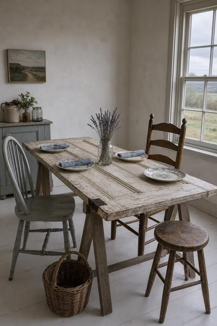
There is something deeply cottage about building your dining table from a door that once opened into another room.
A reclaimed panel door, laid flat on simple sawhorse legs, becomes a table with more character than anything you could order from a furniture store.
The panel molding creates natural sections on the tabletop that define place settings without placemats, and the original paint, whether cream or faded blue or chipped green, becomes the table’s color story.
Sawhorse legs keep the build simple and the cost low, and their A-frame shape provides surprising stability for a dining surface that might look precarious on paper.
If the door still has its original hardware, a brass hinge or a porcelain knob at one end, leave it in place as a reminder of the piece’s first life.
The table height depends on the sawhorse: standard dining height is about 30 inches, so choose or cut the legs to match.
This is a table that invites imperfection, where a water ring or a scratch joins the patina rather than ruining a finish, and where every guest asks about its story.
Style Blueprint:
- Reclaimed panel door with original paint patina (standard interior door size)
- Two wooden A-frame sawhorse legs (adjustable to 30-inch dining height)
- Floral seat cushions or cushioned seats on mismatched chairs
- Clear glass jar with dried lavender or seasonal stems as centerpiece
- Woven basket on the floor near one table leg for bread or napkin storage
Conclusion
A cottage dining room earns its warmth from the choices that happen between the big purchases.
The table and chairs set the stage, but it is the linen runner, the chipped terracotta pot, the hand-forged chandelier, and the mismatched plates that make the room feel gathered rather than decorated.
Each of these 13 cottage dining room ideas focuses on one specific detail you can add, swap, or build without renovating the entire space.
Start with the one that speaks to how you actually eat: if you linger over candlelit dinners, the iron chandelier and beeswax tapers will change your evenings, and if you host big weekend lunches, the trestle table with its open invitation of mismatched chairs will serve you well.
The common thread across every idea here is that nothing needs to match perfectly, because in a cottage dining room, the beauty is in the gathering.