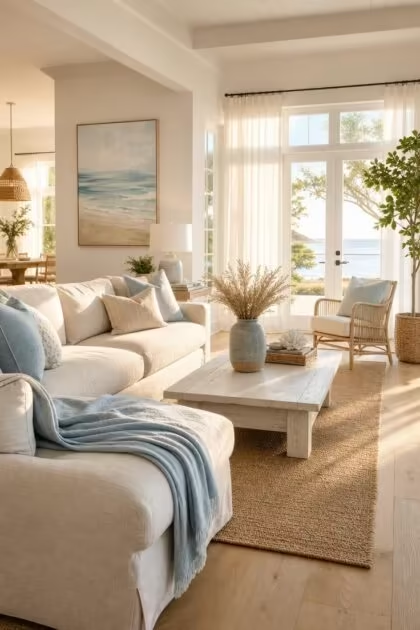
This post may contain affiliate links. If you make a purchase through these links, we may earn a commission at no additional cost to you.
A coastal color palette does more than paint a room blue.
It layers the soft tones you remember from shoreline mornings, from the pale gray of wet sand to the bleached warmth of sun-faded wood, into a combination that makes a space feel open and grounded at the same time.
These 11 coastal color palette ideas each center on a specific pairing of hues, finishes, and materials so you can see exactly how the colors work together in a real room.
Whether you lean toward cool ocean-toned interiors or warmer sand-and-coral combinations, there is a palette here that fits your home.
Powder Blue Ceiling Paired With Bleached Oak Floors and White Linen Drapes
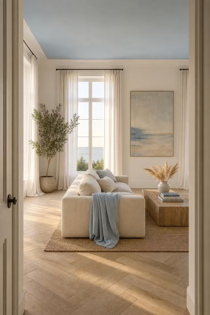
The blue ceiling is the first thing you notice, and that is exactly the point.
Painting the ceiling a soft powder blue pulls the eye upward and makes the whole room feel taller, a trick borrowed from old porch ceilings across the Southern coast.
Below, bleached oak floors keep the palette grounded with just enough warmth to stop the room from reading cold.
White linen drapes filter the light without blocking it, turning every window into a soft glow instead of a hard glare.
This coastal color palette works because the three colors, blue, cream, and pale wood, occupy different visual weights without competing.
The blue is airy, the white is neutral, and the oak is warm, so the room has depth without clutter.
Style Blueprint:
- Powder blue ceiling paint in a flat or eggshell sheen
- Bleached or whitewashed oak plank flooring
- Floor-to-ceiling white linen drapes with a relaxed puddle hem
- Low-profile sofa in cream or natural linen upholstery
- Woven jute area rug in a natural tan tone
Sage Green Cabinets With Sand-Colored Quartzite Counters in a Beach Cottage Kitchen
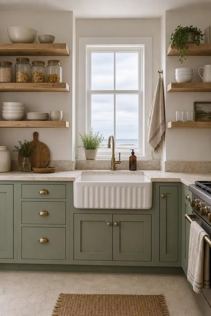
Sage green in a kitchen reads as both coastal and grounded, a color that belongs near the water without screaming “beach house.”
The muted tone pairs naturally with sandy neutral walls and countertops because both colors exist side by side in coastal landscapes, marsh grass meeting sand dunes.
Quartzite in a sand tone adds warmth without the visual weight of darker granite, and its natural veining gives the counter surface character that plain white stone cannot match.
Open pine shelving above the counter replaces heavy upper cabinets and makes the small kitchen feel twice its actual size.
The coastal kitchen colors here lean earthy rather than aquatic, which keeps the space feeling grounded for everyday cooking.
Brass hardware on the cabinets ties the warm tones together and ages well alongside the natural stone.
A single potted herb on the counter adds a living green note that echoes the cabinet color without trying too hard.
Style Blueprint:
- Muted sage green paint on lower cabinets in a satin finish
- Sand-colored quartzite countertops with natural veining
- Open pine or whitewashed wood upper shelving
- Warm brass cabinet pulls and sink hardware
- Pale hexagonal floor tile in warm cream
Deep Teal Accent Wall Behind a Low Walnut Platform Bed With Ivory Bedding
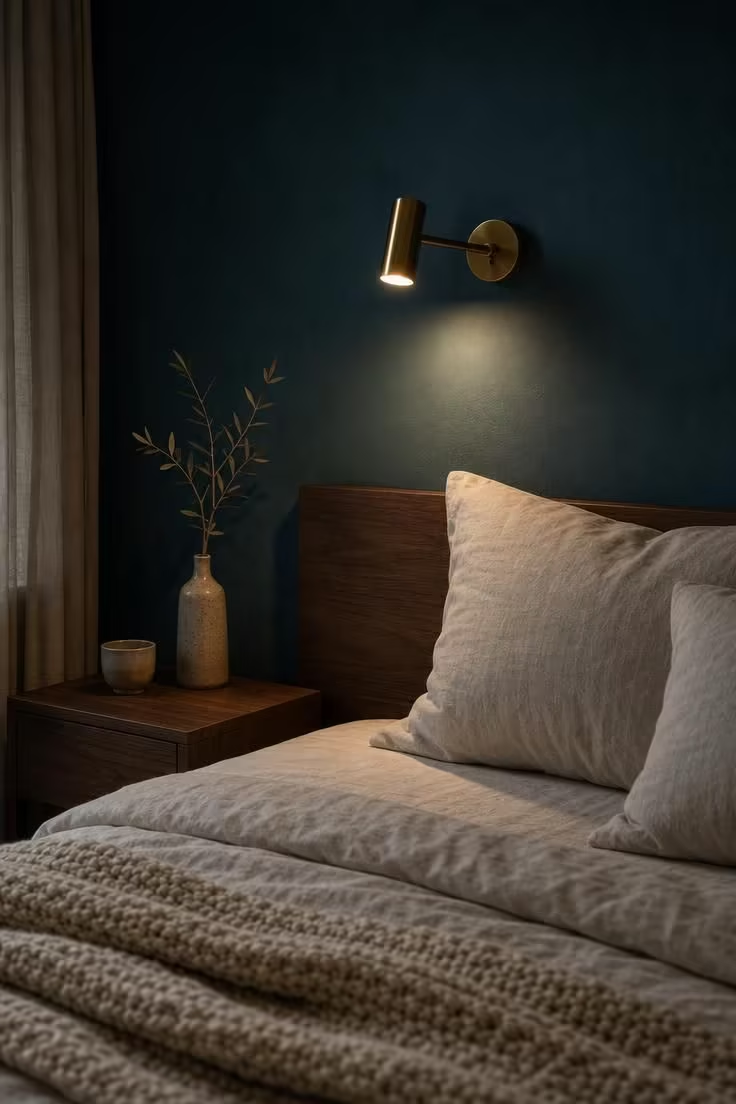
One wall of deep teal changes the entire energy of a bedroom without overwhelming it.
The color is rich enough to anchor the room but cool enough to still feel connected to the coast, less Caribbean and more Pacific Northwest after a storm.
Walnut furniture grounds the palette with warmth that ivory bedding alone cannot provide.
The coastal bedroom palette here works on contrast: the teal is dark and saturated, the ivory is light and soft, and the walnut splits the difference with its mid-tone warmth.
Limiting the bold color to a single wall keeps the room from feeling heavy or enclosed.
A brass reading sconce adds a warm metallic accent that reflects light back against the teal and pulls the eye toward the bed.
Layered textures in the bedding, from smooth linen to chunky knit, give the monochromatic ivory section enough visual interest to hold its own against the strong wall color.
The dried olive branch on the nightstand is a small detail that bridges the natural and styled elements of the room.
Style Blueprint:
- Deep teal paint on a single accent wall in matte or eggshell finish
- Low walnut platform bed frame with a clean silhouette
- Ivory linen duvet and euro shams
- Chunky cream cotton knit throw blanket
- Wall-mounted brass reading sconce with a warm bulb
Warm Coral Throw Pillows on a Slate Blue Sectional With a Sisal Rug
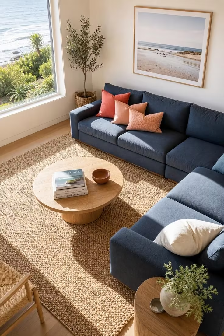
Coral against slate blue is a coastal color palette that borrows directly from sunset reflections on water.
The warmth of coral keeps the room from feeling like a cold, clinical blue-and-white space, adding life and personality without the intensity of red or orange.
Sisal underfoot reinforces the coastal connection through texture rather than color, its sandy neutral tone acting as a bridge between the warm and cool elements.
This combination works in coastal living room colors because neither the blue nor the coral dominates; they share the space with mutual confidence.
The uncurtained window lets in clean midday light that saturates both colors to their fullest, a choice that only works when neither shade needs muting.
A terracotta bowl on the coffee table picks up the warm undertone of the coral pillows and adds an earthy element that keeps the palette from reading too preppy.
Style Blueprint:
- Deep slate blue sectional sofa in a durable cotton weave
- Throw pillows in warm coral and soft peach tones
- Large woven sisal area rug in a natural sandy tone
- Round white oak coffee table
- Small terracotta accent bowl or vase
Seafoam Tile Backsplash Against Matte White Shelving and Copper Hardware
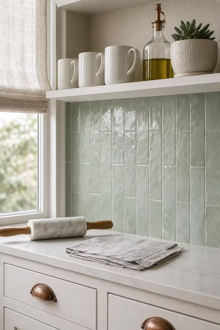
Sea glass tones on a backsplash bring coastal color into the kitchen without repainting a single cabinet.
The slightly irregular surface of zellige tiles catches light at different angles, creating a subtle shimmer that flat tile cannot replicate.
Matte white shelving above keeps the palette clean and lets the seafoam color be the single bold statement in the space.
Aged copper hardware introduces a metallic warmth that complements the cool green without competing, and copper develops more character over time as it oxidizes.
This coastal color palette is ideal for kitchens that need a color accent without a full renovation, since a backsplash swap is one of the most cost-effective ways to shift a room’s entire feel.
The cream planter and pale gray linen on the counter add small neutral notes that soften the contrast between the seafoam tile and white cabinetry.
Together, these sea glass tones create a palette that feels collected over time rather than decorated all at once.
Style Blueprint:
- Handmade seafoam green zellige tiles in a stacked vertical layout
- Matte white open shelving or floating shelves
- Aged copper cabinet pulls and drawer hardware
- White shaker-style base cabinets
- Small neutral accents in cream and pale gray
Design Pro-Tip: When using a bold-colored backsplash tile, keep the grout color close to the tile shade rather than defaulting to white. Tone-matched grout lets the tile pattern flow as a single surface, while white grout creates a grid that chops up the color and makes the wall look busier than it needs to be.
Sun-Bleached Lavender Walls With Driftwood Frames and Oat-Toned Furniture
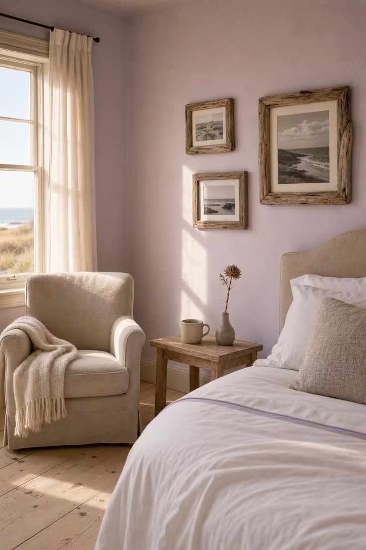
Lavender is not the first color people reach for in a coastal palette, and that is exactly why it works here.
A sun-bleached, barely-there lavender reads as a warm neutral in the right light, closer to a blush gray than a purple.
It pairs naturally with the warm brown of raw driftwood and the soft cream of oat-toned upholstery because all three colors share a muted, faded quality.
This is a coastal color palette for rooms that already get plenty of warm light; the golden tones from the window push the lavender toward pink and bring out the honey grain in the driftwood frames.
The beach house color scheme here avoids blue entirely, proving that coastal palettes can live in the warm spectrum without losing their connection to shore life.
Black-and-white photographs inside the driftwood frames add graphic contrast without introducing a new color, keeping the palette tight and controlled.
A thin lavender stripe on the bedding ties the wall color to the bed without being heavy-handed.
The dried thistle on the side table echoes the muted purple-gray of the walls and adds an organic texture that fresh flowers would overshadow.
Style Blueprint:
- Sun-bleached lavender wall paint in a flat or matte finish
- Raw driftwood picture frames in varied sizes
- Oat-toned upholstered armchair or accent chair
- White cotton bedding with a thin lavender accent stripe
- Bleached oak or pine side table
Dove Gray Wainscoting in a Coastal Entryway With a Bleached Pine Console
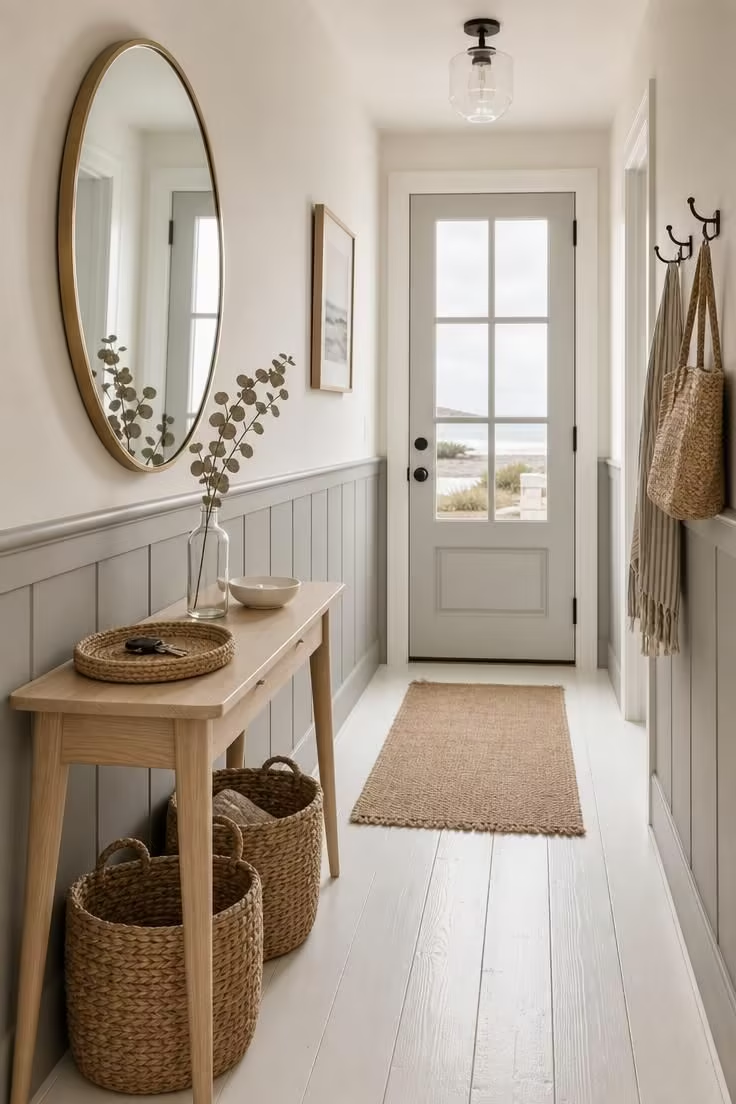
The entryway is where your coastal color palette makes its first promise to anyone walking through the door.
Dove gray wainscoting on the lower walls handles the wear and scuff of daily traffic while setting a soft, cool tone that reads as both coastal and polished.
Warm white above the wainscoting line keeps the narrow hall feeling open and prevents the gray from making the space feel dark.
A bleached pine console adds driftwood gray accents through its natural grain without needing any additional decoration to read as coastal.
The round brass mirror bounces whatever light reaches the hallway back into the space, a practical choice that doubles as a warm metallic accent.
Style Blueprint:
- Dove gray wainscoting covering the lower third of the wall
- Warm white paint above the wainscoting line
- Bleached pine console table with tapered legs
- Round mirror with a thin brass frame
- Woven seagrass storage baskets
Turquoise Glass Pendants Over a White Marble Island With Navy Bar Stools
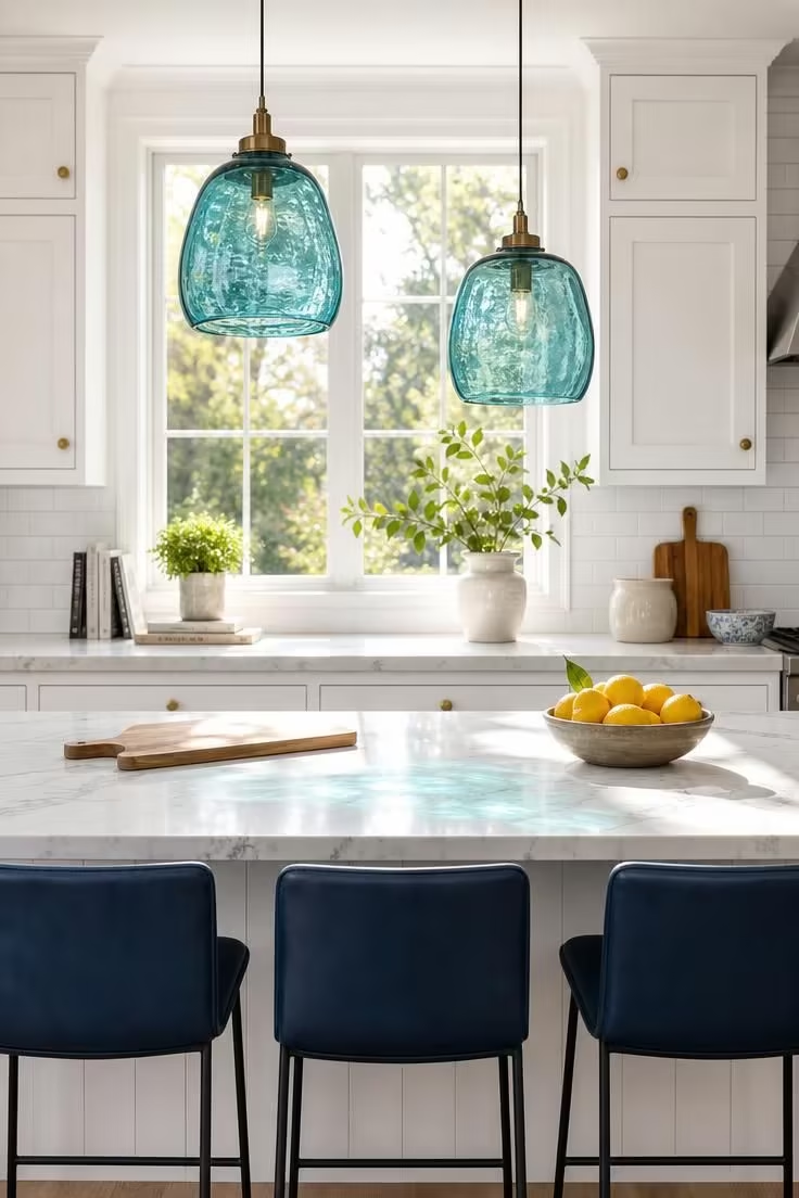
Turquoise and navy together create a blue-on-blue coastal color palette that feels layered rather than flat.
The turquoise glass pendants bring translucent color overhead, and because glass allows light to pass through, the color shifts throughout the day as the sun moves.
Navy on the bar stools anchors the bottom of the frame with a deeper, more grounded version of blue that reads as almost neutral in this context.
White marble between them acts as a visual pause, its cool surface reflecting the turquoise light and creating soft colored shadows that change by the hour.
This coastal color palette demonstrates how blue and white decor gains depth when you add a second shade of blue instead of a contrasting warm accent.
The brass cabinet knobs pick up the warm undertone in the marble veining and prevent the room from tipping entirely cold.
Lemons on the cutting board are the single warm-toned object in the scene, and their bright yellow pops against the blue and white without needing to dominate.
Style Blueprint:
- Recycled turquoise glass pendant lights hung at staggered heights
- White marble island countertop with gray veining
- Navy leather-topped bar stools with matte black frames
- White cabinetry with simple brass knob hardware
- White subway tile backsplash
Dusty Rose Linen Curtains Against a Pale Aqua Wall With a Wicker Armchair
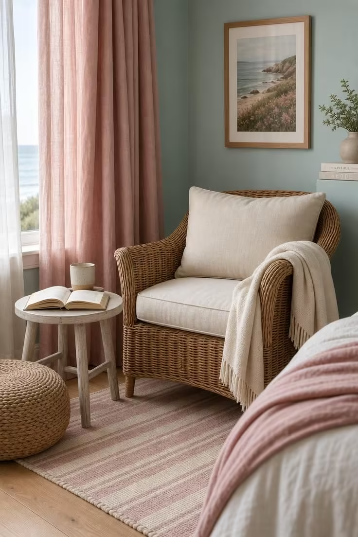
Dusty rose and pale aqua is a coastal color palette that leans feminine without becoming overly sweet.
The aqua wall sits in the blue-green range that reads as undeniably coastal, but its pale saturation keeps it from overwhelming the small reading corner.
Dusty rose curtains introduce a warm complement that exists on the opposite side of the color wheel, creating a gentle tension that makes both colors look more alive.
Wicker furniture bridges the two colors with its natural tan tone, a neutral that belongs at the beach and feels right at home between pink and blue.
The cream cushion and wool throw keep the warmer tones from competing with the curtains and let the rose color remain the clear warm accent.
A flatweave rug in pale blush and ivory stripes echoes the curtain color at floor level, grounding the palette so it does not float entirely at eye height.
This combination proves that a coastal color palette can move well beyond the expected blue-and-white pairing and still feel connected to the water.
Coastal bathroom hues in a similar aqua-and-rose combination translate well into powder rooms and small bathrooms where you want softness without sterility.
The diffused light is the right choice here because direct sun would push the dusty rose toward a stronger pink and shift the balance of the palette.
Style Blueprint:
- Pale aqua wall paint in a satin or eggshell finish
- Floor-length dusty rose linen curtains
- Natural wicker armchair with a cream linen seat cushion
- Whitewashed wood side table
- Flatweave rug in pale blush and ivory stripes
Design Pro-Tip: When pairing two pastel colors in the same room, keep all the secondary elements, furniture, textiles, and accessories, in strict neutrals like cream, natural wicker, or whitewashed wood. Adding a third pastel creates visual noise that dilutes the effect of the primary two-color story.
Ochre and Cream Layered on a Covered Patio With Weathered Teak Seating
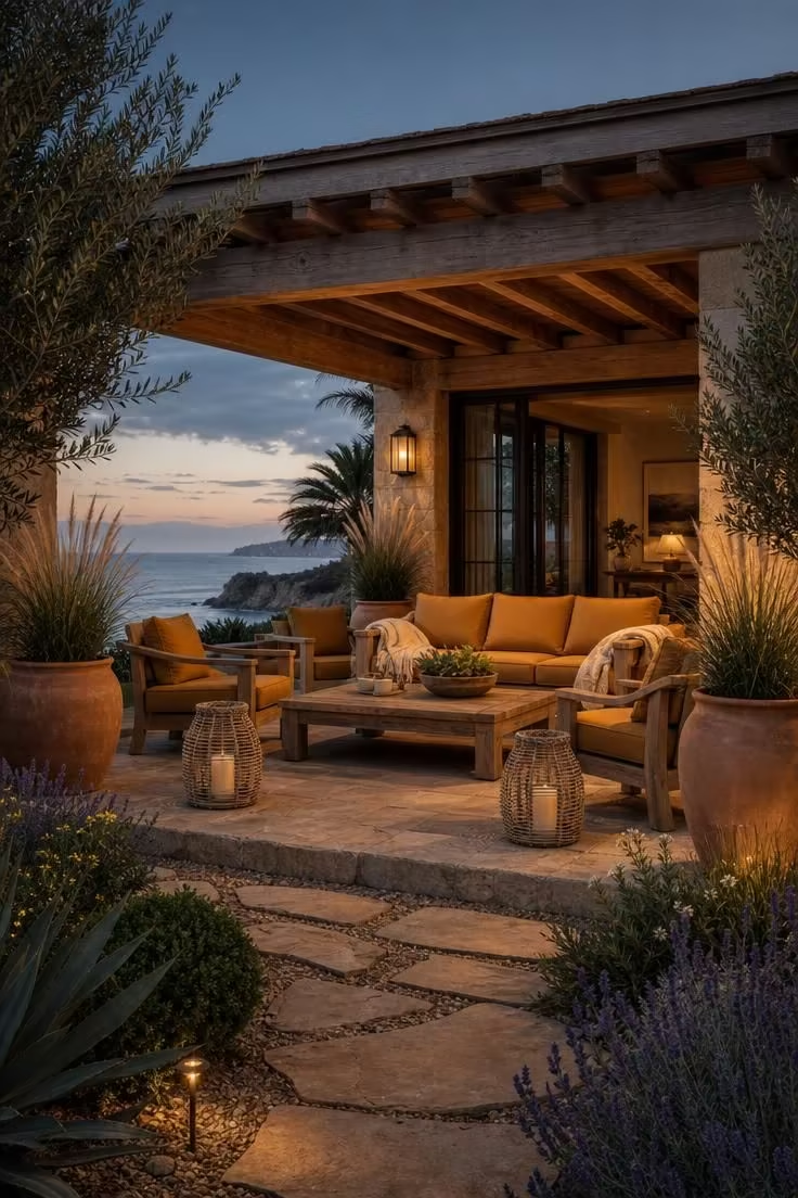
Ochre is a color that belongs to both the coast and the earth, and on a covered patio it connects the indoor palette to the landscape beyond.
This warm golden-brown reads as a richer version of the sandy neutral walls you might use inside, turned up in saturation to hold its own in open air and natural light.
Cream throws layered over the ochre cushions lighten the palette and keep the seating from looking too heavy against the weathered gray of the teak.
Weathered teak furniture is one of the few materials that genuinely improves with coastal exposure, its silver-gray patina developing naturally over seasons of sun, salt, and rain.
Natural stone flooring in a warm sand tone extends the palette to the ground plane and creates a smooth transition from patio to garden path.
The dusky sky at this hour adds its own blue-gray to the scene, acting as a cool backdrop that makes the ochre and cream tones glow warmer by contrast.
Style Blueprint:
- Weathered teak outdoor sofa, chairs, and coffee table
- Large ochre-colored outdoor cushions in a fade-resistant fabric
- Cream linen or cotton outdoor throw blankets
- Tall terracotta planters with ornamental grasses
- Natural sand-toned stone patio flooring
Stone Gray Plaster Walls With a Fog Blue Sofa and Raw Linen Cushions
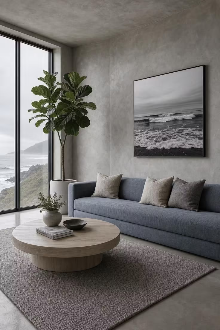
Gray and blue together can read as cold and corporate, but the right textures turn that risk into an advantage.
Stone gray plaster walls bring a handmade, uneven surface quality that absorbs and scatters light differently across every section of the wall.
Fog blue on the sofa is a color that sits between true blue and true gray, reading as blue in warm light and nearly neutral on overcast days.
Raw linen cushions in natural flax add a warm, organic contrast to the cooler tones and keep the sofa from looking like an extension of the gray wall behind it.
This coastal color palette leans modern because it strips away the rattan, rope, and driftwood details that traditional coastal rooms rely on.
The polished concrete floor extends the gray palette to the ground without introducing a new color, and its slight sheen reflects ambient light back into the room.
A fiddle leaf fig in the corner provides the only green in the entire space, and its height draws the eye upward to the full ceiling height.
The black-and-white wave photograph is the finishing detail that ties the room back to the coast without decorating with shells or anchors.
Style Blueprint:
- Textured stone gray plaster or limewash wall finish
- Fog blue sofa with a low profile and clean lines
- Raw linen cushions in natural flax and pewter tones
- Pale ash wood coffee table
- Low-pile wool area rug in warm gray
Conclusion
A coastal color palette gives you more freedom than most people expect.
These 11 ideas prove that coastal living room colors, coastal kitchen colors, and even outdoor palettes can range from deep teal and navy to soft lavender and dusty rose without losing the feeling of being near the water.
The key is in the pairing: every strong color needs a quiet partner, a sandy neutral, a weathered wood, or a raw linen to keep the room grounded.
Pick the palette that matches your light and your mood, and start with the smallest move, a new set of throw pillows, a painted accent wall, or a backsplash swap, to test how the colors live in your space.