This post may contain affiliate links. If you make a purchase through these links, we may earn a commission at no additional cost to you.
An eclectic color palette rarely arrives in one shopping trip, and that is the point.
It reads as a room that has been lived in: deep teal beside rust, a chalky wall holding a saffron bowl, indigo textiles resting on warm oat upholstery.
What separates a collected room from a chaotic one is structure, not restraint.
A single anchor color carries the most visual area, a few satellites repeat across unrelated objects, and the value spread stays wide enough to keep the mix legible.
The ten directions below each show a complete visual world, with notes on what makes the combination hold together.
Jewel Tones Anchored by a Warm Wood Floor
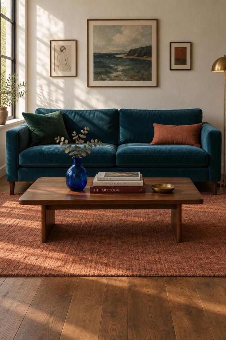
Jewel tones carry a room without needing many objects, and the warm floor is what keeps them from feeling cold.
A deep teal sofa works as the anchor because it covers the most area and gives the eye one place to land.
The satellites, an emerald cushion, a cobalt vase, oxblood book spine, rust lumbar, spread the color story across the frame in small doses.
Brass and walnut tie the cooler jewel hues to the warmth underfoot.
Value spread matters here: the plaster wall provides the light note, the teal and floor carry the mid, and the oxblood and walnut hold the dark end.
If every object were saturated at the same level, the room would tip toward noise.
Repetition is what reads as intention, the same brass appearing on a dish, a lamp base, and a frame edge.
Style Blueprint:
- Anchor: deep teal upholstery carrying the largest color area
- Satellites: emerald, cobalt, oxblood, and rust appearing in four small objects
- Value spread: pale wall as the light note, teal as the mid, walnut floor and oxblood as the darks
- Temperature tension: cool jewel upholstery against warm wood and rust
- Repetition: brass returns in the dish, a lamp base, and one frame edge
Muted Earth Palette With a Single Saturated Accent
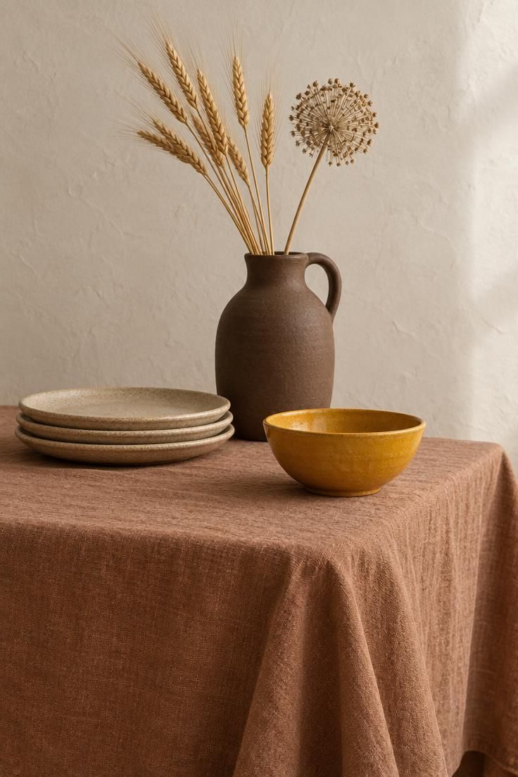
Earth tones do the quiet work in this palette, and the single saffron bowl is what makes the whole arrangement feel alive.
A clay-toned cloth works as the anchor because it stretches across the largest surface and sets the temperature for everything on top of it.
Sand stoneware, an oat-hued wall, and a matte umber jug form the tonal family that surrounds the signal color without competing with it.
Saturation variance is the point: when nearly every object is muted, one fully saturated piece reads as deliberate rather than random.
Value spread comes from the light stoneware against the darker jug, with the cloth sitting in the middle.
Remove the saffron bowl and the arrangement collapses into a single tonal note that looks under-designed rather than collected.
The tradeoff is that the palette is quiet enough to feel flat in a room with no other texture, so linen, stoneware, and dried stems carry a lot of the visual weight.
Style Blueprint:
- Anchor: clay and sand textiles spanning the table surface
- Satellites: umber, oat, and chalky off-white in ceramics and stems
- Signal color: saffron used exactly once, on the smallest object
- Value spread: light stoneware, mid clay, dark umber
- Tradeoff note: removing the saffron bowl flattens the mix into a single tonal family
Faded Mediterranean Pastels Against Chalky White Walls
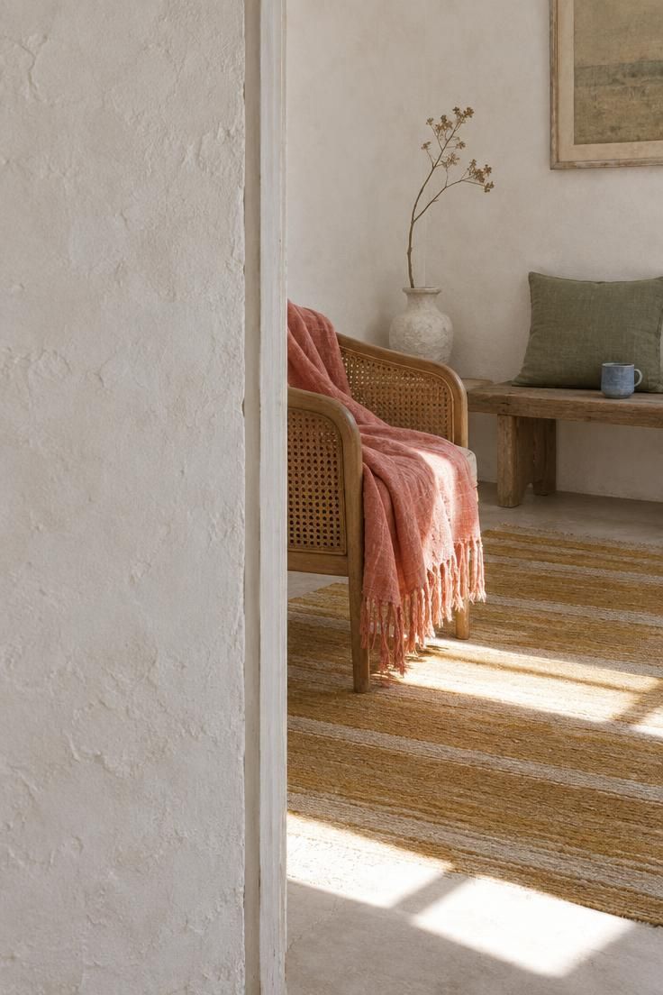
A chalky white field is what allows coral, sage, and ochre to sit together without tipping into candy territory.
The wall and floor do the work of a breather, giving the pastels a place to rest.
Faded coral on the throw is the anchor in warmth, sage in the cushion balances the temperature, and dusty blue in a small ceramic keeps the palette from locking into a single family.
Value spread matters: chalky white holds the light, coral and ochre the mids, and the wood of the bench and darker stripe of the rug anchor the bottom.
Finishes lean matte throughout, which reads as worn rather than newly purchased.
The decision that changes this palette most is the crispness of the pastels, and pushing them toward candy brightness makes the room feel staged.
Repetition carries the intention here, with sage returning in the cushion, a small ceramic, and one stripe of the rug.
Style Blueprint:
- Anchor: chalky white wall and pale floor as the resting field
- Satellites: faded coral, sage, ochre, and dusty blue in textiles and ceramics
- Finish note: matte, sun-worn surfaces rather than glossy or saturated ones
- Temperature tension: coral and ochre warm against sage and dusty blue
- Repetition: sage appears in the cushion, a small bowl, and one stripe of the rug
- Decision criterion: crisper pastels push the room toward candy, faded ones keep it sun-worn
Maximalist Pastels Grounded by Black Accents
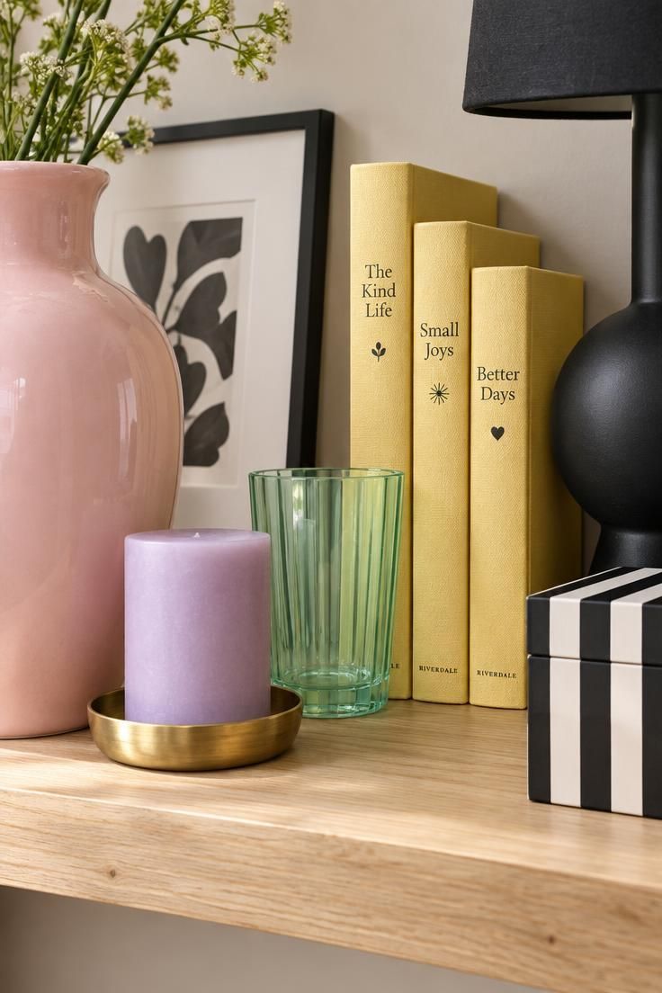
Maximalist pastels require a grounding device, and black is the most efficient one available.
Powder pink anchors the composition because it repeats across more objects than any other pastel on the shelf.
Lilac, mint, and butter yellow each appear once, which keeps the mix legible even when it reads as busy.
The black frame, lamp base, and striped box interrupt the pastel field in three non-adjacent spots, giving the eye a place to rest between bright moments.
Value spread is the discipline: pastels as the lights, the pale shelf as the mid, and black as the only true dark.
Three black objects is often enough.
Fewer and the pastels drift toward a nursery palette, and more and the pastels disappear altogether.
Repetition of powder pink across several objects is what signals that the arrangement was composed rather than accumulated by accident.
Style Blueprint:
- Anchor: powder pink as the most repeated pastel
- Satellites: lilac, mint, and butter yellow in single objects each
- Grounding device: black appears three times, in small, non-adjacent spots
- Value spread: pastels as lights, black as the dark, pale surface as the mid
- Tradeoff note: without black, the mix reads as a nursery palette; with too much black, the pastels disappear
Design Pro-Tip: When a pastel mix starts to feel syrupy, add one small black object to the arrangement and step back. The contrast usually tells you whether the palette needs more grounding or simply needed a darker mid-tone.
Retro-Revival Greens, Oranges, and Browns
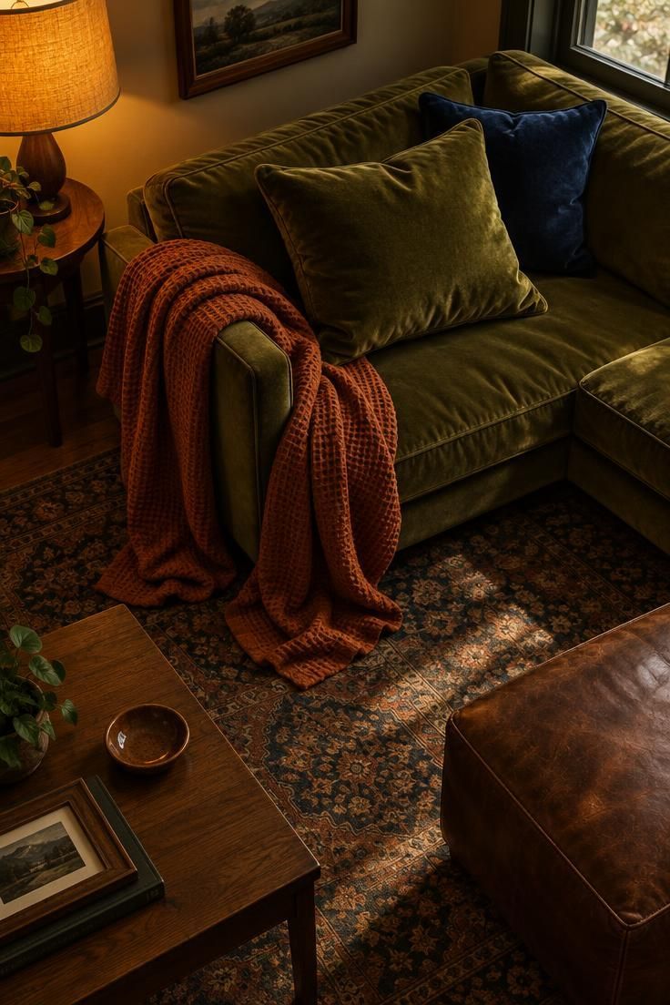
Retro-revival colors accumulate into a warm room quickly, and the navy cushion is what stops the accumulation from becoming heavy.
Avocado green anchors the textile story because it covers the most area and sets the era reference.
Burnt orange and harvest gold layer warmth on top of it, and the brown leather ottoman repeats the tone in a harder material for contrast.
The deep navy cushion is the cool counterweight, and without it the warm tones stack up without relief.
Value spread runs from the gold shade as the light note through avocado and orange as mids to brown and navy as darks.
Finishes lean toward velvet, leather, and matte ceramic, which keeps the palette from reading as glossy or plastic.
Orange reads very differently on a throw than it would on a full wall, so scale changes the decision.
The rule to hold to is choosing avocado or navy as the anchor, never both.
Retro revival colors accumulate into a warm, collected room, and maximalist color schemes work best when one cool tone interrupts the heat.
Avocado green, burnt orange, and harvest gold can carry a whole seating area when the brown leather ottoman repeats the deepest tone in a harder material.
Small space color ideas often depend on one cool note to keep a warm scheme from closing in on itself, the same job the navy cushion performs here.
Style Blueprint:
- Anchor: avocado green spanning the largest textile area
- Satellites: burnt orange, harvest gold, and brown leather
- Cool counterweight: deep navy used once, in a low-contrast spot
- Value spread: gold as the light, avocado and orange as mids, brown and navy as darks
- Finish note: velvet, leather, and matte ceramic rather than all-shiny surfaces
- Tradeoff note: this palette depends on the navy; without it, the warmth accumulates without relief
- Repetition: brown appears in the ottoman, a frame, and a small dish
- Scale note: orange reads very differently on a throw than on a full wall
- Decision criterion: choose avocado or navy as the anchor, not both
Global-Textile Palette Layered Over Warm Neutrals

Warm neutrals give a patterned textile room to speak without competing, which is why the oat wall and cream sofa work as the base.
The rug anchors the palette as the largest patterned surface, and its indigo, rust, and blue-green notes become the source for every other color in the room.
Repetition is the discipline here: the blue-green in the rug reappears in the bowl, a cushion edge, and a book spine, which is what turns a single textile into a working color story.
Value spread runs from cream as the light through oat and rust as mids to indigo as the dark.
The clearest decision criterion is starting with the rug and drawing every satellite from it, rather than choosing objects first and hunting for a rug that matches.
The tradeoff is that a very busy rug needs fewer accessories, and adding more pattern on top will crowd the composition.
Global textile decor often starts with one patterned piece that supplies most of the color.
A warm neutral base lets that pattern lead instead of fighting a second strong color.
A collected home decor look grows from that discipline, where each object earns its place by echoing the rug rather than matching it outright.
Layered over warm neutrals, a global-textile palette stays grounded because the quiet base lets the repeat colors read as one considered group.
Style Blueprint:
- Anchor: warm oat wall and cream upholstery as the neutral field
- Satellites: indigo, rust, and blue-green drawn from the rug
- Repetition: blue-green returns in the bowl, a cushion edge, and one book spine
- Value spread: cream as the light, oat and rust as mids, indigo as the dark
- Decision criterion: choose the rug first, then pull every other color from it
Cool Base With Warm Accents Layered Through Objects
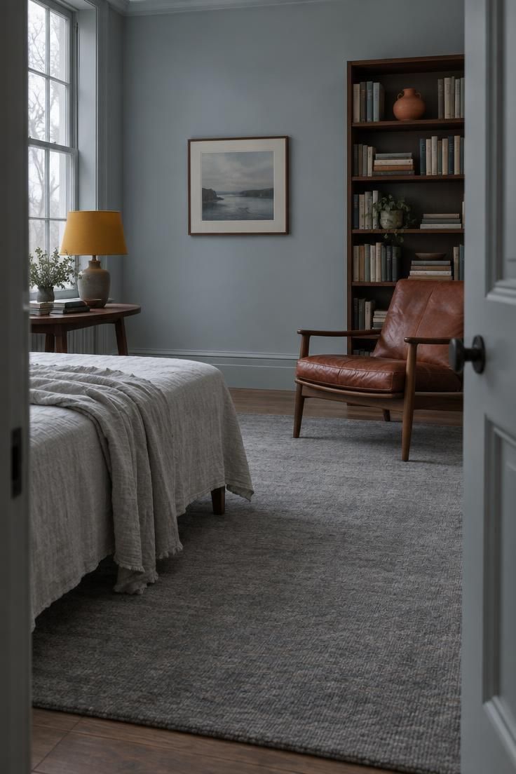
A cool base is a strong frame for warm accents because the contrast reads clearly and the room still feels calm.
Pale blue-grey on the wall and cool linen on the bench or bedding anchor the composition, with the cool grey rug holding the floor.
Rust, mustard, and terracotta appear in three unconnected objects, and the spacing between them is what keeps the base legible.
Value spread goes from the pale wall as the light through linen and grey as mids to the rust and walnut darks.
The tradeoff with this palette is clustering: when warm accents sit side by side, the cool base disappears behind them, and separating the objects restores the tension that makes the mix interesting.
Cool overcast light tends to render the pale wall flatter than warm light, so texture in the linen and rug carries more of the visual weight.
A quick check is whether the room still reads as cool when you remove each warm object in turn.
Style Blueprint:
- Anchor: pale blue-grey wall and cool linen as the base
- Satellites: rust, mustard, and terracotta in three warm objects
- Temperature logic: cool base, warm interruptions, no warm object adjacent to another
- Value spread: pale wall as the light, linen and grey as mids, rust and walnut as darks
- Tradeoff note: clustering the warm accents weakens the tension; spacing them keeps the cool base legible
Gallery-Wall-Led Palette in an Otherwise Quiet Room
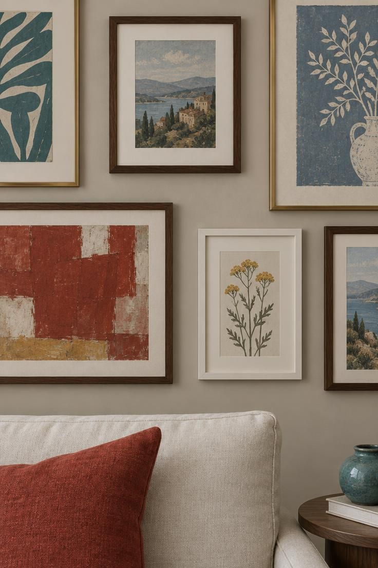
The gallery wall can carry an entire palette when the rest of the room stays quiet.
A soft greige wall and off-white sofa act as the field, and every color enters through the artwork, which makes this one of the lowest-commitment ways to test an eclectic color palette before adding it anywhere else.
Teal, madder red, ochre, and dusty blue live inside the frames, and their repetition outside the frames is what makes the wall feel connected to the room.
A single cushion in madder red does that work on the sofa, and a small ceramic repeats the teal.
The decision criterion is simple: if the frame colors never reappear in the furniture, the gallery reads as a separate object hanging on a wall rather than as part of the palette.
A very busy frame mix on a very busy wall loses the quiet-room contrast that makes this approach work.
Style Blueprint:
- Anchor: the wall itself as the quiet field
- Satellites: teal, madder red, ochre, and dusty blue, all living inside the frames
- Repetition: one frame color returns on a cushion and a small ceramic
- Decision criterion: if the wall colors do not reappear anywhere in the furniture, the gallery reads as a separate object
- Tradeoff note: a very busy frame mix on a very busy wall loses the quiet-room contrast
One Saturated Wall as the Anchor With Collected Objects Around It
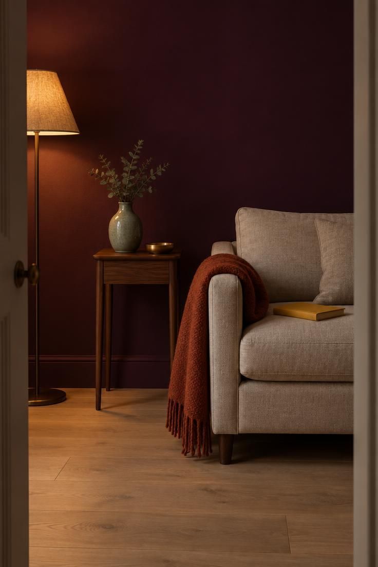
A saturated wall works as the anchor when the surrounding palette stays restrained and the smaller colors concentrate on neutral surfaces.
Deep aubergine covers the most area in the room and sets the palette's temperature, which frees everything else to sit in quiet contrast.
Pale oak, oat upholstery, and a slim walnut table give the room its light and mid tones, and the satellites, sage, mustard, rust, and brass, deliver the color story on the neutral furniture rather than on the wall itself.
Value spread runs from the pale floor as the light through the upholstery as mid to the wall as dark.
The same aubergine on a cushion would read as a small accent rather than an anchor, so scale changes the role.
A saturated wall looks different in daylight and in the evening, so check it in both before committing to the satellite colors.
Repetition keeps the room connected, with one satellite color returning on both a textile and a ceramic.
Sage, mustard, rust, and brass push the deep aubergine wall toward a jewel tone palette without crowding the oak and oat neutrals.
Style Blueprint:
- Anchor: the saturated wall carrying the largest color area in the room
- Satellites: sage, mustard, rust, and brass in small objects against the neutral surfaces
- Value spread: wall as the dark, floor as the light, upholstery as the mid
- Tradeoff note: the wall color will look different in daylight and in the evening, so check it in both before committing
- Repetition: one satellite color returns on a textile and a ceramic
- Scale note: the same aubergine on a cushion would read as a small accent, not an anchor
Design Pro-Tip: Photograph a saturated wall at two different times of day before choosing satellite colors. The objects that still feel right in both light conditions are usually the ones worth repeating.
Rental-Friendly Palette Built Entirely From Moveable Pieces
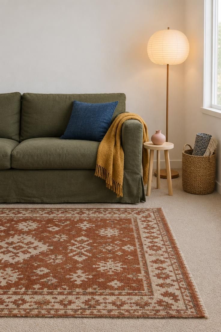
Building a palette entirely from moveable pieces lets a room read as collected even when the fixed surfaces are plain.
A rust and cream rug anchors the composition because it lays the largest colored area over the existing carpet, and the slipcovered sofa in olive green acts as a second anchor that can move when the lease ends.
Mustard, indigo, and chalky pink enter through a throw, a cushion, and a small ceramic, each replaceable.
Value spread runs from the white wall as the light through the cream of the rug as mid to the olive and indigo as darks.
The tradeoff is that portable pieces often lean smaller in scale, so contrast carries more responsibility for keeping the mix legible in a compact room.
Repetition still matters: one of the satellite colors should appear in at least two unrelated objects to read as a decision rather than an accident.
An earthy color palette can lean on clay, sand, and leaf tones that sit comfortably beside plain walls.
Style Blueprint:
- Anchor: a portable patterned rug laying the largest colored area over the fixed floor
- Satellites: olive, mustard, indigo, and chalky pink in movable textiles and ceramics
- Fixed-surface response: palette built so the plain wall and floor stay visually intact
- Value spread: white wall as the light, cream rug as mid, olive and indigo as darks
- Repetition: one satellite color returns in two unrelated portable objects
Conclusion
An eclectic interior design approach rewards patience more than shopping, because the collected feel comes from how colors repeat across a room over time.
Each direction above enters the palette at a different point: a sofa, a rug, a wall, a single object, or a frame.
Choosing that entry point is usually the most useful decision a reader can make, since it constrains every other choice that follows.
From there, the satellites can accumulate slowly, one ceramic, one textile, one book spine at a time, rather than arriving in a single matching set.
Bold color combinations only read as confident when the anchor holds the largest area, a small group of hues returns in unrelated objects, and the value spread stays wide.